

Range sliders in HTML are UI elements that allow users to select a range of values within a certain minimum and maximum range. They are typically used in applications where the user must select a range of values, such as adjusting the volume on a music player. With custom range sliders, we can set minimum and maximum prices using range sliders. They are important because they provide a user-friendly way for users to input data, making the user experience more intuitive and efficient.
In this tutorial, we will learn how to create a custom range slider in Vue.
We’ll look at how to customize the default range input element using CSS. We’ll cover how we can use a few browser-specific pseudo classes like -ms-, -webkit-, -moz-, etc. to change the default appearance of the range input element.
We’ll also see how we can create a custom slider with two handles, one for the minimum value and the other for the maximum value. Using CSS variables, we’ll leverage Vue’s reactivity to bind the input values and style elements.
What we’re building
This tutorial will show you how to create a custom range slider in Vue.js. We will explore the steps necessary to build a range slider that can be easily customized to fit the needs of your application. By the end of this tutorial, you will have a working range slider that you can use in your own Vue.js projects, similar to what we have below:
Set up a new Vue 3 application
To set up a Vue app, simply navigate to a directory of choice and in the terminal, run the following:
npm init vue@latestThen follow the prompts to customize the application:
✔ Project name: … <your-project-name>
✔ Add TypeScript? … No / Yes
✔ Add JSX Support? … No / Yes
✔ Add Vue Router for Single Page Application development? … No / Yes
✔ Add Pinia for state management? … No / Yes
✔ Add Vitest for Unit testing? … No / Yes
✔ Add Cypress for both Unit and End-to-End testing? … No / Yes
✔ Add ESLint for code quality? … No / Yes
✔ Add Prettier for code formatting? … No / Yes
If unsure about an option, feel free to choose No by hitting enter for that option. Once the project is created, run the following to install:
cd <your-project-name>
npm install
We should now have the Vue project running!
Creating a range slider with HTML
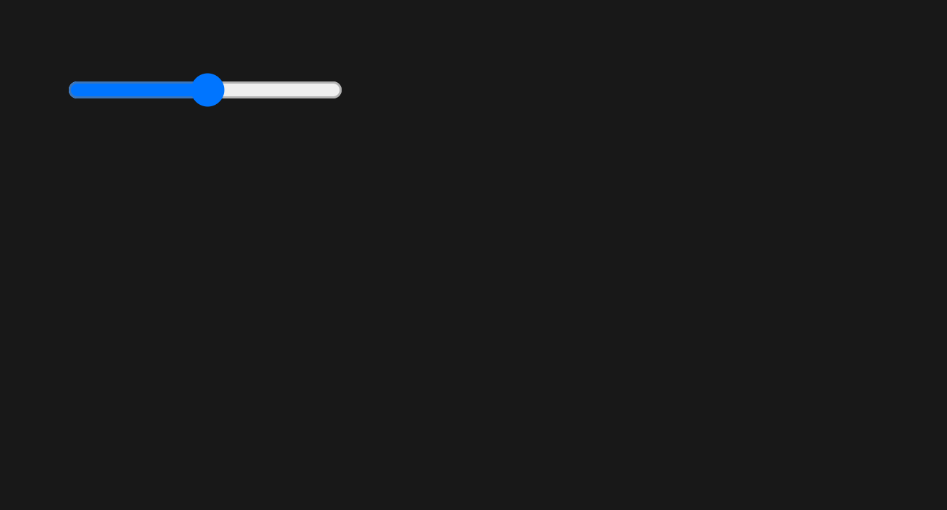
Creating a basic HTML range slider in Vue is pretty straightforward. All we have to do is to add the type=“range” attribute to the <input /> element. We can also add the min and max attributes to give the range slider a minimum value and a maximum value; the value attribute can also be used to specify the default range value, like so:
<!-- ./src/App.vue -->

<template>
  <input type="range" min="0" max="100" value="50" class="slider" />
</template>
This will give us a basic-looking range slider:
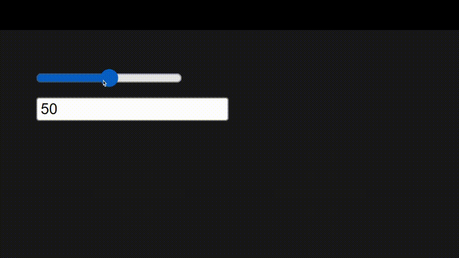
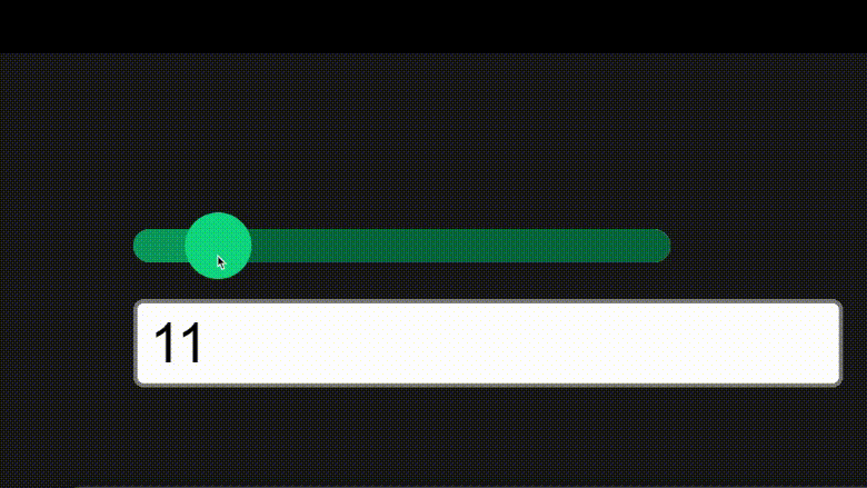
Right now, we can’t see the slider’s value when we adjust it, and we can’t manually specify our desired value. Next, we’ll set up a reactive value with ref() and create another input field to specify the default value. We’ll use v-model on both input elements to enable two-way binding for real-time change in the value of the input and the range slider:
<!-- ./src/App.vue -->
<script setup>
import { ref } from "vue";
const sliderValue = ref(50);
</script>
<template>
  <input v-model="sliderValue" type="range" min="0" max="100" class="slider" />
  <br />
  <input v-model="sliderValue" type="number" />
</template>
With that, we should have this:
Better.
In the next section, we’ll see how to overwrite this default browser-specific styling to create a customized range slider to suit our project needs using CSS.
Customizing the range slider with CSS
First, we’ll wrap our slider and text input in a .custom-slider div to target and style all the necessary elements.
<!-- ./src/App.vue -->
<script setup>...</script>
<template>
  <div class="custom-slider">
    <input
      v-model="sliderValue"
      type="range"
      min="0"
      max="100"
      class="slider"
    />
    <input v-model="sliderValue" type="number" class="input" />
  </div>
</template>
Then in the <style> section of our page, we’ll enter the necessary styles:
<!-- ./src/App.vue -->
<!-- ... -->
<style scoped>
.custom-slider {
--trackHeight: 0.5rem;
--thumbRadius: 1rem;
}
/* style the input element with type "range" */
.custom-slider input[type="range"] {
position: relative;
appearance: none;
/* pointer-events: none; */
border-radius: 999px;
z-index: 0;
}
/* ::before element to replace the slider track */
.custom-slider input[type="range"]::before {
content: "";
position: absolute;
width: var(--ProgressPercent, 100%);
height: 100%;
background: #00865a;
/* z-index: -1; */
pointer-events: none;
border-radius: 999px;
}
/* `::-webkit-slider-runnable-track` targets the track (background) of a range slider in chrome and safari browsers. */
.custom-slider input[type="range"]::-webkit-slider-runnable-track {
appearance: none;
background: #005a3c;
height: var(--trackHeight);
border-radius: 999px;
}
/* `::-moz-range-track` targets the track (background) of a range slider in Mozilla Firefox. */
.custom-slider input[type="range"]::-moz-range-track {
appearance: none;
background: #005a3c;
height: var(--trackHeight);
border-radius: 999px;
}
.custom-slider input[type="range"]::-webkit-slider-thumb {
position: relative;
top: 50%;
transform: translate(0, -50%);
width: var(--thumbRadius);
height: var(--thumbRadius);
/* margin-top: calc((var(--trackHeight) - var(--thumbRadius)) / 2); */
background: #00bd7e;
border-radius: 999px;
pointer-events: all;
appearance: none;
z-index: 1;
}
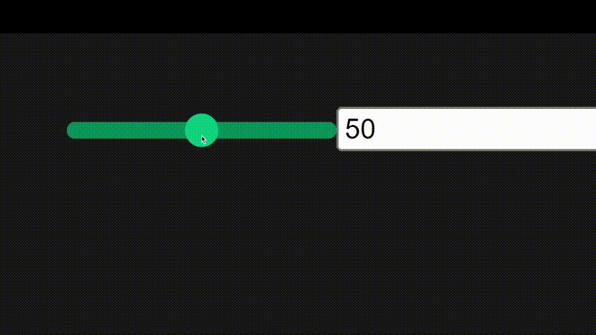
</style>Here, we have set up a few CSS variables --trackHeight and --thumbRadius in our .custom-slider class to customize the height of the slider track and the radius of the slider thumb respectively.
Then, due to the fact that we have multiple input elements nested in the .custom-slider element, we use the .custom-slider input[type="range"] selector to target the range slider input and apply our basic styles to it. The appearance: none style removes the default browser-based styles from the element.
Next, we have a ::before element, which will be styled to replace the slider track progress. We’ll set the width of this pseudo-element using the --ProgressPercent variable, whose value will be updated based on the value of the slider.
After that, we have the .custom-slider input[type="range"]::-webkit-slider-runnable-track and .custom-slider input[type="range"]::-moz-range-track selectors. These selectors target the track (background) of a range slider in Chrome and Firefox browsers
Finally, we have the .custom-slider input[type="range"]::-webkit-slider-thumb selector, where we use the following position and transform rules to place it in the center of the track:
.custom-slider input[type="range"]::-webkit-slider-thumb {
  position: relative;
  top: 50%;
  transform: translate(0, -50%);
  /* ... */
}
Alternatively, we can leverage the --trackHeight and --thumbRadius CSS variables and position the thumb using margin-top:
.custom-slider input[type="range"]::-webkit-slider-thumb {
  /* position: relative;
  top: 50%;
  transform: translate(0, -50%); */

  width: var(--thumbRadius);
  height: var(--thumbRadius);
  margin-top: calc((var(--trackHeight) - var(--thumbRadius)) / 2);
  /* ... */
}
Both approaches yield the same result:
Now, we’ve been able to customize the look of our slider, but we no longer see the slider progress. Thanks to the pseudo-element and the --progressPercent variable we set up earlier, we can add the slider progress.
Setting Slider progress value
In ./src/App.vue, in <script>, we’ll create a few functions to calculate the progress of the slider from the slider value, min and max, and set that progress in the --progressPercent variable.
<!-- ./src/App.vue -->
<script setup>
import { ref, watchEffect } from "vue";
const sliderValue = ref(50);
const slider = ref(null);

// function to get the progress of the slider
const getProgress = (value, min, max) => {
  return ((value - min) / (max - min)) * 100;
};

// function to set the css variable for the progress
const setCSSProgress = (progress) => {
  slider.value.style.setProperty("--ProgressPercent", `${progress}%`);
};


// watchEffect to update the css variable when the slider value changes
watchEffect(() => {
  if (slider.value) {
    const progress = getProgress(
      sliderValue.value,
      slider.value.min,
      slider.value.max
    );
    let extraWidth = (100 - progress) / 10;
    setCSSProgress(progress + extraWidth);
  }
});
</script>
The extraWidth variable is calculated by subtracting the calculated progress from 100 and dividing it by 10; this ensures that the slider progress element gets an extra 10% width when progress is 0 and an extra 0% when progress is 100%. This ensures that the end of progress is always under the slider’s thumb. Here’s what happens when the extra width is not added:
And with the extra width:

And here’s the slider in action:
Awesome!
Create a component for the range slider
Now that we have a working range slider let’s create a new ./src/components/CustomSlider.vue:
<!-- ./src/components/CustomSlider.vue -->
<script setup>
import { ref, watchEffect } from "vue";

// define component props for the slider component
const { min, max, step, modelValue } = defineProps({
  min: {
    type: Number,
    default: 0,
  },
  max: {
    type: Number,
    default: 100,
  },
  step: {
    type: Number,
    default: 1,
  },
  modelValue: {
    type: Number,
    default: 50,
  },
});

// define emits for the slider component
const emit = defineEmits(["update:modelValue"]);

// define refs for the slider component
const sliderValue = ref(modelValue);
const slider = ref(null);

// function to get the progress of the slider
const getProgress = (value, min, max) => {
  return ((value - min) / (max - min)) * 100;
};

// function to set the css variable for the progress
const setCSSProgress = (progress) => {
  slider.value.style.setProperty("--ProgressPercent", `${progress}%`);
};

// watchEffect to update the css variable when the slider value changes
watchEffect(() => {
  if (slider.value) {
    // emit the updated value to the parent component
    emit("update:modelValue", sliderValue.value);

    // update the slider progress
    const progress = getProgress(
      sliderValue.value,
      slider.value.min,
      slider.value.max
    );

    // define extrawidth to ensure that the end of progress is always under the slider thumb.
    let extraWidth = (100 - progress) / 10;

    // set the css variable
    setCSSProgress(progress + extraWidth);
  }
});
</script>
<template>
  <div class="custom-slider">
    <input
      ref="slider"
      :value="sliderValue"
      @input="({ target }) => (sliderValue = parseFloat(target.value))"
      type="range"
      :min="min"
      :max="max"
      :step="step"
      class="slider"
    />
    <input
      :value="sliderValue"
      @input="({ target }) => (sliderValue = parseFloat(target.value))"
      :min="min"
      :max="max"
      :step="step"
      type="number"
      class="input"
    />
  </div>
</template>
<style scoped>
.custom-slider {
  --trackHeight: 0.5rem;
  --thumbRadius: 1rem;
}

/* style the input element with type "range" */
.custom-slider input[type="range"] {
  position: relative;
  appearance: none;
  /* pointer-events: none; */
  border-radius: 999px;
  z-index: 0;
}

/* ::before element to replace the slider track */
.custom-slider input[type="range"]::before {
  content: "";
  position: absolute;
  width: var(--ProgressPercent, 100%);
  height: 100%;
  background: #00865a;
  /* z-index: -1; */
  pointer-events: none;
  border-radius: 999px;
}

/* `::-webkit-slider-runnable-track` targets the track (background) of a range slider in chrome and safari browsers. */
.custom-slider input[type="range"]::-webkit-slider-runnable-track {
  appearance: none;
  background: #005a3c;
  height: var(--trackHeight);
  border-radius: 999px;
}

/* `::-moz-range-track` targets the track (background) of a range slider in Mozilla Firefox. */
.custom-slider input[type="range"]::-moz-range-track {
  appearance: none;
  background: #005a3c;
  height: var(--trackHeight);
  border-radius: 999px;
}

.custom-slider input[type="range"]::-webkit-slider-thumb {
  position: relative;
  /* top: 50%;
  transform: translate(0, -50%);
  */
  width: var(--thumbRadius);
  height: var(--thumbRadius);
  margin-top: calc((var(--trackHeight) - var(--thumbRadius)) / 2);
  background: #00bd7e;
  border-radius: 999px;
  pointer-events: all;
  appearance: none;
  z-index: 1;
}
</style>
From the code above, to move our custom slider functionality into its own self-contained component, we had to do a few things:
- Define the component props using
defineProps() - Define the component events using
defineEmits()
We passed the props such as min, max etc.
Most importantly, to get v-model working from our component, we defined the modelValue prop:
// define component props for the slider component
const { min, max, step, modelValue } = defineProps({
  // ...
  modelValue: {
    type: Number,
    default: 50,
  },
});
To the input elements and to pass the updated slider value to the parent component, we use the emit() function.
We obtained the emit() function by defining the emits:
const emit = defineEmits(["update:modelValue"])Then we emit the update event from the watchEffect():
// watchEffect to update the css variable when the slider value changes
watchEffect(() => {
if (slider.value) {
// emit the updated value to the parent component
emit("update:modelValue", sliderValue.value);
// ...
}
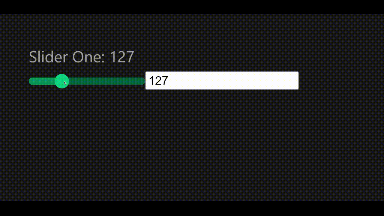
});Now, to use it in our application - ./src/App.vue:
<!-- ./src/App.vue -->
<script setup>
import { ref } from "vue";
import CustomSlider from "./components/CustomSlider.vue";

const slider1 = ref(100);
</script>
<template>
  <div class="slider-cont">
    <h3>Slider One: {{ slider1 }}</h3>
    <CustomSlider :max="500" v-model="slider1" />
  </div>
</template>
With that, we should have something like this:
Session Replay for Developers
Uncover frustrations, understand bugs and fix slowdowns like never before with OpenReplay — an open-source session replay tool for developers. Self-host it in minutes, and have complete control over your customer data. Check our GitHub repo and join the thousands of developers in our community.
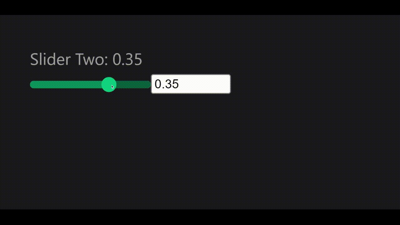
Working with Negative and decimal numbers
Given that we’re still using the <input> element under the hood in our custom element, to use negative and decimal numbers in our custom component, we just have to include it in our component props:
<!-- ./src/App.vue -->
<script setup>
import { ref } from "vue";
import CustomSlider from "./components/CustomSlider.vue";

const slider2 = ref(0);
</script>
<template>
  <div class="slider-cont">
    <h3>Slider Two: {{ slider2 }}</h3>
    <CustomSlider :min="-1" :max="1" :step="0.01" v-model="slider2" />
  </div>
</template>
And with that, we should have something like this:
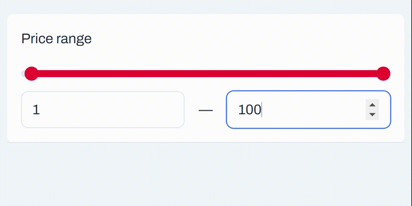
Building a Min & Max Range slider
With everything we’ve learned so far, let’s build a min and max range slider to adjust two input values: min and max. To prevent writing extra CSS for this component, let’s move the CSS in our previous <CustomSlider/> component to ./src/assets/main.css; we can add more of our styles to this file.
Next, create a new file ./src/components/CustomMinMaxSlider.vue and enter the following code:
<script setup>
import { computed, ref, watchEffect } from "vue";

// define component props for the slider component
const { min, max, step, minValue, maxValue } = defineProps({
  min: {
    type: Number,
    default: 0,
  },
  max: {
    type: Number,
    default: 100,
  },
  step: {
    type: Number,
    default: 1,
  },
  minValue: {
    type: Number,
    default: 50,
  },
  maxValue: {
    type: Number,
    default: 80,
  },
});

// define emits for the slider component
const emit = defineEmits(["update:minValue", "update:maxValue"]);

// define refs for the slider element and the slider values
const slider = ref(null);
const sliderMinValue = ref(minValue);
const sliderMaxValue = ref(maxValue);

// function to get the percentage of a value between the min and max values
const getPercent = (value, min, max) => {
  return ((value - min) / (max - min)) * 100;
};

// function to get the difference between the min and max values
const sliderDifference = computed(() => {
  return Math.abs(sliderMaxValue.value - sliderMinValue.value);
});

// function to set the css variables for width, left, and right
const setCSSProps = (width, left, right) => {
  slider.value.style.setProperty("--width", `${width}%`);
  slider.value.style.setProperty("--progressLeft", `${left}%`);
  slider.value.style.setProperty("--progressRight", `${right}%`);
};

// watchEffect to emit the updated values, and update the css variables
// when the slider values change
watchEffect(() => {
  if (slider.value) {
    // emit slidet values when updated
    emit("update:minValue", sliderMinValue.value);
    emit("update:maxValue", sliderMaxValue.value);

    // calculate values in percentages
    const differencePercent = getPercent(sliderDifference.value, min, max);
    const leftPercent = getPercent(sliderMinValue.value, min, max);
    const rightPercent = 100 - getPercent(sliderMaxValue.value, min, max);

    // set the CSS variables
    setCSSProps(differencePercent, leftPercent, rightPercent);
  }
});
</script>
<template>
  <div ref="slider" class="custom-slider minmax">
    <input
      type="range"
      name="min"
      id="min"
      :min="min"
      :max="max"
      :value="minValue"
      :step="step"
      @input="({ target }) => (sliderMinValue = parseFloat(target.value))"
    />
    <input
      type="range"
      name="max"
      id="max"
      :min="min"
      :max="max"
      :value="maxValue"
      :step="step"
      @input="({ target }) => (sliderMaxValue = parseFloat(target.value))"
    />
  </div>
  <div class="minmax-inputs">
    <input type="number" :step="step" v-model="sliderMinValue" />
    <input type="number" :step="step" v-model="sliderMaxValue" />
  </div>
</template>
For this component, we have two range inputs, one for the minimum value - minValue and another for the maximum value - maxValue. Like our previous component, we defined our emits to pass updated values to our parent component. Since we have two input values, to use v-model for the input values, first, we define them in our props:
// define component props for the slider component
const { min, max, step, minValue, maxValue } = defineProps({
  // ...
  minValue: {
    type: Number,
    default: 50,
  },
  maxValue: {
    type: Number,
    default: 80,
  },
});
Then we define the emits for the values:
// define emits for the slider component
const emit = defineEmits(["update:minValue", "update:maxValue"]);
Similarly to our previous component, we assign these props to their respective refs: sliderMinValue and sliderMaxValue:
const sliderMinValue = ref(minValue);
const sliderMaxValue = ref(maxValue);
Next, we have a few other functions:
getPercent(): gets the percentage of a value between the min and max valuessliderDifference(): gets the difference between the min and max valuessetCSSProps(): sets the CSS variables for the width, left, and right of the slider progress
Finally, we have the watchEffect() function, which emits the updated values and calculates and sets the CSS values.
In the template, we can see that we have the two input range elements, then we have two more input number elements which are also bound to the min and max values.
For the styling, we’ll add the following to the ./src/assets/main.css file:
/* ./src/assets/main.css */

/* ... */

.custom-slider.minmax input[type="range"] {
  position: absolute;
  pointer-events: none;
  width: 100%;
}
.custom-slider.minmax input[type="range"]::-webkit-slider-runnable-track {
  background: none;
}

.custom-slider.minmax::before {
  left: var(--progressLeft);
  right: var(--progressRight);
  width: unset;
}

.custom-slider.minmax input[type="range"]::before {
  display: none;
}

.minmax-inputs {
  display: flex;
  justify-content: space-between;
}

.minmax-inputs input {
  width: 50px;
}
Next, we import our newly created range slider in ./src/App.vue:
<!-- ./src/App.vue -->
<script setup>
import { ref } from "vue";
import CustomMinMaxSlider from "./components/CustomMinMaxSlider.vue";
const sliderMin = ref(50);
const sliderMax = ref(80);
</script>
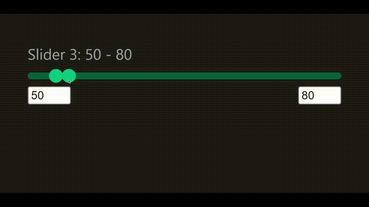
<template>
<div class="slider-cont">
<h3>Slider 3: {{ sliderMin }} - {{ sliderMax }}</h3>
<CustomMinMaxSlider
:max="700"
v-model:min-value="sliderMin"
v-model:max-value="sliderMax"
/>
</div>
</template>And with that, we should have something like this:
Conclusion
At the end of this tutorial, we’ve been able to use Vue.js to build a custom range slider which is an excellent method to improve the user interface of our applications. This tutorial walks us through the process of customizing the default range input element to suit our unique requirements.
With this tutorial, we discovered how to utilize CSS to customize the range input element’s design and build a unique slider with two handles for the minimum and maximum values. We also managed to have a functioning range slider after this lesson that we can apply to your personal Vue.js projects. This tutorial offers a thorough walkthrough for making a customized range slider in Vue.js, especially if you’re familiar with Vue.js.
Further reading and resources
Here are a few resources you might find helpful:
- For more information on how to implement
v-modelon a component: https://vuejs.org/guide/components/v-model.html#component-v-model
Resources
Here are the resources from this tutorial
Gain Debugging Superpowers
Unleash the power of session replay to reproduce bugs and track user frustrations. Get complete visibility into your frontend with OpenReplay, the most advanced open-source session replay tool for developers.