
Dialogs provide a way to display modal windows and overlays in React Native components. They are used to display additional information, prompt the user for input, create additional interactions, or display messages. In this article, you will go through setting up and using dialogs in React Native.
Setting things up
Ensure you have a working application. Run the following command to initialize a React Native application:
npx react-native init custom-dialogOnce the installation is complete, proceed to the newly created directory:
cd custom_dialogYou can test the initialized application by starting the development environment based on your platform:
#android
npm run android
#ios
npm run ios
Setting up the state for the dialog
States determine a component’s behavior and render information to the user. A dialog requires states to manage dialog interaction events. You will require a state to manage user interaction with a dialog component. Therefore, go to your project src/app.js file and import the state hook from React:
import { useState } from 'react';Inside the render function, add a state definition for dialog visibility:
const [isVisible,setVisible] = useState(false);Additionally, create a function to toggle the visibility of the dialog:
const toggleVisibility = () => setVisible(!isVisible);This state will create the logic to open and close the dialog.
Displaying a basic dialog
You can use React Native components to create custom dialogs. Alternatively, you can utilize React Native dialog-based libraries to create dialogs. Let’s use these two approaches and learn how to create dialogs. First, let’s create a basic custom dialog.
You will require to import the view components from react-native. The following component will be created in the app.js as follows:
- Add these component elements:
import { StyleSheet, Text, View, Modal, Button } from 'react-native';- Inside the parent
Viewcomponent, add aButtoncomponent for triggering the dialog, i.e., Show Dialog:
<Button title="Show Dialog" onPress={() => toggleVisibility()} />- Beneath it, show the basic alert dialog:
<Modal visible={isVisible} animationType="fade" transparent={true}>
    <View style={styles.modalView}>
        <View style={styles.alert}>
          <Text style={styles.alertTitle}>Attention!</Text>
          <Text style={styles.alertMessage}>Your account has been activated.</Text>
          <View style={styles.alertButtonGroup}>
            <View style={styles.alertButton}>
                <Button title="OK" onPress={() => toggleVisibility()} />
            </View>
          </View>
        </View>
    </View>
</Modal>
Once the button is clicked, the application will change state to visible to allow the dialog component to be displayed.
- Update the styles as follows:
const styles = StyleSheet.create({
    container:{
        display:'flex',
        flex:1,
        justifyContent:'center',
        alignContent:'center',
        backgroundColor:'#fff'
    },
    modalContainer:{
        backgroundColor:"#ccc",
        top:0,
        left:0,
        right:0,
        bottom:0,
        position:'absolute',
    },
    modalView:{
        flex:1,
        alignContent:'center',
        justifyContent:'center'
    },
    alert:{
        width:'100%',
        maxWidth:300,
        margin:48,
        elevation:24,
        borderRadius:2,
        backgroundColor:'#fff'
    },
    alertTitle:{
        margin:24,
        fontWeight:"bold",
        fontSize:24,
        color:"#000"
    },
    alertMessage:{
        marginLeft:24,
        marginRight:24,
        marginBottom:24,
        fontSize:16,
        color:"#000"
    },
    alertButtonGroup:{
        marginTop:0,
        marginRight:0,
        marginBottom:8,
        marginLeft:24,
        padding:10,
        display:"flex",
        flexDirection:'row',
        justifyContent:"flex-end"
    },
    alertButton:{
        marginTop:12,
        marginRight:8,
        width:100
    },
});
This dialog is called information dialog, which just displays something to the user.
How to close the dialog
To close the dialog, you can do that using two approaches:
- Clicking outside the dialog - To close the dialog, add the
onRequestClosemethod that will execute thetoggleVisibilitystate to close the dialog accordingly. - Clicking a dialog button - You need to wrap the dialog with
TouchableOpacitythat will execute theonPressOutmethod to close the dialog.
Below is the code sample that you need to execute the above two options:
<Modal visible={isVisible} animationType="fade" transparent={true} onRequestClose={() => toggleVisibility()}>
 <TouchableOpacity style={styles.modalContainer} onPressOut={() => toggleVisibility()}>
    <View style={styles.modalView}>
        <View style={styles.alert}>
          <Text style={styles.alertTitle}>Attention!</Text>
          <Text style={styles.alertMessage}>Your account has been activated.</Text>
          <View style={styles.alertButtonGroup}>
            <View style={styles.alertButton}>
                <Button title="OK" onPress={() => toggleVisibility()} />
            </View>
          </View>
        </View>
    </View>
  </TouchableOpacity>
</Modal>
Ensure that the development server is running. Once you click on the show dialog button, you should be able to see a dialog as below:
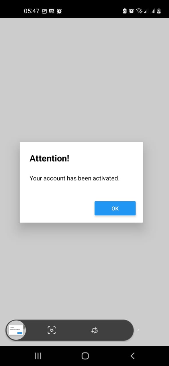
Note that, Once you click the OK button, the dialog visibility will change, and the dialog will be closed. Also, onPressOut will close the dialog container whenever you click outside the dialog container.
Session Replay for Developers
Uncover frustrations, understand bugs and fix slowdowns like never before with OpenReplay — an open-source session replay tool for developers. Self-host it in minutes, and have complete control over your customer data. Check our GitHub repo and join the thousands of developers in our community.
Adding buttons for interactive elements
Let’s add some interaction to the dialog based on how the user will interact with a dialog.
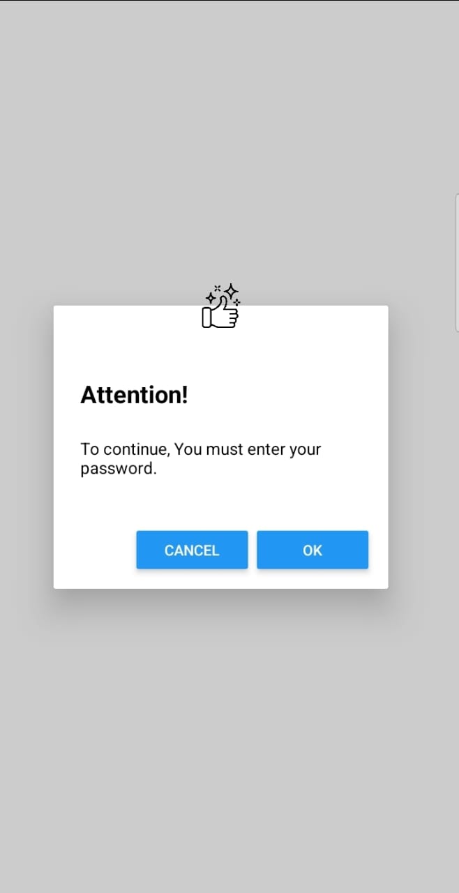
Note that when using dialogs, you can use icons to make your dialog more informational while remaining interactive. In that can, the following dialog will require a simple icon. You can get a thumbs-up icon from flaticon and save it in the project directory.
Import this icon as an image component in your app.js:
import {Image} from 'react-native';To use the static icon, import the image file while specifying the path using require():
const staticImage = require("./thumbs-up.png");Using the above simple dialog, let’s build up on it and create some interaction buttons. In the render function of the alert component, add the icon and the two buttons, CANCEL and OK:
<View style={styles.alert}>
    <Image style={styles.alertIcon} source={staticImage} />
    <Text style={styles.alertTitle}>Attention!</Text>
    <Text style={styles.alertMessage}>To continue, You must enter your password.</Text>
    <View style={styles.alertButtonGroup}>
        <View style={styles.alertButton}>
            <Button title="Cancel" onPress={() => toggleVisibility()} />
        </View>
        <View style={styles.alertButton}>
            <Button title="OK" onPress={() => toggleVisibility()} />
        </View>
        </View>
</View>
Add their styles in the styles section:
alertButtonGroup:{
    marginTop:0,
    marginRight:0,
    marginBottom:8,
    marginLeft:24,
    display:"flex",
    flexDirection:'row',
    justifyContent:"space-between"
},
alertButton:{
    marginTop:12,
    marginRight:8
},
alertIcon:{
    width:40,
    height:40,
    left:130,
    top:-20
}
Ensure that the development server is running. Your alert now will be as follows. Once you click the button, a log will be created based on that specific dialog button:
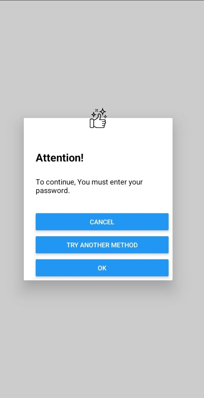
Creating a three buttons dialog
A dialog is limited, but it can handle anything you intend to. For example, if you want to add more interaction buttons, you can do so easily. Let’s create a three-button-based dialog here. In the render function of the app.js file, inside the dialog component, add the three buttons, Cancel, Try Another Method, and OK, as follows:
<View style={styles.alertButtonGroup}>
    <View style={styles.alertButton}>
        <Button title="Cancel" onPress={() => console.log("Cancel Pressed")} />
    </View>
    <View style={styles.alertButton}>
        <Button title="Try Another Method" onPress={() => console.log("Try Another Method Pressed")} />
    </View>
    <View style={styles.alertButton}>
        <Button title="OK" onPress={() => console.log("OK Pressed")} />
    </View>
</View>
Arrange the buttons vertically by adding the style below:
alertButtonGroup:{
    marginTop:0,
    marginRight:0,
    marginBottom:8,
    marginLeft:24,
    display:"flex",
    flexDirection:'column',
    justifyContent:"space-between"
}
Ensure that your development server is running. You should get the three buttons dialog as below:
Adding a text input on the alert dialog
In the app.js, add an import for the TextInput component:
import {TextInput} from 'react-native';Add a state for the input:
const [input,setInput] = useState('');Inside the View for the alert, add the text input component in place of the alert message:
<TextInput placeholder="Enter An Input" value={password} onChangeText={ (value) => setInput(value)} />Beneath the modal, show the input if it is set:
{
    input && <Text>Your input is {input}</Text>
}
Your render function should be similar to the following:
return (
    <SafeAreaView style={styles.container}>
    <Button title="Show Dialog" onPress={() => toggleVisibility()} />
    <Modal visible={isVisible} animationType="fade" transparent={true} onRequestClose={() => toggleVisibility()}>
        <TouchableOpacity style={styles.modalContainer} onPressOut={() => toggleVisibility()}>
            <View style={styles.modalView}>
                <View style={styles.alert}>
                <Text style={styles.alertTitle}>Enter Your Password to Confirm</Text>
                <TextInput placeholder='Enter Your Password'secureTextEntry={true} placeholderTextColor="#000" style={styles.textInput} value={input} onChangeText={(value) => setInput(value)} />
                <View style={styles.alertButtonGroup}>
                    <View style={styles.alertButton}>
                    <Button title="Cancel" onPress={() => toggleVisibility()} />
                    </View>
                    <View style={styles.alertButton}>
                    <Button title="Try Another Method" onPress={() => toggleVisibility()} />
                    </View>
                    <View style={styles.alertButton}>
                    <Button title="OK" onPress={() => toggleVisibility()} />
                    </View>
                </View>
                </View>
            </View>
        </TouchableOpacity>
    </Modal>
    </SafeAreaView>
);
Add some styles for the text input:
textInput:{
    marginLeft:24,
    marginRight:24,
    marginBottom:24,
    fontSize:16
},
Ensure your development server is up and running. The dialog should be able to provide a text input area as below:
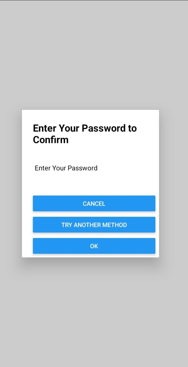
Alternative to using custom dialog
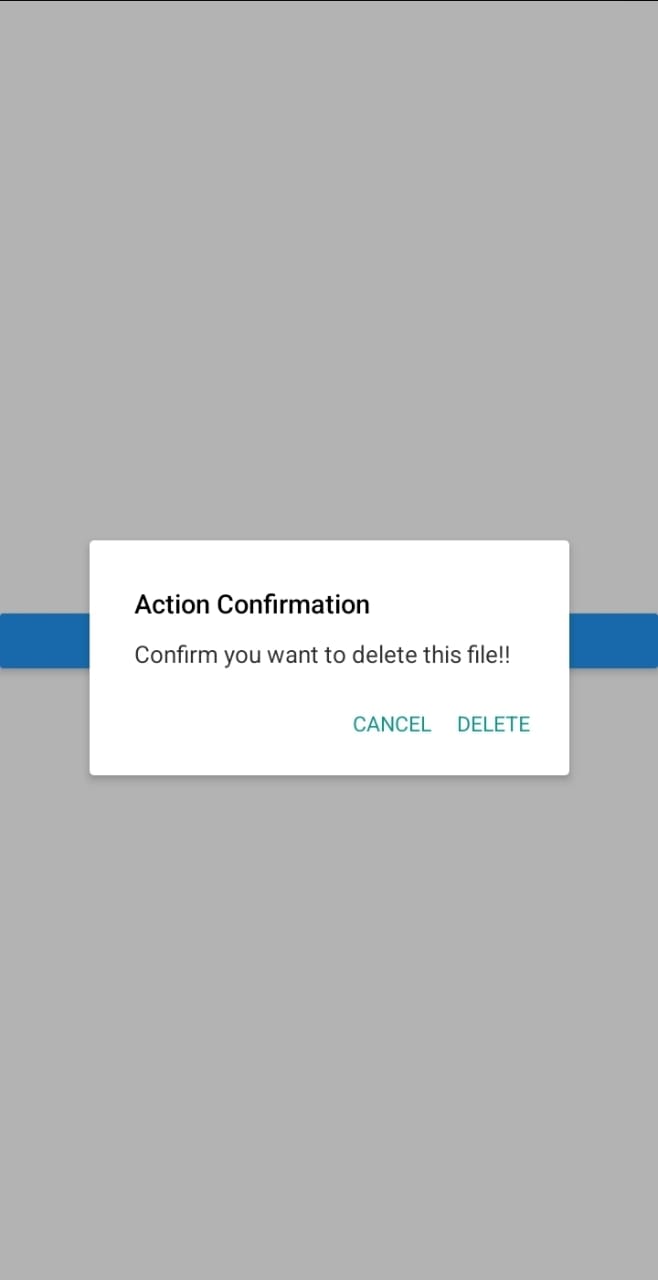
The above examples demonstrated how to build custom dialogs. While dialogs are not limited to custom approaches, you still utilize dialog-based libraries to create your dialogs.
Here is an example of how to create React Native dialogs using react-native-dialog package
Install the react-native-dialog package to your project:
npm install react-native-dialogImport the Dialog from the package in your app.js file:
import Dialog from "react-native-dialog";Render the dialog based on the isVisible prop. Use the Dialog method to add the dialog elements as follows:
<View>
    <Dialog.Container visible={isVisible}>
    <Dialog.Title>File Submit</Dialog.Title>
    <Dialog.Description>
       Confirm you want to submit this file.
    </Dialog.Description>
    <Dialog.Button label="Cancel" onPress={() => toggleVisibility()} />
    <Dialog.Button label="Delete" onPress={() => toggleVisibility()} />
    </Dialog.Container>
</View>
This should display the following dialog based on the above packaged based component:
Conclusion
In React Native, there are several libraries available for implementing dialogs. You can use the following:
These libraries provide a way to create and customize dialogs easily. You can leverage React Native components for more personalized dialogs and build custom dialogs that fit your need.
Gain Debugging Superpowers
Unleash the power of session replay to reproduce bugs and track user frustrations. Get complete visibility into your frontend with OpenReplay, the most advanced open-source session replay tool for developers.