CSS Container Style Queries


CSS Container Style Queries and how they work
CSS exists to make responsive and reusable UI components. CSS container queries focus on the container size and modify it to fit into the space instead of the device’s viewport. Like media queries, container inquiries let you directly query a component based on its size or style instead of the device’s viewport. Maybe you want to make small changes or change the display and alignment of child elements; the container style query changes the contents of the container rather than the container itself.
This functionality empowers a component to own its responsive layout and allows a new entry point to explore and provide responsive styles. This implies that a given element’s appearance may differ depending on its accessible size and dynamics. By allowing any component or element to respond to the width of a defined container, container queries allow us to think about more than just the viewport. This tutorial will teach you about style queries, how they work and how to implement them.
How container style queries work
You may use style queries to find out the style of any parent element on a page and then apply that style to the child elements. Style inquiries allow you to inquire about the computed style of a parent element in a manner similar to size-based container queries.
As mentioned earlier, container style queries let you directly query a component based on its size or style rather than the device’s viewport. To use the container query properties, you create a class to define the elements as containers. You can query them, then set the container-type property with the inline-size value, as this sets the containment on the parent you are querying, or we can say it successfully creates a new containing block and lets the browser separate it from the rest of the layout of the page.
.box{
  container-type: inline-size;
}
The purpose of setting up a container query is to change the contents of the container based on the width of the entire page itself. Below is how the syntax is written, using the class, and with this, you can style your container however you want it at different widths of the webpage.
@container (min-width: 500px) {
  .box{
    display: grid;
    font-size: 1.5rem;
  }
}
In particular:
- Min-width applies the styles when the box container is greater than or equal to the width value specified.
- Max-width applies the styles when the box container is less than or equal to the width value specified.
The @container usually detects when the parent of an element changes the width and specifies what changes are to be made in the child element for every width change.
Use cases for container style queries
When creating responsive designs, a media query is typically used to change the document layout based on the viewport size. However, the positioning of many identical design components differs depending on the container’s width. Instead of the component’s size in the viewport, this may have something to do with where it is placed in the layout.
When container style queries come in handy
Setting containment on the parent element you wish to track is a prerequisite for using a container query. Then you may create reusable elements with container queries that can display differently depending on where they are located on the page. They become significantly more adaptable and responsive across sites and layouts.
As shown above, container Queries instruct the various steps to take up available space until they reach a specified width. We can also use container queries to make the layout of the page vertical or horizontal and show less info, depending on the available space or the device type. This is an excellent use case as it makes for a better and more compatible UI. The example above can be displayed in a tiny or big column based on the site’s layout, depending on how much space is available for a desktop, tablet, or phone display. Container queries can fix this, and by examining the container, we may modify our design based on the available space rather than the viewport size.
Using container style queries to make better UI
Now, we will use an example and work through how container style queries work and how they make better responsive UI.
First, we have our HTML, which is quite straightforward and not tasking to write.
<div class="container">
    <div class="card">

      <div>
        <div>
          <h1>What do we do?</h1>
        </div>
          <p class="description">Lorem, ipsum dolor sit amet consectetur adipisicing elit. Temporibus minus eum amet quisquam est harum officia eos veritatis deserunt reprehenderit. Ipsum, eius minima accusamus animi tenetur esse est asperiores fugit.</p>
        <button>click</button>
      </div>
    </div>
  </div>
Putting every element in a class makes writing the CSS much more manageable.
Secondly, we start styling the CSS by setting the containment on the parent element, simply the container class.
How to do this is by setting the container-type property to inline-size.
.container {
  container-type: inline-size;
}
Although not mandatory, we can also choose to set the container name, and the syntax is not so different:
.container {
  container-name: container;
}
Also, both the name and type can be written in one line, and the syntax is as follows:
.container {
  container: container / inline-size;
}
The @container rule can now set styles based on the nearest parent.
@container (min-width: 350px) {
  .card {
    display: grid;
    grid-template-columns: 40% 1fr;
    align-items: center;
    gap: 1rem;
    text-align: left;
  }
}
The @container will now detect when the parent element’s width has changed, and it will put in place the changes specified for every given width change.
Below is an example of a complete implementation of the container style queries
HTML:
<div class="container">
    <div class="card">

      <div>
        <div>
          <h1>What do we do?</h1>
        </div>
          <p class="description">Lorem, ipsum dolor sit amet consectetur adipisicing elit. Temporibus minus eum amet quisquam est harum officia eos veritatis deserunt reprehenderit. Ipsum, eius minima accusamus animi tenetur esse est asperiores fugit.</p>
        <button>click</button>
      </div>
    </div>
  </div>
CSS:
body {
  font-family: system-ui, serif;
  padding: 3rem;
  background-color: rgb(173, 166, 156);
}
button{
  color: white;
  background-color: rgb(35, 80, 80);
  border: none;
  width: 50px;
  height: 30px;
  border-radius: 5px;
}
.container {
  container-type: inline-size;
  width: 100%;
  max-width: 750px;
  margin: 0 auto;
}
.description {
  display: none;
}
.card {
  text-align: center;
  padding: 0.5rem;
}

@container (min-width: 350px) {
  .card {
    display: grid;
    grid-template-columns: 40% 1fr;
    align-items: center;
    gap: 1rem;
    text-align: left;
  }
}
@container (min-width: 500px) {
  .description {
    display: block;
  }
}
Output:
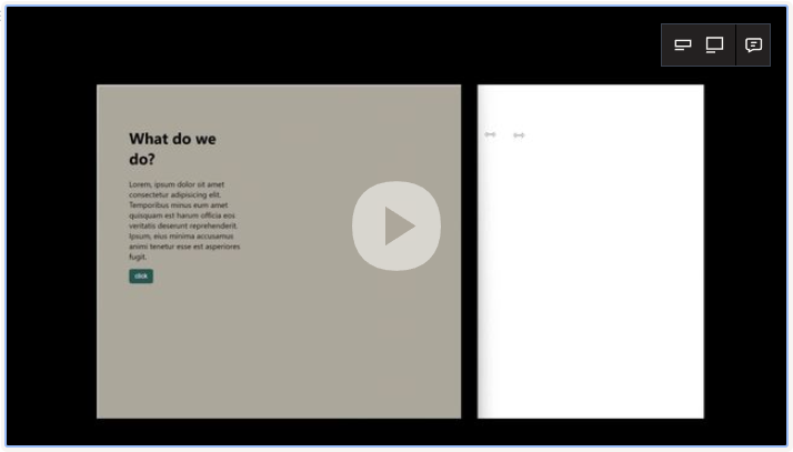
One of its strongest characteristics is the flexibility of container queries to differentiate between little and bigger or best-quality layouts. This adds flexibility and hierarchy, making user interfaces even better and more responsive.
Session Replay for Developers
Uncover frustrations, understand bugs and fix slowdowns like never before with OpenReplay — an open-source session replay tool for developers. Self-host it in minutes, and have complete control over your customer data. Check our GitHub repo and join the thousands of developers in our community.
Limitations and Compatibility
Height-based queries cannot be used just yet, and although grids can be used, it works by using a <div> element and adding a class to it before styling.
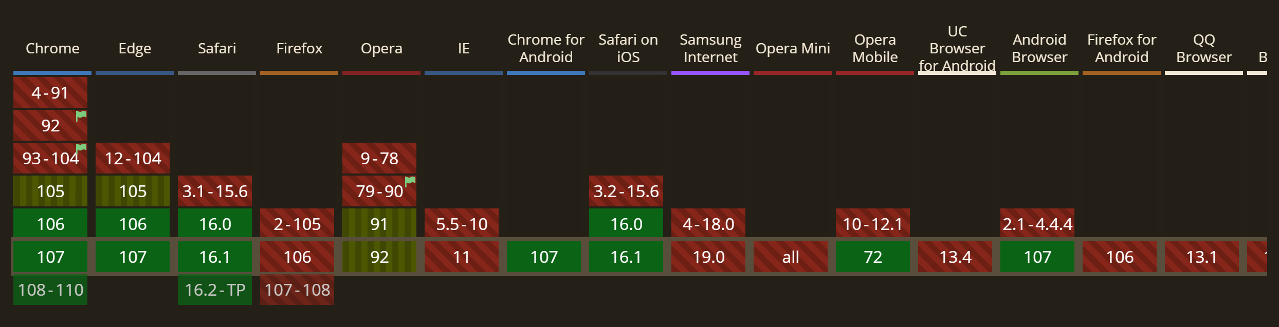
Compatibility is as follows, according to caniuse.com:
Browser Compatibility
Conclusion
The container style queries provide a way to declare independence for parts of a page from the rest of the page regarding the styles, layouts, and others. You can specify a set of styles for a component using container queries. Try out the @container property today, and remember to enable the CSS container queries setting at chrome://flags, as this enables browser support for the container queries properties.
A TIP FROM THE EDITOR: For more on CSS features, do not miss our CSS Pseudo Elements: A Definite Guide and Modern CSS Selectors articles!
Gain Debugging Superpowers
Unleash the power of session replay to reproduce bugs and track user frustrations. Get complete visibility into your frontend with OpenReplay, the most advanced open-source session replay tool for developers.