

Have you ever wondered what makes for a beautiful web experience beyond accessible designs, unique color palettes, and captivating visuals? It is no other than a smooth navigation. Stepping into the world of web design, no feature gives users quite an impeccable web experience better than seamless navigation. From its ability to streamline interaction to reducing web frustration, creating easily navigable websites has become a trendy addition to the modern web. This article will show you how to unlock CSS Scroll Snaps to produce better UX.

Discover how at OpenReplay.com.
While most web developers find it daunting to create easily navigable websites, we hope to make this task less intimidating by delving into the world of CSS scroll snaps and utilizing them for intuitive web navigations.
By the end of this tutorial, you can apply your knowledge of scroll snaps to create web pages that scroll seamlessly, just like the image carousel showcased below.
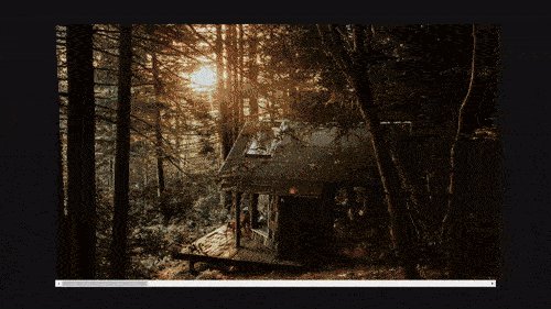
The video above introduces the concept of scroll snaps applied to an image carousel. On observation, you will notice how scrolling stops at precise intervals, offering smooth and controlled movement through the carousel.
What is scroll snap?
Scroll snap is the CSS feature that gives developers the leverage to control the positioning of scroll containers. When web users scroll through a web page, the page stops at the point where the user stops scrolling. However, by utilizing the CSS scroll snap feature, the webpage stops at specific points within the container specified by the developer. These points are known as snap points, and their primary function is serving as positions within a scroll container that ensures scrolling aligns within designated locations. By utilizing scroll snap in websites, web developers can associate each element within a scroll container to specific snap points, ensuring scrolling ends at these positions.
Two properties are associated with controlling the scrolling behavior of a website. They are the scroll-snap-type and the scroll-snap-align properties.
Scroll-snap-type property
Scroll-snap-type is the CSS property usually specified within the webpage’s parent or container element and which defines the page’s scrolling behavior. This property comes with a syntax that holds two values—the first, which represents the direction of the scroll, and the second, which defines its behavior.
Syntax
.container {
  scroll-snap-type: x/y/both none/mandatory/proximity;
}
Scroll direction
The scroll direction defines what direction the scroll-snap-type property should be applied to. It holds three possible values, which are:
-
The
Xvalue: This value appliesscroll-snap-typeproperty to the horizontal direction. -
The
Yvalue: This value appliesscroll-snap-typeproperty to the vertical direction. -
The
Bothvalue: This value applies thescroll-snap-typeproperty to horizontal and vertical directions.
Other possible scroll direction values include:
-
Inlinevalue: Appliesscroll-snap-typeproperty to theinlinedirection. -
Blockvalue: Appliesscroll-snap-typeproperty to the block direction.
Scroll behavior
The scroll behavior defines the type of scroll-snap that should be applied to a webpage. Similar to the scroll direction, scroll behavior also holds three values. They are:
-
Nonevalue: This is the default value of thescroll-snap-typeproperty, specifying that no scroll behavior should be applied on a webpage. -
Mandatoryvalue: Themandatoryvalue ensures that elements are automatically taken to scroll points irrespective of the user’s scroll position. It is a very strictscroll-snap-typeproperty value. -
Proximityvalue: Theproximityvalue carries similar functions as themandatoryvalue. However, it is a less strictscroll-snap-typeproperty value.
Scroll-snap-align property
The scroll-snap-align is the CSS property applied to the child/children element within the scroll container and determines how each item aligns within specific snap points. It determines where each container element snaps into focus when scrolling stops.
Syntax
.panel {
  scroll-snap-align: none/start/center/end;
}
This property holds four possible values, and they are:
-
Nonevalue: This is the default value of thescroll-snap-alignproperty, specifying that noscroll-snapeffect be applied to the element(s). -
Startvalue: This value applies thescroll snapeffect at the element’s start for horizontal and vertical scrolls. -
Centervalue: This value applies thescroll snapeffect at the element’s center. -
End: This value applies thescroll snapeffect at the element’s end for horizontal and vertical scrolls.
Creating horizontal and vertical snap points
In our exploration of scroll snaps, we’ve covered their basic properties: scroll-snap-type and scroll-snap-align. Moving forward, we will translate this knowledge into practical horizontal and vertical scrolling applications while integrating them into flexbox layouts and grid containers. Throughout this process, we’ll tailor our HTML and CSS files to create an engaging product showcase.
General HTML markup
<!DOCTYPE html>
<html lang="en">
  <head>
    <meta charset="UTF-8" />
    <meta name="viewport" content="width=device-width, initial-scale=1.0" />
    <title>Document</title>
  </head>
  <body>
    <div class="container">
      <div class="panel">
        <img src="./im/pexels-terrance-barksdale-10112911.jpg" alt="" />
      </div>

      <div class="panel">
        <img src="./im/icee-dc-PvObYzFkTAE-unsplash.jpg" alt="" />
      </div>

      <div class="panel">
        <img src="./im/pexels-grailify-8871471.jpg" alt="" />
      </div>

      <div class="panel">
        <img src="./im/chris-henry-tV8yaU09t7w-unsplash.jpg" />
      </div>

      <div class="panel">
        <img src="./im/pexels-jonathan-garcìa-8490975.jpg" alt="" />
      </div>
    </div>
  </body>
</html>
Our HTML markup holds six div tags. The first is the div tag with the class “container”. This div tag serves as the parent element, and it holds the remaining div tags: <div class= "panel"></div> which are its children elements.
Result
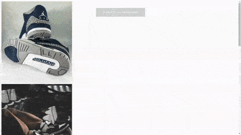
The above video illustrates the behavior of a webpage without scroll snap applied. Note how each panel stops without snapping when scrolling comes to a halt.
Having set up our HTML markup, it’s time to move to our CSS file.
CSS markup for horizontal scroll
We will set our horizontal scroll within a grid container for our CSS markup. We do this by setting the display of our parent element to grid. Below is the code.
/*sets the style for the entire webpage, giving the page zero margin and padding*/
* {
  margin: 0;
  padding: 0;
  box-sizing: border-box;
}
/*sets the background color of the entire webpage to black*/
body {
  background: black;
}

/*sets the display of the parent element to grid and sets the scroll-snap-type to x mandatory,
lays the elements of the container over a background image,
sets the margin of the container to auto, thereby placing container element at the center of the webpage*/
.container {
  background: url(./im/pexels-terrance-barksdale-10112911.jpg);
  display: grid;
  grid-template-columns: repeat(5, 100%);
  width: 90vw;
  height: 90vh;
  overflow-x: scroll;
  margin: auto;
  margin-top: 40px;
  scroll-snap-type: x mandatory;
}

/*gives each child element a width of 100% and height of 100vh, while setting the scroll-snap-align property to start*/
.panel {
  width: 100%;
  height: 100vh;
  scroll-snap-align: start;
}

/*gives each image a width and height of 100%*/
.panel img {
  width: 100%;
  height: 100%;
  object-fit: contain;
}
In our above code, we set the style of the entire webpage using the * syntax. We set the margin and padding to zero and the box-sizing property to border box. The essence of box-sizing is to ensure elements do not take up extra space when padding is set on them. We move forward by setting the background color of the webpage to black.
To implement our scroll snap feature, we apply style to our "container" element, setting its display to grid. We give the container width and height of 90vw and 90vh, respectively. This is to prevent our container element from filling up the entire screen. To place our container element at the center of the page, we set its margin to auto and its margin-top to 40px.
For our children’s element, we set their width and height to 100% and 100vh, respectively. Also included is our scroll-snap-align property set to start. This implements scroll-snapping.
Note each image carries a width and height of 100% each, and the object-fit property is set to contain.
Also note the use of the overflow-x property holding a value of scroll and the scroll-snap-type property holding a value of x. Both properties implement seamless horizontal scrolling.
Result
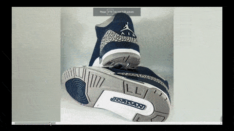
In the video above, we showcased the application of horizontal scroll snaps in a product showcase. Each product is presented within its panel, and the horizontal scroll snap seamlessly guides users through diverse offerings.
CSS markup for vertical scroll
We will set our vertical scroll within a flex container for our CSS markup. We do this by adding a flex display to our parent element and setting the flex property of our children’s elements to none. Below is the code.
/*sets the style for the entire webpage, giving the page zero margin and padding*/
* {
  margin: 0;
  padding: 0;
  box-sizing: border-box;
}

/*sets the background of the entire webpage*/
body {
  background: url(./im/pexels-terrance-barksdale-10112911.jpg);
}

/*sets the display of the parent element to flex and sets the scroll-snap-type to y mandatory*/
.container {
  display: flex;
  flex-direction: column;
  height: 100vh;
  width: 100%;
  overflow-y: scroll;
  scroll-snap-type: y mandatory;
}

/*gives each child element a width of 100% and height of 100vh, while setting the scroll-snap-align property to start*/
.panel {
  flex: none;
  width: 100%;
  height: 100vh;
  scroll-snap-align: start;
}

/*gives each image a width of 100% and height of 90%*/
.panel img {
  margin-top: 40px;
  width: 100%;
  height: 90%;
  object-fit: contain;
}
Similar to our horizontal scroll, we set the style of the entire webpage for our vertical scroll using the * syntax. We set the margin and padding to zero and the box-sizing property to border box.
We go further, implementing the scroll snap feature on our webpage by applying style to our "container" element, setting its display to flex. We give the container a width and height of 100% and 100vh respectively. We also set our overflow-y property to scroll. This feature enables vertical scrolling. To implement scroll-snapping, we set the scroll-snap-type to y mandatory.
For our children’s element, we set their width and height to 100% and 100vh, respectively. Also included is our scroll-snap-align property set to start.
Note each image carrying a width and height of 100% and 90% respectively, and the object-fit property set to contain.
Result

In the above video, we utilized vertical scroll snaps within a product showcase. Each item in the catalog is aligned in a vertical sequence and distinctly represented within its vertical panel. The vertical scroll snap creates a guided navigation experience, giving users the leverage to smoothly scroll through the product lineup in a controlled manner.
Advanced scroll snap techniques
So far, we have set up horizontal and vertical scrolling within our flexbox layout and grid container, ensuring a smooth scrolling experience. However, we could take a step further by adding specific properties to help fine-tune our scroll behavior, enhancing users’ web experience. These properties are the scroll-padding and scroll-margin.
Scroll-padding property
The scroll-padding property is the feature that allows the control of spacing within a scroll container. This implies that when a user scrolls through a page, and the motion comes to a halt, the page quickly adjusts, stopping at a specified distance from the container to the snap position of the child element in focus.
Syntax
.container {
  scroll-padding: 50px;
}
Scroll-padding has a similar syntax as the regular padding property, and it is the shorthand for four other properties, which are:
-
Scroll-padding-top: This property controls spacing at the top of the scroll container. -
Scroll-padding-bottom: This property controls spacing at the bottom of the scroll container. -
Scroll-padding-left: This property controls spacing at the left of the scroll container. -
Scroll-padding-right: This property controls spacing at the right of the scroll container.
To effectively implement scroll-padding, the scroll-snap-align property must be set on the child element, while the scroll-padding and scroll-snap-type properties must be placed on the parent element.
Scroll-margin property
The scroll-margin property is the feature that controls the space within snap positions and scroll container edges. This implies that once scrolling is halted, the scrolling adjusts and stops at a specified distance between the snap position and the container.
Syntax
.panel {
  scroll-margin: 50px;
}
Scroll-margin property is the shorthand property for four other values. They are:
-
Scroll-margin-top: Sets the margin between the snap position and the top of the scroll container. -
Scroll-margin-bottom: Sets the margin between the snap position and the bottom of the scroll container. -
Scroll-margin-left: Sets the margin between the snap position and the left of the scroll container. -
Scroll-margin-right: Sets the margin between the snap position and the right of the scroll container.
To effectively apply the scroll-margin property, the scroll-margin and scroll-align properties must be set on the child element, while the scroll-snap-type property must be on the parent element.
Real-world application of CSS scroll snap
So far, there’s no doubt that CSS scroll snap stands out as a powerful and indispensable feature for every modern website as it improves user experience by providing a smooth and controlled scrolling behavior. Below, we delve into some real-world applications of CSS scroll snaps.
-
Image galleries and carousels: Image galleries and carousels utilize CSS
scroll snapsto provide a smooth and visually appealing browsing experience. When users scroll through image collections, with this feature’s help, each image aligns with the viewport, creating a seamless transition. This further ensures that users focus on individual images rather than being distracted by partial views. -
Responsive web designs: Yet another excellent application of CSS
scroll snapsis in creating responsive web designs. When users navigate a website,scroll snapsensure that sections are neatly snapped into view, aligning with the viewport. This guarantees a consistent and visually pleasing layout whether on a Smartphone, tablet, or desktop. -
Interactive maps: In the case of interactive maps, the CSS
scroll snapfeature brings them alive, guiding users on a virtual journey through several locations. When users navigate the map, the feature enables the map to transition smoothly to points of interest, providing a unique exploration experience. -
Product showcases: E-commerce websites leverage the power of the
scroll snapto showcase their products in well-organized formats. As users scroll through product catalogs, each item aligns perfectly with the viewport, giving customers the much-needed ability to focus on individual products while avoiding distractions.
Conclusion
CSS scroll snaps offer a promising approach to creating seamlessly navigable websites. By defining snap points, developers can improve user experience, making scrolling smoother and less frustrating. Whether applied to creating image galleries or interactive maps, the CSS scroll snap feature seamlessly improves user navigation, thereby creating a more immersive and well-polished web experience.
Truly understand users experience
See every user interaction, feel every frustration and track all hesitations with OpenReplay — the open-source digital experience platform. It can be self-hosted in minutes, giving you complete control over your customer data.
Star on GitHub12k