

CSS wrapping is critical in today’s world of modern web design, as it allows developers to develop adaptable, well-aligned, and visually appealing layouts. CSS wrapping may be relied on when it comes to regulating how items are displayed and wrapped within a container. Many developers have learned to love and work with it over time because of its dynamic capabilities of making websites and applications adapt smoothly to multiple screen sizes. This article will delve deep into the various types and techniques of CSS wrapping.
Regarding CSS wrapping, several techniques are employed to control how content is being wrapped within a container. Understanding the basic techniques employed by various developers with a clear knowledge of CSS wrapping will set a good base for a beginner looking to create visually appealing and flexible layouts with CSS wrapping.
Let’s move on by exploring some of the basic CSS wrapping techniques.
Line Wrapping
Line wrapping (or text wrapping) ensures that long lines of text are split down into many lines when the container’s width is insufficient to accommodate the entire line. It emphasizes content readability and adaptability to any screen size, particularly smaller screens.
CSS has several properties for managing how to make text wrap; the two most common properties are word-break and white-space. While the word-break property monitors how long words are handled when they exceed the container width, the word-space property controls how whitespace characters, such as spaces, are handled when wrapping text.
Let’s look at a practical example that demonstrates line wrapping in CSS.
To start with, make sure you have an HTML code written, just as shown in the example below:
<div id="content">
 <p>
   This is a practical example of a Line wrap in CSS; the words should break
   into multiple lines due to insufficient space
 </p>
</div>
On running the code above, you should have an output like this:
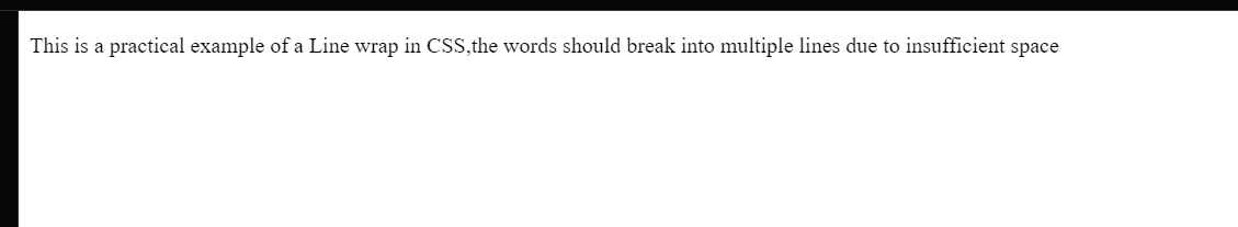
In the image above, note how long the words are with no line break. To make them break respectively, Firstly, style the content id and the p tag, as well as the container, with a fixed width, border, and padding. After that add the CSS properties white-space and word-break for line wrapping.
#content {
 width: 220px;
 border: 2px solid #ccc;
 padding: 12px;
}

p {
 white-space: normal;
 word-break: break-all;
}
Now reload the HTML web page, and you should have the following result:
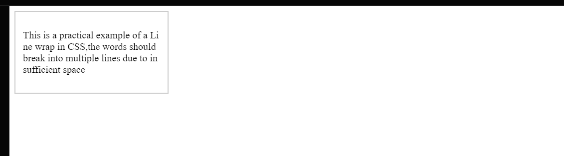
In the example above, the text automatically adjusts to fit in the container provided. The CSS values word-break: break-all; and white-space: normal; ensured that the long line of text was broken into multiple lines and that large words were broken and wrapped to fit within the container’s width.
Word Wrapping
Unlike line wrap, which involves breaking long lines of text into multiple lines if the container’s width cannot accommodate the entire line, word wrap involves breaking long words into multiple lines while keeping each word intact and responsive. Word wrap prevents horizontal overflow by ensuring the complete word is visible inside the available space.
When it comes to implementing word wrap in CSS, we use the word-wrap property or its equivalent, the overflow-wrap property. The word-wrap property allows developers to specify how long words should be wrapped when they extend over the container width. In most cases, the overflow-wrap property tells the browser that a line of text inside the targeted element can be split across multiple lines in an otherwise unbreakable string.
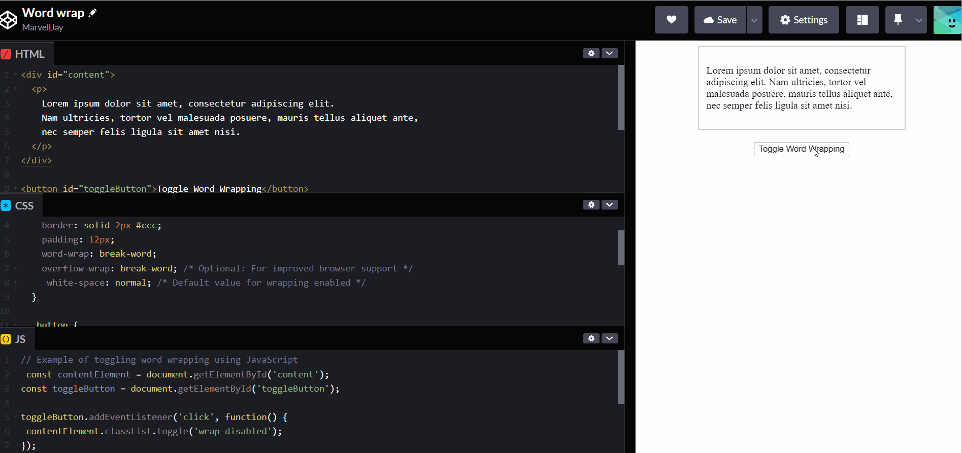
In this example, we will create a toggle button to toggle the texts to wrap. Firstly, ensure you have an HTML code written:
<div id="content">
<p>
Lorem ipsum olor sit amet, consectetur adipiscing eit. Nam ultricies, tortor
vel malesuada posuere, mauris tellus aliquet ante, nec semper felis ligula
sit amet nisi.
</p>
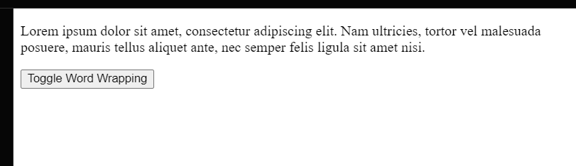
</div>Also, do not forget to create your button. To do that, check out the code written below:
<button id="toggleButton">Toggle Word Wrapping</button>After adding the text and the button, you should have an output like this:
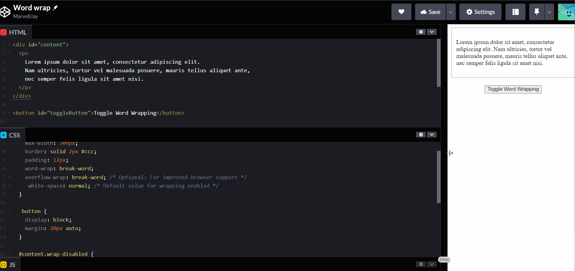
To add some CSS properties to our HTML code, including our wrap properties, check out the code written below:
#content {
 margin: 0 auto;
 max-width: 300px;
 border: solid 2px #ccc;
 padding: 12px;
 word-wrap: break-word;
 overflow-wrap: break-word; /* Optional: For improved browser support */
 white-space: normal; /* Default value for wrapping enabled */
}

button {
 display: block;
 margin: 20px auto;
}

#content.wrap-disabled {
 white-space: nowrap; /* Disable wrapping */
}
Observe how the text and button respond to the screen size:
Next, let’s make our toggle button function. To do that, we need to write some Javascript commands, just as seen below:
// Example of toggling word wrapping using JavaScript const contentElement =
document.getElementById('content'); const toggleButton =
document.getElementById('toggleButton'); toggleButton.addEventListener('click',
function() { contentElement.classList.toggle('wrap-disabled'); });
After writing the javascript code, notice how the text reacts when you toggle the button:
The text exceeds the specified width on the toggle and wraps into multiple lines when you toggle back on.
Session Replay for Developers
Uncover frustrations, understand bugs and fix slowdowns like never before with OpenReplay — an open-source session replay tool for developers. Self-host it in minutes, and have complete control over your customer data. Check our GitHub repo and join the thousands of developers in our community.
Advanced CSS Wrapping Techniques
While basic CSS wrapping techniques such as Word wrap and Line wrap help you get started, Advanced CSS wrapping focuses on boosting the visual text flow, improving readability, and, most importantly, improving the general visual appeal of your web pages.
There are a few Advanced CSS wrapping techniques employed by developers to make their web pages smooth, intuitive, and responsive. But for this tutorial, we will look into two main techniques, Flexbox Wrapping and CSS Grid Wrapping, respectively.
Flexbox Wrapping
Flexbox is a style model that allows for more efficient organization, alignment, and space distribution among elements in a container. The Flexbox paradigm comprises two major parts: the container and the items, also referred to as the flex container and the flex items.
A flex container is a parent component containing one or more flex elements. It establishes the context in which the flex items will be positioned. It is essentially the container into which everything is placed. On the other hand, the child components stored within the flex container are referred to as flex items. Flexbox characteristics such as flex-wrap, flex-grow, flex-basis, and so on can be used to size, order, and align them within the container.
Now that we know what Flexbox is, let’s look at an example using the flex-wrap property.
First, write down an HTML code for the flexbox wrap, say, for example, a code with three different containers and a few flex items just like we have below:
<div>
 <ul class="container nowrap">
   <li class="flex-item">1</li>
   <li class="flex-item">2</li>
   <li class="flex-item">3</li>
   <li class="flex-item">4</li>
   <li class="flex-item">5</li>
   <li class="flex-item">6</li>
 </ul>

 <ul class="container wrap">
   <li class="flex-item">1</li>
   <li class="flex-item">2</li>
   <li class="flex-item">3</li>
   <li class="flex-item">4</li>
   <li class="flex-item">5</li>
   <li class="flex-item">6</li>
 </ul>

 <ul class="container wrap-reverse">
   <li class="flex-item">1</li>
   <li class="flex-item">2</li>
   <li class="flex-item">3</li>
   <li class="flex-item">4</li>
   <li class="flex-item">5</li>
   <li class="flex-item">6</li>
 </ul>
</div>
The next step is to style the ul and li tags and also assign various flex-wrap values to the different groups:
.container {
 padding: 0;
 margin: 0;
 list-style: none;
 border: 1px solid silver;
 display: flex;
 justify-content: center;
 background: yellow;
}

.nowrap {
 display: flex;
 flex-wrap: nowrap;
}

.nowrap li {
 background: blue;
}

.wrap {
 flex-wrap: wrap;
}

.wrap li {
 background: pink;
}

.wrap-reverse {
 flex-wrap: wrap-reverse;
}

.wrap-reverse li {
 background: red;
}

.flex-item {
 padding: 5px;
 width: 100px;
 height: 100px;
 margin: 10px;

 line-height: 100px;
 color: white;
 font-weight: bold;
 font-size: 2em;
 text-align: center;
}
After giving the three groups different flex-wrap properties, here’s what they should look like:
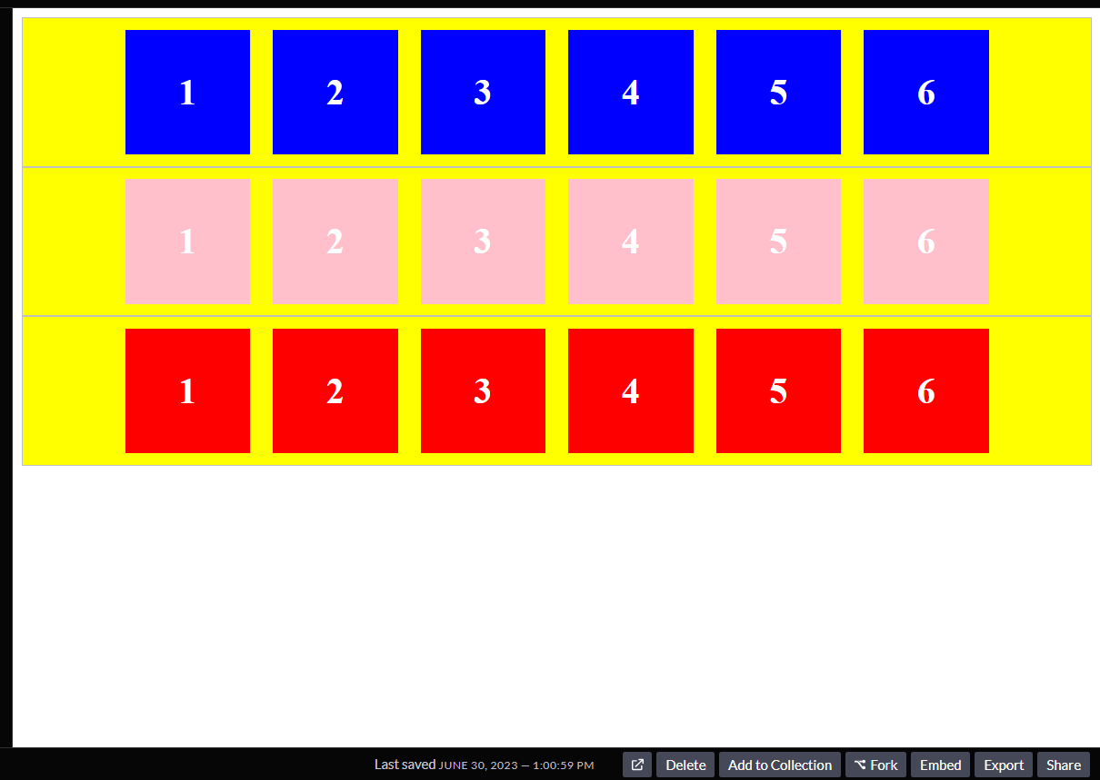
The flex-wrap does not appear to have any effect in the image above. Let’s have a look at what occurs when the screen is compressed:
If you look closel y at the GIF above, you’ll observe that the first row with flex-wrap set to nowrap does not shift onto a new line when the screen size is reduced; instead, it squeezes into any available space, no matter how small the screen size becomes.
Taking a look at the other two rows, which have their flex-wrap set to wrap and wrap-reverse, you’ll notice that as the screen size shrinks, the boxes in the rows react by moving into a new line, with the second row creating a new line directly underneath itself and the last row doing the opposite by creating a new line above itself.
CSS Grid Wrapping
CSS grid aids in the definition of grid containers and the alignment of components within appropriate grid cells. The enclosing elements of a Grid system are used to define a row inside the layout.
One of the most important features of CSS grid wrapping is its ability to adapt to any screen size. When the screen size is reduced, or there is less area to accommodate objects, the grid items automatically wrap onto the next available line instead of being cut off.
grid-template-columns, grid-template-rows, and grid-auto-flow are some well-known CSS grid wrapping properties.
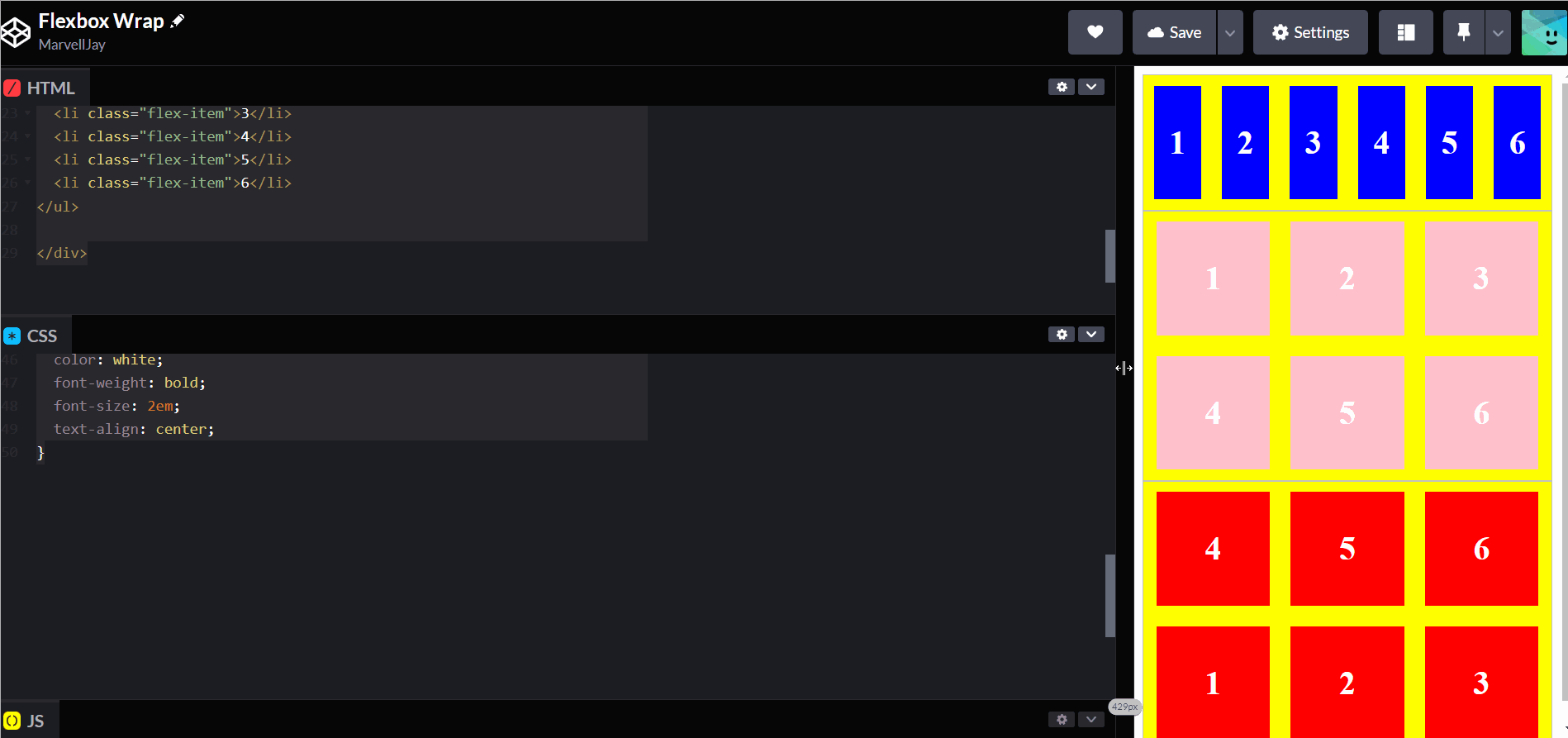
Now to look into a practical example of CSS Grid wrapping, let’s say we have the following HTML code:
<div class="container">
 <div class="box">1</div>
 <div class="box">2</div>
 <div class="box">3</div>
 <div class="box">4</div>
 <div class="box">5</div>
 <div class="box">6</div>
</div>
Now to add the CSS properties to the HTML code:
.container {
 display: grid;
 grid-template-columns: repeat(auto-fill, minmax(300px, 1fr));
 grid-gap: 10px;
 grid-auto-flow: dense;
}

.box {
 background-color: #00ffff;
 padding: 20px;
 text-align: center;
}
The grid items within the container are modified when the appropriate CSS property is added. Take a look at the GIF below to see what happens:
The CSS properties introduced to the grid container and grid elements allow us to control many attributes such as wrapping, alignment, and spacing.
Conclusion
CSS wrapping is critical in assisting developers in creating flexible and responsive web design layouts. Correctly using CSS wrapping techniques, such as word wrapping, line wrapping, flexbox wrapping, and CSS Grid wrapping can aid in the creation of a smooth and responsive design.
Gain Debugging Superpowers
Unleash the power of session replay to reproduce bugs and track user frustrations. Get complete visibility into your frontend with OpenReplay, the most advanced open-source session replay tool for developers.