Customize and Extend Tailwind CSS for your Specific Needs
Make Tailwind CSS work for you with customization


Tailwind CSS is very popular, but if you need it customized to meet your specific needs, such as a distinct brand identity or adding custom features, you may need to go beyond its default capabilities. This article guides how to extend and configure Tailwind CSS to create a truly personalized and unique design.

Discover how at OpenReplay.com.
Tailwind CSS is a utility-first CSS framework that enables users to control the appearance and style of their websites. It provides a set of classes that can be combined to create different designs. However, you may want or need to customize it, and this is what we’ll be seeing.
Customizing the Theme
Now, let’s dive straight into customizing the theme 🤞
The tailwind.config.js file is the heart of Tailwind CSS. It is where you define your project’s theme, which includes elements such as colors, fonts, spacing, and breakpoints.
To customize your Tailwind CSS theme, you must edit the tailwind.config.js file. You can add, remove, or modify any values in the configuration file.
Adding Custom Colors, Fonts, and Spacing
Tailwind CSS theme can be customized by adding custom colors, fonts, and spacing.
To add a custom color, add a new key to the theme.colors object in your tailwind.config.js file, containing the hex code for the desired color.
For example, to add a purple color, add the following code.
module.exports = {
theme: {
colors: {
purple: '#673AB7',
},
},
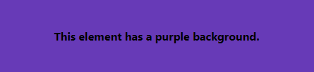
};Once you have added your custom color, you can use it in your CSS just like any other Tailwind CSS utility class. For example, to set the background color of an HTML element to purple, you would use the bg-purple class.
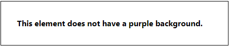
<div class="bg-purple">
 This element has a purple background.
</div>
Before
After
Adding Custom Fonts
To customize your Tailwind CSS font, add a new key to the theme.fonts object in your tailwind.config.js file containing the name of your font. For example, to add a custom font called Oswald, add the following code to your CSS and tailwind.config.js files.
@tailwind base;
@tailwind components;
@tailwind utilities;

@import url('https://fonts.googleapis.com/css2?family=Cedarville+Cursive&family=Oswald:wght@200&family=Poppins&family=Roboto&display=swap');

/* or if importing locally */

@font-face {
 font-family: "Oswald";
 src: url("../public/fonts/Oswald.otf");
}module.exports = {
content: [
"./pages/**/*.{js,ts,jsx,tsx}",
"./components/**/*.{js,ts,jsx,tsx}",
],
theme: {
extend: {
fontFamily: {
Oswald: ['Oswald', 'sans-serif'],
},
},
},
plugins: [],
}Once you have added your custom font, you can use it in your CSS like any other Tailwind CSS utility class. For example, to set the font family of an element to Oswald, you would use the font-Oswald class.
<div class="font-Oswald">
 This element uses the Oswald font family.
</div>
Adding Custom Spacing
To add custom spacing, simply add a new key to the theme.spacing object in your tailwind.config.js file. The value of the key should be the amount of spacing in pixels.
module.exports = {
theme: {
spacing: {
30: '30px',
},
},
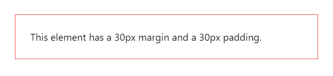
};Once you have added your custom spacing value, you can use it in your CSS like any other Tailwind CSS utility class. For example, to set the margin of an element to 10 pixels, you would use the m-10 class.
<div class="m-30 p-30">
 This element has a 30px margin and a 30px padding.
</div>
Before
After
Overriding Default Theme Values
To override default Tailwind CSS theme values, set the corresponding key in your tailwind.config.js file to your desired value. For example, to change the default font-size value, add the following code to your tailwind.config.js file.
module.exports = {
 theme: {
   fontSize: {
     base: '20px',
   },
 },
};
Once you have overridden the default font-size value, all elements in your project will use the new font size, unless you explicitly override it.
Before
After
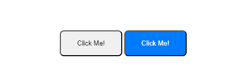
Using the @apply Directive to Add Custom CSS
The @apply directive lets you incorporate existing Tailwind CSS utility classes into your custom CSS. This is useful when creating custom CSS, but still want to use your design tokens and HTML syntax.
.my-button {
 @apply bg-blue-500 text-white px-4 p-10;
}
You can then use the .my-button class in your HTML like any other CSS class.
<button class="my-button">Click Me!</button>
The @apply directive is useful for overriding third-party libraries’ styles or creating complex components with reusable styles.
- Override the styles of a third-party library:
/* Override the default styles of the Bootstrap `.btn` class */
.btn {
 @apply bg-blue-500 text-white px-4 !important;
}
Before
<button class="btn btn-danger">Override Bootstrap</button>
After
<button class="btn btn-danger">Override Bootstrap</button>
- Create a custom component with reusable styles:
.card {
 @apply bg-white shadow-md rounded-md !important;
}

.card-header {
 @apply bg-blue-500 text-white px-4 py-2 !important;
}

.card-body {
 @apply px-4 py-4 border border-red-500 !important;
}
- Create a custom CSS class that applies multiple utility classes:
.my-button {
 @apply bg-blue-500 text-white px-4 py-2 rounded-md !important;
}
Extending Tailwind CSS
This is about preserving the default values of a theme option while adding new values.
Let’s dive straight in🎿
Adding custom components
Tailwind CSS can be extended by adding custom components, such as buttons, navigation bars, forms, dropdowns, responsive layouts, navigation, and menus, to create reusable elements. The addComponents() function in the tailwind.config.js file can be used to add a custom component, taking an object of CSS-in-JS as its argument.
module.exports = {
 plugins: [
   require('tailwindcss'),
 ],
 theme: {
   extend: {
     addComponents: {
       'my-button': {
         display: 'inline-flex',
         alignItems: 'center',
         justifyContent: 'center',
         padding: '10px 15px',
         margin: '10px 200px',
         borderRadius: '4px',
         backgroundColor: '#008000',
         color: '#ffffff',
       },
     },
   },
 },
};
Once you have added your custom component, you can use it in your HTML code like any other Tailwind CSS class:
<button class="my-button">Click me!</button>
Adding Custom Utilities
Leveraging Tailwind CSS Plugins, Tailwind CSS can be extended by adding custom utilities, which can be used to create custom CSS classes for your project. The addUtilities() function in the tailwind.config.js file can be used to add a custom utility, with each key representing a utility name and corresponding CSS value.
Below, we add two custom utilities called my-border-radius and my-shadow:
const plugin = require('tailwindcss/plugin')

module.exports = {
 plugins: [
   plugin(function ({ addUtilities }) {
     addUtilities({
       '.my-border-radius': {
         'border-radius': '8px',
       },
       '.my-shadow': {
         boxShadow: '0 2px 4px rgba(0, 0, 0, 0.2)',
       },
     })
   }),
 ],
}
<div class="my-border-radius my-shadow">This element has a border radius of 8px and a shadow.</div>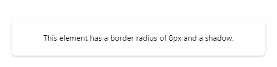
Best Practices
Once you’ve customized and extended Tailwind CSS to your liking, it’s important to keep your customizations organized and easy to maintain. Here are a few tips:
- Keep your customizations organized. Create a separate CSS file for your custom classes, and use a consistent naming convention. This helps in finding and updating custom styles.
- Use descriptive names for your custom classes. Avoid using generic names like
.my-classor.custom-btn. Instead, use names that describe what the class does, such as.btn-primaryor.card-header. This makes codes more readable and maintainable. - Use CSS variables to centralize your theme values. This will make it easier to update theme values across an entire project. For example, you could create a CSS variable for your primary brand color and then use that variable in all of your custom classes that use that color.
- Test your customizations thoroughly. Before you deploy your project to production, be sure to test your custom styles thoroughly on different browsers and devices. This will help you to catch any potential issues.
Examples of Common Customizations
Here are some examples of common customizations for Tailwind CSS:
Custom Breakpoints
Tailwind’s default breakpoints may not fit your project. You can add custom breakpoints in tailwind.config.js or customize existing ones:
module.exports = {
 theme: {
   screens: {
     'sm': '640px',
     'md': '768px',
     'lg': '1024px',
     'xl': '1280px',
     '7xl': '2400px'
   }
 }
}
Custom Border Radius
You can also extend the borderRadius theme option to add custom radii for rounded buttons, images, or any other element in your project:
module.exports = {
 theme: {
   borderRadius: {
    'lg': '0.5rem',
    'xl': '1rem'
   }
 }
}
Custom Animations and Transitions
You can also add custom CSS animations and transitions as utilities:
.transition-fade {
 transition: opacity 0.3s ease-in-out;
}

.animate-bounce {
 animation: 1s bounce infinite;
}
Custom Font Sizes
Since Tailwind has a preset font size scale, you can add intermediate font sizes as your project needs:
module.exports = {
 theme: {
   fontSize: {
     '15': '0.9375rem'
   }
 }
}
Creating Custom Components
You can create custom components for buttons, menus, and other UI elements. This can help you to reduce code duplication and create more consistent interfaces. Below is a custom component for a button:
.btn {
 padding: 1rem 2rem;
 border-radius: 0.5rem;
 cursor: pointer;
}

.btn-primary {
 background-color: #007bff;
 color: #fff;
}
You can also add custom utilities for rounded borders, drop shadows, and other common CSS effects. This can help you to avoid having to write custom CSS for these effects. Below is an example of a custom utility for rounded borders:
@tailwind base;

.rounded-full {
 border-radius: 100%;
}
These are just a few examples of how you can customize Tailwind CSS. With its flexible configuration system, you can tailor Tailwind CSS to meet any need.
Conclusion
Tailwind CSS is a powerful and flexible CSS framework that can be customized and extended to meet the specific needs of any project. By following the tips and tricks in this article, you can learn how to create a custom Tailwind CSS theme, add custom components and utilities, and write custom plugins.
Summary of key points
- Customizing Tailwind CSS allows you to:
- Create a unique and consistent design for your project
- Reduce the amount of CSS you need to write
- Make your CSS more maintainable and scalable
- There are two main ways to customize Tailwind CSS:
- Editing the
tailwind.config.jsfile - Writing custom plugins
- When customizing Tailwind CSS, it is important to:
- Keep your customizations organized
- Use descriptive names for your custom classes
- Use CSS variables to centralize your theme values
- Test your customizations thoroughly
Resources for learning more about Tailwind CSS customization and extension
- Tailwind CSS documentation
- Theming With Tailwind CSS
- Which Is Easier To Customize: Tailwind CSS Or Material UI?
Gain Debugging Superpowers
Unleash the power of session replay to reproduce bugs, track slowdowns and uncover frustrations in your app. Get complete visibility into your frontend with OpenReplay — the most advanced open-source session replay tool for developers.
Star on GitHub12k