Data Validation and Form Handling with Blazor

Forms and validation are crucial parts of any application. They allow users to submit input, not just any input, but the correct input. Blazor comes in handy to support all of these, as this article will show.

Discover how at OpenReplay.com.
Do you know why data validation and form handling are essential? Ensuring data integrity and providing a seamless user experience are paramount. In Blazor applications, achieving these goals requires mastering the art of data validation and form handling, which will be covered in this article.
In this guide, we’ll explore Blazor’s built-in validation features, explore custom validation techniques, and uncover best practices for effective form handling. By the end of this article, you will have the knowledge to handle data validation seamlessly in your Blazor application.
Prerequisites
Ensure you have the necessary applications installed on your computer before continuing with this guide:
- To build and update Blazor projects, you’ll need Visual Studio, a feature-rich Integrated Development Environment (IDE) that can be downloaded from the official Microsoft website.
- The .NET SDK (Software Development Toolkit), which has everything you need to create and execute .NET apps, is required for Blazor projects. Make sure your computer has the
.NET SDKinstalled. It is available for download on the official .NET website. - Basic knowledge of C# and Blazor.
You will be ready to follow along once you have installed Visual Studio and the .NET SDK.
Understanding Blazor Forms
Just like any other form, Blazor simplifies the process of collecting user input through its form components and accurately sends the collected input to the intended destination.
Ensuring data integrity is paramount when developing applications, including Blazor. This article will delve into the various validation mechanisms Blazor offers and provide insights on implementing them within your projects.
Form Elements in Blazor
Blazor, by default, provides a range of form elements to help user input and validate their data. Below are a few available elements; additional ones can be found here.
InputText: This creates an HTML (HyperText Markup Language) input element for text entry. It provides a way to bind the input field’s value to a property in a C# class, allowing for two-way data binding. This means that changes made in the input field will automatically update the associated property in the code block. Changes to the property in the code block will be reflected in the input field.
<InputText @bind-Value="model.Firstname" />The @bind-Value attribute allows two-way data binding. It must be added to every other component because data cannot be bound without it.
InputCheckbox: This component generates anHTMLcheckbox input element. It allows users to select or deselect a single option. In Blazor, it’s typically used in forms to representbooleanvalues or toggle specific settings.
<InputCheckbox @bind-Value="model.IsChecked" />InputDate: This creates anHTMLinput element for date selection. It provides a convenient way for users to input dates. It ensures consistency and validation of date entries.
<InputDate @bind-Value="model.SelectedDate" />InputNumber: This generates anHTMLinput element designed explicitly for numeric input. It restricts user input to numeric values, providing validation and ensuring that only valid numbers are accepted. This component captures numerical data, such as quantities or prices.
<InputNumber @bind-Value="model.Quantity" />InputTextarea: This component allows users to enter text in many lines by creating anHTMLtextareaelement. WhileInputTextareais appropriate for capturing larger text entries, like comments or descriptions within forms,InputTextis utilized for single-line text input. It offers more input space and allows for multiline text editing.
<InputTextarea @bind-Value="model.Comment" />Form Submission and Event Handling in Blazor
Can a form be submitted without anything taking place? No. For a form to be submitted, an event must take place.
EditForm in Blazor is not part of the HTML form elements; it is a Blazor component specifically designed to facilitate form handling in Blazor applications. While HTML elements like InputText, InputCheckbox, etc., represent individual input fields within a form.
EditForm provides a wrapper around these elements to manage form submission, validation, and data binding in a Blazor application. It simplifies the process of handling form submissions and managing form state.
Handling form submissions and events in Blazor is straightforward. You can leverage event handlers like OnSubmit, OnValidSubmit, and OnInvalidSubmit to execute logic upon form submission. These events can’t stand alone; they have to be an attribute of a Blazor component called EditForm. I will explain these events below;
OnSubmit: This event is triggered when the form is submitted, regardless of validity. You can use this event to handle form submissions, irrespective of whether the form passes validation.OnValidSubmit: This event is triggered only when the form submission is valid. It’s typically used when you want to perform specific actions or submit data, but only when the form passes validation. For example, save form data to a database only when all required fields are filled out correctly.OnInvalidSubmit: This event is triggered when the form submission is invalid, meaning it fails validation. It helps handle scenarios where you want to provide feedback to the user about validation errors or take other actions when the form fails validation.
<EditForm Model="model" OnValidSubmit="HandleSubmit" OnInvalidSubmit="HandleSubmit">

    <!-- Other form fields will be here -->

    <button type="submit">Submit</button>

</EditForm>

@code {
    private void HandleSubmit()
    {
        // Logic to handle form submission
    }
}
This code above sets up a form in a Blazor application using the EditForm component. It binds the form to the Model object, specifies methods to handle form submission events (both OnValidSubmit and OnInvalidSubmit), and provides a submit button to trigger the form submission process. The text between <!-- --> is called a comment, which will be ignored.
<EditForm Model="model" OnSubmit="HandleSubmit">

    <!-- Form fields here -->

    <button type="submit">Submit</button>

</EditForm>

@code {
    private void HandleSubmit()
    {
        // Logic to handle form submission
    }
}
The code above uses the OnSubmit attribute, which triggers the event that submits the form. However, this doesn’t check for the form’s validity before submission.
You cannot use the OnValidSubmit and OnInvalidSubmit in the same form and use the OnSubmit. This will flag an error, which I will provide in the image below;

From the image above, you can see that you can only use the OnSubmit or OnValidSubmit and OnInvalidSubmit.
NOTE: Validation has to be set on the form before all of these can be enabled. We will discuss validations in the next section.
Built-in Validation in Blazor
Blazor comes with built-in validation attributes that simplify the validation process. Blazor allows you to enforce data validation rules for form inputs without writing custom validation logic.
This validation is a form of security in our application, making sure the user’s input matches what is expected.
Applying Validation Attributes
To start with validation, Data Annotations from the System.ComponentModel.DataAnnotations namespace has to be used on the properties of the Model.
A model helps define the structure and types of data the application requires, just like a blueprint defines the layout of an object. The model can be stored in a .cs file, I will provide an example below;
public class Person
{
    public string Firstname { get; set; }

    public string Lastname { get; set; }

    public int Age { get; set; }

    public string Email { get; set; }

    public string Phone { get; set; }

    public string PostalCode { get; set; }
}
The data annotation will be added to the properties as an attribute that requires it in the model. Blazor has several attributes that make validation easy. Some of them will be explained below. You can find more of these here.
Required: This mandates that a property must be included, and its value cannot benullor an emptystring.
[Required(ErrorMessage = "Field is required")]
public string Firstname { get; set; }StringLength: This defines the minimum and maximum length limits for astringproperty.
[StringLength(50, MinimumLength = 2, ErrorMessage = "Firstname must be between 2 and 50 characters")]
public string Firstname { get; set; }Range: This sets the minimum and maximumnumericvalue limits for anumericproperty.
[Range(18, 50, ErrorMessage = "Age must be between 18 and 50")]
public int Age { get; set; }RegularExpression: Specifies that astringproperty must match a specified regular expression pattern.
[RegularExpression(@"^\d{5}$", ErrorMessage = "Invalid postal code")]
public string PostalCode { get; set; }EmailAddress: Astringproperty must adhere to a valid email address format.
[EmailAddress(ErrorMessage = "Invalid email address")]
public string Email { get; set; }Compare: Compares the value of one property with the value of another.
[Compare(nameof(Password), ErrorMessage = "Passwords do not match")]
public string ConfirmPassword { get; set; }MaxLength: This defines the maximum length permitted for astringproperty.
[MaxLength(50, ErrorMessage = "Lastname cannot exceed 50 characters")]
public string Lastname { get; set; }MinLength: Specifies the minimum length required for astringproperty.
[MinLength(2, ErrorMessage = "Lastname must be at least 2 characters long")]
public string Lastname { get; set; }
Displaying Validation Error Messages
Displaying validation errors is essential to creating user-friendly forms in your application. When a user inputs incorrect data, it is important to provide clear feedback about what went wrong and how they can fix it.
How can the form know what field has been set to required?
A component called DataAnnotationsValidator solves that. The DataAnnotationsValidator component is very important for your validation to be activated on the form and to show error messages where required. Without the component, no validation message will appear on the form, even while submitting an empty form. The DataAnnotationsValidator component is added below the opening EditForm tag (<EditForm>).
Below are some of the ways Blazor offers to display validation error messages;
ValidationSummary: This component summarizes all validation errors in the form. It’s placed near the top of the form below theDataAnnotationsValidatorcomponent.ValidationSummaryprovides a convenient way for users to see all validation errors simultaneously. Below is what this component looks like;
<DataAnnotationsValidator />
<ValidationSummary />
Using the component above and trying to submit the form without its required data being filled up will generate the error in the image below;
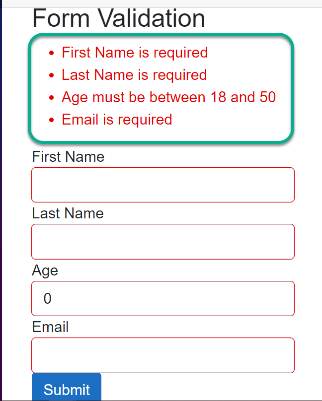
From the image above, you can see the summary of the error messages is being outputted.
ValidationMessage: This displays validation error messages next to individual form fields using theValidationMessagecomponent. This component is bound to a specific form field and will only display the validation error for that field. Below is how it can be implemented;
<InputText @bind-Value="model.Firstname" />
<ValidationMessage For="@(() => model.Firstname)" />
From the code snippet above, the ValidationMessage uses the For attribute, which takes an expression to validate the current property ( in this case, the Firstname property). Submitting the form, which uses the ValidationMessage component without filling in the required field, will generate the error in the image below;
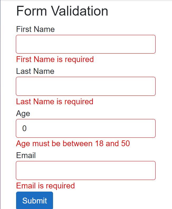
As you can see from the image above, each field is outputting a unique error message.
Custom Validation in Blazor
Built-in Blazor validation works fine but cannot cover every scenario we want to implement. We should be able to customize validation based on our needs; this is where Custom Validation will come in handy.
Custom validation in Blazor allows you to define your logic for form fields beyond the built-in validation attributes. This is useful when you need to enforce validation rules that cannot be expressed using standard data annotation attributes. Blazor provides a way to create custom validation rules by implementing the ValidationAttribute class or by defining custom validation methods.
Implementing Custom Form Validation in Blazor
In some situations, you may desire to restrict certain text inputs for security purposes. Custom validation serves as an effective solution in such scenarios. Below, I will explain how custom validation can prevent the word password from being accepted when a user inputs it.
I will create a new file called ValidateName.cs, which will contain the custom validation logic below;
public class ValidateName : ValidationAttribute
{
    protected override ValidationResult IsValid(object value, ValidationContext validationContext)
    {
        if (value.ToString().Contains("password"))
        {
            return new ValidationResult("Sensitive word such as password is not allowed.");
        }
        return ValidationResult.Success;
    }
}
The above is a custom validation attribute named ValidateName, which inherits from the ValidationAttribute class provided by .NET for creating custom validation attributes.
The IsValid method is overridden to implement custom validation logic. This method is called when validation is triggered for the property associated with this attribute. The value represents the value of the property being validated. Inside the IsValid method, the value of the property is checked if it contains the word password and returns a custom validation error or success message.
The custom validation logic above will be called as an attribute on the property that requires validation in the Person model class. This will be explained below;
public class Person
{
    [Required(ErrorMessage = "Firstname is required")]
    [ValidateName]
    public string Firstname { get; set; }

    [Required(ErrorMessage = "Lastname is required")]
    public string Lastname { get; set; }

    [Required(ErrorMessage = "Email is required")]
    public string Email { get; set; }

    [Required(ErrorMessage = "Phone Number is required")]
    public string PhoneNumber { get; set; }
}
From the above, the ValidateName, which is the custom validation logic, is being used as an attribute on the FirstName property. So when this property contains the word password, it will flag an error just like the image below;
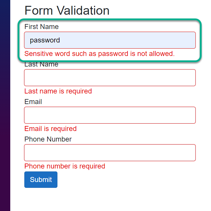
According to requirements, the user can see different errors depending on how custom validation is applied, as seen in the image above.
Form Submission and Validation
The form submission process in Blazor involves several steps to collect user input, validate it, and handle the submission. Some of these have been discussed above. This section will be an overview of how the form submission and validation process work together in a Blazor application.
In this section, we will create a form from scratch, trigger its validation, and handle its form submission gracefully.
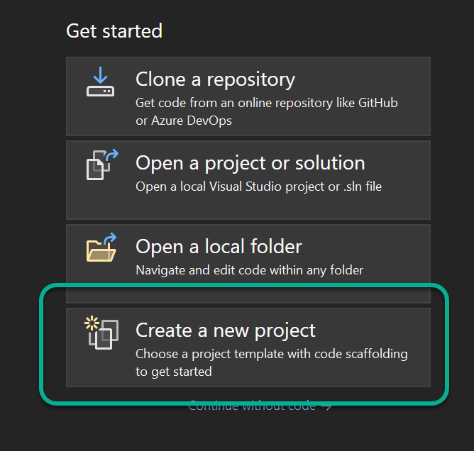
- STEP 1: Create a New Project
Click the marked area in the image below to start creating a new Blazor project.
- STEP 2: Select the Blazor Template
After selecting the marked button above, select the Blazor Web App and click Next as shown below;

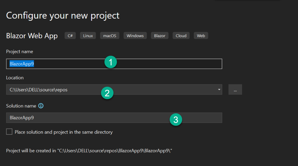
- STEP 3: Configure Project
You can leave this by the default value or change it to whatever suits your project requirement. We will use the default configurations. Once you are done, click Next;
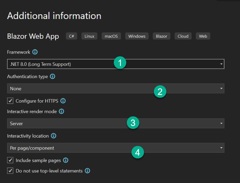
- STEP 4: Set Additional Information
We will be using the .NET 8 framework. This guide will work with .NET 6 and later. You can change the settings below as you see fit, but we will work with the default settings. Click on Create to continue;
How to Trigger Validation and Handle Form Submission
In this section, we will create an Employee class which will contain the model we will use. Below is what the model will look like;
using System.ComponentModel.DataAnnotations;

namespace BlazorApp9.Components;

public class Employee
{
    [Required(ErrorMessage = "First name is required")]
    [StringLength(20, ErrorMessage = "First name must be less than 50 characters")]
    public string FirstName { get; set; }

    [Required(ErrorMessage = "Last name is required")]
    [StringLength(10, ErrorMessage = "Last name must be less than 50 characters")]
    [ValidateName]
    public string LastName { get; set; }

    [Required(ErrorMessage = "Email is required")]
    [EmailAddress(ErrorMessage = "Invalid email address")]
    public string Email { get; set; }

    [Required(ErrorMessage = "Date of Birth is required")]
    [DataType(DataType.Date)]
    public DateTime DateOfBirth { get; set; }
}
From the code snippet above, the Employee model class properties have been set together with their data-annotations attributes for error validation. Also on the LastName property, we set the custom validation error message ValidateName as an attribute. The logic for the ValidateName method, which has been discussed above, can be found here.
Next, you will create an Employee.razor file containing the form and implement the Employee, a model class created above. The code for the form is below;
@page "/employee"
@using BlazorApp9.Components
@using System.Text.Json
@rendermode InteractiveServer

<h3>Data Validation and Form Handling</h3>

<p>Fill the form below</p>

<EditForm Model="employee" OnValidSubmit="HandleValidSubmit" FormName="employeeForm" >
    <DataAnnotationsValidator />

    <div class="form-group">
        <label for="firstname">First Name</label>
        <InputText id="firstname" class="form-control" @bind-Value="employee.FirstName" />
        <ValidationMessage For="@(() => employee.FirstName)" />
    </div>

    <div class="form-group">
        <label for="lastname">Last Name</label>
        <InputText id="lastname" class="form-control" @bind-Value="employee.LastName" />
        <ValidationMessage For="@(() => employee.LastName)" />
    </div>

    <div class="form-group">
        <label for="email">Email</label>
        <InputText id="email" class="form-control" @bind-Value="employee.Email" />
        <ValidationMessage For="@(() => employee.Email)" />
    </div>

    <div class="form-group">
        <label for="dateOfBirth">Date Of Birth</label>
        <InputDate id="dateOfBirth" class="form-control" @bind-Value="employee.DateOfBirth" />
        <ValidationMessage For="@(() => employee.DateOfBirth)" />
    </div>

    <button type="submit" class="btn btn-primary">Submit</button>
</EditForm>

<div>
     <span>@outputEmployee</span>
</div>


@code {
    private Employee employee = new Employee();
    private string outputEmployee;

    private void HandleValidSubmit()
    {
        Console.WriteLine("Submitted Employee Information:");
        Console.WriteLine($"First Name: {employee.FirstName}");
        Console.WriteLine($"Last Name: {employee.LastName}");
        Console.WriteLine($"Email: {employee.Email}");
        Console.WriteLine($"Date of Birth: {employee.DateOfBirth}");

        outputEmployee = JsonSerializer.Serialize(employee);
        employee = new();
    }
}
From the code snippet above, the EditForm component wraps the form to handle form submission and validation. The EditForm uses the Model attribute and its value (employee) in the instantiated Employee class. The employee contains information about the Model, which gives the form the type of data to expect.
The EditForm uses the OnValidSubmit attribute and passes the HandleValidSubmit method. The EditForm also makes use of the DataAnnotationsValidator component, so the form can be aware of its validation and display the individual field error message with the help of the ValidationMessage component.
In the @code{ } block, we instantiate the Employee class and create a string variable called outputEmployee, which will display the details of the employee in @outputEmployee on the webpage.
When triggered, the HandleValidSubmit method will check if its validation is met, and then it will display the employee in the Console. This method also Serializes the value of the employee into a JSON (Javascript Object Notation) object and passes the result tooutputEmployee which displays it on the webpage.
The employee = new() will clear the inputs entered by the user on the form after submission. Running the code above without inputting any data will produce what you will see in the image below;
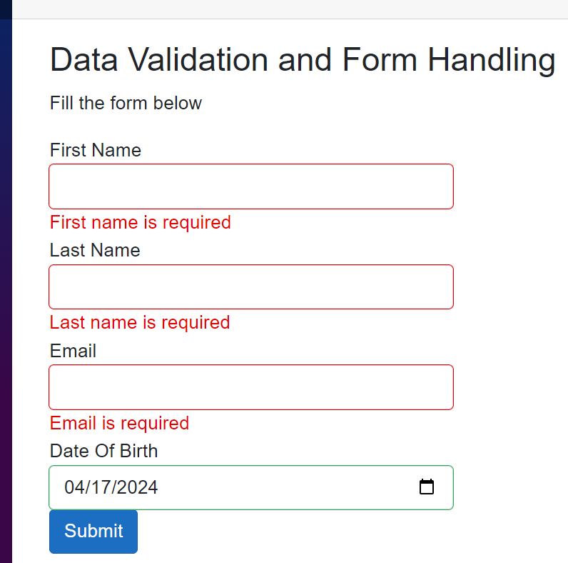
As seen in the above image, the user is presented with the appropriate validation messages. Hence, the user will know how to easily fix it. Again, we will run the code by inputting some incorrect data to see what error message will be displayed.
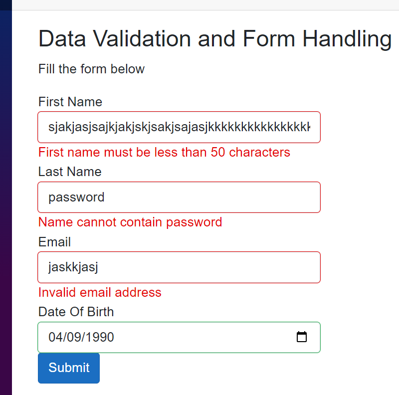
From the image above, you can see the validation messages are being displayed based on the pre-defined requirements.
Now, the form will be filled with the right data, and the result will be displayed in the console. The output for the console can be found below;

The image above shows the output of the submitted form in the console.
Asynchronous Validation in Blazor
Asynchronous validation in Blazor allows you to perform validation tasks that require taking some time before they get executed, such as database queries or API (Application Programming Interface) calls, before determining the validity of a form field. This is useful when validating user input against external data sources.
How to Implement and Showcase Asynchronous Validation Logic in Blazor Forms.
Firstly, we will create a custom validation attribute by inheriting from ValidationAttribute and implementing asynchronous validation logic in the IsValid method.
using System.ComponentModel.DataAnnotations;

namespace BlazorApp9.Components;

public class UniqueEmail : ValidationAttribute
{
    protected override ValidationResult IsValid(object value, ValidationContext validationContext)
    {
        var task = Task.Run(async () =>
        {
            await Task.Delay(2000);

            // Validate the email uniqueness
            if (value != null && value.ToString() == "existing@example.com")
            {
                return new ValidationResult("Email is already in use");
            }

            // Return success if validation passes
            return ValidationResult.Success;
        });

        return task.Result; // Wait for the asynchronous task to complete and return its result
    }
}
In this approach, the Task.Run will asynchronously execute the validation logic inside the IsValid method, allowing you to perform asynchronous operations.
You will add the UniqueEmail custom validation above as a data-annotation attribute on the Email property in the Employee model class. Below shows how that can be done;
[Required(ErrorMessage = "Email is required")]
[DataType(DataType.EmailAddress)]
[EmailAddress(ErrorMessage = "Invalid email address")]
[UniqueEmail]
public string Email { get; set; }
From the code snippet above, the Email property uses the UniqueEmail custom validation to asynchronously validate user input, and the validation message is waited for a few seconds before being displayed.
Advanced Form Handling Techniques
Handling complex forms and validation rules efficiently is necessary for a smooth user experience and data integrity. Here are several strategies to consider:
- Divide and Conquer: Break down the form into smaller sections or logical groups of fields. Each section can be managed independently, making the form more manageable and easier to maintain.
- Component-Based Architecture: Utilize Blazor components to encapsulate form sections or individual fields. This promotes reusability and helps keep the code organized.
- Validation: Leverage Blazor’s built-in validation features such as
EditForm,ValidationMessage, andValidationSummarycomponents. You can usedata annotations, custom validation logic, or a combination of both to validate user input. - Validation Feedback: Provide immediate feedback to users about validation errors. Highlight invalid fields, and display error messages near the corresponding fields.
- Conditional Validation: Implement conditional validation rules based on the state of other fields or external factors. You can achieve this by dynamically updating validation rules or by using custom validation logic.
- Asynchronous Validation: For complex validation rules that require
server-sidevalidation or asynchronous operations, handle validation asynchronously using custom validation logic.
By employing these strategies, you can effectively handle complex forms with multiple fields and validation rules, resulting in a better user experience and improved data integrity.
Nested Complex Models and Their Implementation In Blazor
The DataAnnotationsValidator provided by default enables form input validation using data annotations. However, it solely validates top-level properties (properties without nested types) bound to the form, excluding child or complex-type properties.
To validate nested complex models, we will substitute the DataAnnotationsValidator with the ObjectGraphDataAnnotationsValidator. This validator assesses the entire object, encompassing child and complex type properties within the form. The ObjectGraphDataAnnotationsValidator does not come by default but can be installed as a Nuget Package. Below explains how it can be installed into your project;
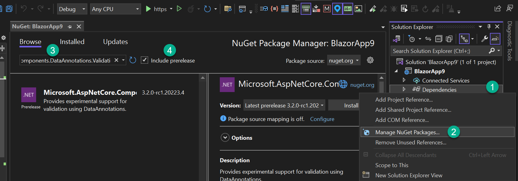
The image above shows how ObjectGraphDataAnnotationsValidator can be installed into your project. Type Microsoft.AspNetCore.Components.DataAnnotations.Validation in the search box to locate the Nuget Package.
We will create a class called Guarantor.cs which will have the properties below;
public class Guarantor
{
   [Required(ErrorMessage = "Guarantor's Name is required")]
   public string Name { get; set; }

   [Required(ErrorMessage = "Guarantor's Phone Number is required")]
   [Phone(ErrorMessage = "Invalid phone number")]
   public string PhoneNumber { get; set; }
}
The above shows that the Guarantor must have a Name and Phone Number. The Guarantor class will be added as a property and a type in the Employee, a class we created earlier in this guide. It can be found here. Below shows how the Guarantor class will be used as a property in the Employee class.
[Required]
[ValidateComplexType]
public Guarantor Guarantor { get; set; } = new Guarantor();
The code snippet above shows that the Guarantor is required and expects its type. The ValidateComplexType attribute tells the model that the Guarantor is a complex type (it contains nested elements).
Also, change the DataAnnotationsValidator tag in the Employee.razor file to ObjectGraphDataAnnotationsValidator. Running the code will produce the result below;
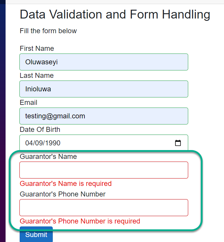
The Name and Phone Number of the Guarantor display the correct validation error message set on the model, as you can see in the image above.
Conclusion
Data validation and form handling in Blazor are crucial for building robust and user-friendly web applications. By leveraging Blazor’s built-in validation features, implementing custom validation logic, and adhering to best practices, you can ensure data integrity and provide a seamless user experience.
Experiment with everything discussed in this guide and unlock the full potential of Blazor in your projects.
Gain Debugging Superpowers
Unleash the power of session replay to reproduce bugs, track slowdowns and uncover frustrations in your app. Get complete visibility into your frontend with OpenReplay — the most advanced open-source session replay tool for developers. Check our GitHub repo and join the thousands of developers in our community.


