
Data Visualization with D3.js


What is Data visualization?
Data visualization is transforming information into a visual representation through visual media, such as a map or graph, to make data more accessible for the human brain to understand and pull insights from.
Its purpose is to facilitate the recognition of patterns, trends, and anomalies within large data sets. This term is often used in place of similar terms, such as information graphics, visualization, and statistical graphics. There are various types of Data visualizations, but the main three types are charts, graphs, and maps.
It is important for professionals in various fields, including education, computer science, and business. Teachers can use it to illustrate student test scores, computer scientists can use it to study AI development, and executives may use it to communicate with stakeholders. Additionally, data visualization is an essential component of big data initiatives. As companies began to accumulate large amounts of data, they needed an efficient way to understand and analyze this information, which is where visualization tools come in.
Data visualization is a powerful way to communicate complex data, and we will explore the creation of data visualization using a JavaScript library, D3.js.
What is D3.js?
D3.js, which stands for Data-Driven Documents, is an open-source JavaScript library created by Mike Bostock that enables users to create interactive data visualizations in a web browser using technologies such as SVG, HTML, and CSS. This library allows users to create custom visualizations that can be easily incorporated into web pages. Some features of D3 are as follows,
-
Data Driven: D3 is data-driven, meaning that it can work with static data or retrieve it from a remote server in various formats, including arrays, objects, CSV, JSON, and XML, to create a wide range of charts.
-
Uses web Standards: D3 is a highly effective tool for creating interactive data visualizations that utilize the latest web technologies such as SVG, HTML, and CSS. It is capable of producing powerful visualizations of data
-
DOM Manipulation: D3 allows you to manipulate the Document Object Model (DOM) based on your data.
-
Dynamic Properties: D3 gives the flexibility to provide dynamic properties to most of its functions. Properties can be specified as functions of data. That means your data can drive your styles and attributes.
-
Transitions: D3 provides the transition() function. This is quite powerful because, internally, D3 works out the logic to interpolate between your values and find the intermittent states.
-
Interaction and animation: D3 provides great support for animation with functions like duration(), delay(), and ease(). Animations from one state to another are fast and responsive to user interactions.
-
Selection: Selection is a crucial concept of D3.js that allows you to select elements on a webpage using CSS selectors and then manipulate them, such as by modifying, appending, or removing them with respect to a pre-defined dataset.
D3.js offers two methods for selecting elements from an HTML page.
-
select()− Selects only one DOM element by matching the given CSS selector. If there is more than one element for the given CSS selector, it selects the first one only. -
selectAll()− Selects all DOM elements by matching a given CSS selector. If you are familiar with selecting elements with jQuery, D3.js selectors are almost identical. We will understand this concept better when we start creating visualizations.
How to install D3.js?
To use D3.js, we need to add the D3.js library. This is done in either of these ways,
- Include the D3.js library from your project’s folder. Go to the official D3.js website at https://d3js.org/ and download the latest version. Extract the downloaded file and look for d3.min.js; this is the minified version of the D3.js source code. Copy the d3.min.js file and paste it into your project’s root folder or any other folder where you want to keep all the library files. Also, include the d3.min.js file in your HTML page, as shown below.
<!DOCTYPE html>
<html lang = "en">
   <head>
      <script src = "/path/to/d3.min.js"></script>
   </head>

   <body>
      <script>
         // write your d3 code here..
      </script>
   </body>
</html>- Alternatively, you can include the D3.js library from a CDN (Content Delivery Network).
<html lang = "en">
   <head>
       <script src="https://d3js.org/d3.v4.min.js">
       </script>
   </head>

   <body>
      <script>
         // write your d3 code here..
      </script>
   </body>
</html>
Creating a variety of common chart types with D3.js
Let us create some standard charts like Bar charts and line charts.
First, we will include D3.js from Cdn(Content Delivery Network) in our HTML file.
<script src="https://d3js.org/d3.v4.min.js">
</script>
Bar charts
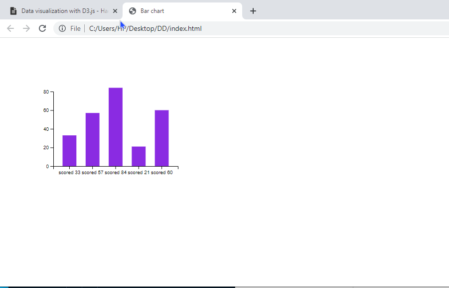
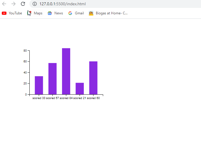
We will need a data set; we’ll use an array of scores, [33, 57, 84, 21, 60].
- Stage 1: we set up our SVG container
<svg width="400" height="300"></svg>- Stage 2: To center and improve the clarity of the chart, we will set a margin for the SVG element. This is done by declaring four variables: SVG, margin, width, and height. The SVG variable is initialized with a width of 400 pixels and a height of 300 pixels. These dimensions can then be adjusted using a margin of 150 pixels.
var svg = d3.select("svg"),
            margin = 150,
            width = svg.attr("width") - margin,
height = svg.attr("height") - margin- Stage 3: To visualize discrete data on the x-axis, you can use a scaleBand() to create discrete bands for the values. The
scaleBand()function also adds padding to separate the bars in the chart. For the y-axis, you can use ascaleLinear()to represent the score data.
var xScale = d3.scaleBand().range([0, width]).padding(0.4),
            yScale = d3.scaleLinear().range([height, 0]);
- Stage 4: We need to specify the data that will be plotted on both the x and y axes. For the x-axis, we will use the values in the dataset as the domain. For the y-axis, we will set the domain to range from 0 to 80.
xScale.domain(dataset1);
yScale.domain([0, 80]);- Stage 5: We will configure the y-axis of our chart to display the score total. For the x-axis, we label each score value with the prefix ‘scored ’ to indicate the nature of the data being plotted.
g.append("g")
         .attr("transform", "translate(0," + height + ")")
         .call(d3.axisBottom(xScale).tickFormat(function(d){
           return "scored " + d;
         })
         );

        g.append("g")
         .call(d3.axisLeft(yScale).tickFormat(function(d){
             return d;
}).ticks(4));- Stage 6: Now, we create our bars
g.selectAll(".bar")
         .data(dataset1)
.enter().append("rect")- Stage 7: Utilizing the X and Y scales we previously created, we will properly position the bars in their appropriate X and Y locations. We will also describe the width and height of the bars.
g.selectAll(".bar")
         .data(dataset1)
         .enter().append("rect")
         .attr("class", "bar")
         .attr("x", function(d) { return xScale(d); })
         .attr("y", function(d) { return yScale(d); })
         .attr("width", xScale.bandwidth())
         .attr("height", function(d) { return height - yScale(d); });
The code we will end up with will be:
<html>
<head>
    <style>
        .bar {
            fill: blueviolet;
        }
    </style>
    <script src="https://d3js.org/d3.v4.min.js"></script>
    <title>Bar chart</title>
</head>
<body>
<svg width="400" height="300"></svg>
<script>
var dataset1 = [33, 57, 84, 21, 60]

var svg = d3.select("svg"),
            margin = 150,
            width = svg.attr("width") - margin,
            height = svg.attr("height") - margin


var xScale = d3.scaleBand().range([0, width]).padding(0.4),
            yScale = d3.scaleLinear().range([height, 0]);

var g = svg.append("g")
            .attr("transform", "translate(" + 100 + "," + 100 + ")");


        xScale.domain(dataset1);
        yScale.domain([0, 80]);

        g.append("g")
         .attr("transform", "translate(0," + height + ")")
         .call(d3.axisBottom(xScale).tickFormat(function(d){
           return "scored " + d;
         })
         );

        g.append("g")
         .call(d3.axisLeft(yScale).tickFormat(function(d){
             return d;
         }).ticks(4));

       g.selectAll(".bar")
         .data(dataset1)
         .enter().append("rect")
         .attr("class", "bar")
         .attr("x", function(d) { return xScale(d); })
         .attr("y", function(d) { return yScale(d); })
         .attr("width", xScale.bandwidth())
         .attr("height", function(d) { return height - yScale(d); });

</script>
</body>
</html>
We should have something like the image below if we run our code.
Line charts
We will follow the same process we used for our bar chart. First, our Data set:
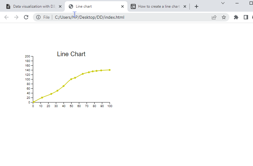
 var dataset1 = [
            [1,1], [12,20], [24,36],
            [32, 50], [40, 70], [50, 100],
            [55, 106], [65, 123], [73, 130],
            [78, 134], [83, 136], [89, 138],
            [100, 140]
];- Stage 1: Set the SVG container.
<svg width="400" height="300"></svg>- Stage 2. Set the margin.
var svg = d3.select("svg"),
          margin = 150,
          width = svg.attr("width") - margin,
height = svg.attr("height") - margin- Stage 3. Set the scale.
var xScale = d3.scaleLinear().domain([0, 100]).range([0, width]),
          yScale = d3.scaleLinear().domain([0, 200]).range([height, 0]);
It uses the linear equation y = mx + c/
- Stage 4. We want to add a title to our chart. For this purpose, we first append text to our .svg. Then we set the position, style, and actual text attribute.
svg.append('text')
      .attr(x', width/2 + 100)
      .attr('y', 100)
      .attr('text-anchor', 'middle')
      .style('font-family', 'Helvetica')
      .style('font-size', 20)
.text('Line Chart');- Stage 5: Now we can add our axis:
 svg.append("g")
         .attr("transform", "translate(0," + height + ")")
         .call(d3.axisBottom(xScale));

        svg.append("g")
.call(d3.axisLeft(yScale));- Stage 6: We need dots added to our coordinates in our dataset1. We provide
dataset1to the data attribute and create a circle for each coordinate.
 svg.append('g')
        .selectAll("dot")
        .data(dataset1)
        .enter()
        .append("circle")
        .attr("cx", function (d) { return xScale(d[0]); } )
        .attr("cy", function (d) { return yScale(d[1]); } )
        .attr("r", 2)
        .attr("transform", "translate(" + 100 + "," + 100 + ")")
        .style("fill", "            fill: #cc1255;
");- Stage 7
Lastly, we need to connect all the dots to form a line. We will make use of d3 line generator by calling
d3.line()To use this line generator to compute the d attribute of an SVG path element, we can append a path to our SVG and specify its class as ‘line’. We can then apply a transformation to it and style the line as desired.
var line = d3.line()
        .x(function(d) { return xScale(d[0]); })
        .y(function(d) { return yScale(d[1]); })
        .curve(d3.curveMonotoneX)

        svg.append("path")
        .datum(dataset1)
        .attr("class", "line")
        .attr("transform", "translate(" + 100 + "," + 100 + ")")
        .attr("d", line)
        .style("fill", "none")
        .style("stroke", "#CC0000")
        .style("stroke-width", "2");
Our final code will be,
<!doctype html>
<html>
<head>

    <script src="https://d3js.org/d3.v4.min.js"></script>
    <title>Line chart</title>

</head>
<body>

<svg width="400" height="300"></svg>
<script>
        // Step 1
        var dataset1 = [
            [1,1], [12,20], [24,36],
            [32, 50], [40, 70], [50, 100],
            [55, 106], [65, 123], [73, 130],
            [78, 134], [83, 136], [89, 138],
            [100, 140]
        ];

        var svg = d3.select("svg"),
            margin = 150,
            width = svg.attr("width") - margin,
            height = svg.attr("height") - margin

        var xScale = d3.scaleLinear().domain([0, 100]).range([0, width]),
            yScale = d3.scaleLinear().domain([0, 200]).range([height, 0]);

        var g = svg.append("g")
            .attr("transform", "translate(" + 100 + "," + 100 + ")");

        // Title
        svg.append('text')
        .attr('x', width/2 + 100)
        .attr('y', 100)
        .attr('text-anchor', 'middle')
        .style('font-family', 'Helvetica')
        .style('font-size', 20)
        .text('Line Chart');


        g.append("g")
         .attr("transform", "translate(0," + height + ")")
         .call(d3.axisBottom(xScale));

        g.append("g")
         .call(d3.axisLeft(yScale));

        svg.append('g')
        .selectAll("dot")
        .data(dataset1)
        .enter()
        .append("circle")
        .attr("cx", function (d) { return xScale(d[0]); } )
        .attr("cy", function (d) { return yScale(d[1]); } )
        .attr("r", 3)
        .attr("transform", "translate(" + 100 + "," + 100 + ")")
        .style("fill", "#CC1");

        var line = d3.line()
        .x(function(d) { return xScale(d[0]); })
        .y(function(d) { return yScale(d[1]); })
        .curve(d3.curveMonotoneX)

        svg.append("path")
        .datum(dataset1)
        .attr("class", "line")
        .attr("transform", "translate(" + 100 + "," + 100 + ")")
        .attr("d", line)
        .style("fill", "none")
        .style("stroke", "#CC1")
        .style("stroke-width", "2");

</script>
</body>
</html>
If you run this code, you should see something like the image below,
Session Replay for Developers
Uncover frustrations, understand bugs and fix slowdowns like never before with OpenReplay — an open-source session replay tool for developers. Self-host it in minutes, and have complete control over your customer data. Check our GitHub repo and join the thousands of developers in our community.
Adding interactivity to visualization
Interactivity in data visualization can improve the user’s experience and understanding of the data by providing interactive features such as tooltips, buttons, hover effects, zooming, transitions, and animation. These features allow the user to actively explore and engage with the visualized data.
Tooltips
To make our bar chart more interactive, let us add tooltips. So that each time the user hovers over it, the score value of the bar will be displayed. This can be achieved with the following code :
g.selectAll(".bar")
  .data(dataset1)
  .enter().append("rect")
  .attr("class", "bar")
  .attr("x", function(d) { return xScale(d); })
  .attr("y", function(d) { return yScale(d); })
  .attr("width", xScale.bandwidth())
  .attr("height", function(d) { return height - yScale(d); })
  .on("mouseover", function(d) {
     d3.select(".tooltip")
       .style("left", d3.event.pageX + "px")
       .style("top", d3.event.pageY + "px")
       .style("display", "block")
       .text(d);
  })
  .on("mouseout", function() {
     d3.select(".tooltip")
       .style("display", "none");
  });
Buttons
We can also add buttons. This will allow the user to switch between different views or datasets. We can add two buttons, one switches to the bar chart while the other switches to the line chart.
var barButton = d3.select("body").append("button")
    .text("Bar Chart");
var lineButton = d3.select("body").append("button")
    .text("Line Chart");

barButton.on("click", function() {
  // code to switch to a bar chart goes here
});

lineButton.on("click", function() {
  // code to switch to a line chart goes here
});
Hover effects
We can also add hover effect mouseover and mouseout event listeners to the bars in our bar chart to change their color when the user hovers over them.
g.selectAll(".bar")
  .data(dataset1)
  .enter().append("rect")
  .attr("class", "bar")
  .attr("x", function(d) { return xScale(d); })
  .attr("y", function(d) { return yScale(d); })
  .attr("width", xScale.bandwidth())
  .attr("height", function(d) { return height - yScale(d); })
  .on("mouseover", function(d) {
    d3.select(this).style("fill", "black");
    div.transition()
      .duration(200)
      .style("opacity", .9);
    div.html("Value: " + d)
      .style("left", (d3.event.pageX) + "px")
      .style("top", (d3.event.pageY - 28) + "px");
  })
  .on("mouseout", function(d) {
    d3.select(this).style("fill", "blueviolet");
    div.transition()
      .duration(500)
      .style("opacity", 0);
  });
Zooming
Zooming allows the user to focus on a particular part of the visualization. To enable it, we first need to define the zoom behavior:
var zoom = d3.zoom()
    .scaleExtent([1, 10])
    .on("zoom", zoomed);
Next, we need to apply the zoom behavior to our visualization:
g.call(zoom);Finally, we need to define the “zoomed” function that will be called when the user zooms in or out:
function zoomed() {
  g.attr("transform", d3.event.transform)};
Transitions
Transitions allow for smooth changes between different states of a visualization. For example, when a user clicks a button to switch between datasets, the bars in a bar chart could transition smoothly rather than change abruptly.
To create a transition, we can use the “transition” method and specify the duration of the transition and any other desired properties.
d3.selectAll(".bar")
  .transition()
  .duration(1000)
  .style("fill", "red");
Animations
We can use D3.js’s “transition” method to add animation to the bar chart. For example, the following code creates an animation that transitions the height of the bars from 0 to their actual value over 1 second:
g.selectAll(".bar")
  .data(dataset1)
  .enter().append("rect")
  .attr("class", "bar")
  .attr("x", function(d) { return xScale(d); })
  .attr("y", function(d) { return yScale(d); })
  .attr("width", xScale.bandwidth())
  .attr("height", 0) // set initial height to 0
  .transition() // apply transition
  .duration(1000) // duration of 1 second
  .attr("height", function(d) { return height - yScale(d); });
We can also use the “delay” method to specify a delay before the animation starts and the “ease” method to specify the easing function to use. For example, the following code creates an animation with a delay of 500 milliseconds and a cubic easing function:
g.selectAll(".bar")
  .data(dataset1)
  .enter().append("rect")
  .attr("class", "bar")
  .attr("x", function(d) { return xScale(d); })
  .attr("y", function(d) { return yScale(d); })
  .attr("width", xScale.bandwidth())
  .attr("height", 0) // set initial height to 0
  .transition() // apply transition
  .delay(500) // delay of 500 milliseconds
  .ease(d3.easeCubic) // cubic easing function
  .duration(1000) // duration of 1 second
  .attr("height", function(d) { return height - yScale(d); }); // set final height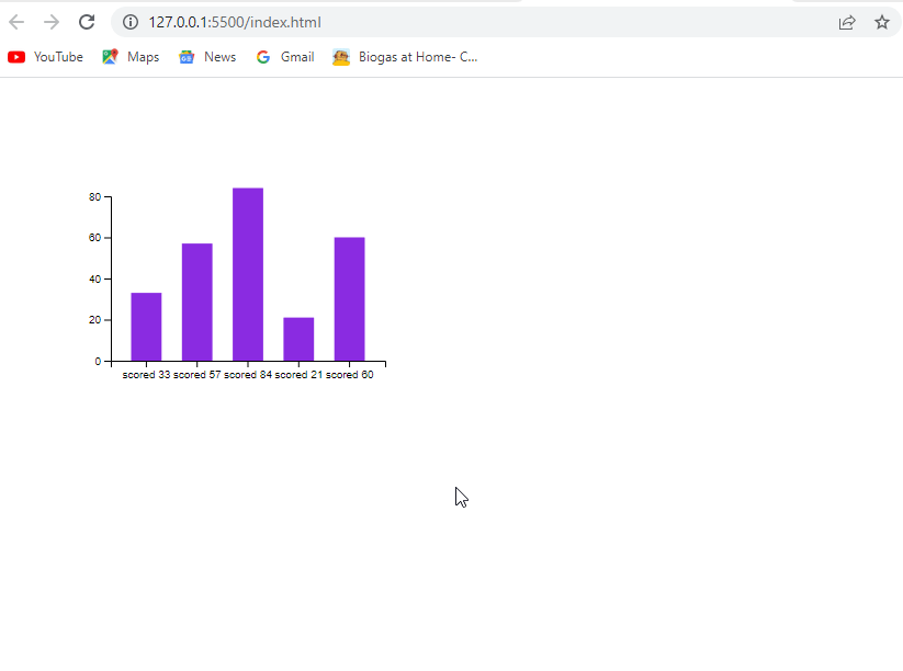
Creating responsive visualizations
To make our visualizations look good and work well on various devices and screen sizes, it is essential to create responsive visualizations. Here are some ways to do this:
One way is to use a responsive container for the visualization. Instead of specifying fixed width and height values for the SVG element, we can use percentages to specify the dimensions of the SVG as a percentage of the container element. This way, the visualization will automatically scale to fit the container element, which can be made responsive using CSS.
Another way to make the visualization more responsive is to use D3.js’s viewBox and preserveAspectRatio attributes on the SVG element. The viewBox attribute allows us to specify the dimensions of the “virtual space” in which the visualization is drawn. In contrast, the preserveAspectRatio attribute determines how the aspect ratio of the visualization is preserved when the dimensions of the container element change.
We can also make the visualization more responsive by dynamically updating the scales to map data values to pixels. For example, we can use the resize event to detect when the dimensions of the container element change and update the scales accordingly.
Finally, we can add responsive behavior to individual elements within the visualization. For example, we can use D3.js’s “text” method to wrap labels that are too long to fit within a bar or use the “attrTween” method to smoothly transition elements when the dimensions of the visualization change.
Some best practices for creating compelling and visually appealing data visualizations with D3.js.
-
Select the most suitable way of displaying your data that effectively conveys your message.
-
Limit the data to the bare essentials to avoid confusion and ensure ease of interpretation.
-
Utilize scales that genuinely reflect the data, and use labels and headings that are easy to understand and meaningful.
-
Choose colors that are suitable for the data and situation. Avoid indistinguishable colors.
Conclusion
The journey has been lengthy, but I believe it was worth it. If you are searching for a powerful tool that can effectively convey our visualization, D3.js is the tool for you.
Gain Debugging Superpowers
Unleash the power of session replay to reproduce bugs and track user frustrations. Get complete visibility into your frontend with OpenReplay, the most advanced open-source session replay tool for developers.
