Shimmer loading effects are a way to provide visual feedback to the user while content is being loaded. They are often used as placeholders while data is fetched from a remote server, or a local database is being queried. Shimmer loading effects create the illusion of content being present by displaying a shimmering animation in the place where the content will eventually appear. This helps improve the user experience by providing a sense of progress and reducing the perceived waiting time. This article will show you how to implement the shimmer effect in a Flutter application.

Discover how at OpenReplay.com.
Let’s start with creating our Flutter application. Open your terminal and run the command below.
flutter create shimmer_demoThe command above creates a Flutter project and installs the necessary dependencies. Once the command above is done, change the directory to the project directory using the command below.
cd shimmer_demoNext, using the command below, let’s install the Flutter Shimmer package.
flutter pub add shimmerAfter installing the Shimmer package, open the project in your preferred code editor.
Exploring the Shimmer package
With all our installations completed, let’s create some items. Add the code below to create an item.dart file in the lib\ folder.
import 'package:flutter/material.dart';

class Items extends StatelessWidget {
 const Items({super.key});

 @override
 Widget build(BuildContext context) {
   return Column(
     crossAxisAlignment: CrossAxisAlignment.start,
     mainAxisAlignment: MainAxisAlignment.start,
     children: [
       ClipRRect(
         borderRadius: BorderRadius.circular(10),
         child: Container(
           height: 190,
           width: 200,
           decoration: BoxDecoration(
             borderRadius: BorderRadius.circular(10),
             color: Colors.teal,
           ),
         ),
       ),
       const SizedBox(height: 10),
       const Row(
         mainAxisAlignment: MainAxisAlignment.spaceBetween,
         children: <Widget>[
           Text(
             'Product',
             style: TextStyle(fontSize: 14, fontWeight: FontWeight.bold),
           ),
           SizedBox(width: 5),
           Icon(Icons.bookmark_add),
         ],
       ),
       const SizedBox(height: 8),
       const Text(
         'Cost',
         style: TextStyle(fontSize: 14, fontWeight: FontWeight.w500),
       ),
     ],
   );
 }
}
In the code block above, we’ve created our product item. This extends a Stateless widget that returns a Column that contains a Container, Product Name (Text widget), BookMark Icon, and Price (Text widget).
Next, create a new file in the lib\ folder named home.dart, and paste the code below into it.
import 'package:flutter/material.dart';
import 'items.dart';
class HomeScreen extends StatelessWidget {
const HomeScreen({super.key});
@override
Widget build(BuildContext context) {
return Scaffold(
appBar: AppBar(
title: const Text('Shimmer Effect'),
),
body: Padding(
padding: const EdgeInsets.symmetric(horizontal: 16.0),
child: SingleChildScrollView(
child: Column(
children: [
_buildProduct(),
],
),
),
),
);
}
Widget _buildProduct() => GridView.builder(
shrinkWrap: true,
physics: const NeverScrollableScrollPhysics(),
itemCount: 6,
itemBuilder: (context, index) => const Items(),
gridDelegate: const SliverGridDelegateWithFixedCrossAxisCount(
crossAxisCount: 2,
crossAxisSpacing: 10,
childAspectRatio: 1 / 1.7,
),
);
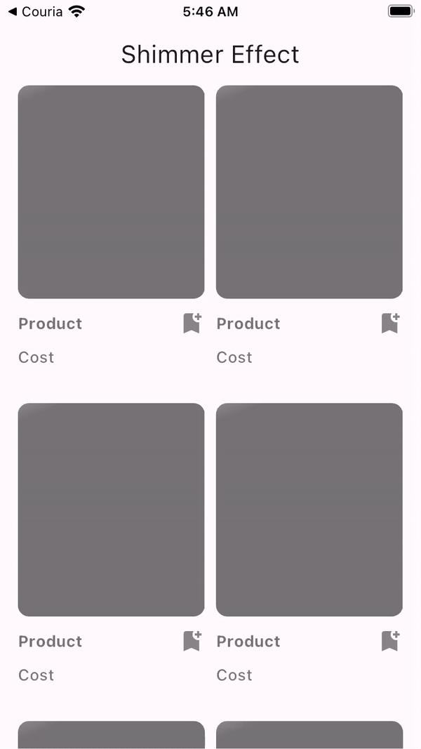
}In the code block above, we display our product items created earlier in a Grid view display in our newly created Home widget. The Home widget contains an appbar and a scrollable column that contains our product items in a grid view.
Finally, head over to the main.dart file in the lib\ folder and update the entire code with the one below.
import 'package:flutter/material.dart';
import 'package:shimmer_demo/home.dart';

void main() {
 runApp(const MyApp());
}

class MyApp extends StatelessWidget {
 const MyApp({super.key});

 // This widget is the root of your application.
 @override
 Widget build(BuildContext context) {
   return MaterialApp(
     title: 'Shimmer Demo App',
     debugShowCheckedModeBanner: false,
     theme: ThemeData(
       colorScheme: ColorScheme.fromSeed(seedColor: Colors.deepPurple),
       useMaterial3: true,
     ),
     home: const HomeScreen(),
   );
 }
}
The code above is a clean-up version of the former main.dart code. In this version, we’ve removed all the comments, imported and used the HomeScreeen widget as our home route. Finally, we’ve removed the debug mode banner by setting the debugShowCheckedModeBanner to false.
With all these changes done correctly, run the command below to see a preview of the application on a simulator, emulator, or physical device.
flutter run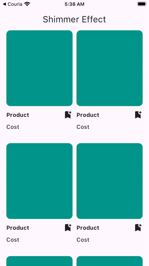
Experimenting a bit
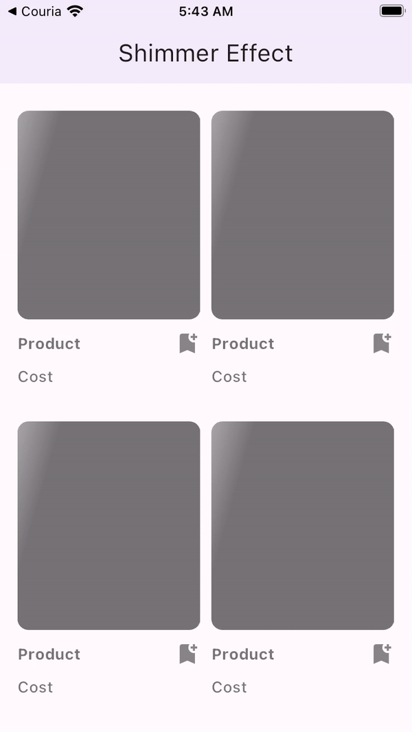
Now that we’ve set up our User Interface set up, let’s go ahead and experiment with the Shimmer effect on it. Head over to the home.dart file and import the Shimmer package at the top of the file.
import 'package:shimmer/shimmer.dart';Next, update the _buildProduct() widget function with the one below.
Widget _buildProduct() => GridView.builder(
shrinkWrap: true,
physics: const NeverScrollableScrollPhysics(),
itemCount: 6,
itemBuilder: (context, index) => Shimmer.fromColors(
baseColor: Colors.black54,
highlightColor: Colors.black12,
child: const Items()),
gridDelegate: const SliverGridDelegateWithFixedCrossAxisCount(
crossAxisCount: 2,
crossAxisSpacing: 10,
childAspectRatio: 1 / 1.7,
),
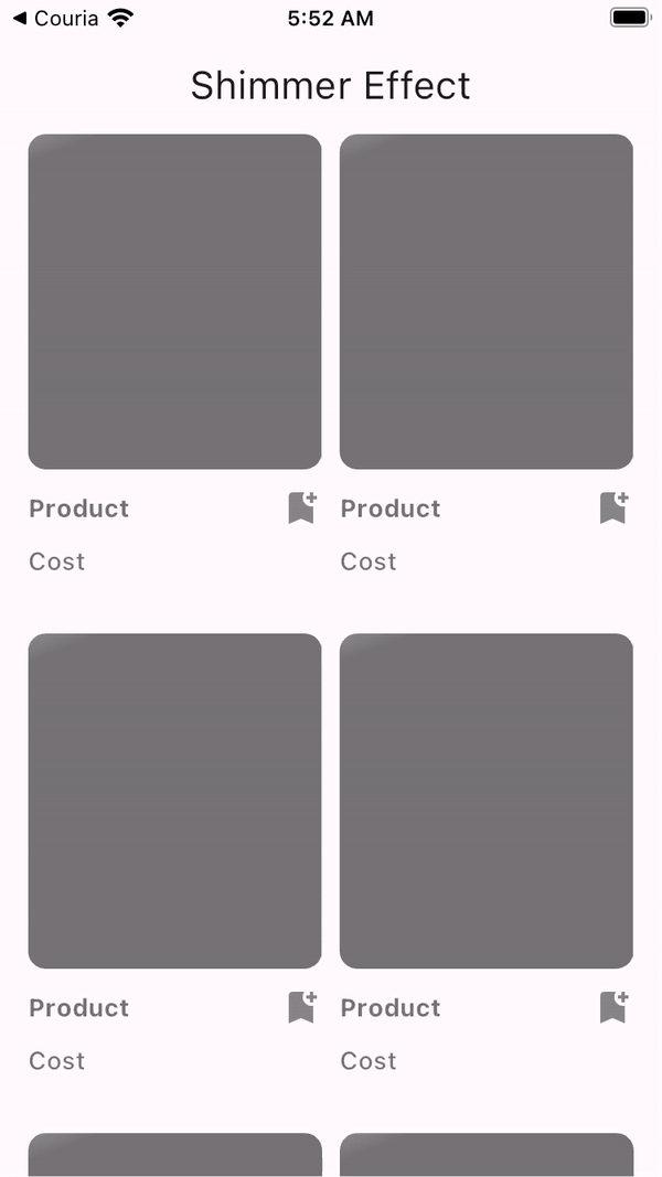
);In the code above, we wrapped the Items() with the shimmer widget as a parent widget. We also provided the shimmer widget with a base and highlight color in different shades of black.
Reloading the application gives us the result below.
The Shimmer Package provides some customizable features for the Shimmer widget. In this section, we’ll be looking into other features that the Shimmer package has to offer.
Shimmer direction
From the example above, the moving shimmering effect goes from left to right. But this can be changed by your choice of direction ranging from left-to-right (ltr), right-to-left (rtl), top-to-bottom (ttb), and bottom-to-top (btt). To see this in action, update the _buildProduct() widget function with the code below.
Widget _buildProduct() => GridView.builder(
shrinkWrap: true,
physics: const NeverScrollableScrollPhysics(),
itemCount: 6,
itemBuilder: (context, index) => Shimmer.fromColors(
baseColor: Colors.black54,
highlightColor: Colors.black12,
direction: ShimmerDirection.ttb, // added direction
child: const Items()),
gridDelegate: const SliverGridDelegateWithFixedCrossAxisCount(
crossAxisCount: 2,
crossAxisSpacing: 10,
childAspectRatio: 1 / 1.7,
),
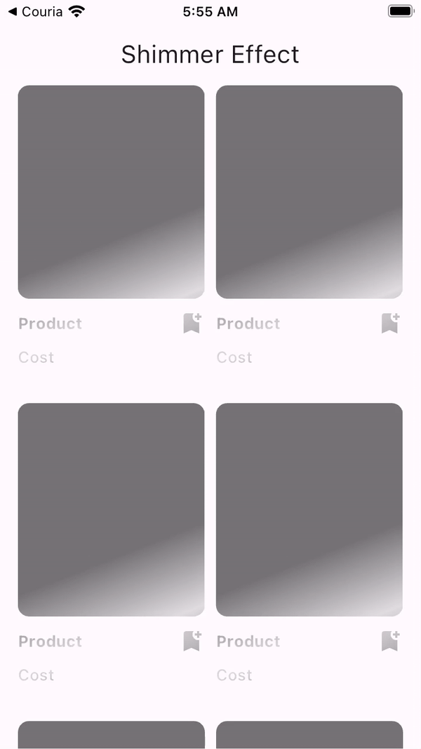
);In the code block above, we’ve updated the animation direction to start from the top to the bottom.
Shimmer Loop
Not only can the direction be changed, but the number of animating movements can be controlled. This can be controlled using integers ranging from 0 being the infinity looping to any specific integer. Update the _buildProduct() widget function by adding the loop property.
Widget _buildProduct() => GridView.builder(
     shrinkWrap: true,
     physics: const NeverScrollableScrollPhysics(),
     itemCount: 6,
     itemBuilder: (context, index) => Shimmer.fromColors(
         baseColor: Colors.black54,
         highlightColor: Colors.black12,
         direction: ShimmerDirection.ttb,
         loop: 2, //added loop
         child: const Items()),
     gridDelegate: const SliverGridDelegateWithFixedCrossAxisCount(
       crossAxisCount: 2,
       crossAxisSpacing: 10,
       childAspectRatio: 1 / 1.7,
     ),
   );
In the code above, we’ve restricted the animation movement to 2.
Shimmer Duration
The duration of the shimmering animation can be controlled, thus controlling the speed at which it moves. Update the _buildProduct() widget function by adding the period property.
Widget _buildProduct() => GridView.builder(
     shrinkWrap: true,
     physics: const NeverScrollableScrollPhysics(),
     itemCount: 6,
     itemBuilder: (context, index) => Shimmer.fromColors(
         baseColor: Colors.black54,
         highlightColor: Colors.black12,
         direction: ShimmerDirection.ttb,
         period: const Duration(milliseconds: 900), // added period
         child: const Items()),
     gridDelegate: const SliverGridDelegateWithFixedCrossAxisCount(
       crossAxisCount: 2,
       crossAxisSpacing: 10,
       childAspectRatio: 1 / 1.7,
     ),
   );
In the code block above, we’ve updated the shimmer animation loops’ duration. This can be seen in the example below.
Adding Shimmer Effects to Asynchronous Content
Shimmer Effects are mainly used in asynchronous content because they act as the perfect placeholders to fill in when the content is retrieved from the API. Another amazing fact about the Shimmer package is how it paints its child widget with the Shimmer effect, thus mimicking the original content to be displayed. In this section, we’ll improve our asynchronous content user experience by adding the Shimmer effect when the items are being fetched.
To begin, clone the starter project from GitHub, and run the command below in the project directory.
flutter pub get && flutter runThe command above will download the necessary dependencies and run the project in a simulator, emulator, or physical device connected to the code editor.
Below is a preview of the clone project.
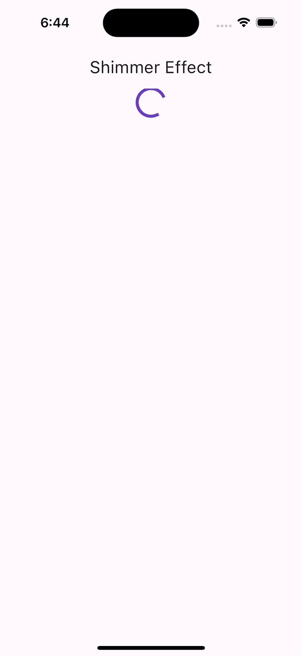
In the gif above, we perform an asynchronous action to fetch content from an API. A CircularProgressIndicator widget is used as a placeholder to await fetched content.
Let’s improve the user experience of this application by using a shimmer loading effect to mimic the contents of the application when it is loading.
First, install the Shimmer package using the below command.
flutter pub add shimmerNext, create a file in the lib\ folder named product_shimmer.dart and paste the code below.
import 'package:flutter/material.dart';

class ProductShimmer extends StatelessWidget {
 const ProductShimmer({super.key});

 @override
 Widget build(BuildContext context) {
   return Column(
     crossAxisAlignment: CrossAxisAlignment.start,
     mainAxisAlignment: MainAxisAlignment.start,
     children: [
       Container(
         height: 190,
         width: 200,
         decoration: BoxDecoration(
           borderRadius: BorderRadius.circular(10),
           color: Colors.teal,
         ),
       ),
       const SizedBox(height: 10),
       const Row(
         mainAxisAlignment: MainAxisAlignment.spaceBetween,
         children: <Widget>[
           Expanded(
             child: Text(
               'Contents here Contents here Contents here',
               style: TextStyle(fontSize: 14, fontWeight: FontWeight.bold),
             ),
           ),
           SizedBox(width: 5),
           Icon(Icons.bookmark_add),
         ],
       ),
       const SizedBox(height: 8),
       const Text(
         '0',
         style: TextStyle(fontSize: 14, fontWeight: FontWeight.w500),
       ),
     ],
   );
 }
}
The code above is a mimicry of the individual content of the Home screen.
Next, head to the home.dart file and paste the code below into the _HomeScreenState.
Widget _buildProductShimmer() => GridView.builder(
     shrinkWrap: true,
     physics: const NeverScrollableScrollPhysics(),
     itemCount: 6,
     itemBuilder: (context, index) {
       return Shimmer.fromColors(
           baseColor: Colors.black54,
           highlightColor: Colors.black12,
           direction: ShimmerDirection.ttb,
           period: const Duration(milliseconds: 800),
           child: const ProductShimmer());
     },
     gridDelegate: const SliverGridDelegateWithFixedCrossAxisCount(
       crossAxisCount: 2,
       crossAxisSpacing: 10,
       childAspectRatio: 1 / 2,
     ),
   );
In the code block above, we’re populating the screen with the ProductShimmer, wrapped with the Shimmer widget from the Shimmer package. We’ve also customized the Shimmer widget by defining our duration, period, and direction. The code above mimics the grid view with the populated contents.
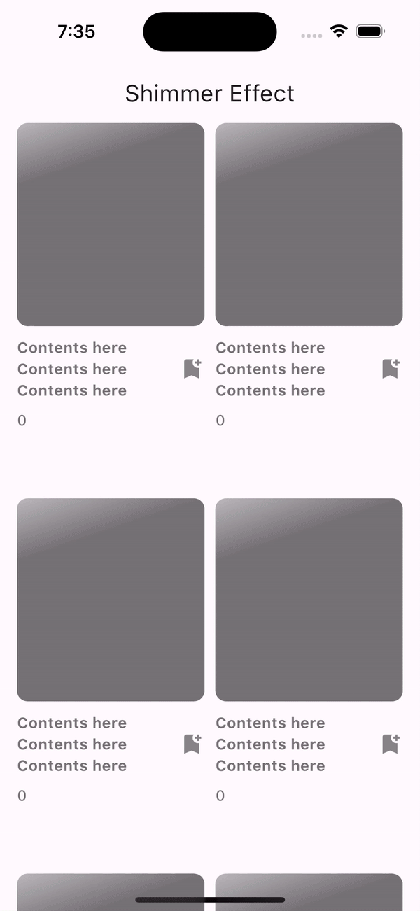
Finally, update the ternary statement by displaying the _buildProductShimmer() widget in place of the Circular progress indicator.
Column(
 mainAxisAlignment: MainAxisAlignment.center,
 children: [
   isLoading ? _buildProductShimmer() : _buildProduct(),
 ],
),
With all the steps followed accurately, we should have an end product like the gif below.
Conclusion
Based on the demo app above, the Shimmer package has proven to be effective, intuitive, and a beautiful placeholder when performing asynchronous calls. It has also created a significant difference between itself and the default Circular progress indicator when boosting the user’s experience of an application.
Here is the Link to the complete Asynchronous code source on GitHub.
Truly understand users experience
See every user interaction, feel every frustration and track all hesitations with OpenReplay — the open-source digital experience platform. It can be self-hosted in minutes, giving you complete control over your customer data.
Star on GitHub12k