Dynamic Multi-step Forms with Formik

Forms represent a document section used to capture user input. A robust form component not only contains input fields but also handles the form state, validation, error handling, and form submission. Formik is an open-source React form library used to build scalable form components ranging from simple to complex with less boilerplate and ease. In this article, you will learn how Formik works and how to build a complex multi-step React form with dynamic input fields.
What is Formik?
Formik is a free, open-source React and React Native form library used to build form fields with less boilerplate while handling form procedures by:
- Managing form state.
- Form submission.
- Form validation and display of error messages.
If you are familiar with React and forms, you can do each of the mentioned tasks on your own. However, Formik handles this entire method in a scalable, high-performing, and simpler manner. Building forms of all complexity levels will be a breeze with Formik.
Behind the scenes, Formik is just plain React state and props, nothing extra. This makes the form component you build with Formik easy to debug and test.
Building a Complex Formik Form
In this section, you will learn how to use Formik advanced component features such as <FieldArray/> to build a complex form.
The first step is to create the react project. Run the commands below in your terminal to create a project and install the needed dependencies:
npx create-react-app formik-project
cd formik-project
npm install formik yup @mui/material @emotion/react @emotion/styled formik-material-ui
npm start
Formik offers React Context powered components: <Formik />, <Form />, <Field />, and <ErrorMessage />. These components use React Context to connect with the form state/methods and make the form boilerplate less complex.
Head on to src/App.js and modify it with the code block below:
import React from "react";
import { Formik, Form, Field } from "formik";
import { Container, Card, CardContent, Typography, Grid, Button } from "@mui/material";
import { TextField } from "formik-material-ui";

const App = () => {
  return (
    <Container sx={{ bgcolor: "#87c1ff4d", paddingY: 3, marginTop: 5 }}>
      <Typography variant="h3" align="center" component="h2">
        Formik Form
      </Typography>
      <Card sx={{ marginTop: 2 }}>
        <CardContent sx={{ paddingY: 10, paddingX: 5 }}>
          <Formik>
            <Form>
              <Grid container spacing={2}>
                <Grid item md={6}>
                  <Field fullWidth name="firstname" component={TextField} label="First Name" />
                </Grid>
                <Grid item md={6}>
                  <Field fullWidth name="lastname" component={TextField} label="Last Name" />
                </Grid>
              </Grid>
              <Grid container spacing={2}>
                <Grid item xs={12}>
                  <Typography variant="h6" component="h2">
                    Add Social Links
                  </Typography>
                </Grid>
                  <Grid item md={5}>
                    <Field fullWidth name="linkname" component={TextField} label="Link Name" />
                  </Grid>
                  <Grid item md={5}>
                    <Field fullWidth name="linkurl" component={TextField} label="Link URL" />
                  </Grid>
                  <Grid item md={2}>
                    <Button variant="outlined" color="error">
                      Delete
                    </Button>
                  </Grid>
                <Grid item>
                  <Button variant="outlined" >Add Link</Button>
                </Grid>
              </Grid>
            </Form>
          </Formik>
        </CardContent>
      </Card>
    </Container>
  );
};

export default App;
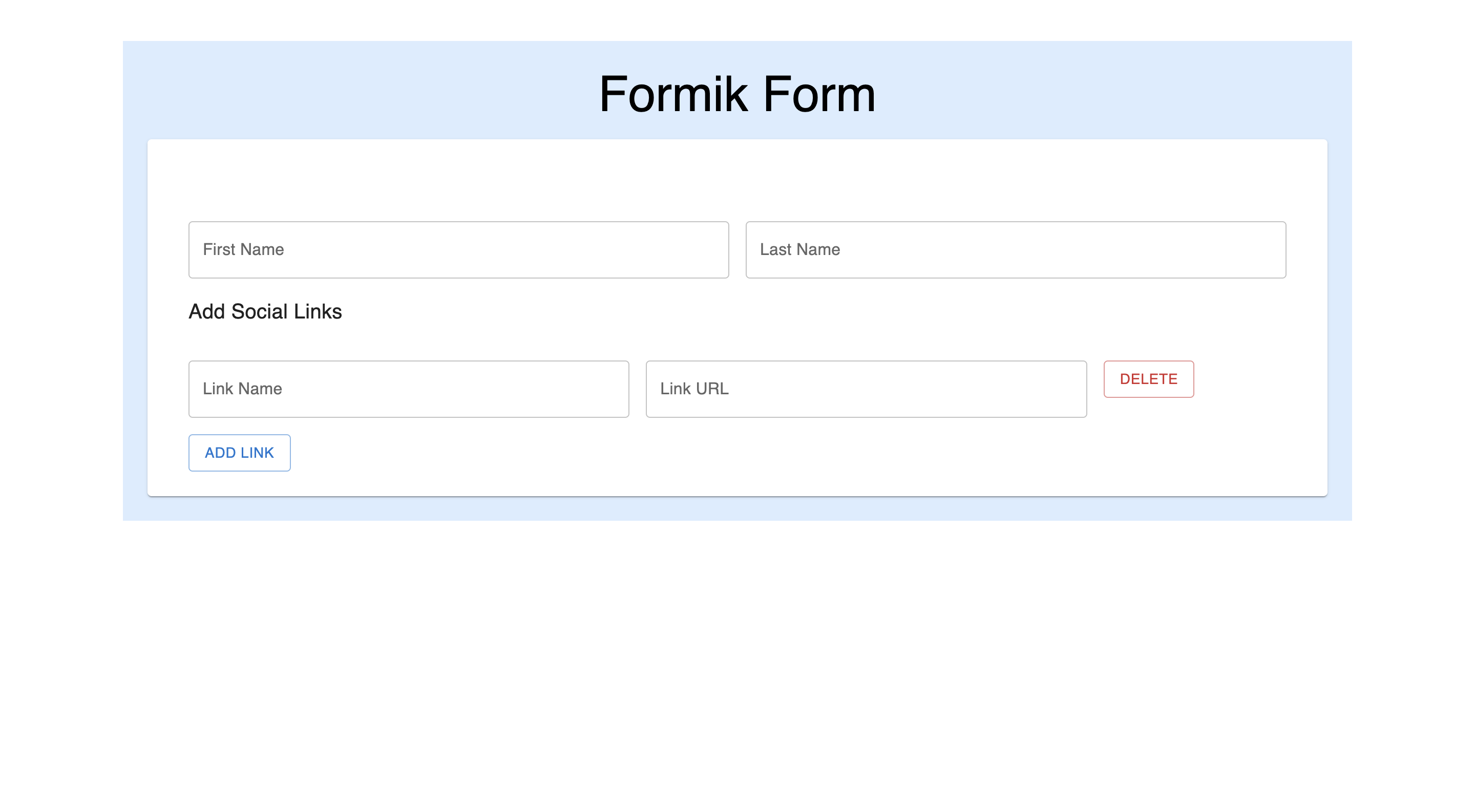
You should have a simple form on localhost:3000:
Open Source Session Replay
OpenReplay is an open-source, session replay suite that lets you see what users do on your web app, helping you troubleshoot issues faster. OpenReplay is self-hosted for full control over your data.

Start enjoying your debugging experience - start using OpenReplay for free.
Building a Custom Form Stepper
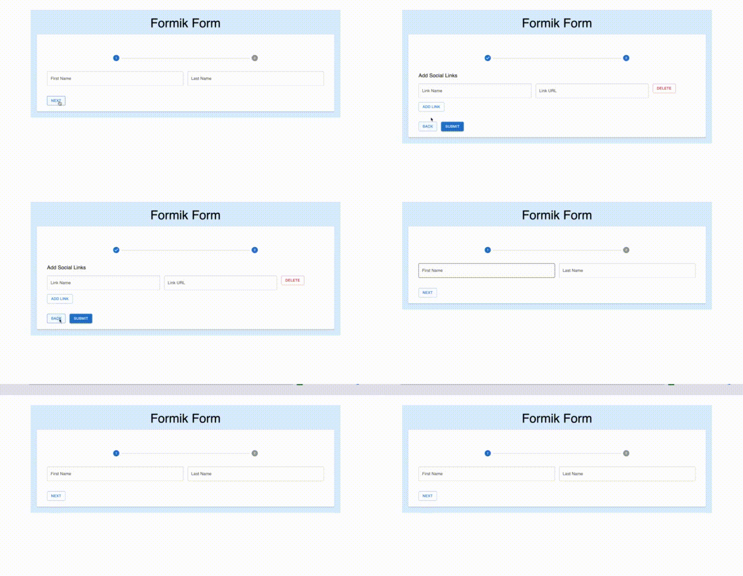
The goal is to divide the form into a two-step form, create a new file src/FormStepper.jsx, and paste the code block below to create a custom stepper component:
import React, { useState } from "react";
import { Form } from "formik";
import { Button, Stack, Step, StepLabel, Stepper } from "@mui/material";

export const FormStepper = ({ children }) => {
  const stepsArray = React.Children.toArray(children);
  const [step, setStep] = useState(0);
  const currentStep = stepsArray[step];

  return (
    <Form>
      <Stepper alternativeLabel activeStep={step} sx={{ marginBottom: 5 }}>
        {stepsArray.map((child, index) => (
          <Step key={child.props.label} completed={step > index}>
            <StepLabel>{child.props.label}</StepLabel>
          </Step>
        ))}
      </Stepper>
      {currentStep}
      <Stack direction="row" spacing={2} sx={{ marginTop: 5 }}>
        <Button
          variant="outlined"
          onClick={() => {
            step === 0 ? setStep(1) : setStep(0);
          }}
        >
          {step === 0 ? "Next" : "Back"}
        </Button>
        {step === 1 && (
          <Button variant="contained" type="submit">
            Submit
          </Button>
        )}
      </Stack>
    </Form>
  );
};
This component will be the wrapper of the form created in src/App.js and will show one step at a time. Head on to src/App.js and replace the <Form> component with the new <FormStepper> component:
import { FormStepper } from "./FormStepper"; // new import

const App = () => {
  return (
      <Formik>
         <FormStepper>
          {/* The rest of the form components goes here */}
         </FormStepper>
      </Formik>
)}
Dynamic Form Field List
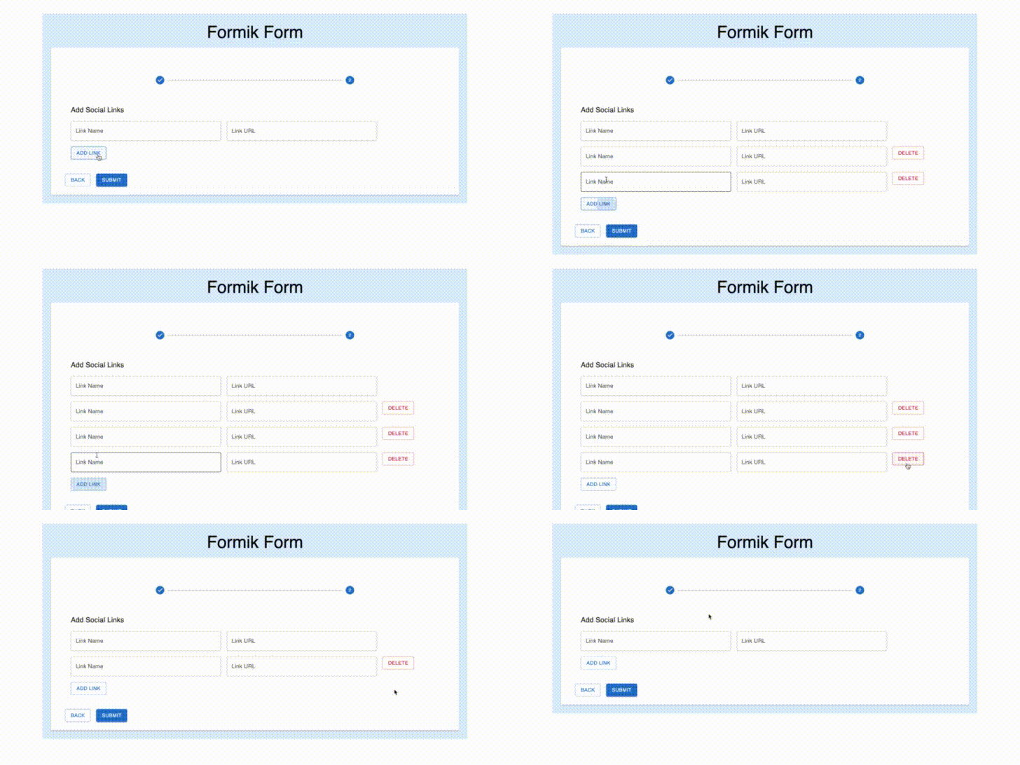
The next feat is to make the social links <Field/> a dynamic list. To do this, import <FieldArray /> from Formik. Update src/App.js with the code block below:
import React from "react";
import { Formik, Field, FieldArray } from "formik";
import { Container, Card, CardContent, Typography, Grid, Button } from "@mui/material";
import { TextField } from "formik-material-ui";
import { FormStepper } from "./FormStepper";

const App = () => {
  const linksGroup = { linkname: "", linkurl: "" };

  return (
    <Container sx={{ bgcolor: "#87c1ff4d", paddingY: 3, marginTop: 5 }}>
      <Typography variant="h3" align="center" component="h2">
        Formik Form
      </Typography>
      <Card sx={{ marginTop: 2 }}>
        <CardContent sx={{ paddingY: 10, paddingX: 5 }}>
          <Formik
            initialValues={{
              firstname: "",
              lastname: "",
              links: [linksGroup],
            }}
            onSubmit={async (values, actions) => {
              alert(JSON.stringify(values, null, 2));
            }}
          >
            {({ values }) => (
              <FormStepper>
                <Grid container spacing={2}>
                  <Grid item md={6}>
                    <Field fullWidth name="firstname" component={TextField} label="First Name" />
                  </Grid>
                  <Grid item md={6}>
                    <Field fullWidth name="lastname" component={TextField} label="Last Name" />
                  </Grid>
                </Grid>
                <FieldArray name="links">
                  {({ push, remove }) => (
                    <Grid container spacing={2} sx={{ marginTop: 2, paddingX: 2 }}>
                      <Grid item xs={12}>
                        <Typography variant="h6" component="h2">
                          Add Social Links
                        </Typography>
                      </Grid>
                      {values.links.map((_, index) => (
                        <>
                          <Grid item md={5}>
                            <Field fullWidth name={`links.${index}.linkname`} component={TextField} label="Link Name" />
                          </Grid>
                          <Grid item md={5}>
                            <Field fullWidth name={`links.${index}.linkurl`} component={TextField} label="Link URL" />
                          </Grid>
                          {index > 0 && (
                            <Grid item md={2}>
                              <Button variant="outlined" color="error" onClick={() => remove(index)}>
                                Delete
                              </Button>
                            </Grid>
                          )}
                        </>
                      ))}{" "}
                      <Grid item xs={12}>
                        <Button variant="outlined" onClick={() => push(linksGroup)}>
                          Add Link
                        </Button>
                      </Grid>
                    </Grid>
                  )}
                </FieldArray>
              </FormStepper>
            )}
          </Formik>
        </CardContent>
      </Card>
    </Container>
  );
};

export default App;
<FieldArray /> is a component that helps with array or list manipulation. It receives a name property that contains the path to the key in values, which holds the necessary array. Through props, the component grants you access to array helper methods. In the code block above, the push and remove methods are used to add and remove elements from the links array.
Add Validations
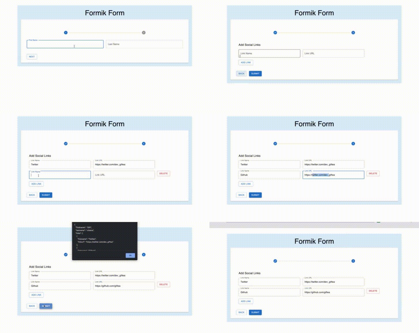
Now that the form component has all the desired functionalities, it is time to add validations. Yup will be used to add validations. Import the following from the yup library into src/App.js:
import { array, object, string } from "yup"; // new importThe Formik component receives a validationSchema prop, which is an object containing validations for the form fields. Copy and paste the code block below and add it as a prop to the Formik component.
validationSchema={object({
    firstname: string().required("First Name is required"),
    lastname: string().required("Last Name is required"),
    links: array(
    object({
       linkname: string().required("Link Name is required"),
       linkurl: string().required("Link URL is required"),
       })
       ),
})}
Conclusion
Formik has proven to be a reliable, scalable, and high-performant react library for creating forms, with over 2m downloads in the last year. In this article, a complex form was built. Formik offers flexibility and allowed us to build a custom form stepper component. Yup works well with Formik, and custom validations can be used too.
Visit the Github Link and Live Link to the project built in this article.
Resources
A TIP FROM THE EDITOR: For more on the usage of Formik, don’t miss our Better Form Validation in React with Formik article.

