Effective Call-To-Action (CTA) Strategies


Calls to action could make or break the success of any social media campaign. In any social media marketing strategy, a call to action (CTA) is one of the ways of boosting sales and propelling the business to success, if done correctly. This article will show the best ways to implement CTAs and create successful websites.
A call to action (CTA) is a marketing term for any design that encourages or prompts an instant response and immediate sale. Most often, a CTA refers to the use of words or phrases that are catchy and could be integrated into advertising messages, web pages, and sales scripts, which compel an audience to act. Furthermore, a CTA is a prompt in the form of a brief phrase on email, website, or other content that encourages visitors to take some desired action.
Take a look at an example.

CTAs guide visitors through the purchasing journey and directly impact conversion rates. A truly effective call-to-action does wonders when it comes to drawing the attention of website visitors, piquing their interest, and guiding them through the signup process.
CTAs Boost Conversion Rates
Call-to-actions could boost web conversion rates, especially when situated in strategic places on web pages.
- Pop-ups boost up to 6 percent conversion rates
- A CTA at the end of a post could create a 1.5 conversion increase rate
- A feature box or a full-width opt-in box or email could generate 3 to 9 percent rates of conversion
- Welcome gates, full-screen CTAs that pop up before readers see the content could boost conversion rates from 10 to 25 percent
A great offer is not enough if the reader does not know how to respond. The following are some effective CTA strategies that could be used right now to boost customer data capture, inquiries, and sales.
CTAs in the Right Places
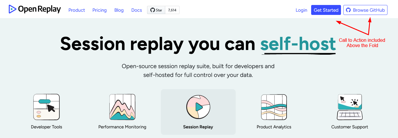
A CTA should be included above the fold on the first page of your sales letter, website, or other content. Originally, the term came from the newspaper industry, in which the most important headlines and news were located at the top of the page and would be visible when the papers were folded. Moreover, a CTA above the fold can be seen immediately without scrolling. An example would be: ‘Learn More’ or ‘Get Started’.
Here’s an example showing how CTA is included above the fold.
Another way of putting a CTA would be in the margin, such as an offer or a signup button alongside the content where readers will see it. A CTA could also be put above the footer. The call to action could be a good anchor for your page when put on the end of the page, providing a reason for visitors to take action while the information is still fresh on their minds.
Hard-to-find or hidden CTAs will never benefit you or your potential customer. The page’s layout should ensure easy-to-find CTAs. Make sure to tuck your CTAs beside small-text telephone numbers or make them only available after several searching or clicks.
Strong Action Verbs
A strong and short call to action is not only persuasive, but it’s also necessary because of the limit of characters in advertisements. Consider starting with a verb, such as ‘buy,’ and follow it with an adverb, such as ‘now’ or a subject, like, for example, ‘eBook’ or both. Often, copywriters build a good call to action using persuasive language.
Your words should convince people to follow you. The CTA copy should be concise to create intrigue and make the audience want to learn more. Furthermore, create a value proposition, such as making an incentive that benefits them, such as lower rates of money savings.
Some of the most common call-to-action verbs are the following:
- Shop
- Order
- Buy
- Save
- Pick
- View
- Add to cart
- Subscribe
- Sign up
- Try
- Get started
Here’s an example showing how this can be used:

Mix with Emotions
Keep in mind that in advertising, emotions play a critical role. To provoke an emotional response, opt for a longer call to action. Consider integrating more modifiers to achieve the desired effect.
To provoke an emotional response from users, go for a longer call to action. You have to integrate more modifiers to achieve the desired effect. Some examples of calls to action that provoke emotion include the following:
- Numbers: Get 50% off if you purchase now
- Promise: Guaranteed weight loss in just six weeks
- Adjectives: Find the home of your dreams with us!
- Play up the USP: Order a hand-made soap today!
- Influence the FOMO: Limited offer. Free Shipping!
You could also make up your own with your creative juices. Verbalize what your business does for the customers, or you could review your mission statement. The next step would be transforming the verbs into a 2–5-word CTA. If necessary, add relevant information, such as ‘treat yourself today’ and so on.
Here’s an example showing how this can be used:

Create a Sense of Urgency
Viewers are easily distracted due to too much noise in everyday life and online. Including a sense of immediacy or urgency in your call to action could move viewers to take immediate action rather than letting a distraction move them away from what you offer. Urgent words could help persuade the audience to take action.
You could use numbers or percentages to show how many items are left or how many have already claimed your offer. Words like ‘limited’ or ‘exclusive’ convey a sense of uniqueness. Creating urgency is all about making the target audience feel that they could not miss out. Build a sense of urgency by highlighting that the offer is selling fast through social proof or that many people are taking advantage of the offer. Furthermore, explain what your audience could be missing out if they don’t act immediately. A good example would be: If you don’t purchase now, you may have to pay full price later.
The words’ limited time offer’ convey a sense of urgency to respond immediately. Phrases such as ‘last chance’ or ‘once in a lifetime’ could emphasize the relevance of your offering. Nevertheless, ensure not to create false scarcity, make it too vague, or use it in every call-to-action. This could damage your trust and credibility to a great extent.
Here’s an example of how Limited Time Offer can be used in CTA:

Design that Catches the Eye
Your design should capture the attention of site visitors. Furthermore, to capture viewers’ attention, consider the call-to-action design. Consider using a different color for the CTA text. You could also use a brightly colored button to catch the eye. This could make your CTA easier to find.
Another key to an eye-catching design is to put it on an email or a page. The call-to-action could be on the closing statement of a blog, strategically placed within an email, or on the side panel button on a webpage. The key is to build high visibility, like surrounding the CTA with white space to make it stand out.
CTAs should stand out and create an impact. Refrain from following the standard rules in design when crafting your CTA image or button. Moreover, it should not blend in with the rest of the page design. Combine several elements that match your style, like brand colors and fonts. A highly contrasting design makes for an eye-catching CTA.

Session Replay for Developers
Uncover frustrations, understand bugs and fix slowdowns like never before with OpenReplay — an open-source session replay tool for developers. Self-host it in minutes, and have complete control over your customer data. Check our GitHub repo and join the thousands of developers in our community.
Free Trial Offering
When you have a product that’s second to none, free trials work. Furthermore, if you can effectively solve a user’s issue or boost their efficiency with free trials, expect big conversions to full services. Remember that people love to experience or try things before making a purchase.
Notice how there are always free samples in supermarkets. This is the same idea as a free trial. People will test it before buying and will realize they need it. Great examples would be:
- Free exclusive traffic tips
- Start a 7-day free trial
- Get 30 days free
- Get started—it’s free!
- Get a free savings assessment
Include a link to a free trial in your ‘Free Trial’ section. If you have an event coming up, you can use the call-to-action to direct users to your landing page or direct them to connect with the sales team.
Here’s an example of the same:

Take Advantage of FOMO
FOMO is short for Fear of Missing Out. This is an extremely effective motivator. When visitors think they could lose out on a chance that might not happen again, they will be very quick to hop on the bandwagon. In your call-to-action, one of the best uses of FOMO is to mention a promotion or sale that your brand is offering and won’t last forever.
Some fine examples would be:
- Buy now while supplies last
- Sales end on Friday!
- Shop today!
- 24 Hours Only
These are particularly effective during the holidays. It’s difficult to ignore a prompt like those mentioned above. The same as provoking enthusiasm, provoking fear or missing out in the call-to-action is a surefire way of getting more clicks.
Here’s an example:

Conclusion
For any web page, a call-to-action is an important aspect. Furthermore, CTA buttons and links serve as signposts that tell users what to do next. Without clear CTAs, users could find it difficult to see how to purchase a product or sign up for a service. Thus, a great call-to-action is paramount in boosting your brand, boosting conversion, and keeping your business in the hearts and minds of your target audience.
Gain Debugging Superpowers
Unleash the power of session replay to reproduce bugs and track user frustrations. Get complete visibility into your frontend with OpenReplay, the most advanced open-source session replay tool for developers.