Exploring CSS @-rules
As a web designer using CSS, you have likely encountered directives or block-level rules that start with the ”@” symbol. These are called CSS At-rules, which provide instructions on how CSS should behave. A typical example is the
@mediaquery for designing responsive web layouts. However,@mediais one common example. This article will explore the various at-rules, focusing on some of the most important ones and their use cases.

Discover how at OpenReplay.com.
Learning CSS At-rules opens doors to more advanced development.
They allow you to achieve effects and functionalities that are impossible with just basic CSS selectors. For instance, you can create smooth animations with @keyframes.
At-rule like @media query enables the creation of responsive designs that adapt to various screen sizes and devices, providing a consistent, user-friendly experience across different platforms.
They help maintain modularity and organize your CSS architecture.
There are many reasons to learn these rules. I gave a quick summary above, but as you read the article, you will discover why they are essential.
Types of CSS At-Rules
CSS At-rules can be categorized into two main types: directives and block CSS At-rules. All available rules are detailed in the MDN documentation.
Directives CSS At-Rules
Directives CSS At-rules set the foundational styling parameters. They define styles across different elements and components within a stylesheet and should be placed at the top before all other CSS attributes and properties.
Below is its General syntax:
@identifier "rule";The documentation contains many directives CSS At-rules, but this article will only explore the @import rule because of its high importance.
@import
The @import rule imports external stylesheets into a CSS file. It can be used to split large stylesheets into smaller ones suitable for modularization and organization. The imported stylesheets are fetched sequentially, which may impact page loading performance.
The @import rule must be placed at the top of the CSS file before other CSS rules.
The basic syntax of @import:
@import url('path/to/stylesheet.css');The URL (uniform resource locator) specifies the path to the external stylesheet you want to import.
The @import rule is supported in all browsers.
Use Case
In this example, we would import the following external stylesheets, header.css and paragraph.css, into a main stylesheet, style.css, to style the HTML page below.
<!DOCTYPE html>
<html lang="en">
  <head>
    <meta charset="UTF-8" />
    <meta name="viewport" content="width=device-width, initial-scale=1.0" />
    <meta http-equiv="X-UA-Compatible" content="ie=edge" />
    <title>HTML + CSS</title>
    <link rel="stylesheet" href="styles.css" />
  </head>
  <body>
    <h1>@import CSS at-rule</h1>
    <p>The @import rule is used to import external stylesheet in a CSS file.</p>
  </body>
</html>
Below is the code for the header.css
h1 {
  text-decoration: underline;
  color: tomato;
}
Below is the code for the paragraph.css
p {
  color: navy;
}
We would import these external stylesheets into the only linked stylesheet, styles.css.
@import url(header.css);
@import url(paragraph.css);

/* Additional styles can be added here */
body {
  font-family: Arial, sans-serif;
  margin: 20px;
}
Below is the output:
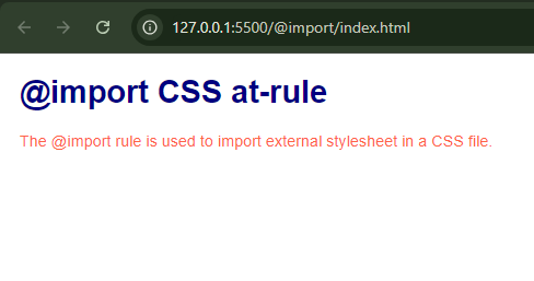
If you study the code blocks and the output above, you will notice that the only linked stylesheet is styles.css and how this rule is used to import external CSS files into it, carefully placing the rule at the beginning of the stylesheet.
As seen in this example, you will understand why I mentioned that this rule is useful for large projects where styles need to be segmented into different files for better maintenance and readability.
For more details, refer to the MDN documentation.
Block CSS At-Rules
As the name implies, they are CSS At-rules containing a block statement represented by curly braces "". These braces can include statements or other at-rules. Some block rules are conditional because they are applied within a specific condition.
General syntax:
/* standalone statements within a stylesheet */
@identifier {
  /* write your statements here*/
}
/* OR */

/* inside of a condition */
@identifier condition {
  /* statement go here */
}
Now, let’s explore the Block CSS At-rules that will help level up your design game.
@media
The @media rule is popularly known as media queries. It applies styles only when a specific media query condition is true. This is essential for responsive design, which allows you to tailor the appearance of your site to different devices and screen sizes.
The basic syntax for @media:
@media (media-feature) {
/* CSS rules go here */
}
The media-feature specifies the condition (e.g., min-width, max-width) that must be met for the styles to be applied.
The @media rule is supported in all modern browsers.
Use Case
In this example, we will create a simple HTML structure and apply different styles for smaller and larger screens using @media.
Below is the HTML code.
<!DOCTYPE html>
<html lang="en">
  <head>
    <meta charset="UTF-8" />
    <meta name="viewport" content="width=device-width, initial-scale=1.0" />
    <title>Responsive Design with @media CSS at-rule</title>
    <link rel="stylesheet" href="styles.css" />
  </head>
  <body>
    <div class="container">
      <div class="box">Blog 1</div>
      <div class="box">Blog 2</div>
      <div class="box">Blog 3</div>
    </div>
  </body>
</html>Let’s apply some styling to the HTML code and implement the media query to demonstrate its use.
body {
  font-family: Arial, sans-serif;
  background-color: white;
  margin: 0;
  padding: 0;
  display: flex;
  justify-content: center;
  align-items: center;
  height: 100vh;
}

.container {
  display: flex;
  flex-direction: row;
  justify-content: space-around;
  width: 80%;
}

.box {
  background-color: teal;
  color: white;
  padding: 20px;
  margin: 10px;
  text-align: center;
  flex: 1;
}

/* Media Query for screens 600px and below */
@media (max-width: 600px) {
  body {
    background-color: whitesmoke;
 }

  .container {
    flex-direction: column;
    align-items: center;
 }

  .box {
    background-color: gray;
    color: cyan;
    width: 100%;
    margin: 5px 0;
 }
}

/* Media Query for screens 360px and below */
@media (max-width: 360px) {
  .box {
    background-color: darkcyan;
    color: lightyellow;
 }
  .container {
    width: 60%;
 }
}
Note that you can add more media queries for different screen sizes, but the order in which they are arranged is important depending on the media feature you use.
For example, if you write your media queries using max-width, all your max-width media queries should be written in descending order. This is because max-width applies styles to screens of the specified width and below. On the other hand, if you choose to write your media queries using min-width, all your min-width media queries should be written in ascending order. This is because min-width applies styles to screens from the specified width and up.
As the example above shows, the max-width media queries are written in descending order, starting from the larger screens and moving to the smaller screens.
For a broader understanding of CSS media queries, refer to this article.
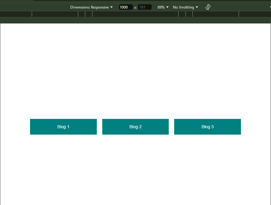
Below is the default output of this example:
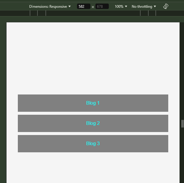
After applying media queries for smaller screens at 600px or below, this is the output:
Finally, after applying media queries for screens at 360px or below, this is the output:
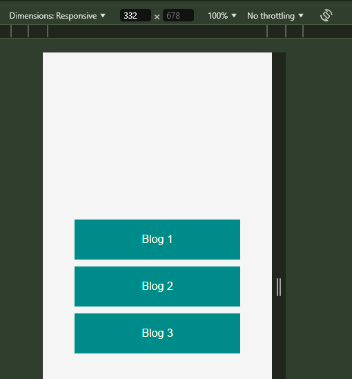
In this example, the @media rule is used to apply different styles based on the screen width, using max-width as the media feature. For screens smaller than 600px, the background color of the body changes to whitesmoke, the .container changes its flex-direction to column, and the .box class changes its background color and width. For screens smaller than 360px, the .box class changes its background color and text color, and the .container changes its width.
By arranging the media queries in this order, you ensure that the styles are applied as intended.
For more details, refer to the MDN documentation.
@supports
The @supports rule lets you write CSS that applies styles based on the browser’s support for specific CSS features or properties.
The basic syntax for @supports:
@supports (property: value) {
    /* CSS rules go here */
}
The property: value specifies the CSS property and value to check for support.
The @supports rule is well-supported across all modern browsers.
Use Case
In this example, we would use @supports to apply styles based on the browser’s support for display: grid and scroll-timeline.
Below is the HTML code.
<!DOCTYPE html>
<html lang="en">
  <head>
    <meta charset="UTF-8" />
    <meta name="viewport" content="width=device-width, initial-scale=1.0" />
    <title>HTML and CSS</title>
    <link rel="stylesheet" href="styles.css" />
  </head>
  <body>
    <h1>@supports CSS at-rule</h1>
    <p>This example will be used to demonstrate how @supports works</p>
  </body>
</html>
Below is the code for the CSS stylesheet:
@supports (display: grid) {
  p {
    font-size: 1rem;
    color: blue;
    display: grid;
    grid-template-columns: 1fr 1fr 1fr;
    gap: 10px;
 }
}
Below is the output:
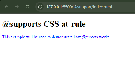
In this example, the styling applied to the paragraph tag will run because every modern browser supports display: grid.
The styling won’t be applied if you try using an abstract or an unsupported rule.
Let’s demonstrate this by using the @supports rule to check if the latest version of Chrome supports scroll-timeline.
Using the same HTML structure, let’s replace our stylesheet with this instead:
@supports (scroll-timeline: auto) {
  p {
    font-size: 1rem;
    color: green;
 scroll-timeline: auto;
 }
}
In this example, the paragraph will only turn green if the browser supports the scroll-timeline property. Since this property is not widely supported, the style changes will not be applied.
Below is the output:
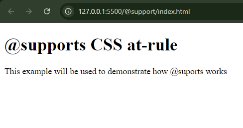
Alternatively, you can check which browsers support or do not support certain features by using websites like caniuse.com. But this rule is handy if you intend to check what your browser supports without referring to any website.
For more details, refer to the MDN documentation.
@keyframes
The @keyframes rule is the powerhouse of CSS animations. It defines our animations and tells CSS which properties to change, when, and how.
The basic syntax for @keyframes:
@keyframes animation-name {
 from {
    /* CSS properties */
 }
 to {
    /* CSS properties */
 }
}

/* or with percentage-based for more intermediate keyframes */

@keyframes animation-name {
 0% {
    /* CSS properties */
 }
 50% {
    /* CSS properties */
 }
 100% {
    /* CSS properties */
 }
}
where animation-name is the animation’s name, from and to are the keywords representing the animation’s starting (0%) and ending (100%) points. The percentage values (e.g., 0%, 50%, 100%) help define more intermediate values.
The @keyframes rule is supported in all modern browsers.
Use Case
In this example, we will create an animating box element that moves infinitely from left to right as its background color changes.
Below is the HTML code:
<!DOCTYPE html>
<html lang="en">
  <head>
    <meta charset="UTF-8" />
    <meta name="viewport" content="width=device-width, initial-scale=1.0" />
    <title>CSS Animations with @keyframes CSS at-rule</title>
    <link rel="stylesheet" href="styles.css" />
  </head>
  <body>
    <div class="box"></div>
  </body>
</html>
Below is the code for the CSS stylesheet:
body {
  display: flex;
  justify-content: center;
  align-items: center;
  height: 100vh;
  margin: 0;
  background-color: #f0f0f0;
}

.box {
  width: 100px;
  height: 100px;
  background-color: red;
  animation: colorBox 3s infinite;
}

@keyframes colorBox {
 0% {
    transform: translateX(0);
    background-color: red;
 }
 50% {
    transform: translateX(300px);
    background-color: blue;
 }
 100% {
    transform: translateX(0);
    background-color: yellow;
 }
}
Below is the output:

We used the animation property to apply the colorBox animation. The animation lasts 3 seconds (3s) and repeats infinitely (infinite).
Keyframes have many other important use cases, such as creating smooth transitions for hover effects, animating logos, and enhancing user interactions on web pages. Try implementing keyframes to make your web pages more interactive and visually appealing.
For more details, refer to the MDN documentation.
@layer
The @layer rule, also known as cascade layers, allows you to organize styles into named layers. These layers influence the order in which styles are applied and help resolve specificity conflicts. Before this rule, we relied on selector specificity or the !important flag to avoid conflicting styles, which is not advisable in larger projects.
The basic syntax for @layer:
@layer layer-name {
  /* CSS rules go here */
}
Note that the first declared layer gets the lowest priority, and the last gets the highest priority. Therefore, you can re-organize your layer declarations or set the order of the layers using the @layer directive, which follows this syntax:
@layer layer-name, layer-name, layer-name;Since this is a directive, it must be placed at the top of your stylesheet and before any @import statements and other block CSS At-rules. This ensures this rule is applied throughout the stylesheet and other imported stylesheets.
The @layer rule is supported in all modern browsers.
Use Case
In this example, we create a .btn class for all buttons. However, the Read more button does not inherit this styling, though it shares the same class name; this is because there is a conflicting style between the .btn selector and the selector that targets the anchor tags. Using the !important flag could solve this, but it would escalate the problem of conflicting styles in the future, resulting in a messy stylesheet full of !important flags.
Below is the HTML Code.
<!DOCTYPE html>
<html lang="en">
  <head>
    <meta charset="UTF-8" />
    <meta name="viewport" content="width=device-width, initial-scale=1.0" />
    <title>@layer rule</title>
    <link rel="stylesheet" href="styles.css" />
  </head>
  <body>
    <nav>
      <a href="#" class="btn">Login</a>
    </nav>

    <h2>Selector Specificity</h2>
    <main>
      <section class="main-content">
        <p>We will use `@layer` to resolve this styling conflict.</p>
        <a href="#" class="btn">Read More</a>
      </section>
    </main>
  </body>
</html>
Below is the code for the CSS Stylesheet:
/* layout */
body {
  margin: 0;
  max-width: 600px;
  margin: 0 auto;
  padding: 15px;
  background: whitesmoke;
}

/* content */
.main-content a {
  color: red;
  background: transparent;
  text-decoration: underline;
}

/* component */
.btn {
  background: blue;
  color: #fff;
  padding: 8px 12px;
  border-radius: 8px;
  text-decoration: none;
  display: inline-block;
}
Below is the output without using layers:
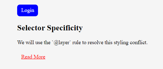
Let’s use the @layer rule to solve this selector specificity problem. Using the same HTML structure, let’s replace our stylesheet with this instead:
@layer layout {
  body {
    margin: 0;
    max-width: 600px;
    margin: 0 auto;
    padding: 15px;
    background: whitesmoke;
 }
}

@layer content {
  .main-content a {
    color: red;
    background: transparent;
    text-decoration: underline;
 }
}

@layer component {
  .btn {
    background: blue;
    color: #fff;
    padding: 8px 12px;
    border-radius: 8px;
    text-decoration: none;
    display: inline-block;
 }
}
Below is the output using layers:
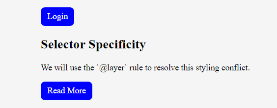
By organizing styles into layers, we ensure that the .btn class styles are applied correctly, resolving any specificity conflicts.
As mentioned earlier, you can further control the layer order by setting the arrangement using the @layer directive, which should be placed at the top of the stylesheet.
For example:
@layer layout, component, content;By using this directive you would ensure that content takes the highest priority, followed by layout, and then component.
Using the @layer rule, you can avoid specificity conflicts and maintain a clean, manageable stylesheet.
For more details, refer to the MDN documentation.
Conclusion
CSS At-rules enhances your ability to create flexible, responsive, and maintainable stylesheets. Throughout this article, we explored various at-rules and their practical applications in web development. You have learned how to use them to ensure that your stylesheets effectively deliver the desired visual outcomes and are easier to manage and scale as your projects grow. Now it’s time to elevate your web design skills and optimize your stylesheet using these at-rules.
Gain control over your UX
See how users are using your site as if you were sitting next to them, learn and iterate faster with OpenReplay. — the open-source session replay tool for developers. Self-host it in minutes, and have complete control over your customer data. Check our GitHub repo and join the thousands of developers in our community.


