Working with the latest Twitter Bootstrap
Learn the advantages of Bootstrap version 5.2.

Twitter Bootstrap is the best toolkit to create an excellent, fast, and responsive website for the whole universe. It is the most popular framework for creating mobile-first, front-end, and great websites for the universe. Bootstrap centers on collecting HTML and CCS plugins to style and structure a website faster. Bootstrap includes several pre-designed components we can add to a website, such as buttons, forms, and navigation menus. In addition, Bootstrap version 5.2 has a responsive grid that will allow the website to respond to the viewport, making it mobile-friendly for all to use. Twitter bootstrap is 100% free to download, and it comes with HTML, CSS, and Javascript plugins, ensuring that we can design great-looking websites.
Twitter Bootstrap v5.2
Bootstrap v5.2 is the most popular framework worldwide that we can use to build a responsive and customized website. The current version of Bootstrap is version 5.2; it includes many pre-designed plugins that we can fastly add to a website, like forms, buttons, menu navigation, etc. In addition, version 5.2 of Bootstrap has a new upgrade, like great support for CSS custom properties and fast accessibility. It equally added updates to existing features, such as the grid system. Finally, Bootstrap v5’s core goal is to make it significantly more effortless and efficient to create responsive, mobile-friendly websites and web applications for the whole universe.
Importance of working with Twitter Bootstrap v5.2
The importance of working with Twitter Bootstrap v5.2 is as follows:
- Excellent pre-styled Components: Bootstrap has superior pre-styled components that we can easily insert into the website, like the navigation bar, the form, and the table. This component helps us to create great websites.
- Responsive: Bootstrap helps a website adapt to different screen sizes and display appropriately on other devices. We can access a website with desktop computers, mobile phones, laptops, and tablets. It will automatically adjust its layout and design to suit your device’s screen for viewing the website, providing an excellent viewing experience. Even if you make the screen bigger or smaller, it will respond to the viewport.
- Large and active support community: Bootstrap v5 has a website that provides enough documentation and tutorials on how to use the framework and several examples we can use to start our projects. The bootstrap community is solid and active in solving any issue you may encounter while using Bootstrap. In addition, Bootstrap has a high support community that helps us find the help and resources we need while working with Bootstrap.
- Easy to learn and understand: Bootstrap is easy to learn once you know HTML, CSS, and JavaScript. You can visit the Bootstrap website to follow step-by-step instructions on how to use different features of Bootstrap, and following the steps in this article will help you to understand Bootstrap better.
- Highly Customizable: As a programmer, you can easily make changes and extend the framework as you wish. You can change the fonts or colors as you want to, allowing us to create a unique website.
- Speed up the development process: Bootstrap can speed up the development process because it provides several pre-designed components that will help you finish your projects quickly and not build the website from the beginning.
- Bootstrap is free and open source: Bootstrap is a free and open-source front-end framework that we can use to create websites and web applications. We do not pay money to use Bootstrap, and we can fastly download Bootstrap for free without having to pay any cash.
- Compatible with modern browsers: Bootstrap is consistent with browsers like Google Chrome, Firefox, Safari, and Internet Explorer. Once you build your website with Bootstrap, it will work across many browsers.
Installation and Set up
There are many ways to install and set up Bootstrap, but most importantly, you need access to a web server. The ways to install Bootstrap are:
- Manual downloading of the source files: You need to visit Bootstrap’s official website, getbootstrap.com, to download Bootstrap v5.2. Extract the downloaded file to your web server’s root directory, and you can now link to the Bootstrap CSS and JavaScript files in your HTML page
<head>section. - NPM Bootstrap installation method: Click here to download Bootstrap via the NPM method
- CDN method: Click here to download Bootstrap via the Content Delivery network method
Session Replay for Developers
Uncover frustrations, understand bugs and fix slowdowns like never before with OpenReplay — an open-source session replay tool for developers. Self-host it in minutes, and have complete control over your customer data. Check our GitHub repo and join the thousands of developers in our community.
Let us build a project!
For this article, I will be using Vs. Code as my code editor and Google Chrome as my browser. I will equally use the CDN Bootstrap installation, and to build a project with Twitter Bootstrap v5.2, you will need to follow the steps below:
<!doctype html>
<html lang="en">
<head>
  <meta charset="UTF-8">
  <meta http-equiv="X-UA-Compatible" content="IE=edge">
  <meta name="viewport" content="width=device-width, initial-scale=1.0">
  <title>Building a project with Twitter Bootstrap v5.2</title>
  <!-- CSS -->
<link href="https://cdn.jsdelivr.net/npm/bootstrap@5.2.0/dist/css/bootstrap.min.css" rel="stylesheet" integrity="sha384-gH2yIJqKdNHPEq0n4Mqa/HGKIhSkIHeL5AyhkYV8i59U5AR6csBvApHHNl/vI1Bx" crossorigin="anonymous">
<link rel="stylesheet" href="css/styles.css">
  </head>
<body>
  <h1>Hello OpenReplay World</h1>
  <!-- Js -->
<script src="https://cdn.jsdelivr.net/npm/bootstrap@5.2.0/dist/js/bootstrap.bundle.min.js" integrity="sha384-A3rJD856KowSb7dwlZdYEkO39Gagi7vIsF0jrRAoQmDKKtQBHUuLZ9AsSv4jD4Xa" crossorigin="anonymous"></script>
</body>
</html>
The code above shows that I used the CDN method to install Bootstrap. The title I used is “Creating a project with Twitter Bootstrap v5.2,” and on the body, I have the
Hello OpenReplay World
. I added the CSS link after the title and the JS link after the body. To verify that you installed Bootstrap well, Kindly right-click on the Chrome browser and click on network. Once you click on “network,” you reload to see the bootstrap bundle, which indicates that you installed Bootstrap very well. With these, you are good to start building your projects. The outcome of the code above:
The screenshot above shows that I installed Bootstrap very well and used external CSS to style it.
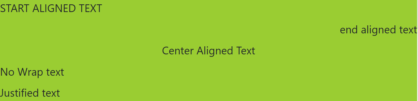
- Alignment: Alignment means arranging in a line, but alignment in Bootstrap involves positioning elements horizontally on a web page, and it only affects table cell elements, inline-block, inline-table and inline. You can easily use the text-* classes to start align-text, end align-text, center align-text, no-wrap text, and justified text as you wish.
<p class="text-start text-uppercase">start aligned text</p>
<p class="text-end text-lowercase">end aligned text</p>
<p class="text-center text-capitalize">Center aligned text</p>
<p class="text-nowrap">No Wrap text</p>
<p class="text-justify">Justified text</p>
The code above shows the alignment element in the body of the code, and it will give us the outcome below on the Google Chrome browser:
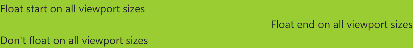
- Float and Clear Fix: In Bootstrap, we use the float utility class to float an element to its parent element’s start or end. So, for example, to float a part to the start, you can use the float-start class, or to float an element to the end, you can use the float-end class and the float-none class in order not to float the part. In Bootstrap, we have the “clearfix utility class,” which we use to clear the floating of child elements within a container. Therefore, whenever we have a series of floated elements within a parent element, you want to ensure that the parent element’s height is adjusted correctly to enclose its child elements.
<div class="float-start">Float start on all viewport sizes</div><br>
<div class="float-end">Float end on all viewport sizes</div><br>
<div class="float-none">Don't float on all viewport sizes</div>
<div class="clearfix"></div>
The code above shows how to float elements from the start to the end and float to none. It will give us the outcome below on the google chrome browser:
- Blockquotes: In Bootstrap, we use Blockquote to quote a massive volume of text from another source. We displayed Blockquote in an indented text block with a left border followed by a citation at the bottom. A classic example of Blockquote will be shown in the code below:
<figure>
  <blockquote class="blockquote">
    <p>A classic-known quote, contained in a blockquote element.</p>
  </blockquote>
  <figcaption class="blockquote-footer">
    Quote by someone famous in <cite title="Jessica">Jessica</cite>
  </figcaption>
</figure>
The code above will give us the outcome below on the google chrome browser:

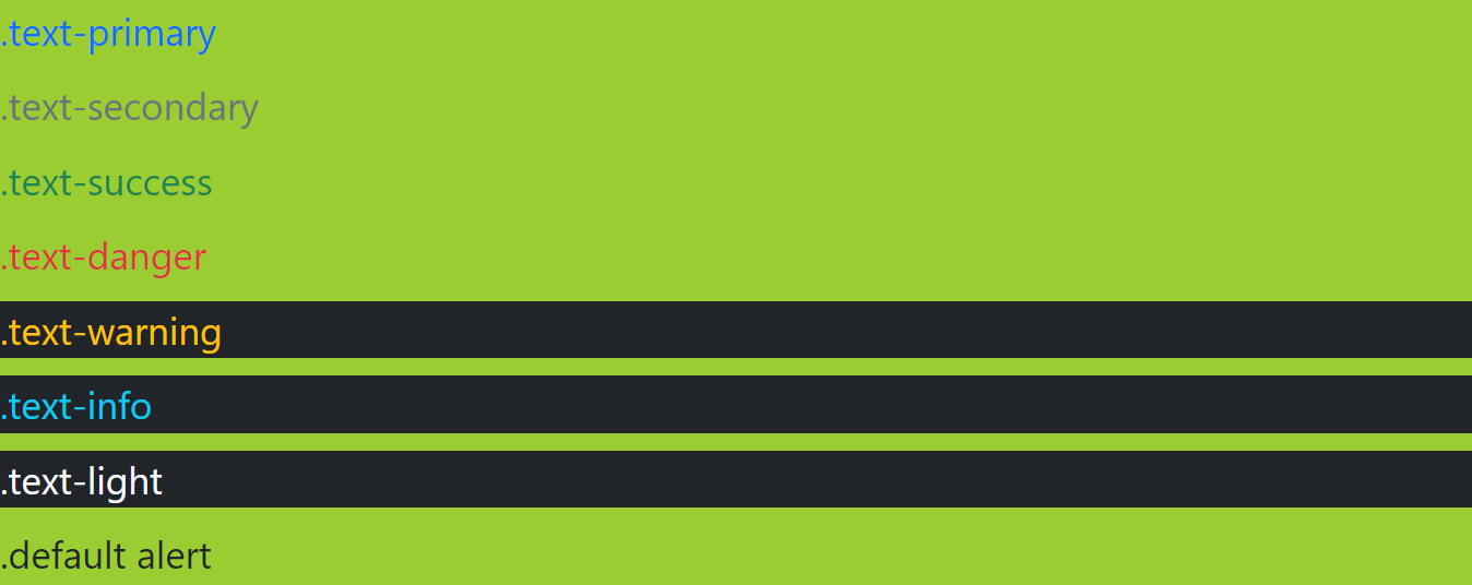
- Contextual Color Element: Contextual color elements are the Bootstrap element we use to add color to text or background elements based on their meaning. It helps in communicating the importance to the users. You can quickly and easily use many contextual color classes to build projects in Bootstrap, depending on the meaning you want them to convey to the users.
- The text-primary class: We use this class to add a blue color to the text and highlight the essential primary information displayed on the page.
- The text-secondary class: This is the class we use to add gray color to the text, and we use it to highlight less critical information.
- The text-success Class: The text-success class adds green color to the text. We use it to show that we have completed something successfully.
- The text danger: This class adds red to the text, showing a warning or error.
- The text warning: The text warning means to caution us, and this color class is yellow.
- The text-info: The text info class adds a blue color to the text and mainly provides further information.
- The text light: The text-light utility class helps to apply a lighter color to text. It helps create a visual hierarchy within a layout or a page.
- The default text: The text uses shades of gray for various elements.
The code below is a classic example of how to use a contextual color class in Bootstrap:
<p class="text-primary">.text-primary</p>
<p class="text-secondary">.text-secondary</p>
<p class="text-success">.text-success</p>
<p class="text-danger">.text-danger</p>
<p class="text-warning bg-dark">.text-warning</p>
<p class="text-info bg-dark">.text-info</p>
<p class="text-light bg-dark">.text-light</p>
<p class="text-default">.default alert</p>
The code above will give us the outcome below on the google chrome browser:
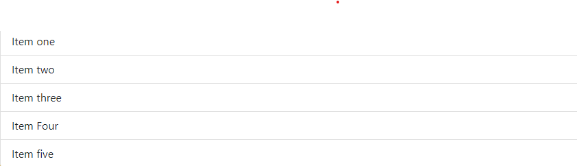
- List Group Element: The List-group element is a flexible container that shows a series of content items. In addition, it displays a list of items in a better way.
<ul class="list-group">
  <li class="list-group-item">Item one</li>
  <li class="list-group-item">Item two</li>
  <li class="list-group-item">Item three</li>
  <li class="list-group-item">Item Four</li>
  <li class="list-group-item">Item five</li>
</ul>
The code above will give us the outcome below on the google chrome browser:
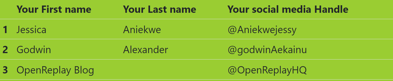
- Table: In Bootstrap, the table is a component that displays data in a grid of responsive rows and columns. So first, we create a table with the table element. The
trtag (table row) represents each row, while thetdtag (table data) represents each column, with `th’ for headers.
<table class="table">
  <thead>
    <tr>
      <th scope="col"></th>
      <th scope="col">Your First name</th>
      <th scope="col">Your Last name</th>
      <th scope="col">Your social media Handle</th>
    </tr>
  </thead>
  <tbody>
    <tr>
      <th scope="row">1</th>
      <td>Jessica</td>
      <td>Aniekwe</td>
      <td>@Aniekwejessy</td>
    </tr>
    <tr>
      <th scope="row">2</th>
      <td>Godwin</td>
      <td>Alexander</td>
      <td>@godwinAekainu</td>
    </tr>
    <tr>
      <th scope="row">3</th>
      <td colspan="2">OpenReplay Blog</td>
      <td>@OpenReplayHQ</td>
    </tr>
  </tbody>
</table>
The code above will give us the result below on the chrome Browser:
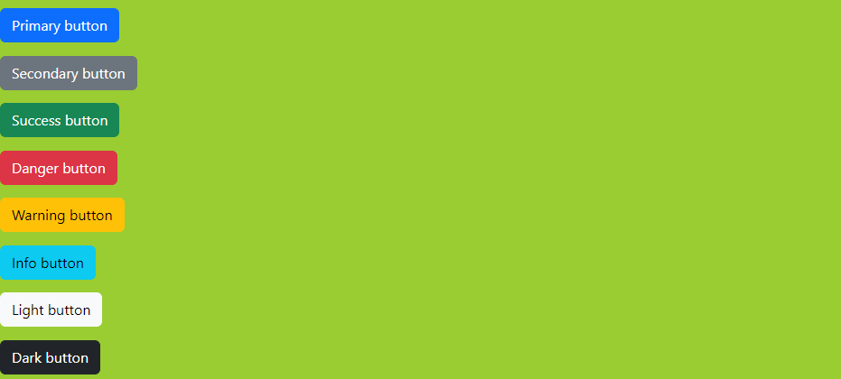
- Buttons: We can use the buttons element to create an action. Bootstrap has made provisions for many button variations, like buttons with different sizes, icons, dropdowns, etc. for further research on Bootstrap buttons, click here. Bootstrap has many button styles with unique semantic elements, and you can create a button that looks like a link too. The code below is for Bootstrap buttons:
<button type="button" class="btn btn-primary">Primary button</button>
<br>
<button type="button" class="btn btn-secondary">Secondary button</button>
<br>
<button type="button" class="btn btn-success">Success button</button>
<br>
<button type="button" class="btn btn-danger">Danger button</button>
<br>
<button type="button" class="btn btn-warning">Warning button</button>
<br>
<button type="button" class="btn btn-info">Info button</button>
<br>
<button type="button" class="btn btn-light">Light button</button>
<br>
<button type="button" class="btn btn-dark">Dark button</button>
The code above will give us the outcome below:
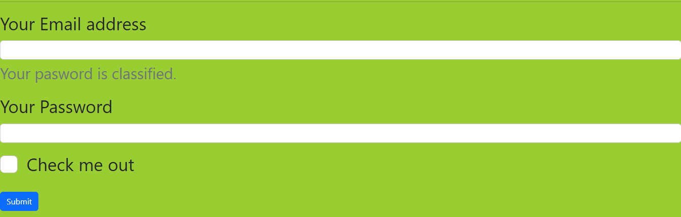
- Forms: The form element helps to input the user’s data in a well-styled form. Bootstrap provides us with three form layouts: Vertical form (this is the default), Horizontal form, and Inline form.
The code Bootstrap form(this is the default) is below:
<form>
  <div class="mb-3">
    <label for="exampleInputEmail1" class="form-label">Your Email address</label>
    <input type="email" class="form-control" id="exampleInputEmail1" aria-describedby="emailHelp">
    <div id="emailHelp" class="form-text">We'll never share your email with anyone else. </div>
  </div>
  <div class="mb-3">
    <label for="exampleInputPassword1" class="form-label">Your Password</label>
    <input type="password" class="form-control" id="exampleInputPassword1">
  </div>
  <div class="mb-3 form-check">
    <input type="checkbox" class="form-check-input" id="exampleCheck1">
    <label class="form-check-label" for="exampleCheck1">Check me out</label>
  </div>
  <button type="submit" class="btn btn-primary">Submit</button>
</form>
The code above will give us the result below on the chrome browser:
Conclusion
Bootstrap v5.2 is the most popular framework that can help developers build classical, responsive, consistent, and customizable websites quickly and easily. Bootstrap is free and open to all to use to build excellent websites.
A TIP FROM THE EDITOR: For comparisons to other frameworks, don’t miss Tailwind CSS Vs. Bootstrap — A Comparison and Bulma Vs. Bootstrap — What Are Their Differences?.
Gain Debugging Superpowers
Unleash the power of session replay to reproduce bugs and track user frustrations. Get complete visibility into your frontend with OpenReplay, the most advanced open-source session replay tool for developers.