Five Practical Examples of Animations in Angular
Angular animations have become integral to modern web development, enriching user experiences with dynamic transitions and engaging visual effects. This article is a practical guide to mastering Angular animations, offering hands-on examples and insights into creating fluid and responsive UIs.

Discover how at OpenReplay.com.
Angular Animations: A Hands-On Guide with 5 Practical Examples
From setting up the development environment to implement animation techniques, this guide equips developers with the knowledge and skills needed to leverage the full potential of Angular’s animation capabilities.
Setting Up the Development Environment
Initiate a new Angular project by executing this command in the terminal.
ng new <filename>Navigate to the Angular directory.
cd <filename>Open the project in VS Code.
code .Generate an Angular component named toggleOver.
ng generate component toggleOverIn the main.ts file, import the necessary Angular modules.
import { provideAnimations } from '@angular/platform-browser/animations';
import { provideRouter } from '@angular/router';
import { routes } from './app/app.routes';
Within the bootstrapApplication function, update the configuration to include the required providers.
bootstrapApplication(AppComponent, {
  // Configure providers for the application
  providers: [
    provideRouter(routes),     // Provide routing functionality using defined routes
    provideAnimations()        // Provide animation support for components
  ]
})
  .catch((err) => console.error(err));
In the app.routes.ts file, import ToggleOverComponent.
import { ToggleOverComponent } from './toggle-over/toggle-over.component';Define an empty path for ToggleOverComponent to render the component in the DOM.
export const routes: Routes = [
  { path: '', component: ToggleOverComponent },
];
Navigate to the app.component.html file and replace the existing code with the one below.
<router-outlet />Two-Way Animation
Two-way animation refers to animations triggered by an event and subsequently reversed or undone when the event is reversed. A classic illustration is a toggle button that displays additional information when clicked and conceals it upon a second click. Now, let’s create such a button.
Navigate to the toggle-over.component.ts file and import the required modules and functionalities.
import { CommonModule } from '@angular/common';
import { trigger, state, style, animate, transition } from '@angular/animations';
Add CommonModule to the imports array within the @Component decorator.
@Component({
  imports: [CommonModule],
  // other properties
})
In the ToggleOverComponent class, initialize a property show with a boolean false, representing the initial state where the toggleOver is hidden. This property serves as a flag indicating whether the toggleOver is visible (true) or hidden (false).
Implement a getter function named presentState. This function returns show if it’s true; otherwise, it returns hide.
Define a method called popOver, which switches the value of the show property between true and false, effectively toggling the visibility of the toggleOver component.
export class ToggleOverComponent {
  // Boolean flag to track whether the component is shown or hidden
  show = false;

  // Getter method to determine the current state ('show' or 'hide') based on the 'show' flag
  get presentState() {
    return this.show ? 'show' : 'hide';
  }

  // Method to toggle the visibility of the component
  popOver() {
    this.show = !this.show; // Toggle the value of 'show' to show or hide the component
  }
}
In the @Component decorator, specify an animation property that accepts an array. Within this array, include a trigger named toggleOverState. This trigger consists of definitions encapsulated in an object, which comprises an array of state() and transition() declarations.
Within the state() declaration, define styles corresponding to the element’s state. The element should be visible with an opacity of 1 when in the show state and hidden with an opacity of 0 when in the hide state.
To enable animation, include a transition that sets the duration and easing for the animation. The duration can be specified in either seconds or milliseconds as a string.
@Component({
  // Other properties

  animations: [
    // Define animation trigger named 'toggleOverState'
    trigger('toggleOverState', [
      // Define state 'show' with opacity 1 (fully visible)
      state('show', style({
        opacity: 1
      })),
      // Define state 'hide' with opacity 0 (fully transparent)
      state('hide', style({
        opacity: 0
      })),
      // Define transition from 'show' to 'hide' with a specified duration and easing
      transition('show => hide', animate('0.6s ease-out')),
      // Define transition from 'hide' to 'show' with a specified duration and easing
      transition('hide => show', animate('1s ease-out'))
    ])
  ]
})
In the toggle-over.component.html file, we define a <div> element and apply an animation by prefixing its name toggleOverState with the @ symbol and passing the current state as presentState.
Additionally, we include a button to toggle the visibility of the variable, linking it to a popOver method through a click event.
<div [@toggleOverState]="presentState">
  <p>
    <img
      src="https://www.finsmes.com/wp-content/uploads/2022/06/openreplay.png"
    />
  </p>
  <p>OpenReplay logo toggle</p>
</div>
<button (click)="popOver()">Toggle Popover</button>
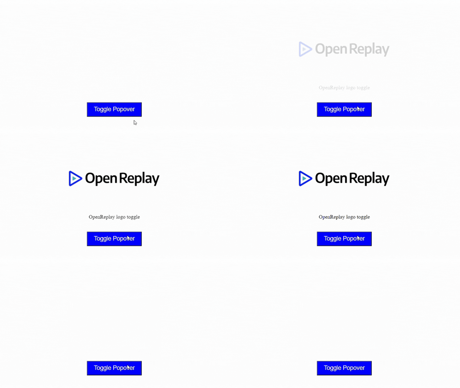
Here’s a preview of the toggle animation. When the button is clicked, it reveals the OpenReplay log and accompanying text and hides the information when clicked again.
Multistate Animation
These animations involve transitioning between multiple states or configurations of an element over time. These animations can include changes in position, rotation, scale, opacity, and other visual properties.
Implementing translate, rotate, and scale animations
Generate a new component using the command line interface by running the code below.
ng generate component gallery-imagesIn the gallery-images.component.ts file, import all required modules and functionalities.
import { animate, state, style, transition, trigger } from '@angular/animations';
import { CommonModule } from '@angular/common';
Include CommonModule in the imports array within the @Component decorator.
@Component({
  imports: [CommonModule],
  // other properties
})
In the app.routes.ts file, define an empty path for the GalleryImagesComponent.
export const routes: Routes = [
  { path: '', component: GalleryImagesComponent },
];
In the gallery-images.component.ts file, we set up the animation property within the @Component decorator. This property expects an array containing a trigger that encompasses all animations. The trigger requires two parameters: the animation’s name, imgState, and an array defining the animation states and transitions.
@Component({

  // other properties

  animations: [
    trigger('imgState', []),
  ]
})
Define three states in the array: move, enlarge, and spin, each corresponding to translate, scale, and rotate operations, respectively. Utilize the’ transform’ property to assign distinct styles to each state.
For instance, the move state will employ translateX(-100%), shifting the element leftwards by its width. In the enlarge state, the element is scaled up by a factor of 1.5, while in the spin state, rotation occurs along the Y and Z axes.
Establish a transition function specifying the animation behavior during state shifts to facilitate smooth transitions between these states. Utilize the wildcard ' * => * ' to account for all 16 possible state combinations. This wildcard ensures uniform animation across transitions, with the first * representing any initial state and the second * representing any final state.
@Component({
  //other properties

  animations: [
    trigger('imgState', [
      state('move', style({
        transform: 'translateX(-100%)',
      })),
      state('enlarge', style({
        transform: 'scale(1.5)',
      })),
      state('spin', style({
        transform: 'rotateY(180deg) rotateZ(90deg)',
      })),
      transition('* => *', animate('2s ease-out')),
    ])
  ],
})
In the GalleryImagesComponent class, create a property named orientation of type string and initialize it with 'null'.
Define a property named photoUrl initialized with a URL pointing to an image file.
Implement a method named changeOrientation that accepts a newOrientation parameter of type string. Upon invocation, this method updates the orientation property with the provided newOrientation value.
export class GalleryImagesComponent {
  // A property to store the orientation
  orientation: string = 'null';

  // A property to store the URL of the photo
  photoUrl = 'https://www.finsmes.com/wp-content/uploads/2022/06/openreplay.png';

  // <Method to change the orientation
  changeOrientation(newOrientation: string) {
    this.orientation = newOrientation;
  }
}
Open the gallery-images.component.html file and add an img element. Use Angular animation binding to implement animation effects on the image, driven by the orientation variable in the component.
Additionally, create four buttons with click events that trigger the changeOrientation() method. Pass the arguments move, enlarge, spin, and null respectively to this method. These arguments correspond to the state names in the animation array.
<div class="photo-gallery">
  <img [src]="photoUrl" [@imgState]="orientation" class="photo" />

  <div class="button-container">
    <button (click)="changeOrientation('move')">Translate</button>
    <button (click)="changeOrientation('spin')">Rotate</button>
    <button (click)="changeOrientation('enlarge')">Scale</button>
    <button (click)="changeOrientation('null')">Reset</button>
  </div>
</div>
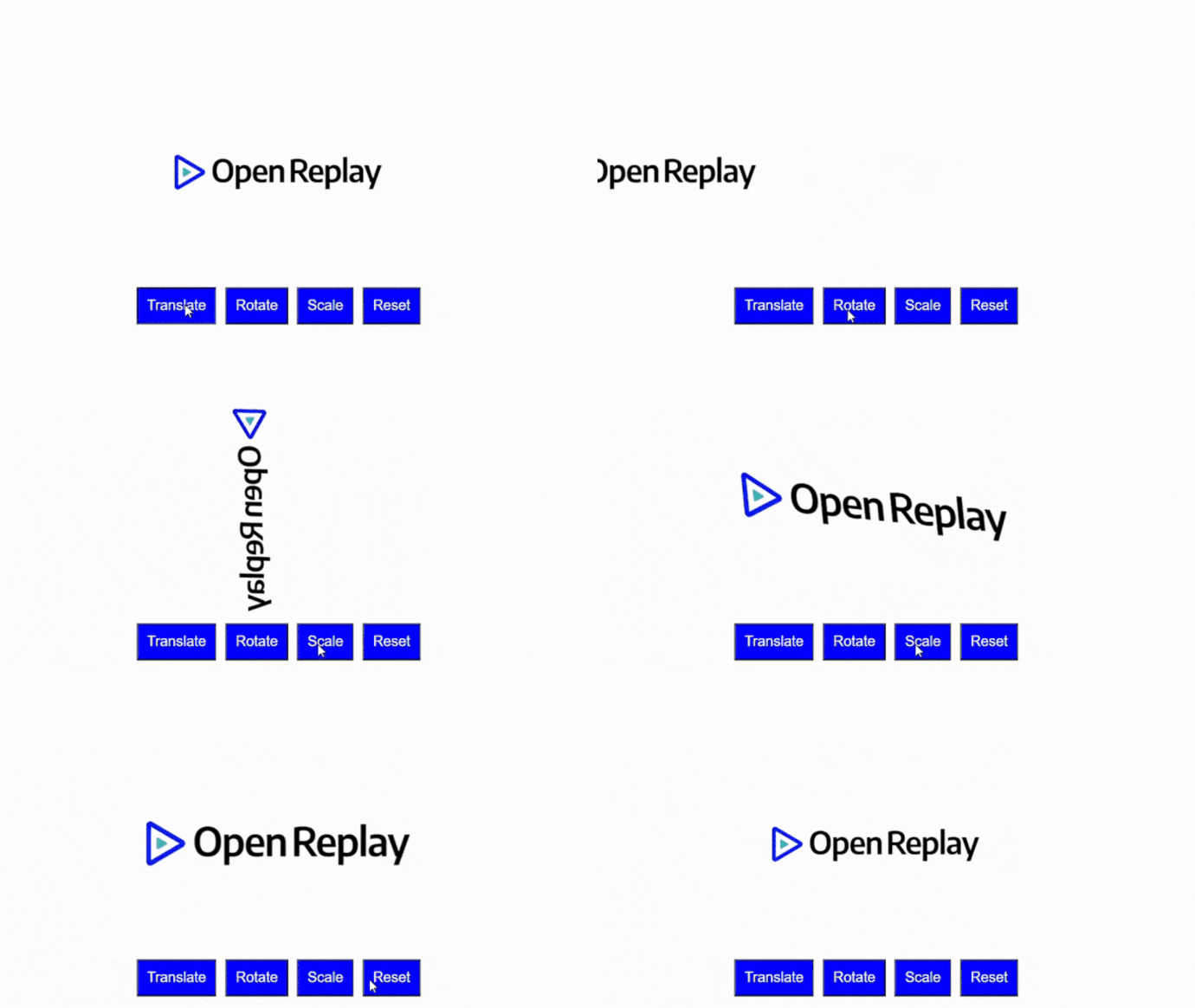
Preview of multistate animations involving translation, rotation, scaling, and resetting an image’s orientation.
Keyframe Animation
This allows you to specify a sequence of styles at various points in time (keyframes) and apply them to an element using Angular’s animation triggers.
Implementing Keyframe Animations in Angular
Import the keyframes function from @angular/animations within the gallery-images.component.ts file.
import { animate, state, style, transition, trigger, keyframes } from '@angular/animations';Modify the transition in the trigger array by adding keyframes as the second parameter.
animations: [
  trigger('photoState', [

    // previous animation states

    transition('* => *', animate('2000ms', keyframes([]))),
  ])
]
In keyframes, create an array of styles, each style with a transform property that describes the movement of the element at specific times denoted by offset.
Offset: 0 occurs at the beginning of the animation (0% progress).
Offset: 0.33 occurs approximately one-third of the way through the animation (33% progress).
Offset: 0.66 occurs approximately two-thirds of the way through the animation (66% progress).
Offset: 1.0 occurs at the end of the animation (100% progress).
keyframes([
  style({ transform: 'translateX(0) rotateY(0)', offset: 0 }),
  style({ transform: 'translateX(50%) rotateY(90deg)', offset: 0.33 }),
  style({ transform: 'translateY(-75%) rotateY(180deg)', offset: 0.66 }),
  style({ transform: 'translateX(-100%)', offset: 1.0 }),
]);
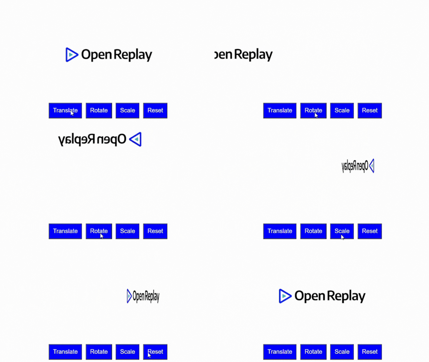
Preview of the image moving at different positions in time swiftly.
Animation Callbacks
Animation callbacks in Angular provide a way to execute code at specific points during the lifecycle of an animation. These callbacks allow for greater control and customization of animations, performing actions such as starting, completing, or canceling animations and reacting to animation events.
Using animation start and end callbacks
Import the AnimationEvent function from @angular/animations in the gallery-images.component.ts file.
import { animate, state, style, transition, trigger, keyframes, AnimationEvent } from '@angular/animations';Create a method called logAnimation, which accepts an AnimationEvent object. The AnimationEvent is an Angular-specific class that represents an event occurring during an animation, such as when the animation starts, ends, or is canceled.
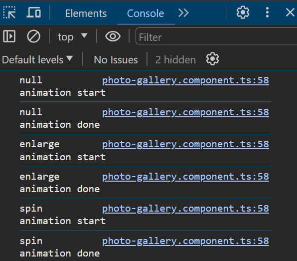
Inside the logAnimation method, log details about the animation to the console. This information comprises the animation’s current position or state (this.orientation) and the phase of the animation event (event.phaseName), which could be start, done, or void.
export class GalleryImagesComponent {
  // previous code from keyframes animation goes here

  logAnimation(event: AnimationEvent) {
    console.log(`${this.orientation} animation ${event.phaseName}`);
  }
}
In the gallery-images.component.html file, modify the img element by adding an event listener for animation initiation and completion triggered by the imgState animation trigger.
<img
  [src]="photoUrl"
  [@imgState]="orientation"
  (@imgState.start)="logAnimation($event)"
  (@imgState.done)="logAnimation($event)"
/>
Here’s a snapshot from the console log displaying the animation event, indicating both the start and completion of the animation.
List Animation
In Angular, animation can be applied to a list using the query functionality, which selects nested elements within an animation based on their HTML tag. Additionally, the stagger function can introduce a delay between each animation of the elements, resulting in a shutter-like effect.
To utilize these features, import the query and stagger functionalities from @angular/animations in the gallery-images.component.ts file.
import { animate, style, transition, trigger, query, stagger } from '@angular/animations';In @Component decorator, include an animation property. Within the transition array, specify a query property with two parameters: the HTML tag name and the animation style that moves each image 100% to the right.
Additionally, incorporate another query parameter to apply staggered animations to the <img> elements, introducing a delay between the start of each element’s animation.
@Component({
  //other properties go here

  animations: [
    trigger('imgAnimation', [
      transition('* => *', [
        query('img', style({ transform: 'translateX(100%)' })),
        query('img', stagger('1000ms', [
          animate('1500ms', style({ transform: 'translateX(0)' }))
        ]))
      ])
    ])
  ]
})
In the GalleryImagesComponent class, declare an array containing URLs of images, serving as the data source for our application.
export class GalleryImagesComponent {
  images: string[] = [
    'https://img.freepik.com/free-vector/adorable-wideeyed-kitten-illustration_1308-162844.jpg?q=10&h=200',
    'https://img.freepik.com/free-photo/portrait-lion-ai-generated_268835-4278.jpg',
    'https://img.freepik.com/free-photo/eurasian-wolf-white-winter-habitat-beautiful-winter-forest_475641-702.jpg?size=626&ext=jpg&ga=GA1.1.735520172.1711411200&semt=ais'
  ];
}
In the gallery-images.component.html file, use the *ngFor directive to iterate through the images array, generating a <div> element for each image.
<div [@imgAnimation]="images.length">
  <div *ngFor="let image of images">
    <img [src]="image" width="200px" alt="" />
  </div>
</div>
Here’s a preview of the animation: each image slides in from the right with a staggered effect, and a delay is introduced between each image’s animation.

Conclusion
Mastering Angular animations opens up a world of possibilities for developers to create captivating and dynamic user interfaces. Throughout this hands-on guide, we’ve explored various animation techniques, from simple toggle animations to more complex multistate animations and keyframe animations. By following the practical examples and insights provided in this article, developers can leverage Angular’s animation capabilities to enrich user experiences, whether it’s through fluid transitions, engaging visual effects, or interactive list animations.
Additional Resource
Gain Debugging Superpowers
Unleash the power of session replay to reproduce bugs, track slowdowns and uncover frustrations in your app. Get complete visibility into your frontend with OpenReplay — the most advanced open-source session replay tool for developers. Check our GitHub repo and join the thousands of developers in our community.


