Get started with Bulma CSS in 5 minutes


Bulma CSS is one of the most popular CSS frameworks. It is ready to use, accelerating UI development and making reusable UI components easier. Why manage “1000” code lines when you can scale them down and facilitate easy debugging? In this article, we will go through the advantages of Bulma CSS and how to set the development environment.
How to Install Bulma CSS
Bulma is publicly accessible and provides ready-to-use front-end components for easy integration of web designs into responsive web pages; it’s fantastic because no CSS knowledge is required. Bulma can be accessed directly through a cloud CDN provider like jsDelivr and npm package for Node.js users; click here for documentation.
Below is the CDN link used in importing the styles when using Html.
<link rel="stylesheet" href="https://cdn.jsdelivr.net/npm/bulma@0.9.4/css/bulma.min.css">The link element imports the files from jsDelivr cloud CDN.
Introduction to Bulma Components
Let’s look at several of the allowed available style rules.
Font Style
Font Style comprises colors, sizes, weight, and the style used on a text. Below are ways in which we can add them using Bulma CSS.
<html lang="en">
<head>
    <meta charset="UTF-8">
    <meta http-equiv="X-UA-Compatible" content="IE=edge">
    <meta name="viewport" content="width=device-width, initial-scale=1.0">
    <title>Bulma fonts</title>
    <link rel="stylesheet" href="https://cdn.jsdelivr.net/npm/bulma@0.9.4/css/bulma.min.css">
</head>
<body>
<h1 >first heading</h1>
<h2 >second heading</h2>
<h3 >third heading</h4>
<h4 >fouth heading</h4>
<h5 >fifth heading</h5>
<h6 >sixth heading</h6>
</body>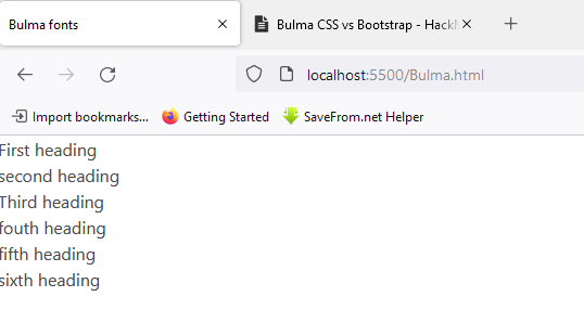
</html>- The
linkelement imports the files from jsDelivr cloud CDN. - This makes Bulma easily accessible, as only one link for the entire project is needed.
- Bulma scales all its text elements to a uniform size, allowing the developer to add a custom size style as he desires.
Below is the output from the code we added to our Bulma CSS file.
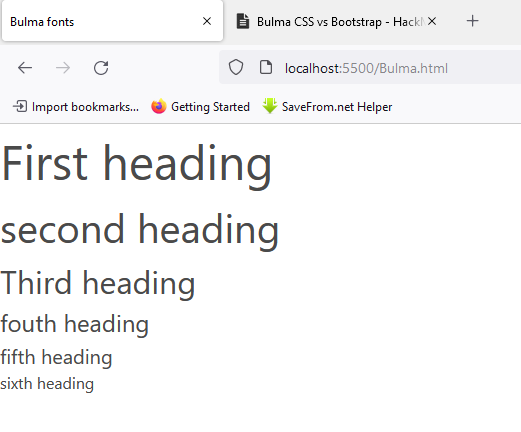
Let’s see how class attributes to the elements are added. The class name used for size is is-size-[1-7], and you can enter numbers from one to seven after the name size.
<body>
<h1 class="is-size-1">First heading</h1>
<h2 class="is-size-2">second heading</h2>
<h3 class="is-size-3">Third heading</h4>
<h4 class="is-size-4">fouth heading</h4>
<h5 class="is-size-5">fifth heading</h5>
<h6 class="is-size-6">sixth heading</h6>
</body>
Below is the output of the code; the size is now similar to the heading tags used in HTML.
Colors
Web design isn’t possible without the use of colors. Picking the correct shade for UI components is challenging; most web designers may argue about this but not front-end developers.
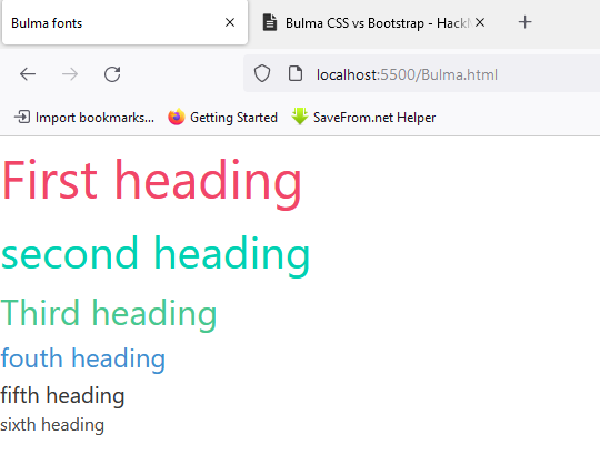
The class name starts with has-text-danger. This code snippet shows the color class attribute in action.
<body>
    <h1 class="is-size-1 has-text-danger">First heading</h1>
    <h2 class="is-size-2 has-text-primary">second heading</h2>
    <h3 class="is-size-3 has-text-success">Third heading</h4>
    <h4 class="is-size-4 has-text-info">fouth heading</h4>
    <h5 class="is-size-5 has-text-dark">fifth heading</h5>
    <h6 class="is-size-6 has text-warning ">sixth heading</h6>
</body>
Bulma also allows the nesting of multiple names in one class attribute, just like in pure CSS. The output below is after adding the color class attribute.
Bulma applies Font styles identical to those in CSS. Please check their documentation for more information. It is well-managed and is up-to-date with the latest version of Bulma 0.7. 1.
Buttons
Buttons are essential elements in creating websites, and they are needed when navigating to different pages, submitting forms, and downloading buttons. Recreating buttons each time can be annoying and time-consuming. Let’s look at an effortless and fast way of including buttons using Bulma.
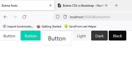
- Class name
buttonadds a simple button. - Colors can be added using class name attributes such as
is-dark,is-primary,is-large,is-light,andis-black. - The size can also be customized using
is-large,is-small,andis-medium.
<html>
<body>
  <button class="button">Button</button>
  <button class="button is-primary">Button</button>
  <button class="button is-large">Button</button>
  <button class="button is-light">Light</button>
  <button class="button is-dark">Dark</button>
  <button class="button is-black">Black</button>
</body>
</html>
Below is the output created using Bulma CSS.
This method clearly shows that Bulma has brought simplicity into styling web pages. No need to set borders or padding; add a class name, and Bulma will do it.
Session Replay for Developers
Uncover frustrations, understand bugs and fix slowdowns like never before with OpenReplay — an open-source session replay tool for developers. Self-host it in minutes, and have complete control over your customer data. Check our GitHub repo and join the thousands of developers in our community.
How to use Bulma CSS with Sass
Bulma has the best way of customizing web components; the technology offers 419 Sass variables in 4 different levels that can be accessed and customized.
Sass Variables Available:
- initial variables.
- derived variables
- generic variables
- element/component variables
Sass compatibility with Bulma CSS can be achieved through three different ways, with-node-sass, the Sass-cli, and webpack. Let’s see how we can customize some elements like colors and font sizes using Sass in Bulma CSS; below is the installation process.
- Click here for Node.js installation.
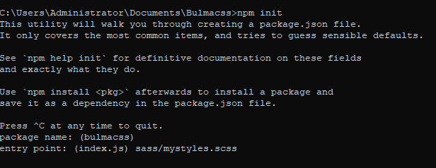
- Create a folder using the command prompt; name it Bulmacss.
mkdir Bulmacss- Type the commands below to view the created folder in visual studio code.
cd Bulmacss
code ..- initialize an npm project by typing this in the command prompt; some questions will pop up.
npm init- When prompted to enter an entry point, type “sass/mystyles.scss”.
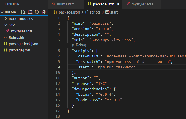
- Create a folder matching the entry point in the working directory, and then add these lines to the
mystyles.scssfile.
@charset "utf-8";
@import "../node_modules/bulma/bulma.sass";- For Sass to work with Bulma, we will need only two dependencies, type these and press enter for both installations.
npm install node-sass --save-dev
npm install bulma --save-dev- Create an Html file and call it Bulma.html, and add this code to the file.
<!DOCTYPE html>
<html lang="en">
  <head>
    <meta charset="utf-8">
    <meta http-equiv="X-UA-Compatible" content="IE=edge">
    <meta name="viewport" content="width=device-width, initial-scale=1">
    <title>My custom Bulma website</title>
    <link rel="stylesheet" href="css/mystyles.css">
  </head>
  <body>
     <h1 class="title">
        Bulma
      </h1>
      <div class="buttons">
        <a class="button is-primary">Primary</a>
        <a class="button is-link">Link</a>
      </div>
  </body>
</html>- Edit the
" script"section in the package.json file by adding this text.
"scripts": {
  "css-build": "node-sass --omit-source-map-url sass/mystyles.scss css/mystyles.css",
  "css-watch": "npm run css-build -- --watch",
  "start": "npm run css-watch"
}- This is how the working directory should look if we use visual studio code.
- The script is responsible for bundling the Sass file into a CSS file and also watching any changes made to the Sass file.
- Type
npm run css-buildfor the bundling to take place.
npm run css-build- This will create a CSS file in the working directory, updated each time the Sass file changes.
- This is the Html page created.
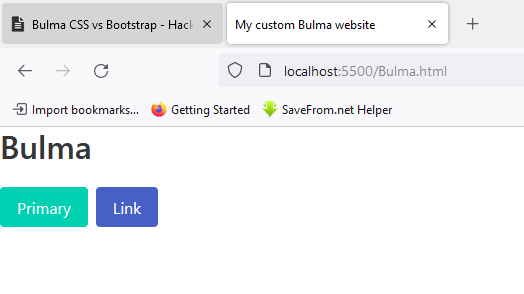
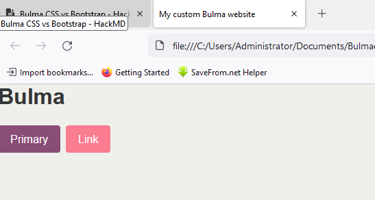
Let’s see the output after adding some sass variables to the file. This code will change the colors of our background, title, and Buttons.
@charset "utf-8";

// Set your brand colors
$purple: #8A4D76;
$pink: #FA7C91;
$brown: #757763;
$beige-light: #D0D1CD;
$beige-lighter: #EFF0EB;

// Update Bulma's global variables
$family-sans-serif: "Nunito", sans-serif;
$primary: $purple;
$link: $pink;


// Update some of Bulma's component variables
$body-background-color: $beige-lighter;

// Import only what you need from Bulma
@import "../node_modules/bulma/sass/utilities/_all.sass";
@import "../node_modules/bulma/sass/base/_all.sass";
@import "../node_modules/bulma/sass/elements/button.sass";
@import "../node_modules/bulma/sass/elements/title.sass";
@import "../node_modules/bulma/sass/form/_all.sass";
Below is the output after adding the custom CSS.
Anyone can add these easy steps for a successful Bulma CSS customization. If you are having any trouble while reloading, delete the CSS file created during the build and rebuild it again.
Conclusion
As developers, we want our first startup project to reach the code standards available on the market. With a pure CSS file, Bulma would be the most preferred for a front-end developer who needs to add his custom CSS and JavaScript. At the same time, it is suitable for back-end developers with no comprehensive knowledge of front-end components, as the framework ships with ready-made styling components.
A TIP FROM THE EDITOR: For more material on learning and using Bulma, do not miss our Introduction To Bulma: A Simple And Intuitive CSS Framework and Implementing Dark Mode With Bulma articles.
Gain Debugging Superpowers
Unleash the power of session replay to reproduce bugs and track user frustrations. Get complete visibility into your frontend with OpenReplay, the most advanced open-source session replay tool for developers.