Implementing Dark Mode with Bulma
Configuring Bulma to easily provide an alternative dark mode

A modern-day front-end developer is almost always expected to be able to implement User interfaces (UIs) into working code with a pixel-perfect standard. Over time there have been various CSS libraries that help us achieve this standard more efficiently and require much less code.
Bulma is a CSS library built to help front-end developers better style their markup code and build responsive web layouts by providing utility classes that can be used on your front-end project for various effects and by providing ready-to-use front-end components. For more information on Bulma and how to get started, click here
In this article, we will pay attention to Bulma and how we can implement a dark mode feature with it.
Dark Mode with Bulma
Now that we’ve been able to familiarize ourselves with what Bulma is and why we love and use it so much, let’s dive into how we can implement dark mode using Bulma. First, we need to:
Setup your project with Bulma
To utilize Bulma’s features in our project, we have to install Bulma and set up our project file directory. There are various methods to install Bulma and get started, which are:
- Use a CDN
- Download Bulma’s official release file here
- Install a package manager (npm or yarn)
For the sake of this article, we shall be downloading Bulma’s official compiled file and embedding it in our project directory.
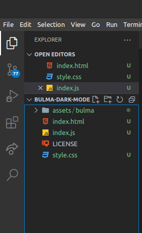
In the image above, you will notice our Bulma file in our assets folder. Then we will import Bulma into our HTML file.
<!---index.html-->

<!DOCTYPE html>
<html>
    <head>
        <meta charset="utf-8">
        <meta name="viewport" content="width=device-width, initial-scale=1">
        <title>Dark mode with Bulma!</title>
        <link rel="stylesheet" href="/assets/bulma/css/bulma.css">
        <link rel="stylesheet" href="/index.css">
    </head>
    <body class="">
        <section class="section">
            <div class="container">
                <h1 class="title">
                    Hello World
                </h1>
                <p class="subtitle">
                    My first website with Bulma!
                </p>
                <button id='toggle'>
                    Toggle Theme
                </button>
            </div>

        </section>
    </body>
    <script src="index.js"></script>
</html>
To learn more about other installation options for Bulma click here
Customize both themes using Bulma’s Sass variables
Now that we have Bulma in our project, the next step is customizing each theme using Bulma’s Saas variables. Although this process is beginner-friendly, knowledge of Saas will be required for easy follow-along.
- Install and Setup Sass - Since we will be writing styles in Sass, our first step would be to install and set up Sass, after which we can now create our .sass or .scss file. If you are unfamiliar with the Sass installation process, you can find out more here
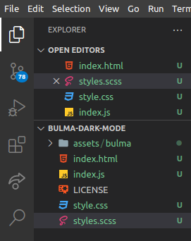
- Import Bulma’s variables into the Sass file Now that Sass has been installed and set up in our project, we can import Bulma’s Sass file with the variables we intend to customize and update.
//styles.scss

// Import Bulma Sass file

@import "./assets/bulma/bulma.sass";- Update Bulma Sass variables In the code below, you will notice we now have access to Bulma’s global variables and are updating them with our custom brand colors. We have also added some styling for both light and dark themes, which is being distinguished by a .dark class.
//styles.scss

body {
    background-color: $light;
    height: 100vh;
    transition: all 0.4s ease;
}

// Some styling

body .subtitle,
body .title {
    color: $dark;
}

body.dark {
    background-color: $dark;
    color: $light;
}

body.dark .subtitle,
body.dark .title {
    color: $light;
}

.section {
    display: flex;
    align-items: center;
    justify-content: center;
    height: 100vh;
    text-align: center;
}

button{
    cursor: pointer;
    border: none;
    color: $light;
    padding: .8rem;
    background: $dark;
    border-radius: 6px;
}

body.dark button {
    background: $light;
    color: $dark;
}
Some JavaScript to toggle themes
Congratulations, you have made it this far. At this point, we have both themes ready. We will be adding a button to toggle the themes once clicked using JavaScript.
//App.js
const body = document.querySelector('body');
const toggle = document.getElementById('toggle');
toggle.addEventListener("click", () => {
const bodyCheck = body.classList.contains('dark');
if (bodyCheck) {
body.className = ''
} else {
body.className = "dark"
}
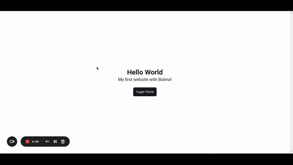
})If everything is done right, you should achieve a similar experience to this.
Session Replay for Developers
Uncover frustrations, understand bugs and fix slowdowns like never before with OpenReplay — an open-source session replay tool for developers. Self-host it in minutes, and have complete control over your customer data. Check our GitHub repo and join the thousands of developers in our community.
Conclusion
Congrats! You have made it to the end, and I hope you were able to learn this awesome feature with Bulma. Take it up as a challenge, explore other wonderful features that come with Bulma, and perhaps do something even more awesome with it.
Resources
You can find the complete code for this on GitHub
The live demo can also be found here
A TIP FROM THE EDITOR: For another take on dark mode, look at our Theming React Native Applications With Styled Components article.
Gain Debugging Superpowers
Unleash the power of session replay to reproduce bugs and track user frustrations. Get complete visibility into your frontend with OpenReplay, the most advanced open-source session replay tool for developers.