Getting Started with BootstrapVue
The BootstrapVue toolkit is Bootstrap for Vue, a winning combination


Are you looking to create stunning and responsive online applications easily? With BootstrapVue, you can quickly create beautiful and user-friendly interfaces in no time. This open-source toolkit is built on Vue.js and Bootstrap, which is perfect for developing modern web applications, and this article will go through its fundamentals, so you can get started with this powerful framework.
BootstrapVue is a popular open-source front-end framework that combines Bootstrap (a front-end UI framework) and vue.js (a progressive JavaScript framework) to create reusable UI components and web applications.
It is designed to be highly customizable, allowing developers to easily modify the appearance and behavior of the components to fit the specific needs of their project. It also includes support for CSS preprocessors like Sass and Less, making it easy to customize the styles of the components.
Why use BootstrapVue?
- Fast Development: One of the main reasons to use BoostrapVue is that it provides many pre-built UI components (such as buttons, forms, modals, and tooltips) that can be easily integrated into your web application.
- Large Community: Another benefit of using BootstrapVue is that it has a large and active community of developers who contribute to the framework and provide support to users.
- Easy Migration: BootstrapVue makes it easy for developers to switch from Vanilla JavaScript to Vue.js without bothering about Bootstrap’s heavy dependency on JQuery.
Integrating BootstrapVue with Vue.js
The first step would be to create a Vue.js project. This is essential for you to integrate BootstrapVue. Create a Vue.js project by running the following commands in your terminal.
vue create my-project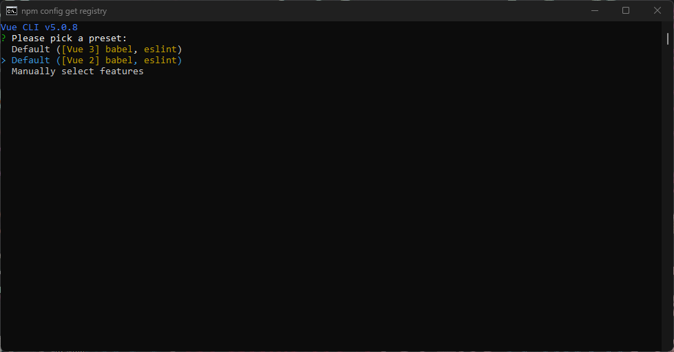
Note: BootstrapVue does not presently support the stable version of Vue.js 3. You’d need to integrate it with the vue2-3 migration build to get it working. However, this is not recommended due to recognized limitations of this method. Regardless, you can use the vue2-3 migration build to create a new application by following the steps here.
Then navigate into your project’s directory using cd my-project. You can now proceed to integrate BootstrapVue.
There are two ways to integrate BootstrapVue into your Vue.js project:
- Using a package manager like NPM and Yarn
- Using CDN links
Using NPM or Yarn
Run one of the commands below depending on the package manager you are working with:
# With npm
npm install bootstrap bootstrap-vue

# With yarn
yarn add bootstrap bootstrap-vue
Using CDN
Visit CdnJS website to get the current CDN link, then open the index.html file in the public folder and add the code below:
<!-- Add Bootstrap and Bootstrap-Vue CSS in the <head> section -->
<link
 rel="stylesheet"
 href="https://unpkg.com/bootstrap/dist/css/bootstrap.min.css"
/>
<link
 rel="stylesheet"
 href="https://unpkg.com/bootstrap-vue/dist/bootstrap-vue.min.css"
/>

<!-- Add Vue and BootstrapVue scripts just before the closing </body> tag -->
<script src="https://unpkg.com/vue@2.6.14/dist/vue.min.js"></script>
<script src="https://unpkg.com/bootstrap-vue@2.21.2/dist/bootstrap-vue.min.js"></script>
The code above will pull each package’s minified and the latest version into our project, clean and simple!
For this article, we will stick to using package managers. Let’s continue setting up the BootstrapVue package we have installed.
Setting up BootstrapVue
To set up the Bootstrap and BootstrapVue packages we just installed. In the src folder, you will find the main.js file. Import BootstrapVue, and its CSS files as seen below:
import Vue from 'vue'

// Import BootstrapVue
import { BootstrapVue } from 'bootstrap-vue'

// Import Bootstrap and BootstrapVue CSS files ( ensure to follow the order)
import 'bootstrap/dist/css/bootstrap.css'
import 'bootstrap-vue/dist/bootstrap-vue.css'

// Make BootstrapVue available throughout your project
Vue.use(BootstrapVue)
In the code above, we registered BootstrapVue in the application’s entry point using the Vue.use() function so our application can recognize it.
BootstrapVue Components
If you have ever used Bootstrap, you will know it uses some pre-built components. This is the same with BootstrapVue. BootstrapVue components are built specifically for Vue.js, making them easier to use and integrate into your Vue.js applications.
Some popular BootstrapVue components include buttons, forms, modals, tooltips, navigation menus, carousels, and more. BootstrapVue also includes some unique components not available in standard Bootstrap, such as the BTable component for creating dynamic and interactive tables.
BootstrapVue also includes a range of utility classes and mixins that can customize the appearance and behavior of components even further. This makes it possible to create highly customized and unique websites and applications that stand out.
Let’s explore some basic BootstrapVue components, including buttons, forms, and cards.
Buttons
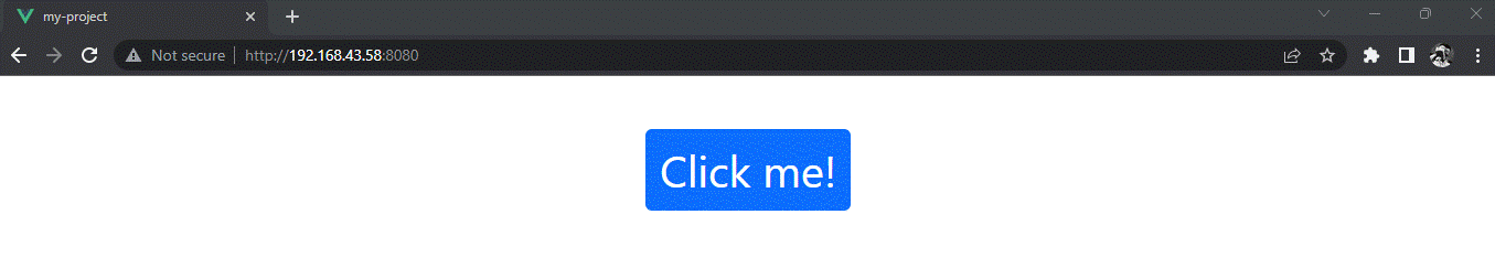
BootstrapVue provides a variety of button components that can be used to create different types of buttons with various styles and functionalities. The most basic button component is the b-button, which can be used to create a simple clickable button.
Here is an example:
<template>
  <div class="m-5 d-flex justify-content-center">
    -<b-button variant="primary">Click me!</b-button>
  </div>
</template>;
This code above will create a primary-colored button with the text “Click me!” because the variant prop is set to primary. You can change the color and style of the button by specifying other variant values, such as danger or success.
BootstrapVue also provides other button components that can be used to create dropdown menus, toggle buttons, and more. You can learn more about button components via the BootstrapVue documentation.
Forms
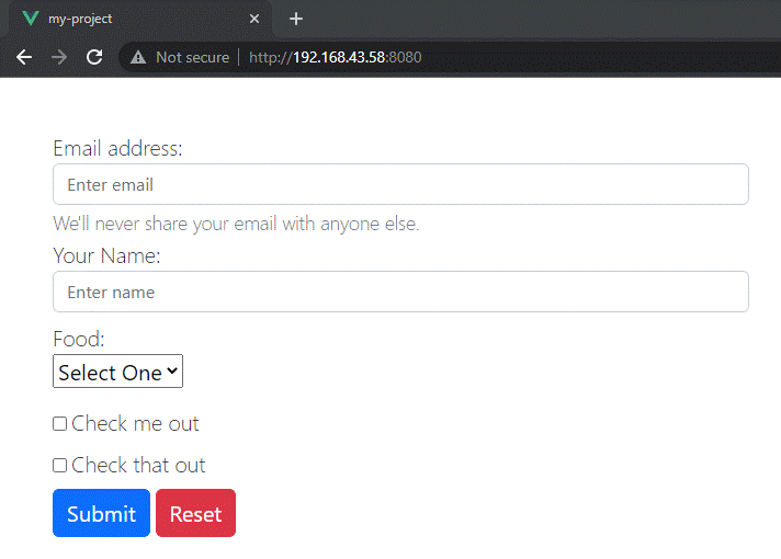
BootstrapVue provides a variety of form components that can be used to create forms with different types of input fields, labels, and validations. The most basic form component is b-form-input, which can be used to create a simple text input field.
Here is an example:
<template>
  <div class="m-5">
    <b-form @submit="onSubmit" @reset="onReset" v-if="show">
      <b-form-group
        id="input-group-1"
        label="Email address:"
        label-for="input-1"
        description="We'll never share your email with anyone else."
      >
        <b-form-input
          id="input-1"
          v-model="form.email"
          type="email"
          placeholder="Enter email"
          required
        ></b-form-input>
      </b-form-group>

      <b-form-group id="input-group-2" label="Your Name:" label-for="input-2">
        <b-form-input
          id="input-2"
          v-model="form.name"
          placeholder="Enter name"
          required
        ></b-form-input>
      </b-form-group>

      <b-form-group id="input-group-3" label="Food:" label-for="input-3">
        <b-form-select
          id="input-3"
          v-model="form.food"
          :options="foods"
          required
        ></b-form-select>
      </b-form-group>

      <b-form-group id="input-group-4" v-slot="{ ariaDescribedby }">
        <b-form-checkbox-group
          v-model="form.checked"
          id="checkboxes-4"
          :aria-describedby="ariaDescribedby"
        >
          <b-form-checkbox value="me">Check me out</b-form-checkbox>
          <b-form-checkbox value="that">Check that out</b-form-checkbox>
        </b-form-checkbox-group>
      </b-form-group>

      <b-button type="submit" variant="primary">Submit</b-button>
      <b-button type="reset" variant="danger">Reset</b-button>
    </b-form>
  </div>
</template>

<script>
export default {
  data() {
    return {
      form: {
        email: "",
        name: "",
        food: null,
        checked: [],
      },
      foods: [
        { text: "Select One", value: null },
        "Carrots",
        "Beans",
        "Tomatoes",
        "Corn",
      ],
      show: true,
    };
  },
  methods: {
    onSubmit(event) {
      event.preventDefault();
      alert(JSON.stringify(this.form));
    },
    onReset(event) {
      event.preventDefault();
      // Reset our form values
      this.form.email = "";
      this.form.name = "";
      this.form.food = null;
      this.form.checked = [];
      // Trick to reset/clear native browser form validation state
      this.show = false;
      this.$nextTick(() => {
        this.show = true;
      });
    },
  },
};
</script>
The code above will create a simple form requesting the user’s email, name, and food choice. We can always customize this form to suit our use case.
BootstrapVue provides other form components that can be used to create radio buttons, checkboxes, dropdown menus, and more. It provides form validation functionality through the v-validate directive, the ValidationProvider, and ValidationObserver components.
Cards
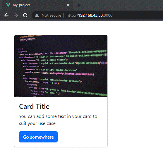
BootstrapVue provides a variety of card components that can be used to style text, headings, and images. The most basic card component is the b-card, which can be used to display an image, a heading, and text.
Here is an example:
<template>
  <div class="m-5 d-flex justify-content-center">
    <b-card
      title="Card Title"
      img-src="https://images.unsplash.com/photo-1653387137517-fbc54d488ed8?ixlib=rb-4.0.3&ixid=MnwxMjA3fDB8MHxzZWFyY2h8MjB8fHZ1ZXxlbnwwfHwwfHw%3D&auto=format&fit=crop&w=500&q=60"
      img-alt="Image"
      img-top
      tag="article"
      style="max-width: 20rem"
      class="mb-2"
    >
      <b-card-text>
        You can add some text in your card to suit your use case
      </b-card-text>
      <b-button href="#" variant="primary">Go somewhere</b-button>
    </b-card>
  </div>
</template>
The code above will create a card component with an image, a title, and some text displayed using the b-card component.
BootstrapVue provides other card components that can be used to create headings, paragraphs, lists, and more. BootstrapVue also provides a utility class system for card-related styles, in which you can apply common styles like text color, font weight, and text alignment.
Session Replay for Developers
Uncover frustrations, understand bugs and fix slowdowns like never before with OpenReplay — an open-source session replay tool for developers. Self-host it in minutes, and have complete control over your customer data. Check our GitHub repo and join the thousands of developers in our community.
Advanced Components
BootstrapVue provides many advanced components that can be used to add more complex functionality to your Vue.js applications. Some of these advanced components are modals, carousels, and tooltips.
Modals
Modals are a popular way to display content in a modal dialog on the current page. BootstrapVue provides a b-modal component that can be used to create modals with various functionalities, such as showing/hiding the modal, changing its size, and adding custom content.
Here is an example:
<template>
  <div
    class="d-flex justify-content-center align-items-center"
    style="height: 100vh"
  >
    <b-button variant="primary" @click="showModal = true">Open Modal</b-button>
    <b-modal v-model="showModal" title="My Modal">
      <p>Hello, world!</p>
    </b-modal>
  </div>
</template>
<script>
export default {
  data() {
    return {
      showModal: false,
    };
  },
};
</script>
The code above will create a button that, when clicked, will show a modal dialog with the title “My Modal” and the text “Hello, world!”.

BootstrapVue also provides other modal-related components that can be used to create confirmation dialogs, scrollable modals, and more. BootstrapVue also provides events that can trigger actions before and after the modal is shown or hidden.
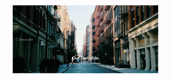
Carousels
Carousels are a popular way to display a series of images or other content in a rotating carousel. BootstrapVue provides a b-carousel component that can be used to create carousels with various functionalities, such as autoplay, navigation controls, and indicators.
Here is an example:
<template>
  <div
    class="d-flex justify-content-center align-items-center"
    style="height: 100vh"
  >
    <b-carousel
      id="carousel-1"
      v-model="slide"
      :interval="4000"
      controls
      indicators
      background="#ababab"
      img-width="1024"
      img-height="480"
      style="text-shadow: 1px 1px 2px #333"
      @sliding-start="onSlideStart"
      @sliding-end="onSlideEnd"
      class="w-75"
    >
      <!-- Text slides with image -->
      <b-carousel-slide
        caption="Our First slide"
        text="A beautiful day in the streets"
        img-src="https://picsum.photos/1024/480/?image=57"
      ></b-carousel-slide>
      <!-- Slides with custom text -->
      <b-carousel-slide img-src="https://picsum.photos/1024/480/?image=62">
        <h1>Welcome to BootstrapVue</h1>
      </b-carousel-slide>
      <!-- Slides with just an image -->
      <b-carousel-slide
        text="my text"
        img-src="https://picsum.photos/1024/480/?image=64"
      ></b-carousel-slide>
      <!-- Slides with img slot -->
      <!-- Note the classes .d-block and .img-fluid to prevent browser default image alignment -->
      <b-carousel-slide>
        <template #img>
          <img
            class="d-block img-fluid w-100"
            width="1024"
            height="480"
            src="https://picsum.photos/1024/480/?image=50"
            alt="image slot"
          />
        </template>
      </b-carousel-slide>
    </b-carousel>
  </div>
</template>
This code will create a carousel with three slides containing an image and a caption. BootstrapVue also provides other carousel-related components that can be used to create slide transitions, fade transitions, and provides events that can be used to trigger actions before and after each slide is shown.
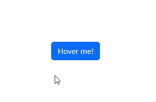
Tooltips
Tooltips are a popular way to display additional information when the user hovers over an element. BootstrapVue provides a b-tooltip component that can be used to create tooltips with various functionalities, such as changing the position, adding custom content, and controlling when the tooltip is shown.
Here is an example:
<template>
  <div
    class="d-flex justify-content-center align-items-center"
    style="height: 100vh"
  >
    <b-button variant="primary" v-b-tooltip.hover.top="'Hello, world!'"
      >Hover me!</b-button
    >
  </div>
</template>
This code will create a button that, when hovered over, will show a tooltip with the text “Hello, world!”.
BootstrapVue also provides other tooltip-related components that can be used to create tooltips with HTML content, programmatically show/hide tooltips, and more.
Customizing BootstrapVue components
Customizing BootstrapVue components allows you to tailor the appearance and behavior of the components to your specific needs. Using examples, let’s now learn how to customize two BootstrapVue components, buttons, and modals.
Customizing Buttons
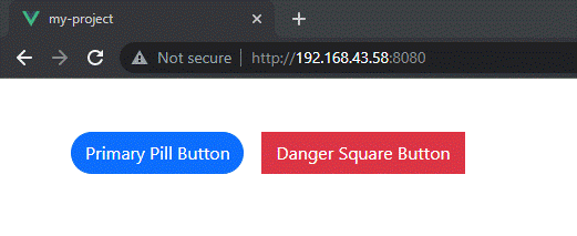
BootstrapVue provides many customization options for buttons, such as changing the size, color, and shape and adding custom classes or styles.
Here is an example of how to change the color and shape of a button using BootstrapVue classes:
<template>
  <div class="m-5">
    <b-button variant="primary" class="rounded-pill"
      >Primary Pill Button</b-button
    >
    <b-button variant="danger" class="rounded-0">Danger Square Button</b-button>
  </div>
</template>
This code will create two buttons, one with a primary color and a rounded pill shape, and one with a danger color and a square shape. The rounded-pill and rounded-0 classes are BootstrapVue classes that control the border radius of the button.
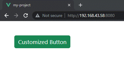
You can also add custom classes or styles to the button by using the class or style attributes:
<template>
  <div class="m-5 d-flex justify-content-center">
    <b-button
      variant="success"
      class="my-custom-class"
      style="font-size: 1.2rem"
      >Customized Button</b-button
    >
  </div>
</template>
This code will create a success button with a custom class of my-custom-class and a custom style of font-size: 1.2rem;.
Customizing Modals
BootstrapVue provides many customization options for modals, such as changing the size, position, backdrop, and adding custom content or styles.
Here is an example of how to change the size and position of a modal using BootstrapVue props:
<template>
  <div
    class="d-flex justify-content-center align-items-center"
    style="height: 100vh"
  >
    <b-button variant="primary" @click="showModal = true">Open Modal</b-button>
    <b-modal v-model="showModal" title="My Modal" size="lg" centered>
      <p>Hello, world!</p>
    </b-modal>
  </div>
</template>
<script>
export default {
  data() {
    return {
      showModal: false,
    };
  },
};
</script>
When clicked, this code will create a button that will show a modal dialog with the title “My Modal” and the text “Hello, world!” with a large size and centered position.

You can also add custom content or styles to the modal by using slots or the style attribute:
<template>
  <div class="d-flex justify-content-center m-5">
    <b-button variant="primary" @click="showModal = true">Open Modal</b-button>
    <b-modal v-model="showModal" title="My Modal">
      <template #default>
        <h2>Custom Heading</h2>
        <p>This is some custom content.</p>
      </template>
      <template #modal-footer="{ ok }">
        <b-button @click="ok()">Custom OK Button</b-button>
      </template>
      <template #modal-body="{ css }">
        <p :style="css">This paragraph has custom CSS.</p>
      </template>
    </b-modal>
  </div>
</template>
<script>
export default {
  data() {
    return {
      showModal: false,
    };
  },
};
</script>
This code will create a modal dialog with a custom heading and content, an OK button, and a paragraph with custom CSS.

Styling with BootstrapVue
BootstrapVue provides powerful styling features that allow you to easily style your components with CSS. In this article, we will explain how to style BootstrapVue components using CSS.
Styling Components
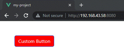
BootstrapVue components have a set of default styles that you can easily customize. You can apply styles to a component by adding a class or style attribute to the component:
<template>
  <div class="m-5">
    <b-button
      variant="primary"
      class="my-custom-class"
      style="background-color: red"
      >Custom Button</b-button
    >
  </div>
</template>
In the code above, we’ve added a custom class of my-custom-class to the button and a custom style of background-color: red. This will change the background color of the button to red.
CSS Preprocessors
BootstrapVue also supports the use of CSS preprocessors like Sass and Less. Using a preprocessor allows you to write more powerful and modular CSS code. To use a preprocessor with BootstrapVue, you can simply include the preprocessor file in your project and import it into your code:
/* In your main.scss file */
@import "~bootstrap/scss/bootstrap";
@import "~bootstrap-vue/src/index.scss";
Once you’ve imported the preprocessor files, you can use their features to style your components. For example, in Sass, you can use variables to define colors and other properties:
$primary-color: #007bff;

.custom-button {
  background-color: $primary-color;
  border-radius: 0.25rem;
}
In this example, we’ve defined a variable for the primary color and used it to style a custom button with a custom class of custom-button. This will give the button a background color of #007bff (the primary color) and a border radius of 0.25rem.
Scoped Styles
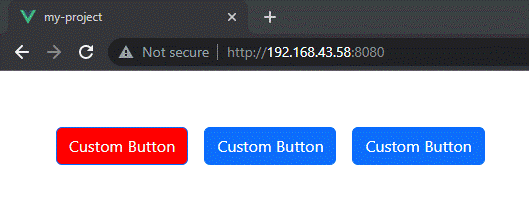
Sometimes you may want to apply styles to a component that only affects that component and not any other components on the page. In this case, you can use scoped styles, which are only applied to a specific component and its children.
To use scoped styles in BootstrapVue, you can add a scoped attribute to the <style> tag in your component:
<template>
  <div class="m-5">
    <b-button variant="primary" class="my-custom-class m-2"
      >Custom Button</b-button
    >
    <b-button variant="primary">Custom Button</b-button>
    <b-button variant="primary">Custom Button</b-button>
  </div>
</template>
<style scoped>
.my-custom-class {
  background-color: red;
}
</style>
In this example, we’ve added a scoped attribute to the <style> tag and defined a style for the my-custom-class class. This style will only be applied to the button in this component and not to any other buttons on the page.
Conclusion
In this article, we have covered the basics of BootstrapVue, including its installation and setup, configuration, and usage. We have explored some of its key components, such as buttons, modals, tooltips, and others.
BootstrapVue is a powerful tool that can help developers create beautiful, responsive web applications quickly and easily. Whether you are building a simple website or a complex web application, it can help you get started and make building user interfaces much easier.
Gain Debugging Superpowers
Unleash the power of session replay to reproduce bugs and track user frustrations. Get complete visibility into your frontend with OpenReplay, the most advanced open-source session replay tool for developers.