Glassmorphic UI in React using CSS

Ever since Glassmorphism entered the mainstream, it has been adopted by Microsoft, Windows, and many others, becoming the go-to UI design. This article will show you what you need to know about creating a Glassmorphism UI. With the help of an example, we’ll also see how you can achieve this effect in a React application using CSS.
What is Glassmorphism?
As the name implies, Glassmorphism is a style that uses the properties of glass to enhance your design. It gives a translucent or transparent look to its elements. This effect is achieved by blurring an object, allowing the background to shine through, giving it the impression of frosted glass. Here are some examples:

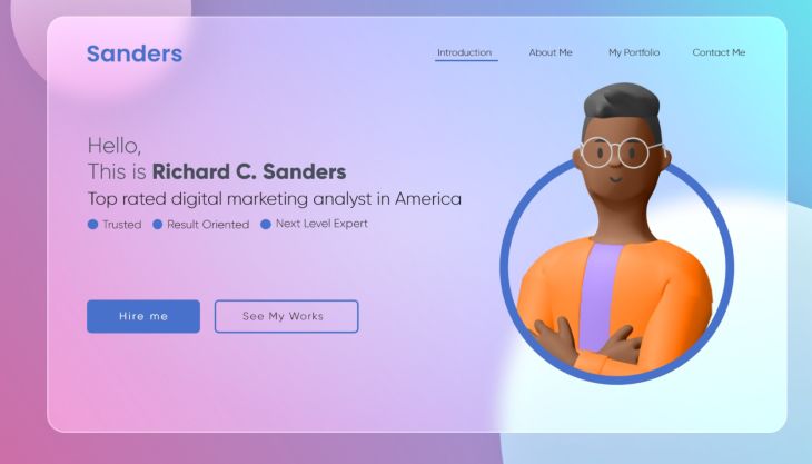
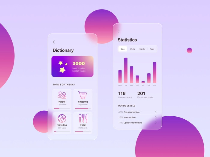
The images above show that the upper layers receive color and light from the background, like glass.
Elements and features of a Glassmorphism UI
Glassmorphism creates an interface that looks like a series of glassy panels floating in the background. To achieve this, the following features need to be implemented:
- Multi-layered style: The best way to have a Glassmorphic effect is to create a multi-layered style in which one or more transparent layers are placed on a bright, colorful background. The layered interface maintains a clean look that’s easy on the eyes.
- Transparency: To achieve the glass-like effect, the upper layer is blurred to increase transparency, allowing it to receive light and color from the layer underneath it. Adding a subtle shadow around the contours of the layers on top gives the impression of extra depth in the design.
- Subtle and Colorful backgrounds: Choosing brilliant colors for the background is essential when designing a Glassmorphism UI. It is best to use bright backgrounds or a pastel color palette, depending on the intended aesthetic. Using these colors highlights the transparency of the layers on top, which plays a crucial role in enhancing the Glassmorphic effect. You can create colorful gradients for your background here.
Simple steps to creating a Glassmorphism UI
In other to have a great Glassmorphism UI, do the following;
- Set up the right background: choosing the proper background is crucial in having the specified look. However, it deserves note that an excessive amount of detail within the background isn’t required for the proper impact. On the other hand, certify the background isn’t too bland. Colorful backgrounds with less detail and more vibrancy are nice.
- Set the proper Transparency: Setting the proper transparency is essential to an ideal through-glass effect. Play with the opacity of the background and the upper layer to produce the proper balance between transparency and blurring effect.
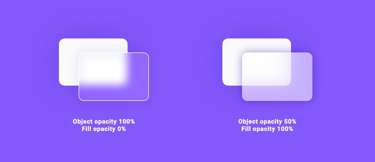
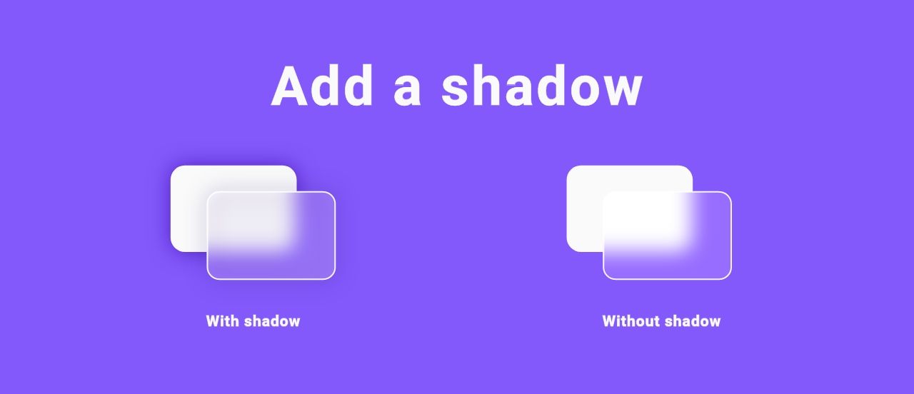
- Add a Shadow: Adding a shadow to the object or upper layer on which you wish to use the Glassmorphism effect conveys a feeling of the object’s scale and depth. However, the shadow shouldn’t be overdone.
- Add borders to the Outline: Along with transparency, adding a thin border creates an imitation of a glass-like edge. It helps in making the design stand apart from its surrounding.
- Establish a clear sense of hierarchy: Create the correct spacing and contrast between the items in the design layout. Making sure the intended elements stand out will help with accessibility challenges. Remember, a strong visual hierarchy helps the user understand the information quickly.
- Don’t apply the transparency effect in areas requiring active interactions, such as buttons, toggles, navigation, and similar elements.
Creating our Glassmorphic React UI
To better understand the concept of Glassmorphism, we’ll be building a simple UI with React and implementing the Glassmorphism effect. To do this, navigate to your desired project directory and run the following command to create our React app :
npx-create-react-app glassmorphism-uiRun this command to access the newly-created directory.
cd glassmorphism-uiStart the development server using the command below.
npm startThe default React page will be loaded on your browser.
Session Replay for Developers
Uncover frustrations, understand bugs and fix slowdowns like never before with OpenReplay — an open-source session replay tool for developers. Self-host it in minutes, and have complete control over your customer data. Check our GitHub repo and join the thousands of developers in our community.
Building our simple landing page
When building a Glassmorphism UI, the CSS properties to watch out for are the backdrop-filter and the alpha value for the background.
The backdrop-filter: blur(_px) is what adds the blur effect while the alpha value in the background rgba sets the opacity or transparency of the object. We’ll also use the box-shadow to add shadows to our Glassmorphic components. Feel free to get documentation on these or any other CSS properties on MDN.
In other to build our UI, we are going to do the following. Firstly we’ll add our background image via our index.css file in our React app.
*{
    margin: 0;
    padding: 0;
    box-sizing: border-box;
}
body {
/*Adding our background image*/

    background-image: url('../src/Geometric-Background.png.webp')
}
Then we’ll create a file GlassUI.jsx in our React app. Using JSX, we’ll do all the HTML work for our UI in this file.
GlassUI = () => {
return (
  <div>
    /*Our code goes here*/
  </div>
}
To create the upper transparent card layer of UI, we first create a div in our GlassUI.jsx file.
<div className = "upper-layer">
  {/* code block */}
</div>
To implement the Glassmorphic effect on the upper layer div created above, we’ll add the following in our index.css file.
.upper-layer {
  display: flex;
  position: relative;
/* Setting the size of the upper layer to 80% of the screen size*/
  height: 80vh;
  width: 80vw;
  align-items: center;
  justify-content: space-between;
  padding: 50px;

/*the alpha value controls the transparency*/
  background: rgba( 255, 255, 255, 0.3 );

/* This controls the blurring effect*/
backdrop-filter: blur( 7.5px );
  -webkit-backdrop-filter: blur( 7.5px );

/*Adding the shadow*/
box-shadow: 0 8px 32px 0 rgba( 0, 0, 0, 0.18 );

/* Adding our borders*/
  border-radius: 10px;
  border: 1px solid rgba( 255, 255, 255, 0.18 );
  z-index: 4;
}
With this done, we have successfully added the Glassmorphism effect to our upper layer. Here’s what it should look like.
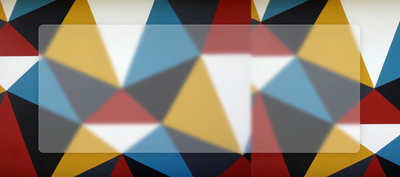
Our upper layer is transparent, allowing light and color to pass through it.
The Glassmorphism effect can be used on any component in React just by altering the opacity of the background of the component, its box-shadow, and its backdrop-filter: blur(). To demonstrate this, we’ll add some content to our UI and implement our Glassmorphism effect on these contents.
<div className="upper-layer">
<header>
<a href="#" className="logo">
Logo
</a>
<ul>
<li>
<a href="#" className="active">
Home
</a>
</li>
<li>
<a href="#">Contact</a>
</li>
<li>
<a href="#">About</a>
</li>
<li>
<a href="#">Team</a>
</li>
</ul>
</header>
<div className="content">
<h2>Glasmorphism in React</h2>
<p>
Ever since Glassmorphism entered the mainstream, it has been adopted by
Microsoft and Windows and a host of others. Glassmorphism has gone on to
become the go-to UI design. This article will show the concept of us
Glassmorphism and a step-by-step illustration of how you can achieve this
effect in a React application.
</p>
<a href="#">Read more</a>
</div>
<div className="image">
<img src={sideImage}></img>
</div>
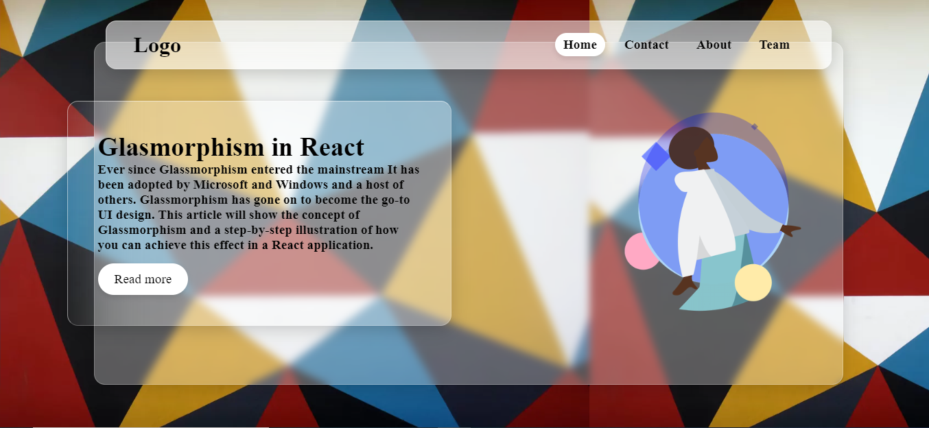
</div>;With these contents added to our page, we can now add our Glassmorphism effect to these contents using their tag class names.
li {
      list-style: none;
}
  header {
      position: absolute;
      top: -40px;
      right: 20px;
      left: 20px;
      padding: 20px 50px;
/* Responsive layout */
      display: flex;
      align-items: center;
      justify-content: space-between;

/* Adding Glassmorphism effect to our navbar*/
      background: rgba( 255, 255, 255, 0.5);
      box-shadow: 0 8px 32px 0 rgba( 0, 0, 0, 0.18 );
      backdrop-filter: blur(50px);

/* Adding our borders*/
      border-radius: 20px;
      border: 1px solid rgba( 255, 255, 255, 0.25 );
      border-top: 1px solid rgba( 255, 255, 255, 0.5 );
      border-left: 1px solid rgba( 255, 255, 255, 0.5 );
}
/* Adding some styles to the header */
  header .logo {
      color: #000000;
      font-weight: 700;
      text-decoration: none;
      font-size: 2.5em;
}
  header ul {
      display: flex;
}
  header ul li {
      list-style: none;
      margin: 0 10px;
}
  header ul li a {
      text-decoration: none;
      font-weight: 800;
      font-size: 1.5em;
      color: #000000;
      padding: 8px 15px;
}
  header ul li a:hover, .active{
      border-radius: 30px;
      background: #ffffff;
      box-shadow: 0 5px 10px rgba( 0, 0, 0, 0.1 )
}


  .content {
      transform: translateX(-100px);
/* Adding Glassmorphism effect to the body*/
      background: rgba( 255, 255, 255, 0);
      backdrop-filter: blur(50px);

/*Adding shadow to the content*/
      box-shadow: 0 8px 32px 0 rgba( 0, 0, 0, 0.18 );

/*Setting the borders of the content*/
      border-radius: 20px;
      border: 1px solid rgba( 255, 255, 255, 0.25 );
      border-top: 1px solid rgba( 255, 255, 255, 0.5 );
      border-left: 1px solid rgba( 255, 255, 255, 0.5 );
      max-width: 700px;
      padding: 55px;
}
  .content h2 {
      font-weight: 800;
      font-size: 3em;
      color: #000000;
}
  .content p {
      font-weight: 500;
      font-size: 1.5em;
      color: #000000;
}
  .content a {
      display: inline-block;
      padding: 15px 30px;
      color: #000000;
      margin-top: 20px;
      border-radius: 30px;
      font-size: 1.5em;
      font-weight: 500;
      text-decoration: none;
      background: #ffffff;
      box-shadow: 0 5px 10px rgba( 0, 0, 0, 0.1 );
}
With these done, our UI should look like this:
Before development, you can save time by generating values for the following CSS properties;
- Background
- Box-shadow
- Backdrop-filter: blur (_px)
From sites like css.glass, hype4academy. Also, you can test and modify it as you wish, as these sites come with visual representations.
Conclusion
Adding the Glassmorphic effect to your designs is pretty simple and can be implemented in any application. This article helped you implement a Glassmorphism effect in React.js on a simple UI, but the same principles apply to more complex UI. I hope you found this helpful. Happy coding!
Resources
A TIP FROM THE EDITOR: For a different UI style, check out our Introduction To Neumorphic Designs article.
Gain Debugging Superpowers
Unleash the power of session replay to reproduce bugs and track user frustrations. Get complete visibility into your frontend with OpenReplay, the most advanced open-source session replay tool for developers.