
Harnessing Modern Dialog Elements for Modals


Crafting beautiful dialog and modal effects is a fantastic way to flaunt your front-end prowess. Yet, it can be quite difficult to juggle HTML, scripting, and complex CSS bugs. To empower developers and take their skills to the next level, the web’s gatekeepers have granted us a gift: the ability to design and create these effects with a plethora of utilities using just HTML. This article will delve into the latest enhancements packed into the HTML dialog toolkit, unlocking a whole new level of web design possibilities.

Discover how at OpenReplay.com.
In the contemporary digital landscape, no matter how much you may try to avoid it, crafting your website components with elegance is a must.
Over the years, developers have grappled with a formidable challenge: creating modals that captivate the attention of website visitors. This has been a constant uphill battle.
Let’s take a stroll down memory lane to explore the less organized methods of creating modals before the introduction of the Dialog element.
- Create the HTML file named
modal.html. - Put in the boilerplate HTML code; it should also contain a
styletag and ascripttag.
<!DOCTYPE html>
<html lang="en">
 <head>
  <meta charset="UTF-8" />
  <meta name="viewport" content="width=device-width, initial-scale=1.0" />
  <title>Document</title>
 </head>
 <style></style>
 <body>
  <!-- HTML Elements here -->
  <script></script>
 </body>
</html>- Here’s the styling:
<style>
 .overlay {
  display: none;
  position: fixed;
  inset: 0;
  background: rgba(0, 0, 0, 0.5);
  z-index: 9;
 }
 .modal.open,
 .overlay.open {
  display: block;
 }
 .modal {
  display: none;
  position: fixed;
  padding: 0.5rem;
  top: 50%;
  left: 50%;
  transform: translate(-50%, -50%);
  background: white;
  border-radius: 0.25rem;
  z-index: 10;
 }
</style>.overlayproperty gives a dark shade on the background but is hidden withdisplay:none..modalproperty styles the modal effect, which is also hidden withdisplay:none..openwill be toggled on with a javascript event listener to make.overlayand.modalvisible.
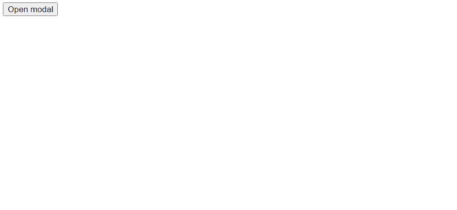
- Write the HTML elements. Something to demo the effect, nothing too complex.
<button data-open-modal>Open modal</button>
<div data-overlay class="overlay"></div>
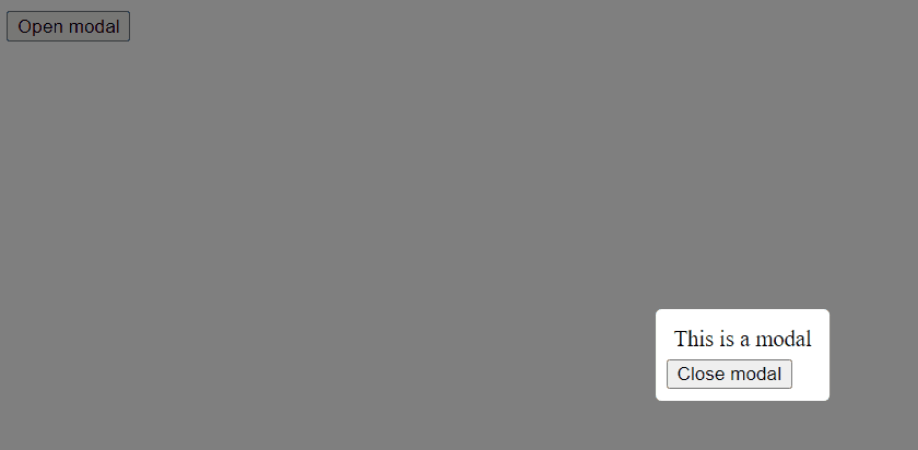
<div data-modal class="modal">
<div style="margin: 5px">This is a modal</div>
<button data-close-modal>Close modal</button>
</div>- A
buttonelement is created here with an attributedata-open-modal - Two
divelements are also created with theoverlayandmodalclasses. Remember that the display of this property is hidden for now.
- Here’s the script for the modal behavior:
<script>
 const openButton = document.querySelector("[data-open-modal]");
 const closeButton = document.querySelector("[data-close-modal]");
 const modalEffect = document.querySelector("[data-modal]");
 const overlayEffect = document.querySelector("[data-overlay]");
 openButton.addEventListener("click", () => {
  modalEffect.classList.add("open");
  overlayEffect.classList.add("open");
 });
 closeButton.addEventListener("click", () => {
  modalEffect.classList.remove("open");
  overlayEffect.classList.remove("open");
 });
</script>- I used the DOM to select the data attributes,
data-open-modal,data-close-modal,data-modal, anddata-overlay. - Then, event listeners were added to toggle the
openclass on themodalandoverlayclasses to give both effects a block display.
modal.htmlshould look like this
<!DOCTYPE html>
<html lang="en">
 <head>
  <meta charset="UTF-8" />
  <meta name="viewport" content="width=device-width, initial-scale=1.0" />
  <title>Modal</title>
  <style>
   .overlay {
    display: none;
    position: fixed;
    inset: 0;
    background: rgba(0, 0, 0, 0.5);
    z-index: 9;
   }
   .modal.open,
   .overlay.open {
    display: block;
   }
   .modal {
    display: none;
    position: fixed;
    padding: 0.5rem;
    top: 50%;
    left: 50%;
    transform: translate(-50%, -50%);
    background: white;
    border-radius: 0.25rem;
    z-index: 10;
   }
  </style>
 </head>
 <body>
  <button data-open-modal>Open modal</button>
  <div data-overlay class="overlay"></div>
  <div data-modal class="modal">
   <div style="margin: 5px">This is a modal</div>
   <button data-close-modal>Close modal</button>
  </div>
  <script>
   const openButton = document.querySelector("[data-open-modal]");
   const closeButton = document.querySelector("[data-close-modal]");
   const modalEffect = document.querySelector("[data-modal]");
   const overlayEffect = document.querySelector("[data-overlay]");
   openButton.addEventListener("click", () => {
    modalEffect.classList.add("open");
    overlayEffect.classList.add("open");
   });
   closeButton.addEventListener("click", () => {
    modalEffect.classList.remove("open");
    overlayEffect.classList.remove("open");
   });
  </script>
 </body>
</html>
See the result
- Observe how tedious it is to create a modal effect as simple as this, and now imagine how much code would be needed to create more complex modals.
- This is the reason behind the new HTML
dialogelement, which makes creating simple modal effects and adding more complex features easier with as little markup as possible.
Introducing Dialog Elements
In modal.html, there were a few redundancies:
- A random element for overlay,
<div data-overlay class="overlay"></div>which is extra code, in my opinion. - Even though the modal is in use, the user can still tab into the background and interact with the entire webpage.
 This is where the
 dialogelement comes into play; it allows the creation of modals without the need for coding an overlay effect and locks the webpage out so that only the modal can be used.
Dialog effect vs. Modal effect
Before firing off with the dialog element, I want to highlight a subtle difference between dialog and modal effects. The element used is called the dialog element but can be used to create a dialog or modal effect.
When a dialog effect is used, it shows a pop-up that allows the user to interact with the rest of the webpage.
However, a modal effect will only allow a user to interact with the modal and restrict the user from interacting with the webpage until the modal is closed.
To specify between dialog and modal effects, use the method show() for a dialog effect and showModal() for a modal effect.
I demoed this in the markup below.
Markup
This is the same example from modal.html, but modified to use the dialog element.
The main difference is in the <body></body> and <script></script> elements. The styling is the same.
For clarity, create a new HTML file dialog.html
<!DOCTYPE html>
<html lang="en">
 <head>
  <meta charset="UTF-8" />
  <meta name="viewport" content="width=device-width, initial-scale=1.0" />
  <title>Dialog element</title>
  <style>
   .overlay {
    display: none;
    position: fixed;
    inset: 0;
    background: rgba(0, 0, 0, 0.5);
    z-index: 9;
   }
   .modal {
    display: none;
    position: fixed;
    padding: 0.5rem;
    top: 50%;
    left: 50%;
    transform: translate(-50% -50%);
    background: white;
    border-radius: 0.25rem;
    z-index: 10;
   }
  </style>
 </head>
 <body>
  <button data-open-modal>Open modal</button>
  <!-- Get rid of overlay element -->
  <!-- Remove the modal class -->
  <dialog data-modal>
   <div>This is a modal</div>
   <button data-close-modal>Close modal</button>
  </dialog>
  <script>
   // Remove overlay from Javascript
   const openButton = document.querySelector("[data-open-modal]");
   const closeButton = document.querySelector("[data-close-modal]");
   const modalEffect = document.querySelector("[data-modal]");
   openButton.addEventListener("click", () => {
    // No need for class lists; just use .show() or .showModal
    modalEffect.showModal();
   });
   closeButton.addEventListener("click", () => {
    // Just use modal.close()
    modalEffect.close();
   });
  </script>
 </body>
</html>
Almost the same result
 I made the following changes to the markup:
- Removed the
overlaydiv - Removed the
modalclass and changed thedivelement containing the modal content to adialogelement - Removed the
overlayDOM elements - Changed
modalEffect.classList.add()tomodalEffect.showModal(). - Changed
modalEffect.classList.remove()tomodalEffect.remove() - Removed the CSS code for changing the display since
.showModal()automatically changes the display
Benefits of Dialog Elements
Less styling
Notice the CSS styling of the modal class before:
.modal {
 display: none;
 position: fixed;
 top: 50%;
 left: 50%;
 transform: translate(-50% -50%);
 padding: 0.5rem;
 background: white;
 border-radius: 0.25rem;
 z-index: 10;
}
With the dialog element, even if the first five properties of the .modal class are removed, the modal will still have the same effect and appear in the center.
.modal {
 padding: 0.5rem;
 background: white;
 border-radius: 0.25rem;
 z-index: 10;
}
To make things juicier, try removing all the custom styling. You’ll see that
the modal still retains its basic style, which is cool, in my opinion.
Directing User Attention
To ensure that users concentrate on filling out a form without being sidetracked by other website elements, here’s a simple trick: enclose your form within a dialog element. This way, users won’t be able to interact with anything else on the page until they choose to close the modal. It’s a subtle yet effective way to keep their focus right where you want it.
Enhancing Accessibility
Using the dialog element makes it simple for users to exit a modal by pressing the esc key. On the other hand, if you opt for a custom modal setup, you’d have to create this functionality from the ground up. The dialog element not only improves accessibility but also saves you the hassle of reinventing the wheel.
Advanced Features of Dialog Elements
Let’s try some cooler stuff with styling the modal. Setting the Scene If you’re aiming to customize the background of the dialog element, giving it a unique vibe distinct from the standard dark overlay effect, here’s the creative way to go about it:
<style>
 dialog::backdrop {
  background-color: hsl(194, 99%, 72%);
 }
</style>
Backdrop change
- Create new styles within the
<style></style>tag - Using the element selector and pseudo element
dialog:: backdrop {}, specify the colour you want. Form Flexibility The ‘dialog’ element is fantastic for its high degree of customization. For example, let’s consider a ‘form’ element. You can effortlessly nest a ‘form’ inside the ‘dialog’ element to harness its versatility.
<dialog data-modal>
 <form>
  <input type="text" />
  <button type="submit">Update</button>
 </form>
</dialog>- Upon form submission, the data in the textbox is sent, just as you’d expect from a standard form. However, suppose you wish to give users the option to hold off on submission and retain their information until they’re prepared. In that case, the ‘dialog’ element comes to the rescue, allowing you to create this user-friendly feature.
<dialog data-modal>
 <form>
  <input type="text" />
  <button type="submit" formmethod="dialog">Cancel</button>
  <button type="submit">Update</button>
 </form>
</dialog>- Start by crafting a new button, and don’t forget to include the formmethod attribute, setting it to “dialog.”
- Here’s the magic: when a user clicks the “cancel” button, the form won’t leap into submission mode. Instead, it can be reopened later, allowing users to return to it and complete their entries.
- Meanwhile, the “Update” button functions like a regular form’s submit button, processing the information as expected.

Limitations and Workarounds
While the dialog element is powerful, it lacks the default feature of closing modals by clicking the background, a common trait in responsive modals. To bring this convenient functionality to your dialog, you’ll need a touch of JavaScript (pun intended). But before you dive into the code, make sure to remove the close functions. Those elements are no longer used, and keeping them around might cause our script to misbehave.
const closeButton = document.querySelector("[data-close-modal]") // Remove this line
// Remove this block of code.
closeButton.addEventListener("click",()=>{
  modalEffect.close();
})
Here’s the script for closing on clicking
modalEffect.addEventListener("dblclick", e => { const dialogDimensions =
modalEffect.getBoundingClientRect(); if( e.clientX < dialogDimensions.left ||
e.clientX > dialogDimensions.right || e.clientY < dialogDimensions.top ||
e.clientY > dialogDimensions.bottom ){ modalEffect.close() } })
Here are the key steps to achieve the desired functionality:
- Include the code above within the
scripttag. - The line
modalEffect.addEventListener("dblclick", e =>adds an event listener to themodalEffectelement, and when it’s double-clicked, it captures the event object to provide information aboutmodalEffect. - Use
const dialogDimensions = modalEffect.getBoundingClientRect();to obtain the dimensions of the clicked element. - The subsequent
ifstatement checks if the double-click occurred outside themodalEffectelement.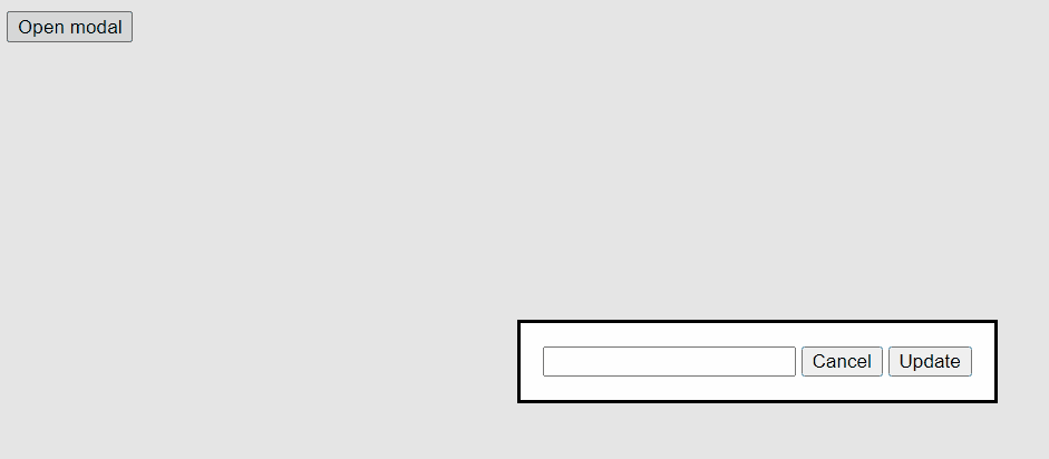
Comparison: Dialog vs Traditional Modals
As always, software is best approached when two sides are looked at fairly, so if you are ever faced with a choice between using the dialog element and coding up traditional modals, here are some facts to consider:
Dialog Elements:
- HTML Integration: Dialog elements are part of the HTML5 specification, providing a native and semantic way to create modals.
- Simplicity: They offer a simpler and more declarative way to define modals without needing custom HTML structures.
- Built-in Features: Dialog elements come with built-in methods like
showModal()andclose(), making it easy to manage modal states. - Accessibility: They have built-in accessibility features, such as ARIA attributes, for better accessibility out of the box. Traditional Modals:
- Custom Implementation: Traditional modals are typically custom-coded using HTML, CSS, and JavaScript. They involve creating HTML structures and styles from scratch.
- Flexibility: They provide more flexibility in terms of design and behavior, allowing you to fully customize the modal’s appearance and functionality.
- Complexity: Building custom modals can be more complex and may require additional effort for handling open/close states, animations, and accessibility.
- Compatibility: They can work in older browsers that don’t support the newer dialog elements.
Conclusion
In conclusion, the evolution of modals and dialogs in web development has reached a new level of simplicity and efficiency with the introduction of the HTML dialog element.
As explored in this article, the dialog element offers a range of benefits that make it a compelling choice for creating modal dialogs in modern web applications.
The traditional approach to creating modals involved a complex mix of HTML, CSS, and JavaScript, often leading to redundancy and potential pitfalls regarding accessibility and user experience.
The dialog element, on the other hand, provides a more streamlined and accessible solution
which borders on simplicity, accessibility, customization, and efficiency.
In the choice between traditional modals and the dialog element, consider your specific project requirements.
If you need a quick and accessible solution for modal dialogs, the dialog element is a powerful tool.
Embracing this modern approach to modals will not only enhance
the user experience but also simplify your front-end development workflow.
Resources
Gain control over your UX
See how users are using your site as if you were sitting next to them, learn and iterate faster with OpenReplay. — the open-source session replay tool for developers. Self-host it in minutes, and have complete control over your customer data. Check our GitHub repo and join the thousands of developers in our community.
