Implementing select dropdown components that can deal with huge datasets is not trivial, and this article will show you how to go about it, avoiding performance problems and providing a slick user experience.

Discover how at OpenReplay.com.
One common challenge web developers face involves handling large datasets, particularly when implementing components like a select dropdown. Usually, developers display all the data options in the dropdown at once. But when large data is involved, this poses significant drawbacks:
- Performance Issues: Loading all data at once can significantly slow down the application, especially if there’s a large volume of data. Users might experience delays or crashes due to the overwhelming amount of information being loaded simultaneously.
- High Resource Consumption: Fetching and rendering all data simultaneously consumes much bandwidth and system resources. It can lead to increased server load, higher data usage, and reduced battery life on mobile devices.
To address these, we’ll display the data in batches. Initially, we will show the first n items (say 10). Then, users can trigger an action to view the subsequent ten items and repeat this process. Pagination typically enables users to navigate through data sets using a next button, a previous button, and numbered links. However, this approach isn’t practical for a select dropdown because we can’t display the buttons/links inside the dropdown. Instead, we will use the infinite scroll technique, which shares the same premise as classic pagination but eliminates the need for button clicks or numbered links. Instead, as users scroll to the bottom of the displayed options, the next set of options is loaded, continuing until all options are fetched. Users can revisit earlier options to scroll back to the previously loaded data.
We can optimize this component further by including a search field. This combination ensures that users never need to load all options upfront; they can search for what they need regardless of its position in the list, enhancing the component’s efficiency.
We will implement the infinite scrolling using the Intersection Observer API.
The Intersection Observer API
The Intersection Observer API detects when an element intersects with the browser’s viewport or a parent element’s viewport. For a select dropdown component, we can use it to identify when the last option(s) is displayed within the parent container. If this occurs, we can trigger a callback to fetch additional data.
Creating the Select Dropdown Component
We’ll kick off by creating the base select dropdown component. While we’ll use TailwindCSS for styling and TypeScript for typing, it’s worth noting that neither TailwindCSS nor TypeScript is mandatory for this implementation.
To integrate this component, you can add it to an existing React application or start with a new one. If you’re starting fresh, create a new React app using create-react-app:
npx create-react-app my-app --template typescript
cd my-app
Once your React app is set up (or if you’re using an existing project), proceed by creating a new file src/Components/Select/Select.tsx for the select dropdown component and paste the code below:
import { FC, useState } from 'react'
import { SelectOptionProps, SelectProps } from 'Types/SelectTypes'

import { GreaterThanIcon } from 'Assets/Svgs'
import { useListenForOutsideClicks } from 'Hooks'

const Select: FC<SelectProps> = ({ options, selected = { label: '', value: '' }, placeholder = 'Select', handleSelect }) => {
  const [isDropdownOpen, setIsDropdownOpen] = useState(false)

  const openDropdown = () => {
    setIsDropdownOpen(true)
  }

  const closeDropdown = () => {
    setIsDropdownOpen(false)
  }

  const labelClassName = () => {
    return `block max-w-full capitalize truncate ${selected?.label ? 'text-black' : 'text-neutral/400'}`
  }

  const optionClassName = (option: SelectOptionProps, index: number, isSelected: boolean) => {
    isSelected ||= selected?.value === option.value

    return `active:bg-background-selected-option relative cursor-default select-none py-2 px-4 ${
      options.length - 1 === index ? 'rounded-b-md' : ''
    } ${isSelected ? 'bg-secondary/blue/50' : ''} hover:bg-secondary/blue/50 mb-1 last-of-type:mb-[0] block text-left w-full`
  }

  const containerClassName = () => `
    ${
      isDropdownOpen ? '!border-grey/900' : ''
    } px-4 py-2 flex justify-between items-center rounded w-full font-normal border border-solid border-neutral/200 bg-transparent leading-[20px] text-xs text-grey/900
    `

  const { elementRef } = useListenForOutsideClicks(closeDropdown)

  const renderOptions = (options: SelectOptionProps[]) => {
    return options?.length > 0 ? (
      options?.map((option, index) => {
        const isSelected = selected?.value === option.value

        return (
          <button
            type='button'
            key={String(option.value) + String(index)}
            className={optionClassName(option, index, selected?.value === option.value)}
            onClick={() => {
              handleSelect(option)
              closeDropdown()
            }}
          >
            <span
              title={option.label}
              className={`${
                isSelected ? 'font-semibold ' : 'font-normal'
              } block truncate text-black text-[0.625rem] cursor-pointer leading-[0.8rem] font-normal`}
            >
              {option.label}
            </span>
          </button>
        )
      })
    ) : (
      <div className='relative cursor-default select-none py-2 pl-3 pr-9'>
        <span className='font-normal block truncate text-sm text-black'>No options here</span>
      </div>
    )
  }

  return (
    <div className='relative grow'>
      <button type='button' onClick={openDropdown} className={containerClassName()}>
        <span title={selected?.label} className={labelClassName()}>
          {selected?.label || placeholder}
        </span>
        <span className='pointer-events-none ml-3 flex items-center'>
          <GreaterThanIcon className='rotate-90 text-[#96989A]' />
        </span>
      </button>

      {isDropdownOpen && (
        <div
          className={
            'absolute z-[500] w-full overflow-auto rounded-b-md bg-shades/white py-[14px] text-base ring-opacity-5 focus:outline-none mt-1 max-h-40 '
          }
          style={{ boxShadow: '0px 4px 10px rgba(0, 0, 0, 0.08)' }}
          ref={elementRef}
        >
          {renderOptions(options)}
        </div>
      )}
    </div>
  )
}

export default Select
In the component, we manage the open/close state of the dropdown with the isDropdownOpen state, which is a boolean. Alongside this, we create some functions to manage different aspects of the component:
-
openDropdownsets theisDropdownOpenstate totrueand is used to open the dropdown. -
closeDropdownsets theisDropdownOpenstate tofalseand is used to close the dropdown. -
labelClassNamedynamically generates and returns the CSS class name for the component’s label based on whether an item is selected. It helps apply different styles when a selected label or placeholder is displayed. -
optionClassNameprovides dynamic class names for each dropdown option. It takes into account whether the option is selected and the position of the option in the list, which aids in styling each option appropriately. -
containerClassNamegenerates the CSS class for the dropdown container, including adjustments based on whether the dropdown is open or closed. -
renderOptionshandles the rendering of dropdown options. It maps over the options array and returns a button element for each option or a message if there are no options.
Inside this component, we reference TypeScript types SelectOptionProps and SelectProps to enforce a consistent structure for the dropdown options and the component props, respectively. We also use a custom hook named useListenForOutsideClicks to close the dropdown when the user clicks outside it.
We will now define these types in src/Types/SelectTypes.ts. Here’s the code for these type definitions:
export type SelectOptionProps = {
  label: string // displayed label
  value: string // value used in computation
}

export type SelectProps = {
  options: SelectOptionProps[] // an array of the options.
  selected?: SelectOptionProps // the selected option.
  handleSelect: (option: SelectOptionProps) => void // function that is called when an option is selected.
  placeholder?: string
}
Then, we define the useListenForOutsideClicks hook in src/Hooks/useListenForOutsideClicks.ts:
import { useEffect, useRef } from 'react'

/**
 * A custom React hook that listens for clicks outside of a specified element
 * and executes a callback function when detected.
 *
 * @param onOutsideClick The callback function to execute when an outside click is detected
 *
 * @returns A map object containing the following properties:
 *    `elementRef`: A React ref object that should be attached to the element that
 *                  should listen for outside clicks
 *
 */
const useListenForOutsideClicks = (onOutsideClick: () => void) => {
  const elementRef = useRef<any>(null)

  useEffect(() => {
    const handleClickOutside = (event: MouseEvent) => {
      if (elementRef.current && !elementRef.current.contains(event.target)) {
        onOutsideClick?.()
      }
    }
    document.addEventListener('click', handleClickOutside, true)
    return () => {
      document.removeEventListener('click', handleClickOutside, true)
    }
  }, [onOutsideClick])

  return { elementRef }
}

export default useListenForOutsideClicks
When you attach this hook to a component, it monitors clicks anywhere in the document. The hook triggers a callback function if a click occurs outside the specified element. This function, passed as onOutsideClick, typically contains instructions to alter the parent component’s state, like closing a dropdown menu.
The core of this hook lies in its use of a React ref (elementRef) created with useRef. elementRef is attached to the element we want to monitor. The hook then sets up an event listener using useEffect that listens for click events on the document. The listener checks whether the click occurred outside the elementRef. If it did, the onOutsideClick function is executed.
Finally, we use the select dropdown component in our main application file, src/App.tsx. We can import and use the component as part of our application’s UI. Here’s an example of how to incorporate the <Select /> component in App.tsx:
import { Select } from 'Components'
import { SelectOptionProps } from 'Types/SelectTypes'
import { useState } from 'react'
function App() {
const [selectedOption, setSelectedOption] = useState<SelectOptionProps>({ label: '', value: '' })
const handleSelect = (option: SelectOptionProps) => {
setSelectedOption(option)
}
const options: SelectOptionProps[] = [
{ label: 'Option 1', value: 'option-1' },
{ label: 'Option 2', value: 'option-2' },
{ label: 'Option 3', value: 'option-3' },
]
return (
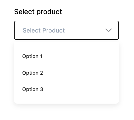
<div className='p-20'>
<div className='block w-52'>
<span className='block mb-2 text-sm'>Select product</span>
<Select options={options} selected={selectedOption} placeholder='Select product' handleSelect={handleSelect} />
</div>
</div>
)
}
export default AppIn the App component, we demonstrate using the Select component. We define a selectedOption state to track the currently selected item. This state is updated through the handleSelect function, which we pass to the Select component, alongside options, a placeholder and selectedOption.
When we start our app, we should see a working Select dropdown component in our browser with three options.
Populating the Dropdown Options
Next, we will populate our dropdown options with data from an API. We will use the https://dummyjson.com/ API to fetch a list of products, map through the products, and display the product titles while using the product ID as values.
We will start by fetching the products in src/App.tsx and passing it to the Select component, replacing the earlier dummy options. We’ll also introduce a boolean value, isFetchingProducts, indicating the data fetching status which we will pass to the component and will be used to display a loader to the user during data retrieval.
import { useEffect, useState } from 'react'

import { Select } from 'Components'
import { SelectOptionProps } from 'Types/SelectTypes'

function App() {
  const [selectedOption, setSelectedOption] = useState<SelectOptionProps>({ label: '', value: '' })
  const [productOptions, setProductOptions] = useState<SelectOptionProps[]>([])
  const [isFetchingProducts, setIsFetchingProducts] = useState(true)

  const handleSelect = (option: SelectOptionProps) => {
    setSelectedOption(option)
  }

  const transformProductToSelectOptions = (products: { title: string; id: number }[]) => {
    if (!products) return []

    return products?.map((product) => {
      return {
        label: product?.title,
        value: product?.id,
      }
    })
  }

  const fetchAndSetProducts = async () => {
    try {
      const response = await fetch('https://dummyjson.com/products')
      const data = await response.json()
      setProductOptions(transformProductToSelectOptions(data?.products))
    } catch (error) {
      alert('Something went wrong')
    } finally {
      setIsFetchingProducts(false)
    }
  }

  useEffect(() => {
    fetchAndSetProducts()
  }, [])

  return (
    <div className='p-20'>
      <div className='block w-52'>
        <span className='block mb-2 text-sm'>Select product</span>
        <Select
          options={productOptions}
          selected={selectedOption}
          placeholder='Select product'
          handleSelect={handleSelect}
          isFetchingOptions={isFetchingProducts}
        />
      </div>
    </div>
  )
}

export default App
Upon loading, the component executes the fetchAndSetProducts function, which retrieves product data from the API. Once the fetch is successful, the data transforms by the transformProductToSelectOptions function. This function converts the product data into an array of objects, each with a label and a value, aligning with the expected format for the Select component. This transformed array is then stored in the productOptions state. The Select component receives these product options as its options prop. Additionally, the isFetchingProducts state, indicating the loading status, is passed to the Select component to manage the display of a loader during data fetching.
Next we will update the Select component (src/Components/Select/Select.tsx) to display a loader when isFetchingProducts is true.
// src/Components/Select/Select.tsx

import { FC, useState } from 'react'
import { SelectOptionProps, SelectProps } from 'Types/SelectTypes'

import { GreaterThanIcon } from 'Assets/Svgs'
import { Loader } from 'Components'
import { useListenForOutsideClicks } from 'Hooks'

const Select: FC<SelectProps> = ({ options, isFetchingOptions, selected = { label: '', value: '' }, placeholder = 'Select', handleSelect }) => {
  const [isDropdownOpen, setIsDropdownOpen] = useState(false)

  const openDropdown = () => {
    setIsDropdownOpen(true)
  }

  const closeDropdown = () => {
    setIsDropdownOpen(false)
  }

  const labelClassName = () => {
    return `block max-w-full capitalize truncate ${selected?.label ? 'text-black' : 'text-neutral/400'}`
  }

  const optionClassName = (option: SelectOptionProps, index: number, isSelected: boolean) => {
    isSelected ||= selected?.value === option.value

    return `active:bg-background-selected-option relative cursor-default select-none py-2 px-4 ${
      options.length - 1 === index ? 'rounded-b-md' : ''
    } ${isSelected ? 'bg-secondary/blue/50' : ''} hover:bg-secondary/blue/50 mb-1 last-of-type:mb-[0] block text-left w-full`
  }

  const containerClassName = () => `
    ${
      isDropdownOpen ? '!border-grey/900' : ''
    } px-4 py-2 flex justify-between items-center rounded w-full font-normal border border-solid border-neutral/200 bg-transparent leading-[20px] text-xs text-grey/900
    `

  const { elementRef } = useListenForOutsideClicks(closeDropdown)

  const renderNoOptions = () => {
    if (isFetchingOptions) return <Loader />

    return (
      <div className='relative cursor-default select-none py-2 pl-3 pr-9'>
        <span className='font-normal block truncate text-sm text-black'>No options here</span>
      </div>
    )
  }

  const renderOptions = (options: SelectOptionProps[]) => {
    return options?.length > 0
      ? options?.map((option, index) => {
          const isSelected = selected?.value === option.value

          return (
            <button
              type='button'
              key={String(option.value) + String(index)}
              className={optionClassName(option, index, selected?.value === option.value)}
              onClick={() => {
                handleSelect(option)
                closeDropdown()
              }}
            >
              <span
                title={option.label}
                className={`${
                  isSelected ? 'font-semibold ' : 'font-normal'
                } block truncate text-black text-[0.625rem] cursor-pointer leading-[0.8rem] font-normal`}
              >
                {option.label}
              </span>
            </button>
          )
        })
      : renderNoOptions()
  }

  return (
    <div className='relative grow'>
      <button type='button' onClick={openDropdown} className={containerClassName()}>
        <span title={selected?.label} className={labelClassName()}>
          {selected?.label || placeholder}
        </span>
        <span className='pointer-events-none ml-3 flex items-center'>
          <GreaterThanIcon className='rotate-90 text-[#96989A]' />
        </span>
      </button>

      {isDropdownOpen && (
        <div
          className={
            'absolute z-[500] w-full overflow-auto rounded-b-md bg-shades/white py-[14px] text-base ring-opacity-5 focus:outline-none mt-1 max-h-40 '
          }
          style={{ boxShadow: '0px 4px 10px rgba(0, 0, 0, 0.08)' }}
          ref={elementRef}
        >
          {renderOptions(options)}
        </div>
      )}
    </div>
  )
}

export default Select
In the renderOptions function, when the options array is empty, it calls renderNoOptions. This function conditionally renders a <Loader /> component if isFetchingOptions is true, indicating data is being fetched. Otherwise, it displays a message indicating that there are no options available.
Next, we will update the SelectProps type in src/Types/SelectTypes.ts to include isFetchingOptions.
export type SelectProps = {
  options: SelectOptionProps[] // an array of the options.
  selected?: SelectOptionProps // the selected option.
  handleSelect: (option: SelectOptionProps) => void // function that is called when an option is selected.
  placeholder?: string
  isFetchingOptions?: boolean
}
Finally, we will create our <Loader /> component in src/Components/Loader/Loader.tsx
const Loader = () => {
  return (
    <div className='flex justify-center items-center '>
      <div className='animate-spin rounded-full h-4 w-4 border-t-2 border-black '></div>
    </div>
  )
}

export default Loader
If all goes well, you should see the product titles from the API in the dropdown menu of the <Select /> component.
Adding Infinite Scroll to the Select Component
As mentioned, we will use the Intersection Observer API to enable infinite scrolling. First, we’ll add parameters to the API endpoint to support pagination. API endpoints support pagination in different ways, and this is often outlined in their documentation. The API we use in this guide requires us to pass the limit and skip parameters. limit dictates the number of items to return, while skip specifies the number of items to bypass before fetching. For instance, with a limit of 5 and a skip of 2, it skips the initial two items (index 0 and 1) and fetches items from index 2 to 6 (totaling five).
To implement infinite scrolling in our component, we will begin by creating a useIntersectionObserver hook (src/Hooks/useIntersectionObserver.ts) dedicated to managing intersection checks. This hook will update the page state once the referenced elements enter the viewport. It will return some values and methods its calling components can use to implement infinite scrolling.
import { useCallback, useRef, useState } from 'react'

const useIntersectionObserver = (isDataLoading: boolean) => {
  const [page, setPage] = useState(1)
  const [hasMore, setHasMore] = useState(true)

  const observer = useRef<IntersectionObserver | null>(null)

  const lastEntryRef = useCallback(
    (node: Element | null) => {
      if (isDataLoading) return

      if (observer.current) observer.current.disconnect()

      observer.current = new IntersectionObserver((entries) => {
        if (entries[0].isIntersecting && hasMore) {
          // update page.
          setPage((prev) => prev + 1)
        }
      })

      if (node) observer.current.observe(node)
    },
    [isDataLoading, hasMore]
  )

  return { lastEntryRef, setHasMore, setPage, page }
}

export default useIntersectionObserver
This hook uses a combination of React’s useState, useRef, and useCallback hooks to manage pagination and observe when a user scrolls to the end of a list or page. The hook initializes state variables for tracking the current page (page) and whether there are more items to load (hasMore). An IntersectionObserver detects when the last item in the current list comes into view. Suppose data is not loading (isDataLoading is false) and more items are available (hasMore is true). In that case, the hook increases the page number, indicating that the next set of items should be loaded. This logic, wrapped in the useCallback hook, ensures efficient, automatic loading of new content as the user scrolls.
The hook returns elements to the consuming component. It returns the lastEntryRef callback ref, which is used to assign the element to be observed for intersection changes. This is typically the last item in the list, enabling the detection of when the user has scrolled to the bottom. The hook also provides setHasMore and setPage functions, allowing the component to update whether more items are available to load and manually set the page number if needed. Finally, it returns the current page state (page), giving the component access to the current pagination status.
Next, we will make use of this hook in src/App.tsx:
import { useEffect, useState } from 'react'

import { Select } from 'Components'
import { SelectOptionProps } from 'Types/SelectTypes'
import { useIntersectionObserver } from 'Hooks'

const LIMIT = 5

function App() {
  const [selectedOption, setSelectedOption] = useState<SelectOptionProps>({ label: '', value: '' })
  const [productOptions, setProductOptions] = useState<SelectOptionProps[]>([])
  const [isFetchingProducts, setIsFetchingProducts] = useState(true)
  const [totalItems, setTotalItems] = useState(0)

  const handleSelect = (option: SelectOptionProps) => {
    setSelectedOption(option)
  }

  const transformProductToSelectOptions = (products: { title: string; id: number }[]) => {
    if (!products) return []

    return products?.map((product) => {
      return {
        label: product?.title,
        value: product?.id,
      }
    })
  }

  const { lastEntryRef, setHasMore, setPage, page } = useIntersectionObserver(isFetchingProducts)

  useEffect(() => {
    if (totalItems === 0) return
    if (!isFetchingProducts) {
      setHasMore(productOptions?.length < totalItems)
    }
  }, [productOptions, totalItems])

  const getSkipValue = () => {
    return (page - 1) * LIMIT
  }

  const fetchAndSetProducts = async () => {
    try {
      setIsFetchingProducts(true)
      const response = await fetch(`https://dummyjson.com/products?limit=${LIMIT}&skip=${getSkipValue()}`)
      const data = await response.json()

      if (page === 1) setProductOptions([])

      setProductOptions((prev) => [...prev, ...transformProductToSelectOptions(data?.products)])
      setTotalItems(data?.total)
    } catch (error) {
      alert('Something went wrong')
      console.log({ error })
    } finally {
      setIsFetchingProducts(false)
    }
  }

  useEffect(() => {
    fetchAndSetProducts()
  }, [page])

  return (
    <div className='p-20'>
      <div className='block w-52'>
        <span className='block mb-2 text-sm'>Select product</span>
        <Select
          options={productOptions}
          selected={selectedOption}
          placeholder='Select product'
          handleSelect={handleSelect}
          isFetchingOptions={isFetchingProducts}
          lastOptionRef={lastEntryRef}
        />
      </div>
    </div>
  )
}

export default App
We append limit and skip params to the API endpoint. Then we use the useIntersectionObserver hook passing the isFetchingProducts state to it. We make use of the functions and variables returned by the hook. We pass lastEntryRef to the lastOptionRef of the <Select /> component which we will handle later. Then we use setHasMore to set hasMore to true if length of productOptions is less than totalItems, and false and isFetchingProducts is false. We will use setPage in the next section.
Finally, let’s update the <Select /> component to pass lastOptionRef to the last item in the dropdown. The only thing to change is in the renderOptions function:
const renderOptions = (options: SelectOptionProps[]) => {
    return options?.length > 0
      ? options?.map((option, index) => {
          const isSelected = selected?.value === option.value

          return (
            <button
              type='button'
              key={String(option.value) + String(index)}
              className={optionClassName(option, index, selected?.value === option.value)}
              onClick={() => {
                handleSelect(option)
                closeDropdown()
              }}
              ref={options?.length - 1 === index ? lastOptionRef : null}
            >
              <span
                title={option.label}
                className={`${
                  isSelected ? 'font-semibold ' : 'font-normal'
                } block truncate text-black text-[0.625rem] cursor-pointer leading-[0.8rem] font-normal`}
              >
                {option.label}
              </span>
            </button>
          )
        })
      : renderNoOptions()
  }
Here, we pass lastOptionRef as ref of the last item:
ref={options?.length - 1 === index ? lastOptionRef : null}We also need to update the SelectProps type (src/Types/SelectTypes.ts) to accommodate this new prop lastOptionRef:
/* eslint-disable react-hooks/exhaustive-deps */
import { useEffect, useState } from 'react'

import { Select } from 'Components'
import { SelectOptionProps } from 'Types/SelectTypes'
import { useIntersectionObserver } from 'Hooks'

const LIMIT = 5

function App() {
  const [selectedOption, setSelectedOption] = useState<SelectOptionProps>({ label: '', value: '' })
  const [productOptions, setProductOptions] = useState<SelectOptionProps[]>([])
  const [isFetchingProducts, setIsFetchingProducts] = useState(true)
  const [totalItems, setTotalItems] = useState(0)
  const [searchInput, setSearchInput] = useState('')
  const [debouncedSearchInput, setDebouncedSearchInput] = useState('')

  const handleSelect = (option: SelectOptionProps) => {
    setSearchInput(option?.label)
    setSelectedOption(option)
  }

  const transformProductToSelectOptions = (products: { title: string; id: number }[]) => {
    if (!products) return []

    return products?.map((product) => {
      return {
        label: `${product?.title}`,
        value: product?.id,
      }
    })
  }

  const { lastEntryRef, setHasMore, setPage, page } = useIntersectionObserver(isFetchingProducts)

  useEffect(() => {
    if (totalItems === 0) return
    if (!isFetchingProducts) {
      setHasMore(productOptions?.length < totalItems)
    }
  }, [productOptions, totalItems])

  const getSkipValue = () => {
    return (page - 1) * LIMIT
  }

  const getApiUrl = () => {
    if (debouncedSearchInput) {
      return `https://dummyjson.com/products/search?q=${debouncedSearchInput}&limit=${LIMIT}&skip=${getSkipValue()}`
    } else {
      return `https://dummyjson.com/products?limit=${LIMIT}&skip=${getSkipValue()}`
    }
  }

  useEffect(() => {
    const timeoutId = setTimeout(() => {
      setProductOptions([])
      setPage(1)
      setDebouncedSearchInput(searchInput)
    }, 500) // delay fetching by 500ms

    return () => {
      clearTimeout(timeoutId)
    }
  }, [searchInput])

  const fetchAndSetProducts = async () => {
    try {
      setIsFetchingProducts(true)
      const response = await fetch(getApiUrl())
      const data = await response.json()

      if (page === 1) setProductOptions([])

      setProductOptions((prev) => [...prev, ...transformProductToSelectOptions(data?.products)])
      setTotalItems(data?.total)
    } catch (error) {
      alert('Something went wrong')
      console.log({ error })
    } finally {
      setIsFetchingProducts(false)
    }
  }

  useEffect(() => {
    fetchAndSetProducts()
  }, [page, debouncedSearchInput])

  return (
    <div className='p-20'>
      <div className='block w-52'>
        <span className='block mb-2 text-sm'>Select product</span>
        <Select
          options={productOptions}
          selected={selectedOption}
          placeholder='Select product'
          handleSelect={handleSelect}
          isFetchingOptions={isFetchingProducts}
          lastOptionRef={lastEntryRef}
          isSearchable={true}
          setSearchInput={setSearchInput}
          searchInput={searchInput}
        />
      </div>
    </div>
  )
}

export default App
We create a searchInput and debouncedSearchInput state to handle user input for search and trigger the API call after a brief delay, set at 500 milliseconds. This debouncing technique ensures that the API call is made efficiently only after the user has stopped typing for the specified duration rather than on every keystroke. To integrate this new search capability, we update the fetchAndSetProducts function. Now, it constructs the API URL dynamically, considering the current value of debouncedSearchInput. This modification allows the function to fetch products based on the user’s search criteria. Then we pass the necessary search-related props (isSearchable, setSearchInput, and searchInput) to the Select component.
Next, we will teach the <Select /> component (src/Components/Select/Select.tsx) how to handle these new props. It will display an input field if isSearchable is true, and update the search state when the field changes using setSearchInput:
import { FC, useState } from 'react'
import { SelectOptionProps, SelectProps } from 'Types/SelectTypes'

import { GreaterThanIcon } from 'Assets/Svgs'
import { Loader } from 'Components'
import { useListenForOutsideClicks } from 'Hooks'

const Select: FC<SelectProps> = ({
  options,
  isFetchingOptions,
  lastOptionRef,
  isSearchable,
  searchInput,
  selected = { label: '', value: '' },
  placeholder = 'Select',
  handleSelect,
  setSearchInput,
}) => {
  const [isDropdownOpen, setIsDropdownOpen] = useState(false)

  const openDropdown = () => {
    setIsDropdownOpen(true)
  }

  const closeDropdown = () => {
    setIsDropdownOpen(false)
  }

  const labelClassName = () => {
    return `block max-w-full capitalize truncate ${selected?.label ? 'text-text-tertiary' : 'text-neutral/400'}`
  }

  const optionClassName = (option: SelectOptionProps, index: number, isSelected: boolean) => {
    isSelected ||= selected?.value === option.value

    return `active:bg-background-selected-option relative cursor-default select-none py-2 px-4 ${
      options.length - 1 === index ? 'rounded-b-md' : ''
    } ${isSelected ? 'bg-secondary/blue/50' : ''} hover:bg-secondary/blue/50 mb-1 last-of-type:mb-[0] block text-left w-full`
  }

  const containerClassName = () => `
    ${
      isDropdownOpen ? '!border-grey/900' : ''
    } px-4 py-2 flex justify-between items-center rounded w-full font-normal border border-solid border-neutral/200 bg-transparent leading-[20px] text-xs text-grey/900
    `

  const { elementRef } = useListenForOutsideClicks(closeDropdown)

  const renderNoOptions = () => {
    if (isFetchingOptions) return <Loader />

    return (
      <div className='relative cursor-default select-none py-2 pl-3 pr-9'>
        <span className='font-normal block truncate text-sm text-text-tertiary'>No options here</span>
      </div>
    )
  }

  const renderOptions = (options: SelectOptionProps[]) => {
    return options?.length > 0
      ? options?.map((option, index) => {
          const isSelected = selected?.value === option.value

          return (
            <button
              type='button'
              key={String(option.value) + String(index)}
              className={optionClassName(option, index, selected?.value === option.value)}
              onClick={() => {
                handleSelect(option)
                closeDropdown()
              }}
              ref={options?.length - 1 === index ? lastOptionRef : null}
            >
              <span
                title={option.label}
                className={`${
                  isSelected ? 'font-semibold ' : 'font-normal'
                } block truncate text-text-tertiary text-[0.625rem] cursor-pointer leading-[0.8rem] text-shades/black font-normal`}
              >
                {option.label}
              </span>
            </button>
          )
        })
      : renderNoOptions()
  }

  return (
    <div className='relative grow'>
      <button onClick={openDropdown} className={containerClassName()}>
        {isSearchable ? (
          <input
            type='text'
            className='block text-text-tertiary w-full outline-none'
            onChange={(ev) => {
              setSearchInput?.(ev.target.value)
            }}
            placeholder={placeholder}
            value={searchInput}
          />
        ) : (
          <span title={selected?.label} className={labelClassName()}>
            {selected?.label || placeholder}
          </span>
        )}
        <span className='pointer-events-none ml-3 flex items-center'>
          <GreaterThanIcon className='rotate-90 text-[#96989A]' />
        </span>
      </button>

      {isDropdownOpen && (
        <div
          className={
            'absolute z-[500] w-full overflow-auto rounded-b-md bg-shades/white py-[14px] text-base ring-opacity-5 focus:outline-none mt-1 max-h-40 '
          }
          style={{ boxShadow: '0px 4px 10px rgba(0, 0, 0, 0.08)' }}
          ref={elementRef}
        >
          {renderOptions(options)}

          {isFetchingOptions && options?.length > 0 && <Loader />}
        </div>
      )}
    </div>
  )
}

export default Select
Again, we add these new fields to the SelectProps type (src/Types/SelectTypes.ts):
export type SelectProps = {
  options: SelectOptionProps[] // an array of the options.
  selected?: SelectOptionProps // the selected option.
  handleSelect: (option: SelectOptionProps) => void // function that is called when an option is selected.
  placeholder?: string
  isFetchingOptions?: boolean
  isSearchable?: boolean
  searchInput?: string
  lastOptionRef?: (node: Element | null) => void
  setSearchInput?: React.Dispatch<React.SetStateAction<string>>
}
Conclusion
We explored building an optimized select dropdown using the Intersection Observer API for infinite scrolling. It’s worth noting that this technique extends beyond select dropdowns. Components such as tables, comment lists, and others that display a list of similar data items can also benefit from infinite scrolling using a similar approach.
Gain control over your UX
See how users are using your site as if you were sitting next to them, learn and iterate faster with OpenReplay — the open-source session replay tool for developers. Self-host it in minutes, and have complete control over your customer data.
Star on GitHub12k