

Autocomplete functionality facilitates seamless user experiences across various digital platforms, minimizing the time and effort needed for data entry by predicting and suggesting possible completions or inputs depending on the typed characters. Web forms, search bars, chat apps, all use autocomplete, and this article will help you develop a React component.

Discover how at OpenReplay.com.
Beyond its obvious usefulness, autocomplete improves user experience dramatically by reducing cognitive burden and simplifying interactions. It helps users navigate interfaces more effectively by predicting and displaying options intelligently, especially in situations where there are complex input requirements or vast datasets. Additionally, it guides users toward accurate selections, reducing errors and typos and promoting confidence and happiness in their interactions with the application.
Think about the effect of autocomplete on e-commerce sites, for example. The suggestions speed up the search process and provide relevant recommendations when users look for goods or services. This helps consumers make well-informed decisions and may even boost conversion rates. Similarly, autocomplete helps users compose messages or draft content more quickly and accurately in email clients and content creation tools.
Overview of Using React for Building Autocomplete Feature
React, a popular JavaScript library for building user interfaces, provides a robust framework for implementing autocomplete functionality. Leveraging its component-based architecture and virtual DOM rendering, developers can create dynamic and responsive autocomplete components that easily integrate with existing React applications.
Moreover, React’s state management and unidirectional data flow features complement autocomplete functionality perfectly. Through state management of user input, query results, and selection options in React components, developers can create consistent and seamless user experiences that span a variety of use cases and scenarios.
Understanding Autocomplete in React
React’s autocomplete feature consists of a set of linked elements and state management systems that work together to enable predictive text entry and user engagement. This chapter will cover the fundamentals, state management techniques for processing user input, and the importance of efficiently handling suggestions and user interactions.
Autocomplete Feature and Its Components
At its essence, an autocomplete feature in React consists of several key components working together harmoniously:
-
Input Component: The input component captures user keystrokes and serves as the entry point for text input. As users type characters into the input field, the autocomplete feature analyzes the input and generates relevant suggestions based on the entered text.
-
Suggestion Component: The suggestion component presents a list of potential completions or options to the user, dynamically updating as the user continues typing. These suggestions may be fetched from a predefined dataset, an external
API, or generated dynamically based on user input patterns. -
Dropdown Component: The dropdown component provides a visually appealing and intuitive interface for displaying the suggestion list beneath the input field. Users can select suggestions from the dropdown using keyboard navigation or mouse interaction.
-
Event Handlers: Event handlers manage user interactions with the autocomplete feature, including keystrokes, mouse clicks, and selection actions. These handlers trigger updates to the autocomplete state and ensure efficient communication between components.
Overview of React State Management for Handling User Input
Central to the implementation of autocomplete in React is the management of the component state to track user input and update suggestions dynamically. React’s state management features, in particular the useState hook and class-based state management, let developers react instantly to user input and keep all components in sync.
The autocomplete component modifies its internal state to reflect the current input value when a user types text into the input field. It then compares the input to a list of options or makes asynchronous calls to obtain suitable suggestions from an outside source. As the input value changes, the autocomplete component adjusts and updates the list of suggestions displayed to the user, ensuring that the suggestions remain contextually relevant and responsive to the user’s input. Through the use of React’s declarative characteristics, state transitions and changing the user interface can be easily handled, giving the application a seamless and engaging autocomplete experience.
Effective management of suggestions and user interactions is paramount to the success of an autocomplete feature in React. By curating and presenting relevant suggestions in a timely manner, it is possible to enhance user productivity, reduce input errors, and foster a sense of engagement and satisfaction with the application.
Setting Up the React Project
Creating a React project is the first step towards achieving the goal of this article. This section will cover how to use popular tools like create-react-app to create a new React project, as well as give an idea of the project files and directory structure.
Introduction to Setting Up a React Project
Typically, initializing a new project directory, installing dependencies, configuring build tools, and scaffolding the project’s initial structure are the steps involved in setting up a React project. One of the most commonly used tools for this is the create-react-app, a command-line tool that automates the setup process and provides an organized development environment.
To create a new React project using create-react-app, navigate to your desired directory in the terminal and execute the following command:
npx create-react-app my-react-appThis command creates a new directory named my-react-app and populates it with the necessary files and dependencies to kickstart your React development journey. Once the project is created, you can navigate into the project directory and start the development server using:
cd my-react-app
npm start
This command launches a development server that hosts your application and provides live reloading functionality, allowing you to see changes reflected in real time as you edit your code.
Alternatively, you can opt for other tools and configurations tailored to their specific project requirements, such as webpack, Parcel, or custom build setups. These tools offer greater flexibility and customization options but may require more manual configuration and setup compared to create-react-app.
Project Structure and File Organization
Proper organization of files and folders is crucial for maintaining a clean and manageable codebase, especially when dealing with complex components like Autocomplete.
When structuring your component, consider the following guidelines for file organization:
-
Component File: Create a dedicated file for the Autocomplete component, such as
Autocomplete.js, where the core functionality of the component resides. -
Stylesheet: If using custom styles for the component, consider creating a separate stylesheet file, such as
Autocomplete.css, to keep styling concerns in isolation.
As for the directory organization, it is important to integrate the component using standard name and organization guidelines into the project’s current directory structure. This includes:
-
Components Directory: If your project follows a component-based architecture, place the Autocomplete component file within the appropriate directory, such as
/components. -
Styles Directory: Similarly, if your project separates stylesheets into a dedicated directory, place the Autocomplete stylesheet file in a relevant location, such as
/styles.
An example of how your project structure should look like is shown below:
/src
  /components
    Autocomplete.js
  /styles
    Autocomplete.css
By organizing the Autocomplete component files in a logical and consistent manner, you enhance code readability and maintainability.
Creating the Autocomplete Component
Now let’s dive into the process of creating the Autocomplete component in React. This component will empower users with predictive text input capabilities, enhancing the overall user experience of our application. We’ll cover the implementation of the input field, dropdown menu, and state management using the useState hook for handling user input and suggestions dynamically.
The Autocomplete component comprises two primary elements:
-
Input Field: The input field captures user keystrokes and serves as the entry point for text input. As users type characters, the Autocomplete component analyzes the input and generates relevant suggestions.
-
Dropdown Menu: The dropdown menu displays a list of suggested completions beneath the input field, allowing users to select options from the list. The menu dynamically updates as the user continues typing or navigating through the suggestions.
Let’s begin by defining the structure of our Autocomplete component:
import React, { useState } from 'react';
const Autocomplete = () => {
const [inputValue, setInputValue] = useState('');
const [suggestions, setSuggestions] = useState([]);
const handleChange = (event) => {
const { value } = event.target;
setInputValue(value);
// Logic to fetch and update suggestions based on input value
};
const handleSelectSuggestion = (selectedSuggestion) => {
setInputValue(selectedSuggestion);
setSuggestions([]); // Clear suggestions after selection
};
return (
<div className="autocomplete">
<input
type="text"
value={inputValue}
onChange={handleChange}
placeholder="Type here..."
/>
<ul>
{suggestions.map((suggestion, index) => (
<li key={index} onClick={() => handleSelectSuggestion(suggestion)}>
{suggestion}
</li>
))}
</ul>
</div>
);
};
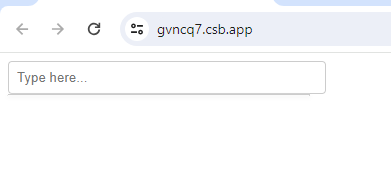
export default Autocomplete;This is what the code above will look like:
In the code above, we initialize two state variables using the useState hook: inputValue to track the current value of the input field, and suggestions to store the list of suggested completions. The handleChange function updates the inputValue state as the user types into the input field and triggers the logic to fetch and update suggestions based on the input value. The handleSelectSuggestion function updates the input field with the selected suggestion and clears the suggestions list.
The useState hook in React allows functional components to manage state dynamically. In the Autocomplete component, it serves two key purposes: tracking the user’s input value and managing the suggestions displayed based on that input. useState enables real-time updates of input values and suggestions as users interact with the component.
Handling User Input
With the structure set, let’s look into the intricate process of handling user input within the Autocomplete component. We’ll look at event handling in React to detect user input changes, implement filtering mechanisms to refine suggestions based on user input, and dynamically update the component’s state to ensure accurate rendering of suggestions.
Event Handling in React for Detecting User Input Changes
Event Handling is the mechanism that controls the event and decides what should happen if an event occurs. Interactive web applications are centered around event handling, which allows developers to capture user interactions and modify the user interface dynamically. In React, event handling is facilitated through synthetic events, which abstract the underlying browser events and provide a consistent interface across different browsers and platforms. We use the onChange event handler that is linked to the input field to detect changes in user input. This event is triggered each time the input value changes which enables us to record the keystrokes made by the user and modify the component’s state accordingly.
const handleChange = (event) => {
  const { value } = event.target;
  setInputValue(value);
  // Logic to filter suggestions based on the input value
};
The handleChange function extracts the current value from the input field and updates the inputValue state variable accordingly. Subsequently, we can implement logic to filter suggestions based on the input value and update the suggestions list accordingly.
Filtering Suggestions Based on User Input
Filtering suggestions involves analyzing the user’s input and selecting relevant options from the dataset to present as suggestions. Often, string matching is used in this process, keeping suggestions that have substrings that match the user’s input while irrelevant options are filtered out.
const filterSuggestions = (inputValue) => {
  const filteredSuggestions = suggestions.filter((suggestion) =>
    suggestion.toLowerCase().includes(inputValue.toLowerCase())
  );
  return filteredSuggestions;
};
In the filterSuggestions function, we iterate over the array of suggestions and retain only those that contain the user’s input as a substring, disregarding case sensitivity. This ensures that suggestions remain aligned with the user’s input preferences.
Updating State and Re-rendering Suggestions Accordingly
Upon filtering suggestions based on user input, we update the component’s state to reflect the filtered suggestions and trigger a re-rendering of the component to display the updated suggestions list.
const handleChange = (event) => {
  const { value } = event.target;
  setInputValue(value);
  const filteredSuggestions = filterSuggestions(value);
  setSuggestions(filteredSuggestions);
};
In the handleChange function, we first update the inputValue state with the latest user input. Subsequently, we filter suggestions based on the input value using the filterSuggestions function and update the suggestions state variable with the filtered suggestions.
Displaying Suggestions
Here, we focus on the visual presentation of suggestions within the Autocomplete component. We’ll explore techniques for styling the dropdown menu using CSS to enhance visual appeal, rendering filtered suggestions dynamically, and improving the overall user experience with smooth transitions and animations.
Styling the Dropdown Menu Using CSS for Visual Appeal
The appearance of the dropdown menu has a big effect on how the user perceives the Autocomplete component. By using CSS styles, we can customize the dropdown menu to make it more readable and accessible while also matching the application’s general design aesthetics.
.autocomplete {
    position: relative;
  }

  .autocomplete input {
    width: 100%;
    padding: 8px;
    border: 1px solid #ccc;
    border-radius: 4px;
  }

  .autocomplete ul {
    list-style: none;
    margin: 0;
    padding: 0;
    position: absolute;
    width: 100%;
    background-color: #fff;
    border: 1px solid #ccc;
    border-top: none;
    border-radius: 0 0 4px 4px;
    box-shadow: 0 2px 4px rgba(0, 0, 0, 0.1);
  }

  .autocomplete li {
    padding: 8px;
    cursor: pointer;
  }

  .autocomplete li:hover {
    background-color: #f0f0f0;
  }
In the CSS snippet above, we define styles for the input field, dropdown menu, and individual suggestion items. These styles ensure that the dropdown menu is visually appealing, with clear demarcations between suggestions and hover effects for enhanced interactivity.
Rendering Filtered Suggestions Dynamically
Once we’ve filtered suggestions based on user input, we need to dynamically render them within the dropdown menu for user selection. React’s component-based architecture makes it possible to present filtered suggestions according to a component’s state with ease.
return (
  <div className="autocomplete">
    <input
      type="text"
      value={inputValue}
      onChange={handleChange}
      placeholder="Type here..."
    />
    <ul>
      {suggestions.map((suggestion, index) => (
        <li key={index} onClick={() => handleSelectSuggestion(suggestion)}>
          {suggestion}
        </li>
      ))}
    </ul>
  </div>
);
The handleChange function updates the input value as users type and the handleSelectSuggestion enables users to select suggestions from the dropdown list. These functions control the behavior of the input field and the selection of suggestions.
Improving User Experience with Smooth Transitions and Animations
Smooth transitions and animations enhance the user experience by providing visual feedback and guiding users’ attention to important interface elements. The dropdown menu can be enhanced with CSS animations and transitions to produce smooth state changes and enhance the overall visual attractiveness.
.autocomplete ul {
  /* Existing styles */
  transition: opacity 0.3s ease-in-out;
  opacity: 1;
}
.autocomplete ul.hidden {
  opacity: 0;
  pointer-events: none;
}
In the CSS snippet above, we define a transition effect for the dropdown menu’s opacity property, creating a smooth fade-in and fade-out effect when the dropdown menu is displayed or hidden.
Handling Selection
Finally, we delve into handling the selection of suggestions, seeing how to update the input field with the selected suggestion, close the dropdown menu after selection, and ensure smooth user interactions.
Handling the selection of suggestions is a critical aspect of the Autocomplete component’s functionality. When a user clicks or navigates to a suggestion, the component should update the input field with the selected suggestion and close the dropdown menu to provide an efficient flow of interaction.
const handleSelectSuggestion = (selectedSuggestion) => {
  setInputValue(selectedSuggestion);
  setSuggestions([]); // Clear suggestions after selection
};
The handleSelectSuggestion function is responsible for updating the input field with the selected suggestion and clearing the suggestions list, effectively closing the dropdown menu. By setting the inputValue state variable to the selected suggestion, we ensure that the input field reflects the user’s choice accurately.
Updating Input Field with Selected Suggestion
Upon selecting a suggestion from the dropdown menu, we update the input field with the selected text to provide visual feedback to the user and facilitate seamless data entry.
<input
  type="text"
  value={inputValue}
  onChange={handleChange}
  placeholder="Type here..."
/>
In the JSX code snippet, the value of the input field is bound to the inputValue state variable, ensuring that any changes to the inputValue state are reflected in the input field immediately. When a suggestion is selected, the handleSelectSuggestion function updates the inputValue state, triggering a re-rendering of the input field with the selected suggestion displayed.
Closing the Dropdown Menu After Selection
After selecting a suggestion, it’s important to close the dropdown menu to clear up the interface and free people from distractions so they can concentrate on other things.
const handleSelectSuggestion = (selectedSuggestion) => {
  setInputValue(selectedSuggestion);
  setSuggestions([]); // Clear suggestions after selection
};
By clearing the suggestions list after selection, we effectively close the dropdown menu, as there are no longer any suggestions to display.
Conclusion
Below is a code that covers everything we’ve talked about and can be simply integrated into your application.
import React, { useState } from "react";
import "./styles.css"; // Import CSS file for styling

const countries = [
  "Afghanistan",
  "Albania",
  "Algeria",
  "Andorra",
  "Angola",
  "Antigua and Barbuda",
  "Argentina",
  "Armenia",
  "Australia",
  "Austria",
  "Azerbaijan",
  // Add more countries as needed
];

const Autocomplete = () => {
  const [inputValue, setInputValue] = useState("");
  const [suggestions, setSuggestions] = useState([]);

  const handleChange = (event) => {
    const { value } = event.target;
    setInputValue(value);
    const filteredSuggestions = filterSuggestions(value);
    setSuggestions(filteredSuggestions);
  };

  const filterSuggestions = (inputValue) => {
    return countries.filter((country) =>
      country.toLowerCase().includes(inputValue.toLowerCase())
    );
  };

  const handleSelectSuggestion = (selectedSuggestion) => {
    setInputValue(selectedSuggestion);
    setSuggestions([]);
  };

  return (
    <div className="autocomplete">
      <input
        type="text"
        value={inputValue}
        onChange={handleChange}
        placeholder="Type here..."
      />
      <ul className="suggestion-list">
        {suggestions.map((suggestion, index) => (
          <li
            key={index}
            onClick={() => handleSelectSuggestion(suggestion)}
            className="suggestion-item"
          >
            {suggestion}
          </li>
        ))}
      </ul>
    </div>
  );
};

export default Autocomplete;
And also a CSS file for some styling.
.autocomplete {
position: relative;
width: 300px;
}
.autocomplete input {
width: 100%;
padding: 8px;
border: 1px solid #ccc;
border-radius: 4px;
}
.suggestion-list {
list-style: none;
margin: 0;
padding: 0;
position: absolute;
width: 100%;
background-color: #fff;
border: 1px solid #ccc;
border-top: none;
border-radius: 0 0 4px 4px;
box-shadow: 0 2px 4px rgba(0, 0, 0, 0.1);
max-height: 200px;
overflow-y: auto;
}
.suggestion-item {
padding: 8px;
cursor: pointer;
}
.suggestion-item:hover {
background-color: #f0f0f0;
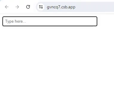
}Now let’s have a look at the code in execution!
In this article, we explored the creation of an Autocomplete component in React, emphasizing its importance in modern web applications. We covered key concepts such as setting up a React project, creating the component, handling user input, displaying suggestions, and managing selection. This feature enhances user experience by predicting and suggesting input values, increasing efficiency, and improving accessibility. Mastering Autocomplete in React empowers developers to build more intuitive and efficient web applications, driving engagement and satisfaction among users.
Truly understand users experience
See every user interaction, feel every frustration and track all hesitations with OpenReplay — the open-source digital experience platform. It can be self-hosted in minutes, giving you complete control over your customer data.
Star on GitHub12k