Mastering Web Animations: Common Mistakes and Best Practices
All about web animations and what to do or not do

In web design and modern web application development, CSS animations play critical roles in providing aesthetics and enhancing user experience. However, when improperly implemented, CSS animations can hinder, rather than elevate, a website’s intuitive design and user interactivity. This article delves into common mistakes in creating CSS animations, shedding light on their effects and providing readers with best practices to ensure seamless, captivating designs and improved user experience.

Discover how at OpenReplay.com.
When properly done, web animations provide a better user experience and feel to a web application. These animations can draw user attention, convey information, provide feedback on user actions, and guide users on the website. However, poorly done animations can be detrimental to the experience of a web application, make it slower or less intuitive, and even drive away potential users. Given this perspective, it becomes increasingly evident why adhering to best practices is essential to address concerns related to slow performance and provide the web application with the following advantages:
- Maintainability: Best practices enforce clean code and code reusability. This makes the animation modular, easy to understand, update, and reuse across the website for coherency.
- User engagement: Good web animation can enhance user interactions and improve engagement on the web application, providing intuitive feedback and an aesthetically pleasing user interface.
- Reduced load-time: Clunky or poorly optimized site animations can contribute to the longer load-time of web applications. Best practices help create animations that do not impede a site’s performance.
- Performance Optimization: Following best practices ensures animations are optimized for smooth rendering. Buggy animations can easily be traced and debugged, reducing the risk of performance bottlenecks and improving the overall user experience.
Best practices to observe when creating animations
In this section, we will discuss different practices that can improve your website animation performance and behaviors and the demerits of poor development practices.
Using the CSS transform property
The CSS transform property is an intuitive tool that can apply various transformations to HTML elements of a webpage. These transformations can influence the appearance and behavior of the objects to which they are applied and enhance their visual representation. CSS transform can be applied to 2D and 3D elements and can be used for web animations and feedback to users. The most commonly used transformations offered by their CSS transform property include:
translate(): Thetranslate()property shifts an element across both the x and y axes in two dimensions. Additionally, it can be applied to move the object specifically along the x, y, or z axis usingtranslateX(),translateY(), ortranslateZ()respectively. Similarly, a three-dimensional translation is attainable through the use oftranslate3D().rotate(): Similar to thetranslateproperty,rotateis used to pivot an element on its axis. The axis for rotation and dimensions can be specified in the same way as thetranslateproperty above.scale(): This property transforms an element by scaling it along the specified axis.skew():skew()applies a skewing transformation on the object two-dimensionally (along the x and y axes).
The transform property is applied with the following syntax:
element {
  transform: transform values;
}
Here, the “transform values” refer to the type of transformation to be applied to the element. An example is given below:
.box {
  background-color: blue;
  height: 100px;
  width: 100px;
  transition: transform 0.5s ease-in-out;
}

.box:hover {
  transform: translate(30px, 20px);
}
Here, the element with a class of box is set to translate 30px on the x-axis and 20px on the y-axis when hovered on. It also utilizes CSS transitions for smooth animation.
The code above increases the scale of the button element when a hover action is detected. Similarly, CSS transform can be used for animating web elements:
.ball {
  height: 100px;
  width: 100px;
  border-radius: 50%;
  background-color: #fb5b5b;
  animation: bounce 2s linear infinite;
}
@keyframes bounce {
  0% {
    transform: translateY(0px) scaleX(1.2) scaleY(0.8);
  }
  50%,
  60% {
    transform: translateY(-150px);
  }
  100% {
    transform: translateY(0px);
  }
}
In the code above, we create a bounce animation for an element with the class ball. This animation makes use of the translateY(), scaleX(), and scaleY() properties to create the following effect:
The benefits of using CSS transform include:
- Improved Performance: CSS transformations are often hardware-accelerated, leading to much smoother and performance-optimized animations compared to alternative methods.
- No Layout Repaints: Using CSS transformations does not trigger a repaint of the entire layout, making it possible to smoothly effect visual changes in elements.
- Versatility: The
transformproperty allows for a wide range of visual effects to be applied to elements in both 2D and 3D. - Responsive Design: CSS
transformscan be easily adjusted to behave differently based on the detected screen size or user interactions, facilitating responsive web design. - Consistent User Experience: When used properly, CSS
transformscreate a uniform and visually pleasing user experience.
Note that not using transform when modifying elements, and instead settling for the following practices such as margins or top and left properties for moving objects, or directly changing an element’s height and width instead of scaling will result in a less smooth animation, which would be heavier on performance and would trigger a layout recalculation. An example of such practice is given below
.bad-square {
background-color: #ff1212;
margin-top: 50px;
margin-left: 50px;
height: 100px;
width: 100px;
transition: all 0.5s ease-in-out;
}
.bad-square:hover {
margin-top: 150px;
margin-left: 150px;
height: 150px;
width: 150px;
}
.good-square {
background-color: #3498db;
margin-top: 50px;
margin-left: 50px;
height: 100px;
width: 100px;
transition: all 0.5s ease-in-out;
}
.good-square:hover {
transform: translate(50px, 50px) scale(1.5);
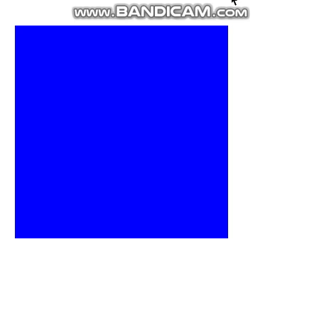
}The code block above has two classes of cubes, bad-square and good-square. The bad-square utilizes margin-top and margin-left to move the cube and directly change the height and width. Meanwhile, the good-square uses translate and scale transformation properties. If we apply these classes to HTML elements and run the code, we get the following results:
 In the GIF above, we can observe that the element with the class
 good-square (the blue square) offers a smoother animation, which does not affect the layout of other elements due to its transform properties, as opposed to the element with class bad-square (the red square).
Optimize animation with CSS will-change property
The will-change is a CSS property used to inform the browser that the element to which it is applied is expected to change in the future. With this information, the browser can allocate resources and optimize its rendering pipeline to accommodate such changes effectively. The main purpose of CSS will-change is to improve animation performance and transition behaviors, as the browser is hinted in advance to handle changes to elements.
The syntax for the CSS will-change property is shown below:
element {
  will-change: property;
}
The properties that can be applied to will-change are the CSS properties to which a change will be made. An example is given below:
.btn{
  will-change: transform, opacity;
}
In the code block above, the browser is informed that the element with class btn will have changes to its transform and opacity properties.
Using the CSS will-change property will provide the following benefits:
- Optimized rendering: Since the browser expects changes in the element properties, resources are set aside to accommodate these changes, leading to more optimized animations. This practice is particularly beneficial in web applications with heavy site animations.
- Improved animation framerates: CSS
will-changecan contribute to a more consistent frame rate, especially in scenarios where frequent and complex animation changes occur to elements. - Better control of an element’s behavior: Since
will-changeallows developers to specify properties that are expected to be modified over time, it allows for better control over the rendering process.
Be mindful of objects that trigger overflows
When working with CSS animations, it’s essential to be mindful of objects that can trigger overflows. An overflow can occur when the content within an element exceeds the specified dimensions of its container. This can occur commonly when handling animations, leading to unexpected behaviors if not properly addressed. The following are some reasons why developers should be mindful of overflows:
- Scrolling issue: Have you ever experienced an issue where a second scrollbar not originally intended pops up on the webpage? This was likely triggered by an overflowing element. If an animated object triggers an overflow, it can result in unintended scrolling behavior on the webpage. Users may experience unexpected scrollbars or have difficulty navigating the content.
- Impact on webpage layout: Overflowing content can interfere with other elements of the page, causing layout issues and impacting the overall user experience.
- Negatively impacting the user interface: Overflowing content may not be displayed as intended, leading to elements extending beyond their intended boundaries and resulting in inconsistent web pages.
Handling overflow behavior is not rocket science, and the following best practices can save hours of debugging:
- Utilize CSS overflow properties: CSS provides properties to handle the behavior of how content overflows its container. Depending on the intended behavior, common values include
hidden,auto,scroll, ’ visible’. An example is given below:
.modal {
width: 100px;
height: 100px;
overflow-y: scroll;
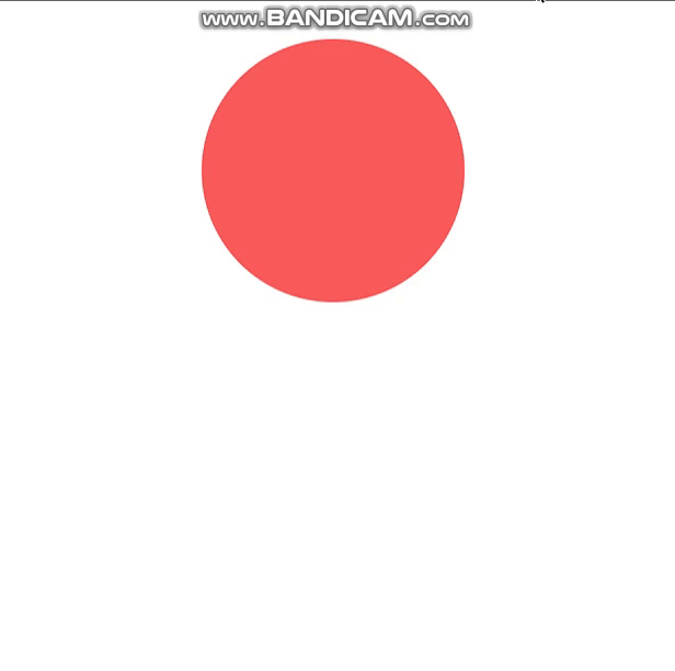
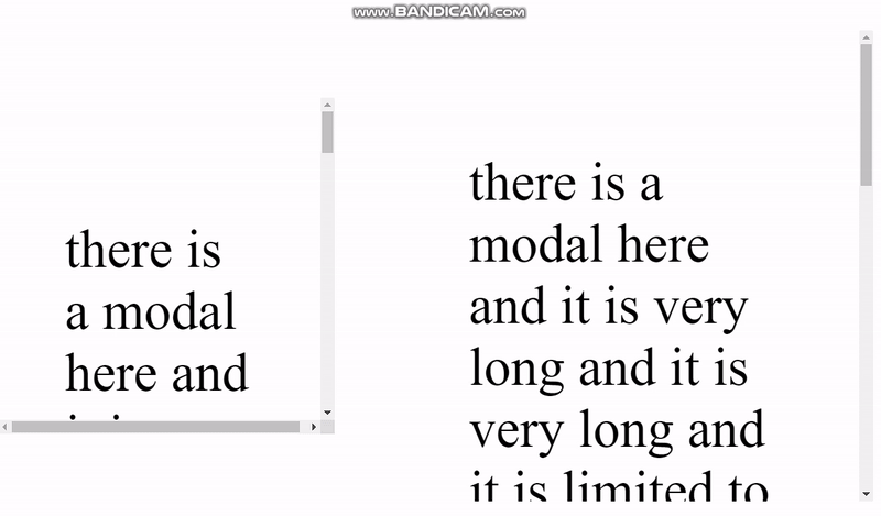
}The code above specifies the element’s default height and width with the class modal. When the content is greater than the specified dimensions, the overflow-y property is set to add a scroll bar to the y-axis. Alternative values for overflow are hidden, scroll, auto and visible. Suppose we have an HTML element with a class of modal and the following content; we can observe how the scroll property handles its overflow:
<div class="modal">
  <p>
    there is a modal here and it is very long and it is very long and it is
    limited to 100px. This code shows how to use the overflow property.
    Here, the overflowing text will be set to create a vertical scrollbar on
    the y-axis. So let's get started.
  </p>
</div>
- Consider using box-sizing: The CSS
box-sizingproperty determines how the sizing of an HTML element is calculated. Usingborder-boxfor the CSSbox-sizingproperty takes into account the element’s padding and border and adds them to the total width and height, potentially preventing unexpected overflows. An example use case ofbox-sizingis given below:
.prompt{
  box-sizing: border-box;
}
To better illustrate the benefits of this practice, we will use the modal class we created earlier:
.modal {
  width: 100px;
  height: 100px;
  overflow-y: scroll;
}

.modal1 {
  box-sizing: border-box;
  padding: 20px;
}

.modal2 {
  padding: 20px;
}
In the code above, we styled two new classes modal1 and modal2. modal1 has the box-sizing property and padding, while modal2 makes use of only padding. In the HTML code, we will duplicate the element with the class of modal and add the classes for modal1 and modal2:
<div class="modal modal1">
  <p>
    there is a modal here and it is very long and it is very long and it is
    limited to 100px. This code shows how to use the overflow property.
    Here, the overflowing text will be set to create a vertical scrollbar on
    the y-axis. So let's get started.
  </p>
</div>
<div class="modal modal2">
  <p>
    there is a modal here and it is very long and it is very long and it is
    limited to 100px. This code shows how to use the overflow property.
    Here, the overflowing text will be set to create a vertical scrollbar on
    the y-axis. So let's get started.
  </p>
</div>
Running the code will produce the following results:
From the GIF above, we can observe that the modal with the property box-sizing retains its dimensions of height and width 100px, while modal2 has the height and width increased to 140px. With this, we can say it is a better practice to use the box-sizing property as it makes it easier for developers to follow web designs appropriately, keep dimensions cohesive, and ensure that elements do not change sizes due to the presence of borders or paddings.
- Check for web responsiveness: Always test the web application on different screen sizes as it will be used by the intended end-users to ensure that the application renders properly and that animated elements do not cause overflows or disrupt the layout on various devices. Device responsiveness can be defined using media queries that execute code at a specified screen width. CSS libraries, e.g., Tailwind and Bootstrap, provide classes that can be used to specify behavior at different media queries. The code below shows a simple site landing section. Using this landing section, we would observe the effects of handling responsiveness for smaller screen sizes:
/* landing */
.landing {
  height: 100vh;
  width: 100%;
  background-color: #f1f1f1;
  display: flex;
  justify-content: center;
  align-items: center;
}

.herotext h1 {
  font-size: 50px;
  font-weight: 700;
  color: #000;
  margin-bottom: 20px;
}

.herotext p {
  font-size: 20px;
  font-weight: 400;
  color: #000;
  margin-bottom: 20px;
}
The code above styles the landing section and hero texts. For the HTML code, we have the following:
<div class="landing">
  <div class="herotext">
    <h1>Welcome to my Website</h1>
    <p>
      Lorem ipsum dolor sit amet consectetur adipisicing elit. Quisquam
      voluptatum, quibusdam, quia, quos voluptates voluptatibus consequuntur
      quod voluptate quas quibusdam, quia, quos voluptates voluptatibus
      consequuntur quod voluptate quas
    </p>
  </div>
  <div class="image">
    <img
      src="./pic.jpg"
      alt="man using man-in-blue-dress-shirt-using-computer"
    />
  </div>
</div>
Running the code will produce the following results:
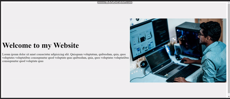
From the GIF above, it can be observed that although the site displays properly on large screens, when the screen size is reduced the elements become shrunk, and a horizontal scroll bar is added due to the elements overflowing the container. This can be fixed by changing the layout for smaller screen sizes:
@media screen and (max-width: 1024px) {
  .herotext h1 {
    font-size: 30px;
  }
  .herotext p {
    font-size: 16px;
  }
  .landing {
    flex-direction: column;
  }

  img {
    width: 100%;
  }
}
In the code block above, we created styles that would be applied to the specified elements when the screen size falls within the range of zero to 1024px.
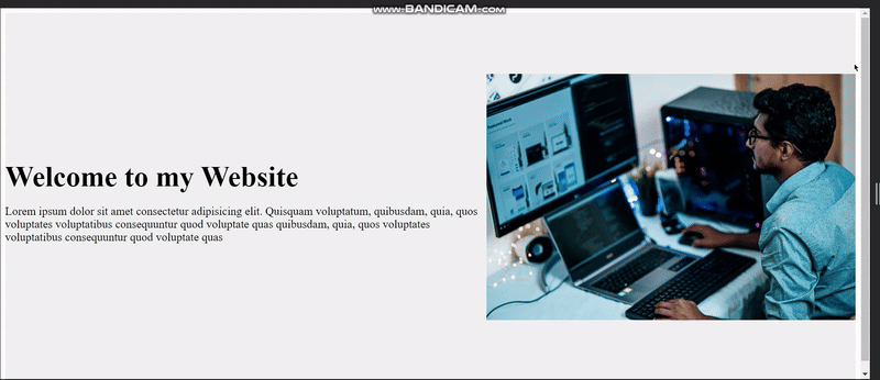
By handling responsiveness, developers can create web applications that display properly on different devices, providing better user experiences.
Failing to write code to detect and handle overflows will create unwanted behavior in situations where elements overflow their container. This creates a bad user interface different from the intended outcome.
Use transitions for simple animations
Transitions in CSS refer to a gradual change in the behavior and property of an element over a defined time duration. They provide a simple way of creating smooth web animations and enhancing the user experience. Using CSS transitions reduces the need for JavaScript to handle basic animation behaviors, is simple to implement, and helps in creating performance-optimized animations.
The various types of transitions offered by CSS are:
ease: Starts slowly, accelerates in the middle, and slows down again towards the end.ease-in: Starts slowly and accelerates as the transition progresses.ease-out: Starts quickly and decelerates towards the end of the transition.ease-in-out: Starts slowly, accelerates in the middle, and slows down towards the end (similar toease, but with a more subtle slowdown process).linear: The transition speed is uniform throughout.cubic-bezier: Allows custom shaping of the timing function using a defined set of control points.
The following is the CSS syntax for adding transition behavior to an element:
.element {
  transition: property timing behavior;
}
The property can be a specific CSS property such as transform or opacity or can be all to apply the transition behavior to every property of that element.
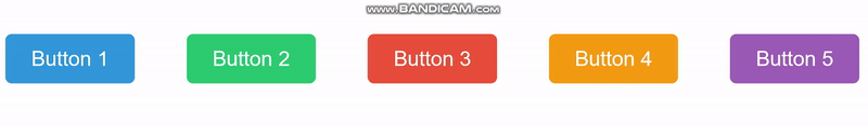
/* Button 1 */
.button1 {
background-color: #3498db;
transition: background-color 0.5s ease-in-out;
}
.button1:hover {
background-color: #2980b9;
}
/* Button 2 */
.button2 {
background-color: #2ecc71;
transition: transform 0.5s ease;
}
.button2:hover {
transform: scale(1.1);
}
/* Button 3 */
.button3 {
background-color: #e74c3c;
transition: color 0.5s linear;
}
.button3:hover {
color: #c0392b;
}
/* Button 4 */
.button4 {
background-color: #f39c12;
transition: box-shadow 0.5s ease-out;
}
.button4:hover {
box-shadow: 0 0 10px rgba(0, 0, 0, 0.5);
}
/* Button 5 */
.button5 {
background-color: #9b59b6;
transition: opacity 0.5s ease-in-out;
}
.button5:hover {
opacity: 0.7;
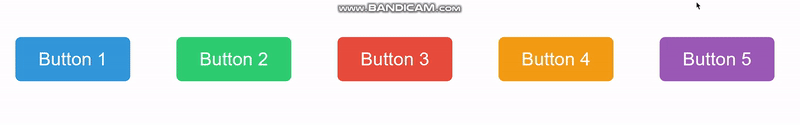
}The code block above shows the application of CSS transitions to different properties such as box-shadow, color, opacity, background-color, and transform when the element is hovered on. Suppose we have 5 button elements with these classes:
<button class="button button1">Button 1</button>
<button class="button button2">Button 2</button>
<button class="button button3">Button 3</button>
<button class="button button4">Button 4</button>
<button class="button button5">Button 5</button>
Running the code will produce the following results:
Using the same code, here is what would happen if the transition behaviors were not specified:
/* Button 1 */
.button1 {
  background-color: #3498db;
}
.button1:hover {
  background-color: #2980b9;
}

/* Button 2 */
.button2 {
  background-color: #2ecc71;
}
.button2:hover {
  transform: scale(1.1);
}

/* Button 3 */
.button3 {
  background-color: #e74c3c;
}
.button3:hover {
  color: #c0392b;
}

/* Button 4 */
.button4 {
  background-color: #f39c12;
}
.button4:hover {
  box-shadow: 0 0 10px rgba(0, 0, 0, 0.5);
}

/* Button 5 */
.button5 {
  background-color: #9b59b6;
}
.button5:hover {
  opacity: 0.7;
}
Running the code will produce the following result:
We can observe that the animations occur suddenly without the transition and lose their visually appealing change. As such, it is a better choice to use transitions so animations occur smoothly and do not seem like glitches.
Customize animation timing with Cubic-bezier
For more complex animation timing behaviors, cubic-bezier provides a better range of control, allowing developers to define custom timing functions for animations. The cubic-bezier function is defined by four parameters (x1, y1, x2, y2) that represent the control points of a Bezier curve. This curve determines the rate of change for the animation over time, and depending on these values, acceleration or deceleration of the transition can be specified.
The following is the syntax to specify CSS cubic-bezier:
.element{
  transition: property duration cubic-bezier(x1, y1, x2, y2);
}
x1 and y1 specified above are the coordinates of the first control point, while x2 and y2 are the coordinates of the second control point.
.box {
  width: 100px;
  height: 100px;
  background-color: #3498db;
  transition: transform 1s cubic-bezier(0.68, -0.55, 0.27, 1.55);
}
.box:hover {
  transform: translateX(200px) rotate(360deg);
}
In the code block above, we are using cubic-bezier to handle the transition behavior of the transform property when the element with class box is hovered on. The outcome of this code can be seen in the GIF below:

Debug buggy animations with dev tools
Most browsers, by default, have in-built tools that can be used to inspect web pages and determine their performance. For example, to make use of the performance tool in Chrome browser, follow the steps outlined below:
- Inspect the page and select performance on the inspector element pane.
- Start recording the page using the tool while the animation is running, and stop the recording process after a while. You will get a result similar to the image below:
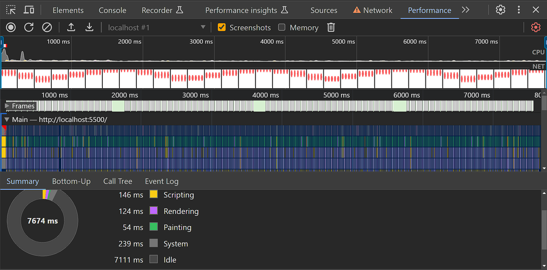
Based on the performance results, we can make the following observations:
- The FPS for animation, as well as CPU and GPU usage, can be determined.
- The animation and user interactions can also be checked at different points of the rendering process to evaluate their impact on the site’s performance.
- In situations where a layout recalculation is forced, the performance tool can inform the developer of the code that caused the behavior.
- Animated elements can be checked to determine if they trigger repaints or impair performance with frame drops.
- The amount of time spent rendering is related to its performance, and the developer should aim to reduce the rendering time.
- The performance tool can also be used to simulate a mobile CPU and determine the performance of the webpage on mobile devices.
Common CSS animation mistakes and how to avoid them
This section provides a list of common mistakes developers make when creating animations, which can also hinder performance and user experience.
-
Excessive utilization of web animations: Overusing animations, particularly complex ones, may result in a crowded and distracting user interface that poses challenges in navigation and adversely affects the overall user experience.
Emphasize meaningful animations that enhance user interactions. Employ animations judiciously and with intent, concentrating on delivering value rather than an overly extravagant visual presentation.
-
Ignoring site performance: Neglecting performance considerations, such as excessive use of large animations where not necessary or non-optimized code, can lead to slow page loading times and poor user experience.
Optimize animations for web performance. Use CSS hardware acceleration, compress images and videos, and consider lazy loading for non-essential animations to improve overall site performance.
-
Inconsistent animation timing and transition properties: Inconsistency in the timing, duration, or easing functions of animations can create a disjointed animation rendering process and negatively impact the user interface.
Establish a consistent animation style guide. Ensure that timing, duration, and easing functions are uniform across your site to provide a cohesive interface.
-
Non-mobile-friendly animations: Animations designed without considering mobile devices may lead to performance issues for users on smaller devices.
To avoid this, be sure to Prioritize mobile responsiveness during application development. Test and optimize animations for various screen sizes and devices. Consider using media queries to adjust animation properties for mobile views.
-
Creating animations that trigger repaints: Animations that trigger repaints (re-rendering the entire element) can be resource-intensive and impact performance.
A possible solution is to use
transformandopacitychanges for animations, as they typically trigger GPU acceleration and minimize repaints. Avoid animating properties that force the browser to recalculate layouts frequently. -
Effect of clunky web animations on User Experience (UX): Bulky and poorly executed animations can result in a frustrating user experience and reduce the number of visitors to your web application.
This can be resolved by optimizing timing, easing, and responsiveness to create a seamless and enjoyable user experience. Also, use simple animations that convey intended meaning to users.
Conclusion
This article discussed animation practices that can enhance site performance and user experiences. We also discussed common mistakes and how they can be avoided.
Mastering web animations involves a careful balance between creativity and user experience. Adhering to best practices, ensuring responsiveness, and optimizing performance are crucial. Common pitfalls like animation overuse and inconsistent designs should be avoided. By staying informed and embracing evolving technologies, developers can elevate the impact of web animations, crafting immersive and delightful digital experiences for users of all kinds.
Truly understand users experience
See every user interaction, feel every frustration and track all hesitations with OpenReplay — the open-source digital experience platform. It can be self-hosted in minutes, giving you complete control over your customer data.
Star on GitHub12k