Mobile App Design Guidelines: An Exploration
Rules for designing clear accessible mobile apps

Mobile apps have reshaped our daily interactions, becoming a fundamental aspect of communicating, working, and relaxing. The wide range of mobile apps available in the market emphasizes the importance of mobile app design. This article is a detailed guide on Mobile App Design, showcasing the significant impact these guidelines have in crafting applications that are aesthetically pleasing and user-friendly and succeed in the competitive market.

Discover how at OpenReplay.com.
Understanding the essence of mobile app design guidelines is crucial. They act as a blueprint for designers and developers, ensuring that apps are visually appealing and offer an intuitive and seamless user experience. Following these principles is key in developing apps that are easy to navigate, an important factor in keeping users engaged.
Additionally, the role of design in making apps accessible is very important. Effective design considers the varied needs of all users, including those with disabilities. By adhering to established design guidelines, developers can make their apps accessible to a broader audience, promoting inclusivity and making technology available to everyone.
Platform-Specific Design Considerations
iOS and Android are central to discussing platform-specific design considerations. These two operating systems dominate the mobile market and have distinct characteristics, user interfaces, design languages, and functionality that significantly influence how apps should be designed and developed for each platform.
Here are some key aspects where iOS and Android differ:
- User Interface and Experience:
iOSandAndroidhave different design guidelines – Apple’s Human Interface Guidelines and Google’s Material Design. These guidelines dictate how apps should look and feel on each platform, including navigation, buttons, typography, color schemes, etc. - Functionality and Features: Each platform offers unique features and capabilities. For example,
Androidallows for more customization and flexibility, whileiOSis known for its streamlined, user-friendly interface. Design considerations must account for these differences to fully leverage each platform’s strengths. - Technical Specifications: Hardware variations, such as screen sizes and resolutions, and software capabilities, like multitasking abilities and background processes, differ significantly between
iOSandAndroiddevices. These factors impact how an app is designed and performs on each platform. - Development Environment and Languages:
iOSapps are typically developed usingSwiftorObjective-CinXcode, whileAndroidapps useJavaorKotlininAndroid Studio. This affects not just the coding aspect but also the design integration and testing processes. - User Demographics and Behavior: The user base of
iOSandAndroidcan differ in demographics and user behavior. These differences can influence design decisions, such as the complexity of an app or the way in-app purchases are presented. - Marketplace Requirements and Distribution: The App Store and Google Play Store have different policies and requirements for app submission and updates. This can affect app design, update cycles, and even feature rollouts.
iOS Design Guidelines
Apple’s iOS design stands as a beacon of sophistication and functionality, focusing on creating a user-centric interface that is aesthetically pleasing and highly functional. This design philosophy is rooted in the belief that the best interface feels natural and almost invisible to the user, enhancing the app’s usability without drawing attention to the design itself.
Design principles specific to Apple devices
The foundational principles of iOS design are key to understanding its success, and they include:
- Simplicity: This principle of minimalism is about stripping down the design to its essence, ensuring that users can navigate the app with ease.
A simple design does not mean a lack of creativity but rather a focus on functionality with clean aesthetics. Simplicity is evident in Apple’s apps like Notes, as seen above, where the design is straightforward, focusing on user content without unnecessary embellishments.
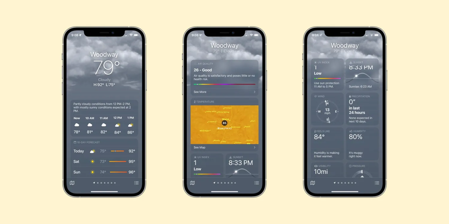
- Clarity: Clarity in
iOSdesign means that content is king. Every element should serve a purpose, and the user should never be confused about what to do next. This involves using legible text, meaningful icons, and avoiding clutter. Clarity is exemplified in the Weather app, where information is displayed crisply, making it easily readable, as shown below.
-
Depth: Depth creates a sense of hierarchy and importance. It is not just about visual layers but also about making interactions feel more natural and engaging. Depth in design is introduced through layering and subtle use of shadows and gradients, as seen in the Music app, creating a sense of space.
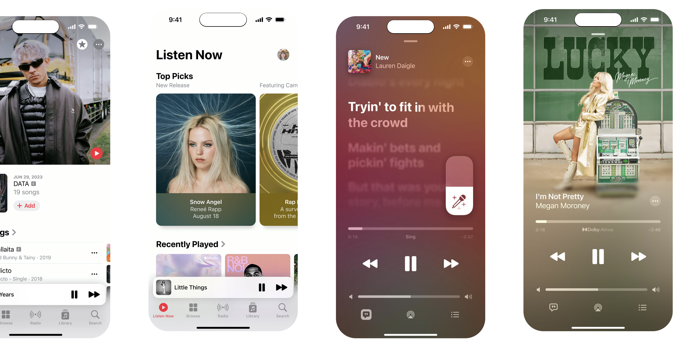
The design of the Music app cleverly uses depth, layering, shadows, and gradients to create an intuitive and inviting space. This approach not only adds visual appeal but also organizes the app in a way that makes it easy for users to find what they’re looking for—be it controls, playlists, or tracks.
A key aspect of iOS design is ensuring accessible touch targets, allowing users to interact easily with the app. This involves designing buttons and interactive elements with sufficient size and spacing. The color scheme and typography in iOS apps should enhance readability and user focus, with a palette that complements the content and a typography style that’s easy on the eyes. Following Apple’s Human Interface Guidelines ensures that apps look and feel like part of the iOS ecosystem and provide a user-friendly experience.
Android Design Guidelines
Android’s design philosophy emphasizes adaptability and inclusivity, catering to various devices and user preferences. This flexibility allows for a range of customization, making Android apps accessible and enjoyable for a diverse user base. The design approach is characterized by its responsiveness and ability to adapt to different screen sizes and resolutions, making it ideal for a variety of devices running Android.
Material Design, Google’s design language for Android, is pivotal in creating a consistent user interface across apps. It utilizes layering to create a sense of depth, making interfaces more dynamic. As seen in Google’s apps like Gmail and Maps, animations and interactive components are used judiciously to provide feedback and guide user interactions. These elements work together to create a cohesive and intuitive user experience.
Material Design is characterized by:
- Bold Graphic Design: This involves using vivid colors, clear typography, and intentional white space to create focus and hierarchy.
The application of vivid colors in the user interface above is a primary tool for capturing user interest and distinguishing between different apps and functionalities. By employing a vibrant and purposeful palette, the design not only becomes more lively but also organizes the interface in a visually intuitive manner. Colors are used not merely for aesthetic appeal but as a functional element to differentiate, highlight, and direct attention towards areas of importance or interaction.
For Android app designers, it is important to create adaptive layouts that cater to a wide range of device sizes, from phones to tablets. This includes using resizable components and testing on multiple screen sizes. Integrating Google’s design components, such as Material Components, can help maintain consistency across platforms while allowing the app to utilize Android’s unique features. This balance ensures that the app provides a familiar experience for users across different devices while leveraging the strengths of the Android platform.
Responsive Design for Multiple Devices
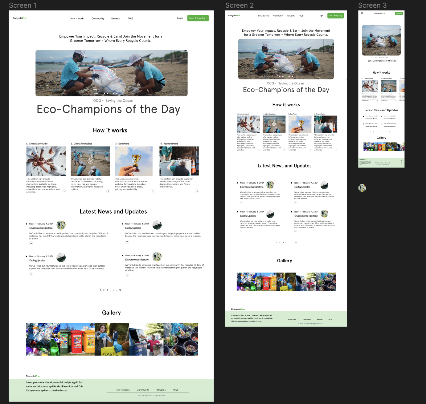
Responsive design has become important due to the high rise of devices, each featuring varying screen sizes. The example photo above showcases responsiveness across three devices—laptop, iPad, and iPhone—as a vivid illustration of how design can adapt to provide a tailored experience for every device. This adaptability is not merely a convenience but a necessity, ensuring that all users, irrespective of their chosen device, encounter a design that caters to their screen’s dimension.
Designers must ensure that all users, regardless of the device they use, receive a tailored experience. This approach enhances the overall user experience by providing a seamless and consistent interface across different devices. Responsive websites are often favored in search engine rankings, as they significantly improve user experience, aligning with SEO best practices. This strategy is not only beneficial for user engagement but also proves to be cost-effective. Instead of allocating resources to develop separate websites for mobile and desktop, responsive design enables creating a single, adaptable website. This unified approach adjusts smoothly to different screen sizes, ensuring development and maintenance efficiency and offering users a cohesive experience across all platforms.
Strategies for Ensuring a Consistent Experience Across Screen Sizes
When focusing on strategies for ensuring a consistent experience across various screen sizes in mobile app design, it is important to prioritize responsive layout design and adaptive components.
- Emphasize Scalability: Designs should be scalable, meaning they should look good and function well regardless of the screen size. This involves thinking beyond fixed layouts and embracing a more fluid approach.
- Uniform Style Guides: Establish a comprehensive style guide for all screen sizes. This includes consistent use of colors, fonts, and design elements, ensuring a uniform look and feel across devices.
- Flexible Typography and Imagery: Typography and images must adapt to different screen sizes without losing clarity or aesthetic appeal. This might involve using responsive images that adjust in size and resolution and typography that scales effectively.
- Responsive Layout Design
- Fluid Grid Systems: Implement fluid grid layouts where elements resize according to screen proportions rather than fixed measurements. This ensures that the layout remains balanced and harmonious on any device.
- Breakpoints and Media Queries: Use breakpoints in the design to make necessary adjustments at certain screen widths. This is crucial for adapting the layout and content to fit various screen sizes seamlessly.
- Prioritizing Content: On smaller screens, it is essential to prioritize content and functionality. This might mean reordering, hiding, or altering content so that the most important information is always front and center.
- Adaptive Components
- Modular Design Elements: Create modular design elements that can adapt their size and functionality. For example, a navigation menu may be a simple dropdown on mobile devices but expand into a more comprehensive sidebar on larger screens, as seen in the image below.

- Interactive Elements: Design buttons and interactive elements to be easily accessible on all devices. This includes considering the size and spacing of these elements, especially for touch screens.
- Context-Aware Components: Implement components that adjust to screen size, the device’s capabilities, and user preferences, enhancing usability and user experience.
- Modular Design Elements: Create modular design elements that can adapt their size and functionality. For example, a navigation menu may be a simple dropdown on mobile devices but expand into a more comprehensive sidebar on larger screens, as seen in the image below.
Navigation and Information Architecture in Mobile App Design
The concepts of navigation and information architecture in mobile app design are very important. They are crucial in defining the user experience, influencing how easily users can find information and complete tasks within an app. Every design aims to create an intuitive, user-friendly interface that makes the journey within the app as effortless as possible. This approach not only enhances user satisfaction but also contributes significantly to the overall success of the app.
Let’s look at some of the best practices for creating intuitive navigation.
- Simplicity is Key: The navigation should be straightforward and self-explanatory. Too many options can overwhelm users. Aim for a minimalistic approach that guides users naturally through their journey.
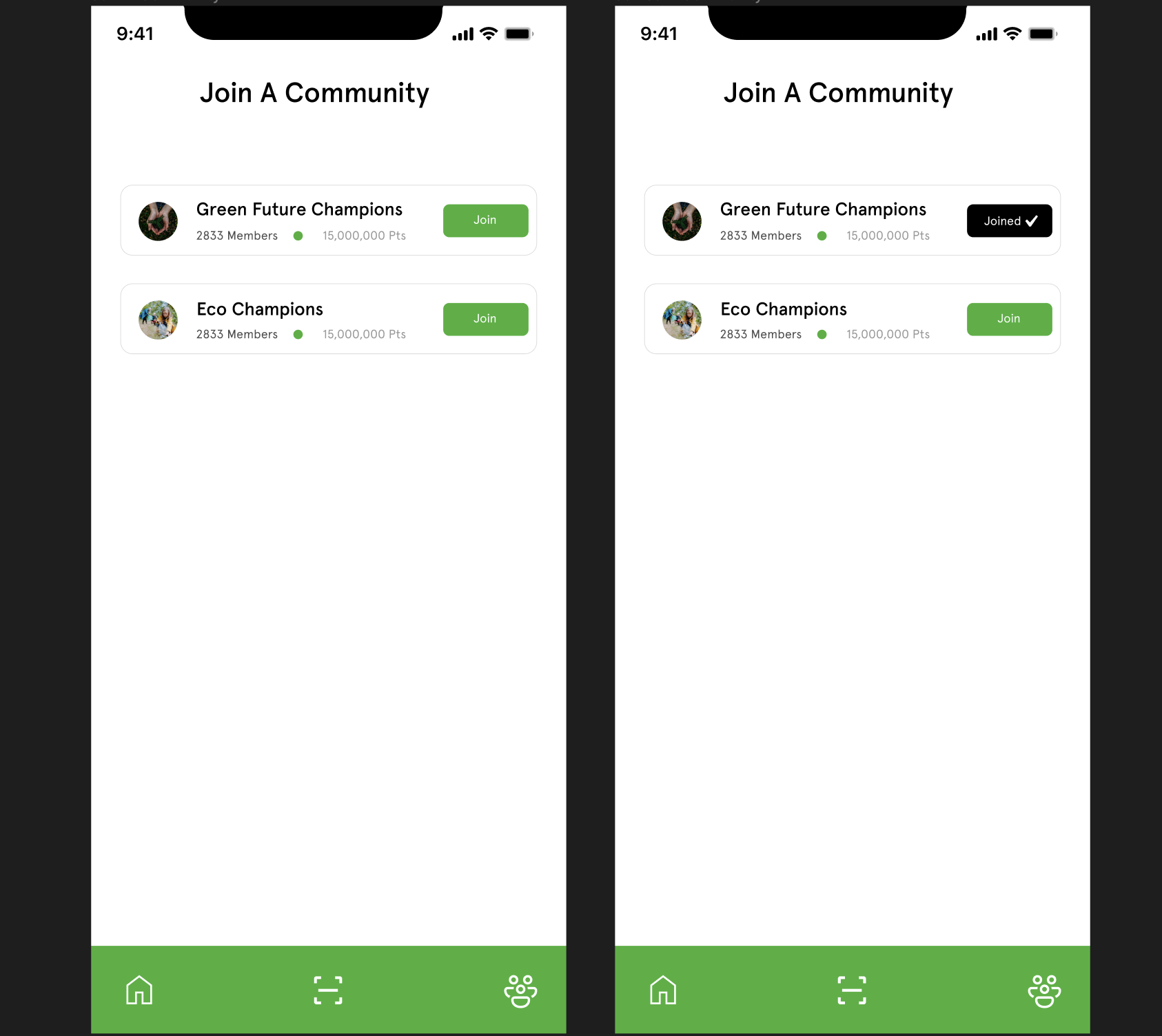
Emphasizing the principle “Simplicity is Key,” the design above showcases a navigation strategy that is both straightforward and self-explanatory. By presenting just two clear options upon arrival—“Join Community” or “Joined Community”—the interface embodies a minimalistic approach that avoids overwhelming users with excessive choices. This design ensures the navigation is clean, with additional information about each community available only upon user engagement. Such a method not only enhances usability but also guides users naturally through their journey, emphasizing the importance of an intuitive and user-centric design.
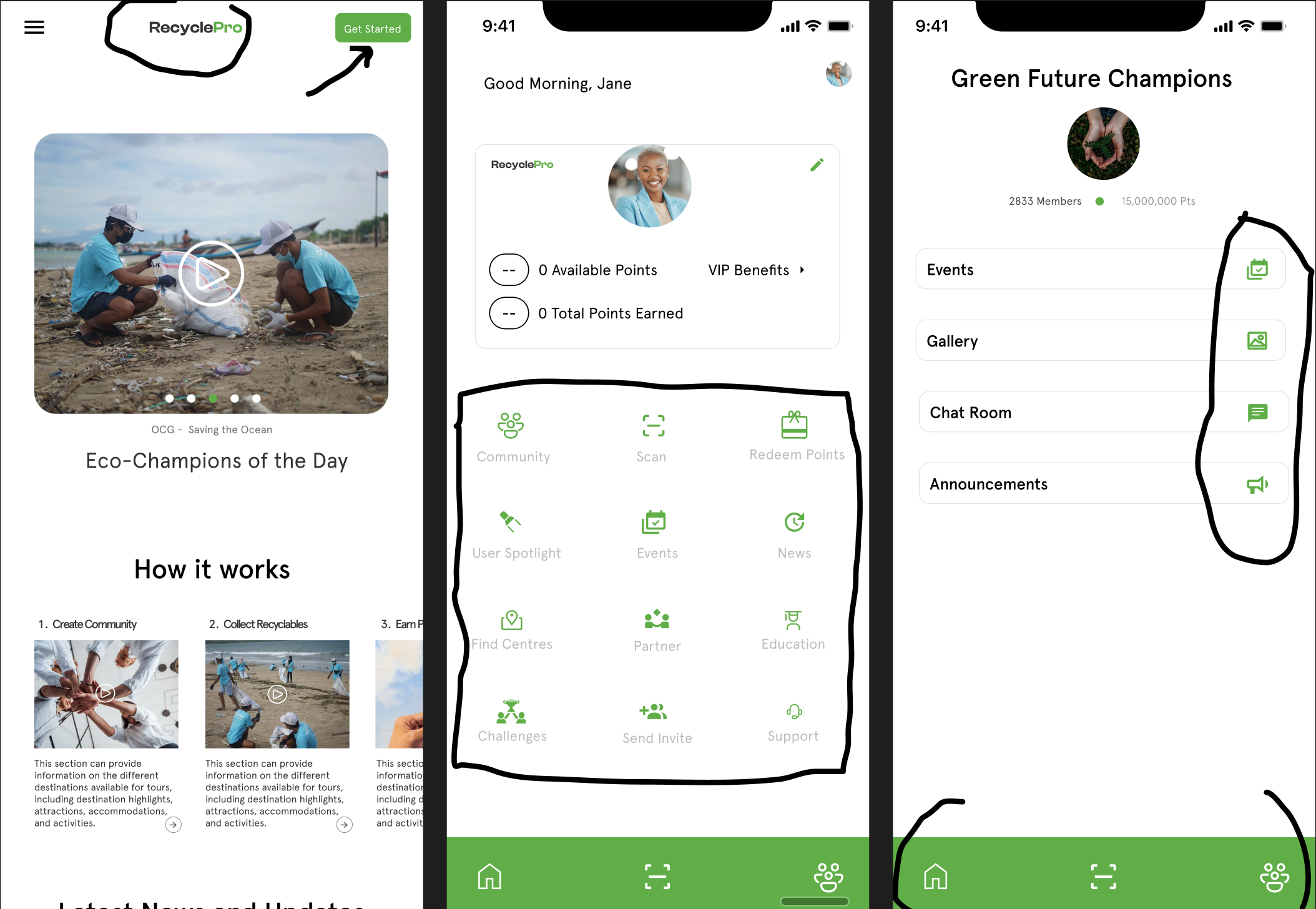
- Consistency Across the App: Navigation elements should be consistent in their placement and behavior across different app sections. This consistency reduces the learning curve and makes the app more intuitive.
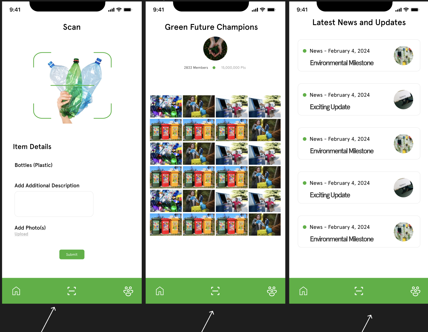
The example above prioritizes uniform placement and behavior of key navigation elements—Home, Scan, and Community—across all sections of the app. This strategic consistency minimizes the learning curve for users and enhances the app’s intuitiveness. Users can effortlessly move between sections by ensuring that these essential navigation tools remain constant in their location and function, fostering a seamless and predictable user experience. This approach underscores the importance of a stable and reliable interface, where familiarity breeds efficiency and comfort for the user. Additionally, Place the most important navigation elements in the most accessible locations, typically at the bottom of the screen for easier reach, especially on larger devices.
- Use Familiar Icons and Labels: Stick to universally recognized symbols and terms. For instance, a calendar for events or a house icon for the home page. This familiarity aids in quicker navigation.
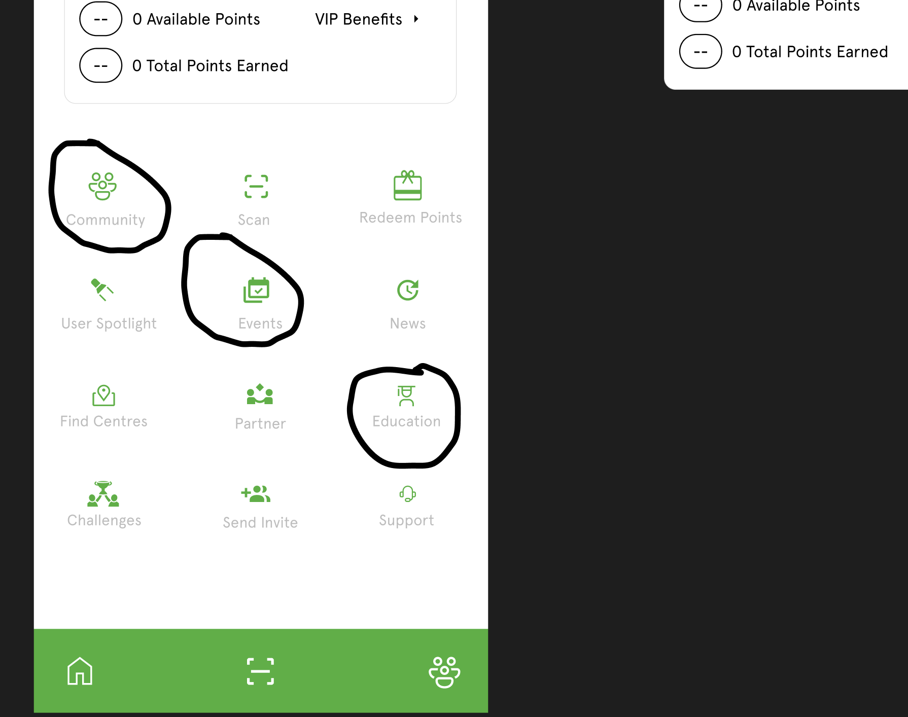
- Implement Progressive Disclosure: Show only what is necessary at each point in the user’s journey to avoid information overload. Additional options and information can be revealed as needed.
In the example above, users are presented with two straightforward options: “Become a Partner” or “Partners.” This choice dictates the subsequent information and options available to users, ensuring they are only exposed to content relevant to their selected pathway. This methodological unveiling of information, tailored to the user’s immediate choice, exemplifies progressive disclosure by keeping the user’s journey focused and free from unnecessary complexity.
Information Hierarchy in Mobile App Design
Incorporating a “Logical Structure” within the UI design ensures that information is organized to follow a logical flow, where the most critical details are highlighted for easy access. This approach makes the most important information, such as the title or heading of a page, prominently visible and easily accessible to users as soon as they navigate to a section of the app.
To complement this, “Clear Categories and Groupings” divide content into distinct sections or categories. This segmentation aids users in quickly locating the information they need without the need to wade through irrelevant details. It streamlines the search process and enhances user experience by simplifying navigation and content discovery.
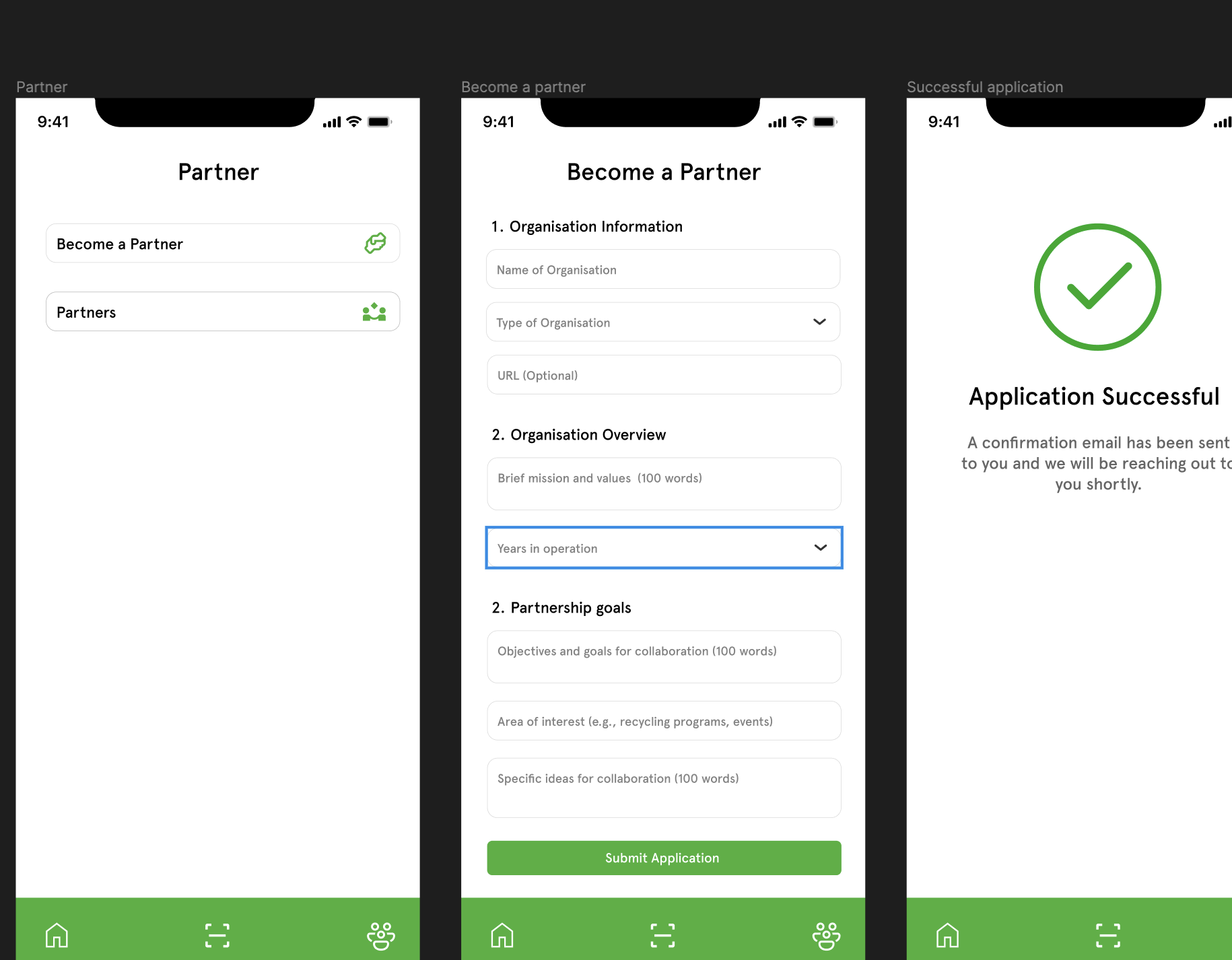
This is achieved by strategically using size, color, and contrast. For example, the title or heading in the example design above is larger and possibly bolder than other text elements, immediately capturing the user’s attention. Similarly, the button is green, standing against a more neutral background. This draws the eye and intuitively guides users towards taking action.
To create a user-friendly and inclusive design, adopt design principles that enhance readability, navigation, and user engagement. Here are a few ways it can be achieved.
- Limit Information per Screen: Avoid clutter by limiting the information on each screen. Utilize drill-down menus or ‘additional details’ options to keep the interface clean.
- Effective Use of White Space: White space is not just space; it helps reduce cognitive overload, making the content more digestible and the navigation more apparent.
- Accessibility: Ensure that the app’s design caters to all users, including those with disabilities. This includes readable font sizes, high-contrast colors, and support for screen readers. Check color compatibility on coolors.
- Testing and Iteration: Regularly test the app with real users to understand how they navigate and access information. Use this feedback to iterate and improve the information architecture.
Typography and Readability
Typography plays a crucial role in determining the readability and overall user experience of content, especially on mobile screens where space is limited, and attention spans are often short. When selecting fonts for mobile screens, several factors need to be considered, including legibility, readability, and aesthetics. Additionally, ensuring readability in various lighting conditions is essential for providing users with a seamless and comfortable reading experience.
Choosing fonts for mobile screens? Here are a few factors to consider:
- Legibility: Focusing on legibility within mobile app design is paramount to ensuring an optimal user experience. The choice of font plays an important role in this aspect, as it directly influences readability and the overall aesthetic appeal of the app. Consider using sans-serif fonts such as:
Roboto: This font is celebrated for its geometric clarity and versatility, making it a go-to choice for mobile interfaces. Its distinct letterforms and straightforward appearance ensure that content is easily digestible, even on small screens where space is at a premium. Roboto’s design aims to balance mechanical precision and friendly warmth, making it adaptable across various app genres.
Open Sans: Designed with an eye towards neutrality and simplicity, it is characterized by its balanced proportions and generous open countenance, which contributes to a clear and relaxed reading experience. Its ample spacing between characters reduces visual clutter, facilitating smoother navigation and comprehension on mobile devices.
Lato: With its semi-rounded details and strong structure, Lato brings a sense of sleek modernity to app design. Its open letterforms and substantial body ensure legibility at smaller sizes, which is essential for text-heavy mobile applications. Lato’s clean lines and contemporary vibe lend the user interface a professional yet approachable feel.
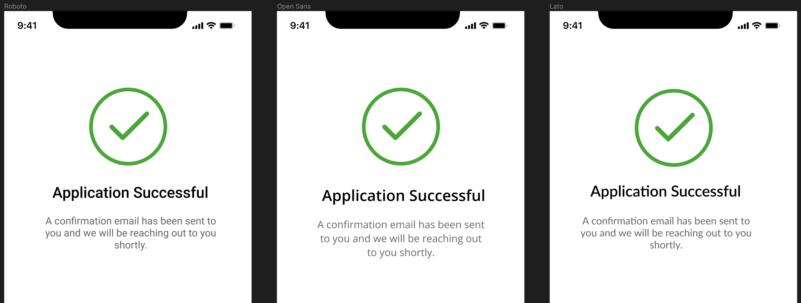
The example image showcasing Roboto, Open Sans, and Lato on a mobile screen UI visually demonstrates the impact of these fonts on legibility. Each font is applied in a way that highlights its unique characteristics while emphasizing clarity and ease of reading. This comparative display underlines the importance of selecting the right font to enhance user engagement and ensure the content is accessible to a wide audience.
- Readability: Fonts prioritizing readability should have sufficient contrast, moderate stroke widths, and well-defined letter shapes. Some options include:
- Montserrat: With its geometric shapes and even stroke widths, Montserrat maintains readability across various font sizes and screen resolutions.
- Nunito: Nunito’s rounded letterforms and open counters contribute to improved readability, particularly for longer passages of text.
- Source Sans Pro: Developed specifically for user interfaces, Source Sans Pro offers excellent readability thanks to its balanced proportions and clear letterforms.
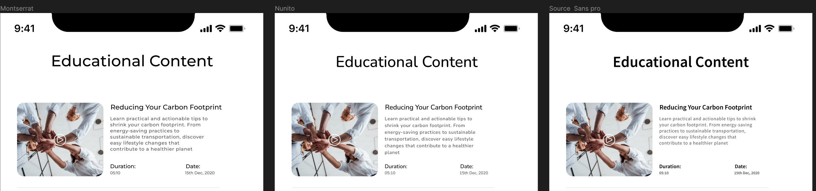
By focusing on the example fonts, designed with readability in mind, app developers can significantly enhance the user’s ability to process information effortlessly. This careful consideration in font selection is depicted in the image above, where each font is utilized within the same mobile UI context, showcasing their impact on readability. The demonstration highlights how sufficient contrast, moderate stroke widths, and well-defined letter shapes create a more pleasant and efficient user experience.
-
Font Size: An appropriate font size is crucial for readability on mobile screens. Opt for large sizes to be easily readable without being overwhelming. Recommended font size ranges include:
- Body Text: 14-16 pixels for comfortable reading on mobile devices.
- Headings: 18-24 pixels for emphasis and hierarchy.
- Subheadings: 16-20 pixels to differentiate from body text while maintaining readability.
-
Typeface Selection: The choice between serif and sans-serif typefaces depends on the desired tone and context of the content. For mobile screens, sans-serif fonts are generally preferred for their clarity and modern aesthetic. However, serif fonts can also be effective for adding a touch of elegance or formality.
 This image showcases the distinct characteristics of serif and sans-serif typefaces.
Sans-serif fonts, characterized by their clean and straightforward lines without additional flourishes, are widely recognized for their readability on digital screens. Their simplicity and modern appearance make them a popular choice for mobile apps, where text clarity is paramount. These fonts lend a contemporary and accessible feel to the app, facilitating legibility even on smaller screens or at lower resolutions.

Serif fonts exude a sense of tradition and formality, identifiable by the small lines or strokes attached to the end of their letters. They are often associated with print media, such as newspapers and books, contributing to a classic and authoritative look. In mobile app design, incorporating serif fonts can add a layer of sophistication and elegance, making them a suitable choice for content that aims to convey credibility or a more formal tone.

Ensuring Readability in Different Lighting Conditions
Ensuring the readability of text across a wide range of lighting conditions is a critical aspect of user experience design. Content visibility on mobile screens can vary significantly depending on environmental lighting. To address this challenge, several strategies can be employed:
- Brightness Adjustments: Mobile devices often feature automatic brightness adjustments based on ambient light conditions. Designing with this feature in mind ensures that text remains legible regardless of the environment.
- Avoiding Glare: Glare from reflective surfaces can make text difficult to read. Minimizing glare using matte screen finishes or positioning text away from light sources enhances readability in bright environments.
- Font Weight and Style: Opting for slightly heavier font weights or thicker strokes can improve readability, especially in outdoor settings where light may wash out finer details.
Color Psychology in Mobile App Design
Color plays a fundamental role in visual design, particularly in mobile app design, where every pixel counts in conveying information, evoking emotions, and guiding user interactions. Understanding color psychology and ensuring accessibility through contrast are critical to creating compelling and inclusive mobile app experiences.
Color psychology refers to the study of how colors influence human behavior, emotions, and perceptions. In mobile app design, leveraging color psychology can significantly impact user engagement, retention, and overall satisfaction.
Emotional Impact
Different colors evoke various emotional responses. For instance, warm colors like red, orange, and yellow often elicit feelings of energy, excitement, and urgency, making them suitable for calls to action or notifications. On the other hand, cool colors like blue and green evoke calmness, trust, and serenity, which might be ideal for relaxation or productivity apps.
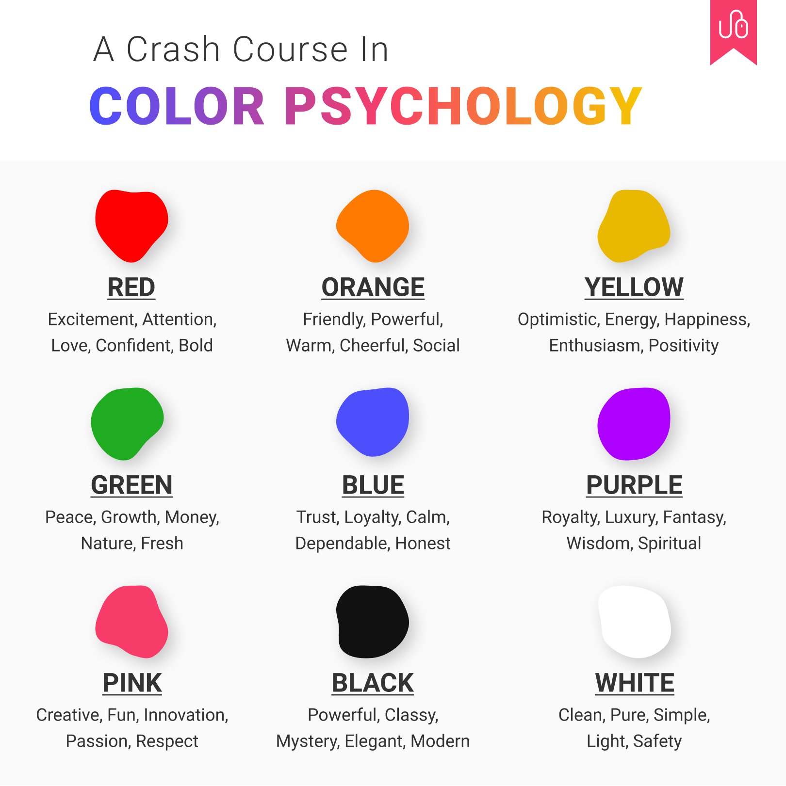 This illustrative guide explores the profound emotional impact colors have on user perception and behavior in mobile app design. Through this visual representation, we see how color choice is not merely an aesthetic decision but a pivotal element in creating an app’s emotional ambiance, influencing how users feel and interact with the digital environment.
Brand Identity
Colors play a crucial role in establishing brand identity and recognition. Consistent use of colors across different app elements, such as logos, buttons, and backgrounds, helps reinforce brand identity and fosters user trust and loyalty.
 This example image shows the powerful role of color in defining and reinforcing brand identity within a mobile app interface. By consistently applying the color green across all elements — from the logo, icons, and buttons to background accents — the design not only creates a visually cohesive experience but also embeds the brand’s identity into the user’s consciousness.
Ensuring Contrast and Accessibility
Inclusive design is paramount in mobile app development to ensure that everyone can access and use the application effectively regardless of their abilities. Contrast and accessibility considerations are crucial in making mobile apps usable by a diverse audience.
Contrast Ratio
Contrast refers to the difference in luminance or color between foreground elements (such as text or icons) and their background. Designers should adhere to accessibility guidelines, such as the Web Content Accessibility Guidelines (WCAG), which specify minimum contrast ratios for text and interactive elements.
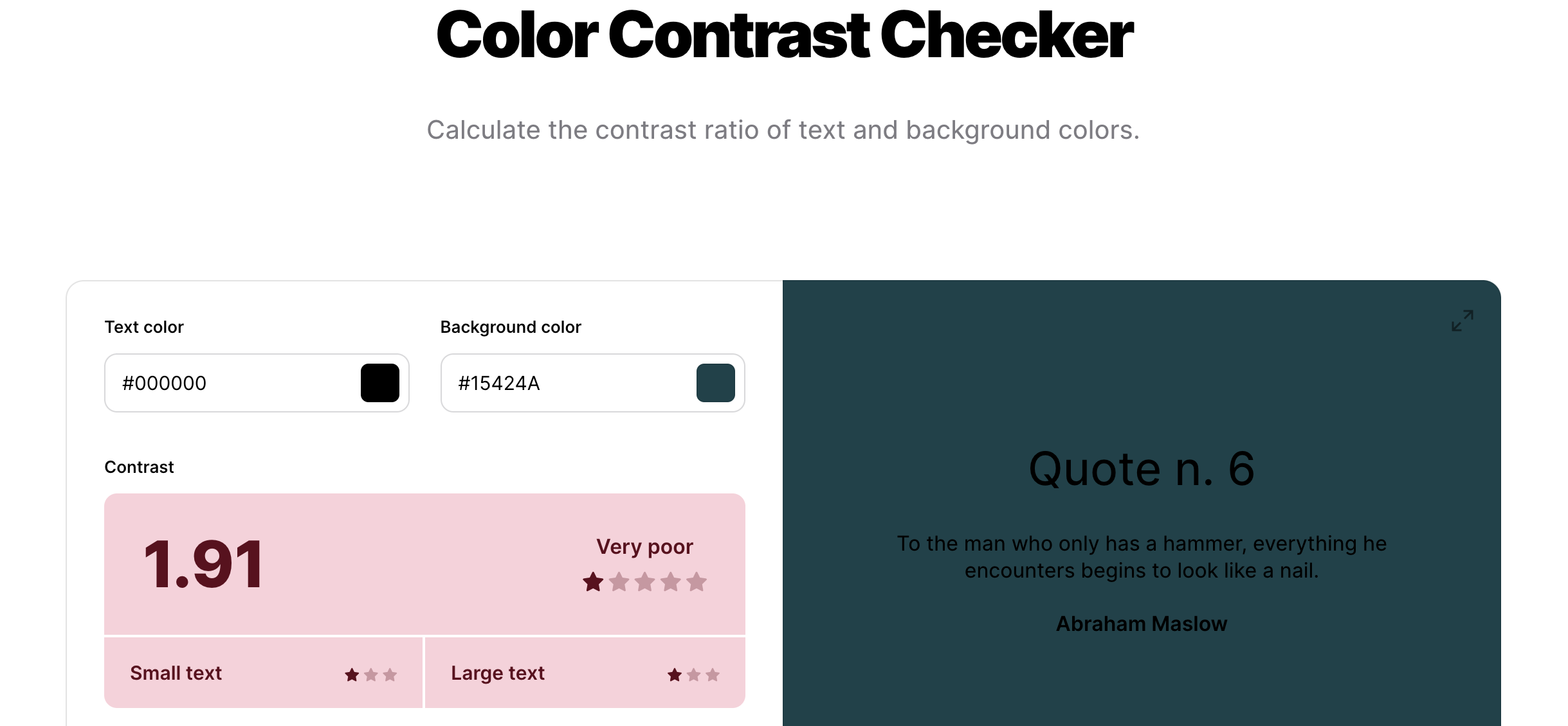
This image exemplifies poor color contrast, where the difference in luminance or color between foreground elements like text and background is minimal. Such low contrast ratios significantly hinder readability and can make content inaccessible to users with visual impairments or those viewing the content in suboptimal lighting conditions.
A sufficient contrast ratio is essential for readability and usability, especially for users with visual impairments or in varying lighting conditions.
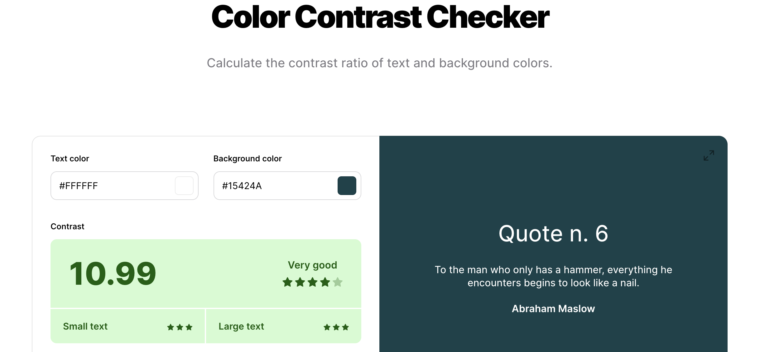
In contrast, this image showcases an example of very good color contrast, adhering to recommended contrast ratios as per accessibility guidelines like the WCAG. The stark difference in luminance between the text and the background enhances readability and ensures that the content is easily navigable for users with visual impairments.
Color Blindness
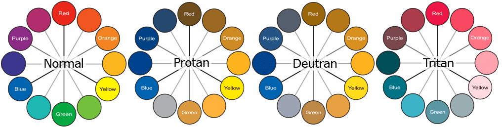
This illustration provides valuable insight into designing for inclusivity, showcasing a range of shades specifically chosen to enhance distinguishability for users with color vision deficiencies. With approximately 8% of men and 0.5% of women globally affected by some form of color blindness, adopting color-blind-friendly palettes is a critical consideration in app design. It emphasizes the importance of ensuring all users can navigate and understand important information without relying on color differentiation alone.
Performance and Loading Times
Efficient performance and swift loading times are imperative for retaining user engagement. Consider the following strategies:
-
Image Compression: Utilize advanced image compression tools to reduce file sizes without compromising visual quality. This ensures images load quickly without consuming excessive bandwidth or impacting the user experience. Some of the popular image compression tools include:
-
Vector Graphics: Whenever possible, use vector images instead of raster images. Vector graphics are resolution-independent and can be scaled infinitely without loss of quality. They adapt seamlessly to various screen sizes and resolutions, reducing file sizes and improving rendering performance.
Emerging Trends in Mobile App Design
Staying abreast of the latest design trends is crucial for creating user-centric, engaging, and accessible applications. Let’s unveil the emerging trends that are redefining user experiences. These emerging trends, including Soft UI aesthetics, Dark Mode implementation, and Adaptive Dark Mode features, highlight a commitment to visual comfort, accessibility, and personalization in app development.
- Soft UI Elements: By incorporating rounded corners, subtle gradients, and soft shadows, the interface achieves a modern and inviting look that promotes visual comfort. These design choices contribute to a more approachable and friendly digital environment. Soft UI elements not only enhance the aesthetic appeal but also improve readability and user interaction by creating a sense of depth and emphasis on key components.
- Dark Mode Implementation: The integration of dark mode provides an alternative visual theme that significantly reduces eye strain in low-light conditions, offering a comfortable viewing experience during nighttime usage. This design approach also contributes to battery conservation on OLED screens. Optimizing color contrast and ensuring readability within dark mode is essential to maintaining the visual hierarchy and user engagement, as demonstrated in the example image, showcasing the application’s interface in light and dark themes.
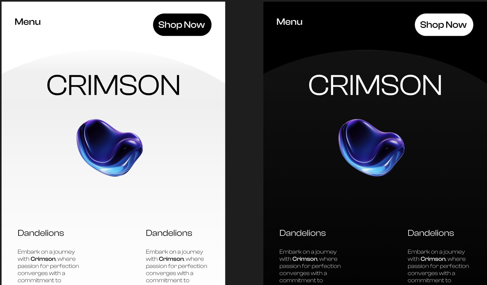
The example image showcasing the app in both light and dark modes illustrates the effective application of these design principles. It highlights the contrast between the two themes while maintaining consistency in layout and visual hierarchy, ensuring that the user’s experience is cohesive and intuitive regardless of their preferred theme. This thoughtful design approach underscores the importance of accommodating user preferences and creating an inclusive digital space that prioritizes accessibility and comfort.
- Adaptive Dark Mode: Implement adaptive dark mode features that automatically adjust interface themes based on system settings or user preferences. Adaptive dark mode enhances user flexibility and comfort by seamlessly transitioning between light and dark themes according to environmental conditions.
Conclusion
The design of mobile apps encompasses a multifaceted approach that considers not only aesthetic appeal and functionality but also inclusivity and accessibility for users of all abilities. As mobile apps continue to shape our daily interactions and experiences, adherence to design guidelines becomes increasingly vital in ensuring a seamless and engaging user experience. The comprehensive exploration of design principles for both iOS and Android platforms highlights the differences and common threads underpinning successful app design. From platform-specific considerations to responsive design strategies, the guide underscores the importance of tailoring app experiences to meet users’ diverse needs and preferences across different devices and operating systems.
As trends like dark mode design and soft UI emerge, designers must adapt and innovate. By incorporating these trends while adhering to core design principles and accessibility standards, mobile apps can remain essential tools for communication and productivity. Ultimately, mobile app design is a dynamic process guided by creativity, innovation, and a commitment to user-centric principles, empowering users worldwide.
Truly understand users experience
See every user interaction, feel every frustration and track all hesitations with OpenReplay — the open-source digital experience platform. It can be self-hosted in minutes, giving you complete control over your customer data.
Star on GitHub12k

