Mobile-first approach with HTML and CSS
How to implement a mobile-first approach to website design


In today’s digital landscape, the mobile-first approach has gained significant importance in web design and development. By adopting a mobile-first approach with HTML and CSS, you prioritize the needs of mobile users and ensure your website delivers a seamless and engaging experience on small screens. This article will explain the principles and benefits of mobile-first design and implementing specific strategies with HTML and CSS so you can apply the methodology.
The mobile-first approach is a design and development approach focusing on creating a user-friendly experience for mobile devices like smartphones and tablets. Unlike the traditional method of starting with desktop design and adapting it for mobile, the mobile-first approach begins with designing specifically for mobile devices and then expanding to larger screens. This approach ensures that the needs of mobile users are prioritized, considering the widespread usage of mobile devices in today’s digital world. It is an excellent approach to creating a responsive design.
The mobile-first approach is essential for several reasons:
-
It ensures developers prioritize performance optimization, resulting in faster load times, reduced data usage, and a smoother experience for mobile users.
-
It enables websites and applications to adapt and scale quickly across different devices and screen sizes.
-
Users can seamlessly navigate and engage with the mobile interface, increasing user satisfaction and engagement.
-
It helps businesses to effectively target and engage with their audience, ensuring seamless experience and interaction.
-
It enables you to concentrate on delivering clear and concise content.
-
It can improve your search engine visibility and drive more organic traffic to your site.
Fundamental principles of the mobile-first approach
Several principles can help shape the design and development process of the mobile-first approach. They include:
-
The mobile-first approach involves designing for the smallest screen and working your way up. Focusing on mobile users first is essential to carefully tailor the user experience to optimize smaller screens and accommodate touch-based interactions.
-
Identify core elements mobile users need to create an efficient, clutter-free experience. For example, prioritize straightforward navigation, user-friendly forms, responsive media, mobile-specific interactions, and prominent call-to-action buttons as core elements for mobile users.
-
Optimize performance by minimizing file sizes and employing techniques like lazy loading to enhance speed and responsiveness.
-
Implement responsive design techniques to ensure your website or application adapt seamlessly to different screen sizes and devices.
-
Designing intuitive touch-based interfaces is a fundamental aspect of the mobile-first approach, leveraging natural gestures like tapping, swiping, and pinching to enhance user-friendliness.
-
Begin with a solid foundation for the mobile experience and then enhance it for larger screens and more powerful devices. This approach allows you to add extra features and optimize the design for desktop users without compromising the core mobile experience.
Structuring HTML
You can effectively implement a mobile-first approach with HTML and CSS, ensuring a responsive and user-friendly design for mobile devices while accommodating larger screens and providing a seamless cross-device experience. Structuring HTML is an essential aspect of building a mobile-first approach. Here are ways to do that better:
-
Start with a well-organized HTML structure, including the doctype declaration (
<!DOCTYPE html>) and semantic elements like<html>,<head>, and<body>. -
Utilize semantic HTML tags for effective content structure, such as using
<h1>to<h6>for headings based on hierarchy,<nav>for navigation menus,<article>for self-contained content, and<section>for grouping related content. -
Enhance the mobile user experience by incorporating mobile-friendly elements like
<input type="tel">for telephone numbers,<input type="email">for email addresses, and<input type="date">for date inputs. These elements facilitate appropriate keyboard layouts and input options. -
Create a mobile-friendly navigation structure for smaller screens, utilizing techniques like a collapsible menu (
<button>with associated<ul>or<nav>), a hamburger icon, or a slide-out panel to ensure easy usability and accessibility. -
Include accessibility features in your HTML structure, such as
altattributes for images (<img>) and proper labeling for form inputs (<label>), to enhance navigation and understanding of your content for users with disabilities. -
Improve code readability and navigation by maintaining consistent indentation and using whitespace effectively to enhance the structure and readability of your HTML.
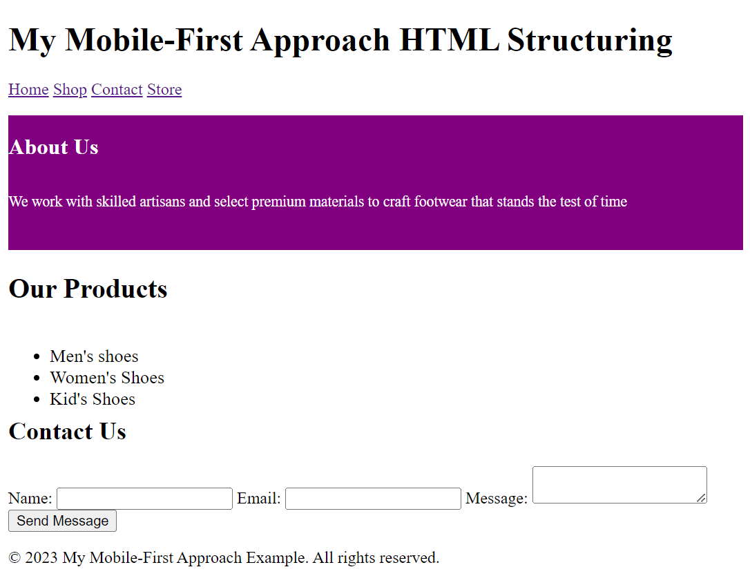
Let’s see an example of how to structure the HTML:
<!DOCTYPE html>
<html>
<head>
<meta charset="UTF-8" />
<meta name="viewport" content="width=device-width, initial-scale=1.0" />
<title>My Mobile-First Approach</title>
</head>
<body>
<header>
<h1>My Mobile-First Approach HTML Structuring</h1>
<nav>
<a href="">Home</a>
<a href="">Shop</a>
<a href="">Contact</a>
<a href="">Store</a>
</nav>
</header>
<main>
<section>
<h2>About Us</h2>
<p>
We work with skilled artisans and select premium materials to craft
footwear that stands the test of time
</p>
</section>
<section>
<h2>Our Products</h2>
<ul>
<li>Men's shoes</li>
<li>Women's Shoes</li>
<li>Kid's Shoes</li>
</ul>
</section>
<section>
<h2>Contact Us</h2>
<form>
<label for="name">Name:</label>
<input type="text" id="name" name="name" />
<label for="email">Email:</label>
<input type="email" id="email" name="email" />
<label for="message">Message:</label>
<textarea id="message" name="message"></textarea>
<input type="submit" value="Send Message" />
</form>
</section>
</main>
<footer>
<p>© 2023 My Mobile-First Approach Example. All rights reserved.</p>
</footer>
</body>
</html>The outcome:
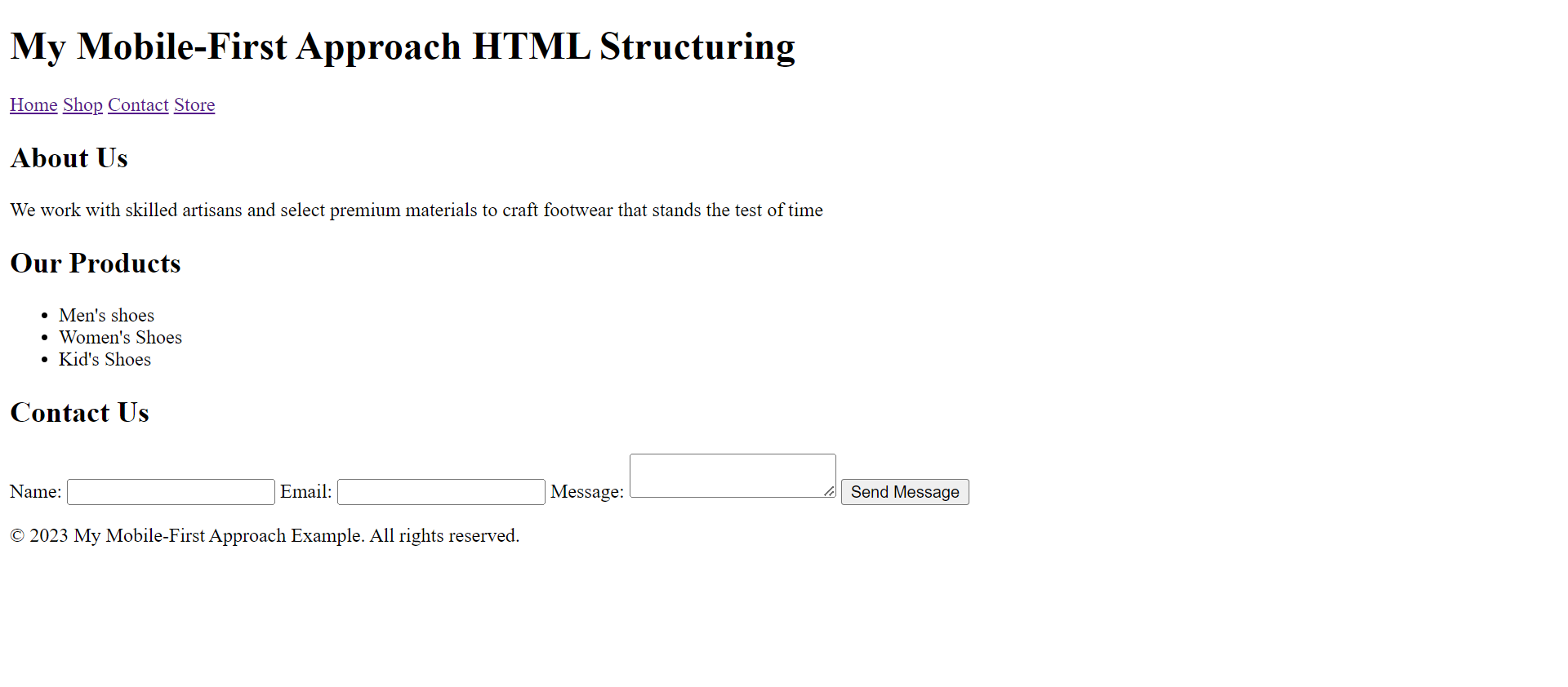
The example above follows the mobile-first approach and includes the necessary structure for a website. It sets the document type, defines the viewport for responsive behavior, and consists of a title for the page. It also comprises a header, a main content area with sections, and a footer. The navigation bar, sections, and form are organized using semantic HTML tags.
Creating responsive grid systems
By leveraging the power of CSS Flexbox and CSS Grid, you can create versatile and responsive grid systems that adapt gracefully to different devices, providing an optimal user experience for mobile and desktop users. Here is how you can use CSS flexbox and grid to create a responsive grid system for the mobile-first approach:
<!DOCTYPE html>
<html>
<head>
<meta charset="UTF-8">
<meta name="viewport" content="width=device-width, initial-scale=1.0">
<title>My Mobile-First Approach</title>
<style>
.grid-container-flex {
display: flex;
flex-direction: column;
background-color: purple;
font-size: 1.5rem;
color: white;
margin-top: 1rem;
height: 7em;
}
.grid-container-grid {
display: grid;
grid-template-columns: 20em;
height: 8em;
font-size: 1.1rem;
}
</style>
</head>
<body>
<header>
<h1>My Mobile-First Approach HTML Structuring</h1>
<nav>
<a href="">Home</a>
<a href="">Shop</a>
<a href="">Contact</a>
<a href="">Store</a>
</nav>
</header>
<main>
<section class="grid-container-flex">
<h2>About Us</h2>
<p>We work with skilled artisans and select premium materials to craft footwear that stands the test of time</p>
</section>
<section class="grid-container-grid">
<h2>Our Products</h2>
<ul>
<li>Men's shoes</li>
<li>Women's Shoes</li>
<li>Kid's Shoes</li>
</ul>
</section>
<section>
<h2>Contact Us</h2>
<form>
<label for="name">Name:</label>
<input type="text" id="name" name="name">
<label for="email">Email:</label>
<input type="email" id="email" name="email">
<label for="message">Message:</label>
<textarea id="message" name="message"></textarea>
<input type="submit" value="Send Message">
</form>
</section>
</main>
<footer>
<p>© 2023 My Mobile-First Approach Example. All rights reserved.</p>
</footer>
</body>
</html>The outcome:
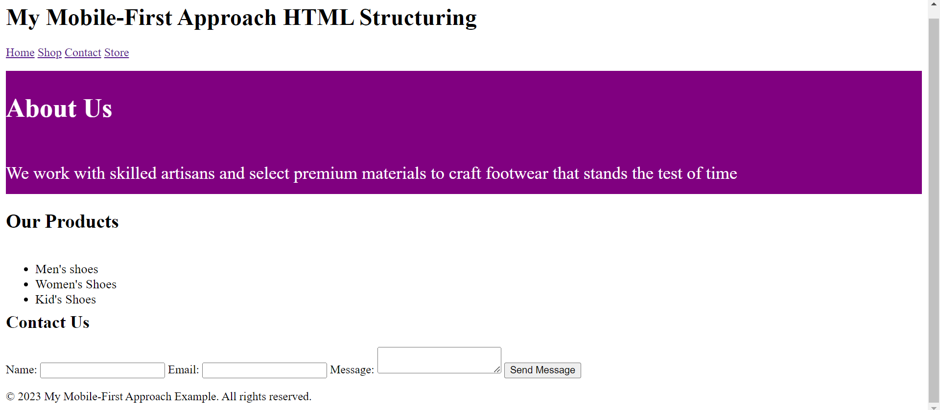
The Flexbox layout is applied to the “About Us” section in the above example, arranging its elements in a vertical column. The Grid layout is used for the “Our Products” section, organizing its elements in a single column. These CSS techniques help create responsive and adaptable layouts that can be customized and optimized for different devices and screen sizes.
You can check out CSS Flexbox and CSS Grid for in-depth knowledge of how to use them and create a responsive grid system for the mobile-first approach.
You can effectively implement a mobile-first approach with HTML and CSS, ensuring a responsive and user-friendly design for mobile devices while accommodating larger screens and providing a seamless cross-device experience.
Session Replay for Developers
Uncover frustrations, understand bugs and fix slowdowns like never before with OpenReplay — an open-source session replay tool for developers. Self-host it in minutes, and have complete control over your customer data. Check our GitHub repo and join the thousands of developers in our community.
Responsive Design with CSS Media Queries
Implementing responsive design with CSS media queries enables you to apply different styles based on the device’s screen size. This approach is commonly used with the mobile-first approach to improve user experience across various devices.
You can create a responsive design using CSS media queries that provides an optimal viewing experience across multiple devices. It allows you to tailor your styles to different screen sizes’ specific needs and constraints, ensuring that your website or application is user-friendly and visually appealing on all devices.
Here is how you can use CSS media queries for a mobile-first approach:
-
Design and style your mobile device website or application using CSS rules targeting smaller screens. This enables your design optimization for mobile users and establishes the mobile-first foundation.
-
You will use the
min-widthmedia query for the mobile-first approach to enhance the design as the screen size increases progressively. This means that the default styles will be for mobile, and additional styles will be added as the screen size increases. -
You must determine the breakpoints at which you want to introduce layout or styling changes. Breakpoints are specific screen widths at which your design will adapt to fit the screen size better. Standard breakpoints include tablets, desktops, and larger screens.
-
To target specific screen sizes, write media queries using the
@mediarule and themin-widthproperty.
For example:
<!DOCTYPE html>
<html>
<head>
<meta charset="UTF-8">
<meta name="viewport" content="width=device-width, initial-scale=1.0">
<title>My Mobile-First Approach</title>
<style>
/* Default styles for mobile */
.grid-container-flex {
display: flex;
flex-direction: column;
background-color: purple;
font-size: 0.9rem;
color: white;
margin-top: 1rem;
height: 9em;
}
.grid-container-grid {
display: grid;
grid-template-columns: 20em;
height: 8em;
font-size: 1.1rem;
}
/* Media query for tablets */
@media (min-width: 768px) {
.grid-container-flex {
font-size: 1.3rem;
}
.grid-container-grid {
grid-template-columns: none;
height: 10em;
}
}
/* Media query for desktops */
@media (min-width: 1024px) {
.grid-container-flex {
font-size: 2rem;
}
.grid-container-grid {
grid-template-columns: none;
height: 12em;
}
}
</style>
</head>
<body>
<header>
<h1>My Mobile-First Approach HTML Structuring</h1>
<nav>
<a href="">Home</a>
<a href="">Shop</a>
<a href="">Contact</a>
<a href="">Store</a>
</nav>
</header>
<main>
<section class="grid-container-flex">
<h2>About Us</h2>
<p>We work with skilled artisans and select premium materials to craft footwear that stands the test of time</p>
</section>
<section class="grid-container-grid">
<h2>Our Products</h2>
<ul>
<li>Men's shoes</li>
<li>Women's Shoes</li>
<li>Kid's Shoes</li>
</ul>
</section>
<section>
<h2>Contact Us</h2>
<form>
<label for="name">Name:</label>
<input type="text" id="name" name="name">
<label for="email">Email:</label>
<input type="email" id="email" name="email">
<label for="message">Message:</label>
<textarea id="message" name="message"></textarea>
<input type="submit" value="Send Message">
</form>
</section>
</main>
<footer>
<p>© 2023 My Mobile-First Approach Example. All rights reserved.</p>
</footer>
</body>
</html>The above example includes CSS media queries for a mobile-first approach to adjust the styles for different screen sizes. The mobile styles are applied by default, and certain elements’ font size and height are increased for tablets. The font size and height are further adjusted for desktops to ensure optimal display on larger screens.
You can check out CSS media queries for an in-depth understanding of using CSS media queries.
Testing and Optimization
Testing and optimization are crucial steps in the mobile-first approach to ensure the effectiveness and performance of the designed website or application on various mobile devices.
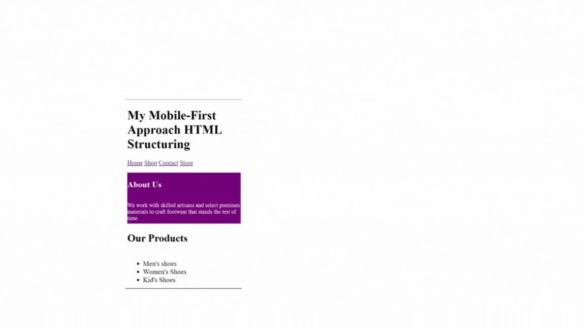
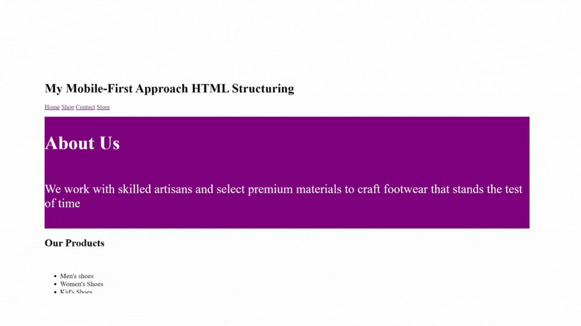
In the developer tools, you can use responsive design testing tools in modern browsers, such as Chrome’s Device Mode, to test on various devices and screen sizes. These tools allow you to simulate multiple devices and screen sizes, visually representing how the code renders on different devices.
Let’s check how the mobile-first approach is displayed on different devices.
Mobile display:
 )
)
Large screen display:
Tablet display:
Using responsive image techniques
Responsive image techniques for the mobile-first approach allow the images to adjust to different screen sizes, ensuring a better user experience on mobile devices while still providing high-quality images on larger screens.
Some of the techniques to use when implementing responsive image techniques for a mobile-first approach include:
- the picture element can present different images based on screen size. For example:
<picture>
  <source media="(min-width: 768px)" srcset="large.jpg">
  <source media="(min-width: 480px)" srcset="medium.jpg">
  <img src="small.jpg" alt="Responsive image">
</picture>
The above example enables the browser to choose large.jpg for screens wider than 768 pixels, medium.jpg for screens wider than 480 pixels, and fallback to small.jpg for smaller screens.
- To avoid overflow of images from the container on different screen sizes, set the
max-widthproperty of the image to 100% and let the height scale automatically to maintain the image’s aspect ratio.
For example:
img {
  max-width: 100%;
  height: auto;
}- To set multiple image sources with different resolutions or sizes, use the
srcsetattribute. This enables the browser to select the most appropriate image based on the device’s screen size and pixel density.
Example:
<img src="small.jpg" srcset="medium.jpg 800w, large.jpg 1200w" alt="Responsive Image">The above example shows the browser will choose between small.jpg, medium.jpg, or large.jpg based on the available width (800w or 1200w).
Conclusion
The mobile-first approach prioritizes mobile users and eliminates the issues associated with scaling down from desktop to mobile. By following the mobile-first approach and incorporating responsive design principles, we can create flexible and adaptive websites that meet the diverse needs of users across different screen sizes and devices. We can create a user-centered and efficient design that works well on mobile devices by starting with the smallest screens and focusing on essential content and functionality.
Gain Debugging Superpowers
Unleash the power of session replay to reproduce bugs and track user frustrations. Get complete visibility into your frontend with OpenReplay, the most advanced open-source session replay tool for developers.