
If you are familiar with Flexbox, you will love what CSS Grid can do. Using CSS Grid to build layouts for your web pages gets better. You can design web pages in rows and columns with CSS Grid without using floats and positioning. In addition, Laying out web content is more efficient with CSS Grid. So in this article, you will understand CSS Grid and how to use it to build layouts with several properties.
What is CSS Grid?
The CSS Grid is a two-dimensional system of building layouts for web pages. It enables you to create a grid of rows and columns with elements. In addition, we can create different layouts, like multi-column, responsive, and nested grids, with CSS Grid.
There are many ways to layout web pages in CSS, like floats, inline-block, and positioning, but they do not offer some efficiency you get with using CSS Grid. Even the one-directional CSS flexbox is an excellent tool, but CSS Grid still beats it. Here are some of the reasons to use CSS Grid:
- You can create various layouts with CSS Grid, from simple grids to complex, responsive layouts. Hence, its flexibility.
- You can comfortably define the layout of an element and its children using a single set of properties instead of floats or position properties.
- It is effortless to learn and use CSS Grid.
- It provides good support for all modern browsers.
- You can create responsive and flexible layouts with ease.
- There is no need to use any additional libraries or frameworks to use it, as it is in-built into modern browsers.
- It is easy to arrange and rearrange elements within a grid, making it well-suited for building dynamic layouts.
Elements of CSS Grid
In CSS Grid Layout, several essential elements make up the grid. These include:
- Grid Container: This is also known as the parent element, containing the grid. The display property specifies this element by setting it to a grid or inline grid.
- Grid Items: These are the child elements of the grid container. The grid lines place this element on the grid and can span multiple rows or columns.
- Grid Lines: These horizontal and vertical lines make up the grid and enable you to position grid items and define their size.
- Grid Tracks: These spaces between grid lines are sized using grid-template-rows and grid-template-columns properties.
- Grid Cells: These are the intersections of grid rows and columns. They are the smallest grid unit and can contain a single grid item.
- Grid Areas: These define the grid sections created by dividing them into rows and columns using grid lines. You can place grid items into grid areas using the grid-area property.
- Grid Gaps: These are the spaces between grid items. The gap property or the grid-row-gap and grid-column-gap properties help specify them.
How does CSS Grid work?
To use CSS Grid, you must create the grid container element you want to use on your webpage. The grid container can be any HTML element, like a div element. Then you set the display property to the grid. So this tells the browser to treat the element as a grid container. The syntax:
.class {
display: grid;
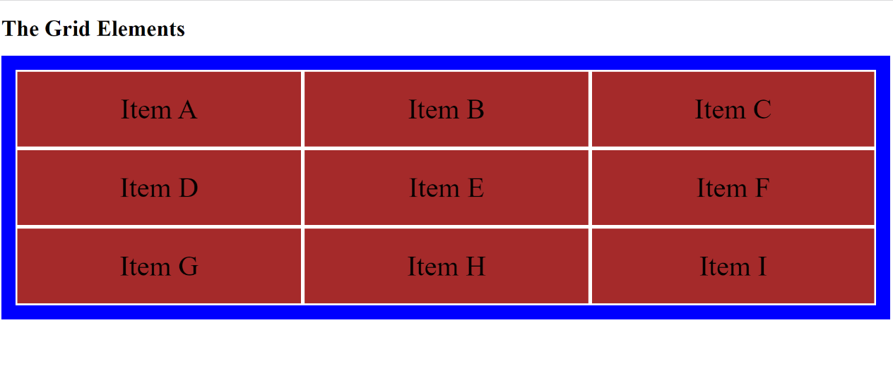
}You can now place elements onto the grid using the various grid properties, which allows you to define the number of rows and columns you want in the grid. You can also use these properties to customize the layout of your grid. A space-separated list is used to specify the sizes of the rows and columns. For example, see how CSS Grid works by displaying the grid items in a container.
    <!DOCTYPE html>

    <html>
    <head>

    <style>

    .grid-container {
      display: grid;
      grid-template-columns: auto auto auto;
      background-color: blue;
      padding: 20px;
    }
    .grid-item {
      background-color: brown;
      border: 3px solid white;
      padding: 30px;
      font-size: 40px;
      text-align: center;
    }
    </style>
    </head>
    <body>

    <h1>The Grid Elements</h1>

      <div class="grid-container">
          <div class="grid-item">Item A</div>
          <div class="grid-item">Item B</div>
          <div class="grid-item">Item C</div>
          <div class="grid-item">Item D</div>
          <div class="grid-item">Item E</div>
          <div class="grid-item">Item F</div>
          <div class="grid-item">Item G</div>
          <div class="grid-item">Item H</div>
          <div class="grid-item">Item I</div>
    </div>

    </body>
    </html>
The outcome:
CSS Grid Properties
CSS Grid has several properties that allow us to use it effectively. Let us look at them now:
Grid-template
This is a shorthand property that defines the structure of a grid layout. It uses row and column size values, followed by an optional grid template area. It works with grid properties, like grid-template-rows, grid-template-columns, and grid-template-areas. You can easily set the grid layout properties simultaneously with this property instead of setting them separately with the grid-template-rows, grid-template-columns, and grid-template-areas properties.
Example:
    <!DOCTYPE html>
    <html>
    <head>

    <style>

    .grid-container {
      display: grid;
      grid-template: 80px 300px / auto auto 190px;
      background-color: blue;
      padding: 10px;
    }
    .grid-item {
      background-color: brown;
      border: 3px solid white;
      padding: 30px;
      font-size: 40px;
      text-align: center;
    }
    </style>
    </head>
    <body>

    <h1>Grid Template Property</h1>

      <div class="grid-container">
          <div class="grid-item">Item A</div>
          <div class="grid-item">Item B</div>
          <div class="grid-item">Item C</div>
          <div class="grid-item">Item D</div>
          <div class="grid-item">Item E</div>
          <div class="grid-item">Item F</div>
    </div>

    </body>
    </html>
The outcome:
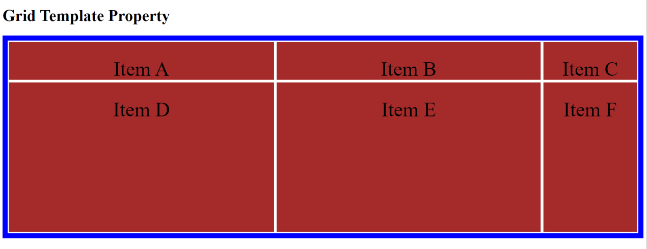
The example above creates a grid with two rows, the first row having a length of 80px and the second a length of 300px. Three columns are also created, with the first two automatically set to fit in the container and the last set to 190px.
Grid-template-columns
This property defines the number and width of the grid’s columns. This property uses a list of values, separated by spaces, to specify the size of the grid’s column.
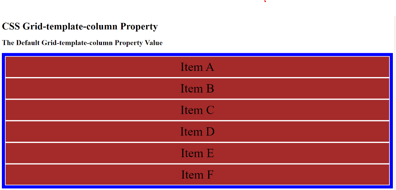
Let us look at several examples of how we can use the grid-template-columns property by specifying different values. None property value: This is the default value of the grid-template column property, specifying that there should not be any column.
    <!DOCTYPE html>
    <html>
    <head>

    <style>

    .grid-container {
      display: grid;
      grid-template-columns: none;
      background-color: blue;
      padding: 10px;
    }
    .grid-item {
      background-color: brown;
      border: 2px solid white;
      padding: 10px;
      font-size: 40px;
      text-align: center;
    }
    </style>
    </head>
    <body>

    <h1>CSS Grid-template-column Property</h1>
    <h2>The Default Grid-template-column Property Value</h2>

      <div class="grid-container">
          <div class="grid-item">Item A</div>
          <div class="grid-item">Item B</div>
          <div class="grid-item">Item C</div>
          <div class="grid-item">Item D</div>
          <div class="grid-item">Item E</div>
          <div class="grid-item">Item F</div>

    </div>

    </body>
    </html>
The outcome:
Length property value: You can use other grid-template property values if you need columns in the layout. For example, you can use the length property value to set the column’s sizes the way you want them. It can be in pixel, em, percentage, etc.
    <!DOCTYPE html>
    <html>
    <head>

    <style>

    .grid-container {
      display: grid;
      grid-template-columns:100px 120px 90px;
      background-color: blue;
      padding: 10px;

    }
    .grid-item {
      background-color: brown;
      border: 2px solid white;
      padding: 10px;
      font-size: 40px;
      text-align: center;
    }
    </style>
    </head>
    <body>

    <h1>CSS Grid-template-column Property</h1>
    <h2>The Length Grid-template-column Property Value</h2>

      <div class="grid-container">
          <div class="grid-item">Item A</div>
          <div class="grid-item">Item B</div>
          <div class="grid-item">Item C</div>
          <div class="grid-item">Item D</div>
          <div class="grid-item">Item E</div>
          <div class="grid-item">Item F</div>

    </div>
    </body>
    </html>
The outcome:
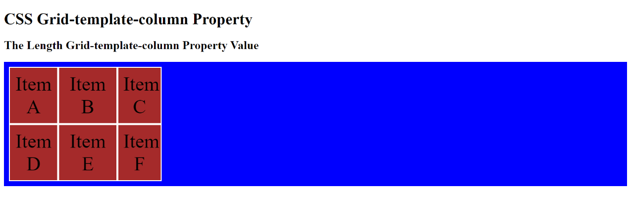
In the above example, the length value property specified the length of the columns to be 100px, 120px, and 90px.
Auto property value: Using the auto property value, you can also set the column’s size based on the container’s and item’s sizes. For example:
    <!DOCTYPE html>
    <html>
    <head>

    <style>

    .grid-container {
      display: grid;
      grid-template-columns: auto auto auto;
      background-color: blue;
      padding: 10px;

    }
    .grid-item {
      background-color: brown;
      border: 2px solid white;
      padding: 10px;
      font-size: 40px;
      text-align: center;
    }
    </style>
    </head>
    <body>

    <h1>CSS Grid-template-column Property</h1>
    <h2>The Auto Grid-template-column Property Value</h2>

      <div class="grid-container">
          <div class="grid-item">Item A</div>
          <div class="grid-item">Item B</div>
          <div class="grid-item">Item C</div>
          <div class="grid-item">Item D</div>
          <div class="grid-item">Item E</div>
          <div class="grid-item">Item F</div>

    </div>

    </body>
    </html>
The outcome:
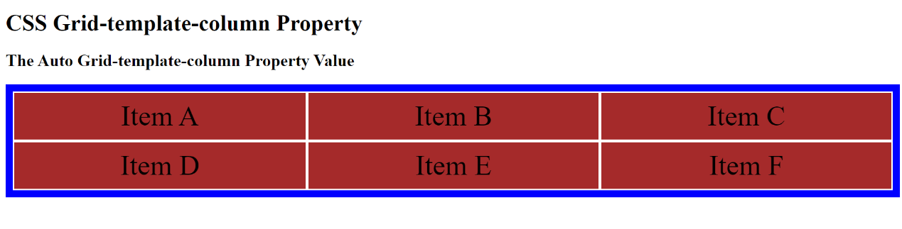
The above example sets the column automatically based on the container size and items.
Min-content and Max-content property value: You can set the size of the column in a way that relies on the smallest item in the column using the min-content property value. Using the max-content property value, you can also set it to rely on the largest item in the column. For example:
    <!DOCTYPE html>
    <html>
    <head>

    <style>

    .grid-container {
      display: grid;
      grid-template-columns: min-content min-content max-content;
      background-color: blue;
      padding: 10px;

    }
    .grid-item {
      background-color: brown;
      border: 2px solid white;
      padding: 10px;
      font-size: 40px;
      text-align: center;
    }
    </style>
    </head>
    <body>

    <h1>CSS Grid-template-column Property</h1>
    <h2>The Min-content and Max-content Grid-template-column Property Value</h2>

      <div class="grid-container">
          <div class="grid-item">Item A</div>
          <div class="grid-item">Item B</div>
          <div class="grid-item">Item C</div>
          <div class="grid-item">Item D</div>
          <div class="grid-item">Item E</div>
          <div class="grid-item">Item F</div>

    </div>

    </body>
    </html>
The outcome:
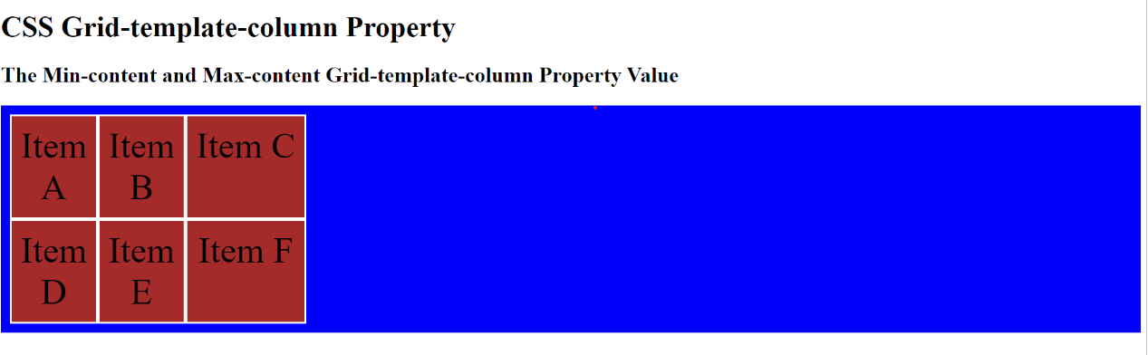
In the above example, the columns are set based on the size of the smallest and largest item in the column.
Grid-template-rows
This property defines the number and size of the grid’s rows. This property uses a list of values, separated by spaces, to specify the size of the grid’s rows. It works similarly to the grid-template-columns property, just that it specifies the number and size of the rows instead of columns.
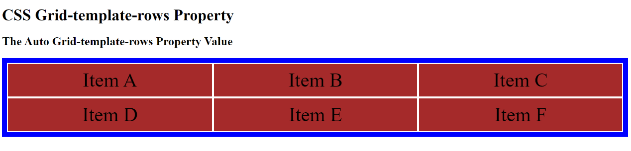
Let us check out some examples of how we can use the grid-template-rows property by specifying different values. None property value: This is the default value of the grid-template-rows property, specifying that the row’s size will not be set. Auto property value: Using the auto property value, you can also set the row’s size based on the container’s and item’s sizes. Example:
    <!DOCTYPE html>
    <html>
    <head>

    <style>

    .grid-container {
      display: grid;
      grid-template-columns: auto auto auto;
      grid-template-rows: auto auto;
      background-color: blue;
      padding: 10px;
    }
    .grid-item {
      background-color: brown;
      border: 2px solid white;
      padding: 10px;
      font-size: 40px;
      text-align: center;
    }
    </style>
    </head>
    <body>

    <h1>CSS Grid-template-rows Property</h1>
    <h2>The Auto Grid-template-rows Property Value</h2>

      <div class="grid-container">
          <div class="grid-item">Item A</div>
          <div class="grid-item">Item B</div>
          <div class="grid-item">Item C</div>
          <div class="grid-item">Item D</div>
          <div class="grid-item">Item E</div>
          <div class="grid-item">Item F</div>
    </div>
    </body>
    </html>
The outcome:
Length property value: You can use this property value to set the row’s sizes the way you want them. It can be in pixel, em, percentage, etc. Example:
    <!DOCTYPE html>
    <html>
    <head>

    <style>

    .grid-container {
      display: grid;
      grid-template-columns: auto auto auto;
      grid-template-rows: 100px 250px;
      background-color: blue;
      padding: 10px;
    }
    .grid-item {
      background-color: brown;
      border: 2px solid white;
      padding: 10px;
      font-size: 40px;
      text-align: center;
    }
    </style>
    </head>
    <body>

    <h1>CSS Grid-template-rows Property</h1>
    <h2>The Length Grid-template-rows Property Value</h2>

      <div class="grid-container">
          <div class="grid-item">Item A</div>
          <div class="grid-item">Item B</div>
          <div class="grid-item">Item C</div>
          <div class="grid-item">Item D</div>
          <div class="grid-item">Item E</div>
          <div class="grid-item">Item F</div>

    </div>

    </body>
    </html>
The outcome:
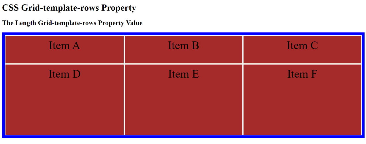
The min-content and max-content property values also allow you to set the size of the row to depend on the smallest and largest item in the row.
Session Replay for Developers
Uncover frustrations, understand bugs and fix slowdowns like never before with OpenReplay — an open-source session replay tool for developers. Self-host it in minutes, and have complete control over your customer data. Check our GitHub repo and join the thousands of developers in our community.
Grid-area property
This property specifies the name of a grid area where an element should be placed. In addition, it can also set the row and column positions of an element within a grid. The property is a shorthand property for grid-template-rows, grid-template-columns, and grid-template-areas.
The grid-area property has several values to specify the placement of elements within a grid layout. These values can be a number or a keyword like auto or span.
Grid-row-start
This property defines the rows grid items occupy by specifying the row line you want the item to start. The values include:
- The auto value is the default value and allows you to place the item following the flow.
- The row-line value allows you to specify the row to start the item’s display.
Example:
    <!DOCTYPE html>
    <html>
    <head>

    <style>

    .grid-container {
      display: grid;
      grid-template-columns: auto auto auto;
      background-color: blue;
      padding: 10px;
    }
    .grid-container > div {
      background-color: brown;
      border: 3px solid white;
      padding: 30px;
      font-size: 40px;
      text-align: center;
    }

    .grid-item2 {
      grid-row-start: 2;
    }

    </style>
    </head>
    <body>

    <h1>Grid Row Start Property</h1>
    <h2>grid-row-start row-line property value</h2>

      <div class="grid-container">
          <div class="grid-item1">Item A</div>
          <div class="grid-item2">Item B</div>
          <div class="grid-item3">Item C</div>
          <div class="grid-item4">Item D</div>
          <div class="grid-item5">Item E</div>
          <div class="grid-item6">Item F</div>

    </div>

    </body>
    </html>
The outcome:
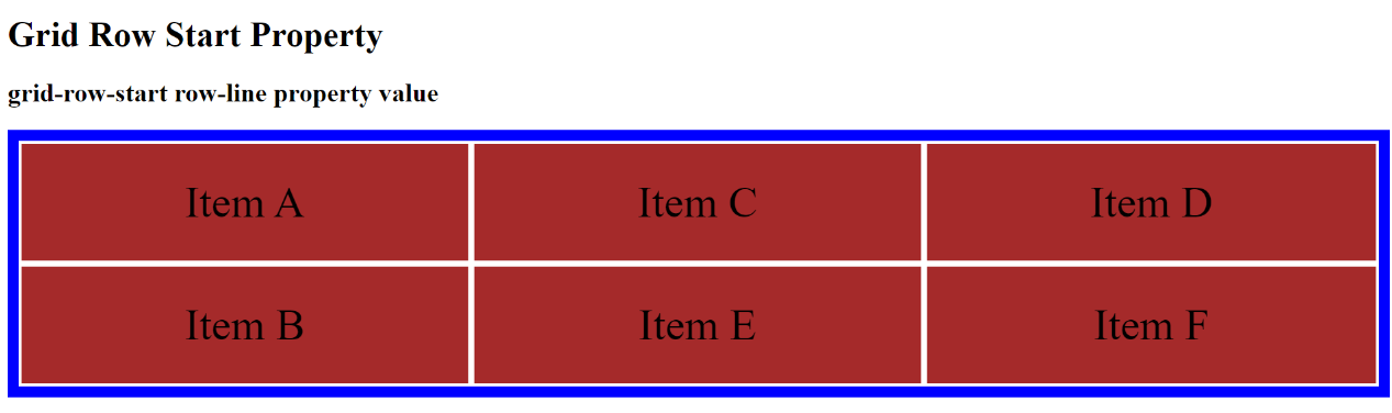
The example above shows how Grid-item2 started on the second row instead of the first.
- The span value defines the number of rows an element should span.
Example:
    <!DOCTYPE html>
    <html>
    <head>

    <style>

    .grid-container {
      display: grid;
      grid-template-columns: auto auto auto;
      background-color: blue;
      padding: 10px;
    }
    .grid-container > div {
      background-color: brown;
      border: 3px solid white;
      padding: 30px;
      font-size: 40px;
      text-align: center;
    }

    .grid-item2 {
      grid-row-start: span 3;
    }

    .grid-item1 {
      grid-row-start: span 2;
    }

    </style>
    </head>
    <body>

    <h1>Grid Row Start Property</h1>
    <h2>grid-row-start span property value</h2>

      <div class="grid-container">
          <div class="grid-item1">Item A</div>
          <div class="grid-item2">Item B</div>
          <div class="grid-item3">Item C</div>
          <div class="grid-item4">Item D</div>
          <div class="grid-item5">Item E</div>
          <div class="grid-item6">Item F</div>

    </div>

    </body>
    </html>
The outcome:
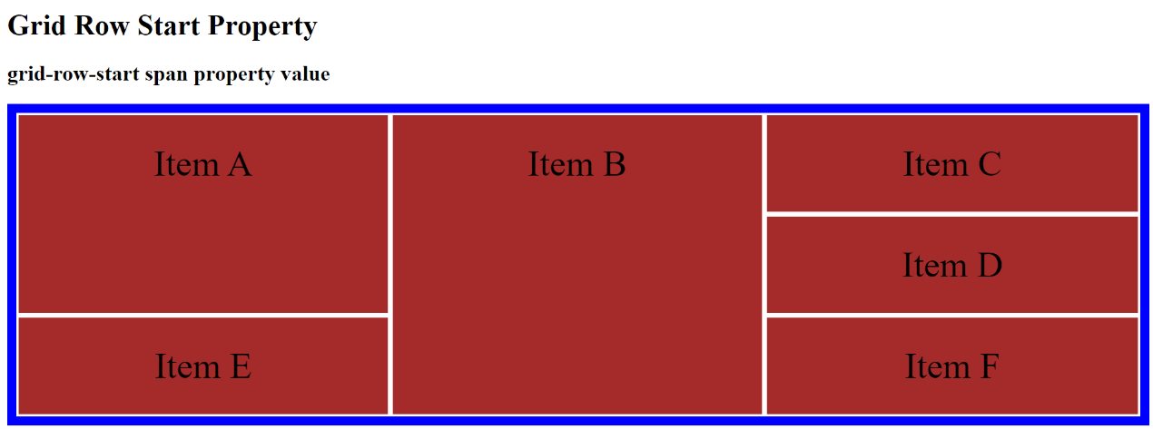
In the above example, Grid-item2 was span to the third row, while Grid-item1 was span to the second row.
Grid-row-end
This property defines the rows grid items occupy by specifying the ending row for a grid item in a grid layout. The values include:
- The auto value is the default value and shows that the item will span one row.
- The span n property defines the number of rows the item will span.
- The row-line defines the row to end the item’s display.
Example:
    <!DOCTYPE html>
    <html>
    <head>

    <style>

    .grid-container {
      display: grid;
      grid-template-columns: auto auto auto;
      background-color: blue;
      padding: 10px;
    }
    .grid-container > div {
      background-color: brown;
      border: 3px solid white;
      padding: 30px;
      font-size: 40px;
      text-align: center;
    }

    .grid-item1 {
      grid-row-start: span 3;
    }

    </style>
    </head>
    <body>

    <h1>Grid Row End Property</h1>
    <h2>grid-row-end span property value</h2>

      <div class="grid-container">
          <div class="grid-item1">Item A</div>
          <div class="grid-item2">Item B</div>
          <div class="grid-item3">Item C</div>
          <div class="grid-item4">Item D</div>
          <div class="grid-item5">Item E</div>
          <div class="grid-item6">Item F</div>

    </div>

    </body>
    </html>
The outcome:
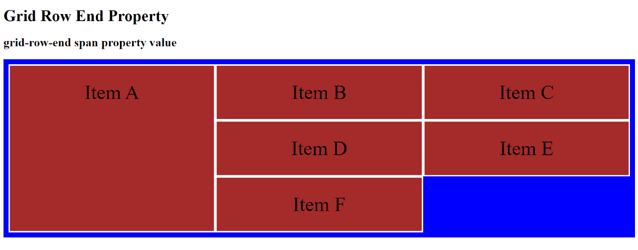
In the above example, Grid-item 1 spans three rows, starting at the first row and ending at the third row.
Grid-column-start
This property defines a grid item’s columns by specifying the starting column for the grid item in a grid layout. The values include:
- The auto value is the default value and shows the placement of the item following the flow.
- The column-line value specifies the column to start the item’s display.
Example:
    <!DOCTYPE html>
    <html>
    <head>

    <style>

    .grid-container {
      display: grid;
      grid-template-columns: auto auto auto;
      background-color: blue;
      padding: 10px;
    }
    .grid-container > div {
      background-color: brown;
      border: 3px solid white;
      padding: 30px;
      font-size: 40px;
      text-align: center;
    }

    .grid-item2 {
      grid-column-start: 3;
    }

    </style>
    </head>
    <body>

    <h2>Grid Column Start Property</h2>
    <h2>grid-column-start Column-line property value</h2>

      <div class="grid-container">
          <div class="grid-item1">Item A</div>
          <div class="grid-item2">Item B</div>
          <div class="grid-item3">Item C</div>
          <div class="grid-item4">Item D</div>
          <div class="grid-item5">Item E</div>
          <div class="grid-item6">Item F</div>

    </div>

    </body>
    </html>
The outcome:
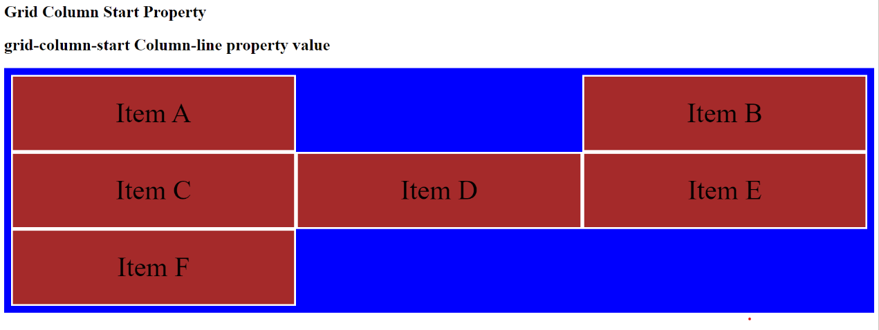
In the above example, the column-line value specified Grid-item 2 to start its display in column three.
- The span n value defines the number of columns the item will span.
Example
    <!DOCTYPE html>
    <html>
    <head>

    <style>

    .grid-container {
      display: grid;
      grid-template-columns: auto auto auto;
      background-color: blue;
      padding: 10px;
    }
    .grid-container > div {
      background-color: brown;
      border: 3px solid white;
      padding: 30px;
      font-size: 40px;
      text-align: center;
    }

    .grid-item1 {
      grid-column-start: span 3;
    }

    </style>
    </head>
    <body>

    <h2>Grid Column Start Property</h2>
    <h2>grid-column-start Span property value</h2>

      <div class="grid-container">
          <div class="grid-item1">Item A</div>
          <div class="grid-item2">Item B</div>
          <div class="grid-item3">Item C</div>
          <div class="grid-item4">Item D</div>
          <div class="grid-item5">Item E</div>
          <div class="grid-item6">Item F</div>

    </div>

    </body>
    </html>
The outcome:
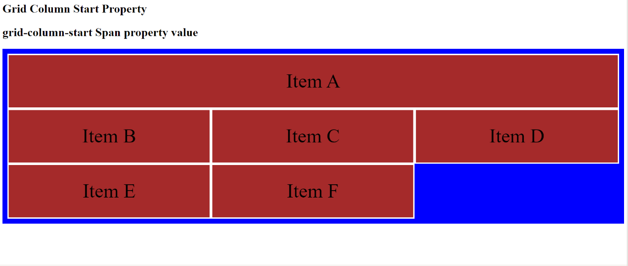
The above example shows Grid-item 1 span from the first column to the third column.
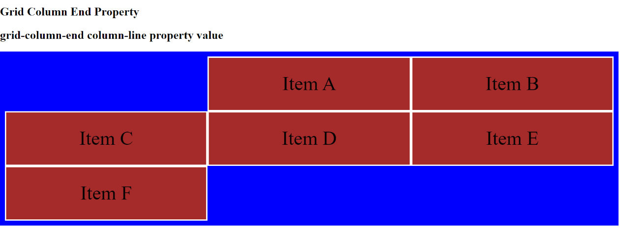
Grid-column-end
This property defines a grid item’s columns by specifying the ending column for the grid item in a grid layout. The values include:
- The auto value is the default value and shows the item will span one column.
- The column-line value specifies the column to end the item’s display.
Example:
    <!DOCTYPE html>
    <html>
    <head>

    <style>

    .grid-container {
      display: grid;
      grid-template-columns: auto auto auto;
      background-color: blue;
      padding: 10px;
    }
    .grid-container > div {
      background-color: brown;
      border: 3px solid white;
      padding: 30px;
      font-size: 40px;
      text-align: center;
    }

    .grid-item1 {
      grid-column-end: 3;
    }

    </style>
    </head>
    <body>

    <h2>Grid Column End Property</h2>
    <h2>grid-column-end column-line property value</h2>

      <div class="grid-container">
          <div class="grid-item1">Item A</div>
          <div class="grid-item2">Item B</div>
          <div class="grid-item3">Item C</div>
          <div class="grid-item4">Item D</div>
          <div class="grid-item5">Item E</div>
          <div class="grid-item6">Item F</div>

    </div>

    </body>
    </html>
The outcome:
- The span n value defines the number of columns the item will span.
Example:
    <!DOCTYPE html>
    <html>
    <head>

    <style>

    .grid-container {
      display: grid;
      grid-template-columns: auto auto auto;
      background-color: blue;
      padding: 10px;
    }
    .grid-container > div {
      background-color: brown;
      border: 3px solid white;
      padding: 30px;
      font-size: 40px;
      text-align: center;
    }

    .grid-item1 {
      grid-column-end: span 2;
    }

    </style>
    </head>
    <body>

    <h2>Grid Column End Property</h2>
    <h2>grid-column-end span property value</h2>

      <div class="grid-container">
          <div class="grid-item1">Item A</div>
          <div class="grid-item2">Item B</div>
          <div class="grid-item3">Item C</div>
          <div class="grid-item4">Item D</div>
          <div class="grid-item5">Item E</div>
          <div class="grid-item6">Item F</div>

    </div>

    </body>
    </html>
The outcome:
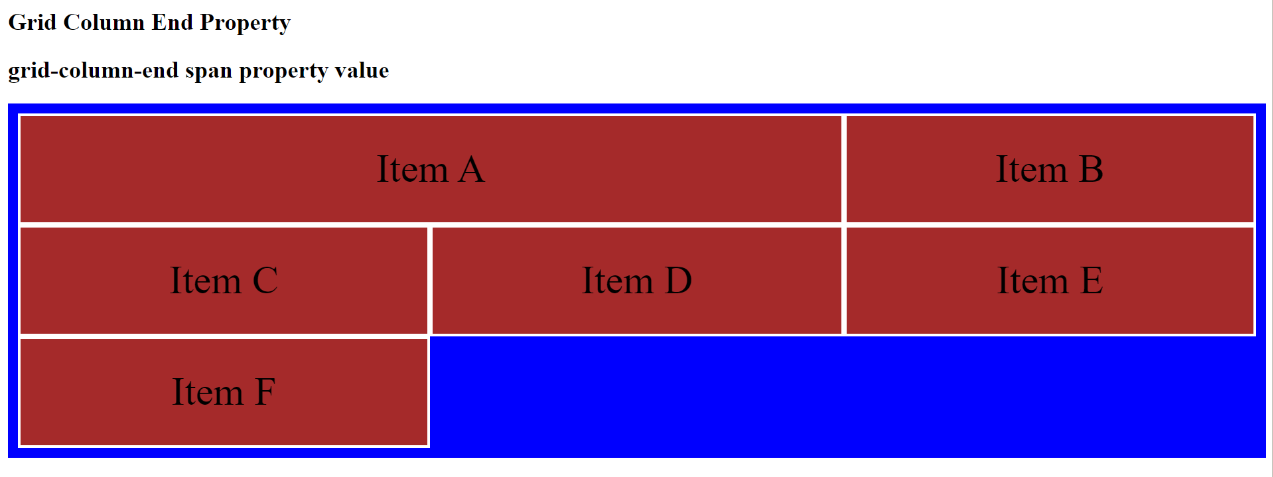
In the example above, Grid-item1 spans two columns.
Gap
This property enables you to add space between the rows and columns of a grid. It is a shorthand property for the grid-row-gap and grid-column-gap properties. In addition, it uses values like px, percentages, etc., to specify the size of the gap you want between the rows and columns. It is easy to set the row gap and column gap simultaneously with this property instead of setting them separately with the row-gap and column-gap properties. Example:
    <!DOCTYPE html>
    <html>
    <head>

    <style>

    .grid-container {
      display: grid;
      grid-template-columns: auto auto auto;
      gap: 20px;
      background-color: blue;
      padding: 10px;
    }
    .grid-item {
      background-color: brown;
      border: 3px solid white;
      padding: 30px;
      font-size: 40px;
      text-align: center;
    }
    </style>
    </head>
    <body>

    <h1>CSS Gap Property</h1>

      <div class="grid-container">
          <div class="grid-item">Item A</div>
          <div class="grid-item">Item B</div>
          <div class="grid-item">Item C</div>
          <div class="grid-item">Item D</div>
          <div class="grid-item">Item E</div>
          <div class="grid-item">Item F</div>

    </div>

    </body>
    </html>
The outcome:
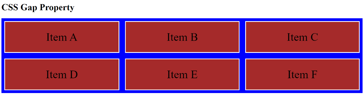
In the above example, a gap of 20px was created between the rows and columns. Note: All browsers do not support the gap property, so if you encounter such a problem, you can use the row-gap and column-gap properties together to create gaps between the grid items.
Row-gap
This property specifies the size of the gap between rows in a grid layout. Example:
    <!DOCTYPE html>
    <html>
    <head>

    <style>

    .grid-container {
      display: grid;
      grid-template-columns: auto auto auto;
      row-gap: 20px;
      background-color: blue;
      padding: 10px;
    }
    .grid-item {
      background-color: brown;
      border: 3px solid white;
      padding: 30px;
      font-size: 40px;
      text-align: center;
    }
    </style>
    </head>
    <body>

    <h1>CSS Gap Property</h1>
    <h2>Row-gap Property</h2>

      <div class="grid-container">
          <div class="grid-item">Item A</div>
          <div class="grid-item">Item B</div>
          <div class="grid-item">Item C</div>
          <div class="grid-item">Item D</div>
          <div class="grid-item">Item E</div>
          <div class="grid-item">Item F</div>

    </div>

    </body>
    </html>
The outcome:
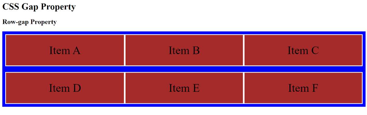
In the example above, a 20px gap was created between the rows and not the columns.
Column-gap
This property specifies the size of the gap between columns in a grid layout. Example:
    <!DOCTYPE html>
    <html>
    <head>

    <style>

    .grid-container {
      display: grid;
      grid-template-columns: auto auto auto;
      row-gap: 30px;
      column-gap: 20px;
      background-color: blue;
      padding: 10px;
    }
    .grid-item {
      background-color: brown;
      border: 3px solid white;
      padding: 30px;
      font-size: 40px;
      text-align: center;
    }
    </style>
    </head>
    <body>

    <h1>CSS Gap Property</h1>
    <h2>Column-gap Property</h2>

      <div class="grid-container">
          <div class="grid-item">Item A</div>
          <div class="grid-item">Item B</div>
          <div class="grid-item">Item C</div>
          <div class="grid-item">Item D</div>
          <div class="grid-item">Item E</div>
          <div class="grid-item">Item F</div>

    </div>

    </body>
    </html>
The outcome:
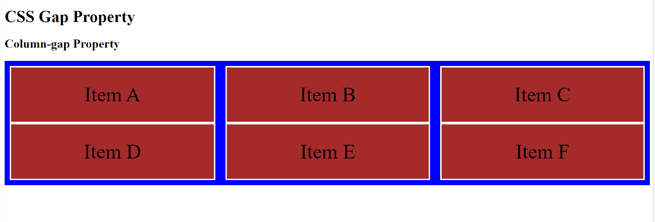
In the example above, a 20px gap was created between the columns, not the rows.
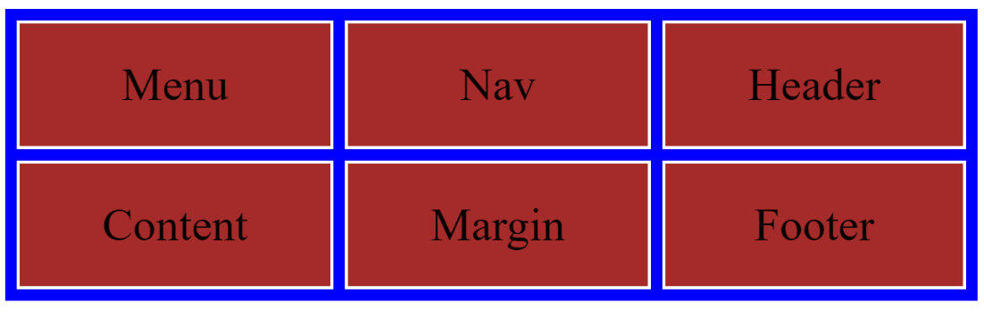
Grid-template-areas
This property allows you to define the layout of a grid using named grid areas. It works with the grid-template-rows and grid-template-columns properties. You can specify the area’s name with apostrophes (”), and if a grid item has no name, you can use a period (.) sign. The property values include:
- The none value is the default value and shows the grid area has no name.
- The item names value defines the display of each column and row.
Let us look at an example with some defined elements:
    <!DOCTYPE html>
    <html>
    <head>

    <style>

    .grid-container {
      display: grid;
      grid-template-areas: 'area area .' 'area area .';
      background-color: blue;
      padding: 10px;
    }
    .grid-container > div {
      background-color: brown;
      border: 3px solid white;
      padding: 30px;
      font-size: 40px;
      text-align: center;
    }

    .grid-item1 {
     grid-area: area;
    }

    </style>
    </head>
    <body>
    <h2>Grid Template area Property</h2>
    <h2>itemnames property value</h2>

      <div class="grid-container">
          <div class="grid-item1">Menu</div>
          <div class="grid-item2">Nav</div>
          <div class="grid-item3">Header</div>
          <div class="grid-item4">Content</div>
          <div class="grid-item5">Margin</div>
          <div class="grid-item6">Footer</div>

    </div>

    </body>
    </html>
The outcome:
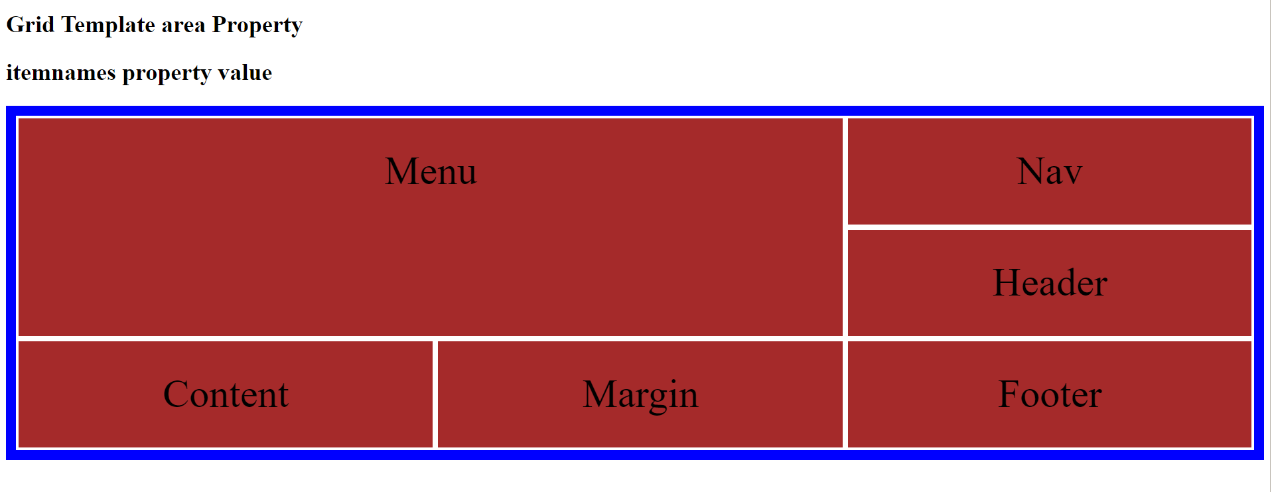
In the above example, there are three column elements, and grid item1, “area,” occupies two out of the three columns and extends to the next row.
Conclusion
The CSS Grid is a powerful tool for creating flexible and responsive layouts. You can use the properties discussed to control the layout of elements on your web page.
Gain Debugging Superpowers
Unleash the power of session replay to reproduce bugs and track user frustrations. Get complete visibility into your frontend with OpenReplay, the most advanced open-source session replay tool for developers.