
Optimize Image and Video Layouts with CSS Object-fit


When browsers resize images or videos to fit, they may become distorted and ruin the aspect of your page. This article will explore the CSS
Object-fitproperty and show how we can use it to optimize media files. Additionally, it will discuss best practices for using CSSObject-fitwith media layouts.

Discover how at OpenReplay.com.
By default, web browsers resize images or videos to suit their containing elements. They ensure media contents fit within their container without causing layout problems. However, occasionally, this default behavior can produce undesirable outcomes. Automatic scaling may distort media if its aspect ratio differs from the container’s. As a result, the media file will appear compressed or stretched and not fit the container. CSS Object-fit property comes in handy in situations like this. It allows us to resize the media in its container while keeping the original aspect ratio intact.
What is the CSS Object-fit property?
We use the CSS Object-fit property to see how an element responds to the height and width of its container. When we resize an image or video, there is a chance that part of it gets cut off or doesn’t fit properly. We use the CSS Object-fit property to avoid occurrences like that. It works on any HTML element with a specified width and height, e.g., videos and images.
The main reason for using Object-fit is to keep the aspect ratio of an element while resizing it to fit a container. By using its property values, we can scale up or down the image or stretch it to fit the specified width and height. For example, Object-fit is invaluable for crafting responsive image and video layouts. It allows us to keep the media’s original aspect ratio while resizing it to fit various screen sizes. Regardless of container size, the media content remains visually pleasing and proportionate.
Note: CSS Object-fit centers the image or video by default if it does not cover the container entirely. It typically occurs when the media’s aspect ratio differs from the container’s. However, we can alter the positioning of the media using CSS object-position property. Using it, we can align media within a container horizontally and vertically.
What are the benefits of using CSS Object-fit property?
Some advantages of using the CSS Object-fit property include the following:
- Responsive Design: Responsive website design requires media content to fit different screen sizes. CSS
Object-fitallows videos and images to scale up or down seamlessly to fit the container. It ensures they are responsive to various screen sizes without distortions. Thus, media will retain vital visual features, resulting in an excellent user experience. - Aspect Ratio: The main goal of
Object-fitis to maintain stable aspect ratios for media files. It keeps the media’s intrinsic dimensions while ensuring they fit inside the container. Thus, videos and images won’t get distorted, resulting in an excellent viewing experience. - Convey information: We can use CSS
Object-fitto emphasize certain parts of a media file. This technique is helpful in limited-space situations, such as when designing mobile websites. UsingObject-fit, developers can provide a more focused and impactful user experience. With object-fit, we can crop an image for an e-commerce website to focus only on the product. It lets customers understand the product’s essential features, leading to more informed purchases. - Cross-Browser Compatibility: CSS
Object-fitproperty is well-supported in modern web browsers. These modern browsers include popular options like Google Chrome, Mozilla Firefox, and more. Thus, developers can create consistent media layouts without worrying about compatibility issues. Its support across modern browsers ensures a seamless user experience for website visitors.
Syntax and values of CSS Object-fit property
The CSS Object-fit property has the following syntax:
    .image-video  {
      object-fit: fill|contain|cover|scale-down|none;
    {
CSS Object-fit property has five primary values: contain, cover, scale-down, and none. They are each essential to determining how the media resizes and fits in its container.
Optimizing image and video layouts with CSS Object-fit
Let’s check out real-world examples to see how we can use each CSS Object-fit value for our media files.
1. The fill value
The fill value is the default value of the CSS Object-fit property. It scales the image or video to fit the entire container, regardless of its aspect ratio. The scaling of the media content occurs horizontally as well as vertically. As a result, the media and container may stretch if their aspect ratios differ. It ensures that there are no empty spaces or margins in the container. The fill value is excellent for creating a visually stimulating image.
NOTE: The aspect ratio of a container is the ratio between its width and height. In essence, it involves dividing the container’s width by its height. Suppose a container has a 600px width and 400px height; its aspect ratio will be 600/400 = 1.5. Learn more about Aspect Ratios.
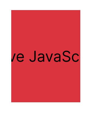
Consider the image below, which has fixed dimensions of 600px width and 400px height:
<img class="image-fill" src="Ilovejavascript.jpg" alt="illustratin image" />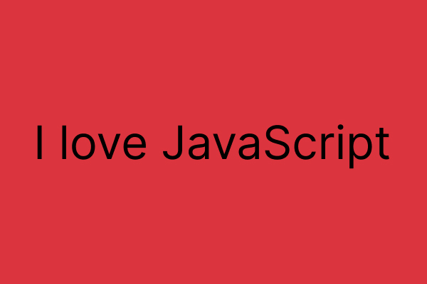
Using the fill value, we can style the image above to be half its width, which is 300px, and the same height, 400px:
    .image-fill {
        width: 300px;
        height: 400px;
        object-fit: fill;
    }
In our browser, the above code will display as follows:
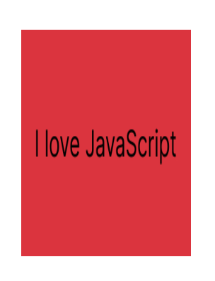
The image in the above example has a fixed dimension of 600px width and 400px height. The image aspect ratio (300px width and 400px height) does not match that of its actual dimensions. Thus, when we apply the fill value, the image stretches to cover the given dimension fully. Generally, the fill value is helpful when we want media content to fill a container without gaps. However, it tends to distort images, like in the example above, making it a poor choice in most instances.
2. The contain value
The contain value keeps the media’s aspect ratio the same while scaling it to fit its container. Thus, the media file will shrink or expand as needed and not stretch or distort unnaturally. It’s a good choice for images and videos; we want to keep their original proportions. It ensures the media is visible in the container and nothing’s getting chopped off. However, a container and media with different aspect ratios may have empty spaces around them. This way, it retains its original aspect ratio while fitting into the container.
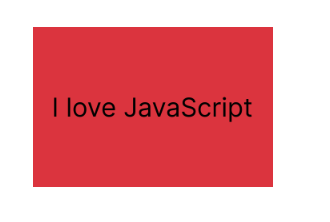
To illustrate, we will use the same image with 600px width and 400px height dimensions. Let’s use the contain value to style the image to be half its width, 300px, and the same height, 400px:
    .image-contain {
        width: 300px;
        height: 400px;
        object-fit: contain;
    }
In our browser, the above code will display as follows:
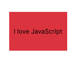
In the above example, the image has 600px width and 400px height fixed dimensions. The image aspect ratio (300px width and 400px height) does not match that of its fixed dimensions. When we apply the contain value, the image resizes to fit its given dimension without cropping. The empty spaces around the image are due to different aspect ratios. Regardless of this, the entire image will be visible without any distortion.
3. The cover value
The cover value scales the media to fill its container while keeping its aspect ratio. It ensures the media fits the entire container without empty spaces or margins. If the media’s aspect ratio and container differ, it will clip to fit the container. As a result, the image or video is not unnaturally stretched or dithered. The media’s essential parts will cover the container and remain visible.
To illustrate, let’s style our image with 600px width and 400px height using the contain value. We’re using half of its width (300px) and the same height (400px):
    .image-cover {
        width: 300px;
        height: 400px;
        object-fit: cover;
    }
In our browser, the above code will display as follows:
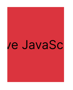
The image in the example has a fixed width and height of 600px and 400px, respectively. The image aspect ratio (300px width and 400px height) does not match that of its actual dimensions. When we apply the cover value, the image will resize to fit the given size while keeping its aspect ratio. As a result of its different aspect ratio, it will clip to fit. It leads to cropping some parts of the image in the coverage process. In this instance, we can use the object-position property to figure out which part of the image is visible. It helps us control the positioning of the image in the container when cropping occurs. The cover value is beneficial when we want to cover the entire container with media content.
4. The none value
The none value does not resize the media to fit its container. Regardless of the container, the image or video will maintain its size (width and height). The media may, however, spill over the edge of the container if its size exceeds its dimensions. Thus, some parts of the media won’t be available for viewing.
Applying the none value to our image with dimensions of 300px width and 400px height:
    .image-none {
        width: 300px;
        height: 400px;
        object-fit: none;
    }
In our browser, the above code will display as follows:
The image in the above example has fixed dimensions of 600px in width and 400px in height. The image aspect ratio (300px width and 400px height) does not match that of its actual dimensions. When we apply the none value, the image will ignore its given dimension and display its original size. However, if the image is larger than the container’s dimensions, it will overflow. Essentially, it tells the browser to show the image as it is without changing its size or anything. If we wish to show a media file’s original size, independent of the size of its container, we must use the none value.
NOTE: The none and cover values have similar images but are not the same. The cover value scales the images while maintaining its aspect ratio. Thus leading to cropping some parts of the image to ensure full coverage. While the none value displays the image at its original size. It does not crop or scale the image.
5. The scale-down value
If the media exceeds the dimensions of the container, the scale-down value scales it down to fit. It will keep the media’s original aspect ratio while resizing it in size. Doing this ensures that it is visible in the container without getting cropped. The scale-down values change as media and container sizes change. When the container is smaller than the media, the scale-down value works like the none value. Due to the media’s small size, it doesn’t need to scale up to fit the container. It keeps the width and height of the media file at its original dimensions while displaying it.
Let’s apply the scale-down value to our image with dimensions of 300px width and 400px height:
    .image-scaledown {
        width: 300px;
        height: 400px;
        object-fit: scale-down;
    }
In our browser, the above code will display as follows:
The image in the above example has fixed dimensions of 600px in width and 400px in height. The image’s natural aspect ratio (300px width and 400px height) is smaller than its fixed sizes. In this scenario, it behaves like the contain value. It will resize to fit while maintaining its aspect ratio. It might result in empty spaces around the image due to the different aspect ratios. The image will fit its dimensions without distortion or resizing despite the gaps. If the image size exceeds its container, it’ll behave like the none value. It displays the image in its original size. It picks the none or contain value that gives the smallest image for a given situation.
Best practices for optimizing image and video Layouts with CSS Object-fit
To optimize image and video layouts with CSS Object-fit, follow these best practices:
- Right value: Our design requirements should guide the selection of the
Object-fitvalue. For instance, we would use thefillvalue to have the image fill the container without cropping. We will use thecontainvalue when we want the media to keep its shape while fitting the container. Remember that each value has a specific use case for the best visual effect. With the right value, we can ensure our media content fits seamlessly into its container. - Use high-quality media: Media quality is vital when using
Object-fit. Using only high-quality media files and choosing the proper file formats is crucial. The compatibility levels of different file formats, such as JPEG and MP4, vary. Thus, the appropriate format will ensure our media displays correctly on various devices. Also, use smaller media files to reduce page load times and performance issues. It is vital to resize and optimize images and videos to match the dimensions of their containers. Use media editing software to compress and resize media files without losing quality. Doing this eliminates the need for excessive scaling, which can cause distortion. - Accessibility: The images and videos on our website must be accessible to everyone. Provide descriptive alt text on the image to highlight its significance and context. Screen reader conveys image information to visually impaired users through alt text. It allows them to comprehend and interact with the content even if they can’t view the pictures. Also, add closed captions to videos to provide textual representations of spoken content. Users with hearing disabilities can understand said content through it.
- Responsive Design: Responsive design ensures seamless adaptability to different screen sizes and devices. It prevents media from appearing too small or too large, making it simple to read and use. Thus, combining
Object-fitwith other responsive design practices like media queries is vital. It is also important to use relative units like percentages for our dimensions. It enables our media to adjust its size according to available screen space. CombiningObject-fitand responsive design ensures our media looks excellent on any device. - Object-position property: Utilizing both the object-position and
Object-fitproperties in tandem is vital. Both properties ensure we position and resize our media correctly within their containers. Using the object-position property, we can control our media’s position within its container. It’s conducive when working with thecoverorcontainObject-fitvalues. It helps us to place parts of the media in a more visible location in the container. Thus, it aids in highlighting a specific subject in an image or video for our intended consumers.
Conclusion
CSS Object-fit property is essential in responsive web design for optimizing media layouts. It gives us fine-grained control over how media displays within their containers. With Object-fit, media files fit in their containers regardless of their aspect ratio. As a result, our websites look better and need fewer manual adjustments.
Truly understand users experience
See every user interaction, feel every frustration and track all hesitations with OpenReplay — the open-source digital experience platform. It can be self-hosted in minutes, giving you complete control over your customer data. . Check our GitHub repo and join the thousands of developers in our community..
