Unlocking the power of CSS subgrid for efficient layout design
Learn how to use CSS subgrids


In web development, achieving pixel-perfect layouts has constantly been a hard nut for developers to crack. This article will show you how to use CSS subgrids to simplify all your layout development work.

Discover how at OpenReplay.com.
From aligning nested grids to maintaining grid responsiveness and writing concise codes, striking a balance between code flexibility and structure remains daunting. This is where the CSS subgrid comes in, a layout design game changer! Imagine a tool that not only solves the problems encountered with traditional grid systems but does so with great precision and elegance. Read on as I journey through the common layout challenges developers face, unveiling the key to conquering them all – the CSS subgrid.
Identifying layout pain points
Developers face so many challenges when working on the layout design of websites. While the traditional grid system lays a solid foundation for solving some of these problems, it, too, brings its own set of dilemmas. Below, we delve into some of these layouts’ pain points that stem from using the traditional grid system, which resonates with developers and designers alike.
-
Nested grid conundrums: Nested grids refer to a grid system (child/children elements) within another grid (parent element). When using the traditional grid system to solve the layout issues in such a scenario, the child elements do not inherit the layout style of the parent element, making them act independently, thereby giving developers the task of managing two separate grids.
-
Responsive rigidity: Solving the problem of nested grids using the conventional grid system poses an issue of responsiveness – the child elements do not display right on other device’s screens. When the web was first introduced, users could only access it via a computer. However, that has changed over the years, with various devices from phones to tablets and laptops flooding the market. Today, responsiveness is so crucial. Applying the traditional grid system to nested grids would see the grid overflow outside the boundaries of the parent element when viewed on varying screens.
-
Maintenance mayhem: As projects evolve, so do the layout requirements. Traditional grids struggle with adapting to these evolutions, resulting in codes that, although functional, lack a sense of orderliness.
-
Code repetition: Using the traditional grid system to produce well-defined layout designs often leads to code repetition. This situation hampers code readability and maintenance as any modification on one element alters other interconnected elements.
Thinking of a possible solution to the above-listed pain point? Then, search no further, as that is what the CSS grid offers.
Understanding CSS subgrid: the why and how
CSS grid was introduced as part of the CSS grid layout module level 2. It is a feature that increases the capabilities of the grid layout system, allowing nested grid containers to inherit the grid definition of their parent element, thereby producing a more cohesive and interconnected grid system.
A grid provides developers with the much-needed solution to grid-based layout issues encountered with columns and rows without them having to utilize the CSS float and position properties.
Below are the major issues the CSS grid offers solutions to:
-
Inheriting grid definition: CSS grid allows child elements within a grid container to participate in a grid layout similar to their parent element. This implies that child elements inherit their parent’s row and column track, aligning them with the overall grid structure.
-
Enhancement of responsive design: CSS grid immensely improves responsiveness by allowing child elements to adapt to the same grid layout across various devices and screens.
-
Streamlined maintenance: Web development projects are liable to change, and most of these changes often affect layout requirements. When this happens, the interconnected nature of the grid ensures that adjustment made on the parent grid runs down to child elements, thereby maintaining the order of codes and reducing the risk of layout-related issues.
-
Code efficiency: CSS grid allows for a more efficient and readable code by eliminating the need to specify grid-related codes in nested elements. The result is a cleaner and easily readable code, as the grid structure gets inherited from the parent container.
Step-by-step implementation of CSS subgrid
At this point, I’m sure you already know a lot about the CSS grid. However, I will be taking this knowledge of yours deeper by giving you a step-by-step guide on how you could implement the CSS grid on a web project (Blog card).
Step 1: Set up your HTML
<!DOCTYPE html>
<html lang="en">
  <head>
    <meta charset="UTF-8" />
    <meta name="viewport" content="width=device-width, initial-scale=1.0" />
    <title>Subgrid</title>
  </head>
  <body>
    <div class="parent-grid">
      <div class="child-grid">
        <img src="./1000_F_627731195_osJSHAWmrNeBWi7RSm8rbXNbBVSVFE3k.jpg" />
        <p>people</p>
        <h1>The Nigerian people</h1>
        <p>
          Journey into the heart of Nigeria’s people – diverse, resilient, and
          bound by a profound sense of community. Their stories reflect the
          strength and spirit of a nation.
        </p>
      </div>
      <div class="child-grid">
        <img src="./austin-ramsey-9X3DmoEM64k-unsplash.jpg" />
        <p>Technology</p>
        <h1>Elon Musk and the beast called Tesla</h1>
        <p>
          Explore the forefront of innovation with Tesla. Discover the power of
          sustainable energy, delve into the future of electric automobiles, and
          witness the power of groundbreaking technology.
        </p>
      </div>
      <div class="child-grid">
        <img src="./nupo-deyon-daniel-67ruAEYmp4c-unsplash (4).jpg" />
        <p>places</p>
        <h1>Lagos! an African wonder</h1>
        <p>
          Discover the vibrant urbanscape of Lagos, a megacity bubbling with
          life. Dive into its cultural hub where tradition meets modernity,
          creating a unique experience.
        </p>
      </div>
    </div>
  </body>
</html>
Our HTML markup is quite simple. It contains one main div tag with a class name of parent-grid (<div class= “parent-grid”>). This div tag serves as the parent container, holding the child elements with class names child-grid (<div class = “child-grid”>). Each child elements holds an image tag (<img/>), a header tag (<h1></h1>) and two paragraph tags (<p></p>).

The above video demonstrates the impact of omitting grid or grid properties in a blog card design. Take note of how images and texts are presented in a disorganized vertical order, paying no attention to the overall page layout.
Step 2: Apply a general style to our blog card
Since we’ve succeeded in creating our HTML markup, we can now take a step further by applying some general styles to it.
* {
  margin: 0;
  padding: 0;
  box-sizing: border-box;
}

body {
  background: linear-gradient(
    to right,
    rgba(33, 165, 132, 0.7),
    rgba(13, 152, 194, 0.7)
  );
  color: white;
  font-family: -apple-system, BlinkMacSystemFont, "Segoe UI", Roboto, Oxygen,
    Ubuntu, Cantarell, "Open Sans", "Helvetica Neue", sans-serif;
}
We set our margin and padding to zero for our entire page and our box-sizing property to border-box. This move prevents our blog card from taking more space than necessary. Also note our background-color applied to our entire blog card to make it look more beautiful.

The video above shows the absence of excess space around our entire blog card design and colorful background color to catch the attention of prospective web users.
Step 3: Set up our grid container
Done with our general styling, we set up our grid container.
.parent-grid {
  display: grid;
  grid-template-columns: 30% 30% 30%;
  justify-content: space-around;
  width: 85%;
  margin: auto;
  margin-top: 60px;
  margin-bottom: 60px;
}
To set up our grid container, we set the display property of the parent element to grid. We go further by setting the properties of our grid-template-columns (indicates how much space each child element can take), width (sets the total width of our parent element), and margin (helps place our parent element at the center of our screen). Also, spot our justify-content property, which helps define what happens to the space around our child elements.

From our image above, you can observe each blog card component displayed in a grid layout, with adequate space around each grid column.
Step 4: Make our blog card look better
Yes! Our grid container is all set; however, we must make our blog card look better before we move forward to see what the CSS grid holds.
.child-grid img {
  width: 100%;
  height: 250px;
}

.child-grid p {
  margin-top: 20px;
  margin-bottom: 20px;
  margin-left: 10px;
  font-size: 18px;
  font-weight: lighter;
  width: 90%;
}

.child-grid h1 {
  margin-left: 10px;
  font-weight: 600;
  font-size: 25px;
  width: 90%;
}

.child-grid p:nth-child(2) {
  border-radius: 25px;
  width: 35%;
  text-align: center;
  padding: 4px 0;
}
First, we don’t want the image of our child elements to look too big, so we specify their width and height. Next, we fine-tune our header and paragraph tags by giving them appropriate styles.

The above image illustrates an improvement in the looks of each blog card component. Notice the margin space between each blog component element and the preceding one.
Step 5: Establish our subgrid child element
Now that we’re done fine-tuning our blog card, it’s time to see the power of the CSS grid.
.child-grid {
  display: grid;
  grid-template-rows: subgrid;
  grid-template-columns: subgrid;
}
To our child elements, we set our display property to grid, and our grid-template-columns and grid-template-rows to grid.

The above image shows the entire blog card looking packed together; this is because of our grid-template-row property set to subgrid.
Remember, the grid property allows our child elements to inherit the grid property of their parent container. By default, only one row is allocated to the parent container, so all the child elements are trying to fit into this row. To fix this, we have to specify our grid-row property.
.child-grid {
  background: white;
  color: black;
  grid-row: 1/5;
  display: grid;
  grid-template-rows: subgrid;
  grid-template-columns: subgrid;
}
Our grid-row property (the shorthand property for grid-row-start and grid-row-end) is set to 1/5. This indicates that our grid starts from the first row and spans to the fifth. We also make each child element look better by giving them a background-color of white and font-color of black.

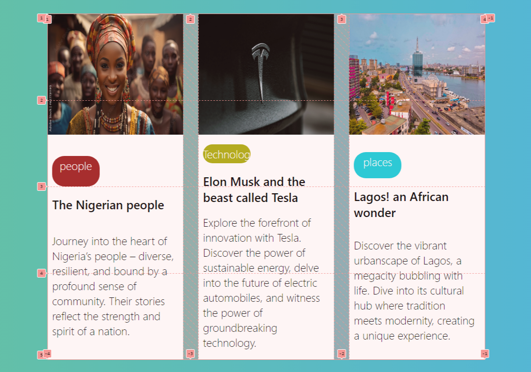
The above image illustrates the transformation of our blog card with a grid. Notice the improved alignment and structure of the card component and how visually pleasing and organized the entire layout looks.
Step 6: Witness the subgrid transformation
You must have noticed how good our blog card looks due to our CSS grid. However, to make the changes look more glaring, here are images of our blog card before and after applying the CSS grid.
Before subgrid:
The above image shows a blog card devoid of a grid. Notice the misalignment within the blog card, emphasizing the need to add the grid feature.
After subgrid:

The above image shows the transformative impact of the grid, which is evident in all elements within the blog card. The grid application successfully rectifies the previous misalignment issues, resulting in a well-structured layout.
Enhancing Responsiveness with Subgrid
Beyond resolving several layout challenges posed by the traditional grid system, the CSS grid significantly enhances responsiveness by allowing child elements to inherit the grid structure of their parent. Below is a detailed exploration of the responsive capabilities inherent in a grid.
-
Consistent grid structure across devices: Maintaining consistent grid structure across various devices and screens can be quite daunting when utilizing the traditional grid system. However, this is easily resolved by the grid as it ensures child elements seamlessly align with the grid tracks of their parent container.
-
Viewports adaptability: As users access websites from devices with varying screen sizes, adapting the layout for optimal viewing becomes necessary. CSS grid enables child elements to adapt to similar grid layouts, ensuring a coherent structure regardless of viewport dimensions.
-
Elimination of responsive challenges in nested grids: Nested grids with traditional grid systems often pose challenges in terms of responsiveness. With subgrid, parent grids’ responsiveness is passed down to the nested grids, eliminating issues where child elements may not display correctly on smaller screens.
-
Reduction of media query complexity: Traditional grid responsive designs often require complex media queries to handle different layouts for various devices. However, this tends to be different with grids as it reduces the need for complex media queries since grid structures naturally adjust based on inherited layouts.
Real-world Examples of Subgrid Success
So far, there’s no doubt that the CSS grid is a powerful tool, serving as a suitable upgrade to the traditional CSS grid and effectively resolving several layout issues. Now, let’s delve into real-world scenarios where the grid has recorded great success.
-
Card layouts: One scenario where the grid has recorded great success is in card layouts. It enables each card to inherit the grid structure of the main container, thereby giving all cards a uniform design.
-
Product listings on E-commerce sites: E-commerce platforms now employ grids for their product listings as the feature allows each product item to inherit its parent’s grid structure, producing a visually consistent and responsive display.
-
Data table: Grids are highly beneficial in crafting responsive data tables as they allow each row and column to inherit the grid structure of their parent, thereby providing a more flexible and readable table layout.
-
Image galleries: Developers now adopt grids to enhance the design of image galleries as the feature ensures each image maintains a consistent alignment within their grid, irrespective of the viewport size.
Looking Forward: The Future of Subgrid
As we anticipate the future of CSS grid and the promises it holds, which include improved performance, enhanced features, and broader compatibility across browsers, it is evident that the true beauty of the grid lies in its adept resolution of numerous layout challenges. Whether applied to card layout designs or responsive image galleries, one thing is certain with its use: the issues of element positioning find a reliable solution.
Truly understand users experience
See every user interaction, feel every frustration and track all hesitations with OpenReplay — the open-source digital experience platform. It can be self-hosted in minutes, giving you complete control over your customer data.
Star on GitHub12k