Responsive mobile layouts made easy with Pure.CSS
A new lightweight CSS framework to simplify developing a responsive layout

Responsiveness is increasingly a primary emphasis for developers creating device layouts. As a web developer, it’s crucial to be acutely aware of the surge in mobile usage. The need to deliver flawless experiences on smartphones and tablets has elevated to paramount importance. Therefore, ensuring your website functions seamlessly on all devices, particularly mobile devices, is imperative in today’s world of digital technology. This is where pure.css proves helpful, and this article will teach you how to use it.

Discover how at OpenReplay.com.
Pure.css is a lightweight CSS framework that places a premium on simplicity and responsiveness. It aims to help developers create mobile-responsive websites quickly.
This tool has become increasingly popular due to its exceptional capabilities for creating adaptable layouts. Among its standout features is a fluid grid system that automatically adjusts to different sizes of mobile device screens. In addition, it provides multiple responsive breakpoints to establish different layouts for various screen sizes. Pure.css is designed to perform smoothly across all web browsers, ensuring mobile users have the same appearance and features regardless of which browser they use. This is a key component of the framework.
This guide is designed to provide developers with the necessary knowledge and skills to effectively utilize Pure.css for creating responsive mobile layouts that are both user-friendly and efficient.
Benefits of Integrating Pure.css for Mobile Layouts
developers prefer Pure.css for mobile layouts because it provides significant benefits that have been thoroughly evaluated and play a vital role in the framework’s core. If you’re new to pure.css and want to improve your mobile layout with this framework, here are some benefits you may expect.
-
Responsive Design: It prioritizes responsiveness on mobile devices. This means that styles for small screens are defined first, followed by larger screens. This helps ensure that your layouts look nice on all devices, regardless of size, with smaller screen or larger screen size.
-
Lightweight: Pure.css is lightweight, resulting in faster loading times for your mobile pages. This is critical for providing a consistent user experience, particularly on mobile networks.
-
Customizability: Pure.css is an easy-to-use and customizable framework that can help you to achieve your desired design. Because of its modular structure, you may pick and choose components to build a unique and consistent mobile design.
-
Minimalistic Design: Pure.css’s minimalist design philosophy helps to create a clean and clear mobile experience, helping users to focus their attention on the content by removing unneeded distractions. This means that people are more likely to read and comprehend the text.
Installation and Integration of pure.css
When it comes to adding pure.css to our website, we have two options:
Using NPM
To integrate Pure.css into your React, Vue, or any other client-based Node.js project, run the following command:
npm install purecssAfter completing the preceding step, import the Pure.css stylesheet into your project by adding the following code to your page:
import 'purecss/build/pure.css';The previous command will load the Pure.css stylesheet and allow you to explore its styles and functionalities. You can then utilize the Pure.css styles and components in your code to create the interface of any website of your choice, just the way you want it.
Using CDN
To incorporate the Pure.css stylesheet into your project via CDN, copy the given CDN link and paste it into the head section of your HTML page:
<link rel="stylesheet" href="https://unpkg.com/purecss@1.0.1/build/pure.css" />Once you’ve added the code to your HTML document, your project will have access to and can utilize the Pure.css styles.
Designing Mobile-First Layouts
Moving forward, it’s important to grasp the primary element of Pure.css, a mobile-first design’s responsive grid system.
Grid System
Developers can use the grid system to create layouts that adjust to various screen sizes, making it a powerful tool. Using grid classes such as pure-u-1-2 or pure-u-1-3, elements automatically rearrange themselves for a consistent experience across different devices.
To enhance the look of your webpage, utilizing the grid system is crucial. You can achieve this by adding grids-responsive.css to your page. This will ensure that your content is organized and visually appealing, simplifying the navigation process for your users. To add the purecss grid to your code, simply place the CDN link provided below within the head tag of your HTML:
<link rel="stylesheet" href="https://cdn.jsdelivr.net/npm/purecss@3.0.0/build/grids-responsive-min.css">For a better understanding of how the Grid system functions, let’s examine the example below. The provided style rules generate a simple Pure.css grid consisting of two columns:
<head>
 <title>Pure.css Two-Column Grid Example</title>
 <!-- Include Pure.css stylesheet -->
 <link
   rel="stylesheet"
   href="https://cdnjs.cloudflare.com/ajax/libs/pure/2.0.3/pure-min.css"
 />
 <!-- Include Pure.css grid stylesheet -->
 <link
   rel="stylesheet"
   href="https://cdnjs.cloudflare.com/ajax/libs/pure/2.0.3/grids-responsive-min.css"
 />
</head>
<body>
 <div class="pure-g">
   <!-- First column -->
   <div class="pure-u-1-2">
     <h2>Column 1</h2>
     <p>This is the content of column 1.</p>
   </div>

   <!-- Second column -->
   <div class="pure-u-1-2">
     <h2>Column 2</h2>
     <p>This is the content of column 2.</p>
   </div>
 </div>
</body>
The code will produce the following result:
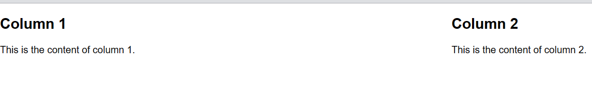
Image Class
Next, we will examine the image class in Pure.css. This class enables responsive web design for <img> tags. The following implementation can be used:
<img class="pure-img" src="...">For example, let’s use an image from the OpenReplay Blog as a case study:
<img class="pure-img" src="https://blog.openreplay.com/images/introduction-to-pure-css/images/hero.png">The Result:
There you go, you have your pure.css image.
You might want to check out a few other components before diving into this tutorial. To better understand these components, I highly recommend reading this article on the Openreplay Blog.
Designing mobile-friendly navigation menus
We will create a responsive mobile layout in this section. Don’t forget to include the CDN <link> element in your page’s <head> before adding your project’s style sheets.
Creating a horizontal menu is simple using Pure.css. Just use the following code:
<header>
<div class="header">
<div class="home-menu pure-menu pure-menu-horizontal pure-menu-fixed">
<img
width="100em"
height="100%"
src="https://openreplay.com/images/logo-open-replay.svg"
alt=""
class="pure-img-responsive"
/>
<ul class="pure-menu-list">
<li class="pure-menu-item pure-menu-selected">
<a href="#" class="pure-menu-link">Blog</a>
</li>
<li class="pure-menu-item">
<a href="https://docs.openreplay.com/" class="pure-menu-link">
Docs
</a>
</li>
<li class="pure-menu-item">
<a href="https://app.openreplay.com/" class="pure-menu-link">
Login
</a>
</li>
</ul>
</div>
</div>
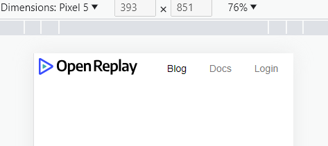
</header>This code creates a header for a webpage. It includes an OpenReplay logo in the form of an (image tag) and an (unordered list) navigation menu with three menu items: BLOG, DOCS, and LOGIN.
The logo and menu are contained within a div with the class header, fixed at the page’s top. They are horizontally aligned using the Pure.css framework’s pure-menu-horizontal class.
Styling Header With pure.css
To enhance the header’s design, we must implement customized styles using Pure.css classes. To achieve this, add the code below:
.home-menu {
   padding: 0.5em;
   text-align: left;
   background: white;
 }
 .home-menu ul {
   float: right;
 }
After entering the command above, our mobile and desktop screens should pan out;
Desktop View:

Mobile View:
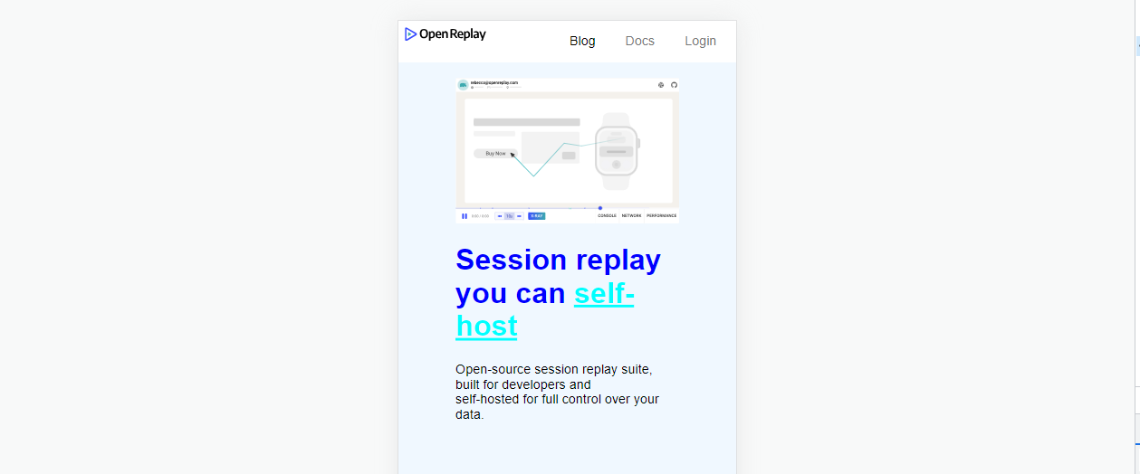
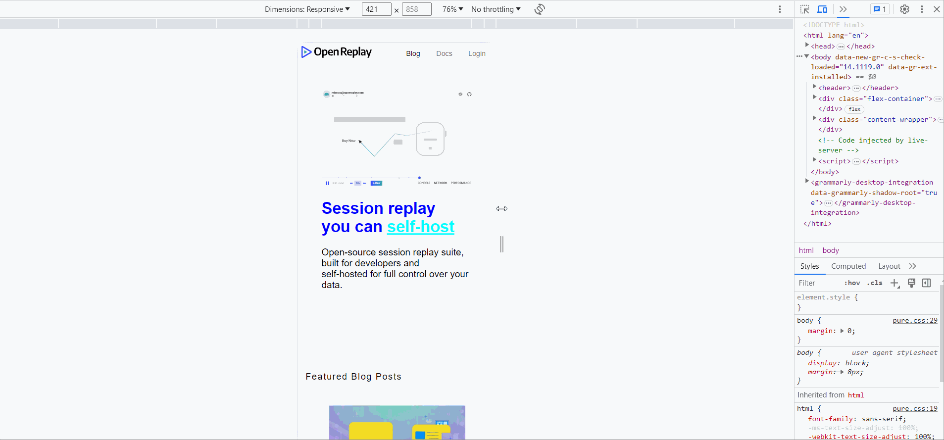
Adding a Responsive image
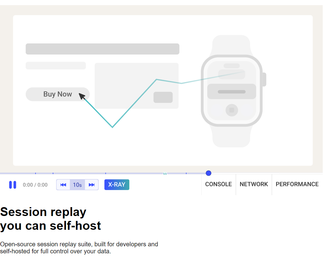
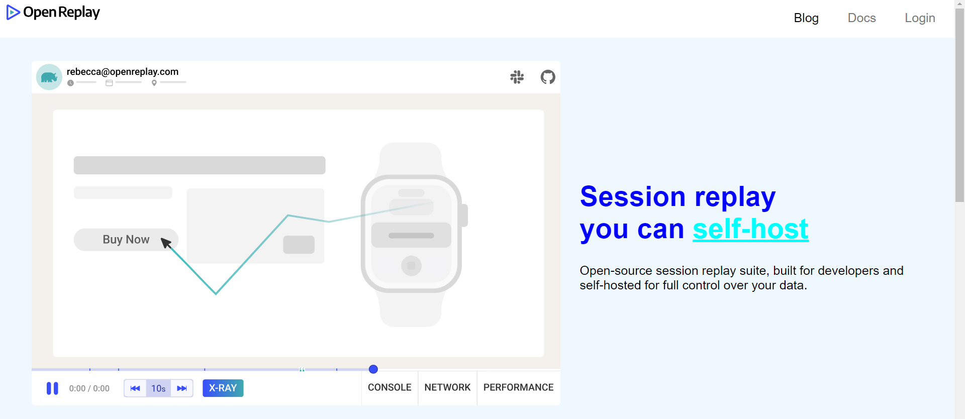
To include a picture in our demo, we’ll use the OpenReplay blog’s image URL and make it responsive with the Pure.css class. We’ll place it beneath the menu alongside the text:
<div class="flex-container">
 <img
   src="https://openreplay.com/images/cover-sessionreplay.svg"
   class="pure-img-responsive"
 />
 <div class="row pt-5 text-center">
   <h1 class="display-3 fw-bold">
     Session replay <br class="d-block d-lg-none hero-callout-break" />you can
     <span
       class="hero-callout text-teal"
       onclick="window.location.href='pricing/#self-host'"
       >self-host</span
     >
   </h1>
   <p class="lead lead-large hero-lead my-0 my-md-3">
     Open-source session replay suite, built for developers and
     <br class="d-none d-lg-block" />self-hosted for full control over your
     data.
   </p>
 </div>
</div>
This should be the result of your code:
The next thing is to write some CSS code (including a CSS media query related to screen width) to style the image and the text:
.flex-container {
 display: flex;
 padding: 70px 70px 50px;
 background-color: aliceblue;
 flex-direction: row;
}

.row {
 margin: auto;
 padding: 100px 150px 200px 80;
}

.display-3 {
 font-size: 6vh;
 color: blue;
}

.hero-callout {
 color: aqua;
 text-decoration: underline;
}

@media (max-width: 800px) {
 .flex-container {
   flex-direction: column;
 }

 .display-3 {
   font-size: 4vh;
 }
}
Your result should turn out to be something similar to the image shown below on running the above code:
Desktop:
Mobile:
Creating Blog Post Section
To ensure that our Blog post section is responsive using Pure.css, our code should be similar to the following:
<div class="content-wrapper">
 <div class="content">
   <h3 class="content-head is-center">Featured Blog Posts</h3>

   <div class="pure-gg">
     <div class="l-box pure-u-lg-1-4">
       <p class="content-subhead">
         <img
           class="pure-img"
           src="https://blog.openreplay.com/assets/hero_ZEx5Bm.webp"
           alt=""
         />
         Jul 31, 2023, 11 min read
       </p>
       <h3>Implementing Live Search Functionality in Javascript</h3>
     </div>
     <div class="1-box pure-u-lg-1-4">
       <p class="content-subhead">
         <img
           class="pure-img"
           src=" https://blog.openreplay.com/assets/hero_w7FvB.webp"
           alt=""
         />
         Jul 30, 2023, 5 min read
       </p>
       <h3>Creating easy custom modals with React</h3>
     </div>
     <div class="l-box pure-u-lg-1-4">
       <p class="content-subhead">
         <img
           class="pure-img"
           src="https://blog.openreplay.com/assets/hero_Z1loewo.webp"
           alt=""
         />
         Jul 29, 2023, 10 min read
       </p>
       <h3>A beginner's guide to your first GraphQL queries</h3>
     </div>
     <div class="l-box pure-u-lg-1-4">
       <p class="content-subhead">
         <img
           class="pure-img"
           src="https://blog.openreplay.com/assets/hero_ZFqxp1.webp"
           alt=""
         />
         Jul 28, 2023, 9 min read
       </p>
       <h3>Deploying Vue apps to the cloud with Kubernetes</h3>
     </div>
   </div>
 </div>
</div>
In the HTML code above, there are four boxes representing each post. Each box contains an image, a title, and the date when the post was published. The titles and publishing dates are styled using the content-subhead class, while each box includes an image with the pure-img class.
The Pure.css grid modules form evenly spaced boxes on a page, resembling a grid layout. This is achieved by dividing the page into four columns, where each box occupies a quarter of the total width.
To ensure better responsiveness when the screen size is reduced, it’s recommended to use a large grid class (pure-u-lg-) for larger screens.
Now let’s look into styling our Blog post section:
.pure-u-lg-1-4 {
 margin: 50px;
}
.div1 {
 width: 100%;
}
.content {
 padding: 1em 1em 3em;
}
.content-head {
 font-weight: 200;
 letter-spacing: 0.1em;
 margin: 2em 0 1em;
}
.content-subhead {
 color: rgb(169, 173, 182);
 font-size: small;
}
After executing the code provided, our mobile layout should be displayed responsively, as demonstrated below:
Conclusion
Creating responsive mobile layouts has become simpler with the help of Pure.css. This lightweight framework includes an intuitive grid system, making designing adaptive layouts for different devices easier. Using Pure.css, you can embrace the convenience of responsive design and take your mobile web development to new heights.
Gain Debugging Superpowers
Unleash the power of session replay to reproduce bugs, track slowdowns and uncover frustrations in your app. Get complete visibility into your frontend with OpenReplay — the most advanced open-source session replay tool for developers.
Star on GitHub12k