
Simple Toast Notifications with React-Hot-Toast


Toast notifications are an important aspect of user interface design as they provide a non-intrusive way to notify users of important events or messages. React-Hot-Toast is a lightweight and customizable React notification library. This tutorial article will cover the basics of using this package to create toast notifications in your React application.
React-Hot-Toast is a library for displaying toast notifications in React applications. Toast notifications are brief messages that appear on the screen to provide users with non-intrusive feedback or information. Toast notifications are short-lived messages that appear on the screen to provide users with important information, feedback, or alerts. They are commonly used to display success, error, or general notifications. Check out Rect-Hot-Toast docs
The following are its main features:
- Customizable Appearance: The library allows customization of the toast notifications’ appearance to match the application’s design. To create visually appealing notifications, developers can customize the toast position, style, animation, and content.
- Event Handlers: Developers can attach event handlers to toast notifications, such as onClick or onClose, to respond to user interactions or trigger additional actions based on user input.
- Duration Control: It allows developers to specify the duration for which the toast notifications should remain visible on the screen before automatic or manual dismissing. This ensures that notifications don’t linger unnecessarily.
- Asynchronous Actions: It supports displaying loading indicators within toast notifications, making it convenient for handling asynchronous actions. This will provide visual feedback to users while tasks like data fetching or form submissions are in progress.
- Simple API: It offers an easy-to-use API for creating toast notifications with minimal code.
- Supports emojis: You can use emojis in the content of your toast notifications to add a touch of fun and expressiveness to your messages.
These features make React-Hot-Toast a powerful tool for implementing toast notifications in React applications, providing developers a convenient way to unobtrusively communicate important information to users.
Importance of a Good Notification System in Web Applications
Why do you need this? A good notification system is important for several reasons:
- User Engagement: Notifications help to engage users by drawing their attention to specific actions or content. They can prompt users to take certain actions like completing a registration or exploring new features.
- Feedback and Error Handling: A notification system plays a significant role in providing feedback to users. It can inform users about the success or failure of their actions, guiding them toward resolving errors or validating successful operations.
- Task Monitoring: Notifications assist users in tracking and monitoring important tasks, events, or updates within the application.
- Communication: Notifications serve as a vital means of communication between the application and its users.
- Real-time Updates: Notifications facilitate real-time updates by instantly informing users about changes or new content.
Installing and setting up React-Hot-Toast on your React app.
On the terminal of your React app, use any of the commands below to install the React-Toastify package.
// Install with Yarn
yarn add react-hot-toast

// Install with NPM
npm install react-hot-toast
Once the installation is complete, you can import React-Hot-Toast into your React component files where you want to use toast notifications. Add the following import statement at the top of your file:
import { toast, Toaster } from 'react-hot-toast';Basic toast notifications with React-Hot-Toast
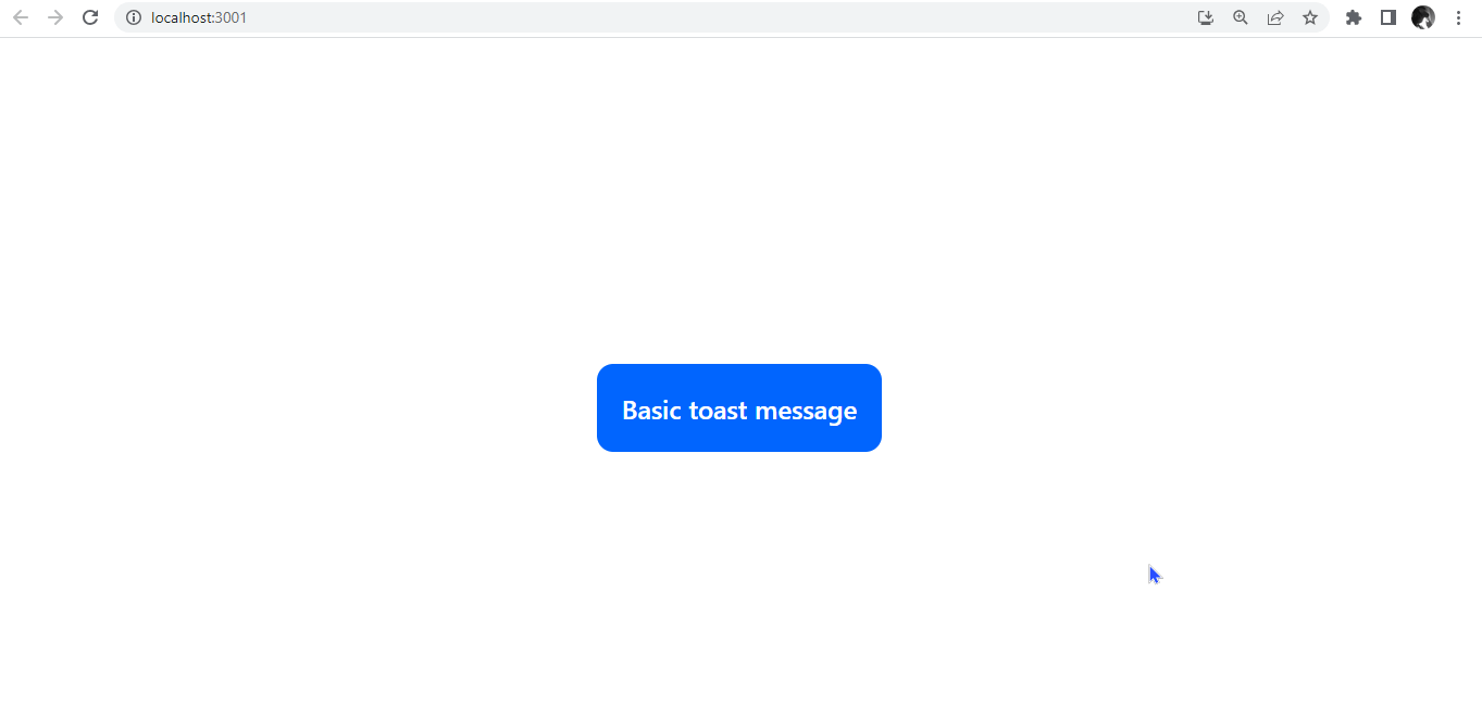
The toast API is the most basic API responsible for generating all the toast notifications. Here, we will create a basic toast notification with React-Hot-Toast, to quickly see the library in action. In the app.js component, we will write a basic function to display a toast message at the click of a button.
const showToast = () => toast('Here is a basic toast message.');This function will trigger the display of a toast notification with the specified message.
const showToast = () => toast("Here is a basic toast message.");
const App = () => {
return (
<div>
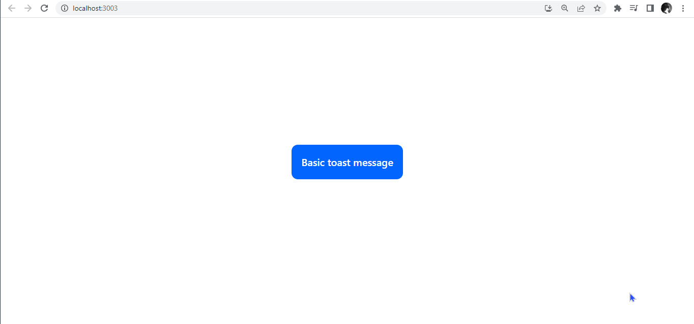
<button onClick={showToast}>Basic toast message</button>
<Toaster />
</div>
);
};
export default App;When the button is clicked, a notification message in the function will appear on the screen.
In summary, when the showToast function is called, it triggers the display of a basic toast message using React-Hot-Toast. Note that you can make your notifications from the toast API. The Toaster API provides the notification’s current state.
Different Types of Toast Notifications.
React-Hot-Toast provides different types of toast notifications that you can use to display various kinds of messages to your users. Here are some of the commonly used types:
- Success: Use
toast.success()to show a success message. This type is typically used to indicate successful actions or operations.
const showToast = () => toast.success("Successfully logged in");
const App = () => {
 return (
   <div>
     <button onClick={showToast}>Basic toast message</button>
     <Toaster />
   </div>
 );
};
export default App;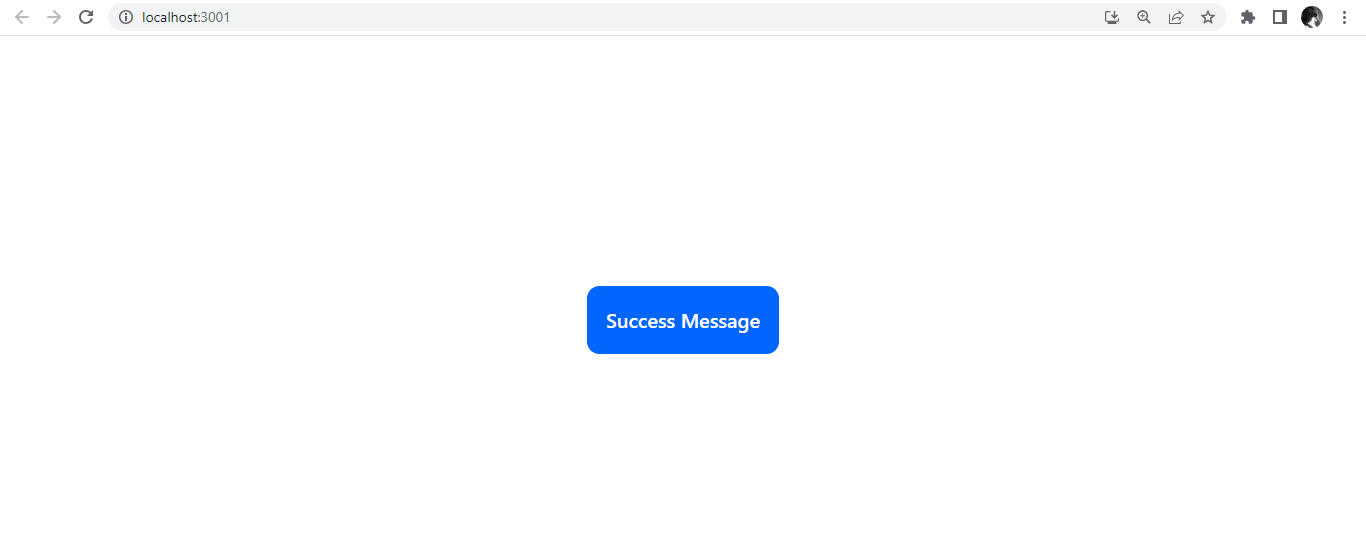
- Error: Use
toast.error()to display an error message. This type is used to notify users about errors or failed actions.
const showToast = () => toast.error('Error! cannot find account');
const App = () => {
 return (
   <div>
     <button onClick={showToast}>Basic toast message</button>
     <Toaster />
   </div>
 );
};
export default App;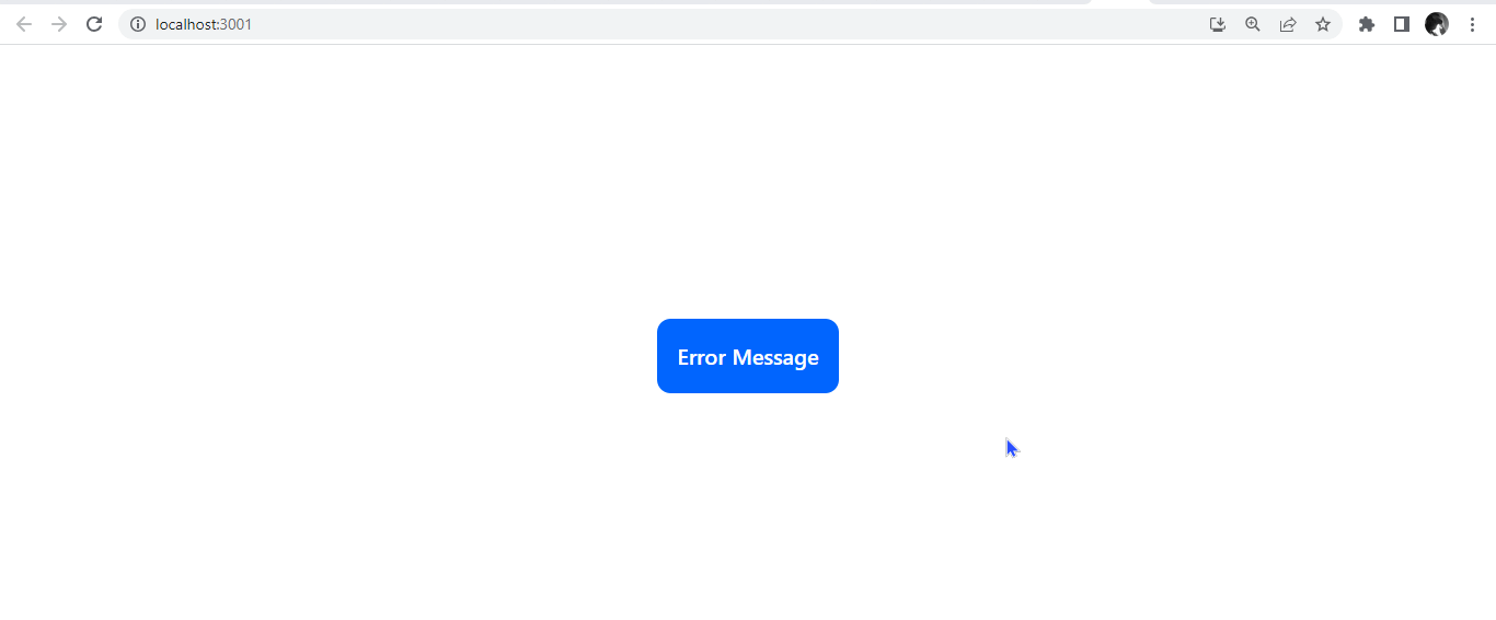
- Loading: Use
toast.loading()to show a loading message or spinner. This type is used to indicate ongoing processes or tasks.
const showToast = () => toast.loading("loading");
const App = () => {
 return (
   <div>
     <button onClick={showToast} className="btn">
       Loading message
     </button>
     <Toaster />
   </div>
 );
};
export default App;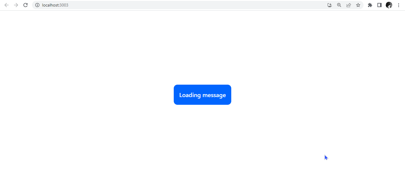
Users must avoid using only the loading toast, as it is impossible to terminate this action. The notification will persist indefinitely, increasing resource usage and ultimately slowing down the application. Instead, an alternative approach can be used, such as leveraging the Promise state, based on the asynchronous Promise concept, where the notification is mapped to the Promise and automatically updates when the Promise is resolved or failed. We will see this down the line as we progress.
Positioning your toast notifications
React Hot Toast offers flexible positioning options for toasts, allowing developers to choose the most suitable placement on the screen. The library provides six pre-defined positions by using the position property within the configuration object allows developers to specify a custom position for the toasts.
import React from "react";
import { toast, Toaster } from "react-hot-toast";
const showToast = () => {
 toast.success("Successfully logged in", {
   position: "top-left",
 });
 toast.success("Successfully logged in", {
   position: "top-center",
 });
 toast.success("Successfully logged in", {
   position: "top-right",
 });
 toast.success("Successfully logged in", {
   position: "bottom-left",
 });
 toast.success("Successfully logged in", {
   position: "bottom-center",
 });
 toast.success("Successfully logged in", {
   position: "bottom-right",
 });
};
const App = () => {
 return (
   <div>
     <button className="btn" onClick={showToast}>
       Basic toast message
     </button>
     <Toaster />
   </div>
 );
};
export default App;
This will position the toast notifications in the six different pre-defined positions.
Custom and Themed Toast
To create a custom or themed toast, we will create a function customToast to display a custom toast notification when called. Creating a custom toast allows for customization based on your preferred styling. You have the flexibility to modify the appearance and behavior of the toast notification by providing options to toast.custom.
This allows you to create a custom and personalized toast layout, incorporating your desired HTML elements and styling. These options include defining the toast’s duration, height, font, font size, padding, and position.
const customToast = () => {
 toast.custom(
   <div
     style={{
       fontSize: "17px",
       border: "1px solid #0065FE",
       padding: "16px",
       color: "#0065FE",
       borderRadius: "10px",
     }}
   >
     this is a custom toast
   </div>
 );
};
const App = () => (
 <div>
   <button onClick={customToast} className="btn">
     Custom toast
   </button>
   <Toaster />
 </div>
);
export default App;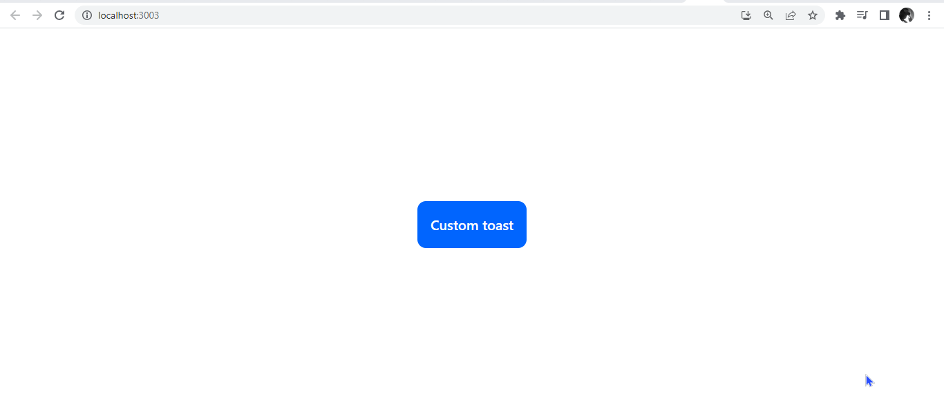
Creating a themed toast with React Hot Toast’s theming capabilities is easy. You can specify colors, fonts, borders, and other visual properties to create a unique and visually cohesive set of toasts to unify the appearance of your toast notifications. It allows users to add and style icons and emojis.
const customToast = () => {
 toast.custom(
   <div
     style={{
       fontSize: "17px",
       border: "1px solid #0065FE",
       padding: "16px",
       color: "#0065FE",
       borderRadius: "10px",
     }}
   >
     this is a custom toast
   </div>
 );
};
const App = () => (
 <div>
   <button onClick={customToast} className="btn">
     Custom toast
   </button>
   <Toaster />
 </div>
);
export default App;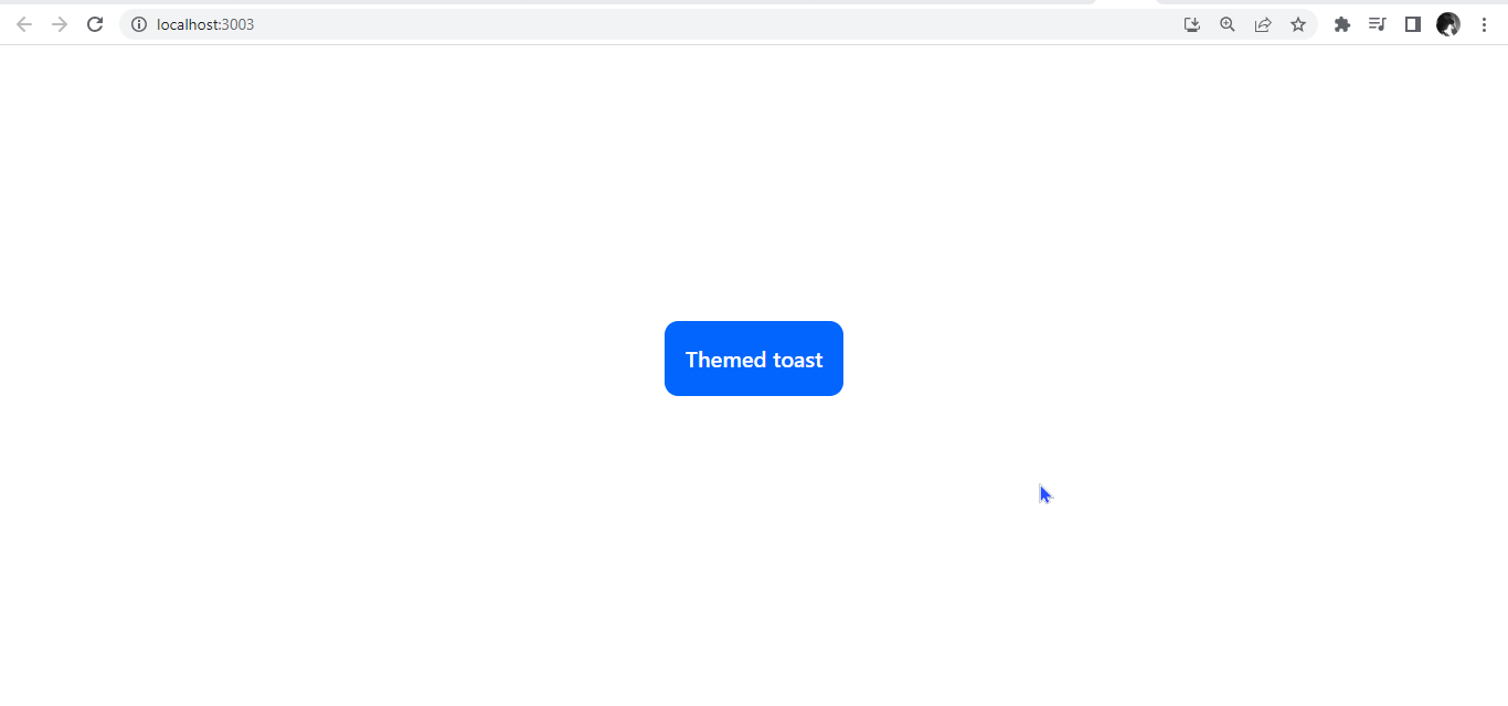
Dismissing Toast Notifications.
We can dismiss toast notifications by setting a duration or using the dismiss() method on the toaster component. You need access to the toast object or its unique identifier to use the method. The toast object is typically obtained when you call the toast function to display a toast notification.
To dismiss a single toast, we will pass an argument into the toast.dismiss function. To clear all toasts, you can call that function without arguments.
const App = () => {
 const toastId = React.useRef(null);
 const toastNotification = () =>
   (toastId.current = toast("Show toast notification"));
 const dismiss = () => toast.dismiss(toastId.current);
 const dismissAll = () => toast.dismiss();
 return (
   <div className="App">
     <div className="btn-header">
       <button className="btn" onClick={toastNotification}>
         Show toast
       </button>
       <button className="btn" onClick={dismiss}>
         Dismiss
       </button>
       <button className="btn" onClick={dismissAll}>
         Dismiss All
       </button>
     </div>
     <Toaster />
   </div>
 );
};
export default App;
Promise State
To better illustrate how the promise state can be utilized, let us create a simple application that utilizes the random user API to fetch a random user. When the user clicks a button, the app will display a loading spinner from the toast library while fetching the data. Once the data is retrieved, the app will render the user’s name and email address.
import React, { useState } from "react";
import { toast, Toaster } from "react-hot-toast";
const App = () => {
 const [isLoading, setIsLoading] = useState(false);
 const [randomUser, setRandomUser] = useState(null);
 const handleAction = () => {
   setIsLoading(true);
   const promise = new Promise((resolve, reject) => {
     setTimeout(() => {
       fetch("https://randomuser.me/api/")
         .then((response) => response.json())
         .then(({ results }) => {
           setRandomUser(results[0]);
           resolve();
         })
         .catch(reject);
     }, 2000);
   });
   toast
     .promise(promise, {
       loading: "Fetching random user details...",
       success: "Random user details fetched",
       error: "An error occurred",
     })
     .then(() => {
       setIsLoading(false);
     })
     .catch((error) => {
       console.error("An error occurred:", error);
       setIsLoading(false);
     });
 };
 return (
   <div>
     <div className="app">
       {isLoading && <div></div>}
       {randomUser && (
         <div>
           <h3 className="header">Random User:</h3>
           <p className="name">
             Welcome{" "}
             <span className="name1">
               {`${randomUser.name.first} ${randomUser.name.last}`}
             </span>
           </p>
           <p className="email">{randomUser.email}</p>
         </div>
       )}
     </div>
     <div className="btn-container">
       <button onClick={handleAction} className="btn">
         Fetch Random User
       </button>
     </div>
     <Toaster />
   </div>
 );
};
export default App;
The code block above demonstrates how to fetch data asynchronously in a React component and utilize the react-hot-toast library to provide visual feedback to the user during the fetch operation.
The code block above will generate a random user when the promise is successfully resolved with a success toast message from the library. If the promise fails, it will display an error toast message instead. We will employ the useState hook to keep track of whether the data is being fetched, and randomUser stores the fetched user data.

Session Replay for Developers
Uncover frustrations, understand bugs and fix slowdowns like never before with OpenReplay — an open-source session replay tool for developers. Self-host it in minutes, and have complete control over your customer data. Check our GitHub repo and join the thousands of developers in our community.
Hover-Based Interactions on Toast Notifications with Handlers
The library allows users to perform hover-based interactions like handleMouseEnter and handleMouseLeave. These handlers are passed to the Toaster component through the toastOptions prop.
The handleMouseEnter function is triggered when the user hovers over a toast notification. It receives the id of the toast as an argument, which can be used to identify and perform additional actions or state updates specific to that toast.
Similarly, the handleMouseLeave function is triggered when the user leaves a toast notification. It also receives the id of the toast as an argument.
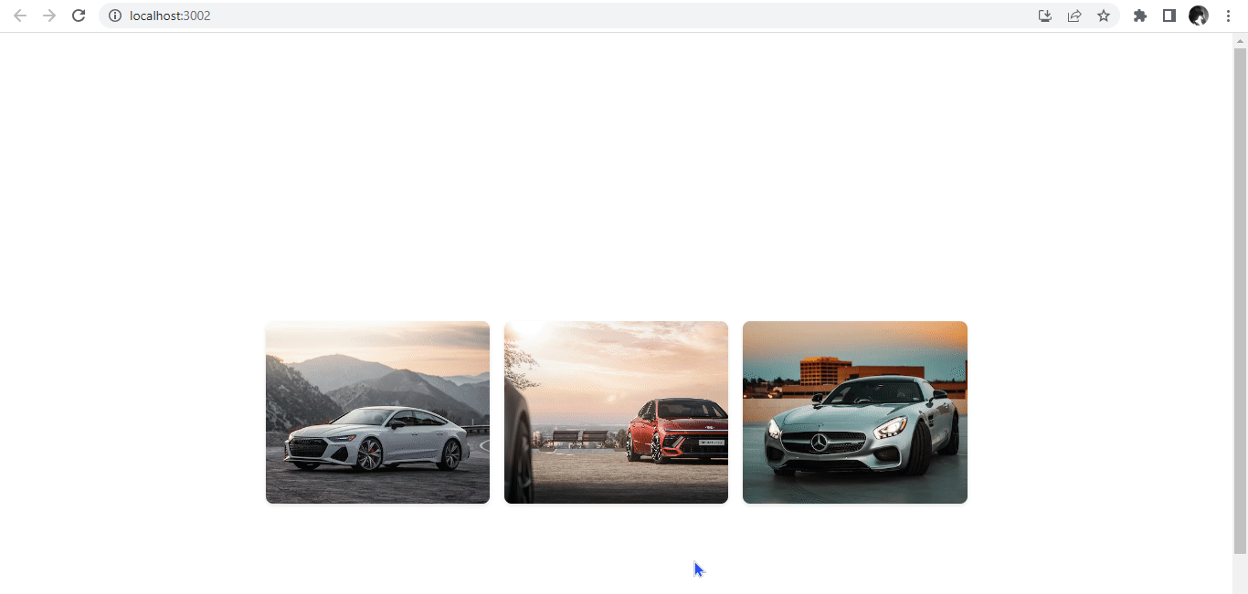
For illustration, we will create an image gallery.
import React from "react";
import { Toaster, toast } from "react-hot-toast";

const App = () => {
 const cars = [
   {
     id: 1,
     title: "Car gallery",
     Dealer: "Audi",
     description: "Audi e tron",
     url: "https://images.unsplash.com/photo-1616422285623-13ff0162193c?ixlib=rb-4.0.3&ixid=M3wxMjA3fDB8MHxwaG90by1wYWdlfHx8fGVufDB8fHx8fA%3D%3D&auto=format&fit=crop&w=431&q=80",
   },
   {
     id: 2,
     title: "Car gallery",
     Dealer: "Hyundai",
     description: "The HYUNDAI SONATA",
     url: "https://images.unsplash.com/photo-1681276159290-29989388a728?ixlib=rb-4.0.3&ixid=M3wxMjA3fDF8MHxwaG90by1wYWdlfHx8fGVufDB8fHx8fA%3D%3D&auto=format&fit=crop&w=1631&q=80",
   },
   {
     id: 3,
     title: "Car gallery",
     Dealer: "Mercedes Benz",
     description: "e-class",
     url: "https://images.unsplash.com/photo-1616789916189-3a0d215b6122?ixlib=rb-4.0.3&ixid=M3wxMjA3fDB8MHxwaG90by1wYWdlfHx8fGVufDB8fHx8fA%3D%3D&auto=format&fit=crop&w=387&q=80",
   },
 ];

 const handleHover = (car) => {
   toast.success(
     <div className="image-details">
       <h3 className="image-title">{car.title}</h3>
       <p className="image-author">Dealer: {car.Dealer}</p>
       <p className="image-description">{car.description}</p>
     </div>,
     {
       duration: 2500,
       style: {
         background: "rgba(0, 0, 0, 0.8)",
       },
     }
   );
 };

 return (
   <div className="image-gallery">
     {cars.map((car) => (
       <div
         key={car.id}
         className="image-card"
         onMouseEnter={() => handleHover(car)}
         onMouseLeave={toast.dismiss}
       >
         <img src={car.url} alt={car.title} className="image" />
         <div className="image-overlay">
           <p className="text-white">Hover to view details</p>
         </div>
       </div>
     ))}
     <Toaster />
   </div>
 );
};

export default App;
The image array contains sample data, each with a title, car dealer, description, and URL. The onMouseEnter handler is triggered when the user hovers over an image; a success toast notification will appear with the image details. The onMouseLeave handler is triggered when the user stops hovering on the image, which dismisses the toast notification. The toast notification has a custom background color and displays the image title, dealer, and description. Next, we will apply styling.
.image-gallery {
 display: grid;
 grid-template-columns: repeat(3, 1fr);
 gap: 1rem;
 padding: 1rem;
 margin: 300px auto;
 max-width: 800px;
}

.image-card {
 position: relative;
 cursor: pointer;
}

.image {
 width: 100%;
 height: 200px;
 object-fit: cover;
 border-radius: 8px;
 box-shadow: 0 2px 4px rgba(0, 0, 0, 0.1);
}

.image-overlay {
 position: absolute;
 top: 0;
 left: 0;
 width: 100%;
 height: 100%;
 display: flex;
 align-items: center;
 justify-content: center;
 opacity: 0;
 background-color: rgba(0, 0, 0, 0.8);
 border-radius: 8px;
 transition: opacity 0.3s ease;
}

.image-card:hover .image-overlay {
 opacity: 1;
}

.image-details {
 text-align: center;
}

.image-title {
 font-weight: bold;
 font-size: 1.2rem;
 margin-bottom: 0.5rem;
 color: #fff;
}

.image-author {
 font-size: 0.9rem;
 margin-bottom: 0.2rem;
 color: #fff;
}

.image-description {
 font-size: 0.8rem;
 color: #fff;
}
It will look like this.
This example demonstrates how hover-based toast notifications can be used in a real-life image gallery application to provide image details when users interact with the images.
Using Hot Toast Notification in a form
Here we will implement a simple login form that utilizes hot notifications to provide user feedback.
import React, { useState } from "react";
import { Toaster, toast } from "react-hot-toast";
const App = () => {
 const [formData, setFormData] = useState({
   username: "",
   password: "",
 });
 const handleChange = (e) => {
   setFormData((prevData) => ({
     ...prevData,
     [e.target.name]: e.target.value,
   }));
 };
 const handleSubmit = async (e) => {
   e.preventDefault();
   toast.promise(
     new Promise((resolve, reject) => {
       setTimeout(() => {
         if (
           formData.username === "user" &&
           formData.password === "password"
         ) {
           resolve("Login successful!");
         } else {
           reject(new Error("Invalid credentials"));
         }
       }, 2000);
     }),
     {
       loading: "Logging in...",
       success: (message) => message,
       error: (error) => error.message,
     }
   );
 };
 return (
   <div className="App">
     <form onSubmit={handleSubmit}>
       <div className="form-group">
         <label htmlFor="username">Username:</label>
         <input
           type="text"
           id="username"
           name="username"
           value={formData.username}
           onChange={handleChange}
         />
       </div>
       <div className="form-group">
         <label htmlFor="password">Password:</label>
         <input
           type="password"
           id="password"
           name="password"
           value={formData.password}
           onChange={handleChange}
         />
       </div>
       <button type="submit">Submit</button>
     </form>
     <Toaster />
   </div>
 );
};
export default App;
The handleSubmit function uses toast.promise to handle the form submission logic. In toast.promise, we create a promise encapsulating the form submission process. We initialize a state variable formData using the useState hook. This state will hold the values of the username and password fields in the form.
A loading toast notification is displayed while the form submission is in progress. This provides visual feedback to the user that the submission is being processed. Once the promise is resolved or rejected, the appropriate success or error toast notification is shown based on the result.
To make the form visually appealing, you can add some CSS styles.
.App {
max-width: 400px;
margin: 160px auto;
padding: 20px;
}
.form-group {
margin-bottom: 20px;
}
label {
display: block;
margin-bottom: 5px;
}
input {
width: 100%;
padding: 20px 30px;
font-size: 16px;
border-radius: 5px;
border: 1px solid #ccc;
outline: none;
}
button[type="submit"] {
display: block;
width: 100%;
padding: 10px;
font-size: 16px;
border-radius: 5px;
border: none;
background-color: #007bff;
color: #fff;
cursor: pointer;
}
button[type="submit"]:hover {
background-color: #0056b3;
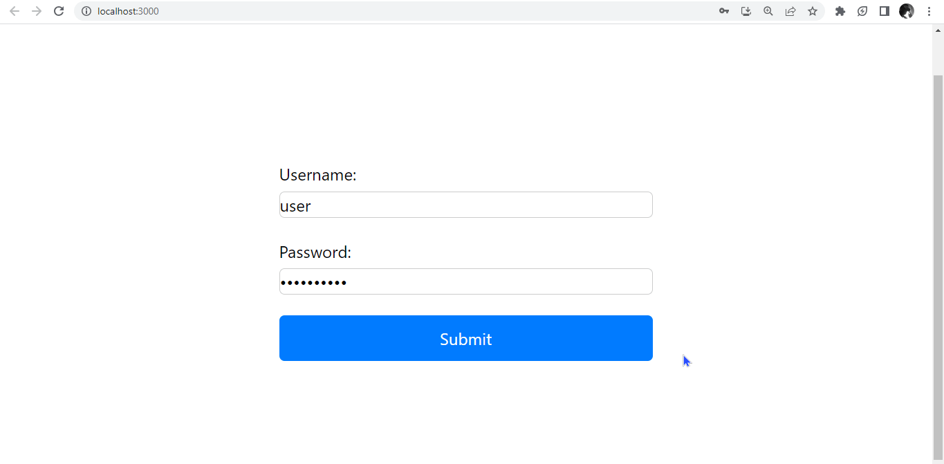
}When user login details are correct, it will render a success toast.
When user login details are incorrect, it will render an error toast.

Alternatives to React-Hot-Toast for Toast Notification
It is established at this point that React-Hot-Toast is a popular and reliable library for toast notifications. However, there are several alternative libraries for implementing toast notifications in React applications. Here are a few popular ones:
- React-Toastify: React-Toastify is a widely used toast notification library for React. It is a highly designed library offering rich features and customization options, including notifications, transitions, and position configurations. It supports global and local notifications and provides callback functions for various events. React-Toastify is highly flexible and has good official documentation, making it a popular choice among developers.
- React-Bootstrap Toast: Described as “An easy peasy to use react toast out of the box without extra rendering of component provider”. If you use React-Bootstrap as your UI framework, you can use the React-Bootstrap Toast component. It provides a simple, elegant way to display toast notifications with customizable styles and animations. You can easily integrate it into your existing React-Bootstrap components.
- Notistack: Notistack is a toast notification library that offers a versatile and easy-to-use solution for displaying notifications in React applications. It provides a stacking mechanism for managing multiple notifications and supports global and local notifications.
Conclusion
This article explored using React-Hot-Toast to create simple toast notifications in React applications. We learned how to display success and error toast notifications using the toast.success and toast.error functions.
Additionally, we saw how to create custom toast notifications using the generic toast function. This feature enabled us to fully customize the toast notifications’ content, appearance, and behavior to suit our specific application needs.
React-Hot-Toast provides a simple and convenient way to implement toast notifications in your React project, enhancing the user experience with informative and visually appealing notifications.
Feel free to experiment and explore the many other features and options offered by React-Hot-Toast to create more complex toast notifications tailored to your specific application needs.
Gain Debugging Superpowers
Unleash the power of session replay to reproduce bugs and track user frustrations. Get complete visibility into your frontend with OpenReplay, the most advanced open-source session replay tool for developers.
