Bulma vs. Bootstrap -- What are their differences?
A comparison between two of the most popular current CSS frameworks

Bootstrap is one of the most popular CSS frameworks for building mobile-first sites. Bootstrap was created by a designer and developer at Twitter in 2010 and released in 2011 as an Open source Product by Github. Among its main characteristics:
- It has a large community support
- It has its own grid system
- It Uses HTML, CSS, and JavaScript
While Bootstrap is still one of the preferred frameworks by developers, libraries like Bulma CSS have gained popularity over the period and have tried to fix some of the shortcomings of Bootstrap. Bulma is newer; it was developed by Jeremy Thomas and released in 2016 under the MIT License. Since Bulma appeared, it gained enough attraction from front-end devs to compete with Bootstrap. Bulma has some characteristics of its own:
- It doesn’t include inbuilt JavaScript and jQuery
- It allows users to import only those modules which are required
- It’s built with Sass
Both frameworks have pros and cons, and there are some key differences between them. By the end of this article, you will be able to get a gist of how they work and which one is more suitable for you as a developer. Over the following sections, we’ll discuss important topics and show how each framework deals with them.
1. Headings
It is pretty simple to implement heading in both these frameworks.
Bootstrap
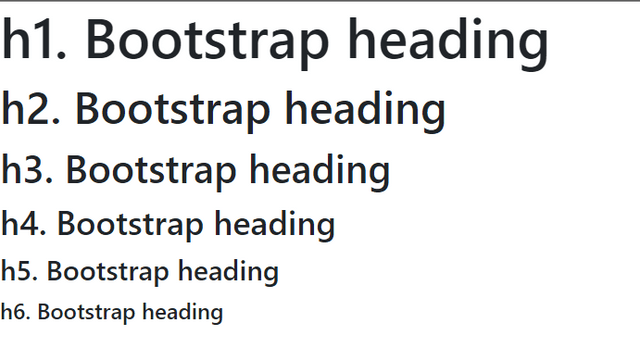
Bootstrap uses the basic tags, and we need not customize them any further. To get a better heading, you can use the display headings
<h1>h1. Bootstrap heading</h1>
<h2>h2. Bootstrap heading</h2>
<h3>h3. Bootstrap heading</h3>
<h4>h4. Bootstrap heading</h4>
<h5>h5. Bootstrap heading</h5>
<h6>h6. Bootstrap heading</h6>
The above code will show you the following output:
Bulma
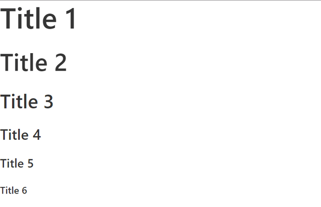
Irrespective of the tag, by simply using is -1, we can get an h1 title. Hence, even if we use h6 or a p tag, with the is-2 class, we will get an h2 sized element. Similarly, we can implement subtitles by replacing the class with subtitle.
<h1 class="title is-1">Title 1</h1>
<h2 class="title is-2">Title 2</h2>
<h3 class="title is-3">Title 3</h3>
<h4 class="title is-4">Title 4</h4>
<h5 class="title is-5">Title 5</h5>
<h6 class="title is-6">Title 6</h6>
The above code will show you the following output:
Bulma provides tons of classes for typography to beautify the text content, placing them or sizing them according to the requirement. Refer
2. Buttons
Bootstrap
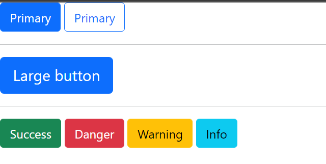
For customizing buttons, Bootstrap provides a variety of classes like btn-outline for outlined buttons, btn-danger for red buttons to indicate danger, btn-lg for large-sized buttons, etc. Checkout the docs for more information.
<button type="button" class="btn btn-primary">Primary</button>
<button type="button" class="btn btn-outline-primary">Primary</button>
<hr>
<button type="button" class="btn btn-primary btn-lg">Large button</button>
<hr>
<button type="button" class="btn btn-success">Success</button>
<button type="button" class="btn btn-danger">Danger</button>
<button type="button" class="btn btn-warning">Warning</button>
<button type="button" class="btn btn-info">Info</button>
The above code will show you the following output:
Bulma
Customizing buttons is super simple in Bulma because of the modifiers like is-primary, is-info, is-medium, is-outlined, etc., to design the buttons according to the requirement. Checkout the docs for more information.
<button class="button is-primary">Primary</button>
<button class="button is-primary is-light">Link</button>
<button class="button is-primary is-outlined">Outlined</button>
<hr>
<button class="button is-primary is-medium">Medium</button>
<hr>
<button class="button is-info">Info</button>
<button class="button is-success">Success</button>
<button class="button is-warning">Warning</button>
<button class="button is-danger">Danger</button>
The above code will show you the following output:
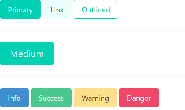
As one can see, Bulma makes customizing buttons very easy by requiring only the addition of modifier classes beginning with .is-, which is more readable and convenient to use.
3. Form components
Bootstrap
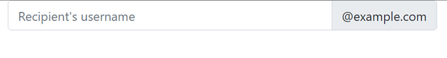
Input Field
The code below is for email input. Be aware that improperly defined input types will prevent them from being fully styled. Read more
<div class="input-group ">
  <input type="text" class="form-control" placeholder="Recipient's username">
  <span class="input-group-text">@example.com</span>
</div>
The above code will show you the following output:
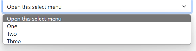
Select / Dropdown
The below example is for creating a dropdown with three options. To make the custom styles appear, use .form-select. Checkout
<select class="form-select">
  <option selected>Open this select menu</option>
  <option value="1">One</option>
  <option value="2">Two</option>
  <option value="3">Three</option>
</select>
The above code will show you the following output:
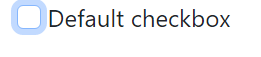
CheckBox
With the aid of .form-check, more customization and cross-browser consistency are provided. Adding the disabled property allows disabling the checkbox. Read more
<input class="form-check-input" type="checkbox" value="" id = "flexCheckDefault">
<label class="form-check-label" for="flexCheckDefault">
  Default checkbox
</label>
The above code will show you the following output:
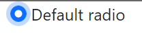
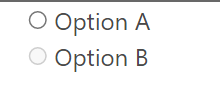
Radio
The following example contains one radio button with an input type radio. Read more about radio buttons in bootstrap here
<input class="form-check-input" type="radio" name="flexRadioDefault">
<label class="form-check-label" for="flexRadioDefault1">
  Default radio
</label>
The above code will show you the following output:
Bulma
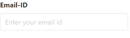
Input Field:
The input class is used for <input>HTML elements. Read more about Input fields here. Note that the field class is used here to create a form container. Read more about [field](https://bulma.io/2017/03/10/new-field-element/)
<div class="field">
  <label class="label">Email-ID</label>
  <div class="control">
      <input class="input" type="email" placeholder="Enter your email id">
      <span class="icon is-small is-left">
          <i class="fas fa-envelope"></i>
      </span>
  </div>
</div>
The above code will show you the following output:
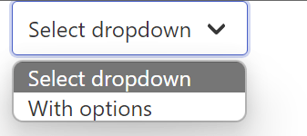
Select
The <select> HTML element is wrapped in the select class to increase stylistic flexibility and support for icons. This can be customized further by changing the dropdown’s colors, shape, and size. Read more .
<div class="select">
  <select>
    <option>Select dropdown</option>
    <option>With options</option>
  </select>
</div>
The above code will show you the following output:
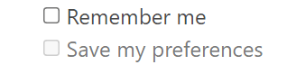
Checkbox
The <input type="checkbox"> HTML element is simply wrapped in the checkbox class. Read more
<label class="checkbox">
  <input type="checkbox">
  Remember me
</label>

For disabled
<label class="checkbox" disabled>
  <input type="checkbox" disabled>
    Save my preferences
</label>
The above code will show you the following output:
Radio Buttons
The radio class is a wrapper around the <radio> HTML elements. Read more
<label class="radio">
    <input type="radio" name="foobar" checked>
    Bar
</label>
The above code will show you the following output:
To disable a radio button, Add the disabled HTML attribute to both the <label> and the <input>.
From the above examples, it is evident that Bulma classes are readable and the same as the HTML elements; they are easy to remember! Bootstrap class names are complicated to implement relatively.
Open Source Session Replay
OpenReplay is an open-source, session replay suite that lets you see what users do on your web app, helping you troubleshoot issues faster. OpenReplay is self-hosted for full control over your data.

Start enjoying your debugging experience - start using OpenReplay for free.
4. NavBars
Bootstrap
Bootstrap provides various classes to support the nav component
navbar-brand- Contains the logo/name which is to the left of the navbarnavbar-collapse- for grouping and hiding navbar contents by a parent breakpoint.
Checkout the docs to know more
<nav class="navbar navbar-light bg-light">
  <div class="container-fluid">
    <a class="navbar-brand">Navbar</a>
    <form class="d-flex">
      <button class="btn btn-outline-success" type="submit">Sign Up</button>
    </form>
  </div>
</nav>
The above code will show you the following output:

Bulma
Bulma provides various classes that can be used with the nav component to customize the navbar. For the desktop, options are:
navbar-brand- Contains the logo/name which is to the left of the navbarnavbar-menu- Contains the list ofnavbar-itemswhich can be organized to the left-most or right-most side of the navbar usingnavbar-start- Beside the brandnavbar-end- At the extreme right of navbarnavbar-items- Items to be displayed in the navbar which consists ofnavbar-link,navbar-dropdown.
A basic example of a navbar built with Bulma :
<nav class="navbar" role="navigation" >
  Brand Logo
  <div class="navbar-brand">
    <a class="navbar-item" href="https://bulma.io">
      <img src="https://bulma.io/images/bulma-logo.png" width="112" height="28">
    </a>
  </div>

  Buttons at the end
  <div class="navbar-end">
    <div class="navbar-item">
      <a class="button is-primary">
          <strong>Sign up</strong>
      </a>
    </div>
  </div>
</nav>
The above code will show you the following output:

For mobile, the hamburger menu can be created using navbar-burger. Read more here.
Bulma would win brownie points here as the classes are readable and easy to pick up. Adding elements to the extreme left or right is very simple because of helper classes like navbar-start and navbar-end.
5. Grid
Bootstrap
Bootstrap’s grid system uses a series of containers, rows, and columns to lay out and align content. It’s built with flexbox and is fully responsive. The below example creates three equal-width columns across all devices and viewports using grid classes.
<div class="row">
    <div class="col">
      Column
    </div>
    <div class="col">
      Column
    </div>
    <div class="col">
      Column
    </div>
</div>
The above code will show you the following output:

Bulma
Bulma uses Flexboxes under the hood and builds a grid system on top of that. By using columns, we can align content in a responsive manner; Bulma adjusts the content according to the screen size.
In the below example, the three columns will be equally spaced on the desktop, but Bulma automatically aligns each box on top of one another for mobile.
<div class="columns">
  <div class="column">
    First column
  </div>
  <div class="column">
    Second column
  </div>
  <div class="column">
    Third column
  </div>
  <div class="column">
    Fourth column
  </div>
</div>
The above code will show you the following output:

It is super simple to align content in Bulma as you only need a single .columns container to wrap as many .column items as you want.
6. Cards
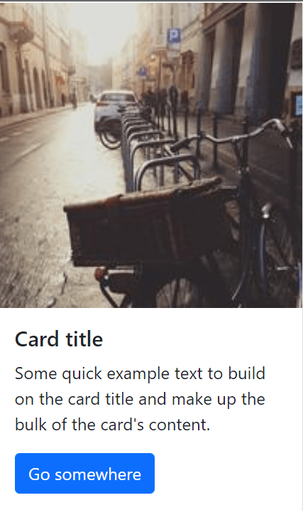
Bootstrap
Cards support various content, including images, text, list groups, links, etc.
card-body: Used whenever a padded section is needed within a cardcard-img-top: Places an image on the top of the cardcard-header,card-footer: Used to add header and footer in the card.card-title,card-text: Used to add title and text to the card.
A basic example of a Cards built with Bootstrap :
<div class="card" style="width: 18rem;">
  <img src="https://picsum.photos/200" class="card-img-top" alt="...">
  <div class="card-body">
    <h5 class="card-title">Card title</h5>
    <p class= "card-text">Some quick example text to build on the card title and make up the bulk of the card's content.</p>
    <a href="#" class="btn btn-primary">Go somewhere</a>
  </div>
</div>
The above code will show you the following output:
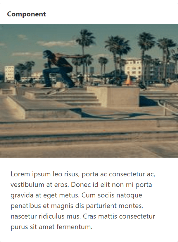
Bulma
Card component in Bulma consists of several elements like :
card-header: A horizontal bar used to display the header and hascard-header-icon,card-header-title: to display the icon and title.card-image: A full-width container to display a responsive imagecard-footer: A list ofcard-footer-itemelements.card-content: A container to display any content on the card.
A basic example of a Card built with Bulma:
<div class="card">
  <header class="card-header">
      <p class="card-header-title">
        Component
      </p>
  </header>

  <div class="card-image">
    <figure class="image is-4by3">
      <img src="https://bulma.io/images/placeholders/1280x960.png" alt="Placeholder image">
    </figure>
  </div>

  <div class="card-content">
    <div class="content">
      Lorem ipsum leo risus, porta ac consectetur ac, vestibulum at eros. Donec id elit non mi porta gravida at eget metus. Cum sociis natoque penatibus et magnis dis parturient montes, nascetur ridiculus mus. Cras mattis consectetur purus sit amet fermentum.
    </div>
  </div>
</div>
The above code will show you the following output:
Bootstrap and Bulma both provide almost the same ease in designing a card. It is super simple to design card components by just referring to the informative docs provided by both these frameworks.
Pros and Cons
Bulma and Bootstrap offer a wide range of components to help front-end developers build. Let’s talk about the benefits and drawbacks of these two frameworks.
Bootstrap
Pros:
- Bootstrap being already established in the community, it has a
- Large Community support
- Better documentation
- Better Internet Explorer compatibility
- Bootstrap provides support for elements that Bulma doesn’t have
- Bootstrap is highly and widely compatible with the WCAG 2.0 standards.
Cons:
- Because Bootstrap styles are intricate, a lot of HTML output that uses them is not entirely semantic.
Bulma
Pros: Bulma CSS deserves brownie points for :
- Easy-to-learn syntax - It’s simple to learn Bulma in a matter of minutes thanks to class names like
buttonortitleand an uncomplicated modifiers system like.is-primaryor.is-large - Font Awesome 5 support - The
.iconelement allows Bulma to work with both Font Awesome 4 and Font Awesome 5. - Super simple grid system - You can wrap as many
.columnelements as you like in a single.columnscontainer to create a Bulma grid. - No JavaScript - Bulma offers a simple solution to implement in any development scenario by concentrating simply on CSS.
- Simple development with modular columns
Cons: Since Bulma is new:
- It has a relatively weaker documentation
- It also has a relatively smaller community support
- Bulma is a CSS-only framework, unlike Bootstrap. It does not come with JavaScript or jQuery preinstalled. Writing a custom script is necessary to add a fundamental feature to Bulma that needs JavaScript or jQuery,
Conclusion
Overall, because of its simplicity and readability, Bulma would be simpler for a novice developer to understand, although there isn’t really a right or wrong CSS framework in general. Depending on the requirements of your application, you can select any CSS framework from Bootstrap and Bulma.
A TIP FROM THE EDITOR: For an introduction to Bulma, the “newer kid on the block” as shown above, don’t miss our Introduction to Bulma: A Simple and Intuitive CSS Framework article.