Styling Web Components with Shadow DOM and CSS
Styling Web Components with Shadow DOM: use :host, ::slotted(), CSS custom properties, ::part(), and adoptedStyleSheets to control component CSS.

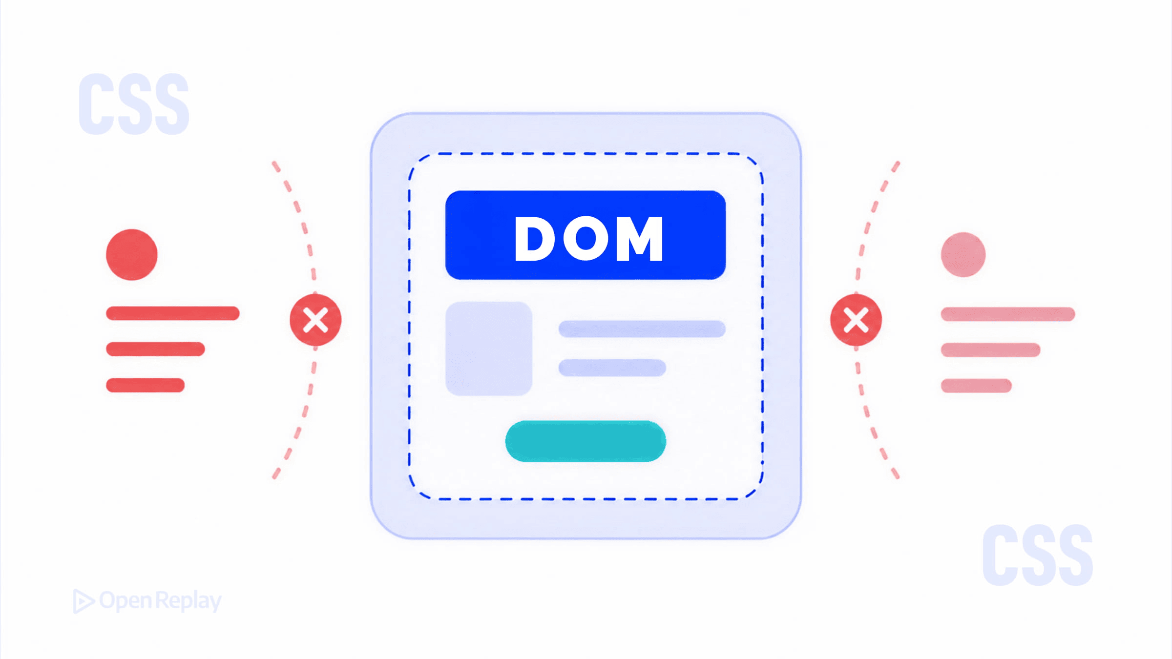
If you’ve ever dropped a Web Component onto a page and wondered why your global CSS stopped working inside it, you’ve run into the shadow boundary. It’s not a bug — it’s the point. Shadow DOM gives custom elements their own scoped DOM tree, which means styles don’t bleed in or out by default. But that doesn’t mean styling is impossible. It means styling is intentional.
This article covers the main mechanisms for Shadow DOM styling: internal styles, :host, ::slotted(), CSS custom properties, ::part(), and adoptedStyleSheets.
Key Takeaways
- Shadow DOM scopes styles by design, so global CSS cannot reach inside a component and internal styles cannot leak out.
- Shadow styles act as defaults and sit below authored page styles in the cascade, much like a browser’s user-agent stylesheet.
- Use
:hostand:host()to style the component element, and::slotted()to style projected light DOM children (direct descendants only). - CSS custom properties and
::part()form a deliberate public styling API: variables for theming tokens, parts for structural styling. adoptedStyleSheetslets multiple components share a single parsedCSSStyleSheet, improving performance at scale.
Why Shadow DOM Changes How CSS Behaves
When you call attachShadow() on an element, you create a separate DOM tree attached to that element (the shadow host). Selectors in your page’s stylesheet can’t reach inside that tree, and selectors inside the shadow tree can’t reach outside it.
There’s one important nuance worth understanding: shadow DOM styles sit below your authored styles in the CSS cascade. That means a global rule like * { color: red } will override a :host { color: green } rule inside the shadow — even if the global rule appears earlier in source order. Think of shadow styles as the component’s default styles, similar to how a browser’s user-agent stylesheet provides defaults for <button> or <input>.
Styling the Shadow Host with :host
From inside the shadow tree, :host selects the element the shadow is attached to:
:host {
  display: block;
  font-family: sans-serif;
}
You can also use :host(selector) to apply styles conditionally based on attributes or classes on the host:
:host([disabled]) {
  opacity: 0.5;
  pointer-events: none;
}
Because the host element lives in the light DOM, document-level styles will override :host rules. If you want the component’s defaults to win, reach for !important inside the shadow — one of the rare cases where it is genuinely appropriate.
Styling Slotted Content with ::slotted()
Slots let you project light DOM content into a shadow tree. The ::slotted() pseudo-element lets you style those projected elements from inside the shadow:
::slotted(p) {
  margin: 0;
  color: #333;
}
Important limitation: ::slotted() only matches the element directly assigned to a slot — not its descendants. A selector like ::slotted(p span) will not work, and ::slotted() only accepts a compound selector (no descendant combinators). For deeper styling, rely on CSS inheritance or let the light DOM’s own styles handle it.
CSS Custom Properties Cross the Shadow Boundary
CSS variables (custom properties) pierce the shadow boundary freely. This makes them the most flexible tool for Web Components theming:
/* In the shadow tree */
:host {
  background: var(--card-bg, white);
  color: var(--card-color, black);
}
/* In your page stylesheet */
my-card {
--card-bg: #1a1a2e;
--card-color: #eee;
}The component defines the hooks; the consumer sets the values. Always include fallback values so the component works without any external configuration.

Discover how at OpenReplay.com.
Exposing Style Hooks with CSS Shadow Parts (::part())
CSS Shadow Parts are the modern answer to styling internal elements of a Web Component from outside. Inside the component, you mark elements with the part attribute:
<button part="trigger">Open</button>Outside the component, consumers can target that part directly using ::part():
my-dialog::part(trigger) {
  background: royalblue;
  border-radius: 4px;
}
This is an intentional styling API — the component author decides what’s exposed. It’s more powerful than CSS variables for structural styling (layout, borders, backgrounds) while keeping internal implementation details private.
Sharing Styles Efficiently with adoptedStyleSheets
adoptedStyleSheets lets you attach CSSStyleSheet objects directly to a shadow root. It has broad support across modern browsers and is well-suited for component libraries that need to share one parsed stylesheet across many instances:
const sheet = new CSSStyleSheet();
sheet.replaceSync(`:host { display: block; }`);

class MyComponent extends HTMLElement {
  constructor() {
    super();
    const shadow = this.attachShadow({ mode: 'open' });
    shadow.adoptedStyleSheets = [sheet];
  }
}

customElements.define('my-component', MyComponent);
The browser parses the stylesheet once regardless of how many components use it — a meaningful performance win at scale. You can add or remove stylesheets by mutating the adoptedStyleSheets array, and changes to a shared CSSStyleSheet apply everywhere it is adopted.
Choosing the Right Approach
| Goal | Tool |
|---|---|
| Style the component’s host element | :host / :host() |
| Style projected light DOM content | ::slotted() |
| Expose theming tokens to consumers | CSS custom properties |
| Expose structural styling to consumers | ::part() |
| Share styles across many components | adoptedStyleSheets |
Conclusion
Shadow DOM styling isn’t about locking CSS out — it’s about making encapsulation explicit. Use internal styles and :host for defaults, CSS variables and ::part() as your public styling API, and adoptedStyleSheets when performance at scale matters. Once you have that mental model, styling Web Components becomes straightforward.
FAQs
Why does my global CSS not affect the contents of a Web Component?
Because the component uses Shadow DOM, which creates a scoped DOM tree isolated from the main document. Page stylesheets cannot select elements inside the shadow tree. To style internals, the component author must expose hooks such as CSS custom properties or CSS Shadow Parts via the part attribute, which you then target with ::part() from outside.
When should I use ::part() instead of CSS custom properties?
Use custom properties for design tokens like colors, spacing, and fonts that flow naturally through inheritance. Use ::part() when consumers need structural control over a specific internal element, such as overriding borders, backgrounds, or layout on a button or header. Parts give finer-grained access, while variables stay simpler and broader in scope.
Why does ::slotted(p span) not match anything?
The ::slotted() pseudo-element only matches top-level nodes assigned directly to a slot, not their descendants. It also accepts only a compound selector, so descendant combinators are invalid. To style children of slotted elements, rely on CSS inheritance from the slotted element or let the consumer's own light DOM stylesheet handle those descendants directly.
Is adoptedStyleSheets safe to use in production?
Yes. It is supported across all modern evergreen browsers and is the recommended way to share styles across many shadow roots without re-parsing. One parsed CSSStyleSheet can be attached to multiple shadow roots, which reduces memory and improves startup time. Shared stylesheets can also be updated and reused across multiple components efficiently.