
Styling Toast Messages with React-Toastify

Notifications are an important part of any React application development, and they provide a medium to communicate information to users in a timely and unobtrusive manner. Notifications can provide users with real-time updates, alert them of an important event, or remind them of an upcoming task.
There is a range of resources available to help us achieve that. One of the interesting tools we can use is React-Toastify. Using React-Toastify, developers can create a better user experience and keep users informed and up-to-date.
This tutorial will introduce readers to React-Toastify and guide them to display notifications, messages, and pop-ups in React applications.
What is a toast notification?
From the word toast — Toast notifications are called “toast” because they are meant to be a brief message, displaying some information that appears briefly on the screen, like a toast popping out of a toaster. The term “toast” in this context refers to a message appearing briefly and then disappearing, similar to how a toast pops up out of a toaster.
The notification could be an error, warning, success, info message, and so on, as illustrated in the image below:

What is React-Toastify?
React-Toastify is a library for React that allows developers to easily create and display toast notifications in their React applications. It provides an easy-to-use and customizable interface for creating toast notifications for React projects.
React Toastify supports various styling options, such as position, color, width, and animation. It also supports callbacks and more. React-Toastify library is also compatible with other libraries, such as Redux.
Why React-Toastify?
Toastify is a React.js library built independently to work well with your React.js project. It is popular among developers, and some of the reasons include the following:
- Toasts are a great way to quickly provide feedback and notify users of important changes or updates in your web application.
- Toastify allows you to customize the look and feel of your notifications. You can change the colors, font size, and position of your toasts.
- Toastify is a lightweight library and is easy to install and use. It also doesn’t require any dependencies.
- Toastify is highly customizable, allowing you to customize the toast’s text, colors, and duration.
Installing and Setting up Toastify Package on your React App
Once you have created your React application, use any of the commands below to install the React-Toastify package.
    // NPM
    $ npm install --save react-toastify

    // YARN
    $ yarn add react-toastify
After installing the package, we will import it into your component, as shown below. In addition, we will import a CSS file provided by React-Toastify for the tool to function properly.
    import { ToastContainer, toast } from 'react-toastify';
    import 'react-toastify/dist/ReactToastify.css';
Styling your Toast Notification(s) with React-Toastify
Here, we will import the toast function, the ToastContainer component, and its CSS file from the react-toastify library. We will also wrap our app with the ToastContainer component, allowing us to display toasts from anywhere in your app.
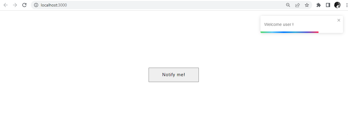
Next, we will create a function called notifyMe in App.js. We will create a button to listen for the event - notifyMe.
    import React from 'react';
    import { ToastContainer, toast } from 'react-toastify';
    import 'react-toastify/dist/ReactToastify.css';

      function App(){
        const notifyMe = () => toast("Welcome user!");

        return (
          <div>
          <button onClick={notifyMe} className="button">Notify me!</button>
            <ToastContainer />
          </div>
        );
      }
At the click of the button, a notification with the message “Welcome user !” will be rendered as shown below.
Identifying the Various Types of Toast Notifications
You can create different toast messages to convey specific information to your users with a toast emitter. Using different types of toast messages can help your users understand the meaning and importance of the information being displayed.
This method uses different colors and symbols to convey the importance of each toast message type to help users quickly identify and understand the information they see.
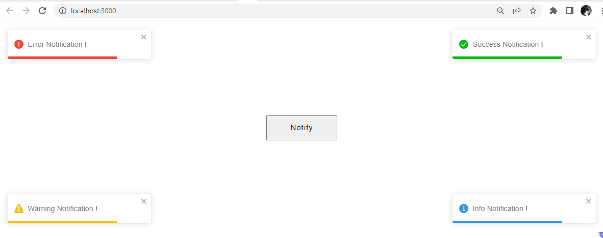
For instance, logging into an application, it is conventional that a green toast message may be used to indicate a successful response, a red toast message typically signifies an error, and a blue toast message conveys some information, as shown below.
    import React from "react";
    import { ToastContainer, toast } from 'react-toastify';
    import 'react-toastify/dist/ReactToastify.css';
    function App() {
      const toastMessage = () => {
          toast.success('Success Notification !', {
              position: toast.POSITION.TOP_RIGHT
          });
          toast.error('Error Notification !', {
            position: toast.POSITION.TOP_LEFT
        });
        toast.info('Info Notification !', {
          position: toast.POSITION.BOTTOM_RIGHT
      });
      toast.warning('Warning Notification !', {
        position: toast.POSITION.BOTTOM_LEFT
    });
      };
      return (
          <div>
              <button onClick={toastMessage} className="button">Notify</button>
              <ToastContainer />
          </div>
      );
    }
    export default App;
The code block will render four basic toast notifications - success, error, info, and warning.
It is important to note that these conventions are not universal, and different apps may use different colors for their toast notifications. It’s a good idea to choose colors that are easy to read and will contrast nicely with the background color of the toast notification.
Positioning your Toast Notification(s)
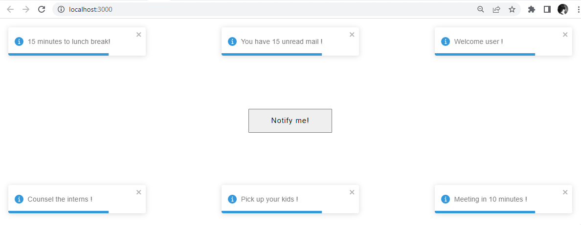
By default, all toasts are located in the top right corner of your browser. The toast can be assigned a different position. React-Toastify allows for six distinct positions:
- Top-right
- Top-center
- Top-left
- Bottom-right
- Bottom-center
- Bottom-left
We can now position our toasts in any of the positions mentioned above, as shown.
    const notifyMe = () => {
        toast.info('Welcome user !', {
          position: toast.POSITION.TOP_RIGHT
      });
      toast.info('You have 15 unread mail !', {
          position: toast.POSITION.TOP_CENTER
      });
      toast.info('15 minutes to lunch break!', {
          position: toast.POSITION.TOP_LEFT
      });
      toast.info(' Meeting in 10 minutes !', {
          position: toast.POSITION.BOTTOM_RIGHT
      });
      toast.info('Pick up your kids !', {
          position: toast.POSITION.BOTTOM_CENTER
      });
      toast.info('Counsel the interns !', {
          position: toast.POSITION.BOTTOM_LEFT
      });
      }
This code block will render the different positions for your toast notifications.
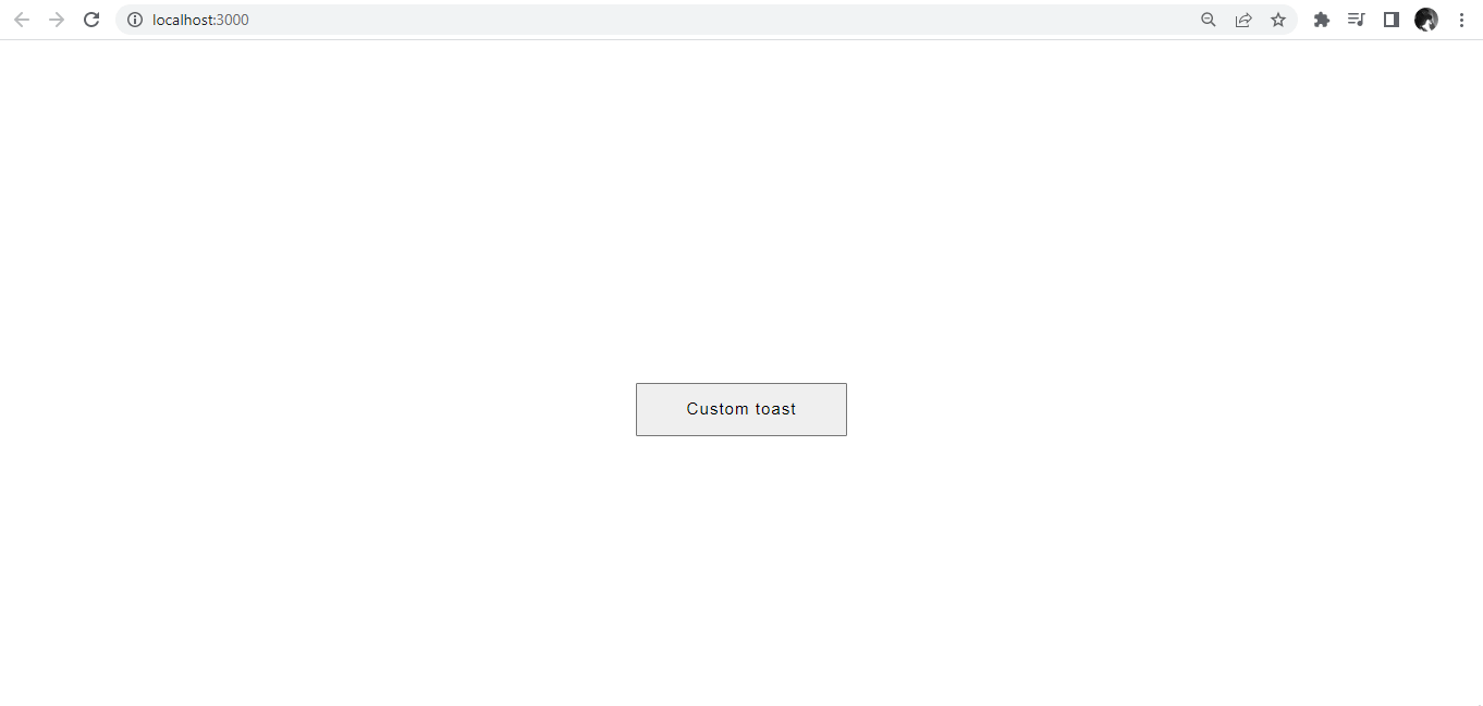
How to Create a Custom Toast Notification.
A custom toast is a notification that can be modified according to your preferred styling. You can customize the appearance and behavior of the toast by passing options to the toast function. For example, you can specify the duration, height, icon, font, font size, position, hideProgressBar, closeOnClick, autoClose, pauseOnHover, and animation style of the toast.
During customization, the package also lets you inject your HTML structure inside of it. For illustration purposes, we will create a custom dismiss toast. The toast will be dismissed automatically after a specific amount of time. We will also create a button with a role of "cancel", then that button will dismiss the toast. To dismiss the toast after creation, call the dismiss() method.
    const CustomToast = ({text}) => (
      <div>
       <p className="text">{text}</p>
      <button className="button1" onClick={() => toast.dismiss()}>Dismiss</button>
      </div>
    );
    const customToast = () => {
      toast(<CustomToast  text="This is a custom toast" />);
    };

    const App = () => (

      <div>
        <button onClick={customToast} className="button">Custom toast</button>
        <ToastContainer />
      </div>
    );
    export default App;
Here, we will style our custom toast with CSS.
    .button{
     display: flex;
     margin: 350px auto;
     padding: 15px 50px;
     letter-spacing: 1px;
     font-size: 17px;
    }
    .button1{
     border-radius: 3px;
     border: none;
     padding: 9px;
     margin: 20px 0;
    }
    .text{
     font-size: 30px;
     color: #844C40;
     margin: 20px 0;
    }
The result below will be rendered on your browser.
Session Replay for Developers
Uncover frustrations, understand bugs and fix slowdowns like never before with OpenReplay — an open-source session replay tool for developers. Self-host it in minutes, and have complete control over your customer data. Check our GitHub repo and join the thousands of developers in our community.
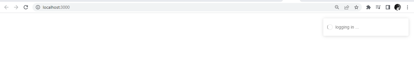
How to Create Promise Toast with React-Toastify
A toast promise in React is a type of promise that allows for asynchronous code execution. It can trigger a specific action or event when the toast message is displayed, such as redirecting the user to a different page or displaying an alert message, and any errors are handled properly.
For example, a toast promise can be used to ensure that a loading spinner is displayed while data is fetched from an API and then removed once the data is successfully loaded.
    import React from "react";
    import { ToastContainer, toast } from 'react-toastify';
    import 'react-toastify/dist/ReactToastify.css';
    import { useEffect } from "react";

    function App() {
        const store = new Promise((res) =>
        fetch("https://fakestoreapi.com/products/")
          .then((res) => res.json())
          .then((json) => setTimeout(() => res(json), 5000))
      );
      useEffect(() => {
        toast.promise(store, {
          pending: "logging in ...",
          success: "Welcome user",
          error: "Error logging in"
        });
      },[]);
      return(
        <>
        <ToastContainer/>
        </>
      )
    }

    export default App;
From the code block above, when a React promise toast is resolved, the toast notification will appear on the user’s screen, indicating that the promise has been fulfilled. The toast notification may contain a success message, an error message, or another type of information.
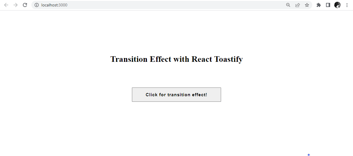
How to Use Transition Effect for Toast Notifications.
Transition effects for toast notifications are animations that are used to transition a toast notification. The most common transition effects for toast notifications are fading, sliding, bouncing, and zooming. These transition effects give the toast notification a more dynamic and fluid feel.
To add transition effects to toast notifications in react-toastify, you can use the transition option of the ToastContainer component. The transition option should be a string that specifies the name of the transition effect.
    import React from 'react';
    import { ToastContainer, toast } from 'react-toastify';
    import { Slide, Zoom, Flip, Bounce } from 'react-toastify';
    import 'react-toastify/dist/ReactToastify.css';

    function App() {
      const toastNotify = () => {
        toast.success("Slide Effect!", {
          transition: Slide,
          position: "top-left",
        });
          toast.error("Zoom Effect!", {
              transition: Zoom,
              position: "top-right",
            })
            toast.warning("Flip Effect!", {
                  transition: Flip,
                  position: "bottom-left",
                })
            toast.info("Bounce Effect!", {
                      transition: Bounce,
                      position: "bottom-right",
                    })
      };

      return (
        <div className='App'>
          <h1 className="heading">Transition Effect with Toastify React</h1>
          <button className='button' onClick={toastNotify}>Pop that toast!</button>
          <ToastContainer />
        </div>
      );
    }
    export default App;
From the code block above, we import the Slide, Zoom, Flip, and Bounce transition effects from the react-toastify package. We can add these transition effects to our toast messages. On your browser, it will render as so.
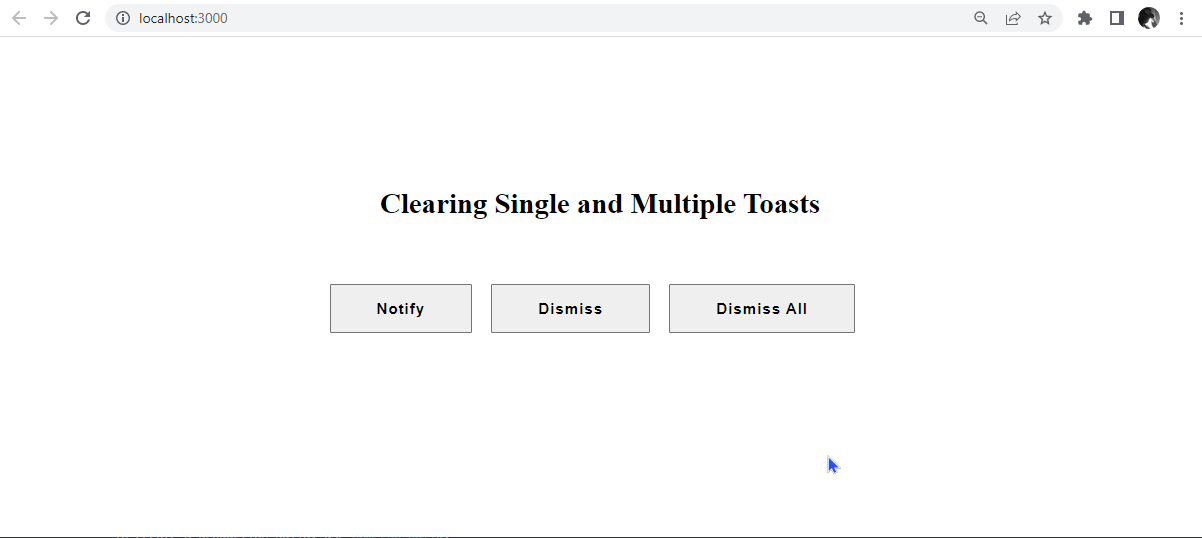
How to Clear Single and Multiple Toasts.
Clearing a React Toast is removing a Toast notification from the screen. This is done by using the dismiss() method on the Toast component.
To dismiss a single toast, we will pass an argument into the toast.dismiss function. To clear all toasts, you can call the toast.dismiss function without arguments.
    const toastId = React.useRef(null);
      const message = () => toastId.current = toast("welcome user");
      const clear = () =>  toast.dismiss(toastId.current);
      const clearAll = () =>  toast.dismiss();
      return (
        <div className='App'>
          <h1 className="heading">Clearing Single and Multiple Toasts</h1>
          <button className="button" onClick={message}>Notify</button>
          <button className="button" onClick={clear}>Dismiss</button>
          <button className="button" onClick={clearAll}>Dismiss All</button>
          <ToastContainer />
        </div>
From the code block above, a single toast is cleared when the dismiss button is clicked, while all toast notifications are cleared from the screen when the dismiss all button is clicked.
useNotificationCenter in React-Toastify v9
The useNotificationCenter hook is a new feature of React-Toastify v9. It manages notifications, such as displaying them, updating them, and removing them. The hook allows developers to easily control their notifications and keep track of them in a centralized place.
The useNotificationCenter is a collection of all notifications, which allows us to utilize array functions such as filtering, sorting, mapping, etc. It also creates a notification center instance that allows you to add, remove, and update notifications from anywhere in your application.
To use the useNotificationCenter hook, we will import from react-toastify/addons/use-notification-center.
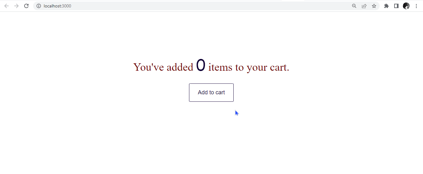
import { useNotificationCenter } from 'react-toastify/addons/use-notification-center';“It also provides a way to get the current notification count, store the notification data in the state, and keep track of the active notifications. A good example is an e-shopping cart.
    import React from "react";
    import { useNotificationCenter } from "react-toastify/addons/use-notification-center";
    import { toast, ToastContainer } from "react-toastify";
    import "react-toastify/dist/ReactToastify.css";
    const App = () => {
      const { notifications } = useNotificationCenter();
      const message = () => {
        toast("Added to your cart !", );
      };
      return (
        <div className="container">
          <p className="counter">
            You've added <span>{notifications.length}</span> items to your cart.

          </p>
          <button className="btn" onClick={message}>
            Add to cart
          </button>
          <ToastContainer />
        </div>
      );
    };
    export default App;
From the code block above, when the add to cart button is clicked, a toast notification pops up with the message added to cart.
Conclusion
In this tutorial, we discussed how to set up React-Toastify in our React app. We also discuss using, positioning, and customizing toast messages in our React app. There are many advantages to using React-Toastify for your toast messages, such as great community, simplicity, lightweight, customization properties, and consistency across the application.
We also saw how to use promise toast and the useNotificationCenter hook to create a notification center and display all our notifications.
Overall, React-Toastify is a valuable and powerful tool for creating and displaying toast notifications in a React application and can help you improve your application’s user experience and design.
Gain Debugging Superpowers
Unleash the power of session replay to reproduce bugs and track user frustrations. Get complete visibility into your frontend with OpenReplay, the most advanced open-source session replay tool for developers.
