Using SvelteKit and TailwindCSS together is a good combination for building responsive and stylish web applications, resulting in efficient and maintainable web development. This article will show you how to set them up and work with them.

Discover how at OpenReplay.com.
SvelteKit is a web application framework built on top of the Svelte framework, which is designed to make it easier to create efficient and maintainable web applications. Routing, server-side rendering, and other characteristics are among the many tools and functionality it offers for developing web applications. Tailwind CSS is a popular utility-first CSS framework that simplifies the process of styling web applications by providing a set of pre-defined utility classes.
Combining the two can be a powerful combination for several reasons:
- Developer Productivity: Tailwind CSS provides a set of utility classes that allow you to rapidly style your components without writing custom CSS. This can significantly speed up development and reduce the amount of time spent on styling, which is a common bottleneck in web development.
- Simplicity: Both are known for their simplicity. SvelteKit’s component-based architecture and Tailwind’s utility-first approach lead to clean and maintainable code. Developers can focus more on functionality and less on the intricacies of CSS.
- Performance: Svelte’s compile-time approach and Tailwind CSS’s JIT mode result in highly optimized code and minimal CSS file sizes. This can lead to faster page loads and better performance for your web applications.
- Maintainability: Both promote code maintainability. It involves reusable components and a clear data flow.
- Server-Side Rendering (SSR): SvelteKit supports SSR, and when combined with Tailwind CSS, your application can have consistent styling between the server-rendered content and the client-side interactions.
- Community and Ecosystem: Both have active and growing communities, which means you can find plenty of resources, plugins, and third-party integrations to enhance your development experience.
- Integration: They can be easily integrated together, allowing you to use Tailwind classes within your components. This integration is straightforward and doesn’t require complex configuration.
Combining simplicity, efficiency, maintainability, and performance, they function well together. Web applications that are effective, responsive, and aesthetically pleasing can be created using this approach. It’s the preferred option for developers who value a cutting-edge, effective, and easy-to-maintain web development stack.
Creating a new SvelteKit Project
Creating a project is a straightforward process. Note: Before you begin, make sure you have Node.js and npm (Node Package Manager) installed on your system.
You can create a new project using npm init and the svelte@next template.
Check here for the full documentation for creating a new Project
Installing Tailwind CSS in the Project
Inside your project directory, you need to install Tailwind CSS and its dependencies. This allows you to be able to use the two together.
npm install tailwindcss postcss postcss-cli autoprefixerAutoprefixer is a PostCSS plugin that parses your CSS and adds vendor prefixes. Check here on full documentation of how to install
Configuring Tailwind CSS
You can use the following command to generate a configuration file:
npx tailwindcss initThis will create a tailwind.config.js file in your project root.
Creating CSS files
Now we create a CSS file (e.g., src/css/tailwind.css) that serves as your entry point. Inside this file, you should import Tailwind CSS and any custom CSS you want to add. For example:
/* src/css/tailwind.css */
@import "tailwindcss/base";
@import "tailwindcss/components";
@import "tailwindcss/utilities";

/* Add any custom CSS here */
Setting up PostCSS
Create a postcss.config.js file in your project root if it doesn’t already exist and configure it to use Tailwind CSS and autoprefixer. Here’s a basic example of a postcss.config.js file:
module.exports = {
  plugins: {
    tailwindcss: {},
    autoprefixer: {},
  },
}Importing Tailwind CSS in your SvelteKit Components
Here is where the interaction between the two is established. You need to import your CSS entry point into your components and you do this by opening your project components (e.g., src/App.svelte) and then adding the import statement at the top:
<!-- src/App.svelte -->
<script>
  // Your Svelte component logic
</script>

<style>
  /* Import your CSS entry point */
  @import './css/tailwind.css';

  /* Add any component-specific styles here */
</style>

<!-- Your component's markup -->
Building the project
To apply the styles to your project, you need to build your project. Run:
npm run buildThis command will compile your components and generate the final CSS that includes your Tailwind styles.
Now that you are done with the configuration and installation, start your Svelte development server to view your project with the applied styles:
npm run devAccess your project in your web browser, and you should see the styles applied to your components.
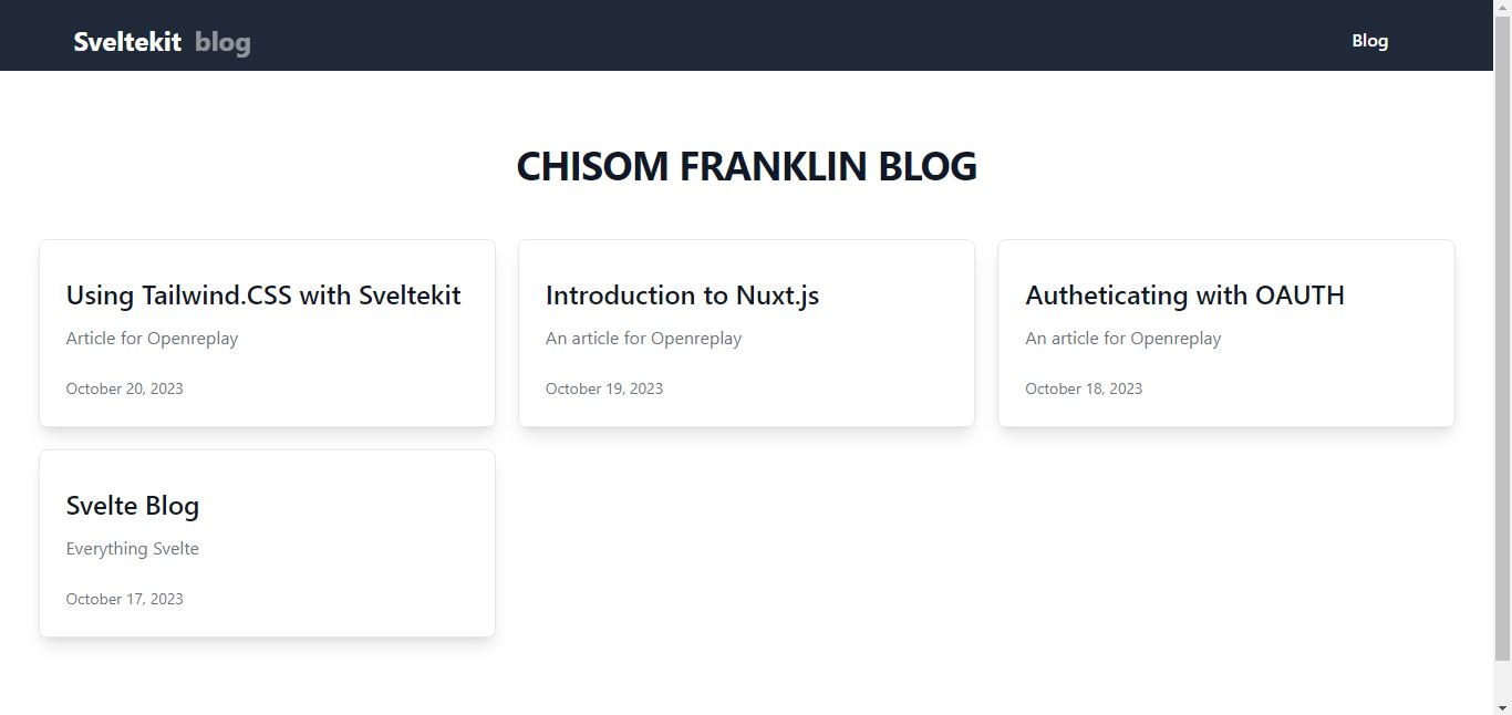
Building a Simple Blog using SvelteKit and Tailwind
Now, let’s use our newly created CSS library to build a simple blog. We’re going to edit the existing HTML in our App.svelte and follow this guide to create a blog like the one pictured here:
For simplicity, we will not be displaying all the codes. For more reference on full code, check out this repository.
First, we create components for our blog in the component folder. For example, you can create components for the header, blog post list, individual blog posts, and footer.
<Navbar />

<div class="relative bg-white px-4 pt-16 pb-20 sm:px-6 lg:px-8 lg:pb-28">
  <div class="relative mx-auto max-w-7xl">
    <div class="text-center">
      <h1 class="text-3xl font-bold tracking-tight text-gray-900 sm:text-4xl">
        CHISOM FRANKLIN BLOG
      </h1>
    </div>
    <div class="mx-auto mt-12 grid max-w-lg gap-5 lg:max-w-none lg:grid-cols-3">
      {#each featuredPosts as { url, title, description, author, date }}
      <PostCard {url} {title} {description} {author} {date} />
      {/each}
    </div>

    <!-- Lists -->
    <ul class="divide-y divide-gray-200">
      {#each posts as { url, title, description, author, date }}
      <PostListItem {url} {title} {description} {author} {date} />
      {/each}
    </ul>
  </div>
</div>
This portion of the code defines the structure of the blog’s landing page, including the navigation bar, a title, a grid layout for featured posts, and a list of regular posts with separators between them.
<Navbar /> is a custom component named “Navbar” that represents the navigation bar of the blog. It is included at the top of the page, indicating that it will be displayed at the top of the page.
The <div> element in <div class="relative bg-white px-4 pt-16 pb-20 sm:px-6 lg:px-8 lg:pb-28"> has several CSS classes applied to it, which define its appearance. It has a white background and padding at the top and bottom. The padding values change based on the screen size (small, large, etc.), providing a responsive design.
The <div> in <div class="relative mx-auto max-w-7xl"> is centered on the page (mx-auto) and has a maximum width of 7xl units, which is a common way to set a maximum content width for responsive web design.
<div class="text-center"> is centered horizontally.
{#each featuredPosts as { url, title, description, author, date }} is a #each block that iterates over the featuredPosts array, and for each item, it binds properties (URL, title, description, author, date) to the PostCard component.
{#each posts as { url, title, description, author, date }} is another #each block that iterates over the posts array, and for each item, it binds properties (URL, title, description, author, date) to the PostListItem component.
Conclusion
In conclusion, this process is a technical approach to configuring Tailwind CSS and importing it into a SvelteKit project. Using the two to build a basic blog is an excellent approach to understanding and using these tools. When creating interactive online apps, SvelteKit offers a component-based approach, whereas Tailwind CSS streamlines styling with utility-first CSS classes. You may set up your blog’s fundamental framework by following the instructions provided in this article, and you can progressively add more features and content.
Remember that this is just the beginning and that there are numerous ways to improve your blog, such as adding routing, integrating with a backend for dynamic content, and performance-enhancing it. To construct a one-of-a-kind and useful blog that meets your demands, keep investigating and experimenting with these tools.
Gain Debugging Superpowers
Unleash the power of session replay to reproduce bugs, track slowdowns and uncover frustrations in your app. Get complete visibility into your frontend with OpenReplay — the most advanced open-source session replay tool for developers.
Star on GitHub12k