Best SVG Icon Libraries for Modern Web Apps

Picking the wrong SVG icon library mid-project is painful. You commit to a style, build components around it, then discover the library is unmaintained, missing icons you need, or ships a bundle that ignores tree-shaking. This guide cuts through the noise and covers the most practical, actively maintained SVG icon libraries worth using in modern frontend projects.
Key Takeaways
- A good SVG icon library should support tree-shaking, offer framework-specific packages, maintain stylistic consistency, and carry a permissive license.
- Lucide, Heroicons, Phosphor, Tabler, Iconoir, and Material Symbols are the six most reliable options for modern web apps.
- Your choice depends on style preference, icon coverage needs, and ecosystem fit — not quality, as all six are production-ready.
- Phosphor stands out for stylistic range with six weights, while Tabler leads in sheer icon count at 5,000+.
What Makes a Modern SVG Icon Library Worth Using?
Before comparing libraries, here are the factors that actually matter in a real project:
- Tree-shaking support — only the icons you import should end up in your bundle
- Framework packages — first-class React, Vue, or Svelte components, not just raw SVG files
- Stylistic consistency — uniform stroke weight, grid, and optical sizing across the full set
- License — MIT or Apache 2.0 for commercial use without friction
- Active maintenance — regular releases, open issues being addressed, community contributions
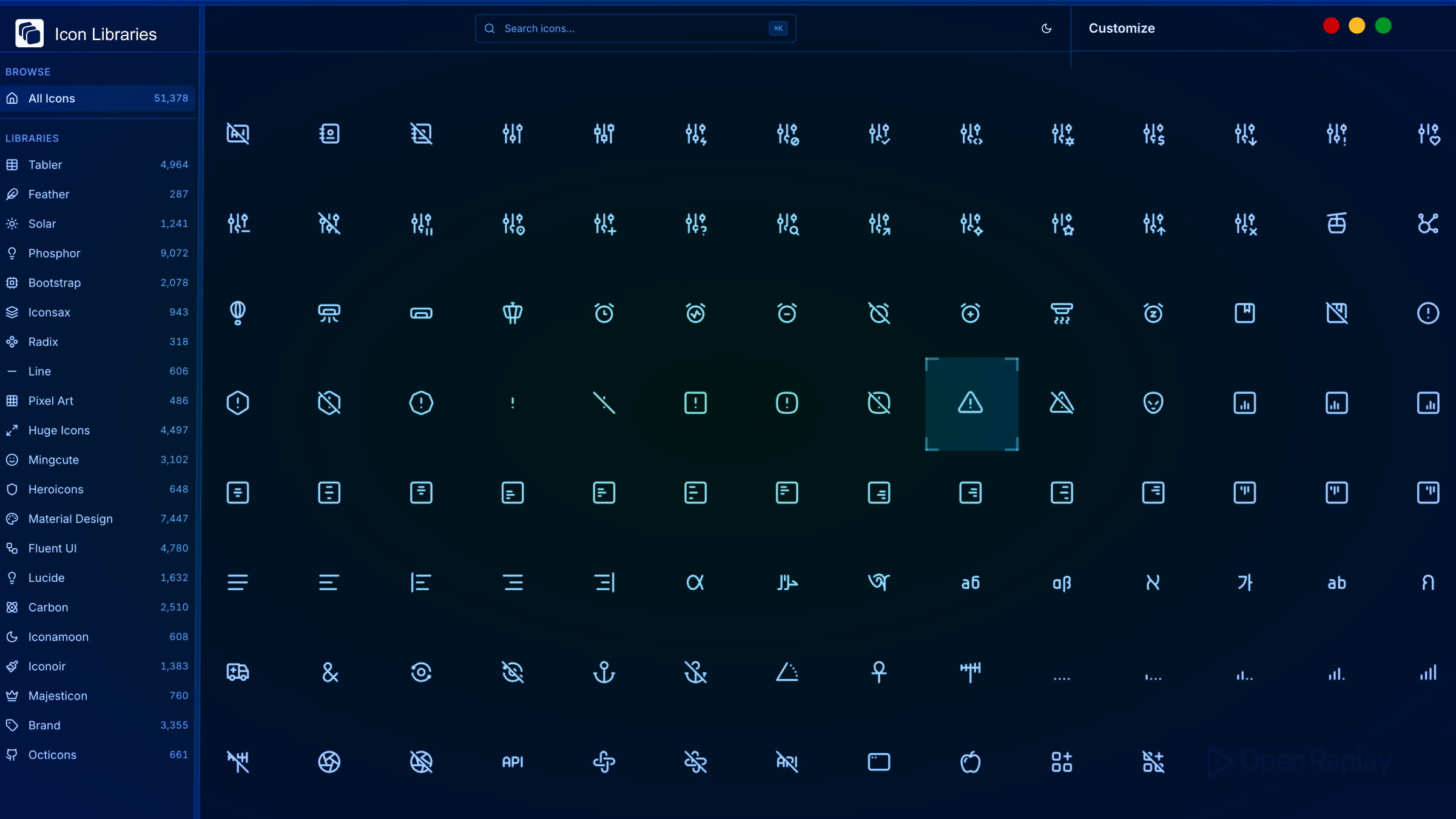
The SVG Icon Libraries Worth Knowing
Lucide
Lucide is the actively maintained fork of Feather Icons and the right choice if you liked Feather’s aesthetic. Feather itself has seen minimal updates in recent years. Lucide has taken over that space with a growing contributor community, 1,700+ icons, and official packages for React, Vue, Svelte, and more.
Each icon is built on a 24×24 grid with a consistent 2px stroke. Imports are fully tree-shakable. If you want a clean, lightweight UI icon set that integrates cleanly with any modern framework, Lucide is the default recommendation.
Heroicons
Made by the Tailwind CSS team, Heroicons ships outline and solid styles at 24px, plus mini and micro variants at 20px and 16px. The set is smaller (~300 icons per style), but every icon is carefully considered for UI use cases.
It has official React and Vue packages, an MIT license, and integrates naturally into Tailwind-based projects. If you’re building with Tailwind CSS, Heroicons is the obvious pairing.
Phosphor Icons
Phosphor Icons is the library to reach for when you need stylistic range. It offers 1,300+ base icons across six weights — thin, light, regular, bold, fill, and duotone — giving you flexibility without mixing libraries.
Packages exist for React, Vue, Svelte, and vanilla JS. All are tree-shakable and MIT licensed. Phosphor is particularly well-suited for SaaS products and dashboards where you need both UI icons and expressive illustrative icons in the same consistent family.

Discover how at OpenReplay.com.
Tabler Icons
Tabler Icons has grown into one of the largest open-source SVG icon libraries, with 5,000+ icons on a consistent 24×24 grid at a 2px stroke. It covers an unusually wide range of categories, making it useful when other libraries run short.
React, Vue, and Svelte packages are available. MIT licensed with no attribution required.
Iconoir
Iconoir offers 1,600+ clean line icons with a slightly more distinctive style than Lucide or Heroicons. It has packages for React, React Native, Vue, Svelte, and Flutter, plus Figma and Framer integration. MIT licensed and actively maintained.
Material Symbols
Material Symbols is Google’s current icon system, distinct from the older Material Icons set. It uses variable font technology, letting you adjust weight, fill, optical size, and grade through font-variation-settings. With 3,000+ icons and deep integration with Angular Material and other Google tooling, it’s the natural fit for apps built on the Material Design system. Apache 2.0 licensed.
Quick Comparison
| Library | Icons | Styles | License | Best For |
|---|---|---|---|---|
| Lucide | 1,700+ | Stroke | ISC | General UI, Feather replacement |
| Heroicons | ~300/style | 4 styles | MIT | Tailwind CSS projects |
| Phosphor | 1,300+/style | 6 weights | MIT | SaaS, dashboards |
| Tabler | 5,000+ | Stroke | MIT | Wide coverage needs |
| Iconoir | 1,600+ | Stroke | MIT | Distinctive line style |
| Material Symbols | 3,000+ | Variable | Apache 2.0 | Material Design ecosystem |
How to Choose
- Building with Tailwind? Use Heroicons.
- Need stylistic flexibility in one library? Use Phosphor Icons.
- Want maximum icon coverage? Use Tabler Icons.
- Replacing Feather or want a solid general-purpose set? Use Lucide.
- Working within Material Design? Use Material Symbols.
Conclusion
Most modern SVG icon libraries support tree-shaking and ship framework-specific packages, while remaining free for commercial use. The differences come down to style, scope, and ecosystem fit — not quality. Start with the library that matches your design system and framework, and you won’t need to swap mid-project.
FAQs
You can, but it is not ideal. Each library has its own stroke weight, grid size, and visual style. Mixing them often creates subtle inconsistencies that make a UI feel unpolished. If one library falls short on a specific icon, pick the closest match and adjust its stroke or size to blend in with the rest of your set.
Yes. Lucide, Heroicons, Phosphor, Tabler, and Iconoir all provide React component packages that work with Next.js out of the box, including server components. Material Symbols may require extra configuration if you use its variable font approach, since font loading behaves differently during SSR.
Import icons individually rather than pulling in the entire library. All SVG-based libraries listed here support tree-shaking when icons are imported individually, so bundlers like Webpack and Vite will automatically exclude unused icons. Avoid wildcard or barrel imports, and verify your final bundle with a tool like Bundlephobia or source-map-explorer.
Most provide basic accessibility support, such as setting aria-hidden to true on decorative icons. However, you should still add meaningful aria-label or title attributes when an icon conveys information without accompanying text. Always test with a screen reader to confirm that interactive icon buttons are properly announced.
Truly understand users experience
See every user interaction, feel every frustration and track all hesitations with OpenReplay — the open-source digital experience platform. It can be self-hosted in minutes, giving you complete control over your customer data. . Check our GitHub repo and join the thousands of developers in our community..