10 Svelte Component Libraries
Ten excellent component libraries to simplify your Svelte development work


Svelte is a popular JavaScript framework for building user interfaces, known for its small size, efficient performance, and easy-to-learn syntax. Like other frontend frameworks, it also has UI library components to improve the developer’s experience, and this article will look at ten libraries that can help you build beautiful, responsive, and dynamic user interfaces.
Attractions
Attractions is a UI library specifically designed for the Svelte framework, meaning it can be used to create beautiful, responsive, and interactive websites with minimal effort. It is a lightweight library that weighs only 210.2 KB (47.7 KB gzipped) and is tree-shaking enabled, making it a great choice for developers who want to create fast and efficient web applications.
Attractions is designed to be easy to use and customize. The library is built with Svelte, a popular JavaScript framework for building web applications. One of the key features of Attractions is its set of pre-designed components that can be easily customized using classes and Sass variables. This means developers can quickly build beautiful and unique interfaces without spending much time designing and coding individual elements. The library includes buttons, forms, navigation, and a grid system for layout. It is open-source and available on GitHub with 800 stars.
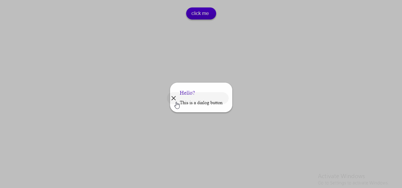
Here’s a basic example of creating a modal with its component
<script>
  import { Modal, Button, Dialog } from "attractions";

  let modalOpen = false;
  let happy = false;
</script>

<div class="button-container">
  <Button style="width: 100px" filled on:click={() => (modalOpen = true)}
    >click me</Button
  >
</div>

<Modal bind:open={modalOpen} let:closeCallback>
  <Dialog title="Hello?" {closeCallback}>This is a dialog button</Dialog>
</Modal>

<style>
  .button-container {
    display: flex;
    justify-content: center;
    margin-bottom: 20px;
  }
</style>
Its result:
Agnostic UI
Agnostic UI is a versatile and flexible UI library providing open-source UI component primitives. The library is designed to be framework-agnostic, meaning that it can be used with any framework, including Svelte, React, Vue 3, Astro, Angular, and vanilla JavaScript and HTML.
One of the key features of Agnostic UI is its “1 stylesheet…many frameworks” approach to the build process. This approach ensures that framework-specific implementations use the same stylesheet, allowing developers to make theme customizations once and use these CSS custom property overrides across their Svelte, React, Vue, and Angular-based applications. This approach also means that applications built using Agnostic UI will have a consistent look and feel, no matter which framework they are built on.
Agnostic UI provides a wide range of components, including buttons, forms, icons, and more, designed for web applications. The library also emphasizes using semantic and accessible HTML, unprocessed CSS, and code on the platform and towards upcoming web standards. This means that applications built with Agnostic UI will look great and be functional and accessible to a wide range of users. It boasts over 500 stars on GitHub
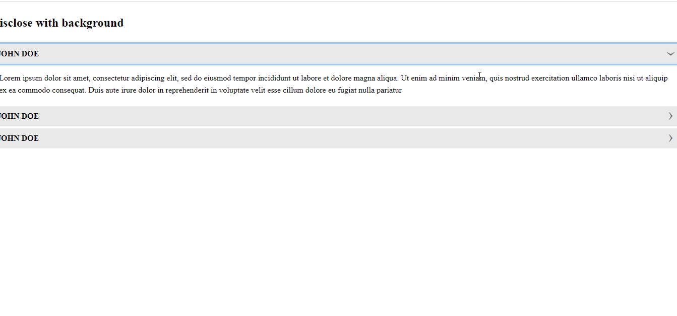
Here’s an example of how to use its disclose component:
<script>
  import 'agnostic-svelte/css/common.min.css';
  import { Disclose } from "agnostic-svelte";
</script>

<section class="mbs24">
  <h2 class="mbe24">Disclose with background</h2>
  <Disclose isBackground title="JOHN DOE">
    Lorem ipsum dolor sit amet, consectetur adipiscing elit, sed do eiusmod tempor incididunt ut labore
   et dolore magna aliqua. Ut enim ad minim veniam, quis nostrud exercitation ullamco laboris nisi ut aliquip
    ex ea commodo consequat. Duis aute irure dolor in reprehenderit in voluptate velit esse cillum dolore eu fugiat
    nulla pariatur
  </Disclose>
  <Disclose isBackground title="JOHN DOE">
   Lorem ipsum dolor sit amet, consectetur adipiscing elit, sed do eiusmod tempor incididunt ut labore
   et dolore magna aliqua. Ut enim ad minim veniam, quis nostrud exercitation ullamco laboris nisi ut aliquip
    ex ea commodo consequat. Duis aute irure dolor in reprehenderit in voluptate velit esse cillum dolore eu fugiat
    nulla
    </Disclose>
</section>
Its result:
Carbon components svelte
Carbon Components for Svelte is a robust and comprehensive UI component library based on IBM’s Carbon Design System, an open-source design system for products and experiences. This library provides various UI components, including buttons, forms, cards, and more, designed for use in web applications developed with the Svelte framework.
One of the key benefits of using Carbon Components for Svelte is that it facilitates design and development through reuse, consistency, and extensibility. This means developers can easily add visually appealing and consistent components to their Svelte projects without building them from scratch, reducing development time and effort.
Carbon Components for Svelte is also open-source, making it available for anyone to use and contribute. Its popularity is reflected with over 2k stars on GitHub, indicating its widespread usage and adoption in the developer community.
The library comes with a vast collection of resources, including over 7000 icons, 700+ pictograms, and more than 20 charts powered by the d3 library. This provides developers with a plethora of options to choose from when designing and developing their web applications.
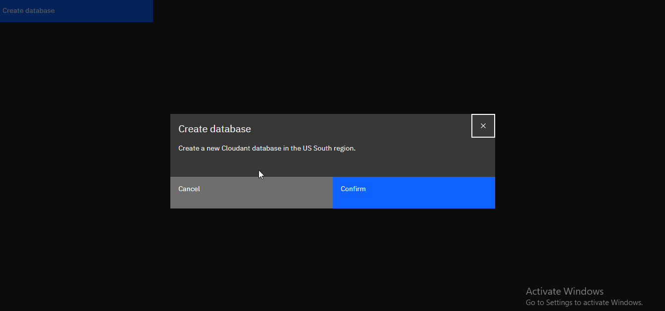
Here’s an example of how to use its modal component:
<script>
  import "carbon-components-svelte/css/g90.css";
  import { Button, Modal } from "carbon-components-svelte";
  let open = false;
</script>

<Button on:click={() => (open = true)}>Create database</Button>

<Modal
  bind:open
  modalHeading="Create database"
  primaryButtonText="Confirm"
  secondaryButtonText="Cancel"
  on:click:button--secondary={() => (open = false)}
  on:open
  on:close
  on:submit
>
  <p>Create a new Cloudant database in the US South region.</p>
</Modal>
Its result:
Daisy UI
Daisy UI is a free and open-source component library for all frameworks that provides a set of UI components that can help developers build responsive and accessible web applications quickly and easily. The library is built on top of Tailwind CSS and follows a similar approach of using utility classes to style components. However, Daisy UI takes it further by providing ready-to-use classes for common UI components, such as buttons, cards, inputs, modals, and more.
One of the main advantages of using Daisy UI is that it speeds up the development process and makes it easier to maintain consistency across different components and pages. Developers can simply add the appropriate class to an HTML element to achieve the desired styling without having to write custom CSS. This saves time and makes the HTML code cleaner and more readable.
Another benefit of Daisy UI is its customizable and themeable nature. The library has a built-in theme that can be easily customized to match the design guidelines of your project. Additionally, it provides a set of utility functions that can be used to extend the theme or create new ones.
Since Daisy UI is a pure CSS library, it can be used with any framework, including Svelte, React, Vue, Angular, and others. It has gained much popularity among developers, with over 19k stars on github.
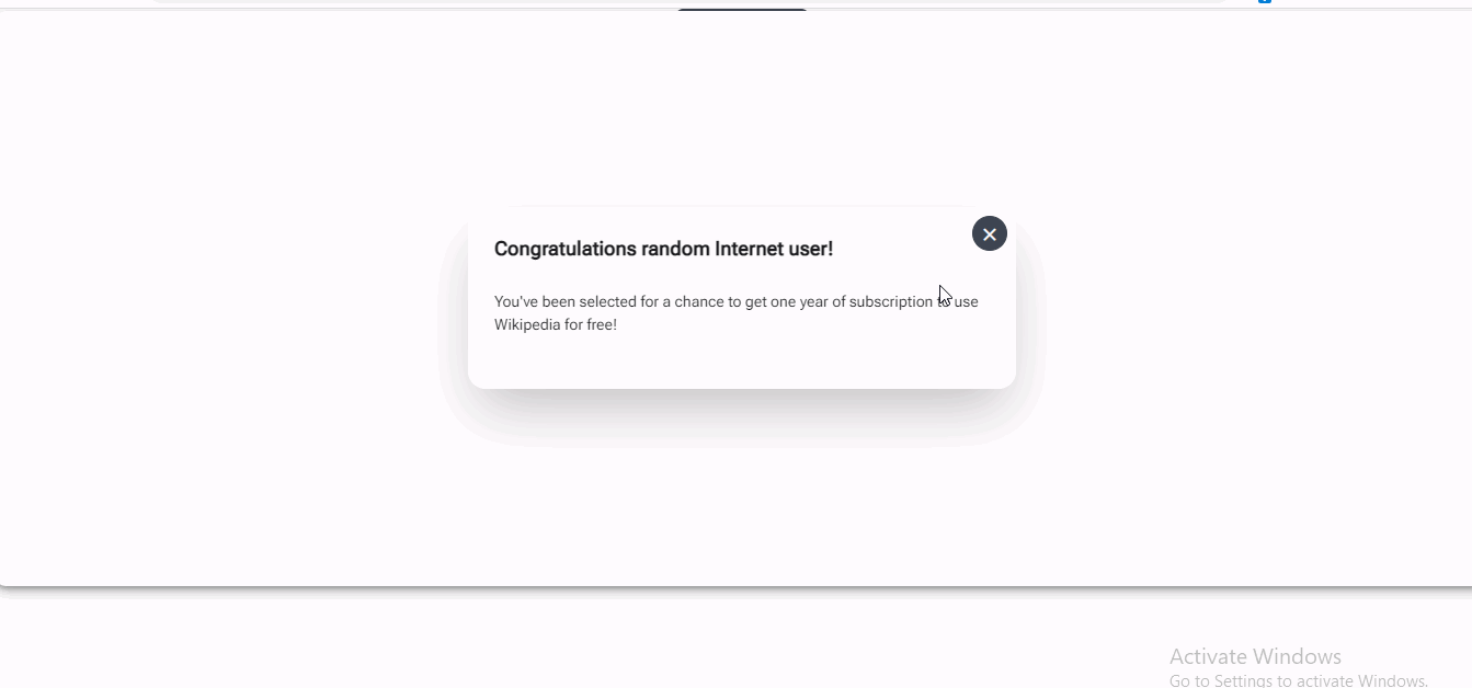
Here’s an example of how to create a modal in Svelte using Daisy UI:
<script>
  //
</script>
<!-- The button to open modal -->
<label for="my-modal-3" class="btn center">open modal</label>

<!-- Put this part before </body> tag -->
<input type="checkbox" id="my-modal-3" class="modal-toggle" />
<div class="modal">
  <div class="modal-box relative">
    <label for="my-modal-3" class="btn btn-sm btn-circle absolute right-2 top-2">✕</label>
    <h3 class="text-lg font-bold">Congratulations random Internet user!</h3>
    <p class="py-4">
      You've been selected for a chance to get one year of subscription to use
      Wikipedia for free!
    </p>
  </div>
</div>
<!-- Add Tailwind CSS styling -->
<style>
  .center {
    @apply w-48 block mx-auto my-96 text-center;
  }
  .modal {
    @apply fixed inset-0 bg-black bg-opacity-50 z-50 flex items-center justify-center;
  }
  .modal-box {
    @apply bg-white rounded p-6;
    max-width: 500px;
  }
  .btn-sm {
    @apply py-2 px-4 text-sm;
  }
  .btn-circle {
    @apply rounded-full;
    width: 32px;
    height: 32px;
    line-height: 32px;
    text-align: center;
    cursor: pointer;
  }
</style>
Its result:
Flowbite-Svelte
Flowbite-Svelte is a UI toolkit or component library built using the Svelte framework and Tailwind CSS. This library provides a wide range of interactive and responsive UI components that can be easily integrated into Svelte projects. It is an excellent tool for web developers who want to speed up their development process.
With Flowbite-Svelte, developers can use the Svelte framework’s efficient and optimized code generation and Tailwind CSS’s utility classes to create modern and professional-looking interfaces. Flowbite-Svelte offers over 100 components, including dark mode, buttons, modals, cards, navbar, accordions, alerts, tabs, and more.
One of the significant benefits of using Flowbite-Svelte is that it handles all interactivity through the Svelte framework, making it easy for developers to create dynamic and responsive user interfaces. The library’s components are also highly customizable, allowing developers to adjust them to fit their project’s design and branding guidelines.
In summary, Flowbite-Svelte is a useful and efficient tool for web developers who want to build responsive and interactive user interfaces quickly and easily. It is an official Flowbite component library for Svelte and is built on top of the Svelte framework and Tailwind CSS. With its wide range of components and customization options, Flowbite-Svelte can help developers create professional-looking interfaces without spending a lot of time on design and development. It also boasts over 700 stars on Github.
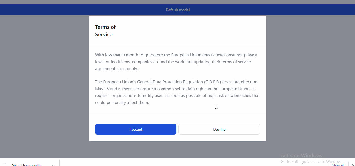
An example of how to use flowbite-svelte is a modal:
<script>
  import { Button, Modal } from 'flowbite-svelte'
  let defaultModal = false;
</script>

<Button on:click={() => defaultModal = true}>Default modal</Button>
<Modal title="Terms of Service" bind:open={defaultModal} autoclose>
  <p class="text-base leading-relaxed text-gray-500 dark:text-gray-400">
    With less than a month to go before the European Union enacts new consumer privacy laws for its citizens, companies worldwide are updating their terms of service agreements to comply.
  </p>
  <p class="text-base leading-relaxed text-gray-500 dark:text-gray-400">
    The European Union’s General Data Protection Regulation (GDPR) goes into effect on May 25 and is meant to ensure a common set of data rights in the European Union. It requires organizations to notify users as soon as possible of high-risk data breaches that could personally affect them.
  </p>
  <svelte:fragment slot='footer'>
    <Button on:click={() => alert('Handle "success"')}>I accept</Button>
    <Button color="alternative">Decline</Button>
  </svelte:fragment>
</Modal>
Its result:
Pico CSS
Pico CSS is a lightweight CSS framework designed to help developers quickly create responsive and mobile-first websites. Unlike larger CSS frameworks, Pico CSS is focused on providing only the most essential features, allowing for faster load times and a more streamlined development process.
One of the main features of Pico CSS is its focus on mobile-first design. This means the framework is optimized for smaller screens and devices, ensuring that websites built with Pico CSS are easily accessible and usable on mobile devices.
Another feature of Pico CSS is its minimalist design. The framework provides only a small set of CSS classes, making it easy to learn and use. This simplicity also means that Pico CSS can be easily customized and extended to fit the specific needs of a project.
Pico CSS also includes several helpful features, such as a grid system for layout, a collection of basic styles for typography and forms, and support for responsive images and videos.
When used in conjunction with a frontend framework like Svelte, Pico CSS can help to speed up development and improve the overall user experience of a website. By providing a lightweight and mobile-first design, Pico CSS and Svelte can work together to create fast and responsive websites that are easy to use on any device. It boasts of over 8k stars on GitHub
An example of building a modal with pico.css:
<script>
  import "@picocss/pico";
</script>

<dialog open>
  <article>
    <h3>Confirm your action!</h3>
    <p>
      Mauris non nibh vel nisi sollicitudin malesuada. Donec ut sagittis erat.
      Praesent eu eros felis. Ut consectetur placerat pulvinar.
    </p>
    <footer>
      <a href="#cancel" role="button" class="secondary">Cancel</a>
      <a href="#confirm" role="button">Confirm</a>
    </footer>
  </article>
</dialog>
Its result:

Session Replay for Developers
Uncover frustrations, understand bugs and fix slowdowns like never before with OpenReplay — an open-source session replay tool for developers. Self-host it in minutes, and have complete control over your customer data. Check our GitHub repo and join the thousands of developers in our community.
Svelte UI
SvelteUI is a comprehensive library of more than 50 customizable UI components, actions, transitions, and utilities for Svelte, a popular JavaScript framework for building web applications. SvelteUI is designed to simplify development and speed up the process by handling complex and tedious tasks for developers.
SvelteUI is built with TypeScript and supports it by default, meaning that all components and functions export types are documented, and offer developers autocomplete features. The library also includes actions, transitions, and utilities, all designed to make development fun and easy.
One of the strengths of SvelteUI is its accessibility. All components are accessible according to WAI-ARIA standards, and there is no annoying focus ring; it only appears when the user navigates with the keyboard.
SvelteUI is highly customizable and features a built-in dark theme and a customizable theming API. The library also works out of the box, without any configuration required, and can be customized as needed as the application grows. It is highly compatible with SvelteKit and SSR and uses minimal to no third-party dependencies, making it highly efficient and easy to use. Svelte UI boasts over 700 stars on github
Here’s an example of creating a modal:
<script>
  import { Modal, Group, Button } from "@svelteuidev/core";

  let opened = false;
  function closeModal() {
    opened = false;
  }
</script>

<Modal
  {opened}
  on:close={closeModal}
  title="Introduce yourself!"
  target={"#my-modal-container"}
>
  <!-- Modal Content -->
</Modal>

<Group position="center">
  <Button on:click={() => (opened = true)}>Open Modal</Button>
</Group>

<div id="my-modal-container" />
Its result:

Svelte Headless UI
Svelte Headless UI is a Headless UI component library specifically built for Svelte. These unstyled components are fully accessible, extensively tested, and typed with TypeScript. With over 1k stars on GitHub, Svelte Headless UI offers a collection of high-quality components that can serve as the foundation for your design system.
One of the key features of Svelte Headless UI is that it handles accessibility, keyboard and mouse interactions, focus management, and other complex tasks that you would normally need to worry about when building your components. This lets you focus on building your application while ensuring the components are accessible and user-friendly.
The library includes components such as buttons, forms, and modals, which are completely unstyled. You can easily add your own CSS to style the components to your liking, and the library will handle the rest. Additionally, Svelte Headless UI is compatible with SvelteKit and can be used with Tailwind CSS as a styling system, although it is not a requirement.
It is important to note that while Svelte Headless UI is a direct port of the original Headless UI library by Tailwind Labs, it is not affiliated with Tailwind Labs and is maintained by the community. Nevertheless, it was originally built to support the paid component library called Tailwind UI and can be used with it. Svelte Headless UI boasts of 1k stars on GitHub
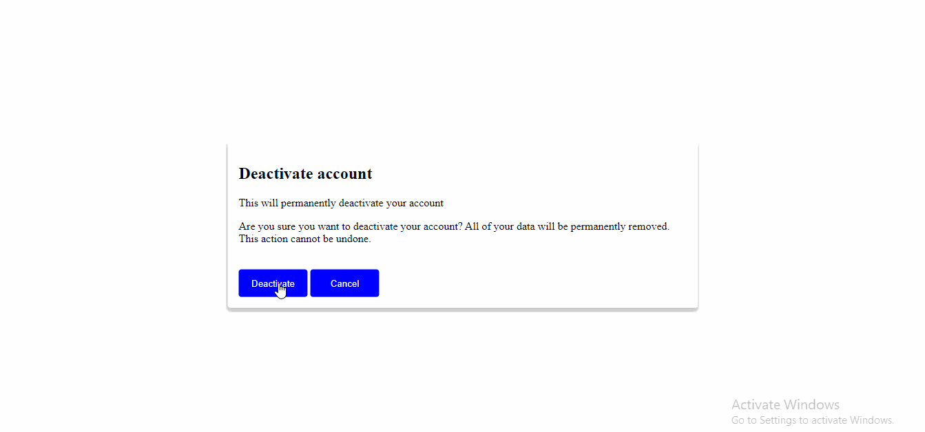
An example of using Headless UI is a dialog button:
<script>
  import {
    Dialog,
    DialogOverlay,
    DialogTitle,
    DialogDescription,
  } from "@rgossiaux/svelte-headlessui";

  let isOpen = false;

  function openDialog() {
    isOpen = true;
  }

  function closeDialog() {
    isOpen = false;
  }
</script>

<div class="dialog-container">
  <button on:click={openDialog} class={isOpen ? "hidden" : "centered"}
    >Open Dialog</button
  >

  <!-- Pass `isOpen` to the `open` prop and use the `on:close` handler to set it back to false when the user clicks outside of the dialog or presses the escape key. -->
  <Dialog open={isOpen} on:close={closeDialog}>
    <DialogOverlay class="overlay" />

    <div class="dialog">
      <DialogTitle>Deactivate account</DialogTitle>
      <DialogDescription>
        This will permanently deactivate your account
      </DialogDescription>

      <p>
        Are you sure you want to deactivate your account? All of your data will
        be permanently removed. This action cannot be undone.
      </p>

      <!-- You can render additional buttons to dismiss your dialog by setting `isOpen` to `false`. -->
      <button on:click={closeDialog}>Deactivate</button>
      <button on:click={closeDialog}>Cancel</button>
    </div>
  </Dialog>
</div>

<style>
  .dialog-container {
    position: relative;
    display: flex;
    justify-content: center;
    align-items: center;
    height: 100vh;
  }

  button {
    width: 100px;
    background-color: blue;
    color: white;
    padding: 8px;
    border-radius: 4px;
    border: none;
    cursor: pointer;
    z-index: 1;
  }

  .centered {
    position: absolute;
    top: 50%;
    left: 50%;
    transform: translate(-50%, -50%);
  }

  .hidden {
    display: none;
  }

  .overlay {
    background-color: rgba(0, 0, 0, 0.5);
    position: fixed;
    top: 0;
    left: 0;
    right: 0;
    bottom: 0;
    z-index: 2;
  }

  .dialog {
    position: absolute;
    top: 50%;
    left: 50%;
    transform: translate(-50%, -50%);
    padding: 1rem;
    background-color: #fff;
    border-radius: 4px;
    box-shadow: 0 4px 6px rgba(0, 0, 0, 0.3);
    z-index: 3;
  }
</style>
Its result:
Svelte Atoms
Svelte Atoms is a UI library for Svelte that offers a variety of pre-made, customizable UI components and utility classes designed to help streamline the process of building user interfaces. Based on the Atol design system, this library provides a minimal and fast way to style applications without requiring a lot of custom CSS.
One of the key advantages of Svelte Atoms is its ease of integration with Svelte projects. The library is designed to work seamlessly with the Svelte framework, providing a quick and convenient way to add style and functionality to a Svelte app. Additionally, all components support a class prop, allowing developers to easily customize and extend the styles of the provided components.
Svelte Atoms is actively under development, with the library’s maintainers encouraging users to report any bugs or issues they may encounter. This commitment to ongoing development and improvement ensures that Svelte Atoms will continue to meet the evolving needs of developers and users alike.
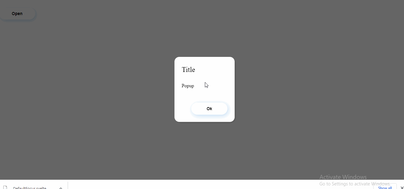
An example on using the Svelte atom popup component:
 <script>
  import Popup from "svelte-atoms/Popup.svelte";
  import Button from "svelte-atoms/Button.svelte";
  let isOpen = false;
  const close = () => (isOpen = false);
  const open = () => (isOpen = true);
</script>

<div class="open-button">
  <Button on:click={open}>Open</Button>
</div>

<Popup {isOpen} on:close={close} header="Title">
  Popup
  <div slot="footer">
    <div class="close-button">
      <Button on:click={close}>Ok</Button>
    </div>
  </div>
</Popup>

<style>
  .open-button {
    width: 100px;
  }
</style>
Its result:
SvelteStrap
SvelteStrap is a UI library for Svelte that provides a set of pre-built, reusable components for building user interfaces. This library is designed to help developers save time and effort by using pre-built components to create complex UI elements without writing a lot of custom code.
SvelteStrap is built on top of Bootstrap-based styling and layout, which makes it easy to build responsive and visually appealing user interfaces. With over 1k stars on GitHub, Svelte Strap is a popular choice for Svelte developers.
One of the biggest advantages of using Svelte Strap is that it frees developers from the necessity of directly applying Bootstrap component classes or including Bootstrap’s JS code. Instead, developers can use Sveltestrap components, which require less markup and do not cause any difficulties in terms of usage.
SvelteStrap is also lightweight and optimized for performance, making it an ideal choice for building fast and responsive applications. However, it should be noted that Svelte Strap does not include any Bootstrap styles, so developers will need to add a link to the Bootstrap 4 stylesheet to their projects. It boasts of over 1k stars on Github
Example of how to use the SvelteStrap Modal component:
<script>
  import {
    Button,
    Modal,
    ModalBody,
    ModalFooter,
    ModalHeader
  } from 'sveltestrap';
  import { Styles } from 'sveltestrap';
  let open = false;
  const toggle = () => (open = !open);
</script>

<div>
  <Button color="danger" on:click={toggle}>Open Modal</Button>
  <Modal isOpen={open} {toggle}>
    <ModalHeader {toggle}>Modal title</ModalHeader>
    <ModalBody>
      Lorem ipsum dolor sit amet, consectetur adipisicing elit, sed do eiusmod
      tempor incididunt ut labore et dolore magna aliqua.
    </ModalBody>
    <ModalFooter>
      <Button color="primary" on:click={toggle}>Do Something</Button>
      <Button color="secondary" on:click={toggle}>Cancel</Button>
    </ModalFooter>
  </Modal>
</div>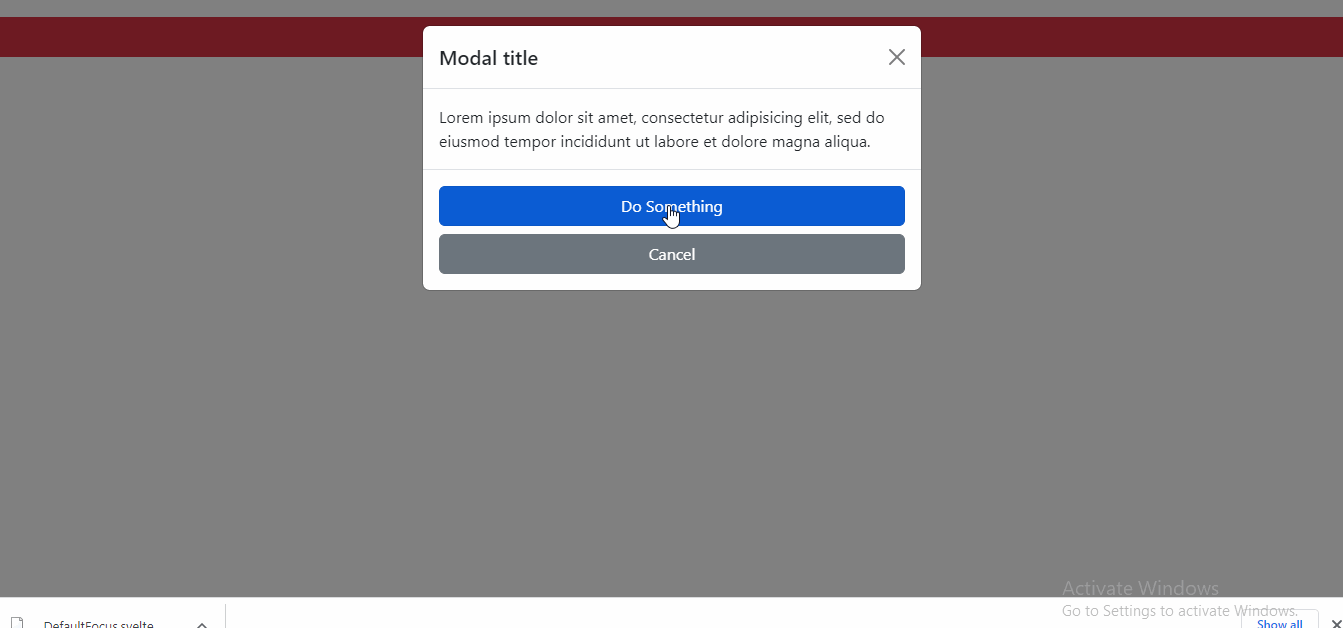
Conclusion
These are just a few examples of the many Svelte UI libraries available. Each library has its own set of features and components, and with the help of these libraries, you can easily create dynamic, responsive, and beautiful interfaces with Svelte. Know any other great UI libraries? Please share in the comments below.
Gain Debugging Superpowers
Unleash the power of session replay to reproduce bugs and track user frustrations. Get complete visibility into your frontend with OpenReplay, the most advanced open-source session replay tool for developers.