
Adding themes to a web application has gained popularity recently. The users are given the option to switch amongst the different themes. The light and dark themes are the most typical ones to encounter. Primer is a React-based open-source design system based on GitHub’s Primer Design System. It offers a variety of components and theming, making it relatively simple to style an application. In this article, we’ll look at it and how to use custom themes in a React application.
Setting up Primer
In this section, we will create a React Application by running the following command in your project terminal:
npx create-react-app react-primer-theme
cd react-primer-theme
We will add the following dependencies using either of the code blocks below:
yarn add @primer/react react react-dom styled-components deepmergeor
npm install @primer/react react react-dom styled-components deepmergeStyle a React app using Primer
In this section, we will style your application using Primer. Because Primer is a design system, it provides rich feature components for easily styling a React application.
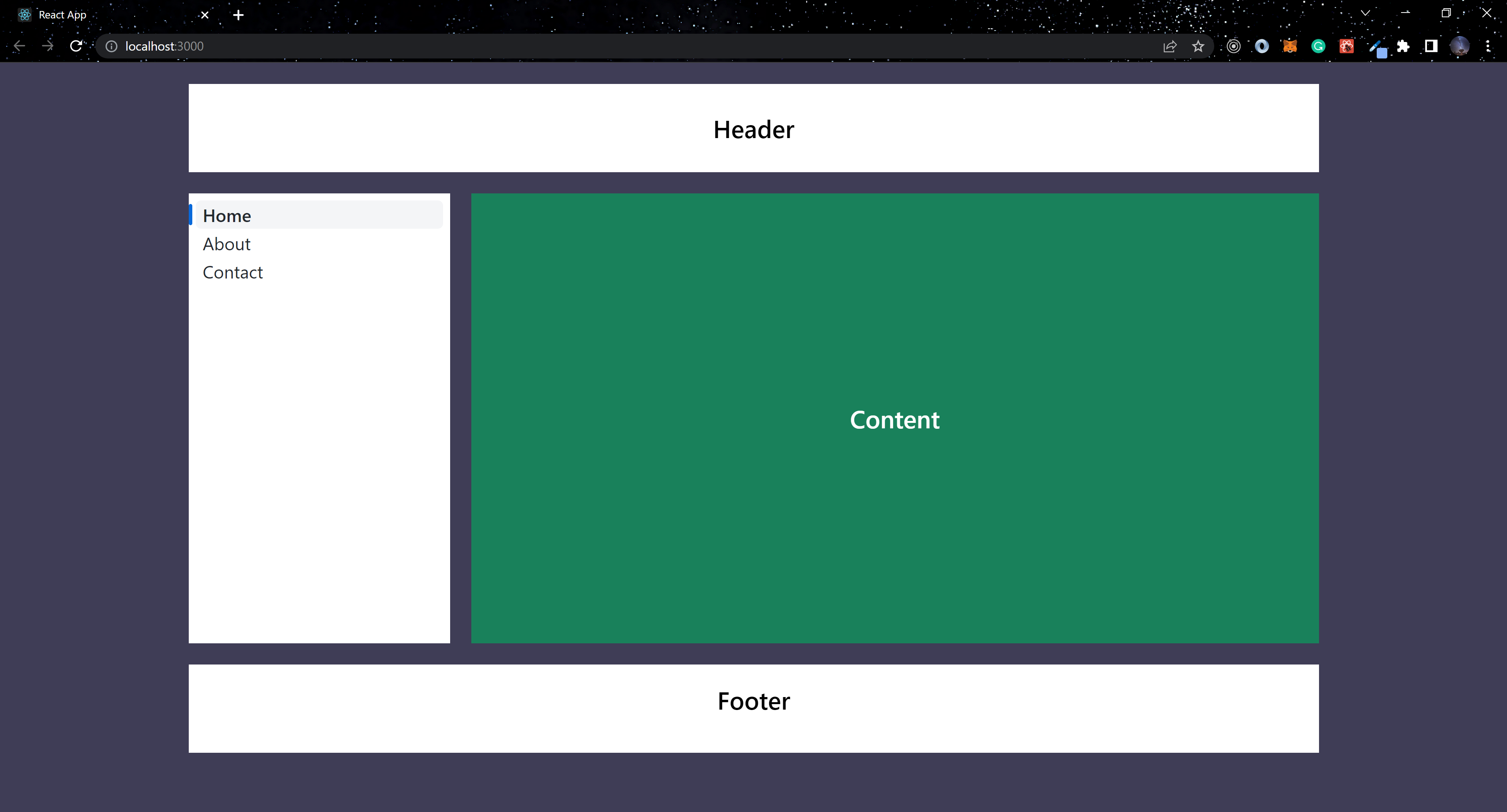
To set up the application’s structure, we will use the BaseStyles and PageLayout components provided by Primer in the code block below. You must wrap your entire application with BaseStyles to establish base Primer styles.
import { Text, NavList, PageLayout, BaseStyles, Box } from "@primer/react";

function App() {
  return (
    <BaseStyles>
      <PageLayout sx={{ backgroundColor: "#3f3d56", height: "100vh" }}>
        <PageLayout.Header
          sx={{
            backgroundColor: "#fff",
            color: "#000",
            display: "flex",
            justifyContent: "center",
            alignItems: "center",
            height: "100px",
            fontSize: "28px",
            fontWeight: 600,
          }}
        >
          <Text height={64}> Header </Text>
        </PageLayout.Header>
        <PageLayout.Pane
          position="start"
          aria-label="Secondary navigation"
          sx={{ backgroundColor: "#fff", color: "#000", fontSize: "20px" }}
        >
          <NavList>
            <NavList.Item
              href="#"
              aria-current="page"
              sx={{ fontSize: "20px" }}
            >
              Home
            </NavList.Item>
            <NavList.Item href="#about" sx={{ fontSize: "20px" }}>
              About
            </NavList.Item>
            <NavList.Item href="#contact" sx={{ fontSize: "20px" }}>
              Contact
            </NavList.Item>
          </NavList>
        </PageLayout.Pane>
        <PageLayout.Content
          sx={{
            backgroundColor: "#fff",
            color: "#000",
            height: "60vh",
            fontSize: "28px",
            fontWeight: 600,
          }}
        >
          <Box
            bg="bg.primary"
            color="#fff"
            display="flex"
            justifyContent="center"
            alignItems="center"
            height="100%"
          >
            <Text> Content </Text>
          </Box>
        </PageLayout.Content>
        <PageLayout.Footer
          sx={{
            backgroundColor: "#fff",
            color: "#000",
            display: "flex",
            justifyContent: "center",
            alignItems: "center",
            height: "100px",
            fontSize: "28px",
            fontWeight: 600,
            pb: "20px",
          }}
        >
          <Text height={64}> Footer </Text>
        </PageLayout.Footer>
      </PageLayout>
    </BaseStyles>
  );
}

export default App;
A few components were imported from Primer in the above code block, and if you look closely, you will notice two types of props used to style the components above. Currently, the system prop is only used in two components: Box and Text. Then there’s the sx prop, which can be used in any Primer component.
Adding Primer Themes
Primer makes it simple to set up themes in a React application. Create a file called theme.js and paste the following code into it:
import { theme } from "@primer/react";
import deepmerge from "deepmerge"

const customTheme = deepmerge(theme, {
    colorSchemes: {
      light: {
        colors: {
          text: {
            primary: "#fff",
            secondary: "#000"
          },
          bg: {
            primary: "#19815b",
            secondary: "transparent",
            default: "#fff"
          },
          outline: {
            default: "red"
          }
        },
      },
      dark: {
        colors: {
          text: {
            primary: "#000",
            secondary: "#fff"
          },
          bg: {
            primary: "#fff",
            secondary: "#fff",
            default: "#000"
          },
          outline: {
            default: "gold"
          }
        },
      },
    },
    fontWeight: {
      light: 300,
      normal: 400,
      semibold: 500,
      bold: 600,
    },
    fontSizes: {
      0: "12px",
      1: "14px",
      2: "16px",
      3: "20px",
      4: "24px",
      5: "32px",
      6: "40px",
      7: "48px",
    },
  });

  export {
    customTheme
  }
Using deepmerge, we added theme from @primer/react with an object containing the custom theme values to the above code block. The colorScheme property will handle the colors used when the application is in light or dark mode. We also have fontWeight and fontSizes as theme values.
Session Replay for Developers
Uncover frustrations, understand bugs and fix slowdowns like never before with OpenReplay — an open-source session replay tool for developers. Self-host it in minutes, and have complete control over your customer data. Check our GitHub repo and join the thousands of developers in our community.
Using Themes in Primer
We covered creating a custom theme in the previous section, and we will now apply the theme to the application.
The first step is to wrap your entire application in ThemeProvider from primer in your index.js file. Next, import customTheme from /src/theme.js and assign it to the theme prop on ThemeProvider.
...
import { ThemeProvider } from "@primer/react";
import { customTheme } from "./theme";
...

...
const root = ReactDOM.createRoot(document.getElementById("root"));
root.render(
  <React.StrictMode>
    <ThemeProvider theme={customTheme}>
      <App />
    </ThemeProvider>
  </React.StrictMode>
);
...
After we have completed the above configuration, we can use the theme we created in the application. We created a theme with two modes, with the application supporting both light and dark modes.
import {
...
  useTheme,
  Button
...
} from "@primer/react";

...
function App() {
  const { colorMode, setColorMode } = useTheme();

  return (
    <BaseStyles>
      <PageLayout sx={{ backgroundColor: "bg.primary", height: "100vh" }}>
        <PageLayout.Header
          sx={{
            backgroundColor: "bg.default",
            color: "text.secondary",
            display: "flex",
            justifyContent: "center",
            alignItems: "center",
            height: "100px",
            width: "100%",
            fontSize: 6,
            fontWeight: "bold",
          }}
        >
          <Box display="flex" justifyContent="center" alignItems="center">
            <Text> Header </Text>
            {colorMode === "dark" ? (
              <Button
                sx={{
                  backgroundColor: "transparent",
                  border: "none",
                  ":hover": "none",
                }}
                onClick={() => setColorMode("light")}
              >
                💡
              </Button>
            ) : (
              <Button
                sx={{ backgroundColor: "transparent", border: "none" }}
                onClick={() => setColorMode("dark")}
              >
                🌑
              </Button>
            )}
          </Box>
        </PageLayout.Header>
        <PageLayout.Pane
          position="start"
          aria-label="Secondary navigation"
          sx={{ backgroundColor: "bg.secondary" }}
        >
          <NavList>
            <NavList.Item
              href="#"
              aria-current="page"
              sx={{ color: "text.primary", fontSize: 3 }}
            >
              Home
            </NavList.Item>
            <NavList.Item
              href="#about"
              sx={{ color: "text.primary", fontSize: 3 }}
            >
              About
            </NavList.Item>
            <NavList.Item
              href="#contact"
              sx={{ color: "text.primary", fontSize: 3 }}
            >
              Contact
            </NavList.Item>
          </NavList>
        </PageLayout.Pane>
        <PageLayout.Content
          sx={{
            backgroundColor: "#fff",
            color: "#000",
            height: "60vh",
            fontSize: 6,
            fontWeight: "bold",
          }}
        >
          <Box
            bg="outline.default"
            color="text.primary"
            display="flex"
            justifyContent="center"
            alignItems="center"
            height="100%"
          >
            <Text> Content </Text>
          </Box>
        </PageLayout.Content>
        <PageLayout.Footer
          sx={{
            backgroundColor: "bg.default",
            color: "text.secondary",
            display: "flex",
            justifyContent: "center",
            alignItems: "center",
            height: "100px",
            fontSize: 6,
            fontWeight: "bold",
            pb: "20px",
          }}
        >
          <Text> Footer </Text>
        </PageLayout.Footer>
      </PageLayout>
    </BaseStyles>
  );
}
...
To toggle between the themes we created, we used colorMode and setColorMode from the useTheme hook provided by Primer in the above code block. To achieve this, we must include the values for backgroundColor, color, fontWeight, and fontSize. Exactly as stated in theme.js.
  backgroundColor: "bg.default",
  color: "text.secondary",
  fontSize: 6,
  fontWeight: "bold",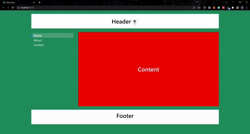
Conclusion
This article demonstrated how to use Primer’s design system and implement a theming feature for a React application. To learn more about Primer, visit the official documentation. Visit the live version and the GitHub repository for the code used in this article.
Gain Debugging Superpowers
Unleash the power of session replay to reproduce bugs and track user frustrations. Get complete visibility into your frontend with OpenReplay, the most advanced open-source session replay tool for developers.