

Creating custom modals in your Vue.js application can improve user interaction and provide a better user experience. This article helps you understand modal creation and customization to enhance your Vue.js app with professionalism and simplicity.

Discover how at OpenReplay.com.
To get the best results while creating custom modals in Vue.js, let’s make sure you have everything you need. Here’s what you’ll require:
- Basic understanding of HTML, CSS, and JavaScript
- Node.js and NPM installed on your device
- Basic understanding of Vue.js
With these basics checked off, you’re all set to create modals in Vue.js!
Creating the Modal Component
Before we dive into the implementation, let’s establish the foundation for our modal. Our modal will be a reusable component that we can easily integrate into our Vue.js application.
Let’s start by creating the basic structure for our modal component. Open a new file named ModalComponent.vue:
<!-- ModalComponent.vue -->
<template>
  <div class="modal">
    <h2>Demo Modal Content</h2>
    <button @click="closeModal">Close</button>
  </div>
</template>

<script>
export default {
  data() {
    return {
      showModal: false,
    };
  },
  methods: {
    closeModal() {
      this.$emit('close');
    },
  },
};
</script>

<style scoped>
/* Add your custom modal styles here */
.modal {
  /* Your styling goes here */
}
</style>
In this example, we’ve created a simple modal component. It includes a <div> element representing the modal with a default title and a close button. The showModal data property manages the visibility of the modal, and the closeModal method emits a close event when the close button is clicked.
The styles for the modal can be customized based on your design preferences.
Styling the Modal
Styling plays an important role in the visual appeal of your modal. While you can use plain CSS for styling, integrating a UI framework like Bootstrap can provide a polished and responsive design without much effort.
Let’s enhance the basic styling of our modal. For that, update the styles in the ModalComponent.vue file:
/* ModalComponent.vue */
<style scoped>
.modal {
  position: fixed;
  top: 50%;
  left: 50%;
  transform: translate(-50%, -50%);
  padding: 20px;
  background-color: #fff;
  box-shadow: 0 0 10px rgba(0, 0, 0, 0.3);
  width: 400px;
  max-width: 80%;
  border-radius: 8px;
  box-sizing: border-box;
  text-align: center;
  z-index: 2;
}
</style>
Using Bootstrap:
If you prefer using Bootstrap, make sure it’s installed in your project:
npm install bootstrapNow, import Bootstrap’s CSS in your main.js file:
// main.js
import 'bootstrap/dist/css/bootstrap.min.css';
You can then leverage Bootstrap classes for your modal:
<!-- ModalComponent.vue -->
<template>
  <div class="modal fade" :class="{ 'show': showModal }" tabindex="-1" role="dialog">
    <div class="modal-dialog" role="document">
      <div class="modal-content">
        <!-- Modal content goes here -->
      </div>
    </div>
  </div>
</template>
The fade class provides a fade-in and fade-out effect, while the show class controls the modal’s visibility.
Adding Necessary Data Properties and Methods
Let’s enhance our modal’s abilities. In the script, add modalTitle and modalContent properties. These are like the titles and contents of our modal – things that can change based on what we want to show.
<!-- ModalComponent.vue -->
<script>
export default {
  data() {
    return {
      showModal: false,
      modalTitle: 'My Modal',
      modalContent: 'This is a custom modal content.',
    };
  },
  methods: {
    closeModal() {
      this.$emit('close');
    },
    updateModal(title, content) {
      this.modalTitle = title;
      this.modalContent = content;
      this.showModal = true;
    },
  },
};
</script>
The updateModal method lets you programmatically update the modal’s title and content. Feel free to further customize the data properties and methods based on your specific modal requirements.
Triggering the Modal
Now that we’ve created our modal component, let’s integrate it into the main application. The integration involves importing the ModalComponent and including it in the template of the main Vue instance.
<!-- App.vue -->
<script>
import ModalComponent from './components/ModalComponent.vue';

export default {
  components: {
    ModalComponent,
  },
  data() {
    return {
      showModal: false,
      modalTitle: 'Custom Modal',
      modalContent: 'This is a custom modal content.',
    };
  },
  methods: {
    openModal() {
      this.showModal = true;
    },
    closeModal() {
      this.showModal = false;
    },
  },
};
</script>
In this example, we’ve imported the ModalComponent and registered it in the components option of the main Vue instance.
To display the modal, we’ll use conditional rendering. Conditional rendering is a common pattern when working with modals. The v-if directive is used to conditionally render the modal based on the value of showModal. Additionally, an overlay is added to visually indicate the modal’s presence.
<!-- App.vue -->
<template>
<div id="app">
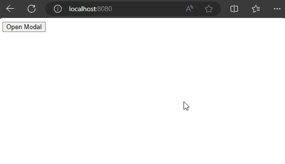
<button @click="openModal">Open Modal</button>
<modal-component v-if="showModal" @close="closeModal" :modal-title="modalTitle" :modal-content="modalContent" />
<div class="overlay" v-if="showModal"></div>
</div>
</template>The modal-title and modal-content props are passed to customize the title and content of the modal.
Also, add styling for the overlay to enhance the visual representation of the modal.
<style>
/* Add this style for the overlay */
.overlay {
  position: fixed;
  top: 0;
  left: 0;
  width: 100%;
  height: 100%;
  background: rgba(0, 0, 0, 0.5); /* Adjust the transparency as needed */
  z-index: 1; /* Make sure the overlay is above other elements */
  pointer-events: auto; /* Enable pointer events on the overlay */
}
</style>
The overlay provides a semi-transparent background behind the modal, emphasizing the modal’s presence and preventing interaction with elements outside the modal. Adjust the transparency and other styles as per your design requirements.
Customizing Modal Content
Customizing the content of your modal in a Vue.js application involves dynamically passing data to the modal component. In this section, we’ll create textboxes in App.vue for entering the modal title and content. The entered data will be dynamically passed to the ModalComponent.vue, allowing you to display customized information within the modal.
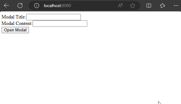
Adding Input Fields
In App.vue, add two textboxes labeled Modal Title and Modal Content for users to input their details. The v-model links these textboxes to our modalTitleInput and modalContentInput data properties, directly connecting user input and our application.
<template>
  <div id="app">
    <div>
      <label for="titleInput">Modal Title:</label>
      <input type="text" v-model="modalTitleInput" id="titleInput" />
    </div>
    <div>
      <label for="contentInput">Modal Content:</label>
      <input type="text" v-model="modalContentInput" id="contentInput" />
    </div>
    <button @click="openModal">Open Modal</button>
    <!-- Modal content goes here -->
  </div>
</template>
In the App.vue script, handle the new input fields. The introduction of modalTitleInputandmodalContentInput` allows us to store user input.
<script>
import ModalComponent from './components/ModalComponent.vue';

export default {
  components: {
    ModalComponent,
  },
  data() {
    return {
      showModal: false,
      modalTitleInput: '',
      modalContentInput: '',
    };
  },
  methods: {
    openModal() {
      this.modalTitle = this.modalTitleInput || 'Default Title';
      this.modalContent = this.modalContentInput || 'Default Content';
      this.showModal = true;
    },
    closeModal() {
      this.showModal = false;
    },
  },
};
</script>
The openModal method updates the modal’s title and content based on user input before displaying it. If no input is provided, default values are used.
Displaying Dynamic Data
Inside the ModalComponent.vue, display the dynamic title and content using Vue.js. Think of it like placing information inside a box. The formattedTitle and formattedContent ensure the displayed content looks friendly and easy to understand.
<!-- Displaying Dynamic Data: ModalComponent.vue -->
<template>
  <div class="modal">
    <div class="modal-content">
      <h2>{{ formattedTitle }}</h2>
      <p>{{ formattedContent }}</p>
      <button @click="closeModal">Close</button>
    </div>
  </div>
</template>
In the script part of ModalComponent.vue, we use computed properties to add a touch of dynamism to the displayed title and content.
<!-- Scripting for Dynamic Content: ModalComponent.vue -->
<script>
export default {
  props: ['modalTitle', 'modalContent'],
  computed: {
    formattedTitle() {
      return `Title: ${this.modalTitle}`;
    },
    formattedContent() {
      return `Content: ${this.modalContent}`;
    },
  },
  methods: {
    closeModal() {
      this.$emit('close');
    },
  },
};
</script>
Now, we’ll add some styling in the style section of ModalComponent.vue. The modal class takes care of positioning and appearance, ensuring it looks centered and elegant. The modal-content styles make the text look clean and neat.
<!-- Styling Magic Touch: ModalComponent.vue -->
<style scoped>
.modal {
  /* Style for modal class */
}

.modal-content {
  font-family: 'Arial', sans-serif;
  color: #333;
  margin-top: 10px;
}

/* Add more styles for modal content as needed */
</style>
With these three elements – displaying, scripting, and styling – our modal with dynamic data is ready.
Modal Transitions
You can add smooth transitions to your modal to make your Vue.js application even more engaging. This not only enhances the user experience but also brings an extra touch of elegance.
Firstly, let’s integrate the transition into your App.vue template. This involves adding a <transition> wrapper around your modal-component. This wrapper acts as a trigger for the transition effect when the modal enters or leaves the DOM.
<!-- App.vue -->
<template>
  <div id="app">
    <div>
      <!-- Your existing content, such as textboxes and buttons -->

      <!-- Now, let's integrate the transition -->
      <transition name="slide-fade">
        <modal-component v-if="showModal" @close="closeModal" :modal-title="modalTitle" :modal-content="modalContent" />
      </transition>
      <div class="overlay" v-if="showModal"></div>
    </div>
  </div>
</template>
Now, let’s add the necessary styles to create the transition effect. The following CSS styles define the behavior of your modal during the transition.
<style>

/* Styling for the modal transition effect */
.slide-fade-enter-active {
  transition: all 2s ease-out; /* Adjust the duration as needed */
}

.slide-fade-leave-active {
  transition: all 2s cubic-bezier(1, 0.5, 0.8, 1); /* Adjust the duration and easing function */
}

.slide-fade-enter-from,
.slide-fade-leave-to {
  transform: translateX(20px);
  opacity: 0;
}
</style>
These styles ensure a smooth transition by controlling the movement and opacity of the modal.
Feel free to adjust the transition duration, easing functions, and styles to align perfectly with the overall aesthetics of your Vue.js application. Now, your users can enjoy a seamless and elegant modal experience!
Using Third-Party Plugins for Modals
Vue.js offers a vibrant ecosystem of third-party plugins, and using a dedicated modal plugin can save development time and provide additional features out of the box. These plugins are often well-maintained and tested and come with built-in functionalities that cater to various use cases.
One popular third-party modal plugin for Vue.js is vue-js-modal. In this section, we’ll introduce the benefits of using such plugins and guide you through the installation and basic configuration of the vue-js-modal plugin.
We’ll use vue-js-modal as our third-party modal plugin for this example. First, install the plugin in your project:
npm install vue-js-modalOnce installed, register the plugin in your main Vue instance (main.js):
// main.js
import Vue from 'vue';
import App from './App.vue';
import VModal from 'vue-js-modal';

Vue.use(VModal, { dynamic: true, injectModalsContainer: true });

new Vue({
  render: (h) => h(App),
}).$mount('#app');
The { dynamic: true, injectModalsContainer: true } options enable dynamic modal creation and ensure that modals are injected into the DOM container.
While third-party modal plugins offer convenience, creating modals from scratch brings its own set of advantages. Building custom modals provides complete control over design, and behavior. These custom modals can be lightweight, including only the necessary code for your application.
Balancing between custom and third-party solutions depends on project requirements and development considerations.
Conclusion
In conclusion, implementing modals in Vue.js involves choosing between ready-made plugins like vue-js-modal or creating custom solutions. Third-party plugins offer quick features, but custom modals provide greater control.
The choice depends on project needs, development speed, and long-term maintenance. Developers can create engaging and user-friendly modals by understanding the pros and cons. Next, troubleshooting tips will refine the process for a smooth user experience.
You can find the complete code used in the tutorial on this GitHub Repo.
Gain Debugging Superpowers
Unleash the power of session replay to reproduce bugs, track slowdowns and uncover frustrations in your app. Get complete visibility into your frontend with OpenReplay — the most advanced open-source session replay tool for developers.
Star on GitHub12k