

CSS is essential for website design, and understanding the distinction between
emandremis one of the most crucial concepts to grasp. This article covers the differences betweenemandrem, when and how to use them, and some real-world applications. And even more, it will discuss pixels(px) and why they’re not the go-to choice for developers.
Web designers who wish to construct responsive, adaptable websites that are simple to update and modify must know the differences between em and rem. This will also aid in your website adhering to current web accessibility standards. This article will discuss both units, their usage, and the advantages over pixels (px) for modern web design.
The Unit of Em and Rem in CSS
Two choices are presented to us when setting the size of any element in CSS. These choices are absolute units and relative units. With absolute units, you get fixed units unrelated to anything. They are always the same, no matter the case. Examples of absolute units are cm, mm, px, etc.
Relative units are relative to something else. It could be the parent element’s size or the size of the main HTML. Relative units cover em, rem, vw, vh, and many more. These are scalable units that help with responsive design.
Let us inspect and understand two of these units. Both rem (The ‘r’ in rem stands for root) and em are scalable and relative units of size. However, the rem unit is only relative to the root font size of the HTML document. While with em, the unit is relative to the font size of its parent element.
Em Unit
With the em unit, users can adjust the font size of a relative element to the font size of the primary or parent element. With every change in the size of the primary element, there is an automatic change in the size of the secondary element.
Note that when em units get used on the font size property, the size is relative to the font size of the primary element. But it is relative to the element’s font size when used on other properties. In this situation, the first declaration references the primary element or parent.
<!DOCTYPE html>
<html lang="en">
<head>
<meta charset="UTF-8" />
<meta http-equiv="X-UA-Compatible" content="IE=edge" />
<meta name="viewport" content="width=device-width, initial-scale=1.0" />
<title>Understand Em and Rem</title>
</head>
<style>
.primary {
font-size: 30px;
}
.secondary-em {
font-size: 3em;
margin: 1.5em;
}
</style>
<body>
<div class="primary">
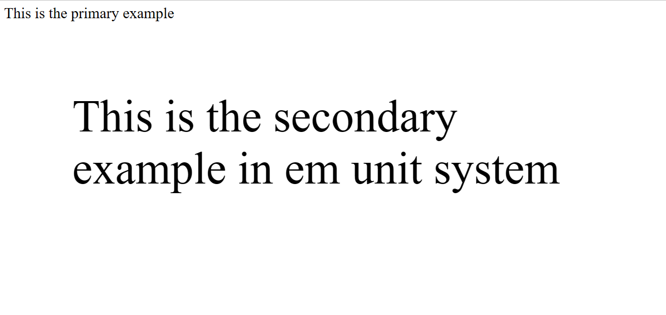
This is the primary example
<div class="secondary-em">
This is the secondary example in em unit system
</div>
</div>
</body>
</html>
Here, the font-size of the .secondary element becomes 90px (3 * 30px), and the margin of .secondary is 135px (1.5 * 90px).
Here is the result on a live server:
Rem Unit
The font size value of the root element is the foundation of rem and is the <html> element. If the <html> element has no specified font size, the browser default value of 16px gets used. Here, the root value is the only thing considered, and there is no relationship with the primary element.
Rem differs from em because, unlike ‘em’, where the first declaration takes the reference to the parents, in rem, size is relative for all declarations.
<!DOCTYPE html>
<html lang="en">
<head>
<meta charset="UTF-8" />
<meta http-equiv="X-UA-Compatible" content="IE=edge" />
<meta name="viewport" content="width=device-width, initial-scale=1.0" />
<title>You Can Understand Em and Rem</title>
</head>
<style>
html {
font-size: 40px;
}
.primary {
font-size: 30px;
}
.secondary-rem {
font-size: 3rem;
margin: 2rem;
}
</style>
<body>
<div class="primary">
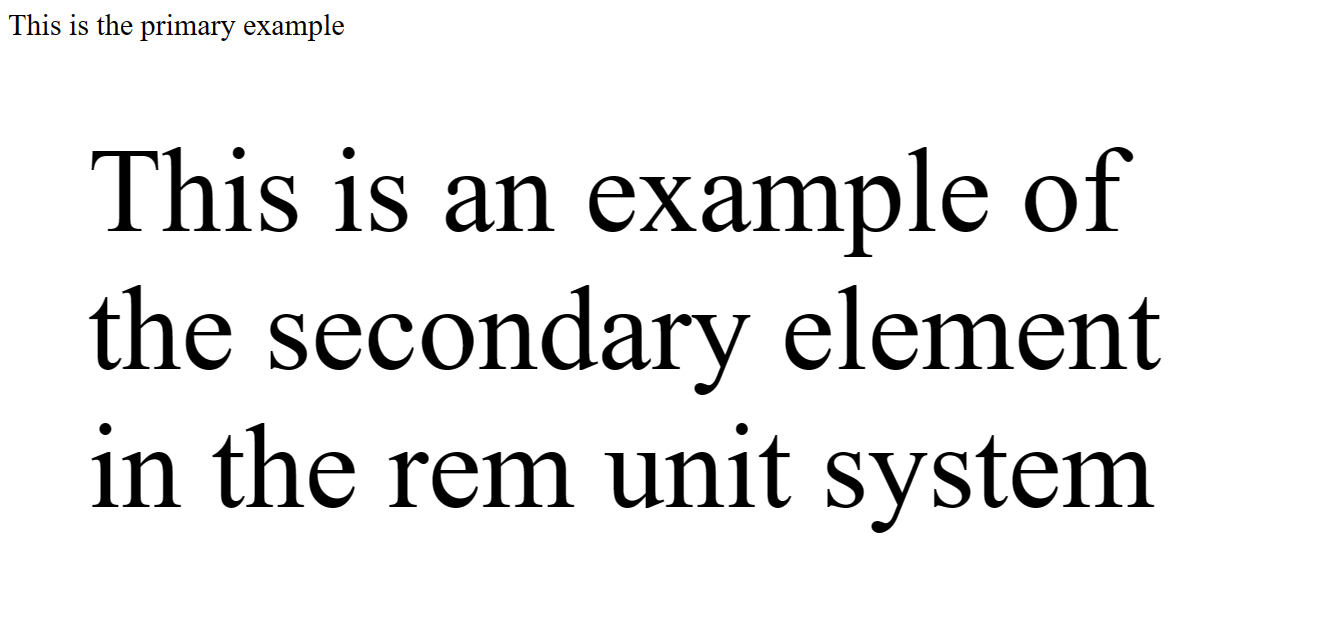
This is the primary example
<div class="secondary-rem">
This is an example of the secondary element in the rem unit system
</div>
</div>
</body>
</html>Here is the result when you go live:
Session Replay for Developers
Uncover frustrations, understand bugs and fix slowdowns like never before with OpenReplay — an open-source session replay tool for developers. Self-host it in minutes, and have complete control over your customer data. Check our GitHub repo and join the thousands of developers in our community.
A Comparison Between Em and Rem Units
Em and Rem share a few similarities:
- They are both scalable units
- They always have values relative to the value of something else.
The Differences Between Em and Rem
Em and rem differ in how a browser converts them to px.
While rem values are relative to the root font size or the font size of the HTML element, em values are relative to the font size of the closest parent element. Rem values are relative to browsers’ 16px default font size when the root font size is not set.
It entails that when the font size of the root is 16px, the value of 1rem would be 16px * 1= 16px. And likewise, 16px * 15 = 240px for a value of 15rem.
With the example, it is easy to note that with rem, you can control the size of elements across a page from one source because it is simple to understand and use.
Even though rem units are straightforward and predictable, they occasionally may not provide the required control over how particular webpage regions scale. It is because it is challenging for all of a webpage’s modules to scale up and down with a single value.
However, because em depends on the font size of the closest parent or major element, it provides more precise control over how particular webpage regions scale. So, using em, we can manage the modular scaling of the website.
When to Use Em and Rem in CSS
To scale the size of an element that depends on the size of its parent, use em because it is relative to the font size of the parent element. Use rem regardless of the parent size if you want to scale the size of an element based on the root (HTML) font size. Rem is relative to the font size of that root (HTML)
The em indicates the font size. Thus, 1em denotes 2 inches of an element with a 2 inches font. When sizes, such as margins and paddings, get expressed in em, they are proportional to the font size, regardless of whether the user uses a large font (on a large screen, for example) or small fonts on handheld devices.
To scale beyond the root font size, use em. Use rem units anywhere you need a value based on the root. Doing so can assist with many issues and improve the responsiveness of your code.
What Are Pixels in CSS?
CSS pixels are the logical units of measurement used in declarations like width: 300px or font-size: 14px. CSS pixel does not depict the pixel density of a device. When the user zooms in, a 300px wide element fills up more and more of the screen, making it broader in device (physical) pixels. However, the width in CSS pixels stays at 300px, and the zooming effect gets produced by expanding CSS pixels as much as necessary. Although pixels are easy to use, they can pose some problems down the line.
Why You Should Not Go With Pixels
Here are some problems you might encounter using Px:
- There is an improvement in accessibility if the developer does not define the default font size.
- A
pxin font size does not correspond to apxon the screen. - Nowadays,
pxdensities are growing as hardware gets modified and developed. Sincepxvalues are not based on hardware pixels, they will appear differently on several screens and resolutions.
The px unit is absolute and will not adapt to a browser’s pixel ratio. As a result, many of the audience cannot get satisfied.
Conclusion
This article taught us about em and rem. The two CSS units are similar, scalable, and comparable. They are also a better option than px because it is unreliable.
While both these units provide the flexibility required for responsive design, users prefer rem because of its simplicity, consistency, and predictability. And, while em can get complicated to use, it has the best option if you want your page to be adaptable or modular.
Gain Debugging Superpowers
Unleash the power of session replay to reproduce bugs and track user frustrations. Get complete visibility into your frontend with OpenReplay, the most advanced open-source session replay tool for developers.