Understanding CSS Timing Functions for Animation and Transitions
All the details about the special configuration items for animations and transitions

You have a lot of flexibility with CSS when it comes to animation. Your animations’ length, focus, timing, and speed are just a few of the features you can modify. Adding another line of CSS will easily change the animation’s speed.
This article provides a comprehensive introduction to the CSS timing function and detailed information on how to use it to manage your animations for a predetermined amount of time.
What are CSS Animations?
Before we define and understand what CSS animation is, we must first understand what animations are. Animation is the technique of faking motion effects and visual changes - changes that occur over a period of time. The CSS animations are a suggested addition to Cascading Style Sheets (CSS) that enables CSS-based animation of HTML document elements. This means that, with the help of CSS animations, HTML document elements can be animated without using JavaScript or Flash.
CSS animations frequently indicate that a button is clickable to grab users’ attention and make web pages more engaging. CSS animations can range from simple to complex, depending on your preference. The properties to animate, their initial and final values, and the duration are just a few details that need to be specified to build a CSS animation. Since animation is still the ultimate product, the syntax is irrelevant. With CSS, you can create animations that delight and engage your users while behaving precisely as you want them to. A CSS animation’s repeat frequency, start time after the page loads, and other options are all adjustable. Even the animation’s tempo is adjustable. Imagine, for instance, that you want your animation to begin slowly, pick up speed in the middle, and then slow down in the end.
Types of CSS Animations
- Animation-name: This type of CSS animation specifies the name of the @keyframes animation that describes an animation keyframe.
Example: Specify a name for the @keyframes animation:
N/B: This animation is static because there is no duration specified. To learn more about animation-name, click here.
- Animation-duration: This animation property specifies the time in which an animation completes one cycle. It defines how long an animation should take to complete. No animation will occur if the animation-duration attribute is left blank because its default value is 0s.
Example: Specify that the animation should complete one cycle in 3 seconds:
- Animation-delay: This CSS animation property specifies the delay between an element loading and the start of an animation sequence and whether the animation should start immediately from its beginning or partway through the animation.
Example: Delay for 2 seconds before starting the animation:
Negative values are also allowed. If using negative values, the animation will start as if it had already been playing for N seconds. Example: Create an animation as if it had already been playing for 2 seconds:
N/B: You can try it out for yourself. Read more about animation-delay.
- Animation-iteration-count: This property specifies the number of times an animation should repeat.
Example: Run the animation three times before it stops:
- Animation-direction: The animation attribute specifies whether an animation’s first iteration should be forward or backward and whether subsequent iterations should be in an alternate direction on each run through the sequence or reset to the start point and repeat. The animation-direction property can have the following values:
- normal - The animation is played as normal (forwards). This is default
- reverse - The animation is played in the reverse direction (backward)
- alternate - The animation is played forwards first, then backward
- alternate-reverse - The animation is played backward first, then forwards
The following example will run the animation in the reverse direction (backward):
The following example uses the value “alternate” to make the animation run forwards first, then backward:
- Animation-fill-mode: This specifies how an animation applies styles to its target before or after it runs. Before the first keyframe is played or after the last keyframe is played, an element is unaffected by CSS animations. The animation-fill-mode property can override this behavior.
The animation-fill-mode property can have the following values:
- none - Default value. Animation will not apply any styles to the element before or after it is executing
- forwards - The element will retain the style values that are set by the last keyframe (depends on animation-direction and animation-iteration-count)
- backwards - The element will get the style values that are set by the first keyframe (depending on animation-direction) and retain this during the animation-delay period
- both - The animation will follow the rules for both forwards and backwards, extending the animation properties in both directions
The following example lets the <div> element retain the style values from the last keyframe when an animation ends:
- Animation-play-state: It specifies whether to pause or play an animation sequence.
Use the CSS animation-timing attribute to accomplish this. Example: To pause an animation,
div {
  animation-play-state: paused;
}- Animation-timing-function: This animation attribute specifies how an animation transitions through keyframes by establishing acceleration curves. This feature specifies the speed curve of an animation. The speed curve specifies the TIME required by an animation to go from one CSS style configuration to another. The modifications are implemented gently by using the speed curve.
Example: Play an animation with the same speed from beginning to end.
- Animation: This CSS animation property applies an animation between styles. The following terms are also known by their shorthand form:
- animation-name
- animation-duration
- animation-timing-function
- animation-delay
- animation-iteration-count
- animation-direction
- animation-fill-mode
- animation-play-state Since you’re using the shorthand, you only need to define the values you require; there’s no need to mention the sub-properties. While not all sub-properties are required for the CSS animation property to function as intended, animation-name and animation-duration are.
Note: Values must be listed in the same order as in the above list for the shortcut to function correctly.
Example:
div {
  animation-name: example;
  animation-duration: 5s;
  animation-timing-function: linear;
  animation-delay: 2s;
  animation-iteration-count: infinite;
  animation-direction: alternate;
}
Using the abbreviation “animation,” a similar animation effect to the one shown above can be obtained:
div {
  animation: example 5s linear 2s infinite alternate;
}
You can’t go very far in online animation development without coming across CSS animations. CSS animations accomplish relatively basic tasks. By requesting that you indicate what your CSS properties will do at various points in time, they enable you to animate CSS properties. There is a very particular nomenclature for these “points in time.” Keyframes are what they’re called. The @keyframes CSS at-rule controls the transitional stages of a CSS animation sequence by defining styles for keyframes (or waypoints) along the animation sequence. This allows the intermediate steps of the animation sequence additional control.
CSS animations provide the ability to animate changes from one CSS style configuration to another. A CSS animation’s style and a collection of keyframes that designate the style’s beginning and ending points and any potential intermediate waypoints make up an animation.
Compared to conventional script-driven animation methods, CSS animations have the following three main benefits:
- You may make them without knowing JavaScript because they are simple to utilize for animations.
- Even with a light strain on the machine, the animations function correctly. Simple animations typically don’t work well in JavaScript. The rendering engine has several options for maintaining performance, including frame-skipping.
- By limiting the update frequency of animations running in tabs that aren’t currently visible, the browser can improve performance and efficiency when given control over the animation sequence.
Session Replay for Developers
Uncover frustrations, understand bugs and fix slowdowns like never before with OpenReplay — an open-source session replay tool for developers. Self-host it in minutes, and have complete control over your customer data. Check our GitHub repo and join the thousands of developers in our community.
What are Timing-Functions?
A timing function can change how quickly your properties animate. You can use the animation-timing-function as a stand-alone CSS property or as a value in the animation shorthand property. The ‘animation-timing-function’ in CSS determines how fast your animation will play:
animation-timing-function: value;
To make the changes smoother, a speed curve is used. If you are familiar with computer graphics, you might already know what a Bezier Curve means: a curve model defined by four points.
Types of Timing-Functions
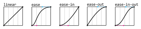
Timing functions appear very complex, yet using them in CSS is relatively simple. There are six distinct types of timing-functions in CSS, which include:
- Linear: The speed of a linear animation is continuous; thus, it moves at the same rate from beginning to end throughout its cycle. Since the speed curve will be a straight-line graph, it is called linear. Similar to cubic-bezier(0.0, 0.0, 1.0, 1.0) and animates at a constant speed.
- Ease: When using the ease feature, animations begin slowly, pick up speed, and then slow down again. If no timing function is added to the animation, this will be utilized by default. The default value, equal to cubic-bezier(0.25, 0.1, 0.25, 1.0), accelerates toward the middle of the animation before slowing back down towards the conclusion. Including a timing function as part of your animation or transition is not required. This is due to the default value of ease for the timing-function parameter on each animation and transition you employ.
- Ease-in: The ease-in timing function causes animations to begin slowly and accelerate near the end. Equal to cubic-bezier(0.42, 0, 1.0, 1.0), the transition speed of the animating property begins slowly and increases until it is finished.
- Ease-out: The reverse of ease-in, ease-out has a quick beginning and a gradual end. Equal to cubic-bezier(0, 0, 0.58, 1.0), the animation begins off rapidly before settling down.
- Ease-in-out: Animations that ease in and out gradually accelerate up in the middle and slow down towards the finish. This resembles the easy timing function, except the curve is symmetrical. The speed of the animation at the beginning and conclusion are the same, equal to cubic-bezier(0.42, 0, 0.58, 1.0), with the animation properties slowing down, speeding up, and then slowing down once more.
- Cubic-bezier ( ): Of all the timing functions, the cubic-bezier timing function is the most wonderful. It has a somewhat complex mechanism. Control points that draw a smooth curve serve as the cubic Bezier curve’s definition. There are Bezier curves in all easing functions. A Bezier curve with just two control points represents the linear timing function. With three control points, it might potentially be a quadratic curve. In the cubic-bezier function, specify your own values. There is a range of possible values, from 0 to 1.
- Using the Cubic-Bezier Generator
A cubic-bezier generator is used to generate the four numerical values corresponding to the timing-function curve. It is an excellent tool for creating Bezier speed curves. Play around with the handles to find a curve you like, then examine and contrast it using the built-in softening options. Once finished, copy and paste the text into your project, and you’re good to go!
A good example is the Lea Verou’s cubic-bezier generator.
- Using the Inspector Tool
The animated element must first get any timing function. By selecting Inspect or Inspect element from the context menu when right-clicking on a web element, depending on the browser, you can access the dev tools. A dropdown icon will be next to the property name if the animation or transition shorthand keyword is used. The timing function is one of several property values listed when you click it. Otherwise, it is a separate property that you own. The timing function’s name is next to a curve icon that launches a cubic Bezier editor. The built-in easing functions can be compared.
- Step-end: The animation doesn’t change until the end of its animation cycle, at which point it abruptly switches to the final state. Using the example below, the animation will stay at 0 pixels for most of the animation cycle until abruptly moving 150 pixels to the right at the very end.
You’ll see that I added the animation-fill-mode property to the sample above. When this attribute is set to “forwards,” the animated element will maintain the appearance of its final state even after the animation is finished (i.e., it won’t move backward).
- Step-start: The animation immediately changes to its finished state. Let’s say the animation is configured to begin at 0 pixels, travel 150 pixels to the right, and last for 4 seconds. It will immediately jump 150px to the right rather than moving slowly over that period of time.
As you can see, I substituted the animation-iteration-count property for the animation-fill-mode property used in the preceding examples in the example above.
- Step ( ): Steps are used to specify the number of steps to be taken before the animation reaches its final state ( ). One integer and one jump-term should be placed inside the parenthesis. The animation will change states instantly rather than progressing progressively through its animation cycle.
The following four jump terms are possible:
- Jump-start (or start): the animation’s first frame marks the initial jump.
- Jump-end (or end): the final jump occurs at the conclusion of the animation.
- No jump is made at the beginning or the finish.
- Jump-both: both the beginning and the end are silent.
Suppose n is 4, meaning there are four steps. Jump-start describes the temporary holding of the animation at 0%, 25%, 50%, and 75%. Jump-end denotes that the animation remains in place at 25, 50, 75, and 100%. Jump-none designates an animation cycle with four stops between 0% and 100%. Jump-both designates four stops for the animation, including the 0% and 100% points (i.e., at 0%, 33.3333%, 66.6666%, and 100%).
The animation in the example below is programmed to progress in six steps between 0% and 100%.
Each timing function is accompanied by a highly distinct timing function curve.
Global Timing-Functions
Every CSS property is compatible with these global properties. They consist of the following:
- inherit: If an element’s properties can be passed down, doing so gives the descendant element the parent’s attributes. The properties return to their initial state if they are not inherited.
- initial: Using initial may seem like merely another way to use the CSS property’s default value, but that isn’t necessarily the case. The initial is the same as the default value when using timing functions.
- revert: This changes an element’s properties to the browser’s default CSS settings.
- Unset: has a unique function that differs from revert. Both inherited and non-inherited attributes are impacted.
Browser Support
The table’s numbers below identify the initial iteration of a browser that fully supports the properties listed below.
| Property | Google Chrome | Microsoft Edge | Mozilla Firefox | Safari | Opera Mini |
|---|---|---|---|---|---|
| @keyframes | 43.0 | 10.0 | 16.0 | 9.0 | 30.0 |
| animation-name | 43.0 | 10.0 | 16.0 | 9.0 | 30.0 |
| animation-duration | 43.0 | 10.0 | 16.0 | 9.0 | 30.0 |
| animation-delay | 43.0 | 10.0 | 16.0 | 9.0 | 30.0 |
| animation-iteration-count | 43.0 | 10.0 | 16.0 | 9.0 | 30.0 |
| animation-direction | 43.0 | 10.0 | 16.0 | 9.0 | 30.0 |
| animation-timing-function | 43.0 | 10.0 | 16.0 | 9.0 | 30.0 |
| animation-fill-mode | 43.0 | 10.0 | 16.0 | 9.0 | 30.0 |
| animation | 43.0 | 10.0 | 16.0 | 9.0 | 30.0 |
Bonus Property
Since we’re talking about timing, the property -delay can be utilized in conjunction with the timing functions.
animation-delay make animations wait a brief time before starting. You can incorporate it with the abbreviation:
animation: <name> <duration> <timing-function> <delay>;No matter the properties’ sequence, the delay property will always be the second time value in the declaration.
Conclusion
Animations are a fantastic method to engage visitors and present exciting content. However, keeping them to a minimum is crucial because animating too many properties simultaneously or on the same webpage might negatively impact performance. Additionally, I advise keeping the duration brief. Animations should ideally be in milliseconds because one second is longer than you might imagine.
We have examined how timing operations regulate the speed and actions of online animations. Can you think of any real-world applications for them, from easing to step functions? Animated text cards, progress bars, buttons, and many other elements are available. Use them, and make something fantastic!
Gain Debugging Superpowers
Unleash the power of session replay to reproduce bugs and track user frustrations. Get complete visibility into your frontend with OpenReplay, the most advanced open-source session replay tool for developers.