Using Material UI with React
How do I use Material UI with React? This article answers that question.


Writing CSS styles in stylesheets has been the traditional way of applying styles to web elements. Although writing styles in pure CSS produces the desired results, it can take time and effort to fully develop user interfaces with desired styles, fix bugs, and implement responsiveness for different screen sizes. This can be solved using CSS frameworks in place of pure CSS. A framework provides developers with easy-to-use components and utilities offering various styles, making it possible to build web apps faster, saving time on design and development.
In this article, readers will learn about material UI and how it can be used with React to quickly build web applications.
What are CSS Frameworks?
A CSS framework refers to a prepped-up library that contains ready-to-use CSS stylesheet collections, making the job of UI developers easier. It contains basic site structures such as grids and flex boxes, text typography, buttons, icons, and interactive user interfaces. It could also contain pre-built site components such as modals, navbars, and cards. Examples of popular CSS frameworks include:
- Bootstrap
- Tailwind CSS
- Material UI
- Foundation
- Pure
- Bulma
- Semantic UI
- UI kit
- Materialize CSS
- Spectre
- Base
- Picnic CSS
What is Material UI?
Material UI is an open-source, front-end user interface library that features components for speeding up the creation of web applications, allowing the developer to save time on design and development. It can be used to add site essentials, such as buttons, sliders, navigation, cards, grids, etc.
Material UI allows the developer to customize the style and appearance of components, changing themes, typography, and appearance to give web pages a unique feel. Material UI can be used with all JavaScript frameworks, is site responsive, and can also be used in mobile app development to make building applications simple and easier.
To find out more about the Material UI components, component APIs, styles, and benefits, you can read this article.
Setting Things Up
To get started, we will first create our React application with the following bash command:
npx create-react-app materialuiThe Material UI dependencies can be installed in a React application using the following command in the CLI environment:
npm install @mui/material @emotion/react @emotion/styled @mui/icons-materialGetting Started
Material UI can be applied to different site sections. Some of the different components provided by Material UI include button components, input fields, autocomplete features, icons, tables, menus, navigation, and pagination, among others. Material UI also offers utility classes for creating containers, grid layouts, popups, etc. Let’s look at how we can import components from MaterialUI in a React application.
To use a MaterialUI component, we need to add an import for it. For example, to make use of the Button component in our App.js file, we can import it as shown below:
import Button from '@mui/material/Button'In the code above, we specified the component we wish to import and the folder where it’s located in our MaterialUI library. While working with MaterialUI, you will most likely use different components. To prevent repetitiveness and rewrite import statements for every component, we can add an import for @mui/material and pass in whatever component we wish to import in a destructured form:
import {Button} from '@mui/material'This way, we can specify multiple imports for components in the same line. To display the button, add the following lines of code:
    function App() {
      return (
        <div className="App">
         <Button>This is a button</Button>
        </div>
      );
    }
If we run our application with the npm start command, the above code will produce the following result:

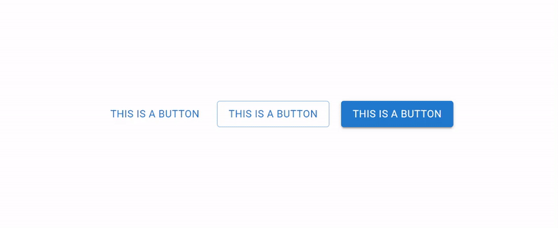
Here, we have the default style for the button component. MaterialUI lets us customize the appearance of components using custom styles (we will cover this later in this tutorial). Apart from user-defined styles, MaterialUI also provides different styles for different components, which can be applied using an attribute called variant. For example, the button component has three variants: outlined, text, and contained. The text variant is the default variant and is applied in the example above.
To make use of the outlined and contained variants, we need to add the attribute to the button as shown below:
    //..
    <Button>This is a button</Button>
    <Button variant="outlined" >This is a button</Button>
    <Button variant="contained" >This is a button</Button>
The above code will produce the following results:
Apart from the variant property, Material UI offers other properties which can be added to components to add unique behaviors or appearances. Some of these properties include the following:
- color: This indicates the color theme of the component
- disabled: If true, the component is disabled by default
- classes: Used to override or append custom styles to the component
- endIcon: indicates an element to be placed after the component’s children. An example is a search icon for an input field component
- fullWidth: If true, the component takes the full width of its container
- size: Indicates the size of the component
Now that we know how to import Material UI components into our application, let’s take it up a notch by using Material UI to recreate the OpenReplay blog page.
Building the Navigation
The OpenReplay blog navigation bar contains the following:
The site icon.
A link to the blog page.
A text field for searching articles.
A button that leads to the GitHub repository.
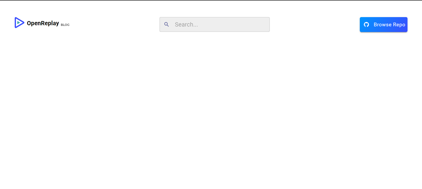
Create a folder in your src directory called components for our site components. Create a file Nav.jsx within the newly created folder. This file will contain the code necessary for our navigation section. To recreate the OpenReplay icon, enter the following code in the Nav.jsx file:
import React from "react";

const Nav = () => {
  return (
    // Navigation bar
    <div className="navigation">
      <div className="nav-left">
        <div>
          {/* OpenReplay icon */}
          <svg
            width="30px"
            height="30px"
            // viewBox= "0 0 179 40"
            className="astro-HEHSLD2D"
          >
            <title>OpenReplay</title>
            <g
              id= "logos"
              stroke= "none"
              strokeWidth= "1"
              fill= "none"
              fillRule= "evenodd"
              className="astro-HEHSLD2D"
            >
              <g id="Open-Replay" fillRule="nonzero" className="astro-HEHSLD2D">
                <g
                  id="Group-Copy"
                  transform="translate(0.000000, 0.000000)"
                  className="astro-HEHSLD2D"
                >
                  <path
                    d="M22.4262619,15 L3.29604084,3.77288564 L3.29604084,26.2271144 L22.4262619,15 Z M25.0367262,12.6792184 C25.8592781,13.1556443 26.3667376,14.0411275 26.3667376,15 C26.3667376,15.9588725 25.8592781,16.8443557 25.0367262,17.3207816 L4.06401836,29.6315942 C2.35007712,30.6386 0,29.4882126 0,27.3108127 L0,2.68918734 C0,0.511787376 2.35007712,-0.638600048 4.06401836,0.368405755 L25.0367262,12.6792184 Z"
                    id="Combined-Shape"
                    fill="#394EFF"
                    className="astro-HEHSLD2D"
                  ></path>
                  <path
                    d="M13.7524069,14.3811249 C13.9742492,14.5081718 14.1111111,14.7443007 14.1111111,15 C14.1111111,15.2556993 13.9742492,15.4918282 13.7524069,15.6188751 L8.09606605,18.9017585 C7.63381597,19.1702933 7,18.8635234 7,18.2828834 L7,11.7171166 C7,11.1364766 7.63381597,10.8297067 8.09606605,11.0982415 L13.7524069,14.3811249 Z"
                    id="Path-Copy"
                    fill="#3EAAAF"
                    className="astro-HEHSLD2D"
                  ></path>
                </g>
              </g>
            </g>
          </svg>
        </div>
      {/* title */}
      </div>
    </div>
  );
};
export default Nav;
For the OpenReplay title, we will use typography from Material UI. Typography lets us type text and specify what text property should be applied to it. For example, we could add header text properties (h1 to h6) to the text by specifying it in the variant property.
import { Typography } from "@mui/material";
//....previous code here
{/* title */}
  <div className="titles">
    {/* OpenReplay Title */}
    <Typography variant="h6">OpenReplay</Typography>
    {/* blog Link */}
    <a href="/" className="blog" >BLOG</a>
  </div>
  </div>
      {/* search fields */}
There are different ways of applying custom styling to Material UI components. The first is to define custom attributes for the component and pass them as a theme. This method is useful if you wish to use the same custom styles wherever that component is called in your application. To do this for the Typography text, we need to import ThemeProvider and CreateTheme for Material UI and define the custom styles. To achieve this, add the following to App.js:
import React from "react";
import "./App.css";
import Nav from "./components/Nav";
import { ThemeProvider, createTheme } from "@mui/material";
function App() {
  const theme = createTheme({
    typography: {
      h6: {
        fontSize: "16px",
        fontFamily: "Figtree",
        fontWeight: "bold",
      }
    },
  });
  return (
    <div className="App">
      <ThemeProvider theme={theme}>
        <Nav />
      </ThemeProvider>
    </div>
  );
}
export default App;
Here we have added an import for our Navigation component and defined a custom font weight, size, and family for our h6 Typography variant. The other method for adding a custom style to a Material component is with the sx attribute, which acts like the style attribute for CSS and is used in the same way as inline styles.
Next, we will add our search field in Nav.jsx. For our search field, we will use the Autocomplete component from Material UI. With the autocomplete component, we have our search box and a window showing available results, which are filtered based on the search query.
import { Typography, Autocomplete, Stack, TextField, Button } from "@mui/material";
import {SearchIcon} from '@mui/icons-material/';
//...previous code here
{/* search fields */}
<div>
<Autocomplete
    id="free-solo-demo"
    freeSolo
    options={ArticleList}
    getOptionLabel={(option) => `${option.title}: ${option.description}`}
    renderInput={(params) => (
      <TextField
        {...params}
        placeholder= "Search..."
        size= "small"
        sx={{
          backgroundColor: "#eee",
          outline: "none",
          border: "none",
          width: "300px",
        }}
        InputProps={{
          ...params.InputProps,
          startAdornment: (
            <InputAdornment position="start">
              <Search
                sx={{
                  color: "#5a5e9a",
                  width: ".7em",
                  paddingLeft: "5px",
                }}
              />
            </InputAdornment>
          ),
        }}
      />
    )}
  />
</div>
{/* repository button */}
In the code above, we have a search field with autocomplete feature. The autocomplete component returns the TextField component in the renderInput property. We added a search icon and a short text for the label attribute. To easily position both items side-by-side, we used a component from Material UI called Stack. The stack component makes it easy to arrange elements in whatever pattern is desired, along rows or columns, assign spacing, and specify the alignItems and justifyContent properties. For the autocomplete data, ArticleList, we will define it as follows:
const ArticleList = [
    { title: "Learning Material UI"},
    { title: "First React App"},
    { title: "React Hooks"},
    { title: "React Router"},
    { title: "React Redux"},
    { title: "Vue JS"},
    { title: "Angular"},
    { title: "Node JS"},
    { title: "Express JS"},
    { title: "Mongo DB & Mongoose"},
  ];
The final aspect of our navigation section is the repository button. To add this, add the following code in Nav.jsx:
import { Search, GitHub } from "@mui/icons-material/";
//... previous code
{/* repository button */}
<div className="git-btn">
  <Button
    variant= "contained"
    size= "medium"
    sx={{
      background:
        "linear-gradient(-60deg,#394EFF,#0095FF),linear-gradient(180deg,#394EFF,#0095FF)",
      paddingX: "6px",
      paddingY: "8px",
    }}
  >
    <Stack
      direction= "row"
      spacing={1}
      justifyContent= "center"
      alignItems= "center"
    >
      <GitHub sx={{ height: "15px" }} />
      <p
        style={{
          fontSize: "14px",
          textTransform: "capitalize",
          fontWeight: "540",
        }}
      >
        Browse Repo
      </p>
    </Stack>
  </Button>
</div>
Finally, add the following styles to App.css:
/* navigation styles */
.navigation{
    padding: 45px 0px 0 0px;
    display: flex;
    justify-content: space-between;
    width: 100%;
    align-items: flex-start;
}
.nav-left{
    display: flex;
    gap: .2em;
    /* justify-content: center; */
    align-items: center;
    margin-left: 40px;
}
.titles{
    display: flex;
    justify-content: center;
    align-items: center;
    font-weight: bold;
    gap: .3em;
}
.blog{
    opacity: .8;
    font-weight: bold;
    font-size: 8px;
    text-decoration: none;
    color: #333;
    padding-top: 1em;
}
.blog:hover{
    cursor: pointer;
}
.git-btn{
    margin-right: 40px;
}
Now, if we run our code with the npm start command in CLI, we get the following result:
All Material icons can be found in the icons documentation.
Session Replay for Developers
Uncover frustrations, understand bugs and fix slowdowns like never before with OpenReplay — an open-source session replay tool for developers. Self-host it in minutes, and have complete control over your customer data. Check our GitHub repo and join the thousands of developers in our community.
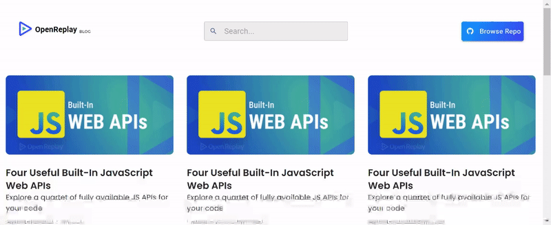
Adding the Articles Section
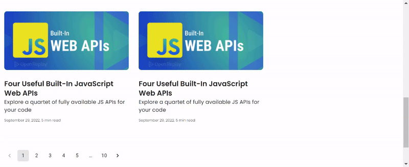
To add the article section, we will use the Grid component from Material UI. Also, we will create a separate component called Articles.jsx in our components directory. In this file, add the following code:
import React from 'react'
import { Grid } from '@mui/material'
const Articles = () => {
  return (
    <div>

    </div>
  )
}
export default Articles
For the grid, we will import Paper, a Material UI component for creating backgrounds that resemble flat sheets with a paper texture. We will customize the paper appearance using styled from Material UI styles.
import React from "react";
import { Grid, Box, Paper, Typography } from "@mui/material";
import { experimentalStyled as styled } from "@mui/material/styles";
import logo from "../openreplay.png";
const Articles = () => {
  const Item = styled(Paper)(({ theme }) => ({
    backgroundColor: "fff",
    ...theme.typography.body2,
    padding: theme.spacing(2),
    boxShadow: "none",
    cursor: "pointer"
  }));
return (
    <div style={{ maxWidth: "100vw", overflow: "hidden" }}>
      <Box sx={{ width: "100vw" }} mt="5em">
        <Grid
          container
          spacing={{ xs: 2, md: 3 }}
          columns={{ xs: 4, sm: 8, md: 9 }}
          sx={{ padding: "0 20px" }}
        >
          {Array.from(Array(8)).map((_, index) => (
            <Grid xs={12} sm={4} md={3} key={index}>
              <Item style={{ width: "350px", marginBottom: "20px" }}>
                <img
                  src={logo}
                  alt= "random"
                  style={{
                    width: "100%",
                    height: "165px",
                    objectFit: "cover",
                    borderRadius: "8px",
                  }}
                />
                <Typography
                  variant="h5"
                  sx={{
                    fontFamily: "Poppins, sans-serif",
                    fontWeight: "640",
                    fontSize: "20px",
                  }}
                  mt="1em"
                >
                  Four Useful Built-In JavaScript Web APIs
                </Typography>
                <Typography
                  variant="body1"
                  sx={{
                    fontFamily: "Poppins, sans-serif",
                    fontWeight: "400",
                    fontSize: "15px",
                  }}
                >
                  Explore a quartet of fully available JS APIs for your code
                </Typography>
                <Typography sx={{
                    fontFamily: "Poppins, sans-serif",
                    fontWeight: "300",
                    fontSize: "10px",
                }}
                mt="1em"
                >September 29, 2022, 5 min read</Typography>
              </Item>
            </Grid>
          ))}
        </Grid>
      </Box>
    </div>
  );
};
export default Articles;
We are using an array of 8 items to render 8 individual article cards. The grid component makes it possible to specify columns for medium, small and extra-small screens to handle responsiveness. We also used the Box component. The box component serves as a wrapper component and can also be used in place of divs or spans. If we run the application now, we will get the following result in our browser:
Adding Site Pagination
Material UI provides a Pagination component, which offers different pagination styles which can be chosen from or customized to meet requirements. For our pagination component, create a new file in the components folder called Paginationbar.jsx:
import React from "react";
import { Pagination, Stack } from "@mui/material";
const Paginationbar = () => {
  return (
    <div style={{margin: "40px 0px 60px 8px"}} >
      <Stack>
      <Pagination count={10} shape="rounded" />
      </Stack>
    </div>
  );
};
export default Paginationbar;
The count property takes the total number of pages to be paginated. For appearance, we used primary (blue) for the color. To check properties and possible entries for any Material component, refer to the Component API section in the docs. Next, add the Paginationbar component in the App.js file:
//.. previous imports
import Paginationbar from "./components/Paginationbar";
//.. previous code
<ThemeProvider theme={theme}>
  <Nav />
  <Articles/>
  <Paginationbar/>
</ThemeProvider>
If we open our browser, we can see our newly added pagination bar:
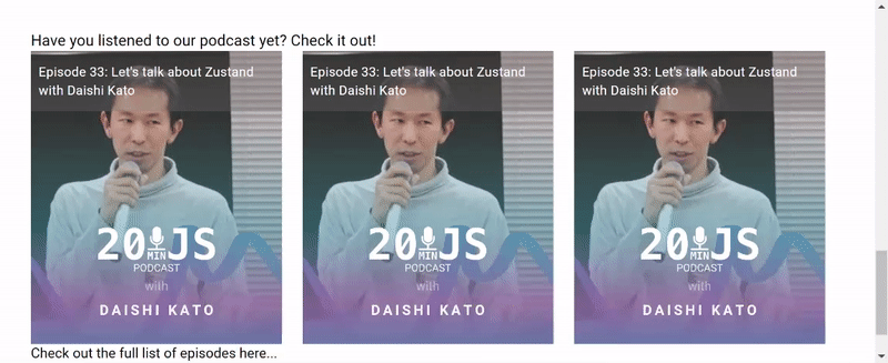
Creating The Talks Section
For the podcast section of the OpenReplay website, we will create a new Talks.jsx component in the components directory. To create our podcast slider, we will use Swiper.js. To install this dependency, enter the following command in the CLI:
npm i swiperWith the package installed, we can proceed to build the Podcast section. To do this, add the following code to Talks.jsx:
import React from "react";
import { Typography } from "@mui/material";
// Import Swiper React components
import { Swiper, SwiperSlide } from "swiper/react";
// Import Swiper styles
import "swiper/css";
const Talks = () => {
  return (
    <div style={{ padding: "0 10px" }}>
      <Typography variant="h5" sx={{paddingLeft: "30px"}}>
        Have you listened to our podcast yet? Check it out!
      </Typography>
      <div style={{ padding: "0 30px" }}>
        <Swiper spaceBetween={2} slidesPerView={3}>
          {/* Swiper component shows 3 slides per view */}
          <SwiperSlide>
            {/* first card */}
            <div
              style={{
                height: "380px",
                background: "URL(/talks.jpg)",
                backgroundRepeat: "no-repeat",
                backgroundSize: "cover",
                backgroundPositionX: "center",
                width: "325px",
                position: "relative",
                cursor: "pointer",
              }}
            >
              <div
                style={{
                  background: "#70707059",
                  color: "#fff",
                  padding: "15px 10px",
                }}
              >
                <Typography variant="body2" sx={{ fontSize: "17px" }}>
                  Episode 33: Let's talk about Zustand with Daishi Kato
                </Typography>
              </div>
            </div>
          </SwiperSlide>
          <SwiperSlide>
            {/* second card */}
            <div
              style={{
                height: "380px",
                background: "URL(/talks.jpg)",
                backgroundRepeat: "no-repeat",
                backgroundSize: "cover",
                backgroundPositionX: "center",
                width: "325px",
                position: "relative",
                cursor: "pointer",
              }}
            >
              <div
                style={{
                  background: "#70707059",
                  color: "#fff",
                  padding: "15px 10px",
                }}
              >
                <Typography variant="body2" sx={{ fontSize: "17px" }}>
                  Episode 33: Let's talk about Zustand with Daishi Kato
                </Typography>
              </div>
            </div>
          </SwiperSlide>
          <SwiperSlide>
            {/* third card */}
            <div
              style={{
                height: "380px",
                background: "URL(/talks.jpg)",
                backgroundRepeat: "no-repeat",
                backgroundSize: "cover",
                backgroundPositionX: "center",
                width: "325px",
                position: "relative",
                cursor: "pointer",
              }}
            >
              <div
                style={{
                  background: "#70707059",
                  color: "#fff",
                  padding: "15px 10px",
                }}
              >
                <Typography variant="body2" sx={{ fontSize: "17px" }}>
                  Episode 33: Let's talk about Zustand with Daishi Kato
                </Typography>
              </div>
            </div>
          </SwiperSlide>
          <SwiperSlide>
            {/* fourth card */}
            <div
              style={{
                height: "380px",
                background: "URL(/talks.jpg)",
                backgroundRepeat: "no-repeat",
                backgroundSize: "cover",
                backgroundPositionX: "center",
                width: "325px",
                position: "relative",
                cursor: "pointer",
              }}
            >
              <div
                style={{
                  background: "#70707059",
                  color: "#fff",
                  padding: "15px 10px",
                }}
              >
                <Typography variant="body2" sx={{ fontSize: "17px" }}>
                  Episode 33: Let's talk about Zustand with Daishi Kato
                </Typography>
              </div>
            </div>
          </SwiperSlide>
        </Swiper>
      </div>
      <Typography variant="h5" sx={{ fontWeight: "lighter", fontSize: "18px", paddingLeft: "30px" }}>
        Check out the full list of episodes here...
      </Typography>
    </div>
  );
};
export default Talks;
Add an import for the Talks component in the App.js file after the Pagination component. With this done, we get the following result in our browser:
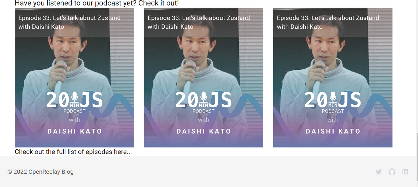
Adding a Footer
We will add a site footer to our web application for the final section. Create a new Footer.jsx file in the components folder and add the following code to it:
import React from "react";
import { Box, Stack, Typography } from "@mui/material";
import { Twitter, LinkedIn, GitHub } from "@mui/icons-material";
const Footer = () => {
  return (
    <div>
      <Box sx={{ backgroundColor: "#f5f5f5", padding: "30px 20px", maxWidth: "100vw", overflow: "Hidden", display: "flex", justifyContent: "space-between"}}>
        <Typography sx={{color: "#706e6e"}} >© 2022 OpenReplay Blog</Typography>
        <Stack
          direction= "row"
          spacing={2}
          justifyContent= "center"
          alignItems= "center"
        >
          <Twitter sx={{ height: "20px", width: "20px", color:"#d3d3dfee", cursor: "pointer" }} />
          <GitHub sx={{ height: "20px", width: "20px", color:"#d3d3dfee", cursor: "pointer" }} />
          <LinkedIn sx={{ height: "20px", width: "20px", color:"#d3d3dfee", cursor: "pointer" }} />
        </Stack>
      </Box>
    </div>
  );
};
export default Footer;
Add the Footer component in App.js and open the result in your browser:
Conclusion
We have come to the end of this tutorial. In this tutorial, we learned about the Material UI framework, its applications, and how it can be used together with a front-end framework to build web applications.
The entire source code used in this tutorial can be found here.
A TIP FROM THE EDITOR: For other examples of Material UI and React, don’t miss our Building A Video Player With React And Material UI and Building A Twitter Sidebar Clone With Material-UI And React articles.
Gain Debugging Superpowers
Unleash the power of session replay to reproduce bugs and track user frustrations. Get complete visibility into your frontend with OpenReplay, the most advanced open-source session replay tool for developers.