UX: best practices for developers
A collection of best practices for UX everybody should follow


User experience (UX) is an essential aspect of any website or application, and web developers play a crucial role in creating a positive user experience. As a web developer, you must understand the principles of UX and how to apply them to your designs. This article will provide a comprehensive guide to UX for web developers, including best practices, tips, and tricks to create a user-friendly website.
User experience (UX) is a critical component of web development that can make or break the success of a website or application. A positive UX can lead to higher user engagement, improved conversion rates, and better commercial results. To create a user-friendly website, it’s important to follow best practices that prioritize the needs and preferences of the target audience. Ultimately, a well-designed UX can contribute to the success of a website or application and the overall success of a business or organization.
This article will cover the fundamental principles of UX, such as understanding users, usability, accessibility, navigation, consistency, and feedback. We will then delve into best practices for UX in web development, including conducting user research, wireframing, and prototyping. We will also provide tips and tricks for creating a user-friendly website, such as using whitespace effectively, creating a clear hierarchy, and utilizing micro-interactions. The article will conclude by emphasizing the importance of continuous improvement and iteration to ensure a positive user experience. By following these best practices, web developers can create an aesthetically pleasing and user-friendly website.
UX refers to the user’s overall experience when interacting with a website, app, or product. A well-designed UX can increase user engagement, retention, and conversions, resulting in better commercial outcomes. On the other hand, a poorly designed UX can lead to user dissatisfaction and abandonment, decreased search engine rankings, and lost revenue. In this article, we will explore the importance of UX in web development, its benefits for developers, and best practices for creating user-friendly websites.
Importance of UX in web development
User experience (UX) significantly impacts how people engage with a website or application, making it a crucial part of web development. From the first impression to the final result, UX includes all facets of the user’s experience, including usability, accessibility, and contentment. Users’ perceptions of a website can be significantly altered by a well-designed user experience, affecting whether or not they stick around to utilize it. The ability to boost user engagement and retention is one of the main reasons UX is crucial in web development. A website that is challenging to use or navigate will frequently cause dissatisfaction and a bad user experience, which will cause users to leave the website or service.
A well-designed UX can help boost conversions and revenue and increase user engagement and retention. Users can be directed toward desired behaviors, like completing a purchase or filling out a form, by using a website created with their needs in mind, such as a straightforward checkout procedure or obvious calls-to-action. This can therefore result in higher sales and the success of your firm.
Also, UX is becoming more and more significant in the cutthroat world of online development. Businesses must make sure that their websites are built to be accessible and user-friendly across all devices and platforms, given the development of mobile devices and the growing significance of search engine optimization (SEO). A website’s poor user experience or lack of mobile optimization can lead to decreased search engine ranks, lost traffic, and eventually lost sales.
How can developers benefit from a good UX design?
Increased user satisfaction, engagement, and loyalty: When users have a positive experience with a website or application, they are more likely to return and recommend it to others. This can lead to increased traffic, revenue, and brand recognition.
Increased efficiency and productivity for developers: By designing a website or application with usability and accessibility in mind, developers can reduce the time and effort required to maintain and update it. A well-designed interface can also make it easier for developers to identify and fix issues, reducing the need for costly and time-consuming bug fixes.
More collaborative and productive work environment: By involving developers in the design process and incorporating their feedback, designers can create a more seamless workflow that benefits both teams. This can lead to increased job satisfaction and better overall project outcomes.
UX Principles
Several UX principles can guide the design of user-friendly websites and applications. Here are some of the most important ones:
-
Understanding Users(The user-first principle): The most important UX principle is understanding users. Understanding users involves researching and analyzing your target audience’s needs, preferences, and behaviors. By understanding your users, you can design products that meet their needs and solve their problems. This principle involves conducting user research, creating user personas, and performing usability testing to ensure your product is user-friendly and effective.
-
Usability: Usability is the second key UX principle, which means designing products that are easy to use and navigate. This principle is critical for ensuring that your product is user-friendly and efficient. A product that is difficult to use will not be successful, no matter how well it is designed or how useful it may be. Usability involves designing interfaces that are intuitive and easy to navigate, minimizing the cognitive load on users, and providing clear feedback on user actions.
-
Accessibility: Designing products that are accessible to everyone, including users with impairments, is a fundamental tenet of user experience (UX). Accessibility means creating products that can be used by people with visual, auditory, or physical impairments or those who use assistive technologies. Using straightforward language, including alternative text for images, and making products compatible with screen readers and other assistive technology are all part of designing for accessibility.
-
Navigation: Navigation involves designing simple user interfaces to browse and comprehend. Navigation entails offering a clear hierarchy of information, clear and consistent labeling, and logical content organization. Navigation also entails clearly stating calls to action and delivering feedback on user activities to aid users in understanding their location within the interface.
-
Consistency: Consistency involves designing interfaces that are consistent across different screens, pages, and interactions. Consistency means using consistent design patterns, typography, and color schemes throughout the product so that users can easily recognize and understand the interface and ensure that a user’s expectations are met. Consistency also means ensuring that interactions and behaviors are consistent across different screens and devices so users can easily move between them.
-
Feedback: Feedback is a UX principle that involves providing clear and timely feedback to users about their actions. Feedback means providing visual cues, such as animations or notifications, to indicate when a user has completed an action or an error has occurred. Feedback also means providing clear and concise messages to users to help them understand the results of their actions and how to correct any errors.
For developers to create products that are intuitive, engaging, and accessible to all users, regardless of their abilities or needs, it is necessary to follow these principles.
Conducting user research
Conducting user research is a critical aspect of UX design and plays an essential role in ensuring that the website or application meets the needs of the target audience. User research involves gathering information about the users, their behaviors, and their preferences, which can help inform design decisions and ensure that the website provides a positive user experience.
There are several methods for conducting user research, including surveys, interviews, user testing, analytics, personas, etc. Here are a few tools for conducting user research:
-
UserTesting is a platform that allows you to create and run user tests with real people. You can test your website or application and receive feedback on the user experience.
-
Hotjar is a tool that allows you to see how users interact with your website. You can track user behavior, create heat maps, and receive feedback through surveys.
-
Optimal Workshop is a suite of tools that allows you to conduct user research, including tree testing, card sorting, and first-click testing.
-
SurveyMonkey is a popular survey tool that allows you to create and distribute surveys to your target audience. You can receive feedback on your website or application and use the data to inform your design decisions.
-
Google Analytics is a web analytics tool that allows you to track user behavior on your website. You can see how users interact with your website, track conversions, and identify areas for improvement.
-
UsabilityHub offers a suite of tools for user research, including first-click testing, five-second tests, and navigation testing. You can receive feedback on the user experience and identify areas for improvement.
-
UserZoom is a user research and testing platform. You can create and run tests, surveys, and card-sorting activities to gather feedback on your website or application.
-
Maze is a user testing and research platform that allows you to create and run tests with real users. You can receive feedback on the user experience and identify areas for improvement.
-
Lookback is a tool that allows you to record and analyze user sessions. You can see how users interact with your website or application and identify areas for improvement.
-
Qualtrics is a online survey, poll, and research platform. You can use the tool to gather feedback from your target audience and identify areas for improvement.
Wireframing and prototyping
Wireframing and prototyping are important steps in the UX design process, as they help designers create a basic structure and layout of a website before investing time and resources into coding.
Wireframing
Wireframes are simple, low-fidelity representations of a design layout, while prototypes are more advanced and interactive. Wireframes can be created using various tools, such as pen and paper, whiteboards, or digital software such as Sketch or Figma.
Using Figma for example,
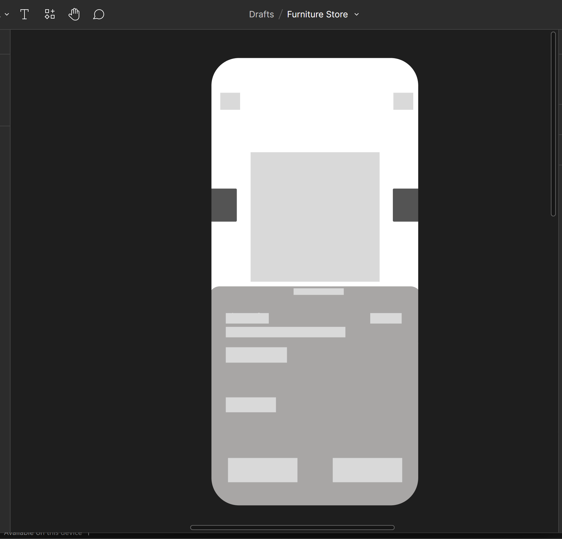
Wireframing is typically the first step in the design process. It involves creating a basic website layout without design elements such as colors or images. Wireframing aims to create a visual representation of the website’s structure and layout and identify potential issues early in the design process.
Prototyping
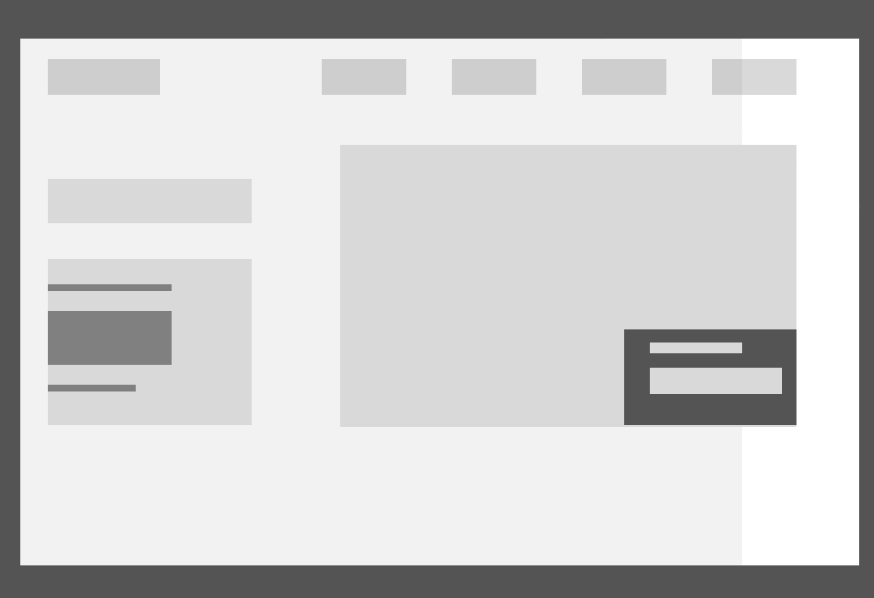
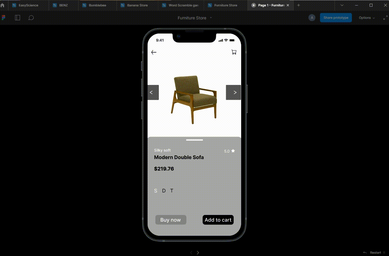
Once the wireframe is complete, the next step is prototyping. Prototyping involves creating a more advanced, interactive version of the website. The purpose of prototyping is to test the website’s usability and identify potential issues before development begins. Prototypes can be created using various tools, such as InVision Studio or Axure RP.
Prototyping allows designers to create a more realistic website representation, including design elements such as colors, images, and typography. This helps stakeholders better understand how the website will look and function and can help identify potential issues with usability, navigation, or overall design.
Wireframing and prototyping can save time and resources in the development process by identifying potential issues early in the design process. They also help ensure that the final product meets the needs of its users, as testing and feedback can be incorporated into the design before development begins.
Overall, wireframing and prototyping are essential best practices in UX design, helping designers create a strong foundation for the website’s layout and structure and ensuring that the final product meets the needs of its users.
Responsive design for mobile devices
UX is an essential aspect of web development, especially when designing for mobile devices. Responsive design allows websites to adapt to different screen sizes and devices. It ensures that content is displayed correctly and users can navigate the website easily, regardless of their device.
As a developer, there are several ways to build responsive web pages that work well on both mobile and web devices:
- Use a Responsive Framework: Several responsive frameworks are available such as Bootstrap, Foundation, and Materialize. These frameworks provide pre-built HTML, CSS, and JavaScript components that can be easily customized to create responsive web pages.
- Use CSS Queries: CSS queries allow you to specify different styles for different screen sizes. This can be used to adjust the layout and style of a webpage for different devices. For more on that, you can check out this article
- Use Flexible Layouts: Flexible layouts are designed to adapt to different screen sizes. One way to create flexible layouts is by using a fluid grid system that adjusts to the screen size. For more on that, you can check out this article
- Optimize Images: Large images can slow down the loading time of a webpage, especially on mobile devices. To optimize images, reduce their file size and use the appropriate image format (e.g., JPEG for photographs, PNG for graphics).
- Use Mobile-first Design: Mobile-first design is a design approach that prioritizes the mobile experience over the desktop experience. This means designing the webpage for mobile devices first and then adding additional features and elements for larger screens.
- Test on Multiple Devices: To ensure your webpage is responsive and works well on different devices, test it on multiple devices. Use emulators, simulators, and real devices to test the webpage and identify any issues that need to be fixed.
Designing for mobile devices requires a unique set of considerations to ensure a positive user experience. By implementing these best practices, web developers can create responsive, easy to navigate, and optimized websites for mobile devices.
Ensuring accessibility, speed, and performance
- Accessibility: Accessibility means ensuring that all users, including those with disabilities, can use and access the website. To ensure accessibility, developers should follow accessibility guidelines such as the Web Content Accessibility Guidelines (WCAG. This includes adding alt tags to images, providing audio and video content transcripts, using clear and concise language, and ensuring the website is keyboard accessible.
- Speed: Website speed is crucial for user experience, especially on mobile devices. Developers can optimize website speed using image compression, caching, and minifying CSS and JavaScript files. It is also important to optimize server response time and reduce the number of HTTP requests. Using a Content Delivery Network (CDN) can improve website speed and performance by caching content and serving it from a server closest to the user’s location.
- Performance: Website performance refers to how well a website performs under different conditions, such as high traffic or slow internet connections. To ensure website performance, developers can use techniques such as lazy loading, which loads images and content only when needed, and optimizing code to reduce the size of files.
By optimizing accessibility, speed, and performance, developers can improve the user experience and ensure that the website is accessible and functional for all users, regardless of location, device, or ability.
Testing and evaluating
Testing and evaluation are essential to ensure that a website meets its users’ needs. It’s important to test a website at various stages of the design process, from wireframing and prototyping to development and post-launch. Usability testing can help identify potential issues and provide valuable feedback for improvement. It’s also important to track website metrics such as bounce rate, time on site, and conversion rate to evaluate the design’s success.
Session Replay for Developers
Uncover frustrations, understand bugs and fix slowdowns like never before with OpenReplay — an open-source session replay tool for developers. Self-host it in minutes, and have complete control over your customer data. Check our GitHub repo and join the thousands of developers in our community.
Tips and Tricks for UX in Web Development
By understanding your users, keeping it simple, prioritizing navigation, using responsive design, paying attention to loading times, using color and typography effectively, and testing your website, you can create a website that is not only visually appealing but also easy to use and navigate. These tips and tricks can help you design and develop a website that users will love and want to return to.
Choosing the right colors
When designing a user experience (UX), color is crucial in creating a visually appealing and effective product. Colors can elicit emotions, convey information, and guide users through a product. Therefore, it is essential to choose the right colors for UX development.
Here are some of the tools you can employ in choosing colors for your designs.
Choosing the right colors is an essential part of UX in web development. The personality of your website is often expressed by the colors you use on the website.
Let us look at a few rules/points to follow when choosing colors.
Understand the Brand and Audience
The first step in choosing the right colors for UX development is understanding the brand and the target audience. The brand’s color palette should be used as a starting point. The colors used in branding should be reflected in the product’s design to maintain consistency and establish a strong brand identity.
Colors can evoke different emotions and feelings, which can be used to enhance the user experience. For example, blue is often associated with calmness and trust, while red can signify urgency or danger. Understanding the emotions and feelings associated with colors can help in choosing the right color palette for UX development.
However, it’s important to use colors in a way that is consistent with the brand’s tone and message. For example, if the brand’s tone is playful and lighthearted, using a serious color like black may not be appropriate.
Next, consider the target audience. Different demographics may have different color preferences, so it’s important to choose colors that resonate with the intended audience. For example, bright and bold colors may be more effective if the product targets children. On the other hand, if the product is for a more mature audience, muted or subdued colors may be more appropriate. Hence, the subject of picking a color system.
Establish a color system
In establishing a color system, we pick the
- Main color(Used to draw attention to an important part of the webpage).
- Sub color
- Accent color(Optional)
There needs to be a relationship in the color system to create a consistent design. For example, consider a call-to-action card for a Couple’s therapy at the beach. In picking out the color system, we must consider colors that would match the scenery for this retreat, that is, colors that resonate or reflect the beachside in general.
First, we choose a base color and then create a color palette

Consider Color Contrast and Accessibility
Color contrast is another important factor to consider in UX development. A great tool to check for color contrast is coolors. Colors should have enough contrast to ensure readability and legibility. Low contrast can make it difficult for users to read text, identify buttons, or navigate the product.
It is also essential to consider accessibility when choosing colors. People with color blindness or visual impairments may struggle to distinguish between certain colors. Therefore, it’s important to use color combinations that are accessible and easy to distinguish for all users.
For example, we will use a white background(#FFFFFF) for most of the design, so we check using the contrast checker if our background color and the text colors we intend to use are a good fit.
First, white (#FFFFFF) background and black (#000000) text,
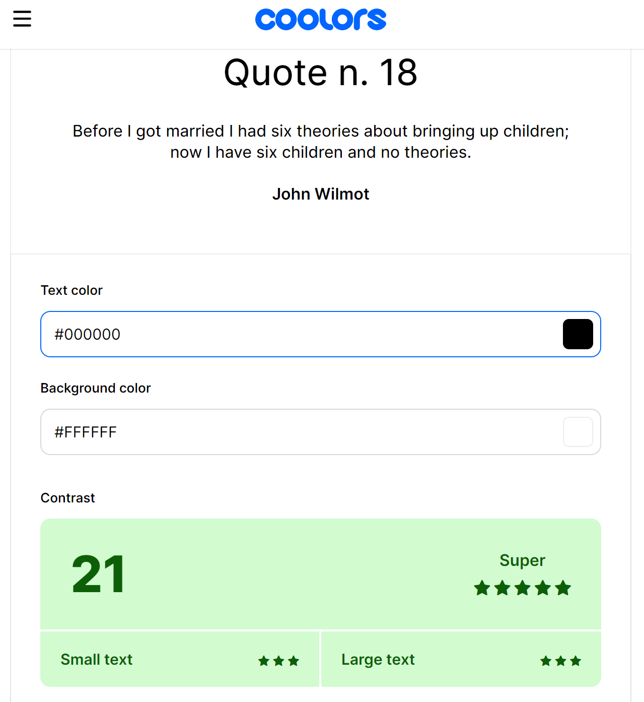
Secondly, white (#FFFFFF) background and green (#000000) text/buttons,
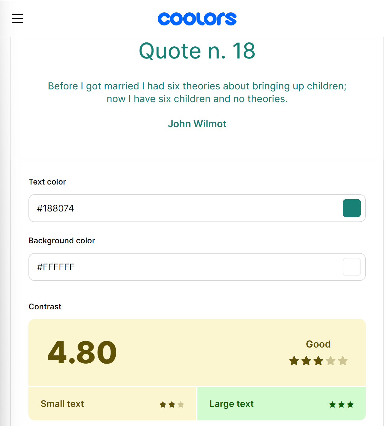
Both are confirmed to be a good fit; then, we can proceed.
Keep it Simple
When it comes to UX development, simplicity is key. Avoid using too many colors, as it can be overwhelming and confusing for users. It’s recommended to use a maximum of three to five colors in a product’s design. Additionally, using a neutral color palette can help to create a clean and minimalist design that is easy on the eyes.
Applying the rules stated above, we will have,

Choosing the right colors for UX development is essential in creating a visually appealing and effective product. By understanding the brand and target audience, considering color contrast and accessibility, choosing colors that elicit emotions, keeping it simple, and testing and iterating, designers can create a successful and user-friendly product.
Choosing the right typography
Typography, according to wikipedia, is the art and technique of arranging type to make written language legible, readable, and appealing when displayed. The arrangement of type involves selecting typefaces, point sizes, line lengths, line-spacing, and letter-spacing, as well as adjusting the space between pairs of letters. Typography is a crucial aspect of UX development, as it affects how users interact with and perceive a website or app. Choosing the right typography can make a website or app more accessible, legible, and aesthetically pleasing. However, with so many font options available, selecting the right typography can be a daunting task.
What are some of the things to consider when choosing the right typography?
-
Legibility: The primary function of typography is to convey information, and legibility is crucial to achieving this goal. The font should be easy to read, even in smaller sizes. Sans-serif fonts are generally considered more legible than serif fonts, especially on digital screens. Font size, spacing, and contrast are critical factors affecting legibility. A good rule of thumb is to use a font size of at least 16 pixels for the body text and ensure there is enough contrast between the font and the background.
-
Brand Identity: Typography can also convey a brand’s identity and personality. The font choice should align with the brand’s values and messaging. For example, a modern and sleek sans-serif font may be appropriate for a technology company, while a more traditional serif font may suit a law firm. Selecting a font that reflects the brand’s image and resonates with its target audience is essential.
-
Hierarchy and Organization: Typography can also be used to establish a visual hierarchy and organize content on a website or app. Different font sizes, weights, and styles can be used to differentiate between headings, subheadings, and body text. It’s important to maintain consistency in typography throughout the design to create a cohesive and organized user experience.
-
Readability: Readability is another crucial factor to consider when selecting typography. The font should be easy to read, even for users with visual impairments. The use of a typeface that is compatible with screen readers and other assistive technologies will provide an inclusive experience for users with disabilities.
In selecting fonts, there are no rules, but there are some fonts that look good in almost all designs, for example, the sans-serif fonts, which include;
These are some of the best sans-serif fonts; for more, check here.
Now applying the above considerations and using Open Sans as font, we will have this;

For more fonts, check google fonts and typoguide.
Creating a clear hierarchy Using whitespace, colors, position, fonts, etc.
In UX development, creating a clear visual hierarchy is essential to ensure that users can quickly and easily navigate a website or application. A visual hierarchy is a design technique that arranges elements on a page or screen in order of importance, making it clear to users where they should focus their attention. When done correctly, a clear visual hierarchy can improve the overall user experience, leading to higher engagement and conversion rates.
There are several key principles to keep in mind when creating a clear visual hierarchy for UX development. First and foremost, it’s important to understand the user’s goals and priorities. What information or actions are most important to them? Once you have a clear understanding of the user’s needs, you can begin to prioritize content and design elements accordingly.
-
Using a grid system: One effective way to create a visual hierarchy is to use a grid system. A grid system is a layout tool that helps designers organize content logically and consistently. By using a grid, you can ensure that each element on the page has a specific place and purpose, making it easier for users to understand the overall layout.
-
Color, size, and typography: Another important principle is to use visual cues such as color, size, and typography to guide the user’s attention. For example, using a larger font size or bold text can draw the user’s attention to a specific headline or call-to-action. Similarly, using contrasting colors can help important elements stand out from the background and create a more visually compelling design.
-
Whitespace: Whitespace is another important element of visual hierarchy. By strategically using whitespace, you can create a sense of balance and clarity on the page. Whitespace can also help separate different content sections and guide the user’s eye to the most important information.
Consistency is also key when creating a clear visual hierarchy. By using consistent design elements such as font sizes, colors, and layouts, you can help users quickly understand how to navigate the site or application. Consistency can also help to build trust and familiarity with the user, leading to a more positive user experience.
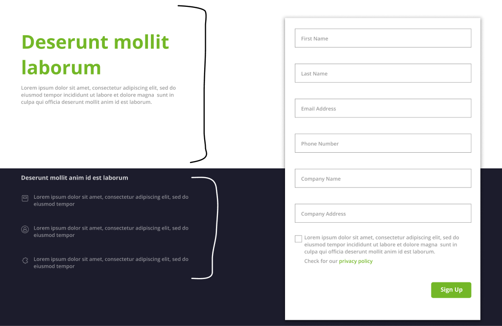
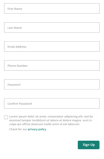
Simplifying navigation and making forms easier to use.
Forms are a crucial part of any website or application that requires user input. They allow users to interact with a website and provide the information that the site needs to function. However, forms can often be confusing and frustrating to use, leading to user abandonment and decreased conversion rates. Therefore, it’s important to make forms easy to use and simplify navigation to provide a better user experience (UX).
-
Keep it Simple: The simpler the form, the easier it is to use. Keep the number of fields to a minimum, and only ask for essential information. Avoid asking for too much personal information that might put off the user. If possible, use dropdown menus or checkboxes instead of text fields to speed up the process.
-
Organize Information Hierarchically: Organize information on your website or application hierarchically, with the most important content at the top-level navigation and the less important content nested under it. This makes it easier for users to quickly find what they are looking for.
-
Limit the Number of Options: Limit the number of options in the main navigation menu to 5-7. This prevents users from feeling overwhelmed by too many choices and makes it easier for them to navigate to the most important pages on the site. The navigation of the site should be clear and straightforward, with clear calls to action and simple menus. Make it easy for users to find what they’re looking for and provide a consistent navigation experience throughout the site.

-
Use Familiar Design Patterns: Use familiar design patterns for navigation, such as dropdown menus, breadcrumbs, and navigation bars. Users are more likely to understand and use a navigation system that is familiar to them. Find some inspiration at LandBook
-
Make it Searchable: Make sure your website or application has a search function that is easy to find and use. This allows users to quickly find what they are looking for without having to navigate through the site manually.

-
Use Consistent Design: Use consistent design throughout the website or application. Consistency in design makes it easier for users to understand how to navigate and find what they are looking for.
-
Test and Refine: Test your navigation system with users and gather feedback. Use this feedback to refine your navigation system to make it even more user-friendly.
Tools and Resources
User experience (UX) development is a crucial aspect of designing digital products and services that are engaging, intuitive, and effective. To achieve this goal, UX designers rely on a range of tools and resources that help them create and refine user interfaces, conduct user research, and collaborate with their teams. These tools can include wireframing and prototyping software, user testing platforms, design systems, and project management tools. By leveraging these resources, UX designers can streamline their workflow, improve communication with stakeholders, and ultimately deliver high-quality user experiences that meet the needs and expectations of their users.
UX Design Tools for Developers
There are several UX design tools available for developers that can help create better user experiences. Here are a few examples:
-
Sketch is a popular vector graphics editor that is commonly used to create wireframes, mockups, and prototypes. It’s also integrated with several design plugins and tools that can help developers streamline their workflows.
-
Figma is a browser-based design tool that allows multiple users to work on a project simultaneously. It offers a wide range of design features, including vector networks, auto-layout, and interactive components, which can be helpful for developers working on complex designs.
-
Adobe XD is a user experience design tool that allows designers and developers to collaborate on projects in real-time. It offers a range of features, including design systems, interactive prototypes, and voice prototyping, that can help developers create engaging and user-friendly experiences.
-
InVision Studio is a powerful design tool that allows designers and developers to create animations, transitions, and micro-interactions. It also offers a range of collaboration features, including live sharing, real-time feedback, and version control.
-
Axure RP is a prototyping tool that allows developers to create interactive wireframes and prototypes. It offers a range of features, including conditional logic, adaptive views, and dynamic panels, that can help developers create complex interactions and experiences.
These are just a few examples of the many UX design tools available for developers. Each tool has its strengths and weaknesses, so it’s important to choose the one that best suits your specific needs and workflow.
Resources for Learning UX Design
Remember that learning UX design is an ongoing process, and it takes time and practice to become proficient. So, don’t be afraid to experiment, ask questions, and seek feedback to improve your skills.
- Online courses: Platforms like Coursera, Udemy, and Skillshare offer a wide range of UX design courses from beginner to advanced levels.
- Design blogs and books.
- Online communities: Joining online communities can be a great way to connect with other UX designers and learn from their experiences.
- Conferences and events: Attending UX design conferences and events are an excellent way to network with other designers and learn about the latest trends and best practices in UX design.
- Design challenges: Participating in design challenges, such as those offered by sites like UX Challenge and 100 Days of UI, etc, will help in practicing your skills and getting feedback from other designers/developers.
- Online tutorials and videos: Websites like YouTube and Vimeo offer a wealth of video tutorials and guides on UX design topics.
Best Practices for Integrating UX Design into Development Workflows
When it comes to web development, creating a positive user experience (UX) is a must-have. To ensure that users have a seamless and enjoyable experience on a website, web developers need to be familiar with the principles of UX and how to integrate them into their designs.
-
Conducting User Research: One of the best ways to start integrating UX design into development workflows is by conducting user research. This research helps to identify the target audience and their needs, and this information can be used to guide design decisions. It also ensures that the website caters to the needs of the users.
-
Collaborating with Designers: Collaboration between web developers and UX designers is also crucial. Working together ensures that the design aligns with the development goals and constraints. It also helps to ensure that the website meets the design standards and is user-friendly.
-
Prototyping and Testing: Prototyping and testing the design with users is another important practice. This process helps to identify usability issues and refine the design before development begins. It’s better to identify problems early on in the process rather than having to rework the entire design later on.
-
Using a Design System: Using a design system is another great way to maintain consistency across the website. It helps to ensure that design elements are reusable and scalable and also saves time by making it easier to implement design changes.
-
Continuous Improvement: Continuous improvement is also vital. UX design is an iterative process, and web developers need to be ready to continuously improve and refine the design based on user feedback and analytics. By constantly improving the design, web developers can ensure that the website remains effective and relevant over time.
Conclusion
Integrating UX design into web development workflows is essential. By understanding the principles of UX design, utilizing best practices, and using tools and resources, web developers can create a website that meets the needs of the users and provides a positive user experience. By prioritizing UX design in their development workflows, web developers can create websites that are both aesthetically pleasing and user-friendly, leading to increased engagement, conversions, and success.
Gain Debugging Superpowers
Unleash the power of session replay to reproduce bugs and track user frustrations. Get complete visibility into your frontend with OpenReplay, the most advanced open-source session replay tool for developers.