Visualize Data in React with Tremor
How to produce elegant data visualizations for React


Data forms the backbone of any modern-day enterprise, and good insight into it propels the business to be at the top of the competition by making grounded decisions. Charts, graphs, and KPI cards are handy in having good data visuals, as everyone in all departments can understand them. This article will introduce Tremor, a fully open-source simple library for data visualization in Reactjs and Nextjs, that lets you achieve sophisticated charts and graphs with just a few lines of code.
Creating well-structured charts and graphs using JavaScript can be very engaging and time-consuming to visualize data. It has pushed the web industry to settle for licensed libraries such as Fusion chart, which sometimes becomes expensive and overkill for small projects. Tremor is a new library with great power despite its simplicity. This article will walk you through the library, how to set it up, how to use it, and why you should use it in your next project. Then we will finish by creating this amazing dashboard.
How does Tremor work?
Tremor is developed for fast dashboard development for data visualization. It comes with ready build components that are beautiful by default and easy to customize. Built with TypeScript, Tremor components intuitively give you everything you need to create amazing-looking dashboards. Components are styled by passing tailwind classes as props, further stretching Tremor’s simplicity. In addition to components, Tremor also has Blocks. A block is a group of Tremor components put together to achieve a certain layout. The layouts brought out by the block are the ones you may frequently need.
To get started, create our React application using Vite. Vite is a built tool for creating almost any web application in seconds.
First, create an empty folder in any preferred location and name it “Tremor”.
Open the VScode editor and its integrated terminal via this shortcut key Ctrl+Shift+\.
Navigate to our newly created “Tremor” folder through the terminal and run the below command.
npm create vite@latestThe Vite installation wizard shall prompt you to provide the project and package names. Name your project with your desired name choice. In our case, we shall call it “Dashboard”, and as for the package name, you can use the default created package name, which is similar to your project name.
Then, you will have the prompt below asking you to choose the framework you want to use.
We shall be working with React hence navigate to the React option through the up and down arrow keys and press Enter. Vite is a very intuitive tool; it will follow up by asking the variant of React your want to use, as shown below.
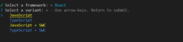
We shall use JavaScript, but feel free to use TypeScript if you’re comfortable with it. Let’s select JavaScript, and then you will have the below final prompt.
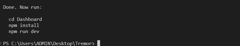
From the prompt, navigate to your project via the cd command and run the below command.
npm installThe above command will install all the React files needed for your project.
We will install the Tremor library as a dependency for our project via the below command.
npm install @tremor/react Once the installation is finished, let’s start up our local server so that we can view the application. For that, run the below command to start the server.
npm run devThis command will create a locally hosted server; on the terminal, you will be given the URL link to where it’s hosted. Open up your favorite browser and visit the link to view your application.
Tremor component
Tremor library standout to provide the fastest and easy way of creating data visualization dashboards. With that, it saves you the hassle of knowing the nitty-gritty of how to style a given chart element or calibrate a bar graph. It comes with out-of-the-box components that you import and passes data to them as props to create great visuals. These intuitive components provide a straightforward way to customize them to fit your needs.
Inside the src folder, open the app.jsx file and clear everything inside the parent div.
Also, clear all imports at the top except the app.css.
We shall start by having a simple Card component. We will import it from Tremor via the below lines of code.
import { Card } from "@tremor/react";Then, import the tremor.css file, which is a file that styles out all the Tremor components via the below line.
import "@tremor/react/dist/esm/tremor.css";You should always make this import in the app.jsx or app.tsx since failure to import it will not let your components be styled. Subsequently, ensure the import is at the bottom in cases where you have many CSS files to avoid CSS conflict.
import { Card, Text } from "@tremor/react";
import "./App.css";
import "@tremor/react/dist/esm/tremor.css";

function App() {
  return (
    <div className="App">
      <Card> </Card>
    </div>
  );
}
export default App;
Use the Card component inside your application, and this will render out as below.

It’s not the most creative thing you have ever seen, but that is how simple Tremor is; you import components, pass in data, then they render out perfectly. Tremor has a massive collection of other components besides the Card component. We shall be going through some of them but feel free to check out the whole group in the documentation. Now, Let’s use more components to add complexity to our application.
Have the below line in your app.jsx file.
import { Card, Text, Metric, Flex, ProgressBar } from "@tremor/react";
import "./App.css";
import "@tremor/react/dist/esm/tremor.css";

function App() {
  return (
    <Card maxWidth="max-w-sm">
      <Text>Sales</Text>
      <Metric>$ 60,465</Metric>
      <Flex marginTop="mt-4">
        <Text>52% of annual target</Text>
        <Text>$ 254,000</Text>
      </Flex>
      <ProgressBar percentageValue={42} marginTop="mt-2" />
    </Card>
  );
}
export default App;
With only those few lines of code, we have the below visual.

Cool right?
-
metric: This component is used to wrap around numbers. It takes in props such as thetruncate,a boolean prop in cases where you want the numbers truncated. -
Flex: This layout component is similar to CSS flex. By default, it displays the items in rows. -
ProgressBar: This component creates a progressive bar; the percentage you want it to show out is passed in through theparcentageValueprop.
All the components are styled out in a tailwind fashion by the tremor.css file we imported.
Tremor Icon
For the perfect decoration of data, Icons play a critical role. They help speed up the recognition of a particular data by bringing in some real-world connection. Tremor provides the icon component to help one easily connect and style the icon. Here is how to use the icon component
import { Icon } from "@tremor/react";

export default () => (
  <Icon icon={undefined} variant="simple" size="sm" color="blue" />
);
The component has the following props.
-
icon: This is the exact icon you would like to use, for example, a shopping cart or a wallet icon. -
size: This property specifies the size you want the icon to take, i.e.,smfor small,lgfor large, andxlfor extra large. -
color: The color prop specifies the color you want the icon to take. -
variantrefers to the style you want the icon to take. Three variants are exportedsimple,outlined,shadow,light, andsolid.
You can use an icon library, but Tremor recommends the Hero icons. To use the hero icons, import them as a library via the code below.
npm install @heroicons/reactNow, you can utilize all the icons with this library by importing them as a component.
import { ShoppingCartIcon } from "@heroicons/react/24/outline";In the above line, we have specified we want the icon from the set. We want to use the 24x24 icon size, which they are from the outline directory; you can also use the 20x20 icon, which you can find in the solid directory. Here is the list of all exported icons you can use in your app here
Now to use it, you will pass in the icon as a prop to the icon component, as shown.
<Icon size="xs" icon={ShoppingCartIcon} />;Tremor ColGrid
colGrid are Tremor’s special component for aligning components in equally sized columns. To use, you can import it as shown below.
import { ColGrid, Col } from "@tremor/react";The ColGrid component will be the parent component for the element you want to arrange in columns. The Col can be used as the direct child of the CollGrid, but it’s not a must.
import { ColGrid, Col } from "@tremor/react";

export default () => (
  <ColGrid
    numCols={1}
    numColsSm={}
    numColsMd={}
    numColsLg={}
    gapX="gap-x-0"
    gapY="gap-y-0"
    marginTop="mt-0"
  >
    <Col numColSpan={1} numColSpanSm={} numColSpanMd={} numColSpanLg={}>

    </Col>
  </ColGrid>
);
On the ColGrid component, you can pass the below props:
-
numColsrefers to the number of columns you want to lay out. The column can be of different sizes,sm,Md,Lgfor, where for example,numColsMdis small -
gaprefers to the margin the column should have in between each other, on the X-axis and the Y-axis.
The Col component has the below parameter
numColSpanrefers to the number of spaces the collum should cover for the others.
Tremor Blocks and shell
The Tremor Block is pre-written code that achieves a specific layout. The blocks are fully configured, allowing you to fill in the data you want to display. Here is an example of a block with a card and the metric
import { Card, ColGrid, Metric, Text } from "@tremor/react";

const categories = [
  {
    title: "Sales",
    metric: "$ 23,456",
  },
  {
    title: "Profit",
    metric: "$ 13,123",
  },
  {
    title: "Customers",
    metric: "456",
  },
];

export default function Example() {
  return (
    <ColGrid numColsSm={2} numColsLg={3} gapX="gap-x-6" gapY="gap-y-6">
      {categories.map((item) => (
        <Card key={item.title}>
          <Text>{item.title}</Text>
          <Metric>{item.metric}</Metric>
        </Card>
      ))}
    </ColGrid>
  );
}
In addition to the block, Tremor also provides Shell pages. Shell pages are complete dashboard designs with a predefined card that only needs elements to be plugged in. The shell page offers a responsive design for all screen sizes; hence you will not write any media query. You can check out these pages here to find the one that suits your need.
Creating a dashboard
After going through most Tremor components and features, you must have learned its essential operation. Now, we will pack up the knowledge you have gained to create this dashboard
To begin, we will use the Tremor shell pages to have a responsive design quickly. We use the page shell with KPI sidebar for our design, but we will add a few minor tweaks. For your app.jsx, you can have the following line of code.
import "@tremor/react/dist/esm/tremor.css";
import "./App.css";
import { Card, ColGrid, Col, Block } from "@tremor/react";
import BarComp from "./Componets/BarComp";
import Header from "./Componets/Header";
import Sideview from "./Componets/Sideview";
import Barview from "./Componets/Barview";

function App() {
  return (
    <div className="App">
      <Header />
      <ColGrid numColsLg={6} gapX="gap-x-6" gapY="gap-y-1" marginTop="mt-6">
        <Col numColSpanLg={4}>
          <Card hFull={true}>
            <div className="h-80">
              <BarComp />
              <Barview />
            </div>
          </Card>
        </Col>
        <Col numColSpanLg={2}>
          <Block spaceY="space-y-6">
            <Sideview />
          </Block>
        </Col>
      </ColGrid>
    </div>
  );
}

export default App;
As mentioned above, we have used the ColGrid Tremor component to lay out our children’s components. We have given it a maximum width of 6, where its direct children share it in a ratio of 4 and 2. You must have also noticed some components we have imported from a component folder and rendered them out. These components contain the data visualization tool; we will go through them momentarily.
On your index.css file inside the root, have the following line of code to create a beautiful linear gradient for our background.
 background-image: linear-gradient(
  to bottom right,
  rgb(215, 174, 174),
  rgb(27, 27, 26)
);
background-repeat: no-repeat;
background-size: cover;
Create a new folder called Components in the ‘src’ folder. Inside the Components folder, create the following components Header.jsx, Revenue.jsx, Platform.jsx, and Sales.jsx.
Session Replay for Developers
Uncover frustrations, understand bugs and fix slowdowns like never before with OpenReplay — an open-source session replay tool for developers. Self-host it in minutes, and have complete control over your customer data. Check our GitHub repo and join the thousands of developers in our community.
Header component
You can have the following line for Header.jsx.
import { Card, Metric, Text, Icon, Flex, Block, ColGrid } from "@tremor/react";
import { TicketIcon, UserGroupIcon } from "@heroicons/react/24/outline";
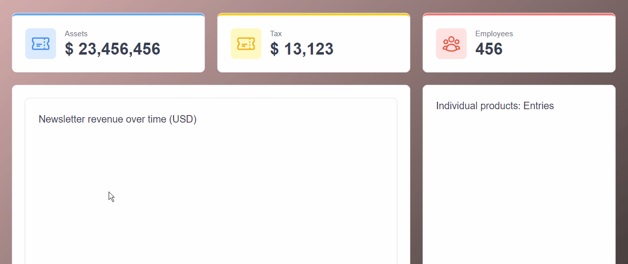
const categories = [
{
title: "Assets",
metric: "$ 23,456,456",
icon: TicketIcon,
},
{
title: "Tax",
metric: "$ 13,123",
icon: TicketIcon,
color: "yellow",
},
{
title: "Employees",
metric: "456",
icon: UserGroupIcon,
color: "red",
},
];
function Header() {
return (
<ColGrid numColsSm={2} numColsLg={3} gapX="gap-x-6" gapY="gap-y-6">
{categories.map((item) => (
<Card key={item.title} decoration="top" decorationColor={item.color}>
<Flex justifyContent="justify-start" spaceX="space-x-4">
< icon
icon={item. icon}
variant="light"
size="xl"
color={item.color}
/>
<Block truncate={true}>
<Text>{item.title}</Text>
<Metric truncate={true}>{item.metric}</Metric>
</Block>
</Flex>
</Card>
))}
</ColGrid>
);
}
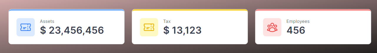
export default Header;We have created a dummy JSON file called category and mapped its data in the main Header component. Inside the component, we have used Tremor colGrid, which is fully configured to display our data inside Card and make the component responsive. The Flex component will show the Block components side by side and space them evenly without leaving any space at the start as we have passed justifyContent="justify-start" props. We have also used the Tremor icon to add more meaning to our data.
Comment the other components, and our Header will render out like this:
Revenue Component
This component will use an area chart to visualize dummy revenue data. Have the following lines of code for the Revenue.jsx file.
import { Card, Title, AreaChart } from "@tremor/react";

const chartdata = [
  {
    date: "Jan 22",
    SemiAnalysis: 2890,
    "The Pragmatic Engineer": 2338,
  },
  {
    date: "Feb 22",
    SemiAnalysis: 2756,
    "The Pragmatic Engineer": 2103,
  },
  {
    date: "Mar 22",
    SemiAnalysis: 3322,
    "The Pragmatic Engineer": 2194,
  },
  {
    date: "Apr 22",
    SemiAnalysis: 3470,
    "The Pragmatic Engineer": 2108,
  },
  {
    date: "May 22",
    SemiAnalysis: 3475,
    "The Pragmatic Engineer": 1812,
  },
  {
    date: "Jun 22",
    SemiAnalysis: 3129,
    "The Pragmatic Engineer": 1726,
  },
];

const dataFormatter = (number) => {
  return "$ " + Intl.NumberFormat("us").format(number).toString();
};

const Revenue = () => (
  <Card height="h-80">
    <Title>Newsletter revenue over time (USD)</Title>
    <AreaChart
      data={chartdata}
      categories={["SemiAnalysis", "The Pragmatic Engineer"]}
      dataKey="date"
      height="h-72"
      colors={["indigo", "cyan"]}
      valueFormatter={dataFormatter}
      marginTop="mt-4"
    />
  </Card>
);
export default Revenue;
The AreaChart is a Tremor component that combines the line chart and bar chart to show data change regarding time. The area chart takes the following props.
export default () => (
  <AreaChart
    data={[{}]}
    categories={[]}
    dataKey=""
    stack={false}
    colors={["blue"]}
    valueFormatter={undefined}
    startEndOnly={false}
    showXAxis={true}
    showYAxis={true}
    autoMinValue={false}
    yAxisWidth="w-14"
    showTooltip={true}
    showLegend={true}
    showGridLines={true}
    showAnimation={true}
    height="h-80"
    marginTop="mt-0"
  />
);
The props are self-explanatory, and you will only use some of them. The dataFormater function changes a number to a specific currency.
Our revenue component will render out as such.

Platform component
We will use the Tremor Donut chart components in this component to display some dummy data. The donut display data similar to a piechart but is open at the center like a donut. In this component, you will pass the colors you would like the given elements to take as props in conjunction with the data and the unique identifier of each entry.
The Platform.jsx file has these lines.
import { Card, Title, DonutChart } from "@tremor/react";

const cities = [
  {
    name: "Google",
    sales: 9800,
  },
  {
    name: "Facebook",
    sales: 4567,
  },
  {
    name: "Medium",
    sales: 3908,
  },
  {
    name: "GitHub",
    sales: 2400,
  },
  {
    name: "Youtube",
    sales: 1908,
  },
  {
    name: "Twiter",
    sales: 1398,
  },
];

function Platform() {
  return (
    <div>
      <Card maxWidth="max-w-s">
        <Title>Platforms traffic</Title>
        <DonutChart
          data={cities}
          category="sales"
          dataKey="name"
          variant="donut"
          marginTop="mt-6"
          colors={["amber", "rose", "violet", "indigo", "cyan", "indigo"]}
        />
      </Card>
    </div>
  );
}
export default Platform;
One thing to note is that you can pass either of these two properties, pie or donut, for the variant prop. The pie will create a pie chart, whereas the donut property will create an open pie chart at the center.
Here is how our donut will render out with some smooth animation.

Have the following line for Platform.jsx.
import { Card, Title, DonutChart, BarChart } from "@tremor/react";
const cities = [
{
name: "New York",
sales: 9800,
},
{
name: "London",
sales: 4567,
},
{
name: "Hong Kong",
sales: 3908,
},
{
name: "San Francisco",
sales: 2400,
},
{
name: "Singapore",
sales: 1908,
},
{
name: "Zurich",
sales: 1398,
},
];
const chartdata2 = [
{
topic: "Brand 1",
"Group A": 890,
"Group B": 338,
"Group C": 538,
"Group D": 396,
"Group E": 138,
"Group F": 436,
},
{
topic: "Brand 2",
"Group A": 289,
"Group B": 233,
"Group C": 253,
"Group D": 333,
"Group E": 133,
"Group F": 533,
},
];
const valueFormatter = (number) =>
`$ ${Intl.NumberFormat("us").format(number).toString()}`;
const dataFormatter = (number) => {
return "$ " + Intl.NumberFormat("us").format(number).toString();
};
function Sales() {
return (
<div>
<Card>
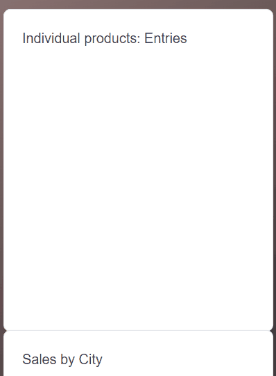
<Title>Individual products: Entries</Title>
<BarChart
data={chartdata2}
dataKey="topic"
categories={[
"Group A",
"Group B",
"Group C",
"Group D",
"Group E",
"Group F",
]}
colors={["blue", "teal", "amber", "rose", "indigo", "emerald"]}
valueFormatter={dataFormatter}
marginTop="mt-6"
yAxisWidth="w-12"
/>
</Card>
<Card maxWidth="max-w-s">
<Title>Sales by City</Title>
<DonutChart
data={cities}
category="sales"
dataKey="name"
variant="pie"
valueFormatter={valueFormatter}
marginTop="mt-6"
colors={["slate", "violet", "indigo", "rose", "cyan", "amber"]}
/>
</Card>
</div>
);
}
export default Sales;Here we have Barchart and Donut Tremor components. The Barchart component creates a bar graph that takes in the props below.
 <BarChart
    data={[{}]}
    categories={[]}
    dataKey=""
    colors={["blue"]}
    valueFormatter={undefined}
    layout="horizontal"
    stack={false}
    relative={false}
    startEndOnly={false}
    showXAxis={true}
    showYAxis={true}
    autoMinValue={false}
    yAxisWidth="w-14"
    showTooltip={true}
    showLegend={true}
    showGridLines={true}
    showAnimation={true}
    height="h-80"
    marginTop="mt-0"
  />
For the DonutChart component, we have made the variant pie; as a result, we will have the below render.
Conclusion
Having gone through this article, you must have seen the Tremor library’s simplicity and power. It abstracts you from the implementation details by providing you with ready-to-use components. This article has reviewed the Tremor library, how to set it up, and use it to visualize data in React. Feel free to bring Tremor awesomeness into your project.
Gain Debugging Superpowers
Unleash the power of session replay to reproduce bugs and track user frustrations. Get complete visibility into your frontend with OpenReplay, the most advanced open-source session replay tool for developers.