Working With CSS Gradients

CSS gradients allow you to create smooth transitions between two or more specified colors. They can add subtle visual interest to a webpage or create a more striking effect. In this article, you will learn what gradients are, how to use the background image to improve your web page, and the tools for generating CSS gradients.
What are gradients?
CSS gradients are CSS images that allow you to display progressive and smooth changes between two or more specified colors. In addition, you can use them to create various visual effects, such as smooth color transitions, shading, etc. To create a gradient, you must specify at least two colors to change; then, use additional properties to control the direction and shape of the gradient and any other shades you want to include in the transition.
We use gradients for several reasons:
- They help us create a webpage that looks great with excellent effects.
- They let us change between two or more colors and control their transparency, which can be captivating and increase conversions.
- Using gradients is a better way to take advantage of web design trends.
- The color gradient gets the visitor to focus on the web design.
- Gradient design creates a memorable impression on its users.
- Gradients give depth and dimensions to the background of a web page by conveying the design from flat to three-dimensional.
- Using gradients, you can bypass the general rule of not choosing palette color for a website against selecting no more than two or three colors.
Types of CSS gradients
There are several types of CSS gradients, and they include:
- Linear gradients: A linear gradient is a type of gradient that changes smoothly along a straight line. It is the most valuable and common among the gradient types in CSS to create a smooth transition between two or more colors. The colors are specified using the background-image property, and the gradient direction is defined using the linear-gradient() function. Therefore, linear gradients can add visual interest to a page or create a sense of depth or movement.
- Radial gradients: A radial gradient ****is a type of gradient that radiates outwards from a central point. Its created by specifying two or more colors that blend at a central point and then spread outwards in a circular or elliptical pattern. You can use radial gradients to create various visual effects, including the illusion of depth, adding emphasis to a particular area, or creating a sense of motion.
- Conic gradients: A conic gradient is a color gradient that creates a circular pattern, with the colors radiating outward from the center in a conical shape. The conic gradient allows for circular color schemes, which can help create visually striking and unique designs. You must define at least two colors in other to create a conic gradient.
In CSS, gradients are generally one color that fades into another, which lets you control every aspect, from the beginning, a direction and the shape to the colors and how they change from one color to another.
In the following sections, we’ll discuss examples of different gradients.
Linear Gradients
The linear gradient effect is a color transition that goes from one color to another in a straight line. Therefore, you can use this effect to add depth or movement to an element on a webpage. You can use several properties to control the appearance of a linear gradient effect, including:
- The direction, which determines the Angle at which the gradient transition occurs,
- The starting and ending colors, which determine the colors at either end of the gradient,
- The stop points determine where the transition between colors begins and ends.
- The shape of the gradient transition,
- The size of the gradient.
Here are the examples of linear gradient properties and how they work:
Top to Bottom Direction
It shows a linear gradient that starts at the top and transitions to the bottom. Example:
<!DOCTYPE html>
<html>
<head>
<style>
.tb {
  height: 400px;
  width: 300px;
  background-color: grey;
  background-image: linear-gradient(grey, orange);
}
p{
  font-size: 18px;
}
</style>
</head>
<body>

  <h1>Linear Gradient - Top to Bottom</h1>
  <p>This linear gradient starts grey at the top, transitioning to orange at the bottom.</p>

<div class="tb"></div>

</body>
</html>
Here is the outcome:
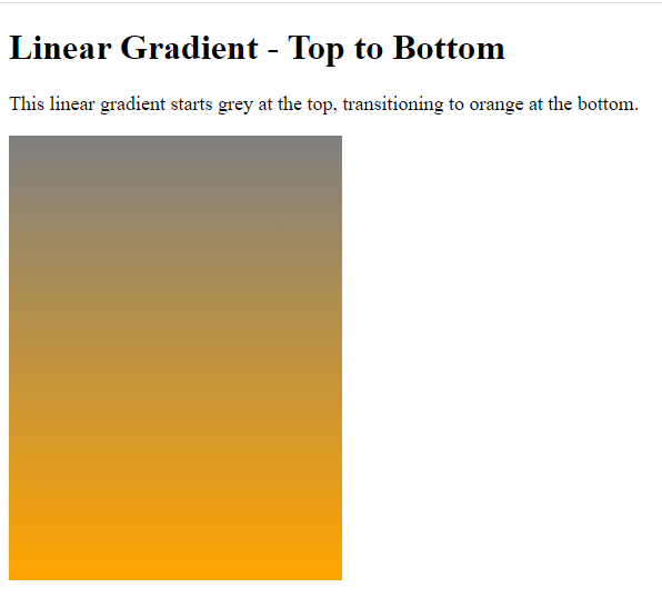
Notice that the linear gradient starts grey at the top and transitions to orange at the bottom.
Left to Right Direction
It shows a linear gradient that begins from the left and transitions to the right. Example:
<!DOCTYPE html>
<html>
<head>
<style>
.lr {
  height: 400px;
  width: 300px;
  background-color: grey;
  background-image: linear-gradient(to right, grey , orange);
}
p{
  font-size: 20px;
}
</style>
</head>
<body>

  <h1>Linear Gradient - Left to Right</h1>
  <p>This linear gradient starts grey at the left, transitioning to orange to the right:</p>

<div class="lr"></div>

</body>
</html>
Here is the result:
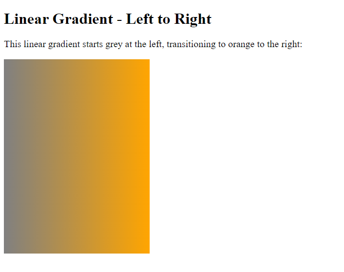
The linear gradient starts grey on the left, transitioning to orange on the right.
Diagonal Direction
A diagonal linear gradient is a gradient that transitions between colors in a diagonal line rather than a horizontal or vertical line. Example:
<!DOCTYPE html>
<html>
<head>
<style>
.d {
  height: 400px;
  width: 300px;
  background-color: grey;
  background-image: linear-gradient(to bottom right, grey, orange);
}
p{
  font-size: 20px;
}
</style>
</head>
<body>

  <h1>Linear Gradient - Diagonal</h1>
  <p>This linear gradient starts grey at the top left, transitioning to orange at the bottom right:</p>

<div class="d"></div>

</body>
</html>
Here is the result of the code:
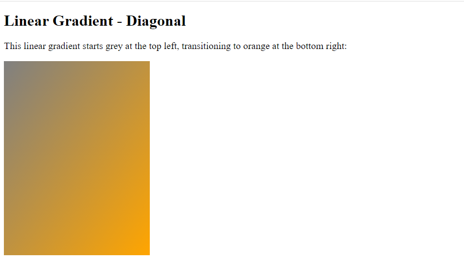
Notice that the linear gradient starts grey at the top left and transitions to orange at the bottom right.
Using Angles
The Angle gives you more control over a gradient direction by specifying an angle rather than limiting the focus to the bottom, top, right, left, and bottom right. Note that 0deg is equal to the top, 90deg is similar to the right, and 180deg is equal to the bottom. Example:
<!DOCTYPE html>
<html>
<head>
<style>
.angle1 {
    height: 180px;
    width: 150px;
    background-color: grey;
    background-image: linear-gradient(0deg, grey, orange);
    font-size: 20px;
}

.angle2 {
    height: 180px;
    width: 150px;
    background-color: grey;
    background-image: linear-gradient(90deg, grey, orange);
    font-size: 20px;
}

.angle3 {
    height: 180px;
    width: 150px;

    background-color: grey;
    background-image: linear-gradient(180deg, grey, orange);
    font-size: 20px;
}

</style>
</head>
<body>

<h1>Linear Gradients - Using Different Angles</h1>

<div class="angle1"style="text-align:center;">0deg</div><br>
<div class="angle2"style="text-align:center;">90deg</div><br>
<div class="angle3"style="text-align:center;">180deg</div><br>

</body>
</html>
Here is the outcome:
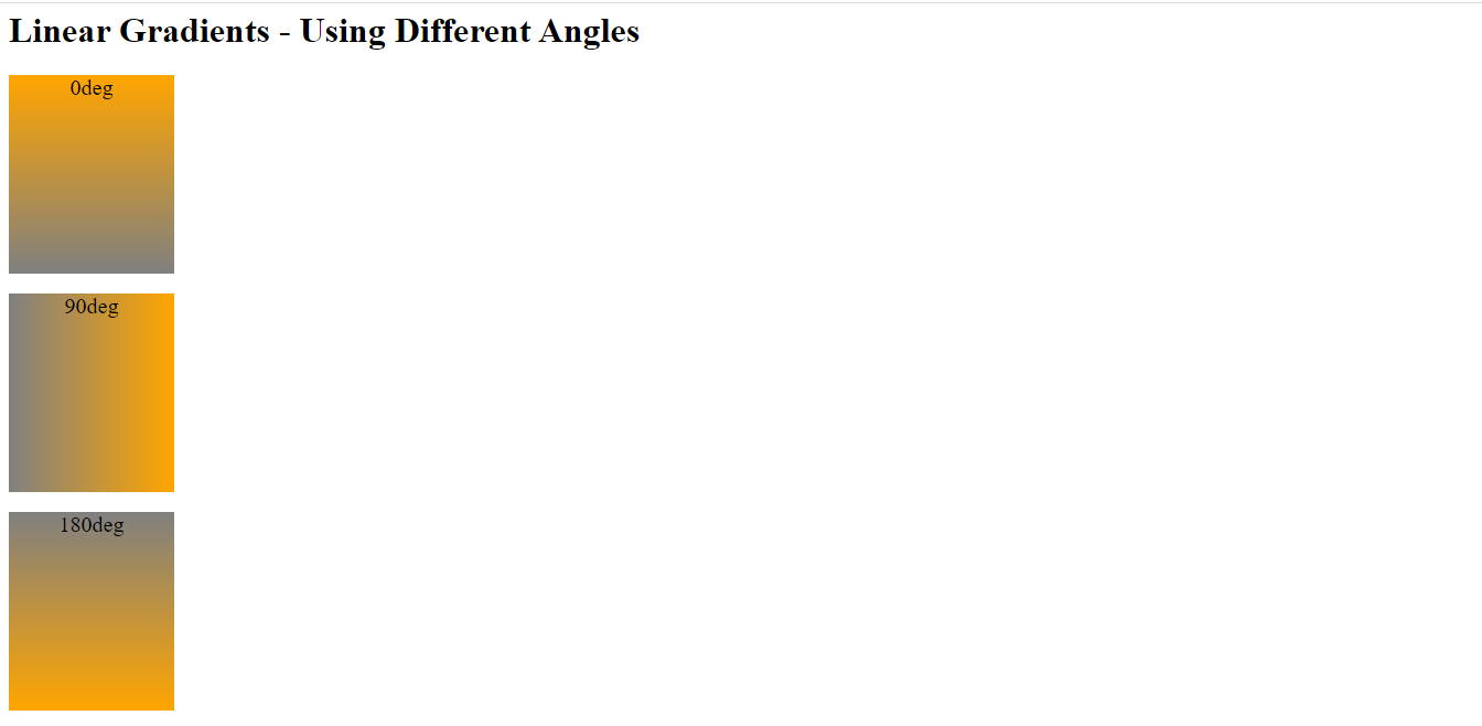
Notice the first image has orange background color at the top because 0deg is equal to the top, and the second image has orange background color at the right because 90deg is similar to the right. Finally, the third image has orange background color at the bottom because 180deg is equal to the bottom.
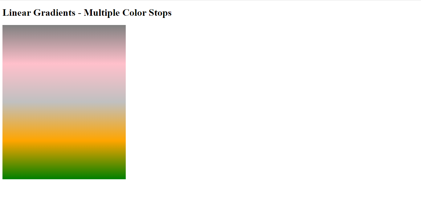
Using Multiple Color Stops
The multiple color stops demonstrate a linear gradient from top to bottom. In addition, you can use it to create gradients that transition between more than two colors. Example:
<!DOCTYPE html>
<html>
<head>
<style>

.mc {
  height: 500px;
  width: 400px;
  background-color: gray;
  background-image: linear-gradient(grey, pink,silver, orange,green);
}
</style>
</head>
<body>

  <h1>Linear Gradients - Multiple Color Stops</h1>
<div class="mc"></div>


</body>
</html>
Here is the outcome:
Using Transparency
You can use gradient transparency to create fading gradient effects. In addition, the clarity of the image or element varies depending on the colors in the gradient. Finally, to add transparency, use the rgba() process to explain the color stops. For instance, the value of the rgba() function in the last parameter could be from 0 to 1, which explains the color’s transparency 0 indicates full transparency, and 1 shows full color (no transparency). For example:
<!DOCTYPE html>
<html>
<head>
<style>
.t {
  height: 400px;
  background-image: linear-gradient(to right, rgba(128,128,128,1), rgba(128,128,128,0));
}
</style>
</head>
<body>
<h1>Linear Gradient - Transparency</h1>
<div class="t"></div>

</body>
</html>
Here is the result:
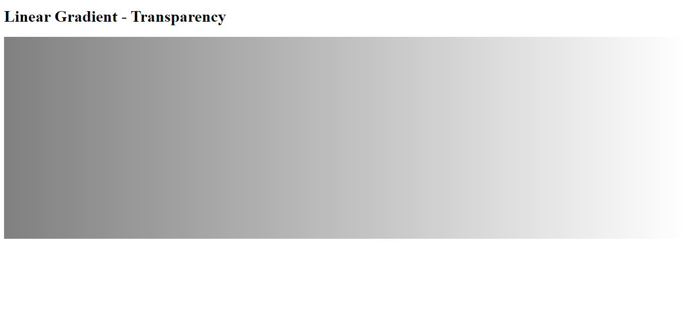
Notice the linear gradient starts fully transparent from the right and transitions to full grey color.
Repeating a linear-gradient
To repeat a linear gradient, you can use the repeating-linear-gradient() function in CSS. This function is the same as the linear-gradient() function but repeats the gradient pattern along the direction you specify. Let us see an example of how to use the repeating-linear-gradient() function to create a repeating gradient:
<!DOCTYPE html>
<html>
<head>
<style>
.rg1 {
  height: 140px;
  width: 600px;
  background-color: grey;
  background-image: repeating-linear-gradient(gray, pink 10%, orange 20%);
}

.rg2 {
  height: 140px;
  width: 600px;
  background-color: grey;
  background-image: repeating-linear-gradient(45deg,grey,pink 7%,orange 10%);
}

.rg3 {
  height: 140px;
  width: 600px;
  background-color: grey;
  background-image: repeating-linear-gradient(190deg,grey,pink 7%,orange 12%);
}
p{
  font-size: 22px;
}
</style>
</head>
<body>

<h1>Repeating Linear Gradient</h1>
  <p>A repeating gradient starting gray and ending orange:</p>
<div class="rg1"></div>

  <p>A repeating gradient on 45deg axe starting gray and ending orange:</p>
<div class="rg2"></div>

  <p>A repeating gradient on 190deg axe starting grey and ending orange:</p>
<div class="rg3"></div>


</body>
</html>
Here is the result:
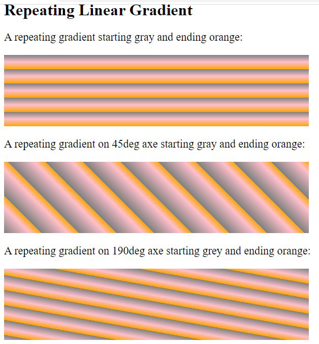
Notice all repeating linear gradient images starting grey and finishing orange.
Session Replay for Developers
Uncover frustrations, understand bugs and fix slowdowns like never before with OpenReplay — an open-source session replay tool for developers. Self-host it in minutes, and have complete control over your customer data. Check our GitHub repo and join the thousands of developers in our community.
Radial Gradients
A radial gradient is a type of gradient that radiates out from a central point. In terms of visual effects, a radial gradient can create the illusion of three dimensions by adding a sense of deep and perspective to an image. In addition, you can adjust the properties of a radial gradient to control the appearance of the effect, like direction, shape, and size.
Examples of some of the properties that you can specify with this function are:
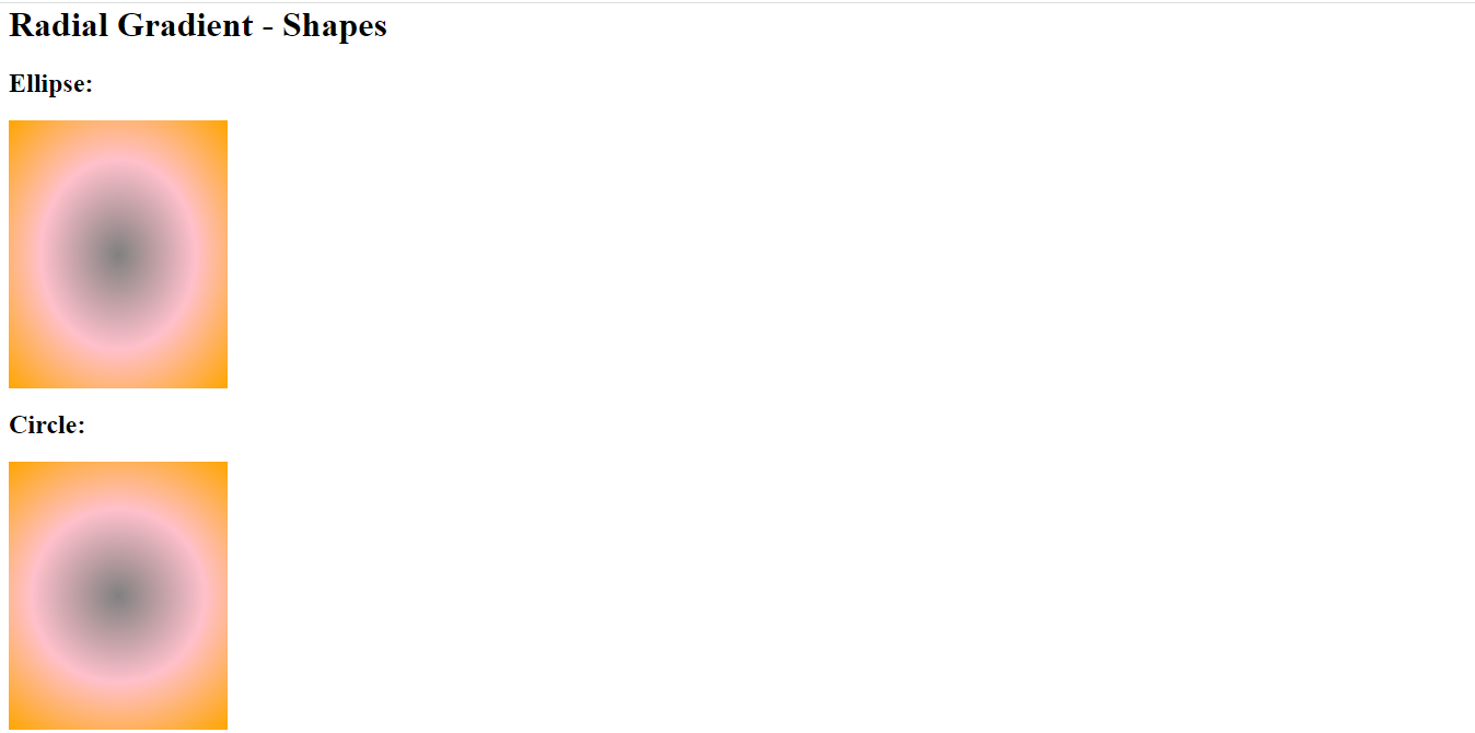
Shape
The shape can be either circular or ellipse. This radial gradient starts from a single point and radiates outward in a circular or elliptical shape.
Example of how it works:
<!DOCTYPE html>
<html>
<head>
<style>
.ell {
  height: 245px;
  width: 200px;
  background-color: grey;
  background-image: radial-gradient(grey, pink, orange);
}

.cir {
  height: 245px;
  width: 200px;
  background-color: grey;
  background-image: radial-gradient(circle, grey, pink, orange);
}
</style>
</head>
<body>

<h1>Radial Gradient - Shapes</h1>

<h2>Ellipse:</h2>
<div class="ell"></div>

<h2>Circle:</h2>
<div class="cir"></div>

</body>
</html>
Here is the result:
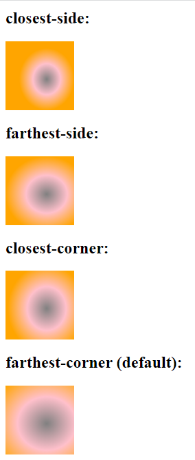
Size
The size of the gradient can be either a specific size or one of four values: closest-side, farthest-side, closest-corner, and farthest-corner. Example:
<!DOCTYPE html>
<html>
<head>
<style>
.cs {
  height: 100px;
  width: 100px;
  background-color: grey;
  background-image: radial-gradient(closest-side at 60% 55%, grey, pink, orange);
}

.fs {
  height: 100px;
  width: 100px;
  background-color: grey;
  background-image: radial-gradient(farthest-side at 60% 55%, grey, pink, orange);
}

.cc {
  height: 100px;
  width: 100px;
  background-color: grey;
  background-image: radial-gradient(closest-corner at 60% 55%, grey, pink, orange);
}

.fc {
  height: 100px;
  width: 100px;
  background-color: grey;
  background-image: radial-gradient(farthest-corner at 60% 55%, grey, pink, orange);
}
</style>
</head>
<body>

<h1>Radial Gradients - Different size keywords</h1>

<h2>closest-side:</h2>
<div class="cs"></div>

<h2>farthest-side:</h2>
<div class="fs"></div>

<h2>closest-corner:</h2>
<div class="cc"></div>

<h2>farthest-corner (default):</h2>
<div class="fc"></div>

</body>
</html>
Here is the result:
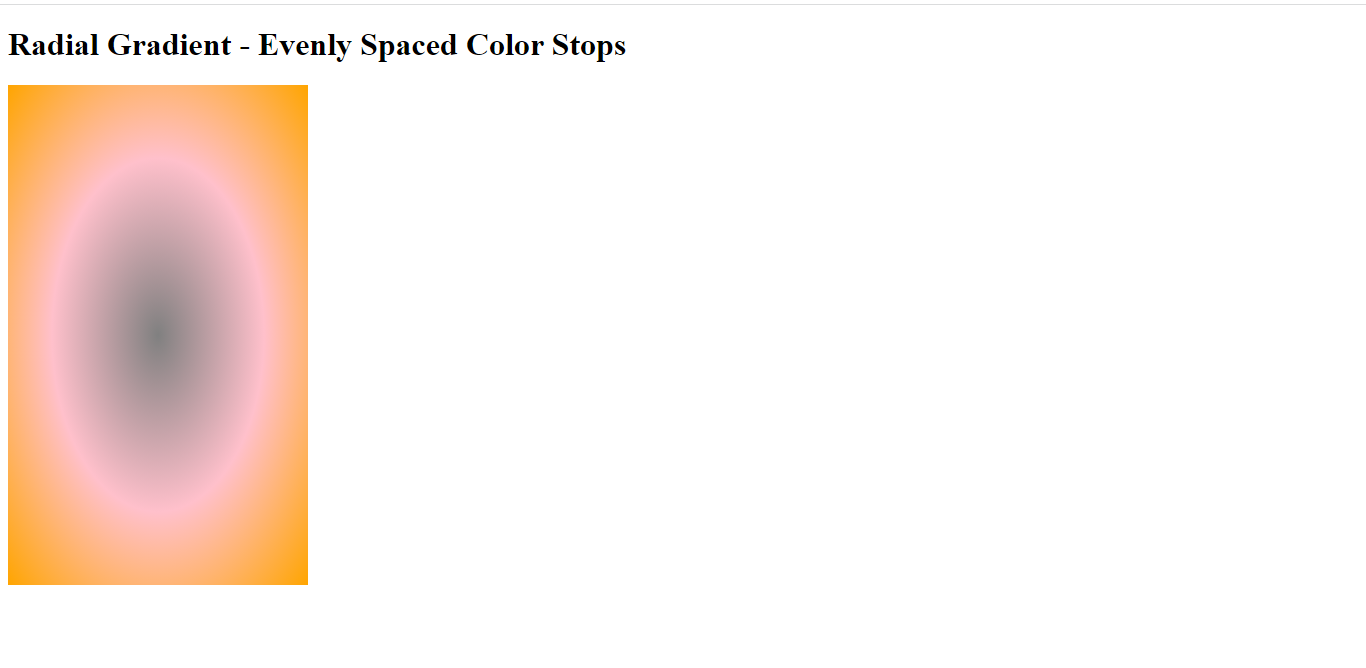
Evenly Spaced Color Stops
It Indicates a radial gradient with evenly spaced color stops. Therefore, when using evenly spaced color stops, the gradient will transition between the different colors at regular intervals, creating a smooth and seamless transition between the colors. Example of how it works:
<!DOCTYPE html>
<html>
<head>
<style>
.scs {
  height: 500px;
  width: 300px;
  background-color: grey;
  background-image: radial-gradient(grey, pink, orange);
}
</style>
</head>
<body>

<h1>Radial Gradient - Evenly Spaced Color Stops</h1>

<div class="scs"></div>

</body>
</html>
Here is the outcome:
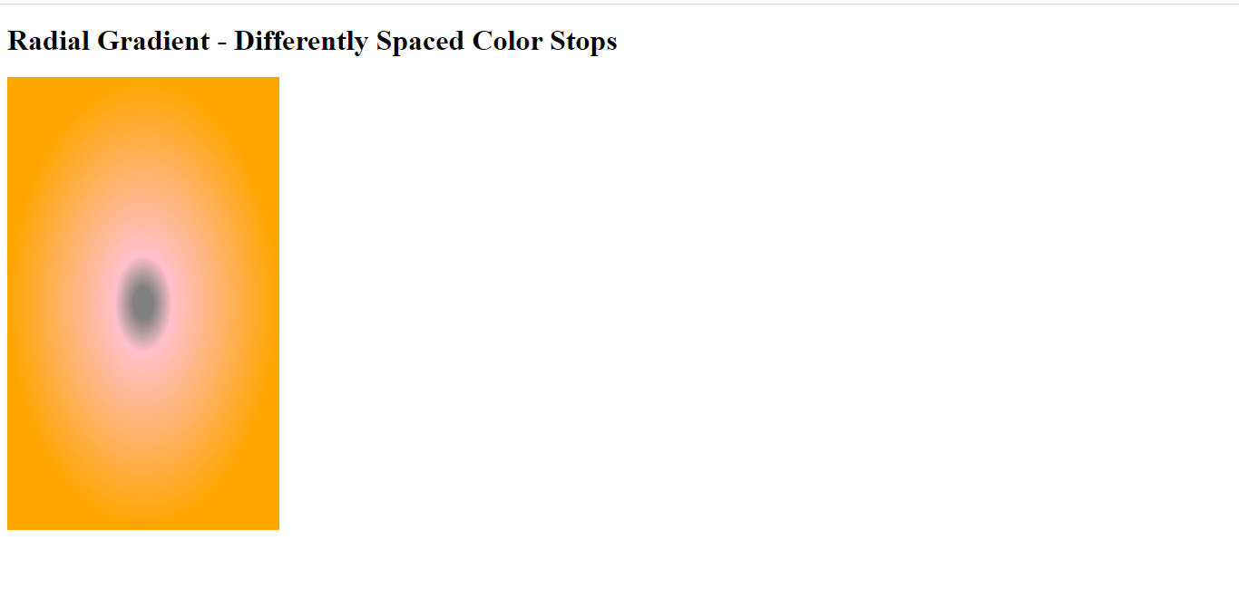
Differently Spaced Color Stops
The colors and locations of the stops in the gradient are specified as color values followed by a position. It shows a radial gradient with differently spaced color stops.
Example:
<!DOCTYPE html>
<html>
<head>
<style>
.dss {
  height: 500px;
  width: 300px;
  background-color: grey;
  background-image: radial-gradient(grey 5%, pink 15%, orange 70%);
}
</style>
</head>
<body>

<h1>Radial Gradient - Differently Spaced Color Stops</h1>

<div class="dss"></div>

</body>
</html>
Here is the result:
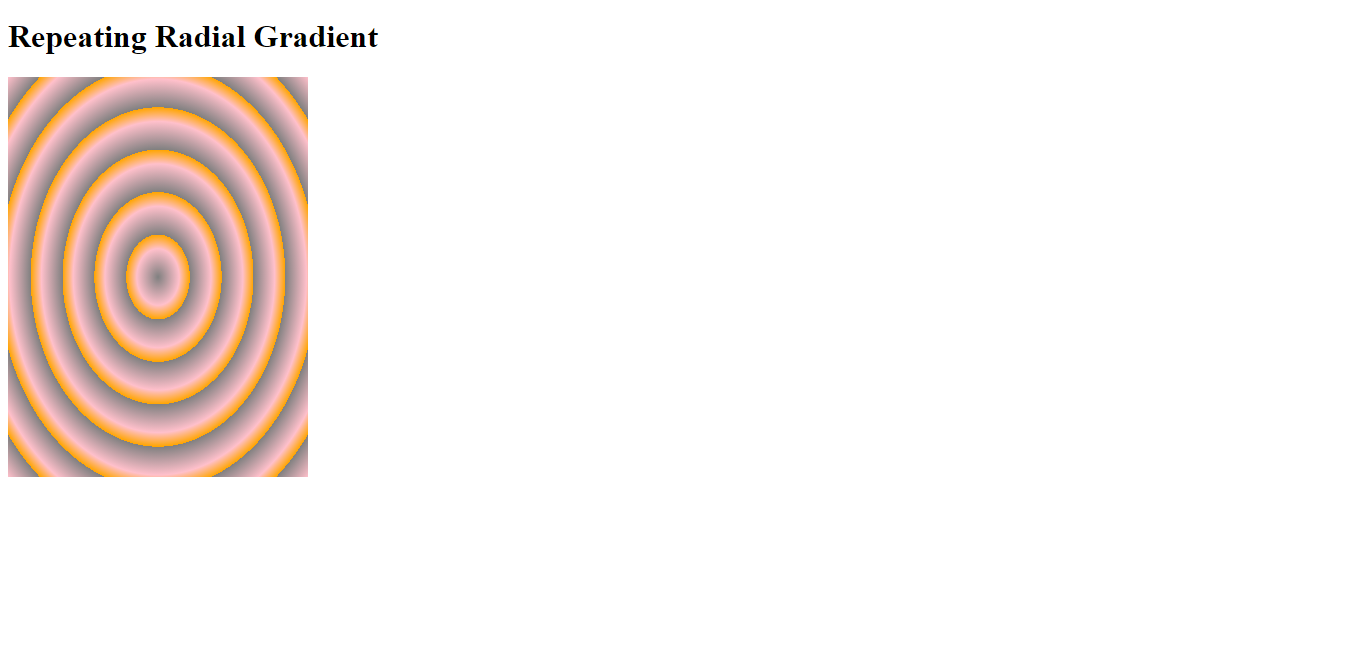
Repeating a radial gradient
To repeat a radial gradient, you can use the repeating-radial-gradient() function in CSS. This function works similarly to the radial-gradient() function but creates a repeating gradient pattern. Example:
<!DOCTYPE html>
<html>
<head>
<style>
.rg {
  height: 400px;
  width: 300px;
  background-color: grey;
  background-image: repeating-radial-gradient(grey, pink 10%, orange 15%);
}
</style>
</head>
<body>

<h1>Repeating Radial Gradient</h1>

<div class="rg"></div>

</body>
</html>
Here is the outcome:
Conic Gradients
A conic gradient is a type of color gradient that is created using a mathematical formula. This formula allows for building smooth, circular gradients that can operate in various design applications, such as web design or graphic design. Here let’s look at examples of conic gradient properties and how they work:
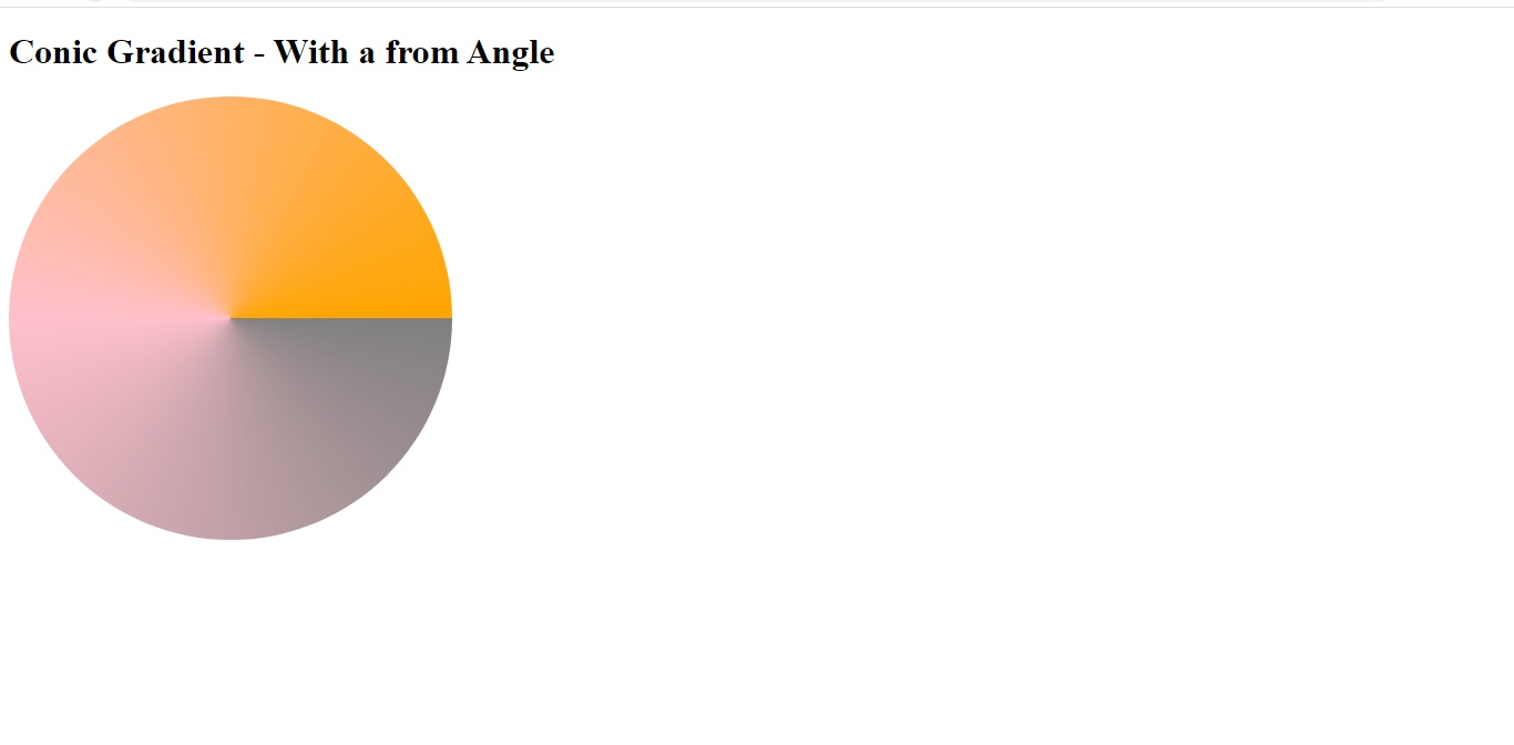
Conic Gradient With Specified From Angle
The “from angle” refers to the starting angle of the gradient line, which determines the starting point of the gradient. Here is an example:
<!DOCTYPE html>
<html>
<head>
<style>
.fa {
  height: 400px;
  width: 400px;
  background-color: grey;
  background-image: conic-gradient(from 90deg, grey, pink, orange);
  border-radius: 50%;
}
</style>
</head>
<body>

<h1>Conic Gradient - With a from Angle </h1>

<div class="fa"></div>

</body>
</html>
Here is the outcome:
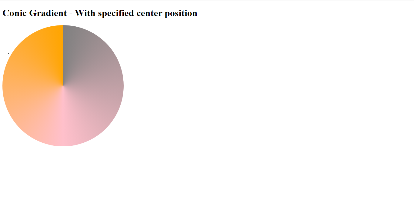
Conic Gradient With Specified Center Position
To create a conic gradient with a specified center position, you can use the position that specifies the conic gradient’s center. Example:
<!DOCTYPE html>
<html>
<head>
<style>
.scp {
  height: 400px;
  width: 400px;
  background-color: grey;
  background-image: conic-gradient(at 50% 50%, grey, pink, orange);
  border-radius: 50%;
}
</style>
</head>
<body>

<h1>Conic Gradient - With specified center position</h1>

<div class="scp"></div>

</body>
</html>
Here is the result:
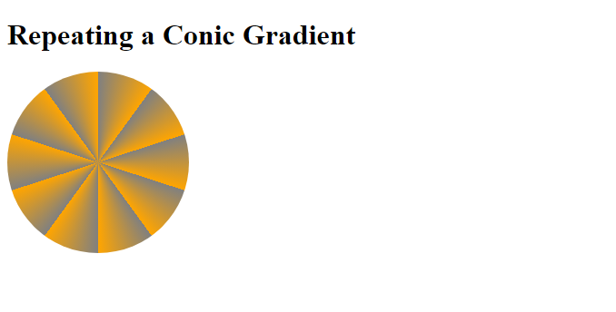
Repeating a Conic Gradient
This function creates a repeating gradient that starts at a given angle and repeats at regular intervals around the circle. Example:
<!DOCTYPE html>
<html>
<head>
<style>
.rc {
  height: 400px;
  width: 400px;
  background-color: grey;
  background-image: repeating-conic-gradient(grey 20%, orange 30%);
  border-radius: 50%;
}
</style>
</head>
<body>

<h1>Repeating a Conic Gradient</h1>

<div class="rc"></div>

</body>
</html>
Here is the result:
CSS gradients generator tools
CSS gradients allow you to display smooth changes between two or more specified colors. A few online tools can help you generate the code for CSS gradients. Some of these tools include:
- The CSS Gradient generator on CSSmatic
- The Ultimate CSS Gradient Generator
- The WebGradients CSS gradient generator
These tools typically allow you to choose from various preset color schemes or specify your colors. They also often provide options for adjusting the direction and Angle of the gradient. Once you’ve created your gradient, the tool will generate the CSS code that you can use to apply the gradient to your website or web application.
Conclusion
CSS gradients are very helpful in our web pages as they can be used in different areas of our page, like the background, to give our web page a unique look. You can use these guides to create the gradient effect you want in your web development projects.
A TIP FROM THE EDITOR: This article just mentioned CSS generators, and we’ve got more on that topic at A Top Collection Of CSS Code Generators.
Gain Debugging Superpowers
Unleash the power of session replay to reproduce bugs and track user frustrations. Get complete visibility into your frontend with OpenReplay, the most advanced open-source session replay tool for developers.