Writing clean, reusable components in React
Learn how to build reusable components and simplify your coding


As a developer, you must have heard of reusable components and how they make your codebase cleaner, maintainable, and reusable. Over time, React applications grow, projects increase in complexity, and we often find ourselves repeating the same code repeatedly: counterproductive and time-wasting. This article will explain what reusable components in React are, and when and how to implement them.
A reusable component is a piece of user interface that can be used in several parts of an application to create several variations of the UI instance. This means you have a piece of UI extracted and used in several parts of your application. However, this piece of UI can have several variants of it rendered depending on the data provided to it. The importance of reusable components is numerous, and we will dive into them in the next section.
Reusable components have several benefits when building a website or application in React, improving code quality.
-
Time management and efficiency: Building and utilizing reusable components around your application saves you time and increases your efficiency. With reusable components already built, there is little work to be done in implementing them in your application. It is as good as saying you have built your mini-component library; all you have to do is import the component and implement it where necessary. This is a much better and faster route than copying and pasting the same piece of code over and over again.
-
Consistency: Utilizing the same components around your application provides consistency around your application. Your application looks more uniform when using reusable components, providing a better user experience.
-
Maintainability: Reusable components are easier to maintain across your application. For example, let’s say you took the counterproductive path of pasting the same piece of code for the same UI across your application, and along the line, you realize that you need to make a change or improve the code for the UI to suit your needs.
At this point, you’ll have to make these changes in every part of your application where you have this piece of code. Not very smart, right? Well, working with reusable components makes your work less stressful. All you need to do is change the reusable component, which will reflect everywhere it is rendered on your application.
Best practices when building reusable components
We have spent most of this article explaining how important reusable components are and how it improves code quality and maintainability. However, if you don’t build your reusable components correctly, they can quickly become a problem for you in the future.
This section covers the best practices to follow when building reusable components so they don’t become a thorn in your flesh in the future.
1. Passing data through props
Props in React are used to pass data from one component to another. Props make components flexible and reusable because the data passed can be changed and manipulated.
When using props, the data passed can be modified to change the UI rendered without having to change any code. This makes it easier to maintain and improves flexibility when modifying your components.
Passing data through props also helps when debugging your code. This is cause it’s clear what data is passed to each component, making it easy to identify where the issue lies.
The code block below shows us the JSX for a button component with props passed as data.
const Button = ({ text, backgroundColor, color, buttonFunc }) => {
  const style = {
    color: color,
    backgroundColor: backgroundColor,
    border: "none",
    padding: "10px 25px",
  };
  return (
    <button style={style} onClick={buttonFunc}>
      {text}
    </button>
  );
};
export default Button;
In the code block above, we have a button component created. This is, however, not a regular button component as it receives props for its text, backgroundColor, color, and the function that is called when the button is clicked. Let’s see how we can reuse this component around our application.
import Button from "./Button";
function App() {
  const func = () => {
    console.log("hello world");
  };

  return (
    <div className="App">
      <Button
        color="white"
        backgroundColor="red"
        text="click"
        buttonFunc={func}
      />
    </div>
  );
}

export default App;
In our App component, you can see that we import the Button component and pass down our necessary data as props, i.e., color as “white”, backgroundColor as “red”, text as “click,” and buttonFunc as func, a function that logs the text “hello world” to the console.
Looking at this, our button component is very flexible and reusable. By just passing different props to our button component, we can create different types of buttons that call different functions. Also, with this approach, debugging becomes easier because it is clear what data is being passed to your component.
2. Set default props for optional props
Our reusable Button component works just fine, but it can be better. For instance, if some props required for our button component were not provided, our Button component would not work as expected.
defaultProps allows you to set a default value for props. By setting default props, the component will still work as expected, even when the user doesn’t provide any value for that prop.
const Button = ({ text, backgroundColor, color, buttonFunc }) => {
  const style = {
    color: color,
    backgroundColor: backgroundColor,
    border: "none",
    padding: "10px 25px",
  };
  return (
    <button style={style} onClick={buttonFunc}>
      {text}
    </button>
  );
};

Button.defaultProps = {
  text: "Button",
  backgroundColor: "blue",
  color: "black",
};

export default Button;
You can see that in our Button component, we set default values for our props using the defaultProps React component property. Now our component is more predictable even when values for all the props are not provided.
3. Make your props immutable
When passing data to a component through props, the data is treated as immutable. This means your component should not modify the data in any way. When a component modifies data passed into it via props, it leads to that component behaving unexpectedly and could create some bugs.
Our button component receives its props text, backgroundColor, color, and buttonFunc as usual. This is fine, as all props passed are not modified in any way within the component. What we don’t want to do is modify, let’s say, the text prop and assign another value to it within our button component.
const Button = ({ text, backgroundColor, color, buttonFunc }) => {
  const style = {
    color: color,
    backgroundColor: backgroundColor,
    border: "none",
    padding: "10px 25px",
  };

  text = "Home";

  return (
    <button style={style} onClick={buttonFunc}>
      {text}
    </button>
  );
};

export default Button;
As you can see from the code block above, the text prop in our button component is reassigned to a new value within our button component. This is not advised when building reusable components.
4. Localize the styles for your components
When building a component, it is important to have all the styles associated with that component in the same file as the component. That way, when you want to reuse that component across your application, you do not have to worry about all the necessary styles for that component being present.
Another importance of your styles being localized within your component is that you can make changes that will affect only the component itself and not other unrelated components across your website.
5. Container/Presentational pattern
Container/presentational pattern is a very popular React pattern that is often used to separate logic/data fetch (container) from your UI code (presentational). This pattern increases the reusability of your code and also a better separation of concerns as you understand your app better by writing components this way.
The idea behind the container/presentational pattern is to simply have a container component that performs some logic and then renders any React node provided to it through the children props. The React node it renders is a presentational component whose main aim is to render some UI.
Let’s get started and see how we can implement this pattern into our code base. First, we have to create a container component. This component contains state, complex logic, and API calls, and it renders a presentational component. Observe the code below for a better understanding.
import React, { useState, useEffect } from "react";
import PresentationalComponent from "./PresentationalComponent";

const ContainerComponent = () => {
  const [user, setUser] = useState(null);

  useEffect(() => {
    const fetchUser = async () => {
      const user = await fetch("https://random-data-api.com/api/v2/users");
      const userData = await user.json();
      setUser(userData);
    };
    fetchUser();
  }, []);

  if (!user) {
    return null;
  }

  const { first_name, last_name, email, phone_number } = user;

  return (
    <div>
      <PresentationalComponent
        firstName={first_name}
        lastName={last_name}
        email={email}
        phoneNumber={phone_number}
      />
    </div>
  );
};

export default ContainerComponent;
In the code block above, we created a component named containerComponent. This component handles fetching a user from an API endpoint, stores the fetched user in the “user” state and then returns the presentational component.
The presentation component, named presentationComponent, receives data via props and displays the data in the UI.
The code block below is how the presentational component should look.
import React from "react";

const PresentationalComponent = ({
  firstName,
  lastName,
  email,
  phoneNumber,
}) => {
  return (
    <div>
      <h2>
        Name: {firstName} {lastName}
      </h2>
      <p>{email}</p>
      <p>{phoneNumber}</p>
    </div>
  );
};

export default PresentationalComponent;
The code block above is our presentational component. As we can see, this component does not handle any complex logic or API calls. It is simple and straight to the point, with the main aim of rendering the UI displaying the data from the container component.
This pattern improves code in terms of reusability and maintainability as it provides a separation of concerns(separating logic/API calls from the rendered UI component). Another way it improves reusability is that you can change the structure of the rendered UI without having to touch your application’s logic.
6. Custom hooks
Hooks are functions that allow you to use state and other React features without having to write a class component. A popular example of hooks in React is the useState and useEffect hooks.
In the previous section, we looked at the container/presentational pattern. While there is nothing wrong with this pattern, our code can be made cleaner and more reusable by utilizing custom hooks to achieve the same goal of separation of concerns and code reusability.
Just like the container component, custom hooks are concerned with fetching data asynchronously, handling the state, and returning the state and data. For more clarity, we will be using our old example in the container/presentational data user from an external API. Observe the code block below to understand the structure of custom hooks.
import React, { useState, useEffect } from "react";

const FetchUser = (api) => {
  const [user, setUser] = useState(null);
  const [loading, setLoading] = useState(false);
  const [error, setError] = useState(null);

  useEffect(() => {
    const fetchUser = async () => {
      setLoading(true);
      try {
        const user = await fetch(API);
        const userData = await user.json();
        setUser(userData);
      } catch (error) {
        setError(error);
      } finally {
        setLoading(false);
      }
    };

    fetchUser();
  }, [api]);

  return { user, error, loading };
};

export default FetchUser;
In the code block above, we created a custom hook called FetchUser that fetches data from an API endpoint and stores it in the user state. It also handles the loading state for the request as well as an error state if there be any.
Our custom hook ends up returning state for user, loading, and error. As we have observed, this hook is concerned only with API calls, state management, and app logic. Now let’s see how to implement this custom hook in a stateless component.
import React from "react";
import FetchUser from "./ContainerComponent";

const UserDetails = () => {
  const api = "https://random-data-api.com/api/v2/users";
  const { error, loading, user } = FetchUser(api);

  if (loading) return <p>Loading...</p>;
  if (error) return <p>Error: {error.message}</p>;

  if (user) {
    const { first_name, last_name, email, phone_number } = user;

    return (
      <div>
        <h2>
          Name: {first_name} {last_name}
        </h2>
        <p>{email}</p>
        <p>{phone_number}</p>
      </div>
    );
  }
};

export default UserDetails;
Our stateless component is very simple. Its main aim is to display data to the UI and some simple app logic. Because we extracted our user fetching logic into a custom hook, it can be reusable around our application where we need our user data. This saves time and improves code reusability and maintainability.
Throughout this article, we have covered a lot about building reusable components to improve the quality and maintainability of your code base. We will go further in the next section and build a reusable input and table component.
Reusable input component
When building a React application or any type of application, you will most likely make use of input forms for log-in, sign-up, and sending of user data to your servers. Making your inputs reusable is a smart approach to save you time and increase the maintainability of your code base.
In this section, we will be building a single but reusable text input. The idea is to have a single text input that’ll receive data concerning how that input will be rendered in the UI.
import TextInput from "./TextInput";
import { useState } from "react";
function App() {
  const [inputValue, setInputValue] = useState("");

  const handleChange = (e) => {
    setInputValue(e.target.value);
  };

  return (
    <div className="App">
      <TextInput
        type="text"
        placeholder="write your name"
        label="Name"
        id="name"
        handleChange={handleChange}
        value={inputValue}
      />
    </div>
  );
}

export default App;
The code block above displays a TextInput component which receives several props. This component will be our input component which we will create real soon. Asides from the props type, placeholder, id, and value, it also receives a handle change prop whose value is a function called handleChange which handles the state change for this input. Let’s see what our TextInput looks like and how it utilizes these props being passed down.
const TextInput = ({ handleChange, value, type, placeholder, label, id }) => {
  const styles = {
    display: "flex",
    flexDirection: "column",
    marginTop: "4px",
    padding: "5px 8px",
    border: "1px solid grey",
    outline: "none",
    borderRadius: "5px",
  };

  return (
    <>
      {label && <label htmlFor={id}>{label}</label>}
      <input
        style={styles}
        type={type}
        placeholder={placeholder}
        onChange={handleChange}
        value={value}
        id={id}
      />
    </>
  );
};

export default TextInput;
Our TextInput component is structured in a way that it dynamically receives the values for its attributes via props. This makes our input component very flexible and reusable. All you need to do is change the values of the props being passed down, and you can create a different variant of the component.
Another good thing to note is that we have some localized inline styling. This increases consistency around our application. Also, it is easier to maintain this component. Let’s say we have used this component in several places around our application, and then we need to make a change in the styling of the component; all we have to do is make the style changes in the component, and we will have it reflect around our application.
Session Replay for Developers
Uncover frustrations, understand bugs and fix slowdowns like never before with OpenReplay — an open-source session replay tool for developers. Self-host it in minutes, and have complete control over your customer data. Check our GitHub repo and join the thousands of developers in our community.
Reusable table component
We will be building a reusable table component in this section. Our table component will be dynamically displaying data. This data will be fetched asynchronously from an endpoint. For this example, we will be using our FetchUser custom hook from our previous sub-section for our API call.
import React, { useState, useEffect } from "react";

const FetchUsers = (api) => {
  const [users, setUsers] = useState(null);
  const [loading, setLoading] = useState(false);
  const [error, setError] = useState(null);

  useEffect(() => {
    const fetchUser = async () => {
      setLoading(true);
      try {
        const user = await fetch(API);
        const userData = await user.json();
        setUsers(userData);
        console.log(users);
      } catch (error) {
        setError(error);
      } finally {
        setLoading(false);
      }
    };

    fetchUser();
  }, [api]);

  return { users, error, loading };
};

export default FetchUsers;
As you can see from the code block above, our FetchUser hook is just fetching an array of users and storing it in the state users. When we log users to the console, we should get the data below.
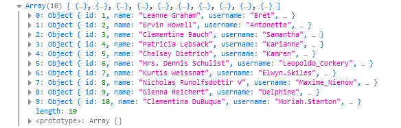
So the data fetched is just an array of objects containing user information. Now that we have our data let’s proceed to build our reusable table component.
Your App.js file should look like this
import Table from "./Table";
function App() {
  const headers = [
    { title: "Name", value: "name" },
    { title: "Phone Number", value: "phone" },
    { title: "Email", value: "email" },
  ];

  return (
    <div className="App">
      <Table headers={headers} />
    </div>
  );
}

export default App;
Our App.js file just returns a table component that we haven’t created. Also, take note of the variable headers being passed as props to our table component, as it’ll be used in creating the component and manipulating our data.
In our table component, we just create a regular HTML table.
const Table = () => {
  return (
    <table>
      <thead>
        <tr>
          <th>Name</th>
          <th>Phone number</th>
          <th>Email</th>
        </tr>
      </thead>
      <tbody>
        <tr>
          <td>John Doe</td>
          <td>123-45433-34</td>
          <td>johndoe@gmail.com</td>
        </tr>
      </tbody>
    </table>
  );
};
Below are the styles for our table component.
table {
  border-collapse: collapse;
  width: 50%;
  margin: 4rem auto;
}
th, td{
  border: 1px solid rgb(206, 206, 206);
  padding: 10px;
  text-align: center;
}
The markup and styles for our table component are set, so let’s pull in our data and make this component dynamic and reusable.
import React from "react";
import FetchUsers from "./FetchUsers";
const Table = ({ headers }) => {
  const api = "https://jsonplaceholder.typicode.com/users";
  const { error, loading, users } = FetchUsers(API);

  if (loading) return <p>Loading...</p>;
  if (error) return <p>Error: {error.message}</p>;
  if (!users) return null;
  return (
    <table>
      <thead>
        <tr>
          {headers.map((header, index) => (
            <TableHeader key={index} header={header} />
          ))}
        </tr>
      </thead>
      <tbody></tbody>
    </table>
  );
};

const TableHeader = ({ header }) => {
  return <th>{header.value}</th>;
};
From the code block above you can see that we have pulled in users, error, and users from our FetchUsers hook. We have also brought in headers as props. In the tr tag within the thead we loop through our headers array and return a TableHeader component which in turn returns header.title.
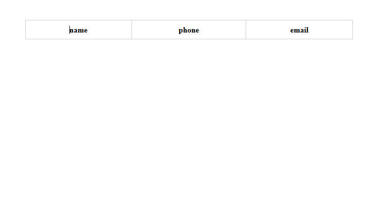
Our table component should display as such in the browser. We have dynamically displayed our table headings; let’s dynamically add our data to this component. We want to configure this table in such a way that each data we loop through falls under its appropriate header. Observe the code block below to understand how we achieve this.
import React from "react";
import FetchUsers from "./ContainerComponent";
const Table = ({ headers }) => {
  const api = "https://jsonplaceholder.typicode.com/users";
  const { error, loading, users } = FetchUsers(API);

  if (loading) return <p>Loading...</p>;
  if (error) return <p>Error: {error.message}</p>;
  if (!users) return null;
  return (
    <table>
      <thead>
        <tr>
          {headers.map((header, index) => (
            <TableHeader key={index} header={header} />
          ))}
        </tr>
      </thead>
      <tbody>
        {users.map((user, index) => (
          <TableData user={user} headers={headers} key={index} />
        ))}
      </tbody>
    </table>
  );
};

const TableHeader = ({ header }) => {
  return <th>{header.value}</th>;
};

const TableData = ({ user, headers }) => {
  return (
    <tr>
      {headers.map((header, index) => {
        return <td key={index}>{user[`${header.value}`]}</td>;
      })}
    </tr>
  );
};
export default Table;
We can see that there are some changes made to our table component, so let’s go through them. In our tbody tag we are looping through our users state and returning a TableData component. This component receives Headers and user(which is each iterated user) as props. Let’s look at what this TableData component does because this is where most of the magic happens.
Our TableData component returns a tr tag; it loops through our headers and returns a td tag which displays a value from our user object with the key corresponding to the value key of our iterated header. In simple terms, we use the value property of our header prop to return the corresponding user data.
NOTE!!
Make sure the value of each key in your headers array corresponds with the keys in your user object coming from the API. Below is the code block for the headers array to refresh your memory.
const headers = [
  { title: "Name", value: "name" },
  { title: "Phone Number", value: "phone" },
  { title: "Email", value: "email" },
];
As you can see our table is reusable and maintainable. If you need to use this table anywhere across your application, all you need to do is provide the headers and data for the table and that’s it. Our table component should appear like so in our browser.

Conclusion
I do commend you for making it this far, throughout this article, we have learnt what reusable component are, their importance and best practices when making components reusable. Making your components reusable might seem like extra work in the start but as your application grows you will thank yourself for taking this approach.
Gain Debugging Superpowers
Unleash the power of session replay to reproduce bugs and track user frustrations. Get complete visibility into your frontend with OpenReplay, the most advanced open-source session replay tool for developers.