A better UX: create URL previews in React

In modern web development, capturing user attention and engagement is a pivotal goal. URL previews, those small yet impactful snippets that provide a glimpse of the content lying behind a link, are pivotal in enhancing user experience and fostering trust. This article will allow you to enrich your React projects with eye-catching and informative URL previews, elevating their user experience to new heights.

Discover how at OpenReplay.com.
Imagine being able to offer users a visual sneak peek of articles, products, or multimedia before they even click a link. In this article, we will delve into the world of URL previews and how they can be seamlessly integrated into React applications using the React-Microlink library. We’ll explore the library’s capabilities and showcase real-world use cases.
Understanding URL Previews
URL previews, often referred to as link previews, provide users with a sneak peek into the content of a linked webpage. When hovering over or clicking on a link, users are presented with a compact preview containing crucial information such as the page’s title, a brief description, and frequently an associated image.
URL previews and their impact on user engagement.
User engagement refers to the extent to which users interact with and immerse themselves in a digital platform’s content. URL previews wield a significant impact on this engagement in several ways:
- Content Relevance: Users can assess the content’s relevance before clicking, reducing uncertainty and enhancing their browsing experience.
- Content Discovery: Users might stumble upon captivating content they wouldn’t have explored without a preview, driving deeper engagement.
- Time Efficiency: URL previews save users time by providing a quick overview of linked content without requiring them to navigate away.
- Higher Click-through Rates: Websites integrating URL previews often experience higher click-through rates due to the enhanced preview experience.
Instances of typical use cases for URL previews
Here are some instances of typical use cases for URL previews where they enhance user experiences and engagement:
- Social Media Sharing: When users share links on social media platforms, URL previews provide a visual preview of the linked content, including the title, description, and image. This allows users to gauge the content’s relevance and encourages others to click the link.
- Content Management Systems: In content management systems, authors and editors use URL previews to embed external content, such as videos or articles. This enriches the content and offers readers a glimpse of referenced material.
- Blogging Platforms: Bloggers incorporate URL previews when referencing external sources in their articles. This provides readers with a glimpse of the linked content’s context.
- Media Sharing Platforms: Platforms that host user-generated content, such as YouTube or Reddit, employ URL previews to offer users insights into linked media content before they access it.
What is React-Microlink?
React-Microlink is a JavaScript library that provides an easy and convenient way to create URL previews in React applications. URL previews, also known as link previews or rich previews, allow users to see a concise preview of a linked webpage’s content before clicking on the link. This library simplifies fetching metadata from a URL and rendering it in a visually appealing card format within your React components. Check out React-Microlink docs here.
Below is an example of a preview card component that uses the Microlink component from React Microlink to create a card with a preview and a link to the homepage of React Microlink.
The significance of React-Microlink in Web Applications.
This React library holds profound significance in contemporary web applications by seamlessly introducing URL previews. Here are a few:
- Elevating User Interaction: Effective web design aims to engage users meaningfully. React-Microlink helps achieve this by providing concise content previews for links. The library bridges the gap between curiosity and engagement.
- Seamless Integration and Ease: React-Microlink stands out for its user-friendly integration into existing web applications. By providing pre-built components, the library minimizes the technical complexity of introducing URL previews. Developers can seamlessly enhance their applications with URL previews, freeing them to focus on other critical aspects of development.
- Responsiveness: React-Microlink’s previews are designed to be responsive across various devices and screen sizes. This ensures that users have a consistent and enjoyable experience whether they’re accessing your web application from a desktop, tablet, or smartphone.
- Cross-Platform Consistency: Regardless of the websites being linked to, React-Microlink ensures a consistent presentation of previews. This consistent design adds a layer of professionalism to your application and improves overall user trust.
Getting Started with React-Microlink
This section will guide readers through installing, setting up, importing, and implementing React-Microlink.
Installation and setup
Before you can use React-Microlink, you need to ensure that your React project is already set up and running. To install React-Microlink, open your project’s terminal and run the following:
// Install with Yarn
yarn add @microlink/react

// Install with NPM
npm install @microlink/react
Also, install the URL library, a High-Order Component and decorator for parsing and resolving URLs inside your application.
// Install with NPM
npm i url
Importing React-microlink into Your Project
Once React-Microlink is installed, you need to import the necessary components into your React components where you want to display URL previews. Open the file where you want to use URL previews and add the following import statement at the top:
import Microlink from '@microlink/react'Basic implementation of React-Microlink
With React-Microlink imported, you can now implement URL previews for articles or media content within your application. In the app.js component, we will import Microlink from @microlink/react using the import statement mentioned earlier. Here’s a basic example of how to do it:
import React from "react";
import Microlink from "@microlink/react";
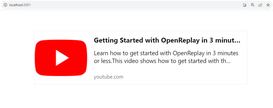
function App() {
return (
<div>
<Microlink url="https://www.youtube.com/watch?v=EWbtMK3qK30" />
</div>
);
}
export default App;- Microlink Component: This is a component provided by the
@microlink/reactlibrary. It’s designed to generate previews for URLs. - URL Prop: The
<Microlink>component takes a prop calledurl. This prop is set to the contents URL. This tells the<Microlink>component which URL to generate a preview for. - Rendering the Preview: Once the
<Microlink>component receives theurlprop, it fetches information about the URL, such as the title, description, image, and more. It then formats this information into a visually appealing preview.
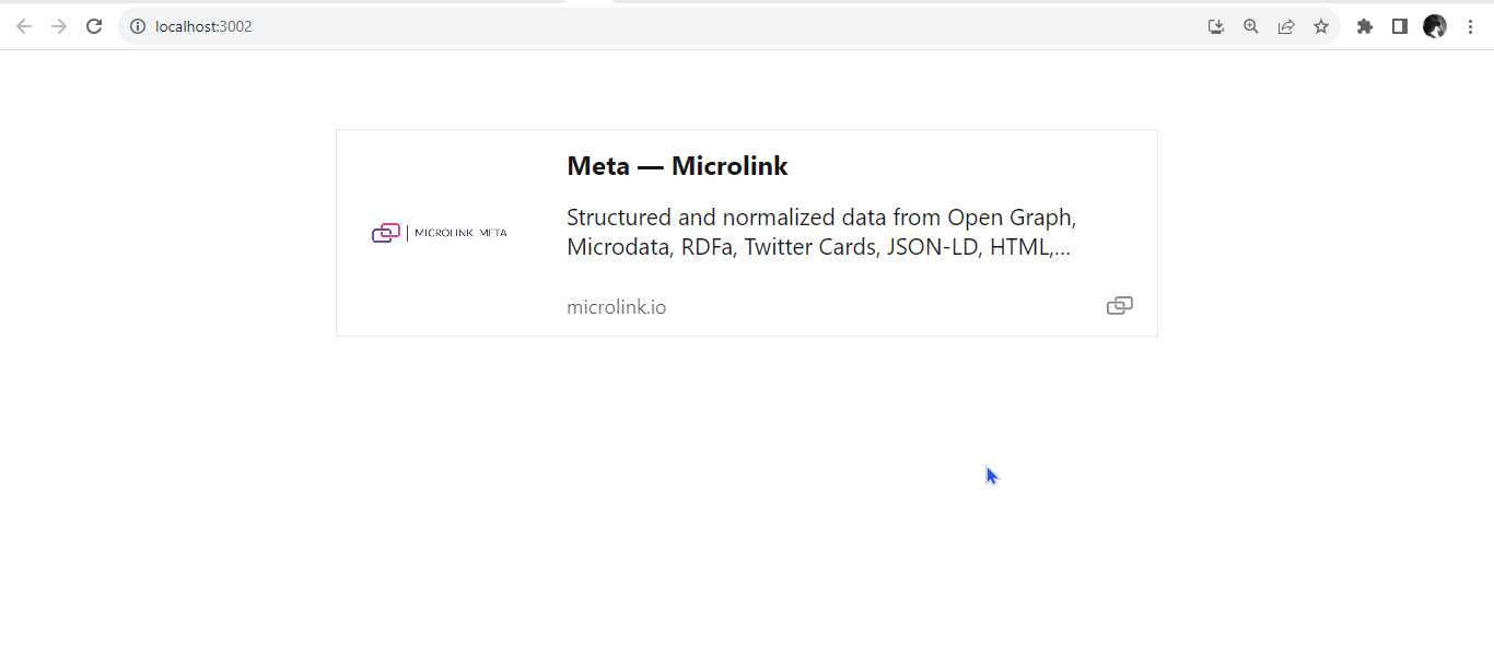
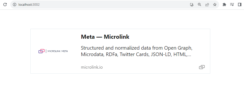
After running the code block above, it should look like this.
When a user clicks on the preview box, it will direct the user to the preview content.
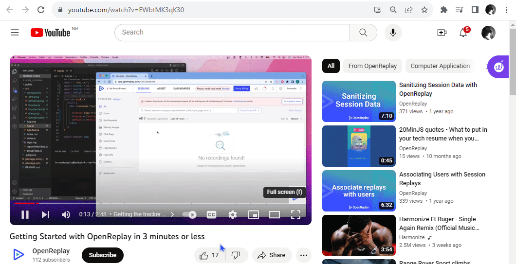
This is an essential way to integrate a URL preview feature into your application using the @microlink/react library. When you render this component in your app, it will display a preview of the YouTube video associated with the provided URL.
Enhancing Contrast for Visual Appeal
The React-Microlink library offers a convenient and easy access contrast API, designed to enhance the accessibility and visual appeal of URL previews. The contrast prop type is boolean and is set as false by default. Users can enable this by simply introducing the contrast keyword. You enable the generation of high-contrast cards that dynamically adapt based on the predominant colors detected in the feature image from the linked URL. This smart feature ensures that the preview card’s color scheme aligns with the content’s colors, improving readability and aesthetics. Below, you can observe a URL preview card that demonstrates the difference when the contrast prop is not utilized.
function App() {
  return (
    <div style={{ padding: "20px" }}>
      <Microlink url="https://microlink.io/meta?url=https%3A%2F%2Fwww.dropbox.com%2Fscl%2Ffi%2Fdi5hl2ei22f6qwr4v1rln%2FElevating-User-Experience-Creating-Informative-URL-Previews-with-react-microlink-in-React.paper%3Frlkey%3Dhfygjgqgm9mlv5ff7jau9k67d%26dl%3D0" />
    </div>
  );
}
export default App;
It will render like this:
Below is a URL preview card with the contrast prop.
function App() {
  return (
    <div style={{ padding: "20px" }}>
      <Microlink
        url="https://microlink.io/meta?url=https%3A%2F%2Fwww.dropbox.com%2Fscl%2Ffi%2Fdi5hl2ei22f6qwr4v1rln%2FElevating-User-Experience-Creating-Informative-URL-Previews-with-react-microlink-in-React.paper%3Frlkey%3Dhfygjgqgm9mlv5ff7jau9k67d%26dl%3D0"
        contrast
      />
    </div>
  );
}
export default App;
It will render like this:
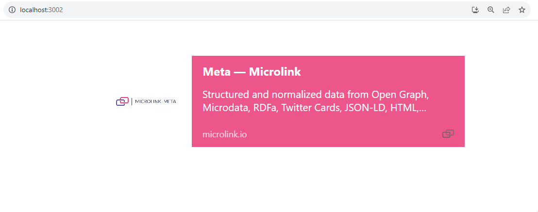
If a user clicks on the preview card, it will display like this.
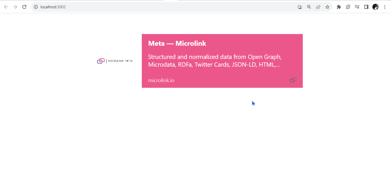
We can see that the contrast prop generated a high contrast card based on the predominant colors detected in the featured image from the target URL.
Defining Direction for User Flow
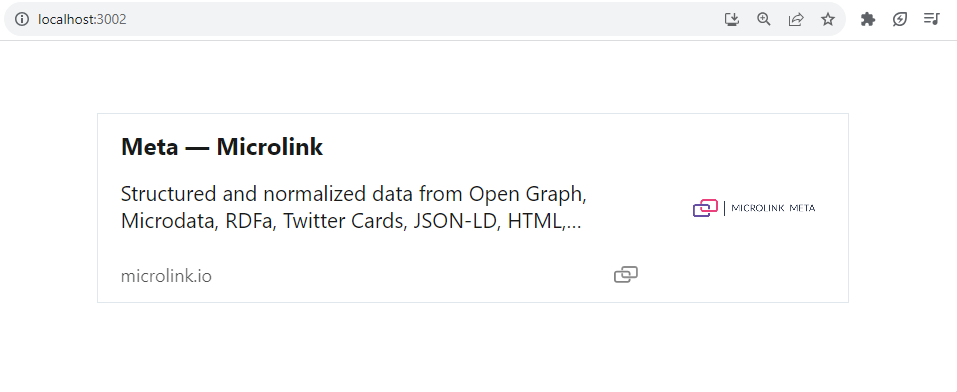
The direction prop plays a crucial role in shaping both the visual and navigational aspects of URL previews. This string type prop provides you with the means to define the directional flow of the preview card following your design and content preferences. By default, it holds a value of ltr (left-to-right), reflecting the conventional reading sequence. However, it allows users to opt for an alternate orientation, such as rtl (right-to-left), catering to languages and user preferences that embrace different reading directions. In the example below, we showcase the utilization of the rtl setting, distinct from the default ltr, illustrating how seamlessly the direction prop can be harnessed to tailor the user experience.
function App() {
  return (
    <div style={{ padding: "20px" }}>
      <Microlink
        url="https://microlink.io/meta?url=https%3A%2F%2Fwww.dropbox.com%2Fscl%2Ffi%2Fdi5hl2ei22f6qwr4v1rln%2FElevating-User-Experience-Creating-Informative-URL-Previews-with-react-microlink-in-React.paper%3Frlkey%3Dhfygjgqgm9mlv5ff7jau9k67d%26dl%3D0"
        direction="rtl"
      />
    </div>
  );
}
export default App;
It will render like this:
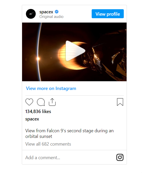
fetchData parameter
The fetchData prop in the React-Microlink library is a pivotal control mechanism, dictating the data-fetching process through the Microlink API. By default, it holds a value of true, indicating that an internal network call will be seamlessly executed to retrieve the necessary data. This approach ensures a smooth data acquisition process for your application.
function App() {
  return (
    <div style={{ padding: "20px" }}>
      <Microlink
        url="https://www.instagram.com/reel/Cu7nAzHAYvv/?utm_source=ig_web_copy_link&igshid=MzRlODBiNWFlZA=="
        fetchData
      />
    </div>
  );
}
export default App;
It will render like this:
Lazy Loading for Improved Performance
The lazy option is used for loading content only when you need it. The lazy prop is a boolean type set to true by default while using the Microlink component. It means that the card content – images, titles, and descriptions – will be loaded only when users start scrolling down the page. It’s like having a waiter bring you dessert only after you finish your main course – no rush, but it’s there when you’re ready.
Here’s the unique part: React-Microlink uses an IntersectionObserver. Think of it as a virtual lookout that keeps an eye on when elements enter and exit your screen. When you scroll down and about half of the card enters your view, the IntersectionObserver signals to fetch the card content. So, it’s like telling the waiter to bring the dessert when you’re halfway through your meal.
If you want to play around with this feature even more, you can pass your options to the IntersectionObserver. These options let you fine-tune how the content is fetched. For example, you could decide that the content should load only when 50% of the card appears on your screen. This lazy-loading feature isn’t just about convenience; it’s about being efficient. By loading content only when needed, you’re saving on data and making your app faster. It’s like only starting to read the next chapter of a book when you’re done with the current one – no need to carry the entire book around all the time.
function App() {
  return (
    <div style={{ padding: "20px" }}>
      <p>
        Lorem ipsum dolor sit amet, consectetur adipiscing elit. Fusce rhoncus
        euismod elit. Proin eget dapibus ligula. Vivamus a tortor ut elit
        egestas lacinia. Nam consequat urna at dictum. Nunc sed felis et erat
        viverra sollicitudin eu ut mi. Ut lacinia felis vel justo ullamcorper,
        eget scelerisque odio eleifend. Sed sit amet urna auctor, fermentum odio
        vel, tempus urna. Nullam dapibus, lorem ut auctor dignissim, ex justo
        tempus purus, in bibendum libero sapien vel ex. Nullam nec arcu et urna
        facilisis dignissim. Maecenas dignissim, nulla at efficitur consectetur,
        elit nulla lacinia quam, in fermentum odio lorem vel est. Integer vel
        metus sapien. Vestibulum vitae fermentum neque. Fusce eget sem vel
        ligula venenatis eleifend.
      </p>
      <Microlink url="https://microlink.io" lazy={{ threshold: 0.5 }} />
      <p>
        Nunc sed felis et erat viverra sollicitudin eu ut mi. Ut lacinia felis
        vel justo ullamcorper, eget scelerisque odio eleifend.
      </p>
    </div>
  );
}
export default App;
The threshold property lets you define at what point the IntersectionObserver should trigger an action, like loading content, when an element enters or exits the viewport.
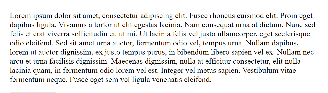
You will observe that for a split second, when the viewport reaches 50%, the card shows up on your screen.
Customizing URL Media Previews
The React-Microlink library provides a variety of custom props that you can use to fine-tune and tailor the URL media previews to your liking. Let’s explore some of these custom props:
Media Type
The default value of the media prop is [ image, logo ]. If the library finds any valid content in the specified order - image or logo, it will use that content as the media for the preview card. The media prop in React-Microlink plays a significant role in controlling what type of media content is displayed within the URL previews. This prop allows you to specify which field to use as the primary media for the card. By specifying values like image, video, audio, iframe, logo, or screenshot, you decide which element becomes the primary visual or auditory focus. This customization lets you tailor the media representation to match the essence of the linked content, enhancing the overall user experience. Let us look at some:
- The
logovalue is often used to display the website’s logo within the preview card. It will display the logo, even if it is an audio or video URL.
function App() {
  return (
    <div style={{ padding: "20px" }}>
      <Microlink
        url="https://www.youtube.com/watch?v=EWbtMK3qK30"
        media="logo"
      />
    </div>
  );
}
export default App;
This can be a helpful approach if you’re looking to provide users with a recognizable visual cue about the video’s source, which can be particularly beneficial for platforms like YouTube.
- The
audiovalue introduces an exciting dimension to URL previews centered around audio content. By settingmedia='audio', users can craft URL previews that give them a glimpse into the audio content linked through the URL, even if it is a video URL.
function App() {
  return (
    <div className="link-preview" style={{ padding: "20px" }}>
      <Microlink
        url="https://www.youtube.com/watch?v=EWbtMK3qK30"
        media="audio"
      />
    </div>
  );
}
export default App;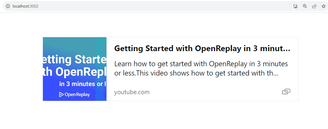
- The
videovalue enables users to seamlessly embed an informative video preview into their applications. This integration dynamically generates a thumbnail or screenshot extracted from the YouTube link, giving users an instant glimpse of the video’s content.
function App() {
  return (
    <div className="link-preview" style={{ padding: "20px" }}>
      <Microlink
        url="https://www.youtube.com/watch?v=EWbtMK3qK30"
        media="video"
      />
    </div>
  );
}
export default App;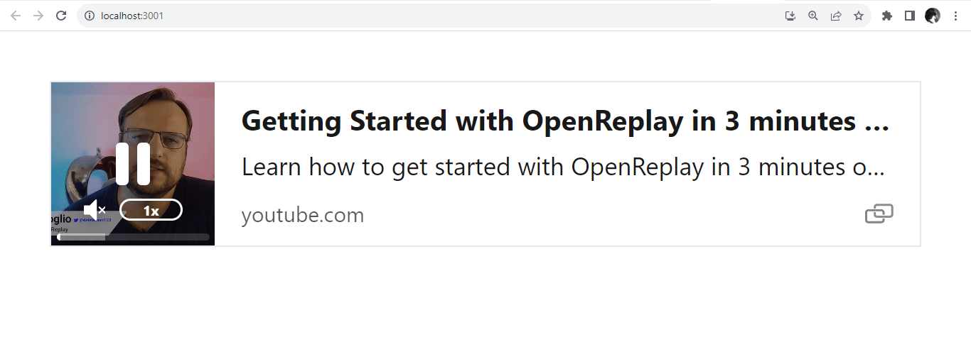
AutoPlay Functionality
The autoPlay feature is a notable attribute within the React-Microlink library’s arsenal. Operating on a simple boolean principle, autoPlay empowers developers to control whether media—such as videos or audio—embedded within URL previews will begin playing automatically as soon as they’re ready. Set autoPlay to true to enable this function.
function App() {
  return (
    <div style={{ padding: "20px" }}>
      <Microlink
        url="https://www.youtube.com/watch?v=EWbtMK3qK30"
        media="video"
        autoPlay={true}
      />
    </div>
  );
}
export default App;
To disable this function, set autoPlay to false.
Adding Controls for Interactivity
Enabling UI controls for the media within URL previews, a functionality enabled by default brings a new dimension of interactivity to the forefront of the React-Microlink library. Represented by a boolean value, these controls offer users an intuitive and accessible way to navigate and interact with the media content. Whether it’s videos or audio, the presence of controls empowers users to play, pause, adjust volume, and even seek through the content at their convenience. This inclusion not only enhances the user experience but also transforms the URL previews into interactive windows, allowing users to actively engage with the media and tailor their interaction to match their preferences.
function App() {
  return (
    <div className="link-preview" style={{ padding: "20px" }}>
      <Microlink
        url="https://www.youtube.com/watch?v=EWbtMK3qK30"
        media="video"
        controls
      />
    </div>
  );
}
export default App;
To disable this function, set controls to false.
Looping through Previews
The loop functionality, enabled by default within the React-Microlink library’s URL previews, introduces a layer of continuity to media playback. Represented by a boolean value, when the loop is enabled, the media content, be it videos or audio, restarts automatically every time it reaches its conclusion. This creates an endlessly looping experience, ideal for content users may want to enjoy repeatedly. By seamlessly blending the end and the beginning, the loop feature transforms the URL previews into captivating loops that engage users with an uninterrupted stream of content.
function App() {
  return (
    <div style={{ padding: "20px" }}>
      <Microlink
        url="https://www.youtube.com/watch?v=EWbtMK3qK30"
        media="video"
        loop
      />
    </div>
  );
}
export default App;
To disable this function, set the loop to false.
Muting Audio Previews
The muted functionality is a valuable attribute within the library’s arsenal. By enabling this feature, which has a default value of true, the media content—whether videos or audio—is automatically muted when presented to users. This muted state offers a seamless and unobtrusive introduction to the content, allowing users to visually or interactively engage without being caught off guard by sudden sound.
If the intention is to have the media content play with sound by default, developers can achieve this by explicitly passing the value false to the muted prop within the React-Microlink library’s URL previews. By setting muted={false}, the media, whether videos or audio, will begin playback with the accompanying sound. This approach offers users an immediate auditory experience, ensuring the media’s intended impact is fully realized.
function App() {
  return (
    <div className="link-preview" style={{ padding: "20px" }}>
      <Microlink
        url="https://www.youtube.com/watch?v=EWbtMK3qK30"
        media="video"
        muted={false}
      />
    </div>
  );
}
export default App;
Adjusting Preview Size
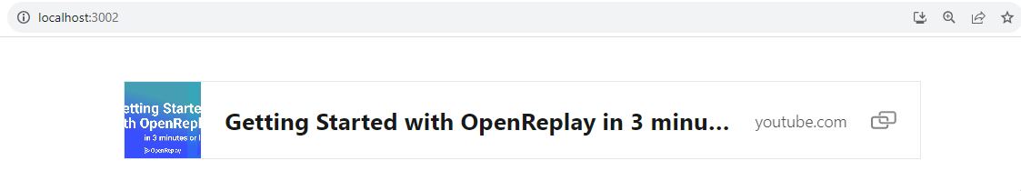
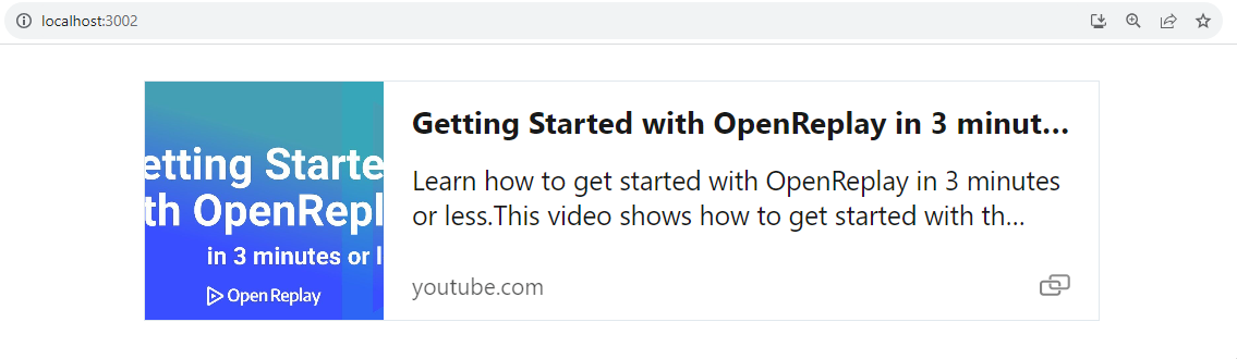
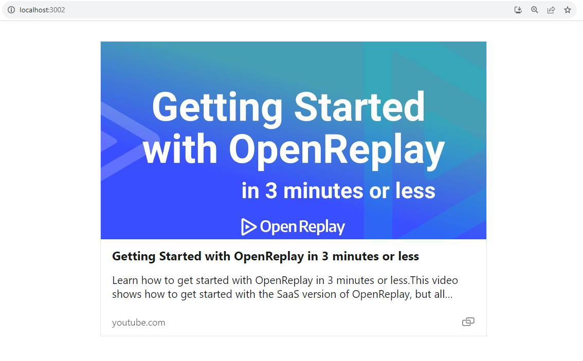
The size attribute within the React-Microlink library plays a pivotal role in customizing the visual impact of URL previews. With three distinct values— small, normal, and large, developers can tailor the size of the preview card to suit their application design and user experience goals. Whether it’s to create a compact and space-efficient card or to amplify the visual presence with a larger rendition, the size attribute empowers developers to seamlessly align the URL previews with their application’s overall aesthetic.
function App() {
  return (
    <div style={{ padding: "20px" }}>
      <div style={{ margin: "20px" }}>
        <Microlink
          url="https://www.youtube.com/watch?v=EWbtMK3qK30"
          media="video"
          size="small"
        />
      </div>
      <div style={{ margin: "20px" }}>
        <Microlink
          url="https://www.youtube.com/watch?v=EWbtMK3qK30"
          media="video"
          size="normal"
        />
      </div>
      <div style={{ margin: "20px" }}>
        <Microlink
          url="https://www.youtube.com/watch?v=EWbtMK3qK30"
          media="video"
          size="large"
        />
      </div>
    </div>
  );
}
export default App;
Small-sized preview card.
Average-sized preview card.
Large-sized preview card.
Integration Scenarios for React-Microlink
The React-Microlink library presents a versatile toolkit for seamless integration into various applications. From enriching social media-like platforms with multimedia previews to enhancing e-commerce experiences by showcasing product details, the possibilities are diverse. Across domains, React-Microlink empowers developers to deliver captivating and informative experiences, drawing users in with glimpses of content before they delve deeper.
When to Utilize React-Microlink in Your React Application
The React-Microlink library proves invaluable when you aim to enhance the visual appeal, engagement, and functionality of your React application. Consider integrating it under the following scenarios:
- Content Previews: When you want to provide users with a sneak peek of linked articles, multimedia content, or external resources, React-Microlink excels at creating dynamic and informative previews.
- Multimedia Feeds: If your application features feeds or streams of multimedia content, React-Microlink can provide a captivating snapshot of videos, images, or audio files, enticing users to explore further.
- Portfolio Showcase: For creative professionals, integrating React-Microlink in your portfolio website can add a dynamic touch, showcasing your work with compelling previews that showcase your projects’ essence.
- Entertainment Insights: Applications centered around entertainment, such as movie databases, music platforms, or gaming websites, can utilize React-Microlink to showcase trailers, tracks, or gameplay previews.
- Curated News: If your application curates news articles, blogs, or videos, React-Microlink can enrich the user experience by providing a glimpse of the content’s core, encouraging further exploration.
Conclusion
Incorporating URL previews using React-Microlink can be a game-changer for your application’s user experience. By giving users a glimpse of the linked content, you empower them to make informed decisions about which links to explore further. Whether you’re building a social media platform or a content-sharing app, URL previews can add a touch of sophistication and interactivity.
Understand every bug
Uncover frustrations, understand bugs and fix slowdowns like never before with OpenReplay — the open-source session replay tool for developers. Self-host it in minutes, and have complete control over your customer data. Check our GitHub repo and join the thousands of developers in our community.