
Advanced Animation Techniques with Anime.js

Adding animations is a nice, fun tweak for web pages, and this article will show you how easily you can implement many variations using the Anime.js library.

Discover how at OpenReplay.com.
Mastering Advanced Animation with anime.js
Animations have become a staple feature of contemporary websites, encountered and engaged with daily as we surf the internet. These animations vary widely in complexity, with some employing straightforward techniques like CSS animation, while others delve into more intricate methods utilizing diverse animation libraries.
Here are some common animations you may find on modern-day websites:
-
Micro-interaction Animation
-
Loading animation
-
Navigation animation

The above animations represent some fundamental animation techniques commonly seen on modern websites. Additionally, more advanced animations such as parallax scrolling and full-page animations are prevalent, particularly in React applications. This is because React often adheres to the principle of single-page websites, where these dynamic and immersive animation effects are frequently utilized to enhance user experience and engagement.
In this blog, we will learn about anime.js and see how it can be used to perform advanced animation.
Introduction
Advanced animation involves the use of JavaScript animation libraries that allow us to create interactive animation for our web design. These animation libraries provide a simple, intuitive API for animating HTML elements, SVG, etc. All without the need for extensive knowledge of complex animation techniques.
Animation libraries offer a ton of features and capabilities, such as flexibility, customization, performance, and compatibility. It is all-inclusive with a wide range of animation options, ranging from basic properties like opacity to advanced properties like complex easing functions. With advanced animation, we can also fine-tune animation using the different properties of different libraries, like duration, delay, loop, etc.
Importance of Mastering Advanced Animation
Techniques for capturing and retaining visitors’ attention on our site are essential, as they have many benefits. Animations are one tool we use to capture visitors’ attention and keep them locked in on our site.
Animation is generally aesthetically pleasing, but there are three main reasons why mastering advanced animation is great in contemporary web development. Here are the reasons:
- Improved User Engagement
- Enhanced User Experience
- Increased Creativity in Design
As we have listed above, mastering advanced animation techniques helps improve user engagement, keeps users intrigued, and gives a more digital experience. It helps keep a long-lasting impression on our site visitors, leading to prolonged interactions and increased engagement metrics.
Great user experience is the key factor in retaining visitors and driving interaction. Advanced animation helps make navigation and interaction more intuitive, making this possible.
Last but not least, with advanced animation, creativity is limitless. The versatility of modern libraries pushes the boundaries of design and animation. With animation libraries’ different effects and properties, creativity knows no bounds.
Brief overview of Anime.js
According to the developers of anime.js, here is how it is defined.
Anime.js (/ˈæn.ə.meɪ/) is a lightweight JavaScript animation library with a simple yet powerful API. It works with CSS properties, SVG,
DOMattributes, and JavaScript objects.
We will highlight a few points from that definition: lightweight, simple, DOM, attribute, SVG, etc. This shows that it is designed to minimize the impact of load time, ensuring smooth animation.
Anime.js uses declarative syntax similar to CSS properties. This allows us to focus more on achieving our desired animation without worrying much about complex syntax.
There is a wide range of animation options with anime.js, including basic properties like opacity and advanced features like staggered animation, keyframes, etc. You even have access to custom easing functions to determine the timing and progression of your animations.
Anime.js offers seamless integration with SVG and Dom elements, letting us animate a wide range of content, from HTML elements to SVG graphs and complex vector shapes. We also have a callback function, which we can leverage to execute custom logic, allowing for dynamic interaction with animations.
Understanding Anime.js Basics
In this section of our blog, we will discuss how to install and set up anime.js and see some basic animation examples to demonstrate how to use it to create simple animations.
Setup
Setting up anime.js for our project isn’t so complicated. There are multiple ways this can be done, either through direct download from the anime.js website, use of a package manager (npm, yarn), use of a model script, and lastly, use of CDN (Content Delivery Network).
For this blog, we will be using the CDN, as it is the method I love to use. It provides a quick and easy way to include it in our project by simply adding a script tag with the CDN link. It doesn’t require the download of an external file for our project, so it is best for demos or projects where we want to get started quickly without downloading and hosting the library ourselves.
To do this, we add a <script> tag in our HTML body with this CDN link.
<script src="https://cdn.jsdelivr.net/npm/animejs@3.0.1/lib/anime.min.js"></script>Voila, with that, you can now start animating.
Basic animation with Anime.js
Basic animation is a term for animations that can be done without a deep understanding of complex animation. They involve simple animation, which can also be carried out using vanilla CSS. Animations such as hover animations and animated buttons are considered basic animations.
To illustrate how we can use anime.js to create basic animation, we will be creating an animated button.
<!DOCTYPE html>
<html lang="en">
 <head>
 <meta charset="UTF-8" />
 <meta name="viewport" content="width=device-width, initial-scale=1.0" />
 <title>Animated Button</title>
 <style>
 button {
 background: linear-gradient(90deg, #1411e6, #a7a6de);
 color: rgb(0, 0, 0);
 border: none;
 border-radius: 5px;
 padding: 10px 20px;
 color: white;
 text-align: center;
 text-decoration: none;
 display: inline-block;
 font-size: 26px;
 font-family: "Lucida Sans", "Lucida Sans Regular", "Lucida Grande";
 margin: 10rem;
 cursor: pointer;
 border-radius: 5px;
 }
 </style>
 </head>
 <body>
 <button id="myButton">OpenReplay</button>
 <script src="https://cdn.jsdelivr.net/npm/animejs@3.0.1/lib/anime.min.js"></script>
 <script>
 const button = document.getElementById("myButton");

 button.addEventListener("mouseenter", () => {
 anime({
 targets: button,
 background: "linear-gradient(90deg, #a7a6de,#1411e6)", // Blue color on hover
 scale: 1.4, // Increase size on hover
 duration: 1000, // Animation duration in milliseconds
 easing: "easeInOutSine", // Animation easing function (optional)
 });
 });

 button.addEventListener("mouseleave", () => {
 anime({
 targets: button,
 background: "linear-gradient(90deg, #1411e6, #a7a6de", // Reset to original green color
 scale: 1, // Reset size on mouse leave
 duration: 1000, // Animation duration in milliseconds
 easing: "easeInOutSine", // Animation easing function (optional)
 });
 });
 </script>
 </body>
</html>
In the code above, we created a button, which we will be animating. Our primary focus will be on the script section of our blog. As you can see, we started by using the anime.js CDN to enable us to use it.
Then, using the getElementById selector, we can target our button to animate it. Two event listeners are used here: the mouseenter and the mouseleave. With these event listeners, we will be able to animate our button whenever a user interacts with it.
As you can see in the following code, using anime.js, we can target the exact element we want to animate, which is our button, and using basic properties like background, scale, duration, and easing, we can have a simple animation like this:
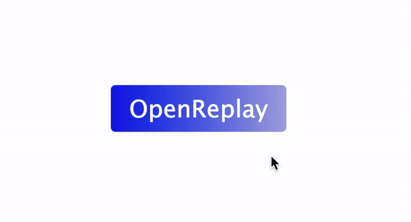 There you have it, a simple animation of a button that scales to 1.4 its size over 1 second when it is hovered on.
Exploring Advanced Animation Techniques
Advanced animations encompass a variety of techniques, including keyframe animation, staggering animation, and more. Despite their advanced nature, these methods are accessible and can be mastered with relative ease. This section will delve into these techniques, exploring some of their use cases and demonstrating their versatility.
Keyframe animations
Custom keyframes are used to define complex animation sequences. We can gain precise control over animations by manipulating keyframe properties such as easing, duration, and delays. In anime.js, there are two ways keyframe animations can be done: either through animation keyframes or property keyframes. Both animation keyframes and property keyframes are used to define the animation’s progression over time, but they offer different approaches.
Here is a table showing the key differences in each approach.
| Feature | Animation Keyframes | Property Keyframes |
|---|---|---|
| Target | Entire animation | Individual property |
| Keyframe Definition | keyframes property | Within each property definition |
| Use Case | Complex animations | Independent property animations |
| Timing Overlap | Possible | Each property has its own timing |
Easing functions
As the name suggests, the easing function plays a major role in the flow of animation. It is used to create smooth and natural animations. We can customize easing functions to achieve specific animation effects, such as bounce, elastic, or custom bezier curves.
Here is a code example to illustrate the easing function:
<!DOCTYPE html>
<html lang="en">
<head>
<meta charset="UTF-8" />
<meta name="viewport" content="width=device-width, initial-scale=1.0" />
<title>Document</title>
<style>
div {
background-color: red;
width: 25px;
height: 25px;
border-radius: 50%;
margin: 5px 15px;
}
</style>
</head>
<body>
<div class="div1"></div>
<div class="div2"></div>
<div class="div3"></div>
<script src="https://cdnjs.cloudflare.com/ajax/libs/animejs/3.2.1/anime.min.js"></script>
<script>
anime({
targets: ".div1, .div2, .div3 ",
translateX: 370,
direction: "alternate",
loop: true,
duration: 2000,
easing: function (el, i, total) {
return function (t) {
return Math.pow(Math.sin(t * (i + 1.5)), total);
};
},
});
</script>
</body>
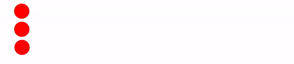
</html>In the code above, we created an animation that applies to three elements: .div1, .div2, and .div3. We use translateX to animate the horizontal translation of the elements. The value set for translateX is 370. This means the elements will be translated 370 pixels to the right during the animation.
The animation direction is set to alternate. This means the elements will move 370px to the right, then 370px back to the left (reversing direction), and this cycle will repeat continuously.
We also added a loop that is set to true, indicating that the animation will loop continuously and a duration of 2000 milliseconds, which sets the animation duration for a complete cycle to 2 seconds.
As for the easing, which is the main point of focus, we used a custom easing function that affects the animation’s speed and smoothness. The provided function in our code is a complex mathematical formula that creates a wavy easing effect.
Here is the result of our code:
Staggering animations
Staggering animations involve the sequencing or timing of elements of an animation with slight delays between each element. Implementing staggered animations can be used to create dynamic and engaging effects, such as cascading or randomized animations.
Here is a code example to illustrate staggering animation.
<!DOCTYPE html>
<html lang="en">
 <head>
 <meta charset="UTF-8" />
 <meta name="viewport" content="width=device-width, initial-scale=1.0" />
 <title>Document</title>
 <style>
 div {
 background-color: red;
 width: 25px;
 height: 25px;
 border-radius: 50%;
 margin: 5px 15px;
 }
 </style>
 </head>
 <body>
 <div class="div1"></div>
 <div class="div2"></div>
 <div class="div3"></div>
 <script src="https://cdnjs.cloudflare.com/ajax/libs/animejs/3.2.1/anime.min.js"></script>
 <script>
 anime({
 targets: ".div1, .div2, .div3 ",
 translateX: 270,
 delay: anime.stagger(300, { easing: "easeOutQuad" }),
 });
 </script>
 </body>
</html>
With anime.js, you can access different values for staggering animation, such as start, range, from, direction, etc. In our code above, we used the easing values, and here is the result we got:
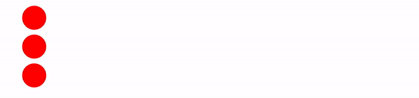
If you observe closely, you can see the staggering effect as the elements translate 270px from the origin.
Path animations
Utilizing Anime.js, we can delve into the fascinating realm of path animation, where elements traverse predefined trajectories, enhancing our web projects’ visual appeal and interactivity. The possibilities for path animations are virtually limitless, allowing us to animate motion along straight lines, graceful curves, and even intricate shapes with ease.
One key advantage of path animation is the level of control it offers over the movement of animated elements. By defining precise paths, we can dictate the speed, direction, and curvature of the animation, resulting in dynamic effects that captivate users’ attention and bring our designs to life.
Anime.js provides a straightforward syntax for creating path animations. We can specify the path using SVG path data or provide an array of coordinates representing the key points along the trajectory. This flexibility allows us to seamlessly integrate path animations into our projects, whether we’re animating the movement of a character across the screen or guiding the user’s focus through a series of interactive elements.
SVG Morphing Animation
In this section of our blog, we will examine how to use anime.js to perform SVG morphing animation. We have created a simple design to illustrate this. In this design, we will be
<!DOCTYPE html>
<html lang="en">
  <head>
    <meta charset="UTF-8" />
    <meta name="viewport" content="width=device-width, initial-scale=1.0" />
    <title>Document</title>
    <link rel="stylesheet" href="./style.css" />
  </head>
  <body class="body">
    <nav>
      <h3>
        <a href="https://www.openreplay.com/">
          <img
            className="logo"
            src="https://openreplay.com/images/logo-open-replay.svg"
            alt="logo"
            width="{200}"
          />
        </a>
      </h3>
      <svg
        class="darkmode"
        width="55"
        height="55"
        viewBox="0 0 55 55"
        fill="none"
        xmlns="http://www.w3.org/2000/svg"
      >
        <path
          class="sun"
          d="M55 27.5C55 42.6878 42.6878 55 27.5 55C12.3122 55 0 42.6878 0
27.5C0 12.3122 12.3122 0 27.5 0C42.6878 0 55 12.3122 55 27.5Z"
          fill="#FFD600"
        />
      </svg>
      <ul class="nav-items">
        <li>
          <a href="https://www.openreplay.com">Platform</a>
        </li>
        <li>
          <a href="https://www.openreplay.com">Enterprise</a>
        </li>
        <li>
          <a href="https://www.openreplay.com">Resources</a>
        </li>
        <li>
          <a href="https://www.openreplay.com">Developers</a>
        </li>
        <li>
          <a href="https://www.openreplay.com">Pricing</a>
        </li>

        <li>
          <a className="upgrade-btn" href="https://www.openreplay.com">
            Upgrade
          </a>
        </li>
      </ul>
    </nav>

    <script src="/animate.js"></script>
    <script src="https://cdnjs.cloudflare.com/ajax/libs/animejs/3.2.1/anime.min.js"></script>
  </body>
</html>
In the code above, we create a simple website layout with a navigation bar containing a logo and a darkmode toggle SVG, which we will use to illustrate SVG morphing and navigation links. Let’s add some CSS to bring our design to life.
@import url("https://fonts.googleapis.com/css2?family=Nunito:wght@400;700&display=swap");

* {
  margin: 0;
  padding: 0;
}
body {
  background-color: rgb(225, 225, 225);
  font-family: "Nunito", sans-serif;
}

/* Nav bar */

nav img {
  width: 200px;
}
.nav-items {
  list-style: none;
  gap: 2rem;
  display: flex;
  align-items: center;
  margin-left: 1rem;
}
nav a:hover {
  color: #56bbc6;
}
nav {
  display: flex;
  justify-content: space-between;
  align-items: center;
  padding: 1rem;
  font-size: 1.2rem;
  background-color: white;
  box-shadow: 0px 0px 25px #888888;
  position: relative;
}
nav a {
  color: #000000;
  text-decoration: none;
}
svg {
  cursor: pointer;
  margin-left: auto;
}
Here is our result with our CSS in place.
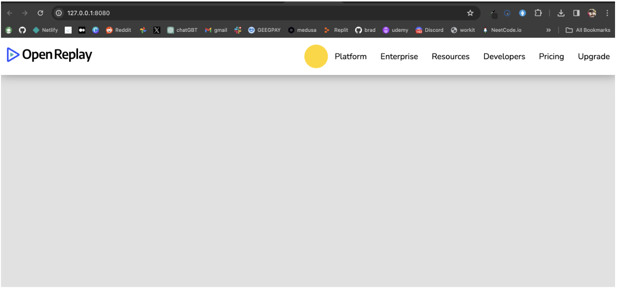
We can see our sun SVG in place in our design, let’s add our JavaScript to bring it all together.
const moonPath =
  "M13 28.5C13 43.6878 27.5 56 27.5 56C12.3122 56 0 43.6878 0 28.5C0 13.3122 12.3122 1.00001 27.5 1.00001C27.5 -0.999998 13 13.3122 13 28.5Z";

const sunPath =
  "M55 27.5C55 42.6878 42.6878 55 27.5 55C12.3122 55 0 42.6878 0 27.5C0 12.3122 12.3122 0 27.5 0C42.6878 0 55 12.3122 55 27.5Z";

const darkMode = document.querySelector(".darkmode");
const sun = document.querySelector(".sun");

let toggle = false;

darkMode.addEventListener("click", () => {
  const timeline = anime.timeline({
    duration: 750,
    easing: "easeOutExpo",
 });
  timeline
 .add({
      targets: ".sun",
      d: [{ value: toggle ? sunPath : moonPath }],
 })
 .add(
 {
        targets: ".darkmode",
        rotate: toggle ? 320 : -60,
 },
      "-=350"
 )
 .add(
 {
        targets: ".body",
        backgroundColor: toggle ? "rgb(225,225,225)" : "rgb(22,22,22)",
        color: toggle ? "rgb(22,22,22)" : "rgb(225,225,225)",
 },
      "-=750"
 );

  //Switching the toggle
  toggle = !toggle; // Toggle the variable for the next click
});
The JavaScript code implements a dark mode toggle functionality on a website using anime.js for animations. We started by creating variables for our sun and moon paths and a boolean variable for our toggle.
With our event listener, we can listen for click events and on-click events using anime.timeline object, we manage a sequence of animations, which involves the morphing of our SVG. The timeline has a duration of 750 milliseconds (0.75 seconds) and uses an easeOutExpo easing function for a smooth animation.
If the toggle is false (light mode), the animation changes the path to the sunPath.If the toggle is true (dark mode), the animation changes the path to the moonPath.
Here is the final result.
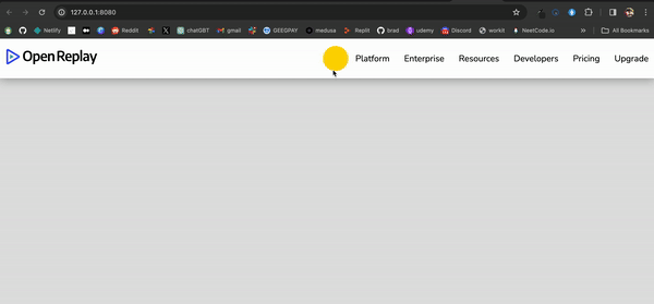
From the GIF above we can see the animation in action, on clicking the toggle SVG you can see the animation and also the toggle between the dark mode and light mode.
Conclusion
In conclusion, advanced animation with anime.js opens up a world of creative possibilities for web developers. Throughout this blog post, we’ve delved into various aspects of it, from understanding its basics to exploring advanced animation techniques.
You can take charge and animate elements in your web projects by harnessing the power of keyframe animations, easing functions, staggering effects, and path animations. The examples and use cases provided offer insights into how they can be applied to create captivating animations that enhance user experiences.
As you continue your journey into mastering advanced animation with anime.js, remember to experiment, practice, and stay updated with the latest developments in web animation techniques. The possibilities are endless, and with dedication and creativity, you can push the boundaries of what’s possible in web animation.
Check out the anime.js documentation for more insight. Happy coding.
Truly understand users experience
See every user interaction, feel every frustration and track all hesitations with OpenReplay — the open-source digital experience platform. It can be self-hosted in minutes, giving you complete control over your customer data. . Check our GitHub repo and join the thousands of developers in our community..
