
An Introduction to the Halfmoon CSS Framework


Halfmoon is a front-end framework for creating modern, responsive, and adaptable user interfaces. It is built on CSS and includes a library of pre-defined classes and styles to help you develop uniform and responsive user interfaces. Halfmoon also comes with a library of pre-designed components and layouts that may be used to quickly create complicated user interfaces. Halfmoon’s primary features are: Customizable design. Support for dark mode. Compatibility with various front-end frameworks like React and Vue.
The advantages of using Halfmoon CSS include the following:
- Design that can be readily customized: Halfmoon enables developers to quickly adjust the appearance and feel of their user interfaces, allowing them to create designs that reflect their brand and fulfill their specific demands.
- Halfmoon supports dark mode, allowing developers to construct user interfaces that are easy to read and use in low-light conditions.
- Easy integration with other frameworks: Halfmoon is meant to integrate well with other front-end frameworks such as React and Vue, making it simple for developers to include it in their existing projects.
- Time-saving: Halfmoon has a library of pre-defined classes and styles that make it simple to design uniform and responsive user interfaces, allowing developers to save time and effort while creating user interfaces.
- Pre-designed components and layouts: Halfmoon contains a library of pre-designed components and layouts that may be used to quickly build sophisticated user interfaces, allowing developers to focus on designing functionality rather than design and layout.
On the other hand, without knowing more about the context in which Halfmoon is being utilized, it is difficult to pinpoint specific disadvantages. Halfmoon, like any other front-end framework, may have various limits or trade-offs based on a project’s individual demands and objectives. Some potential drawbacks of employing Halfmoon include the following:
- While it allows for some design modification, it may not provide as much flexibility as other frameworks that let developers create their own styles and components from scratch.
- Dependence on the framework: Using Halfmoon means that a project is dependent on the framework, which may make it more difficult to change or upgrade the user interface design in the future.
- Learning curve: As with any new framework, there may be a learning curve connected with utilizing it that developers must overcome with time and effort.
The following browsers support Halfmoon:
- Internet Explorer by Microsoft (beginning with version 3.0)
- Firefox
- Safari
- Opera
- Chrome
- Any other browser whose maker has JavaScript installed or licensed
Getting Started
There are two ways of installing Halfmoon.
Installations via npm
You can use the following command to install Halfmoon CSS with npm:
npm install halfmoonAfter installing Halfmoon, you may import the styles into your project by adding the following line to your CSS file:
import '~halfmoon/dist/css/halfmoon.min.css';You can start using Halfmoon’s pre-defined classes and styles in your project. For more detailed instructions on installing and using Halfmoon, please refer to the official documentation to learn more.
Setup via CDN
To use Halfmoon CSS via a CDN, you can include the following link in the <head> section of your HTML file:
<!-- Halfmoon CSS -->
<link
  href="https://cdn.jsdelivr.net/npm/halfmoon@1.1.1/css/halfmoon-variables.min.css"
  rel= "stylesheet"
/>
<!--
  Or,
  Use the following (no variables, supports IE11):
  <link href="https://cdn.jsdelivr.net/npm/halfmoon@1.1.1/css/halfmoon.min.css" rel="stylesheet" />
-->

<!-- Halfmoon JS -->
<script src="https://cdn.jsdelivr.net/npm/halfmoon@1.1.1/js/halfmoon.min.js"></script>
This will fetch the most recent Halfmoon CSS version from the cndjs. After that, you may begin using Halfmoon’s pre-defined classes and styles in your project. You can also use a specific version of Halfmoon CSS by giving the version number in the CDN link, as seen below:
<link
  href="https://cdn.jsdelivr.net/npm/halfmoon@x.x.x/css/halfmoon-variables.min.css"
  rel= "stylesheet"
/>
Replace X.X.X with the version number of Halfmoon you want to use. For more detailed instructions on using Halfmoon via a CDN, please refer to the official documentation to lea
Basic elements
We’ll be combining fundamental elements with Hadlmoon styles in this segment. The styles offer a collection of CSS styles for interacting with Halfmoon-styled elements, including buttons, forms, and navigation bars. Using CSS classes and HTML markup, you can quickly adapt and include these features into your website. Let’s start writing some gorgeous code right now.
Button
To utilize Halfmoon CSS buttons in your project, you must first ensure that Halfmoon CSS is properly installed and imported. After that, use the ‘hm-btn’ class to construct a basic Halfmoon button. For instance, the following code generates a simple Halfmoon button with the text “Click me”:
<button class="btn" type="button">Click me</button>Output:

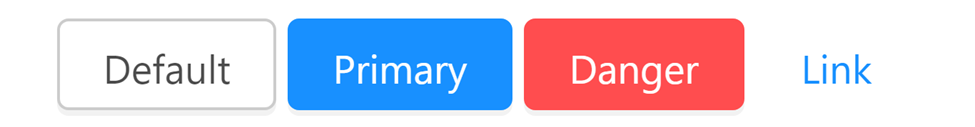
Doing this will produce a button with the standard Halfmoon styles. Other classes can be used to alter the Halfmoon button’s appearance. The ‘btn-primary’ class, for instance, can be used to make a primary button with a blue background color and danger displays red, as shown in the following example:
    <button class="btn" type="button">Default</button>
    <button class="btn btn-primary" type="button">Primary</button>
    <button class="btn btn-danger" type="button">Danger</button>
    <button class="btn btn-link" type="button">Link</button>
Output:
Other button types, such as secondary buttons (‘btn-danger’), (‘btn-success’), and danger buttons (‘btn-danger’), are also supported by Halfmoon CSS classes. These classes enable you to develop buttons that blend seamlessly with your user interface’s style and color scheme. You can learn more about buttons by clicking here.
Image
In Halfmoon, you can make responsive images. Because everything you need to know or use to work with images in Halfmoon is already available to you, doing so is simple. The code for utilizing any class is self-explanatory, and we’ll discuss this.
We can easily make a rounded image by utilizing the .rounded-circle class:
<img
  style="width: 200px; height: 200px"
  src="/assets/img.jpg"
  class= "img-fluid rounded-circle"
  alt= "rounded circle image"
/>
Output:

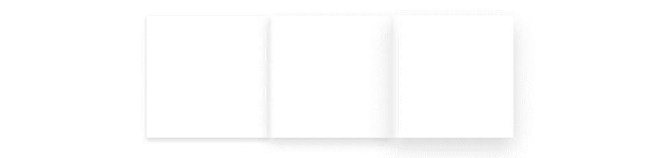
Since images are inline elements by default, you can easily center an image by using the text-center class name:
<div class="text-center">
  <img
    src="https://bookface-images.s3.amazonaws.com/logos/e46de9ab565d7b10514c61f2f5177850be03635b.png"
    class= "img-fluid rounded text-center"
    alt= "..."
    width="200px"
  />
  <br />
  <img
    src="https://images.unsplash.com/photo-1672855944100-18c7123b6495?ixlib=rb-4.0.3&ixid=MnwxMjA3fDB8MHxwaG90by1wYWdlfHx8fGVufDB8fHx8&auto=format&fit=crop&w=387&q=80"
    class= "img-fluid rounded text-center"
    alt= "..."
    width="200px"
  />
</div>
Output:
You can learn more about images by clicking this link.
Links
You can create links in Halfmoon CSS in the HTML <a> element with the Halfmoon’ hm-link’ class. With a light blue for the link text and the standard Halfmoon styles, this will produce a link.
For instance, the following code generates a link that says “Click here” and directs you to the Halfmoon website’s home page:
<a href="https://www.gethalfmoon.com/" class="hm-link">Click here</a>Output:

    <a href="#" class="hyperlink text-danger">Danger link</a>
    <a href="#" class="hyperlink-underline text-danger">Underlined danger link</a>
Output:

Halfmoon CSS also has classes for adding other kinds of links, like danger links, success links, and secondary links (text-secondary) (text-danger). These classes enable you to construct links that blend nicely with your user interface’s style and color scheme. For more detailed information on using Halfmoon CSS links, please refer to the official documentation by clicking here.
Tables
You can use the <table>, <thead>, <tbody>, and <tr> elements in HTML combined with the ‘table’ class from Halfmoon to use tables in Halfmoon CSS. Doing this creates a table with the standard Halfmoon styles, such as a border.
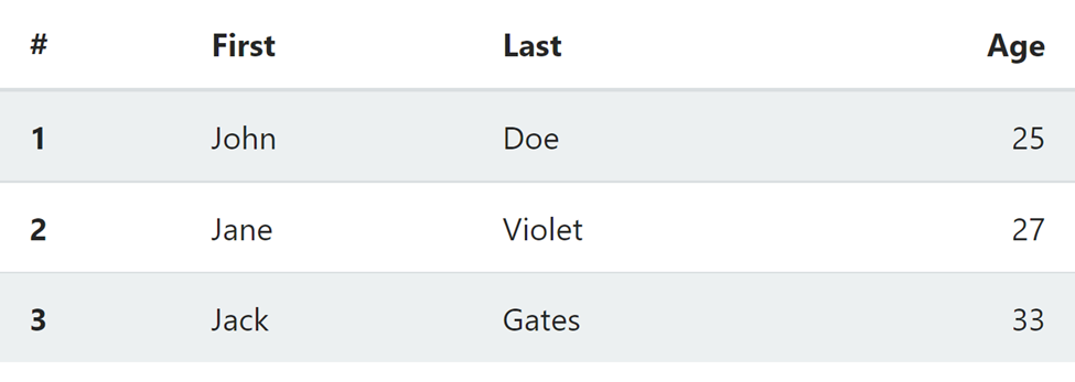
For instance, the code that follows generates a straightforward table with four columns and four rows:
<table class=" table table-striped">
  <thead>
    <tr>
      <th>#</th>
      <th>First</th>
      <th>Last</th>
      <th class="text-right">Age</th>
    </tr>
  </thead>
  <tbody>
    <tr>
      <th>1</th>
      <td>John</td>
      <td>Doe</td>
      <td class="text-right">25</td>
    </tr>
    <tr>
      <th>2</th>
      <td>Jane</td>
      <td>Violet</td>
      <td class="text-right">27</td>
    </tr>
    <tr>
      <th>3</th>
      <td>Jack</td>
      <td>Gates</td>
      <td class="text-right">33</td>
    </tr>
  </tbody>
</table>
This will create a table that looks like this:
You can customize the style of your table by using other classes from Halfmoon. For more detailed information on using tables in Halfmoon CSS, please refer to the official documentation at https://www.gethalfmoon.com/docs/tables/.
Session Replay for Developers
Uncover frustrations, understand bugs and fix slowdowns like never before with OpenReplay — an open-source session replay tool for developers. Self-host it in minutes, and have complete control over your customer data. Check our GitHub repo and join the thousands of developers in our community.
Form elements
We’ll use styles in this part to deal with the Halfmoon form element. These styles are simple to comprehend. Additionally, these styles provide stunning designs that make our forms appear responsive. Let’s get started by making use of the fantastic forms-working approaches.
Form
A form is an area of a page that includes regular content, markup, unique elements called controls (such as checkboxes, radio buttons, menus, etc.), and labels for those controls.
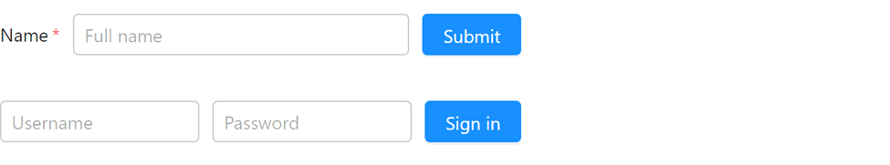
The form-control class name will be used when using forms in Halfmoon as a class name to form elements to produce a responsive look for the form. In contrast, the code that follows generates a straightforward form with text input fields and submit buttons:
<div class="w-400 mw-full">
  <form action="/server" method="POST" class="form-inline">
    <label class="required" for="if-0-full-name">Name</label>
    <input
      type= "text"
      class= "form-control"
      placeholder= "Full name"
      id="if-0-full-name"
      required= "required"
    />
    <input type="submit" class="btn btn-primary" value="Submit" />
  </form>
  <br />
  <form action="..." method="..." class="form-inline-sm">
    <input
      type= "text"
      class= "form-control"
      placeholder= "Username"
      id="if-1-username"
      required= "required"
    />
    <input
      type= "password"
      class= "form-control"
      placeholder= "Password"
      id="if-1-password"
      required= "required"
    />
    <input type="submit" class="btn btn-primary" value="Sign in" />
  </form>
</div>
This will create a form that looks like this:
For more detailed information on using forms in Halfmoon CSS, please refer to the official documentation.
Input
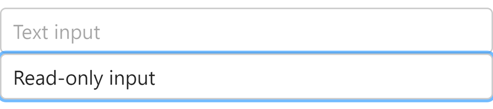
Please use the “form-control” class in Halfmoon to easily create a responsive input; it will automatically beautify the input for you:
<!-- Normal input -->
<input type="text" class="form-control" placeholder="Text input" />

<!-- Read-only input -->
<input
  type= "text"
  class= "form-control"
  value= "Read-only input"
  readonly= "readonly"
/>
This will create an input field that looks like this:
For more detailed information on using input fields in Halfmoon CSS, please refer to the official documentation to learn more.
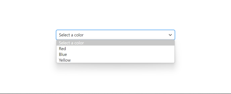
Select
The select element is used to create a dropdown list. You can easily create a responsive, beautiful select dropdown in Halfmoon by utilizing form-control. Kindly note that the styles are coming from the form-control class name. This is very easy to improve responsiveness,
<select class="form-control" id="select-1" style="width: 400px">
  <option value="" selected="selected" disabled="disabled">
    Select a color
  </option>
  <option value="red">Red</option>
  <option value="blue">Blue</option>
  <option value="yellow">Yellow</option>
</select>
This will create a select menu that looks like this:
For more detailed information on using select menus in Halfmoon CSS, please click here.
Textarea
The <textarea> tag defines a multi-line text input control. By applying the form-control class name to our textarea elements, we can produce beautiful and responsive textarea. The code below produces a straightforward textarea element with the placeholder of “Create a post”:
<!-- Normal textarea -->
<textarea class="form-control" placeholder="Create a post"></textarea>
<!-- Read-only textarea -->
<textarea class="form-control" readonly="readonly">
This textarea is read-only, so it can not be edited by the user. It can only be read.</textarea>
This will create a textarea element that looks like this:
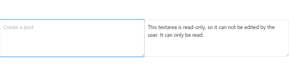
For more detailed information on using textarea in Halfmoon CSS, please click here.
Checkbox
To create awesome checkboxes, you can simply add the “custom-checkbox” class to the div wrapping the checkbox input; by doing so, you will produce beautiful checkboxes with ease. Here is an example of how you can do this:
<!-- First checkbox -->
<div class="custom-checkbox">
  <input type="checkbox" id="checkbox-1" value="" />
  <label for="checkbox-1">I'm Checked </label>
</div>
<br />
<!-- Second checkbox (checked by default) -->
<div class="custom-checkbox">
  <input type="checkbox" id="checkbox-2" value="" checked="checked" />
  <label for="checkbox-2">Click me</label>
</div>
Output:

The checkbox is inserted into a <div> element in this example, and the “custom-checkbox” class is used to decorate the checkbox’s container.
You can add as many checkboxes as you need to your page and alter their appearance using the CSS and given classes. You can consult the checkbox component’s documentation on the Halfmoon website for further details and examples. Please click here to learn more.
Radio
Typically, radio groups are displayed with radio buttons (a collection of radio buttons describing a set of related options). One radio button from a group can only be selected at once. We can easily design our radio by wrapping the input radio element in a div tag with the class name “custom-radio” this will add a beautiful style to the radio button:
<div class="custom-radio">
  <input type="radio" name="radio-set-1" id="radio-1" value="radio-1" />
  <label for="radio-1">Radio 1</label>
</div>
<br />
<div class="custom-radio">
  <input type="radio" name="radio-set-1" id="radio-2" value="radio-1" />
  <label for="radio-2">Radio 2</label>
</div>
<br />
<div class="custom-radio">
  <input type="radio" name="radio-set-1" id="radio-3" value="radio-1" />
  <label for="radio-3">Radio 3</label>
</div>
<br />
<div class="custom-radio">
  <input type="radio" name="radio-set-1" id="radio-4" value="radio-1" />
  <label for="radio-4">Radio 4</label>
</div>
Output:
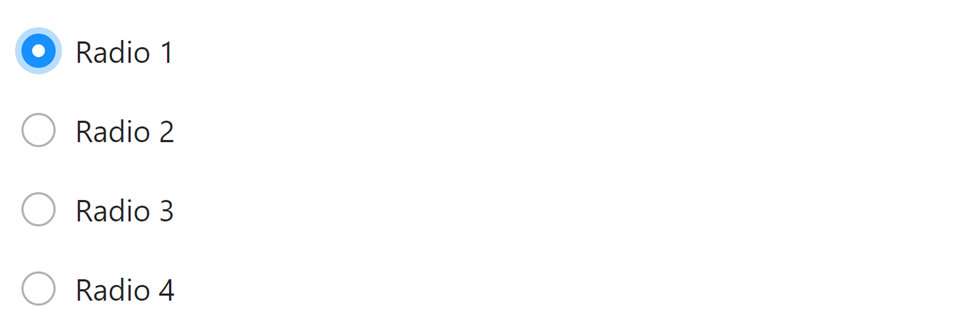
You can use this technique to add as many radio inputs as you need to your page, and customize their styles using the provided classes and CSS. For more information and examples, refer to the documentation for the radio input component on the Halfmoon website.
Switch
You first should include a Halfmoon CSS file in your HTML page before using a switch in Halfmoon. Once you’ve completed this, you can use the class “.custom-switch” to add a switch to your page. Here is an illustration of how to accomplish it:
<div class="custom-switch">
  <input type="checkbox" id="switch-1" value="" />
  <label for="switch-1">Switch 1</label>
</div>
<br />
<!-- Second switch (checked by default) -->
<div class="custom-switch">
  <input type="checkbox" id="switch-2" value="" checked="checked" />
  <label for="switch-2">Switch 2</label>
</div>
Output:
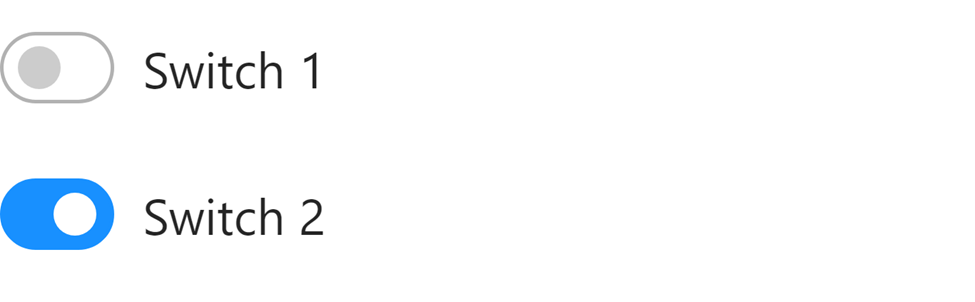
In this example, the switch input is added to a <div> element with the “.custom-switch” class, which is used to style the container for the switch. The input element with the type attribute set to “checkbox” is used to create the switch. The label element provides the toggle for the switch.
File input
Halfmoon comes with a custom file input design that works across browsers. If you want to get full access to file input in Halfmoon, kindly input the JavaScript CDN link:
<script src="https://cdn.jsdelivr.net/npm/halfmoon@1.1.1/js/halfmoon.min.js"></script>Users can choose a local file to open by using the form controls known as “file inputs”.
<!-- File input -->
<div class="custom-file">
  <input type="file" id="file-input-1" />
  <label for="file-input-1">Choose a file</label>
</div>

<!-- Multi-file input -->
<div class="custom-file">
  <input
    type= "file"
    id="multi-file-input-1"
    multiple= "multiple"
    accept= ".jpg,.png,.gif"
  />
  <label for="multi-file-input-1">Choose images</label>
</div>
Output:
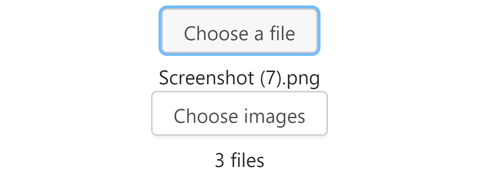
You can see the styles that Halfmoon has introduced in the screenshot above. Additionally, JavaScript operates in the background to recognize the image being uploaded and display the name chosen for the image, as seen in the first input. A user can choose numerous photos by using the “multiple” attribute of the second input you see up there, which displays the number of images.
Input group
To use an input group in Halfmoon, you must include the Halfmoon CSS file in your HTML page. Once you have done this, you can add an input group to your page using the .input-group classes. Here is an example of how you can do this:
<!-- Input group with prepended text -->
<div class="input-group">
  <div class="input-group-prepend">
    <span class="input-group-text">@</span>
  </div>
  <input type="text" class="form-control" placeholder="Your username" />
</div>
<!-- Input group with appended text -->
<div class="input-group">
  <input type="text" class="form-control" placeholder="Your username" />
  <div class="input-group-append">
    <span class="input-group-text">@example.com</span>
  </div>
</div>
<div class="input-group">
  <div class="input-group-prepend">
    <span class="input-group-text">Shop</span>
  </div>
  <input type="text" class="form-control" placeholder="Enter products" />
  <div class="input-group-append">
    <button class="btn btn-primary" type="button">Search</button>
  </div>
</div>
Output:
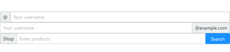
You can see from the example above that we used the class name “input-group” to group the input and its closest surrounding elements, which results in the lovely styles you see above. You can refer to the documentation for the input group component on the Halfmoon website.
Advanced components
Working with Advance components in Halfmoon is what we’ll be doing in this section. These elements have sophisticated styles that enhance the appearance of our website, and it is extremely simple and straightforward to maintain them. Let’s go to work right now.
Alerts
To use alerts in Halfmoon CSS, you can use the <div> tag in HTML and the alert class from Halfmoon. This will create an alert box with the default Halfmoon styles, including styling for the alert message and a close span element.
<div class="alert" role="alert">
<button class="close" data-dismiss="alert" type="button" aria-label="Close">
<span aria-hidden="true">×</span>
</button>
<h4 class="alert-heading">Dismissible alert</h4>
This is a default alert that can be dismissed.
</div>
<div class="alert alert-primary" role="alert">
<button class="close" data-dismiss="alert" type="button" aria-label="Close">
<span aria-hidden="true">×</span>
</button>
<h4 class="alert-heading">Dismissible alert</h4>
This is a primary alert that can be dismissed.
</div>
<div class="alert alert-success" role="alert">
<button class="close" data-dismiss="alert" type="button" aria-label="Close">
<span aria-hidden="true">×</span>
</button>
<h4 class="alert-heading">Dismissible alert</h4>
This is a success alert that can be dismissed.
</div>
<div class="alert alert-secondary" role="alert">
<button class="close" data-dismiss="alert" type="button" aria-label="Close">
<span aria-hidden="true">×</span>
</button>
<h4 class="alert-heading">Dismissible alert</h4>
This is a secondary alert that can be dismissed.
</div>
<div class="alert alert-danger" role="alert">
<button class="close" data-dismiss="alert" type="button" aria-label="Close">
<span aria-hidden="true">×</span>
</button>
<h4 class="alert-heading">Dismissible alert</h4>
This is a danger alert that can be dismissed.
</div>JavaScript:
<script src="https://cdn.jsdelivr.net/npm/halfmoon@1.1.1/js/halfmoon.min.js"></script>This will create an alert box that looks like this:
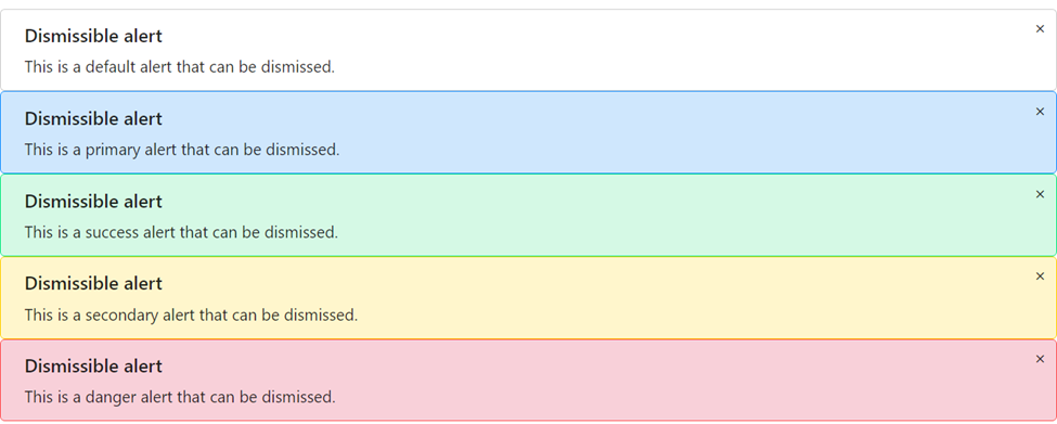
To close the alert box, simply click on the close icon. Ensure that your HTML page includes Halfmoon JavaScript CDN at the very bottom of your page. You can customize the style of your alert box by using other classes from Halfmoon. For more detailed information on using alerts in Halfmoon CSS, please refer to the official documentation to learn more.
Breadcrumb
To use breadcrumbs in Halfmoon CSS, you can use the <nav>, <ol>, and <li> tags in HTML, along with the breadcrumb class from Halfmoon. This will create a breadcrumb navigation bar with the default Halfmoon styles, including styling for the links and the separators between the links. The following code creates a simple breadcrumb navigation bar with three links:
<nav aria-label= "Breadcrumb navigation example">
  <ul class="breadcrumb">
    <li class="breadcrumb-item"><a href="#">Home</a></li>
    <li class="breadcrumb-item"><a href="#">Docs</a></li>
    <li class="breadcrumb-item active" aria-current="page">
      <a href="#">Breadcrumb</a>
    </li>
  </ul>
</nav>
This will create a breadcrumb navigation bar that looks like this:

For more detailed information on using breadcrumbs in Halfmoon CSS, please refer to the official documentation to learn more.
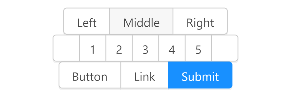
Button group
To use a button group in Halfmoon, you must include the Halfmoon CSS file or CDN in your HTML page. Once you have done this, you can add a button group to your page using the .btn-group and the `.b’tn classes on button element. Here is an example of how you can do this:
<!-- First button group -->
<div class="btn-group" role="group" aria-label="Basic example">
  <button class="btn" type="button">Left</button>
  <button class="btn" type="button">Middle</button>
  <button class="btn" type="button">Right</button>
</div>
<!-- Second button group (used as pagination) -->
<div class="btn-group" role="group" aria-label="Button group as pagination">
  <!-- Previous page -->
  <button class="btn btn-square" type="button">
    <i class="fa fa-angle-left" aria-hidden="true"></i>
    <span class="sr-only">Previous page</span>
    <!-- sr-only = only for screen readers -->
  </button>
  <!-- Pages -->
  <button class="btn btn-square" type="button">1</button>
  <button class="btn btn-square" type="button">2</button>
  <button class="btn btn-square" type="button">3</button>
  <button class="btn btn-square" type="button">4</button>
  <button class="btn btn-square" type="button">5</button>
  <!-- Next page -->
  <button class="btn btn-square" type="button">
    <i class="fa fa-angle-right" aria-hidden="true"></i>
    <span class="sr-only">Next page</span>
    <!-- sr-only = only for screen readers -->
  </button>
</div>
<!-- Third button group -->
<div class="btn-group" role="group" aria-label="Another button group">
  <button class="btn" type="button">Button</button>
  <a href="#" class="btn" role="button">Link</a>
  <input class="btn btn-primary" type="submit" value="Submit" />
</div>
Output:
For more information and examples, you can refer to the documentation for the button group component on the Halfmoon website.
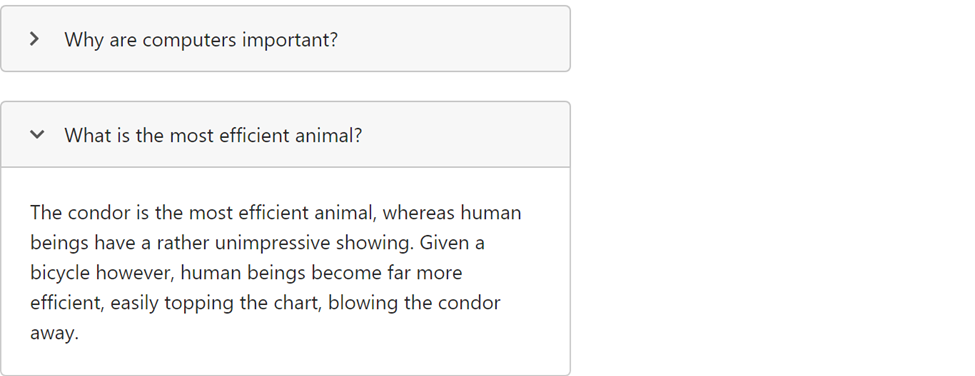
Collapse
The Halfmoon CSS file needs to first be included in your HTML page before you can utilize a collapse in Halfmoon. The ‘.collapse-panel’ class can then be used to add a collapse to your page. The item that will be collapsed when the title is clicked is the one that is designated as the “collapse-content.” An illustration of how to do this is provided below:
<details class="collapse-panel w-400 mw-full">
  <!-- w-400 = width: 40rem (400px), mw-full = max-width: 100% -->
  <summary class="collapse-header">Why are computers important?</summary>
  <div class="collapse-content">
    Computers are important because they are like bicycles for the mind.
  </div>
</details>
<!-- Second collapse panel (open by default) -->
<details class="collapse-panel w-400 mw-full mt-20" open>
  <!-- w-400 = width: 40rem (400px), mw-full = max-width: 100%, mt-20 = margin-top: 2rem (20px) -->
  <summary class="collapse-header">What is the most efficient animal?</summary>
  <div class="collapse-content">
    The condor is the most efficient animal, whereas human beings have a rather
    unimpressive showing. Given a bicycle however, human beings become far more
    efficient, easily topping the chart, blowing the condor away.
  </div>
</details>
Output:
For more information and examples, you can refer to the documentation for the collapse component on the Halfmoon website.
Dropdown
You would first include the Halfmoon CSS file in your HTML page to use a dropdown in Halfmoon, as stated in other sections of this article. Once you’ve finished, you can use the .dropdown classes to add a dropdown to your website. Here is an illustration of how to accomplish it:
<div class="dropdown">
  <button
    class= "btn"
    data-toggle= "dropdown"
    type= "button"
    id="dropdown-toggle-btn-1"
    aria-haspopup= "true"
    aria-expanded= "false"
  >
    Click me <i class="fa fa-angle-down ml-5" aria-hidden="true"></i>
    <!-- ml-5 = margin-left: 0.5rem (5px) -->
  </button>
  <div class="dropdown-menu" aria-labelledby="dropdown-toggle-btn-1">
    <h6 class="dropdown-header">Header</h6>
    <a href="#" class="dropdown-item">Link 1</a>
    <a href="#" class="dropdown-item">Link 2</a>
    <div class="dropdown-divider"></div>
    <div class="dropdown-content">
      <button class="btn btn-block" type="button">Button</button>
    </div>
  </div>
</div>
Output:
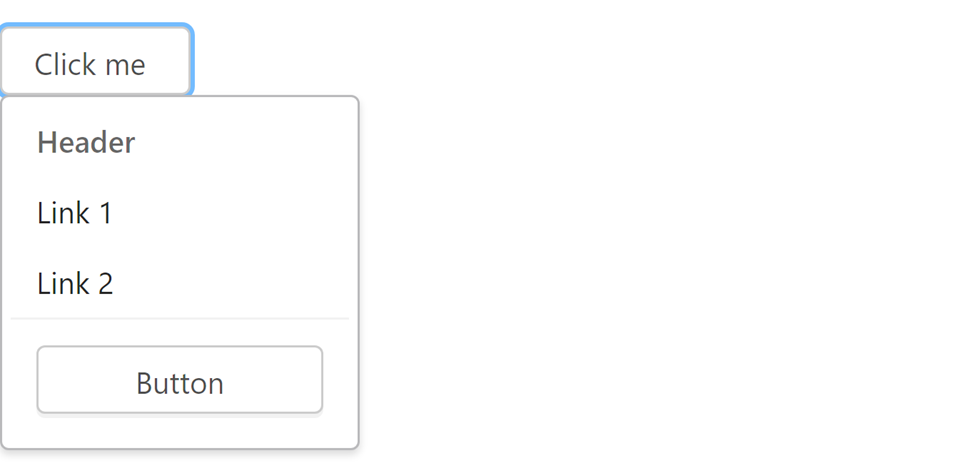
In this example, the dropdown is added to a <div> element with the dropdown class, which is used. For more information and examples, you can refer to the documentation for the dropdown component on the Halfmoon website.
Modal
The ‘.modal’ classes can then be used to add a modal to your page. You can achieve this by following the example given here:
<div class="modal ie-scroll-fix" id="modal-3" tabindex="-1" role="dialog">
<div class="modal-dialog" role="document">
<div class="modal-content w-600">
<!-- w-600 = width: 60rem (600px) -->
<a href="#" class="close" role="button" aria-label="Close">
<span aria-hidden="true">×</span>
</a>
<!-- Long scrollable content here -->
WELCOME TO OPEN REPLAY
</div>
</div>
</div>
<!-- Page wrapper -->
<div class="page-wrapper">
<div class="content-wrapper">
<a href="#modal-3" class="btn" role="button">READ MORE</a>
</div>
</div>Output 1:
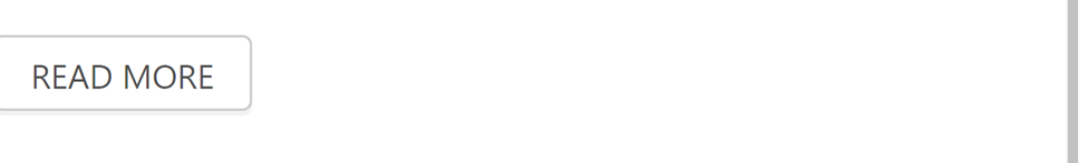
You will see the open modal as shown below after pressing the “READ MORE” button. Output 2:
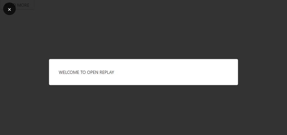
When the modal is opened, the overlay and modal content will be displayed on top of the page, and the styles for the open state will be applied automatically. You can customize the styles for the open state using the provided classes and CSS. For more information and examples, you can refer to the documentation for the modal component on the Halfmoon website.
Pagination
Beautiful and responsive pagination can be added to your page using the .pagination class on ul and .page-item class on the li element. You can accomplish this by using the following example:
<nav aria-label= "Page navigation example">
  <ul class="pagination">
    <!-- Previous page -->
    <li class="page-item">
      <a href="#" class="page-link">
        <i class="fa fa-angle-left" aria-hidden="true"></i>
        <span class="sr-only">Previous</span>
        <!-- sr-only = only for screen readers -->
      </a>
    </li>
    <!-- Pages and ellipses -->
    <li class="page-item"><a href="#" class="page-link">1</a></li>
    <li class="page-item ellipsis"></li>
    <li class="page-item"><a href="#" class="page-link">45</a></li>
    <!-- Active page item -->
    <li class="page-item active" aria-current="page">
      <a href="#" class="page-link" tabindex="-1">46</a>
    </li>
    <li class="page-item"><a href="#" class="page-link">47</a></li>
    <li class="page-item ellipsis"></li>
    <li class="page-item"><a href="#" class="page-link">86</a></li>
    <!-- Next page -->
    <li class="page-item">
      <a href="#" class="page-link">
        <i class="fa fa-angle-right" aria-hidden="true"></i>
        <span class="sr-only">Next</span>
        <!-- sr-only = only for screen readers -->
      </a>
    </li>
  </ul>
</nav>
Output:
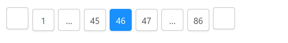
You can customize the styles for the pagination using the provided classes and CSS. For more information and examples, you can refer to the documentation for the pagination component on the Halfmoon website.
Progress
Progress bars are used to display a task’s progress. When utilizing Halfmoon, you must first include the Halfmoon CSS file in your HTML page before using the ‘.progress’ and ‘.progress-bar’ classes to add a progress bar to your page. Here is an illustration of how to accomplish it:
<!-- Primary progress bar (default, without utility class) -->
<div class="progress">
  <div
    class= "progress-bar"
    role= "progressbar"
    style= "width: 80%"
    aria-valuenow= "80"
    aria-valuemin= "0"
    aria-valuemax= "100"
  ></div>
</div>
<br />
<!-- Success progress bar -->
<div class="progress">
  <div
    class= "progress-bar bg-success"
    role= "progressbar"
    style= "width: 60%"
    aria-valuenow= "60"
    aria-valuemin= "0"
    aria-valuemax= "100"
  ></div>
</div>
<br />
<!-- Secondary progress bar -->
<div class="progress">
  <div
    class= "progress-bar bg-secondary"
    role= "progressbar"
    style= "width: 40%"
    aria-valuenow= "40"
    aria-valuemin= "0"
    aria-valuemax= "100"
  ></div>
</div>
<br />
<!-- Danger progress bar -->
<div class="progress">
  <div
    class= "progress-bar bg-danger"
    role= "progressbar"
    style= "width: 20%"
    aria-valuenow= "20"
    aria-valuemin= "0"
    aria-valuemax= "100"
  ></div>
</div>
Output:
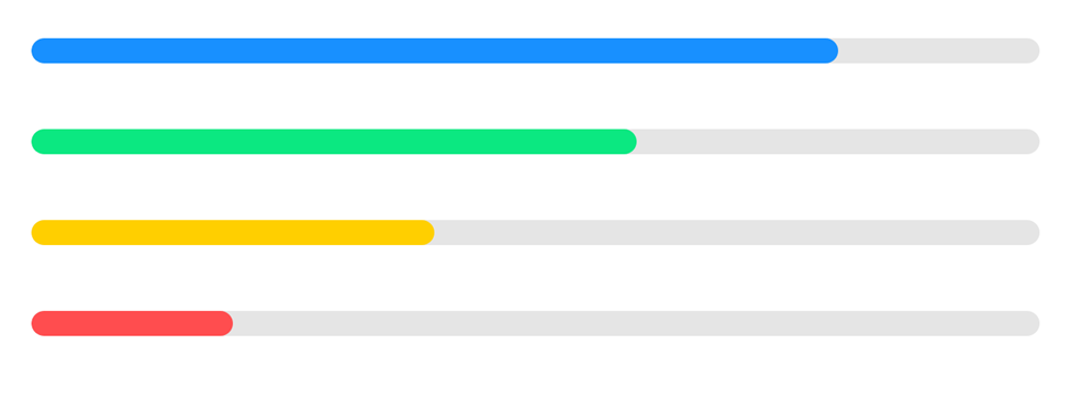
You can customize the styles for the progress bar using provided classes in Halfmoon. For more information and examples, you can refer to the documentation for the progress bar component on the Halfmoon website.
Common utilities
In this section, we’ll discuss the fundamental technique required to work with utility layout styles and utility classes that will be helpful when working with layouts, thanks to Halfmoon.
Flex utilities
Halfmoon CSS includes a set of utility classes for working with the CSS Flexbox layout. These classes can be used to quickly and easily create flexible, responsive layouts that adapt to different screen sizes.
To use the Flexbox utility classes in Halfmoon CSS, you first need to make sure that Halfmoon CSS is properly installed and imported into your project. Once that is done, you can use the d-flex class to create a basic Flexbox container. For example, the following code creates a Flexbox container with four child elements that are aligned horizontally:
<div class= "d-flex flex-row">
  <div>First element</div>
  <div>Second element</div>
  <div>Third element</div>
  <div>Fourth element</div>
</div>
Output:
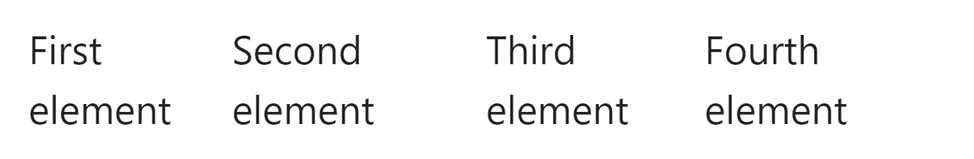
This will create a Flexbox container with four elements aligned next to each other. The d-flex class sets the display property of the container to flex, which enables the Flexbox layout. You can also use other classes from Halfmoon to customize the Flexbox layout. For example, the flex-row class can be used to align the child elements horizontally, like this:
<div class= "d-flex flex-row">
  <div>Item 1</div>
  <div>Item 2</div>
  <div>Item 3</div>
</div>
Output:

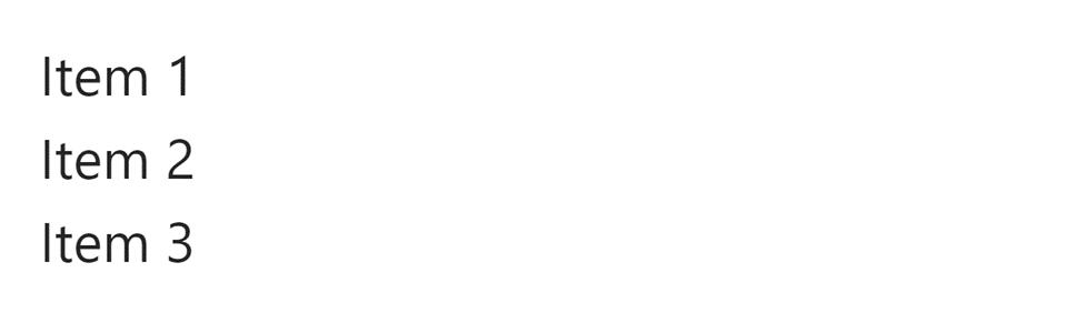
Similarly, the flex-column class can be used to align the child elements vertically like this:
<div class= "d-flex flex-column">
  <div>Item 1</div>
  <div>Item 2</div>
  <div>Item 3</div>
</div>
Output:
Display
The responsive utility classes that come with Halfmoon can be used to change an element’s display attribute. For example, if you want to display an element as a block-level element, you could use the following CSS:
.d-blockThis will make the element take up the entire width of its parent container, and any other elements below it will be pushed down to the following line. Alternatively, you can use the d-inline property to display an element inline with other elements, without causing any line breaks.
It’s important to note that the display property can have many different values, each of which determines how an element is displayed on the page. The values available for the display property in Halfmoon include block, inline, inline-block, flex, and many others. You can learn more about the different values and how to use them in the Halfmoon documentation.
Position utilities
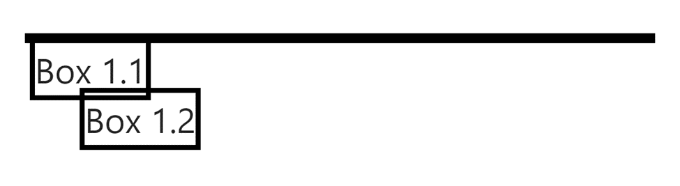
A position of A CSS attribute determines an element’s placement within a document. The final positioning of positioned items is determined by the top, right, bottom, and left characteristics.
<div class="position-relative" style="border: 2px solid black">
  <!-- position-relative = position: relative -->
  <div class="position-absolute" style="border: 2px solid black">Box 1.1</div>
  <!-- position-absolute = position: absolute -->
  <div class="position-absolute m-20" style="border: 2px solid black">
    Box 1.2
  </div>
  <!-- position-absolute = position: absolute, m-20 = margin: 2rem (20px) -->
</div>
Output:
Sizing utilities
To use the sizing property in the Halfmoon CSS framework, you first need to import the Halfmoon CSS stylesheet into your HTML. Once the stylesheet is imported, you can use the sizing property (w : width , h: height) in your CSS styles to specify the size of an element. For example, if you want to set the width of elements, you could use the following code:
<div class="w-50 h-50" style="background-color: pink"></div>
<div class="w-150 h-100" style="background-color: orange"></div>
<div class="w-200 w-sm-300 h-150" style="background-color: tan"></div>
Output:
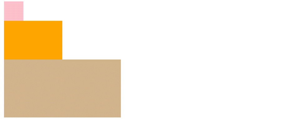
It’s important to note that the sizing property is not an actual CSS property; instead, it is a term commonly used to refer to the properties that control the size and dimensions of an element, such as width, height, min-width, and max-width. You can learn more about these properties and how to use them in the Halfmoon documentation.
Other utilities
We’ll work with appropriate features like borders, colors, box shadows, etc. These classes are important to our daily projects, and with Halfmoon’s assistance, we can simply use them to create stunning styles. Let’s get started.
Border utilities
An element’s border can be set using the shortcut property border in Halfmoon CSS. To use the ‘border’ property in the Halfmoon CSS framework, you must first load the Halfmoon CSS stylesheet into your HTML document. After the stylesheet has been imported, you can use the “border” property in your CSS styles to give an element a border.
<div class="d-flex">
  <!-- No rounded corners -->
  <div class="w-50 h-50 border rounded-0"></div>
  <!-- Rounded corners on all sides -->
  <div class="w-50 h-50 border rounded"></div>
  <!-- Rounded circle -->
  <div class="w-50 h-50 border rounded-circle"></div>
  <!-- Rounded corners only on the top -->
  <div class="w-50 h-50 border rounded-top"></div>
  <!-- Rounded corners only on the bottom -->
  <div class="w-50 h-50 border rounded-bottom"></div>
  <!-- Rounded corners only on the left -->
  <div class="w-50 h-50 border rounded-left"></div>
  <!-- Rounded corners only on the right -->
  <div class="w-50 h-50 border rounded-right"></div>
</div>
Output:
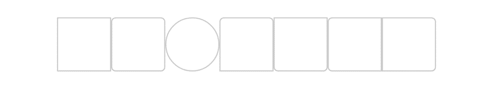
It’s important to note that the border property has many different values and variations, allowing you to control the border’s thickness, style, and color. You can learn more about the different values and how to use them in the Halfmoon documentation.
Box shadow utilities
An element’s frame can have shadow effects added with the shadow CSS attribute. Utility classes included with Halfmoon can be used to customize an element’s box shadow.
<div class="d-flex">
  <!-- No box shadow -->
  <div class="w-50 h-50 shadow-none"></div>
  <!-- Small box shadow -->
  <div class="w-50 h-50 shadow-sm"></div>
  <!-- Default box shadow -->
  <div class="w-50 h-50 shadow"></div>
  <!-- Large box shadow -->
  <div class="w-50 h-50 shadow-lg"></div>
</div>
Output:
It’s important to note that the shadow-* class is a powerful tool that allows you to create a wide range of shadow effects for your elements. You can learn more about the different values and how to use them in the Halfmoon documentation.
Color utilities
You can use the various color-related CSS properties in your styles to specify the colors of your elements. Links can also use the text color utilities. It will automatically handle the hover and focus states (based on the context). The top versions of the color classes that are offered are shown in the following table.
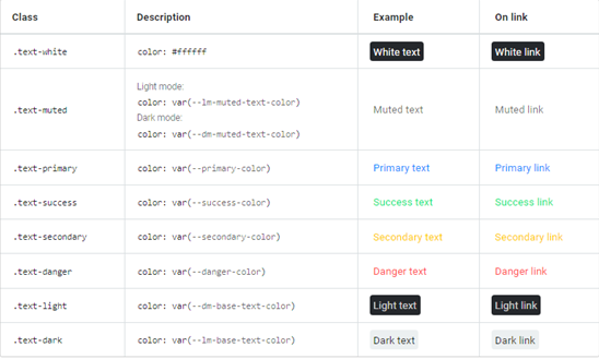
<p class="text-primary">Primary text</p>

<p class="text-muted">Muted text</p>

<p class="text-secondary text-smoothing-auto-dm">Secondary text</p>
Output:

Float utilities
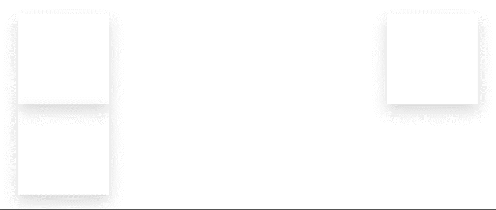
To use floats in the Halfmoon CSS framework, you first must import the Halfmoon CSS stylesheet into your HTML file.
<div class="w-50 h-50 shadow-lg float-right"></div>
<div class="w-50 h-50 shadow-lg float-none"></div>
<div class="w-50 h-50 shadow-lg float-md-left"></div>
Output:
Click here to learn more about floats.
Overflow utilities
You can use the overflow property in your CSS styles to control how content that extends beyond the bounds of an element is handled. For example, if you want to hide any content that overflows an element, you could use the following CSS:
<div class="overflow-auto w-200 h-100">
  <div class="w-300 h-200"></div>
</div>
Output:

This will make any content that overflows the bounds of the element invisible. Alternatively, you can use the overflow-scroll property to add scrollbars to an element when its content overflows, or the overflow-auto property to add scrollbars only when necessary. You can learn more about the different values and how to use them in the Halfmoon documentation.
Pointer events utilities
You can use the pointer-events property in your CSS styles to control whether an element can be clicked or interacted with using a pointing device, such as a mouse or touch screen. The following code represents two buttons, one of which contains a pointer event while the second does not. Please make sure you run the code through a full set of tests:
<button class="pointer-events-auto">With Pointer</button>
<br />
<button class="pointer-events-none">No Pointer</button>
Output:

The second button will make the element unclickable and unresponsive to pointer events.
Alternatively, you can use the pointer-events-auto property to restore the default behavior, allowing the element to be clicked and interacted with easily.
It’s important to note that the pointer-events property is a useful tool for creating custom interactive behaviors and controlling the flow of user events in your web applications. You can learn more about the pointer-events property and how to use it in the Halfmoon documentation.
Integrating Dark Mode toggle
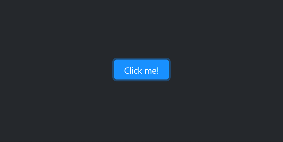
Halfmoon CSS includes support for dark mode, a feature that allows users to switch to a dark color scheme for your website or application. This can be useful for users who prefer a darker color scheme or for users who are viewing your site in low-light conditions. To use dark mode in Halfmoon CSS, you first need to make sure that Halfmoon CSS is properly installed and imported into your project. Once that is done, you can use the btn btn-primary class to create a toggle button that allows the user to switch between the light and dark modes. The following code creates a toggle button that switches between the light and dark modes:
<button class="btn btn-primary" type="button" onclick="toggleDemo()">
  Click me!
</button>
JavaScript:
<script src="https://cdn.jsdelivr.net/npm/halfmoon@1.1.1/js/halfmoon.min.js"></script>
<!-- JavaScript -->
<script type=" text/javascript">
  // Dark mode toggle demo
  function toggleDemo() {
    halfmoon.toggleDarkMode();
  }
</script>
This will create a toggle button that looks like this:

When the user clicks on the “Click me!” button, it will switch to dark mode, and when the button is clicked again, it switches back to light mode.
The following outcome will appear when you first press the toggle button:
Conclusion
I genuinely hope you have enjoyed reading this article. Throughout this tutorial, we learned how to install Halfmoon.css and produced a few Halfmoon.css examples to help us understand the syntax’s fundamental concepts. If you want to create a stunning and quick website for yourself or a client, you can change this example to meet your needs. Alternatively, you can put what you’ve learned into practice by creating more stunning websites.
A TIP FROM THE EDITOR: We’ve seen many other CSS frameworks in this blog; for instance, check Tailwind CSS Vs Bootstrap — A Comparison and Get Started With Bulma CSS In 5 Minutes.
Gain Debugging Superpowers
Unleash the power of session replay to reproduce bugs and track user frustrations. Get complete visibility into your frontend with OpenReplay, the most advanced open-source session replay tool for developers.
