Battle of Style Titans: Tailwind CSS vs SASS
Comparing the framework and the preprocessor


Tailwind CSS is a popular styling framework, and SASS is a preprocessor that empowers CSS. This article will highlight aspects of both, producing a comparison that will help developers choose.

Discover how at OpenReplay.com.
Battle of the Style Titans: Tailwind CSS vs SASS
Tailwind CSS is a utility-first CSS framework allowing developers to rapidly build custom user interfaces. It provides a predefined set of classes that you can use to quickly style your elements. For example, if you want to add some padding or margin to an element, you can simply apply the corresponding utility class instead of writing a custom style. Unlike traditional CSS frameworks like Bootstrap or Foundation, which provide pre-designed components, It provides low-level utility classes that can be composed together to create custom designs without having to write custom Cascading Style Sheets.
SASS (Syntactically Awesome Stylesheets) is a preprocessor for styling web pages. It’s a scripting language that adds functionality to regular CSS, making writing easier and more powerful. While standard CSS offers limited options, This preprocessor provides features like variables, mixins, and functions to streamline your styles. These features let you write more maintainable and reusable code.
Why Developers Use Tailwind CSS
Developers use Tailwind CSS because it simplifies styling for websites. It offers ready-made classes for everyday styling tasks, so there’s less need to write custom Cascading Style Sheets. This makes development faster and ensures consistency across projects. Its flexibility lets developers adjust it to fit their specific needs, making creating and managing styles easier.
Furthermore, it also saves time and effort, allowing developers to focus more on crafting engaging user experiences and less on managing complex style architectures, making it a favored tool for modern front-end development.
Imagine creating a product card layout that’s responsive and visually appealing. Traditionally, you’d write a lot of CSS to style the card element, its image, title, description, and price. This framework helps simplify this process with its utility-first approach. For Example:
<div class="w-full rounded-lg shadow-md overflow-hidden bg-white md:flex md:flex-row md:items-center">
  <img
    class="w-full h-65 object-cover md:w-1/2"
    src="product-image.jpg"
    alt="Product Image"
  />
  <div class="p-4 md:p-8 md:w-1/2">
    <h3 class="text-xl font-bold text-gray-800">CitrusGlow Cream</h3>
    <p class="text-gray-600 text-xl">CitrusGlow Cream is a rejuvenating skincare solution infused with the essence of oranges, offering a refreshing burst of hydration and radiance for your skin.</p>
    <div class="flex items-center mt-4">
      <span class="text-gray-700 text-lg font-semibold mr-2">$29.99</span>
      <button class="px-4 py-2 bg-green-500 text-white rounded-md hover:bg-indigo-700 focus:ring-2 focus:ring-offset-2 focus:ring-indigo-500">
        Add to Cart
      </button>
    </div>
  </div>
</div>
Explanation
Here’s a line-by-line explanation of this code’s functionality.
- We use
w-fullfor full-width,rounded-lgfor rounded corners, andshadow-mdfor a subtle shadow on the card. - The image utilizes
w-full,h-64, andobject-coverto fill the available space while maintaining the aspect ratio. - The card content area uses
p-4for padding on all sides (increased to p-8 on medium screens withmd:p-8. - Text styles are applied with classes like
text-xl,font-bold, and specific color classes for headings and descriptions. - The button leverages
px-4,py-2,bg-indigo-500, andtext-whitefor styling, with hover and focus effects using additional classes.
Product Card Output:
The image below shows a sleek product card layout styled using Tailwind CSS. It features key product details like name, price, and features, with a clean design and responsive layout for optimal user experience.

Why Developers Use SASS
Developers uses this CSS preprocessor because it’s like a helper for writing CSS. It lets you do things like save colors and font sizes in one place so you can easily reuse them. Also, you can write your styles in a way that looks more like how your HTML is structured, which makes it easier to understand. It even has shortcuts for common styles, so you don’t have to write them out every time.
This mini blog project showcases how this tool benefits developers. Using variables in a separate file keeps styles organized and simplifies changing colors throughout the site. Nesting styles mimic the HTML structure, making the code more readable. Defining styles once for elements like blog posts reduces repetition and promotes efficiency. These features combined make this preprocessor a valuable tool for creating clean and maintainable stylesheets. For example:
_variables.scss:
$primary-color: #ff0000; // Red
$secondary-color: #0000ff; // Blue
$font-family: Arial, sans-serif;
styles.scss:
@import "variables"; // Import variables

body {
  font-family: $font-family;
  margin: 0;
  padding: 0;
}

.container {
  max-width: 800px;
  margin: 0 auto;
  padding: 2rem;
}

h1 {
  color: $primary-color;
  text-align: center;
  margin-bottom: 1rem;
}

.post {
  margin-bottom: 2rem;
  border-bottom: 1px solid #ddd;
  padding-bottom: 1rem;
}

.post-title {
  font-size: 1.2rem;
  margin-bottom: 0.5rem;
}

.post-content {
  color: #333;
}

a {
  color: $secondary-color;
  text-decoration: none;
}

a:hover {
  text-decoration: underline;
}
index.html:
<body>
  <div class="container">
    <h1>My Awesome Blog</h1>
    <article class="post">
      <h2 class="post-title">
        Kayaking Through the Bioluminescent Bay of Puerto Rico
      </h2>
      <p class="post-content">
        Plunge into the ethereal waters of Puerto Rico's Mosquito Bay, where
        bioluminescent plankton illuminates your paddle strokes with an
        otherworldly glow. It's a truly unforgettable experience for nature
        enthusiasts and adventure seekers!
      </p>
      <a href="#">Read More</a>
    </article>

    <article class="post">
      <h2 class="post-title">Hiking the Enchantments in Washington State</h2>
      <p class="post-content">
        Lace up your boots and embark on a breathtaking trek through the
        Enchantments, a rugged alpine region in Washington State. Crystal-clear
        lakes, soaring peaks, and vibrant wildflower meadows await you on this
        challenging yet rewarding adventure.
      </p>
      <a href="#">Read More</a>
    </article>
  </div>
</body>
Explanation
_variables.scssdefines reusable values like colors and fonts. This promotes consistency and easier updates.styles.scssimports variables and styles the entire layout:- Body styles set the base font family and remove default margins/padding.
- The .container class defines a centered layout with a
max-widthfor responsiveness. <h1>styles with the$primary-colorvariable create a red heading.- The
.postclass styles individual blog posts with borders and separation. - Styles for .post-title and .post-content manage text size and color.
- Anchor tags
<a>are styled with the$secondary-colorfor blue links.
index.htmlreferences the compiled Cascading Style Sheetsstyles.cssto apply the styles to the HTML structure.
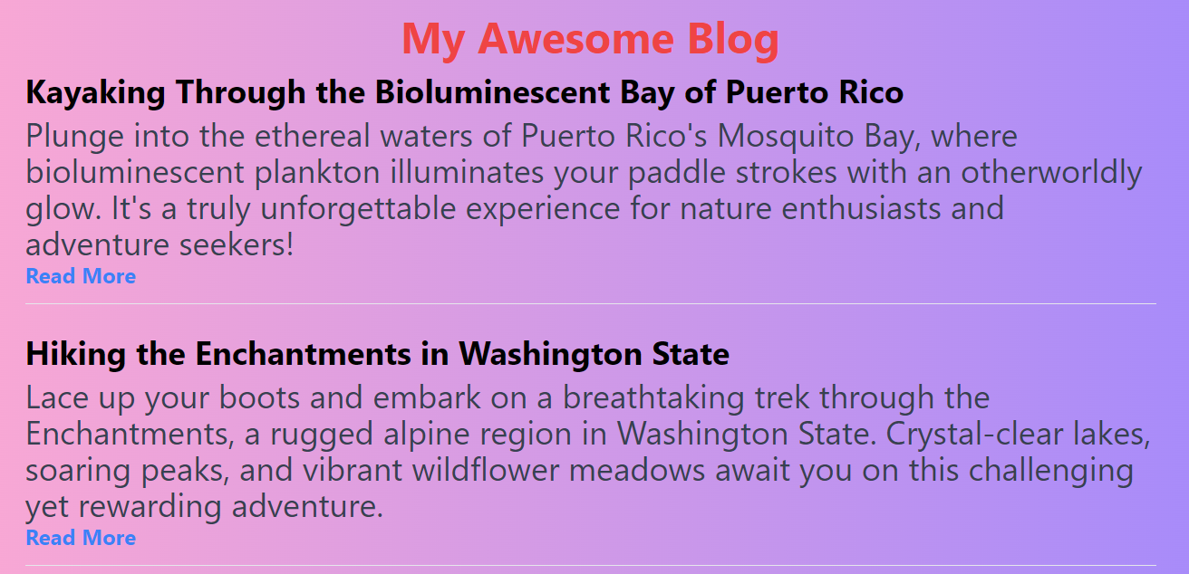
Mini Blog Output:
The following output below illustrates a mini blog layout, providing a condensed presentation of blog content for efficient browsing and quick consumption.
Tailwind CSS: The Utility Maverick
Tailwind CSS stands out as a paradigm-shifting utility-first framework. With its extensive set of utility classes, it revolutionizes front-end development and streamlines styling workflows, offering unparalleled speed and consistency in building modern web interfaces.
Pros of Using Tailwind CSS
Here are some of the key advantages you should know:
-
It enables rapid development by providing a vast library of utility classes that cover everyday styling needs. Developers can quickly apply styles directly in HTML, eliminating the need to write custom Cascading Style Sheets.
-
With this framework, maintaining consistency across the project is straightforward. Since styles are defined using utility classes, there’s less room for deviation, ensuring a cohesive design system.
-
Despite its utility-first approach, it offers flexibility through customization options. Developers can easily tweak configurations, such as colors, spacing, and typography, to match project requirements without sacrificing speed.
-
This framework scales well with projects of varying sizes. Whether building a small landing page or a complex web application, its utility classes provide a solid foundation for styling without introducing excessive CSS bloat.
-
It facilitates responsive design with built-in support for responsive breakpoints. Developers can apply responsive classes to adapt layouts and styles efficiently across different screen sizes.
Cons of Using Tailwind CSS
Here are some considerations regarding the limitations and drawbacks of this framework despite its many benefits in modern web development:
-
Some developers often argue that using utility classes directly in HTML can lead to increased clutter and reduced readability, especially for complex layouts or components with many styles applied.
-
While it offers customization options, some advanced styling needs may require writing custom Cascading Style Sheets.
-
Including the entire Tailwind CSS library in a project can result in a larger CSS file size than handcrafted or minified stylesheets. This might impact page load times, particularly on slower network connections.
-
Its utility-first approach may not align with every designer’s workflow or aesthetic preferences. Some designers prefer a more component-driven approach or greater control over individual CSS properties.
Exploration of Customization Capabilities in Tailwind CSS
Let’s delve into the depths of this framework’s customization features, exploring how they empower developers to create stunning designs with ease and efficiency.
Utility Classes
This tool’s utility classes are its hallmark feature, covering a comprehensive array of styling needs. For instance, from the code below, to add a blue background to an element, developers can simply apply the class bg-blue-500. Similarly, to add padding on all sides of an element, they can use px-4. These classes allow for rapid styling adjustments directly in HTML, promoting consistency and efficiency across the project. For example:
<div class="bg-blue-500 px-4 rounded-lg">This is a styled element.</div>Explanation:
This code creates a <div> element with a blue background colorbg-blue-500, padding on the left and right sides px-4, and rounded corners rounded-lg. Inside the <div>, there is text that says, “This is a styled element.”
Utility class output:

The image above displays a styled element which consists of a blue background and rounded corners
Themes
This utility-first styling framework empowers developers to customize themes through its configuration file. By defining custom color palettes, typography settings, and spacing scales, developers can tailor the design system to seamlessly match the project’s brand identity. For instance, in the configuration file:
// tailwind.config.js
module.exports = {
  theme: {
    extend: {
      colors: {
        customBlue: "#007bff",
      },
      fontFamily: {
        customFont: ["Roboto", "sans-serif"],
      },
    },
  },
};
Explanation:
The code shows how the JavaScript file configures Tailwind CSS by extending its theme. It adds a custom color named customBlue with the hex value #007bff, and a custom font family named customFont with the font stack "Roboto", "sans-serif". This allows developers to easily use these custom colors and font families throughout their project’s styles.
Variants
This framework offers variants that allow for conditional application of utility classes based on different states or breakpoints. For example, developers can use the hover: variant to apply styles on hover. Similarly, they can use the focus: variant to apply styles on focus. These variants facilitate the creation of responsive and interactive interfaces without the need for custom CSS to be written. For instance:
<button class="bg-blue-500 hover:bg-blue-700 text-white font-bold py-2 px-4 rounded">
  Hover over me
</button>
Explanation:
This code creates a button element <button> with a blue background color bg-blue-500, which changes to a darker shade of blue when hovered over hover:bg-blue-700. It also sets the text color to white text-white, makes the text bold font-bold, adds padding on the y-axis py-2 and x-axis px-4, and rounds the corners rounded. The text inside the button says “Hover over me.”
Variants output:
 The image above features a button styled with a blue background color. When hovered over, the button’s background color changes to a darker shade of blue. The text on the button reads “Hover over me.
Screens
This tool uses breakpoints to define responsive styles. You can customize these breakpoints to match your design requirements for different screen sizes.
module.exports = {
  theme: {
    screens: {
      sm: "640px", // Adjusting the starting point for the 'sm' breakpoint
      md: "768px", // Adjusting the starting point for the 'md' breakpoint
    },
  },
};
Explanation:
The module.exports: indicates the code exports this configuration object as a module for use in other parts of your project. The theme: property defines the overall theme configuration for your styles.
The sm: breakpoint applies styles specifically designed for screens with a width of at least 640 pixels (adjusted from the default starting point). The md: breakpoint applies styles for medium-sized screens starting at 768 pixels wide (adjusted from the default).
SASS: The Elegant Enigma
A sophisticated CSS preprocessor renowned for its concise syntax, powerful functionality, and ability to streamline stylesheet creation through features like variables, nesting, and mixins, offers developers a more efficient and maintainable approach to styling web applications.
Pros of using SASS
Delving into the Benefits of Utilizing Syntactically Awesome Style Sheets:
-
This tool offers a more organized and modular approach to styling through variables, mixins, and nesting, leading to cleaner code, especially in larger projects.
-
It allows for the creation of reusable code snippets using mixins and functions, promoting efficiency and reducing redundancy.
-
Its syntax is more human-readable, making it easier for developers to understand and maintain stylesheets.
-
It supports variables, calculations, and control directives, enabling dynamic stylesheets that adapt to different conditions or user interactions.
Cons of using SASS
Here are some drawbacks to consider when using Syntactically Awesome Style Sheets:
-
Compiled Cascading Style Sheets from this preprocessor’s files might be larger than the original code. This can potentially increase page load times.
-
Working with this tool requires a preprocessor compiler, adding a dependency to the workflow.
-
Browser developer tools might not work as seamlessly with this preprocessor’s files as they do with plain CSS. This can make troubleshooting issues in your styles more difficult.
Examination of Customization Features in SASS
Let’s explore how this tool empowers developers with variables, mixins, and more to create personalized and maintainable style solutions.
Inheritance and Operators
This CSS preprocessor allows you to inherit styles from another selector using the @extend directive, which helps you to avoid duplicating code. It also supports arithmetic and logical operators, such as +, -, *, /, %, and, or, and not, allowing you to perform calculations and compare your styles. CSS does not have these features. For example, you can write:
.error {
  border: 1px solid red;
  color: red;
}
.warning {
  @extend .error;
  color: orange;
}

.success {
  @extend .error;
  color: green;
}

.container {
  width: 100% / 3 - 20px;
  height: 50% + 10px;
}

@media (min-width: 768px) and (max-width: 1024px) {
  .container {
    width: 50% - 10px;
  }
}
Explanation:
The code utilizes SCSS features for efficient styling:
- Base error class establishes a foundation for error messages with a red border
border: 1px solid red;and red textcolor: red;. - The
.warningand.successclasses leverage@extendto inherit all styles from the.errorclass, promoting code reuse. They then customize the text color to orangecolor: orange;for warnings and greencolor: green;for success, creating visually distinct messages. - The
.containerclass defines the container’s width using a mathematical expressionwidth: 100% / 3 - 20px;for a likely one-third layout with a 20px right margin. The height is set to 50% plus 10pxheight: 50% + 10px;. - A media query targets specific screen sizes (768px minimum width, 1024px maximum width, likely tablets) and adjusts the container’s width
width: 50% - 10px;for a responsive layout on those devices.
Variables
This tool allows developers to define variables to store reusable values such as colors, font sizes, or spacing. This promotes consistency and simplifies the process of making global style changes. For example:
$white: #ffffff;
$ubuntu-font: "Ubuntu", "Arial", "Helvetica", sans-serif;
$base-color: #ff0000;
$border-dark: darken($base-color, 20%);

body {
  color: $white;
  font: $ubuntu-font;
  border: 1px solid $border-dark;
}
Explanation:
The above code defines variables for colors and fonts and then uses them to style the body element. $white represents the color white, $ubuntu-font specifies a font stack, $base-color sets a base color, and $border-dark calculates a darker shade based on the base color. Finally, these variables are applied to set the text color, font, and border of the body element.
Mixins
Mixins in this style preprocessor enable developers to define reusable sets of CSS declarations that can be included in multiple rulesets; they are like functions in programming languages. This promotes code reuse and modularity. For instance:
@mixin border-radius($radius) {
  -webkit-border-radius: $radius;
  -moz-border-radius: $radius;
  -ms-border-radius: $radius;
  border-radius: $radius;
}

.box {
  @include border-radius(10px);
}
Explanation:
The above code defines a mixin called border-radius, which accepts a parameter $radius representing the border radius value. Inside the mixin, vendor-prefixed properties for border radius are set using the $radius value. Then, the .box class applies the border-radius mixin with a value of 10px. This results in the .box elements having rounded corners with a radius of 10px on all sides.
Partials and Imports
This preprocessor allows you to split your stylesheet into multiple files using partials, which start with an underscore (_). You can then import these partials into your main stylesheet using the @import directive. This helps you to organize your code and avoid repetition. CSS does not support this feature. For example, you can write:
// _variables.scss
$primary-color: #ff0000;
$secondary-color: #00ff00;
$tertiary-color: #0000ff;
// main.scss
@import "variables";
body {
background-color: $primary-color;
h1 {
color: $secondary-color;
}
p {
color: $tertiary-color;
}
}Explanation:
This code utilizes SASS variables and separation of concerns for styling. It defines three color variables (red, green, blue) in a separate file _variables.scss. Then, the main stylesheet main.scss imports these variables to style the body background, <h1> elements, and <p> elements. This approach improves code readability by using descriptive variable names, centralizes color control in one file, and reduces repetition by referencing colors with variables instead of repeating hex values. Overall, it promotes better organization and maintainability.
Tailwind CSS VS SASS: A Direct Comparison
In this direct comparison, we’ll explore their differences in syntax, learning curve, design constraints, and developer community and many more. Let’s dive in, to help you decide which suits your project best.
Here are 25 comparisons between these two style titans in tabular form:
| Comparison Aspect | Tailwind CSS | SASS |
|---|---|---|
| Type | Utility-first CSS framework | Preprocessor for CSS |
| Approach | Ready-made utility classes directly in HTML | Variables, mixins, nesting in separate stylesheets |
| Learning Curve | Moderate, particularly for utility-first CSS, especially for developers familiar with HTML and CSS | Moderate to steep, especially for beginners |
| Customization | Configuration options and utility overrides | Requires CSS knowledge for custom styling |
| Syntax | Class-based styling in HTML | CSS-centric syntax with additional features |
| Flexibility | Consistent styling approach, less flexibility | Highly flexible for creating custom and complex styles |
| Performance | May generate larger CSS files due to many classes | Generates optimized CSS through compilation |
| Ecosystem | Active community support, extensive documentation | Rich ecosystem with plugins, extensions, frameworks |
| Developer Adoption | Increasing popularity among developers | Widely used, established in web development |
| Modularization | Encourages component-based development | Supports modular development through partials, imports |
| Maintenance | Simplifies maintenance with consistent classes | Requires vigilant organization to manage styles |
| Tooling | Offers built-in CLI tools for development | Utilizes preprocessors and task runners for compilation |
| Compilation Options | Supports JIT (Just-In-Time) mode for faster builds | Various compilation options for performance tuning |
| Theming | Provides built-in dark mode support | Supports theming through variables and mixins |
| Code Reusability | Promotes code reusability through utility classes | Facilitates code reuse through mixins and functions |
| File Structure | Simple file structure with single CSS file | Requires organization of multiple SCSS files |
| Documentation | Comprehensive documentation with examples | Extensive resources and tutorials available |
| Workflow Efficiency | Streamlines development with pre-designed classes | Requires more manual styling but offers finer control |
| Design Constraints | Offers opinionated styling approach, potential limitations | Provides flexibility for custom designs, potentially complex codebases |
| Browser Support | Supports modern browsers with fallbacks | Browser support depends on CSS features used |
| Responsive Design | Built-in responsive design utilities | Requires media queries for responsive designs |
| Browser DevTools Integration | Well-integrated with browser DevTools | Works similarly to standard CSS in browser DevTools |
| Codebase Size | Potentially smaller codebase with utility classes | Larger codebase due to additional SASS code |
| Build Process | Minimal setup, integrates into build tools | Requires build process with task runners or build tools |
| Developer Community | Active community support, gaining popularity | Large, well-established community with extensive resources |
Integration with Frameworks
Integrating both tools into your web development projects can significantly streamline your styling workflow and enhance the maintainability of your codebase.
Tailwind CSS Integration with React.js
This tool can be easily integrated with front-end frameworks or libraries like React.js, Vue.js, and Angular, allowing developers to build UI components using utility classes.
Here is an example of how this tool can be Integrated with React:
import React from "react";
import ReactDOM from "react-dom";
import "tailwindcss/tailwind.css"; // Import Tailwind CSS styles

const App = () => {
  return (
    <div className="bg-blue-500 text-white p-4 rounded-lg">
      Hello, Tailwind CSS in React!
    </div>
  );
};

ReactDOM.render(<App />, document.getElementById("root"));
Explanation:
This code demonstrates the integration of Tailwind CSS with a React application. It begins by importing React and ReactDOM, essential libraries for building React applications. Additionally, it imports this utility-first framework’s styles using the tailwindcss/tailwind.css file. The App component is then defined, rendering a simple <div> element with Tailwind CSS classes for background color, text color, padding, and rounded corners. Finally, the ReactDOM.render() function mounts the App component to the HTML element with the ID root, effectively rendering the React application with this framework’s styles applied.
SASS Integration with React.js
This tool has been integrated into many front-end frameworks and libraries over the years. It is often the default styling language in projects built with frameworks like Ruby on Rails and Laravel.
Here is an example of how this tool can be Integrated with React:
// App.jsx
import React from "react";
import "./styles/App.scss"; // Import your Sass file

const App = () => {
 return (
   <div className="app">
     <h1>Hello, World!</h1>
   </div>
 );
};

export default App;
// styles/App.scss
.app {
background-color: #f0f0f0;
padding: 20px;
text-align: center;
}Explanation:
In this project setup, both React components and SASS styles are organized within the same codebase for convenience and maintainability. React components are stored in the components directory, while SASS files reside in the styles directory. Each React component may have its corresponding file, allowing for modularization and easy styling. Commonly used variables can be stored in a _variables.scss file for consistency. Importing the files into React components allows for seamless integration of styles, enhancing the visual presentation and user experience of the application. This approach streamlines development by keeping related code together and simplifying the process of managing styles alongside React components.
Comparing Practical Applications: Tailwind CSS vs. SASS
Let’s delve into some practical examples to compare how both tools can be used in real-world scenarios.
Building a Responsive Navbar with Tailwind CSS
Building a responsive navbar can be long and stressful mostimes; this tool plays a role in helping in that area. You can quickly create a responsive navbar by leveraging its utility classes. Here’s an example of building a simple navbar using this style tool:
<body>
  <nav class="bg-gradient-to-r from-teal-400 to-cyan-500 p-4 flex justify-between items-center relative">
    <h1 class="text-4xl text-white font-bold">Logo</h1>
    <div class="hidden md:flex space-x-4">
      <a
        href="#"
        class="text-2xl hover:text-gray-100 px-4 py-2 rounded-full font-medium bg-clip-text"
      >
        Home
      </a>
      <a
        href="#"
        class="text-2xl hover:text-gray-100 px-4 py-2 rounded-full font-medium bg-clip-text"
      >
        About
      </a>
      <a
        href="#"
        class="text-2xl hover:text-gray-100 px-4 py-2 rounded-full font-medium bg-clip-text"
      >
        Services
      </a>
      <a
        href="#"
        class="text-2xl hover:text-gray-100 px-4 py-2 rounded-full font-medium bg-clip-text"
      >
        Contact
      </a>
    </div>
    <button class="md:hidden text-white focus:outline-none">
      <svg
        class="h-6 w-6"
        fill="none"
        viewBox="0 0 24 24"
        stroke="currentColor"
      >
        <path d="M4 6h16M4 12h16m-7 6h7" />
      </svg>
    </button>
    <svg
      class="absolute inset-0 z-0 overflow-hidden h-full w-full animate-lines"
      viewBox="0 0 1440 320"
    >
      <line
        x1="0"
        y1="160"
        x2="1440"
        y2="160"
        stroke="#fff"
        opacity=".2"
        stroke-width="2"
      />
      <line
        x1="200"
        y1="80"
        x2="1240"
        y2="240"
        stroke="#fff"
        opacity=".2"
        stroke-width="2"
      />
      <line
        x1="400"
        y1="200"
        x2="1040"
        y2="40"
        stroke="#fff"
        opacity=".2"
        stroke-width="2"
      />
      <line
        x1="600"
        y1="120"
        x2="840"
        y2="280"
        stroke="#fff"
        opacity=".2"
        stroke-width="2"
      />
      <line
        x1="800"
        y1="240"
        x2="640"
        y2="80"
        stroke="#fff"
        opacity=".2"
        stroke-width="2"
      />
    </svg>
  </nav>
</body>
Explanation:
This code snippet represents a basic HTML structure for a navigation bar. The <nav> element contains a gradient background defined by the classes bg-gradient-to-r, from-teal-400, and to-cyan-500, along with padding p-4 and flexbox layout flex justify-between items-center. Inside the navigation bar, there’s an <h1> element for the logo and a <div> containing navigation links <a> tags for Home, About, Services, and Contact. These links have styling classes for text size text-2xl, hover effects hover:text-gray-100, padding px-4 py-2, rounded corners rounded-full, font weight font-medium, and background clip text effect bg-clip-text. Additionally, there’s a hidden button for mobile view md:hidden with a SVG icon inside. The SVG element at the bottom represents animated lines for visual aesthetics animate-lines.
Responsive navbar output:

The image above describes a webpage navigation bar with a gradient background that shifts from teal to cyan, which has a logo and links for Home, About, Services, and Contact.
Building a Responsive Navbar with SASS
You can create a reusable navbar component with customized styles and responsiveness. Here’s an example of a SASS-based navbar:
$navbar-bg: #333;
$navbar-text-color: #fff;
$navbar-hover-color: #ccc;

.navbar {
  background-color: $navbar-bg;
  padding: 1rem;
  display: flex;
  justify-content: space-between;
  align-items: center;

  .logo {
    font-weight: bold;
    color: $navbar-text-color;
  }

  .nav-links {
    display: none;

    @media screen and (min-width: 768px) {
      display: flex;
      justify-content: space-between;
      align-items: center;
    }

    a {
      color: $navbar-text-color;
      text-decoration: none;
      margin-right: 1rem;
      transition: color 0.3s;

      &:hover {
        color: $navbar-hover-color;
      }
    }
  }

  .menu-toggle {
    display: block;

    @media screen and (min-width: 768px) {
      display: none;
    }
  }
}
Explanation:
The above code is for styling a navigation bar .navbar using this tool, a CSS preprocessor. It defines variables for background color, text color, and hover color for the navigation bar. Then, it styles the navigation bar with a flexbox layout, aligning items horizontally with space between them. Inside the navigation bar are elements for the logo .logo, navigation links .nav-links, and a menu toggle button .menu-toggle. The navigation links are initially hidden and only displayed when the screen width is at least 768px. The color of the links changes on hover, transitioning smoothly. The menu toggle button is displayed only on screens smaller than 768px and hidden otherwise, typically used for mobile responsiveness.
HTML Markup:
<nav class="navbar">
  <div class="logo">Logo</div>
  <div class="nav-links">
    <a href="#">Home</a>
    <a href="#">About</a>
    <a href="#">Services</a>
    <a href="#">Contact</a>
  </div>
  <button class="menu-toggle">
    <svg
      xmlns="http://www.w3.org/2000/svg"
      class="h-6 w-6"
      fill="none"
      viewBox="0 0 24 24"
      stroke="currentColor"
    >
      <path
        stroke-linecap="round"
        stroke-linejoin="round"
        stroke-width="2"
        d="M4 6h16M4 12h16m-7 6h7"
      ></path>
    </svg>
  </button>
</nav>
Explanation:
The HTML markup represents a navigation bar <nav class="navbar"> containing a logo, navigation links, and a menu toggle button. The logo is represented by a <div> element with the class logo and contains the text Logo. The navigation links are enclosed within a <div> with the class nav-links, each represented by an anchor <a> element pointing to # and labeled as Home, About, Services, and Contact. Finally, there’s a menu toggle button represented by a <button> element with the class menu-toggle, containing an SVG icon with three horizontal lines. This button typically triggers the display of the navigation links on smaller screens, providing a user-friendly mobile navigation experience.
Responsive navbar output:

The output above showcases a responsive navbar layout. It’s designed to adapt seamlessly to different screen sizes, providing easy navigation for users across devices.
Creating a Pricing Table with Tailwind CSS
Creating a pricing table shouldn’t be challenging; let’s see how this tool streamlines the process. Moreover, you can easily create a responsive and visually appealing pricing table using its utility classes. Here’s an example:
<body>
  <div class="flex flex-col md:flex-row justify-center items-center">
    <div class="max-w-xs bg-gradient-to-r from-indigo-500 to-purple-600 shadow-lg rounded-lg overflow-hidden mx-4 my-4 transform transition duration-500 hover:scale-105">
      <div class="px-6 py-8 text-white">
        <h2 class="text-center font-bold text-2xl mb-4">Basic Plan</h2>
        <p class="text-center text-xl mb-6">$9.99 / month</p>
        <ul class="list-disc space-y-2 pl-8">
          <li class="text-gray-200">
            <i class="fas fa-check-circle mr-2"></i> Access to basic feature
          </li>
          <li class="text-gray-200">
            <i class="fas fa-check-circle mr-2"></i>Limited support
          </li>
          <li class="text-gray-200">
            <i class="fas fa-check-circle mr-2"></i> Monthly updates
          </li>
        </ul>
        <button class="w-full bg-transparent border border-white hover:bg-white hover:text-indigo-500 text-white font-bold py-2 px-4 rounded mt-6 transition duration-300">
          Subscribe
        </button>
      </div>
    </div>
  </div>
</body>
Explanation:
This HTML code defines a responsive layout for displaying a pricing card. Inside a <div> with flexbox properties for alignment flex flex-col md:flex-row justify-center items-center, there’s another <div> representing the pricing card itself. This card has a maximum width max-w-xs, a gradient background bg-gradient-to-r from-indigo-500 to-purple-600, a shadow effect shadow-lg, rounded corners rounded-lg, and overflow hidden to control content visibility overflow-hidden. The card also has a transformation effect transform transition duration-500 that scales up on hover hover:scale-105.
Within this card, there’s content styled with padding px-6 py-8 and white text text-white. The content includes a title <h2>, a price <p>, a list of features <ul>, and a subscribe button <button>. The title and price are centered text-center and styled with different font sizes and weights font-bold text-2xl, text-xl. The list items <li> are displayed with bullet points list-disc, indented pl-8, and styled with gray text text-gray-200. Each list item includes a checkmark icon <i class="fas fa-check-circle mr-2"></i> followed by the feature description.
The subscribe button spans the entire width of the card w-full and has a transparent background initially bg-transparent with a white border border border-white. On hover, the background changes to white hover:bg-white and the text color changes to indigo hover:text-indigo-500. The button text is white and bold text-white font-bold with padding py-2 px-4, rounded corners rounded, and a smooth transition effect transition duration-300. Overall, this code creates a visually appealing and interactive pricing card component.
Pricing table output:
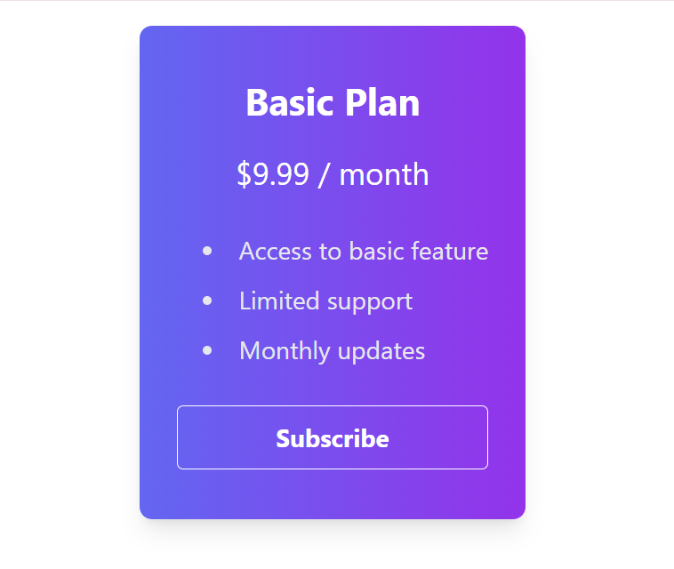
The above image displays a styled card representing a subscription plan. It features a gradient background shifting from indigo to purple, with shadow effects and rounded corners. The card contains information about the “Basic Plan,” including its price, features listed in a bullet-point format, and a “Subscribe” button.
Creating a Pricing Table with SASS
You can define mixins and variables to create a reusable styling pattern for pricing tables. Here’s an example:
$price-card-bg: #ffffff;
$price-card-shadow: 0 4px 6px rgba(0, 0, 0, 0.1);
$price-button-bg: #3498db;
$price-button-hover-bg: #2980b9;

@mixin price-card {
  background-color: $price-card-bg;
  box-shadow: $price-card-shadow;
  border-radius: 0.5rem;
  overflow: hidden;
  margin: 0.75rem;
  max-width: 300px;

  .price-title {
    font-weight: bold;
    text-align: center;
    font-size: 1.5rem;
    margin-bottom: 1rem;
  }

  .price-amount {
    font-size: 1.25rem;
    text-align: center;
    color: #333;
    margin-bottom: 1rem;
  }

  .features-list {
    margin-bottom: 1.5rem;
    padding: 0 1rem;

    li {
      padding: 0.5rem 0;
      display: flex;
      align-items: center;

      i {
        margin-right: 0.5rem;
      }
    }
  }

  .subscribe-button {
    background-color: $price-button-bg;
    color: #fff;
    font-weight: bold;
    padding: 0.75rem 1rem;
    border-radius: 0.25rem;
    display: block;
    text-align: center;
    transition: background-color 0.3s;

    &:hover {
      background-color: $price-button-hover-bg;
    }
  }
}

// Usage example
.pricing-container {
  display: flex;
  flex-wrap: wrap;
  justify-content: center;

  .price-card {
    @include price-card;
  }
}
Explanation:
This code defines a mixin called price-card using this style preprocessor. The mixin sets styles for a price card, including background color, box shadow, border radius, overflow, margin, and max width. Inside the price card, there are elements for the title <h2>, price amount <p>, a list of features <ul>, and a subscribe button <button>. The mixin also defines styles for these elements, such as font weight, text alignment, font size, and margin. Additionally, it includes styles for the subscribe button’s background color, text color, font weight, padding, border radius, and hover effect.
To use the mixin, it’s applied to a container element with the class .pricing-container, which contains individual price cards with the class .price-card. The container is styled to display its contents as a flexbox, allowing for responsive layout adjustments. The .price-card class applies the styles defined in the price-card mixin, creating consistent pricing card designs across the website.
HTML Markup
<div class="pricing-container">
  <div class="price-card">
    <div class="price-title">Basic Plan</div>
    <div class="price-amount">$9.99 / month</div>
    <ul class="features-list">
      <li>
        <i class="fas fa-check-circle text-green-500"></i>Access to basic feature
      </li>
      <li>
        <i class="fas fa-check-circle text-green-500"></i>Limited support
      </li>
      <li>
        <i class="fas fa-check-circle text-green-500"></i>Monthly updates
      </li>
    </ul>
    <button class="subscribe-button">Subscribe</button>
  </div>
</div>
Explanation:
The HTML markup represents a pricing container <div class="pricing-container"> containing a price card. Inside the price card <div class="price-card">, there are elements for the title <div class="price-title">, price amount <div class="price-amount">, a list of features <ul class="features-list">, and a subscribe button <button class="subscribe-button">. The title and price amount are displayed as text, while the list of features is represented by list items <li> with checkmark icons and text. The subscribe button allows users to subscribe to the plan. This structure can be replicated to create multiple price cards for different subscription plans, providing users with various pricing options.
Pricing table output:
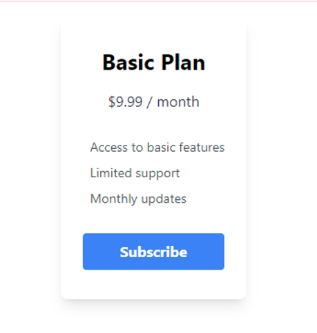 The image above demonstrates a pricing table layout. It presents pricing plans and features in a structured manner, facilitating easy comparison for users.
Factors to Consider When Choosing Between Sass or Tailwind
There are a few things to think about while choosing between these style monoliths:
Team Familiarity
It might be more effective to remain with what your team is already familiar with, If the team is already proficient in one of the technologies, it may be more efficient to leverage that expertise rather than introducing a new tool. However, if developers are open to learning new approaches and techniques, this factor may be less significant.
Project Size
For smaller projects where customization needs are minimal, using a preprocessor might not be necessary. Tailwind CSS will be more appropriate due to its utility-first approach, which offers predefined classes for common styles without the need for extensive customization. However, for larger projects with extensive styling requirements, leveraging variables and mixins can greatly enhance maintainability.
Performance Requirements
Performance depends on the specific requirements and constraints of the project. If optimizing file size and minimizing render time are critical, SASS might be preferable. However, if development speed and efficiency are higher priorities, Tailwind CSS could be the better option.
Community and Ecosystem
The Tailwind CSS community is rapidly growing, with active participation across forums and social media platforms. Extensive documentation and tutorials cater to developers of all levels, supported by a diverse ecosystem of plugins and extensions. In contrast, SASS boasts an established presence and a large, mature community. Its rich ecosystem offers a wide range of tools and educational resources, reflecting its longstanding role in front-end development. Both communities provide valuable support and insights, catering to developers’ varying needs and preferences.
Integration
Take into account how each technology works with the frameworks and toolkit you already have. While SASS is compatible with a variety of build tools and frameworks through plugins and integrations, Tailwind interacts smoothly with contemporary front-end frameworks like React, Vue.js, and Angular.
Conclusion
In the world of styling tools, both tools are like heavyweight champions, each with their own strengths. Tailwind CSS is great when you need to quickly put together designs and keep everything looking consistent. It’s like having a toolkit full of ready-made building blocks that you can use to construct your website without having to write a lot of custom style. This makes it perfect for projects where the design rules are already well-established and you want to work efficiently.
On the flip side, SASS shines when you need to fine-tune every aspect of your styles and keep your code organized. With this preprocessor, you can use variables, mixins, and functions to create reusable bits of code, making it easier to maintain and scale your stylesheets, especially in projects with complex design requirements. It’s the go-to choice when you need more control over your styles and want to build a solid foundation for your project’s style architecture.
Truly understand users experience
See every user interaction, feel every frustration and track all hesitations with OpenReplay — the open-source digital experience platform. It can be self-hosted in minutes, giving you complete control over your customer data.
Star on GitHub12k