Building a Design System in Vue
Build a Vue design system with shared CSS tokens, reusable button and input components, dark mode, Storybook docs, and Vite library packaging for multiple apps.

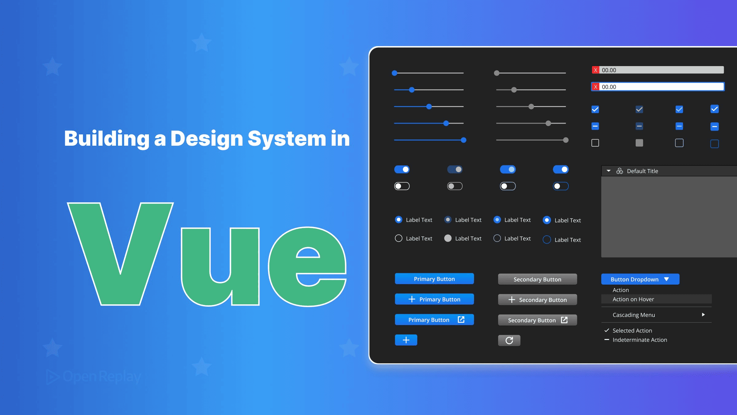
A minimal Vue design system is one npm package that contains a stylesheet of design tokens and a small set of <script setup> components. You document it in Storybook and bundle it with Vite library mode.
If you work with more than one Vue app, you have probably seen this happen: one app’s primary button is #2563eb, another’s is #3b82f6, and a third app uses padding: 10px 14px because someone eyeballed it. These differences pile up over time, and fixing each app separately doesn’t stop them.
This tutorial builds one shared package and installs it in every app. You start with tokens, add two components and a dark theme, document them in Storybook, and publish the result as a library. If you need the background on why design systems matter, read design systems for front-end development. The code targets Vue 3.4+, Vite 8 and Storybook 10.
Prerequisites: You should be comfortable with the Composition API and <script setup>. If you aren’t, start with the fundamentals of Vue 3.
Key Takeaways
- Define design tokens as CSS custom properties on
:root, so every component in every app reads the same colour, spacing and type values at runtime. - A button with one
variantprop and onesizeprop can’t express conflicting styles the way a set of boolean props can. - Since Vue 3.4,
defineModel()is the recommended way to supportv-modelon a custom input. - In Vite library mode, mark
vueas external so the package uses the consuming app’s copy of Vue instead of bundling its own. - Vite emits a library’s CSS as a single file, which you expose through the package’s
exportsmap.
The Goal: One Package Every Vue App Installs
The finished package ships three things: style.css (tokens plus component styles), the components themselves, and a JavaScript entry point that exports those components. Here is the project tree:
design-system/
├── .storybook/
│   ├── main.ts
│   └── preview.ts
├── src/
│   ├── tokens.css
│   ├── index.ts
│   └── components/
│       ├── DsButton.vue
│       ├── DsButton.stories.ts
│       └── DsInput.vue
├── package.json
└── vite.config.ts
Design Tokens as CSS Custom Properties
Put your design tokens in src/tokens.css as CSS custom properties declared on :root. Custom properties inherit and resolve at runtime. That means every component in every app reads the same values, and redefining a token in one place changes it everywhere. Prefix the names with --ds- so they can’t collide with variables the consuming apps already define.
/* src/tokens.css */
:root {
  --ds-color-primary: #2563eb;
  --ds-color-danger: #dc2626;
  --ds-color-surface: #ffffff;
  --ds-color-text: #111827;
  --ds-color-border: #d1d5db;
  --ds-space-1: 0.25rem;
  --ds-space-2: 0.5rem;
  --ds-space-3: 0.75rem;
  --ds-space-4: 1rem;
  --ds-font-size-sm: 0.875rem;
  --ds-font-size-md: 1rem;
  --ds-font-size-lg: 1.125rem;
  --ds-radius: 0.375rem;
}
A Button With Variant and Size Props
A design-system button should have one variant prop and one size prop, each mapped to a CSS class. Don’t add a boolean prop for every style. With booleans, a caller can write <Button primary danger>, and nothing in the API stops it:
<!-- Before: conflicting states are expressible -->
<Button primary danger small>Delete</Button>
Typed union props allow exactly one value per axis:
<!-- src/components/DsButton.vue -->
<script setup lang="ts">
import { computed } from 'vue'

const props = withDefaults(defineProps<{
  /** Visual style of the button */
  variant?: 'primary' | 'secondary' | 'danger'
  /** Padding and font size */
  size?: 'sm' | 'md' | 'lg'
}>(), { variant: 'primary', size: 'md' })

const classes = computed(() => [
  'ds-button',
  `ds-button--${props.variant}`,
  `ds-button--${props.size}`,
])
</script>

<template>
  <button :class="classes"><slot /></button>
</template>

<style>
.ds-button { border: 1px solid transparent; border-radius: var(--ds-radius); cursor: pointer; }
.ds-button--primary { background: var(--ds-color-primary); color: var(--ds-color-surface); }
.ds-button--secondary { background: var(--ds-color-surface); color: var(--ds-color-text); border-color: var(--ds-color-border); }
.ds-button--danger { background: var(--ds-color-danger); color: var(--ds-color-surface); }
.ds-button--sm { padding: var(--ds-space-1) var(--ds-space-2); font-size: var(--ds-font-size-sm); }
.ds-button--md { padding: var(--ds-space-2) var(--ds-space-3); font-size: var(--ds-font-size-md); }
.ds-button--lg { padding: var(--ds-space-3) var(--ds-space-4); font-size: var(--ds-font-size-lg); }
</style>
DsButton renders a native <button>, so the browser handles keyboard and form behaviour. The default slot accepts text or icons. The styles reference tokens only and contain no hex values. Storybook reads the JSDoc comments on the props and shows them in the docs panel.
An Input With defineModel(), a Label and Attribute Pass-Through
Since Vue 3.4, defineModel() is the recommended way to support v-model on a component. It returns a ref that stays in sync with the parent’s modelValue and emits update:modelValue whenever the child changes it. Don’t give it a default value. The Vue docs warn that a default with no value from the parent puts the parent and child out of sync.
<!-- src/components/DsInput.vue -->
<script setup lang="ts">
defineOptions({ inheritAttrs: false })
defineProps<{ /** Visible label text */ label: string }>()
const model = defineModel<string>()
</script>

<template>
  <label class="ds-input">
    <span>{{ label }}</span>
    <input v-model="model" v-bind="$attrs" />
  </label>
</template>
Wrapping the <input> inside its <label> gives the input an accessible name, so the component doesn’t need an id prop. The root element is the <label>, though, so by default attributes like placeholder, type and name would land on the label. Setting inheritAttrs: false through defineOptions turns that behaviour off, and v-bind="$attrs" forwards those attributes to the <input>. With this setup, class and style also go to the input instead of the label.
Light and Dark Themes From the Same Tokens
A Vue design system doesn’t need new components for dark mode. Redefine the same custom properties under a [data-theme="dark"] selector and inside a prefers-color-scheme: dark media query, and every component that reads them switches automatically. Add this to tokens.css:
[data-theme="dark"] {
  --ds-color-surface: #111827;
  --ds-color-text: #f9fafb;
  --ds-color-border: #374151;
}

@media (prefers-color-scheme: dark) {
  :root:not([data-theme="light"]) {
    --ds-color-surface: #111827;
    --ds-color-text: #f9fafb;
    --ds-color-border: #374151;
  }
}
The media query follows the operating system setting. The :not([data-theme="light"]) guard respects a user who explicitly chooses light mode. To set a theme from the app, use one line:
document.documentElement.dataset.theme = 'dark'Storybook for Vue
Storybook renders each design-system component in isolation, so you can review every variant without running an app. For background on how stories turn into living docs, see Storybook UI documentation. Initialise it from the project root:
npm create storybook@latestThe installer detects Vite and Vue and configures the @storybook/vue3-vite framework. As of Storybook 10.6, the default vue-docgen-api engine is deprecated, and the recommended option is vue-component-meta:
// .storybook/main.ts
import type { StorybookConfig } from '@storybook/vue3-vite'

const config: StorybookConfig = {
  stories: ['../src/**/*.stories.ts'],
  framework: {
    name: '@storybook/vue3-vite',
    options: { docgen: 'vue-component-meta' },
  },
}
export default config
Load the tokens globally. Storybook’s styling guide says to add global CSS for all your stories by importing it in .storybook/preview.ts:
// .storybook/preview.ts
import type { Preview } from '@storybook/vue3-vite'
import '../src/tokens.css'

const preview: Preview = {}
export default preview
The following story renders every variant side by side and keeps size editable through Controls. It uses the typed Meta and StoryObj pattern:
// src/components/DsButton.stories.ts
import type { Meta, StoryObj } from '@storybook/vue3-vite'
import DsButton from './DsButton.vue'

const meta = {
  component: DsButton,
  argTypes: {
    size: { control: 'radio', options: ['sm', 'md', 'lg'] },
  },
} satisfies Meta<typeof DsButton>

export default meta
type Story = StoryObj<typeof meta>

export const AllVariants: Story = {
  args: { size: 'md' },
  render: (args) => ({
    components: { DsButton },
    setup: () => ({ args, variants: ['primary', 'secondary', 'danger'] }),
    template: `
      <div style="display: flex; gap: 8px">
        <DsButton v-for="v in variants" :key="v" v-bind="args" :variant="v">{{ v }}</DsButton>
      </div>`,
  }),
}
Package the Vue Design System With Vite Library Mode
Vite library mode builds src/index.ts into a distributable bundle instead of an app. The entry imports the tokens, so they end up in the emitted stylesheet, and then re-exports the components:
// src/index.ts
import './tokens.css'
export { default as DsButton } from './components/DsButton.vue'
export { default as DsInput } from './components/DsInput.vue'
The Vite docs example leaves out @vitejs/plugin-vue, but a Vue library needs it to compile .vue files:
// vite.config.ts
import { resolve } from 'node:path'
import { defineConfig } from 'vite'
import vue from '@vitejs/plugin-vue'

export default defineConfig({
  plugins: [vue()],
  build: {
    lib: {
      entry: resolve(import.meta.dirname, 'src/index.ts'),
      name: 'DesignSystem',
      fileName: 'design-system',
      cssFileName: 'style',
    },
    rolldownOptions: {
      external: ['vue'],
      output: { globals: { vue: 'Vue' } },
    },
  },
})
Vite 8 uses build.rolldownOptions. The older build.rollupOptions is a deprecated alias for it. Mark vue as external so the package uses the consuming app’s copy of Vue instead of bundling its own; two copies of Vue in one page break reactivity and component instances. Vite emits all library CSS as one stylesheet. Without cssFileName, that file takes its name from fileName, so here cssFileName: 'style' produces dist/style.css.
Use the package.json shape that Vite recommends. List vue as a peer dependency, which tells npm the host app provides it:
{
  "name": "design-system",
  "version": "0.1.0",
  "type": "module",
  "files": ["dist"],
  "main": "./dist/design-system.umd.cjs",
  "module": "./dist/design-system.js",
  "exports": {
    ".": {
      "import": "./dist/design-system.js",
      "require": "./dist/design-system.umd.cjs"
    },
    "./style.css": "./dist/style.css"
  },
  "peerDependencies": { "vue": "^3.4.0" }
}
Run npx vite build, then check dist/ and make sure every path in exports matches a file that was actually emitted.
Install It in Another App
Install the package from a workspace or a local path. Import the CSS once in the app entry, then import components wherever you need them:
npm install ../design-systemA local path install is a symlink. The bundle’s import 'vue' can then resolve to the copy in design-system/node_modules, which was installed there for building and Storybook, and the page ends up with two copies of Vue. To prevent that, tell the consuming app’s Vite config to resolve vue from its own project root:
// vite.config.ts in the consuming app
import { defineConfig } from 'vite'
import vue from '@vitejs/plugin-vue'

export default defineConfig({
  plugins: [vue()],
  resolve: { dedupe: ['vue'] },
})
Alternatively, run npm pack in the design system and install the resulting tarball, which contains only the files listed in files.
// main.ts
import { createApp } from 'vue'
import 'design-system/style.css'
import App from './App.vue'

createApp(App).mount('#app')<script setup lang="ts">
import { ref } from 'vue'
import { DsButton, DsInput } from 'design-system'
const email = ref('')
</script>
<template>
<DsInput v-model="email" label="Email" type="email" placeholder="you@example.com" />
<DsButton variant="primary" size="lg">Subscribe</DsButton>
</template>Keep It Small
Each component you add to a shared Vue design system is one more API that every app has to keep compatible with. Start with tokens, a button and an input. Add a component to the shared package only when at least two apps need it; anything else stays in the app that uses it. Your next step is to install the package in your second app, replace that app’s hand-rolled button with DsButton, and remove its hard-coded colour values in favour of --ds- tokens.
FAQs
Why do I get two copies of Vue after installing the design system from a local path?
A local path or workspace install creates a symlink, so the bundle's import of vue can resolve to the design-system folder's own node_modules copy. Add resolve.dedupe with vue to the consuming app's Vite config, which forces Vite to resolve listed dependencies to the copy in the project root. Alternatively, run npm pack and install the tarball, which only contains the files listed in files.
Does Vite library mode generate TypeScript declaration files for Vue components?
No. Vite only transpiles TypeScript and does not emit .d.ts files, so consumers get no prop types by default. Run vue-tsc --declaration --emitDeclarationOnly after vite build, because vue-tsc understands .vue files and plain tsc does not. Run it after the build because vite build empties the output directory by default. The vite-plugin-dts plugin is an alternative that runs inside the Vite build.
Should design tokens be Sass variables or CSS custom properties?
Use CSS custom properties for any token that themes change. Sass variables compile to fixed values at build time and do not exist in the browser, so a data-theme selector or a prefers-color-scheme media query cannot redefine them. Custom properties resolve at runtime and inherit through the DOM. Sass can still generate the custom property declarations if a team prefers authoring tokens in Sass.
If an app imports only DsButton, does it still load the CSS for every component?
Yes. Vite library mode emits one stylesheet for the whole library, so importing style.css loads the tokens and the styles for every component, whichever components the app actually uses. The JavaScript side differs: the ES module build re-exports each component by name, so the consuming app's bundler can tree-shake components it never imports. With a small component set, the shared stylesheet costs little.
Gain Debugging Superpowers
Unleash the power of session replay to reproduce bugs, track slowdowns and uncover frustrations in your app. Get complete visibility into your frontend with OpenReplay — the most advanced open-source session replay tool for developers.
Star on GitHub12k