Building Dropdowns and Accordions with CSS
Learn how to build these components by yourself.


Dropdowns and accordions are similar: hidden content revealed after an event, like clicking a button. The difference is that a dropdown will lay over other content on the page, while an accordion will push down the content to make room for itself. This article will show you how to build them with just CSS or with CSS plus JavaScript.
Creating a Dropdown/Accordion with only CSS
The most common location of a dropdown menu is on the navbar. We are going to build one.
Dropdown with only CSS
Here’s an HTML markup of a navbar:
<nav>
  <a href="#" class="logo">Logo</a>
  <!--Links-->
  <ul>
    <li><a href="#">Home</a></li>
    <li><a href="#">About</a></li>
    <li>
      <a href="#"
        >Services
        <div class="dropdown">
          <ul>
            <li><a href="#">Projects</a></li>
            <li><a href="#">Reviews</a></li>
            <li><a href="#">FAQs</a></li>
          </ul>
        </div>
      </a>
    </li>
    <li><a href="#">Blog</a></li>
    <li><a href="#">Contact</a></li>
  </ul>
</nav>
The first thing to do is create a nav element. Some developers may use a div, but using the right semantics is always good.
The next step is adding the links, which will be list items, or li, in an unordered list. Then the dropdown container, with the dropdown class name, is nested in a li. For this demo, we’re using “Services”.
You should also indicate that the link contains a dropdown. You can either use the plus sign or an icon.
Now, we move over to the CSS.
You should start by styling the anchor tags. Remove the default style and add yours.
a {
  text-decoration: none;
  color: #e0ffff;
  font-size: 20px;
  transition: 0.3s;
}
a:hover {
  color: #00c2cb;
}
Then, you move to the navbar and the links.
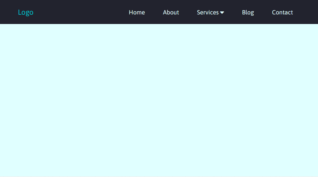
nav {
background: #22232e;
height: 80px;
width: 100%;
display: flex;
align-items: center;
justify-content: space-around;
padding: 0px 5%;
}
nav ul {
display: flex;
list-style: none;
}
nav ul li {
padding: 10px 30px;
position: relative;
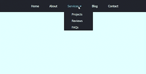
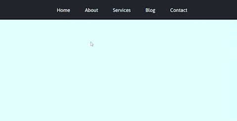
}Here’s a screenshot of what you should have at this point:
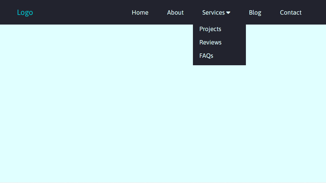
Moving on to the dropdown.
.dropdown {
  display: block;
  position: absolute;
  left: 0;
  top: 100%;
  background-color: #22232e;
}
dropdown ul {
  display: block;
  margin: 10px;
}
.dropdown ul li {
  width: 150px;
  padding: 10px;
}
We’re giving the dropdown a display of block and position of absolute so that the dropdown is directly below the link. After this, you can style the rest of the dropdown.
At this point, you’ll have this:
Now, we’ll hide the list by setting its display to none. After that, we’ll set the condition for triggering the dropdown when you hover over the link.
.dropdown {
  display: none;
}
nav ul li:hover .dropdown {
  display: block;
  position: absolute;
  left: 0;
  top: 100%;
  background-color: #22232e;
}
nav ul li:hover .dropdown ul {
  display: block;
  margin: 10px;
}
nav ul li:hover .dropdown ul li {
  width: 150px;
  padding: 10px;
}
And that’s one way of creating a dropdown with only CSS.
Using the :focus selector
The :focus selector is an alternative to :hover. It’s a pseudo-class that’s applied to an element that’s in focus. You use it to style any element that requires user interaction, like a click.
The most common elements that require focus are input and textarea. You can also use it on the button element, which is ideal for this tutorial.
To demonstrate, we will use a similar setup as the previous example, but we will replace the anchor tags.
<nav>
  <ul>
    <li><button>Home</button></li>
    <li><button>About</button></li>
    <li>
      <button>Services <i class="fas fa-caret-down"></i></button>
      <div class="dropdown">
        <ul>
          <li><a href="#">Projects</a></li>
          <li><a href="#">Reviews</a></li>
          <li><a href="#">FAQs</a></li>
        </ul>
      </div>
    </li>
    <li><button>Blog</button></li>
    <li><button>Contact</button></li>
  </ul>
</nav>
The CSS is also most similar to the first example. Here, you’ll style the buttons like you styled the links in the demo above. The main difference is in triggering the dropdown.
nav ul li button:focus + .dropdown {
  display: block;
  position: absolute;
  left: 0;
  top: 100%;
  background-color: #22232e;
  margin: 10px;
}
nav ul li button:focus + .dropdown ul {
  display: block;
  margin: 10px;
}
nav ul li button:focus + .dropdown ul li {
  width: 150px;
  padding: 10px;
}
The dropdown will open when the link is in focus; that is when you click on it. The + is an adjacent sibling selector. It targets the .dropdown immediately after the button that has focus. So when the button element is in focus, the dropdown will be displayed.
The dropdown will remain open until you click on another part of the page.
Here’s a codepen, so you can see how it works.
Accordion with only CSS
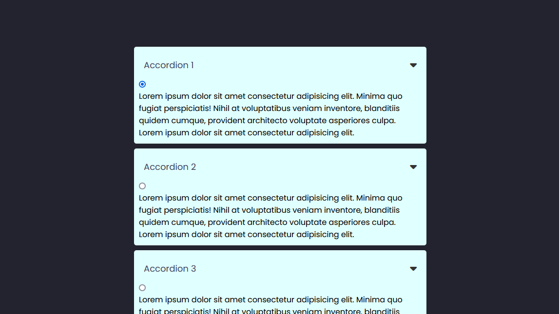
Accordions are used to display specific information, like the answers in an FAQ section of a website. You’ll need radio buttons to control the accordion.
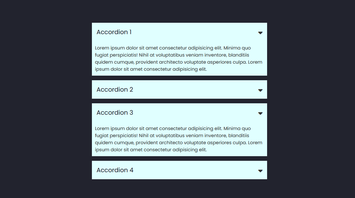
Here’s a screenshot of what we’re aiming for:
You’ll start by creating the accordion’s container, which, for this example, will be an unordered list. Then, the list items will be hidden tabs or panels. Each tab will contain a radio button, a label, and some content.
Here’s the HTML code:
<ul id="accordion">
  <li>
    <label for="first">Accordion 1</label>
    <input type="radio" name="accordion" id="first" />
    <div class="content">
      <p>Lorem ipsum...</p>
    </div>
  </li>
  <li>
    <label for="second">Accordion 2</label>
    <input type="radio" name="accordion" id="second" />
    <div class="content">
      <p>Lorem ipsum...</p>
    </div>
  </li>
  <li>
    <label for="third">Accordion 3</label>
    <input type="radio" name="accordion" id="third" />
    <div class="content">
      <p>Lorem ipsum...</p>
    </div>
  </li>
  <li>
    <label for="fourth">Accordion 4</label>
    <input type="radio" name="accordion" id="fourth" />
    <div class="content">
      <p>Lorem ipsum...</p>
    </div>
  </li>
</ul>
As with the dropdown, you can add an icon to indicate that there’s hidden content. It’ll go into the label.
<label for="first"
  >Accordion 1<span><i class="fa-solid fa-caret-down"></i></span
></label>
Now we move to the CSS, starting with the main accordion container and the tabs.
body {
background: #22232e;
}
#accordion {
margin: 100px auto;
width: 600px;
}
#accordion li {
list-style: none;
width: 100%;
margin-bottom: 10px;
padding: 10px;
background: #e0ffff;
border-radius: 5px;
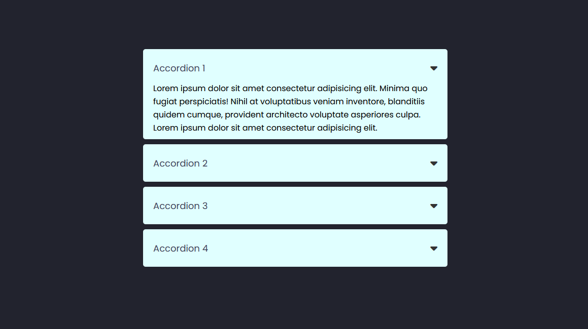
}Next, you’ll style the label and the icon.
#accordion li label {
  padding: 10px;
  display: flex;
  align-items: center;
  justify-content: space-between;
  font-size: 18px;
  font-weight: 500;
  color: #42455a;
  cursor: pointer;
}
#accordion li label span {
  font-size: 22px;
  color: #333;
}
Here’s a screenshot of what the accordion looks like at this point:
The next step is to hide the radio buttons and content. We’re giving the input tags a display of none to hide them. To do the same for the content in the tabs, reduce the max-height to 0.
#accordion label + input[type="radio"] {
  display: none;
}
#accordion .content {
  padding: 0 10px;
  line-height: 26px;
  max-height: 0;
  overflow: hidden;
  transition: max-height 0.5s;
}
The final step to complete the accordion is displaying the content whenever the radio button is clicked or checked.
#accordion label + input[type="radio"]:checked + .content {
  max-height: 400px;
}
And that’s it; you’ve successfully created an accordion using only CSS. Here’s a codepen demo.
Accordion with the HTML details element
This is an alternative to the radio buttons. The details element is used to create a widget that can be used to show or hide additional content on a web page. It’s a block of content that the user can expand or collapse.
The details element should contain a summary element as its first child, which acts as a header for the widget. The accordion’s content is placed inside another element below the summary element, for example, a p tag.
When the user clicks on the summary element, the details element expands or collapses to show or hide the content that follows it.
Here’s an example:
<details>
  <summary>Accordion 1</summary>
  <p>Lorem ipsum...</p>
</details>
<details>
  <summary>Accordion 2</summary>
  <p>Lorem ipsum...</p>
  >
</details>
<details>
  <summary>Accordion 3</summary>
  <p>Lorem ipsum...</p>
</details>
<details>
  <summary>Accordion 4</summary>
  <p>Lorem ipsum...</p>
</details>
With this, you already have a working accordion. You can then customize its default appearance with CSS.
An advantage of using this method is having multiple widgets open simultaneously.
The details element provides built-in accessibility features, such as keyboard navigation and screen reader support, which makes it a good choice for creating an accordion.
Session Replay for Developers
Uncover frustrations, understand bugs and fix slowdowns like never before with OpenReplay — an open-source session replay tool for developers. Self-host it in minutes, and have complete control over your customer data. Check our GitHub repo and join the thousands of developers in our community.
Creating a Dropdown/Accordion with CSS and JavaScript
As with any situation that requires JavaScript, you need a function and an event. You’ll create a function for the active state of the dropdown or accordion and then an event to trigger it.
Here’s the JavaScript function:
const servicesLink = document.querySelector("#services-link");
const dropdownMenu = document.querySelector(".dropdown");

// Show/hide the dropdown when clicking the services link
servicesLink.addEventListener("click", function (event) {
  event.preventDefault(); // prevent the link from being followed
  dropdownMenu.classList.toggle("active");
});
This adds a click event to the “Services” link, which toggles an active class on the dropdown. The preventDefault() method is called on the event object to prevent the link from being followed when the user clicks on it, and allows us to control the behavior of the dropdown menu.
All that’s left is to update the CSS.
.dropdown {
  display: none;
  position: absolute;
  left: 0;
  top: 100%;
  background-color: #22232e;
}
.dropdown ul {
  display: block;
  margin: 10px;
}
.dropdown ul li {
  width: 150px;
  padding: 10px;
}
/* Show the dropdown when clicking the services link */
.dropdown.active {
  display: block;
}Creating an Accordion with CSS and JavaScript
We will create the same accordion as before but without the radio buttons.
<div class="accordion">
  <h1>JavaScript Accordion</h1>
  <div class="container">
    <div class="label">Accordion 1</div>
    <div class="content">
      Lorem ipsum, dolor sit amet consectetur adipisicing elit.
    </div>
  </div>
  <div class="container">
    <div class="label">Accordion 2</div>
    <div class="content">
      Lorem ipsum, dolor sit amet consectetur adipisicing elit.
    </div>
  </div>
  <div class="container">
    <div class="label">Accordion 3</div>
    <div class="content">
      Lorem ipsum, dolor sit amet consectetur adipisicing elit.
    </div>
  </div>
  <div class="container">
    <div class="label">Accordion 4</div>
    <div class="content">
      Lorem ipsum, dolor sit amet consectetur adipisicing elit.
    </div>
  </div>
</div>
Next, hide the content by reducing its height to 0, an active class that gives the height when the accordion is open.
.accordion .content {
  height: 0;
  padding: 0 10px;
  line-height: 26px;
  overflow: hidden;
  transition: height 0.5s;
}
.accordion .container.active .content {
  height: 100px;
}
Finally, use a JavaScript function that selects all the container class names and toggles the active class on the selected elements.
const accordion = document.getElementsByClassName("container");

for (i = 0; i < accordion.length; i++) {
  accordion[i].addEventListener("click", function () {
    this.classList.toggle("active");
  });
}And that’s a wrap; you can now create dropdowns and accordions. You can use plain CSS, which is simple and easy, or you could use JavaScript, which offers a bit more control.
Adding CSS animations and Interactivity
Now you know how to create dropdowns and accordions, you can make them better by adding some CSS animations.
Let’s start with something simple. So far, we’ve used display: none to hide the content. Now we’ll use the opacity property.
Using the dropdown with the :focus selector, you can modify it like this:
.dropdown ul {
  display: block;
  position: absolute;
  left: 0;
  top: 100%;
  background-color: #22232e;
  margin: 10px;
  opacity: 0; /*Hides the dropdown*/
  transform: translateY(-15px);
  transition: all 0.5s ease;
}
And for when it’s in focus:
nav ul li button:focus + .dropdown ul {
  opacity: 1;
  transform: translateY(0px);
}
In this example, we’re animating the dropdown’s opacity and transform properties. When you click on the link, the dropdown will appear to “drop down” from the top of the page.
This can be easily replicated using the :hover pseudo-element and JavaScript. The steps are the same; you’re just replacing :focus with :hover and .active.
We can also animate the individual links in the dropdown using the animation property and @keyframes.
So, using the demo with :hover, here’s how to add CSS animation. You can give each link a unique class name or use the :nth-child() selector.
.dropdown ul li {
  animation-name: slide-down;
  animation-duration: 0.5s;
  animation-timing-function: ease-out;
  animation-fill-mode: forwards;
  opacity: 0;
}

.dropdown ul li:nth-child(1) {
  animation-delay: 0.1s;
}

.dropdown ul li:nth-child(2) {
  animation-delay: 0.2s;
}

.dropdown ul li:nth-child(3) {
  animation-delay: 0.3s;
}

.dropdown ul li:nth-child(4) {
  animation-delay: 0.4s;
}
The animation shorthand can be used instead.
.dropdown ul li {
  animation: slide-down 0.5s ease-out forwards;
  opacity: 0;
}
Next, we add the @keyframes
@keyframes slide-down {
  0% {
    transform: translateY(-20px);
  }
  100% {
    transform: translateY(0);
    opacity: 1;
  }
}
Another way you could spice up the dropdown is to add some transparency. You can use the opacity property, but that wouldn’t produce anything special. You should use rgba colors instead, and then add a frosted glass effect (glassmorphism) using backdrop-filter and a blur() value. This way, it’s not completely see-through. This effect won’t be seen unless there’s something in the background.
Browser compatibility
Most of the elements and properties we used are well-supported on all modern browsers. You can check out caniuse.com for a more detailed analysis of their compatibility.
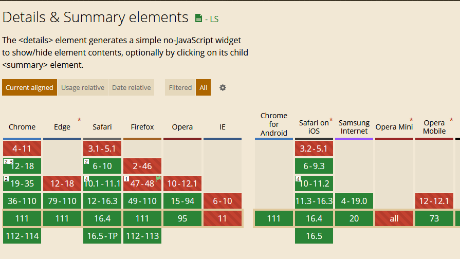
details and summary aren’t supported on any version of Internet Explorer or early versions of Edge, Firefox, Safari, and Chrome. They’re compatible with every modern browser.
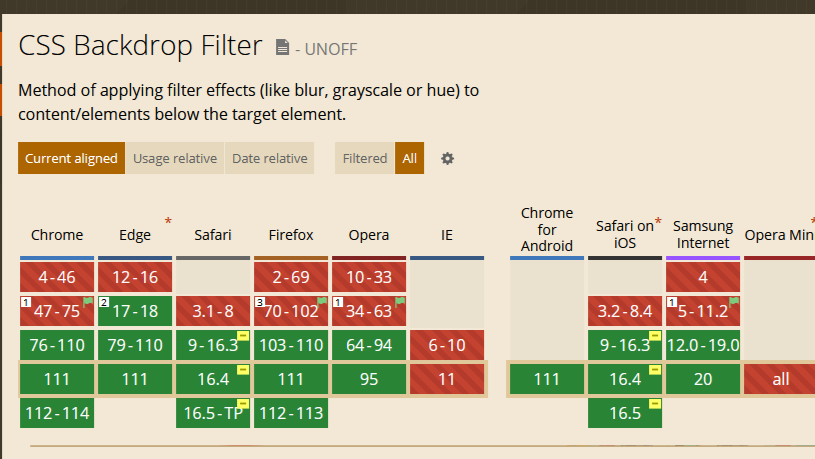
The backdrop-filter property requires the -webkit- prefix to work on Safari.
Conclusion
Dropdowns are a great way to have extra links in your navigation, and you’ve just seen how to create them using CSS and JavaScript. An accordion keeps specific information, which you can use for an FAQ page.
JavaScript adds more functionality, and you can also choose to go simple with plain CSS. Adding CSS animations makes them more interactive.
They’ll make a great addition to your next project.
Gain Debugging Superpowers
Unleash the power of session replay to reproduce bugs and track user frustrations. Get complete visibility into your frontend with OpenReplay, the most advanced open-source session replay tool for developers.